Maruzen Athena Inks
/
Swabs and links to Maruzen Athena ink reviews.
Read More
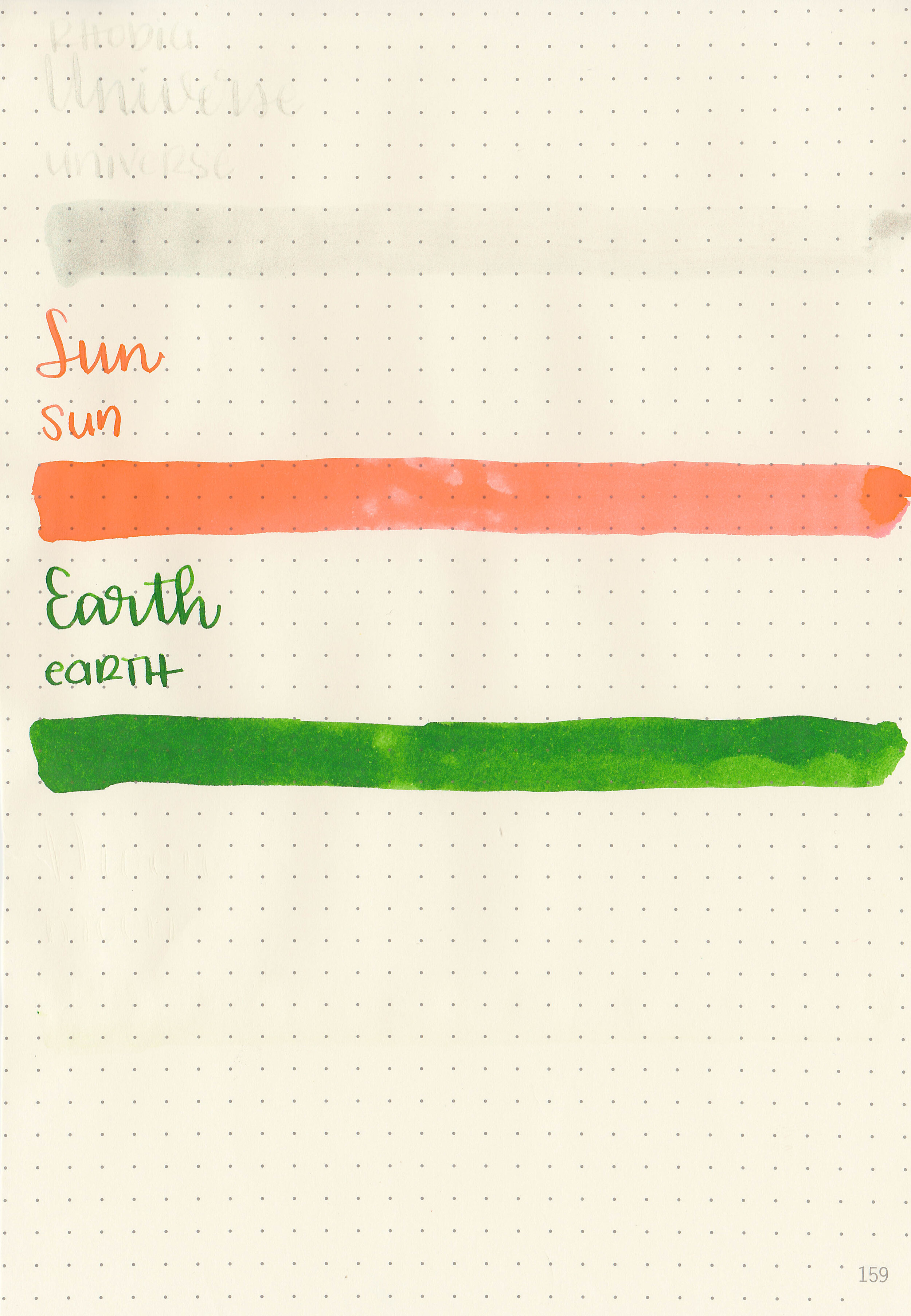
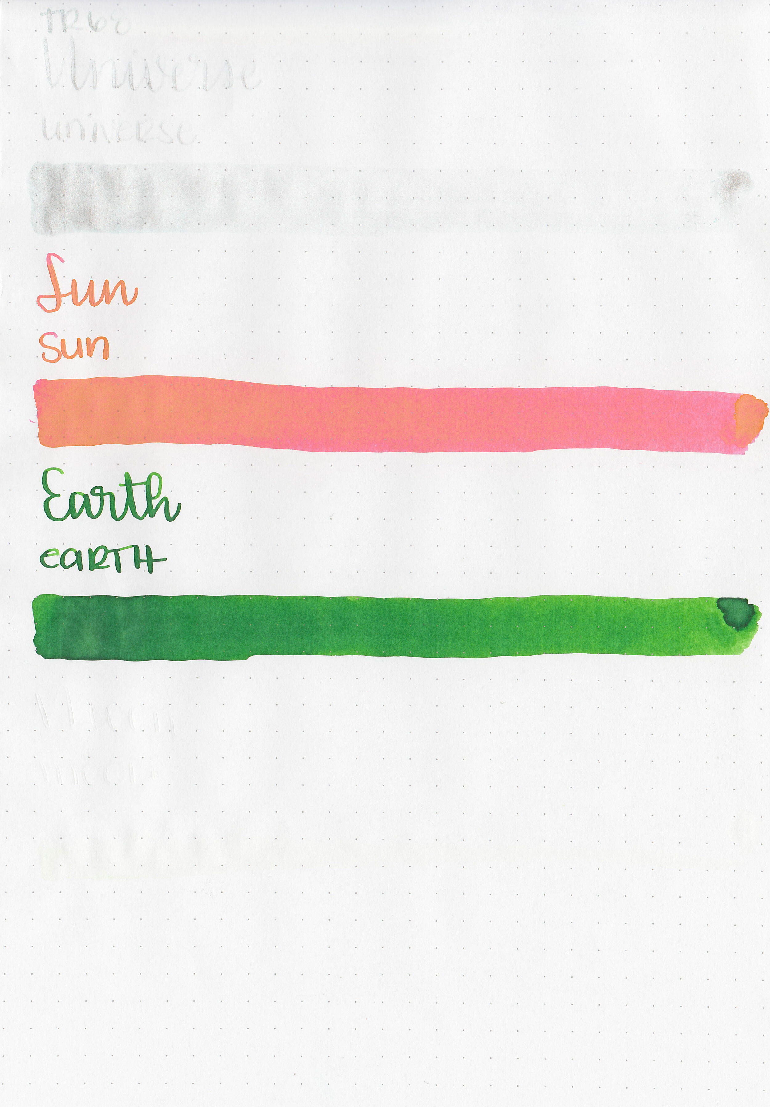
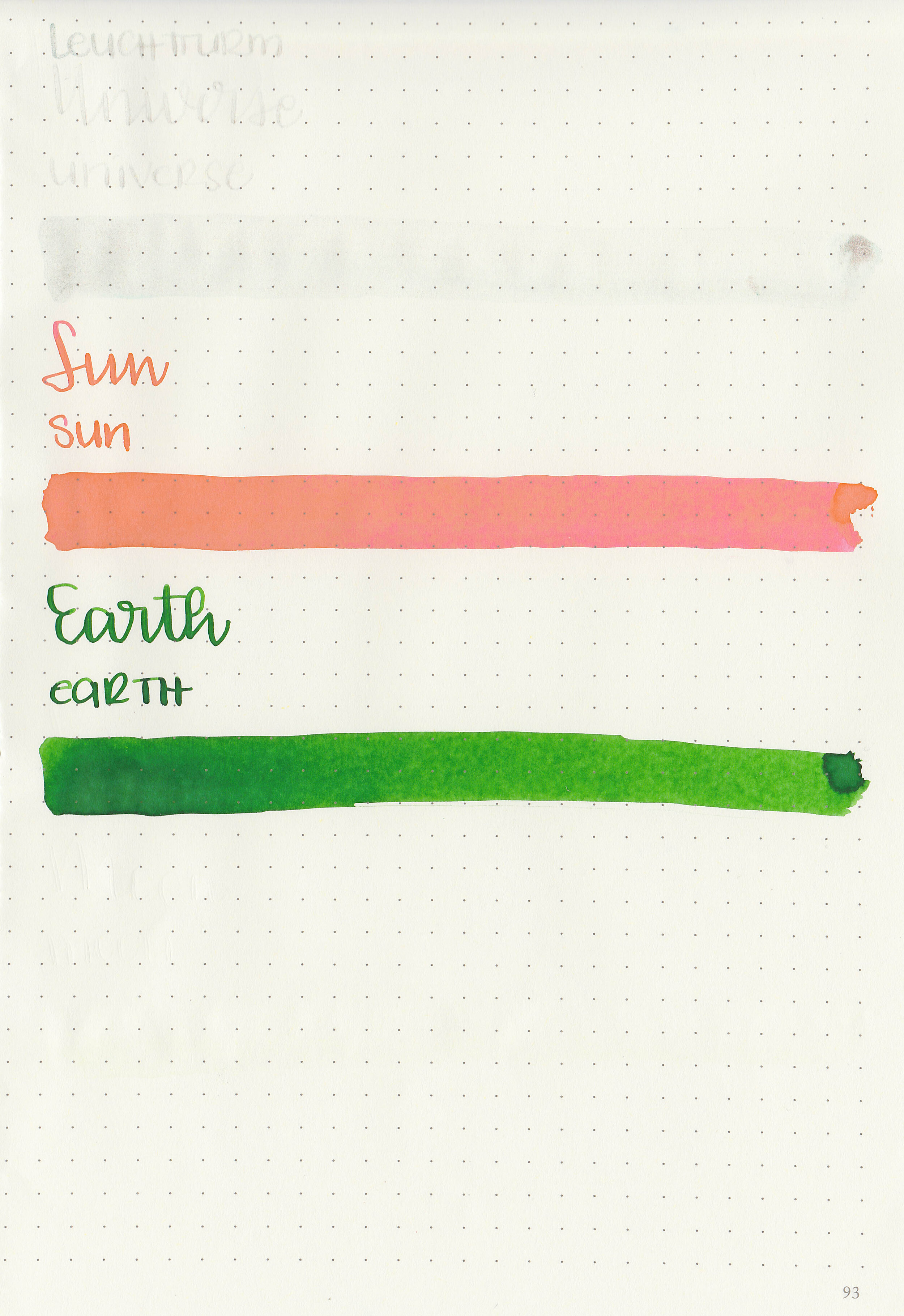
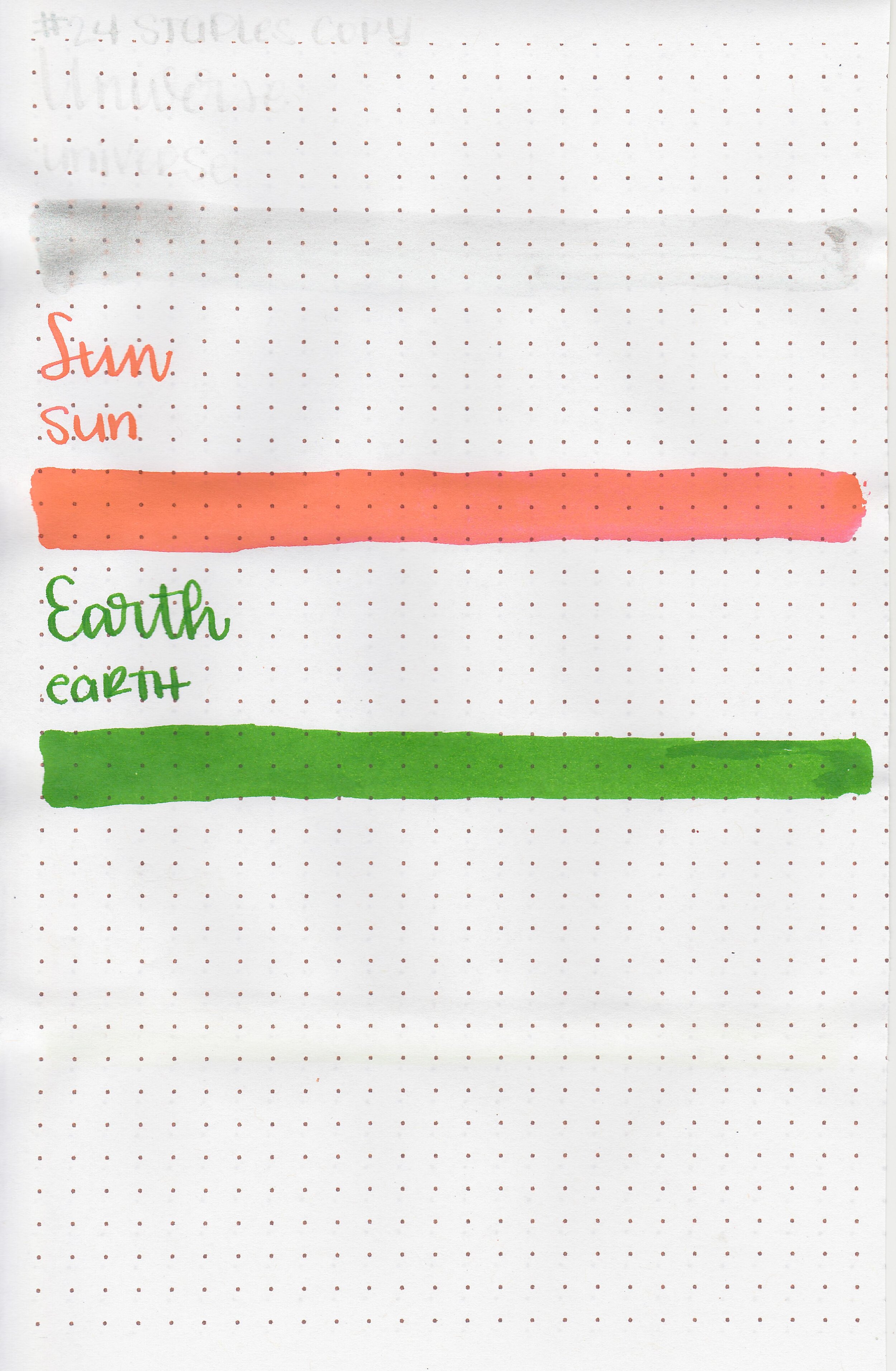
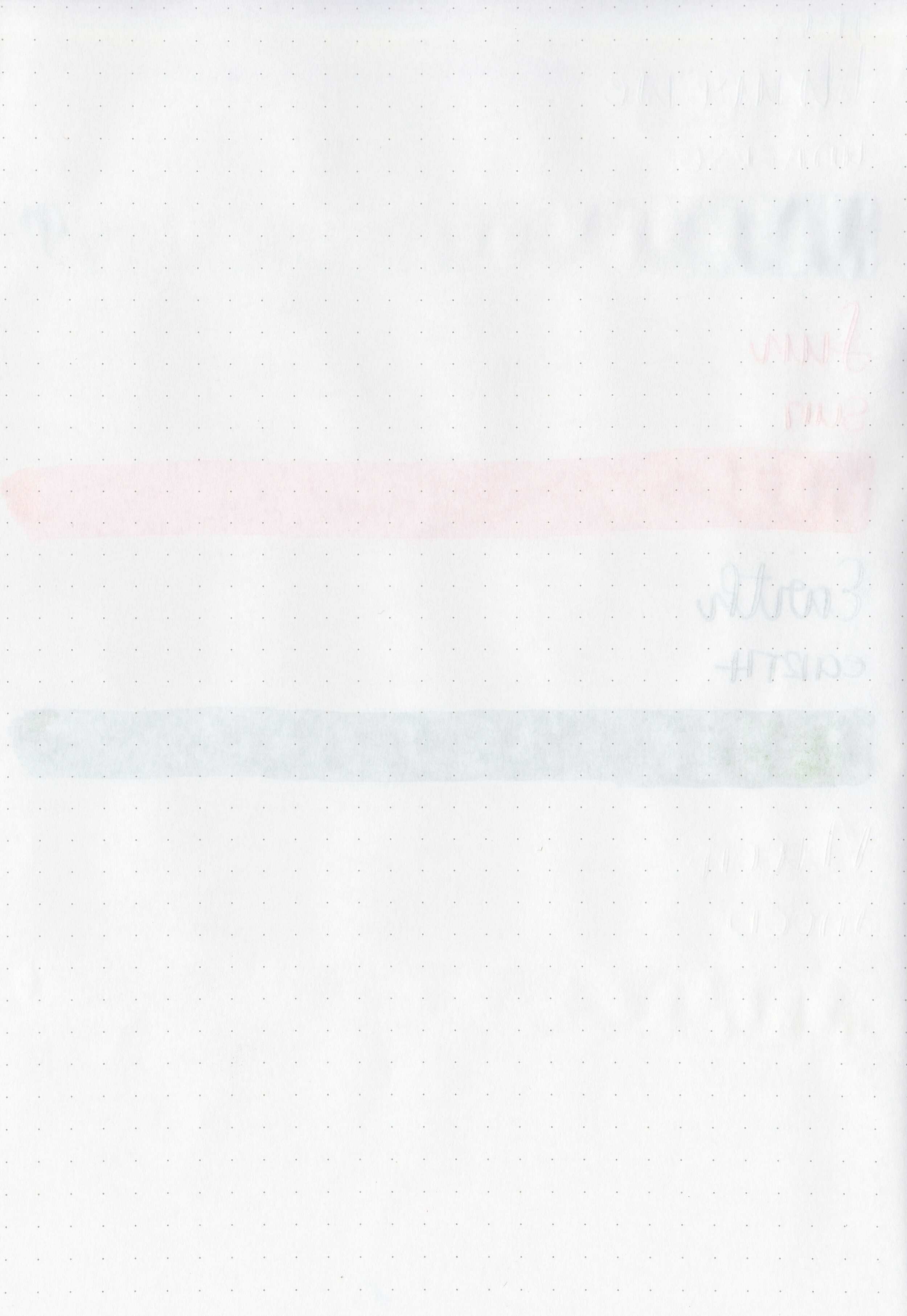
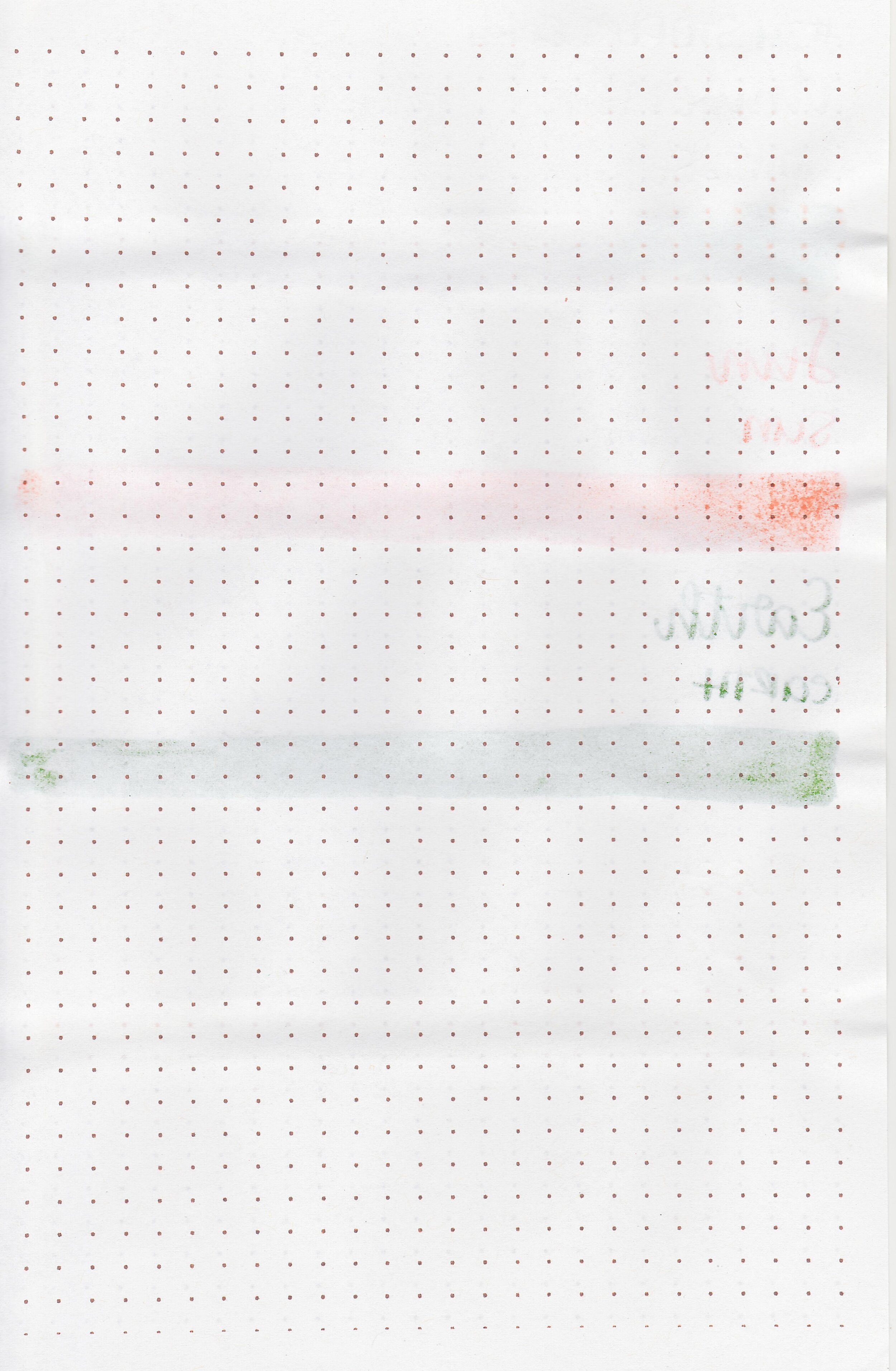
Let’s take a look at the Tono & Lims One Year Anniversary ink collection. Thanks to Shigure Inks for providing samples! Universe is a clear ink with silver shimmer, Sun is a bright coral orange, Earth is a medium green with a slight yellow undertone and Moon is clear. Universe, Sun and Moon fluoresce under uv light.

Left to right: Universe, Sun, Earth and Moon.

Let's take a look at how the ink behaves on fountain pen friendly papers: Rhodia, Tomoe River, and Leuchtturm.
Water resistance: Low
Feathering: None
Show through: Medium
Bleeding: None
Other properties: low shading, no sheen, and Universe has silver shimmer. Earth and Sun both show low shading.
On Staples 24 lb copy paper there was lots of feathering in every nib size as well as a little bleeding.

Universe and Moon are unlike any other inks I’ve tried, so I really have nothing to compare them to. How do you compare clear inks?

Sun is closest to Diamine Peach Haze.

Earth is closest to Colorverse Supernatural.

I used a Taroko Enigma notebook. All of the inks had an average flow.
Overall, I like Sun and Earth, but I can’t think of any reason why I would need a clear uv reactive ink. They are impossible to read unless you use uv light, so they are perfect for secret messages but unusable for anything else.
Disclaimer: These inks were provided by Shigure Inks for the purpose of this review. All photos and opinions are my own. This page does not contain affiliate links, and is not sponsored in any way.

We are on day 51 of our self-imposed quarantine, and luckily we are all doing pretty well. I’ve been sick since Monday, so we are taking one day at a time. Today it hit me that I miss doughnuts. We are not big on eating out, but the one exception is when I take my son for doughnuts after appointments with his specialist. I could seriously use an Oreo doughnut from Legendary Doughnuts in Tacoma right about now (never mind that it’s 9 o’clock at night and they are probably closed-please tell me I’m not the only one that craves doughnuts late at night). Oreos+doughnuts=amazing and you really can’t go wrong, right??? Well you can’t go wrong with these inks either, because they are fun and bright and match these doughnuts that I wish I was eating.

I miss tulips. They are pretty and come in a million different colors. Coral oranges are my favorite oranges, so Sailor Ink Studio 473 is good one.

Gimme all the pastel shading inks in spring, but I also need some great classic inks too. Sailor Jentle Black is one of my favorite inks-I always have it in at least one pen.

I miss farmers markets. I miss being able to take my kids to help me pick out food each week and see what new ingredients they want to try. We have had really good luck with a local company delivering produce to us each week during stay-at-home and appreciate them so much. Sailor Jentle Irori is a really good tomato red and is one of my favorite reds. I’m still deep in my love affair with Platinum Carbon Black, I don’t think we will be breaking up anytime soon-I’m pretty sure we are going steady at this point. Try it because it’s amazing.
I hope you are all staying safe and well. What’s your favorite ink today? Let me know in the comments below!
Disclaimer: All opinions are my own. This post does not contain affiliate links and is not sponsored in any way.

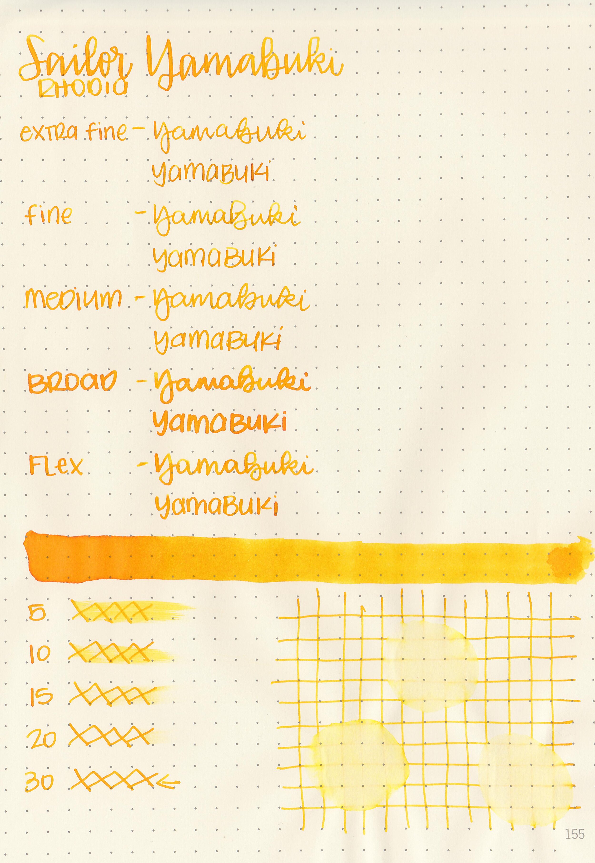
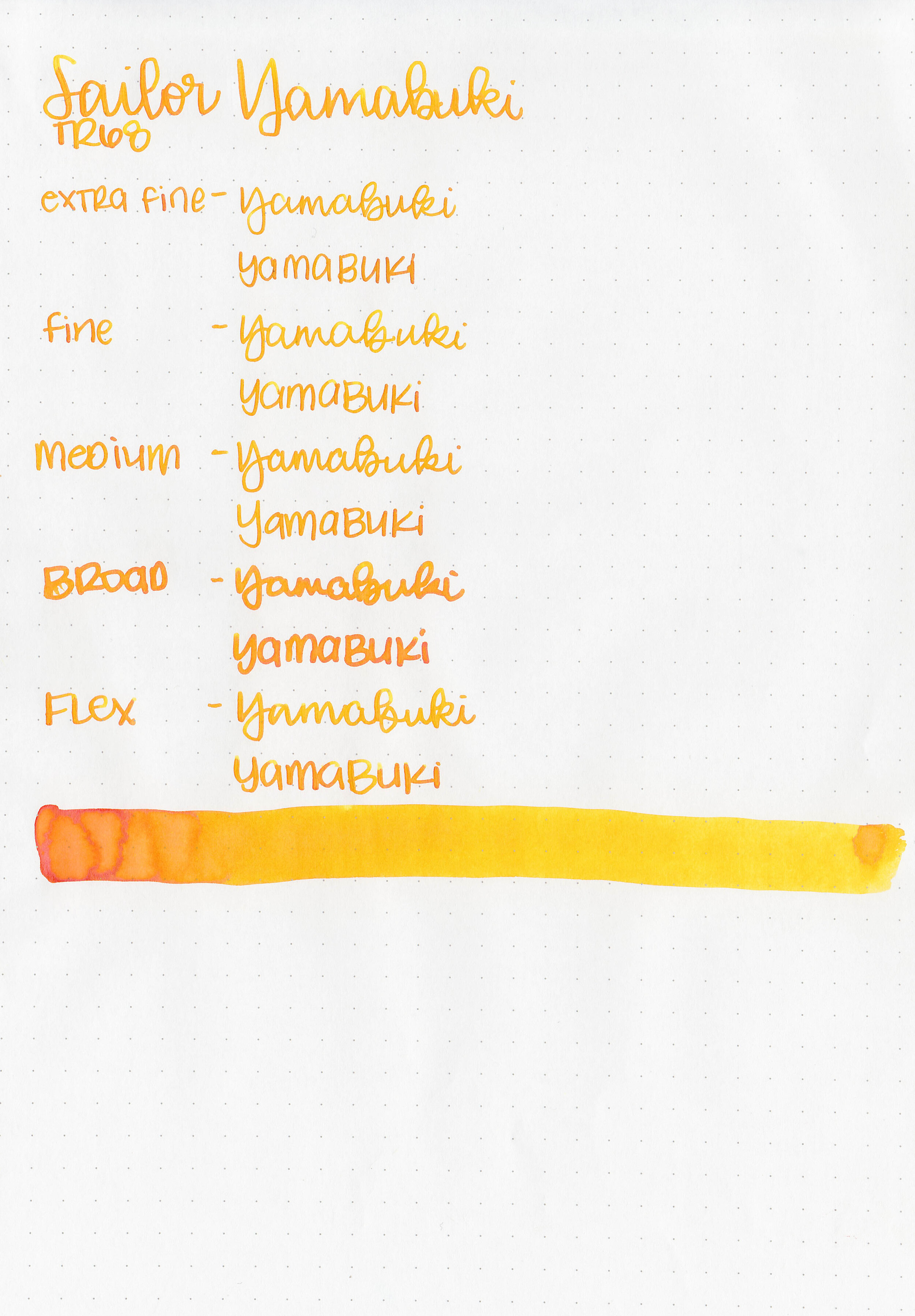
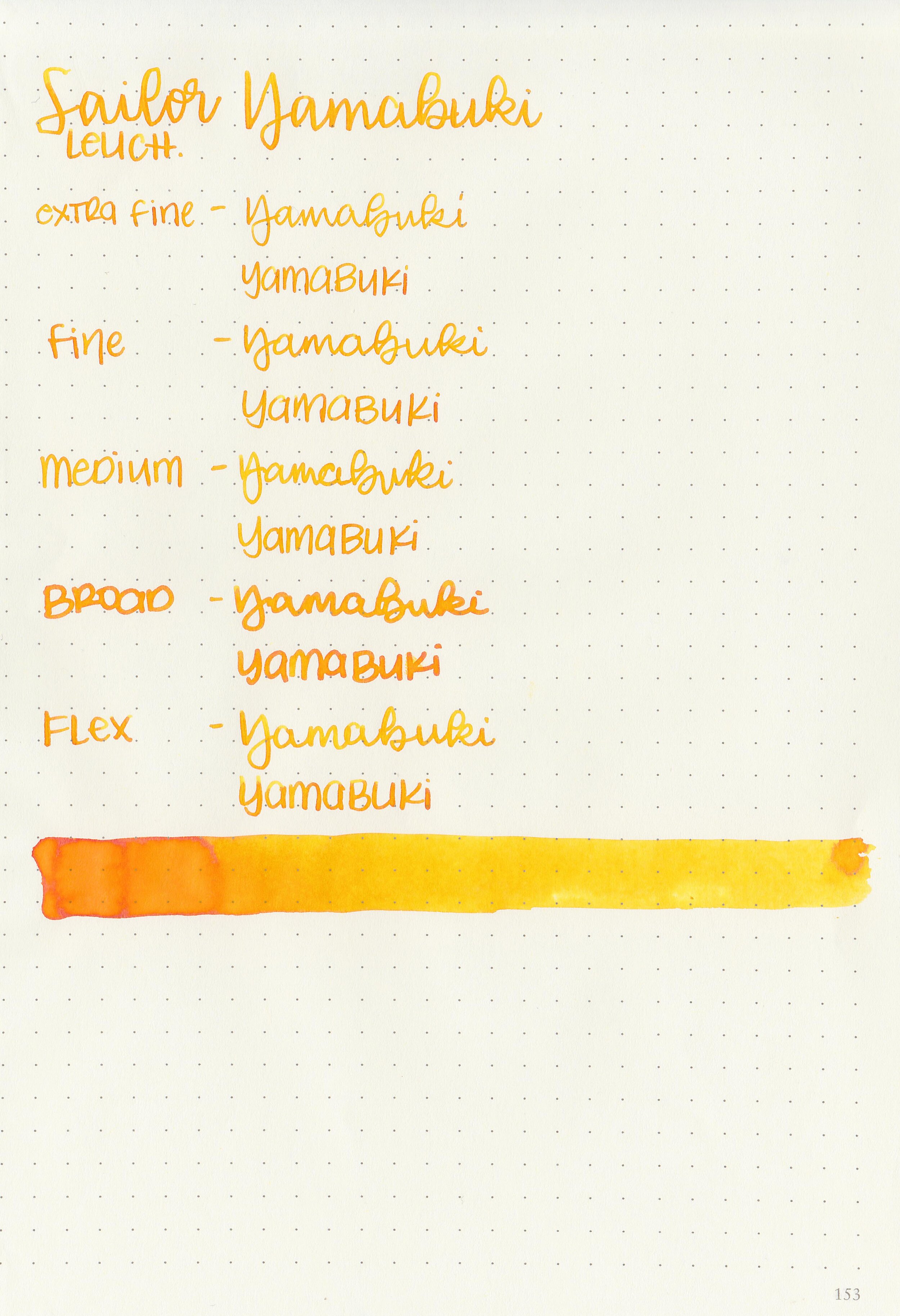
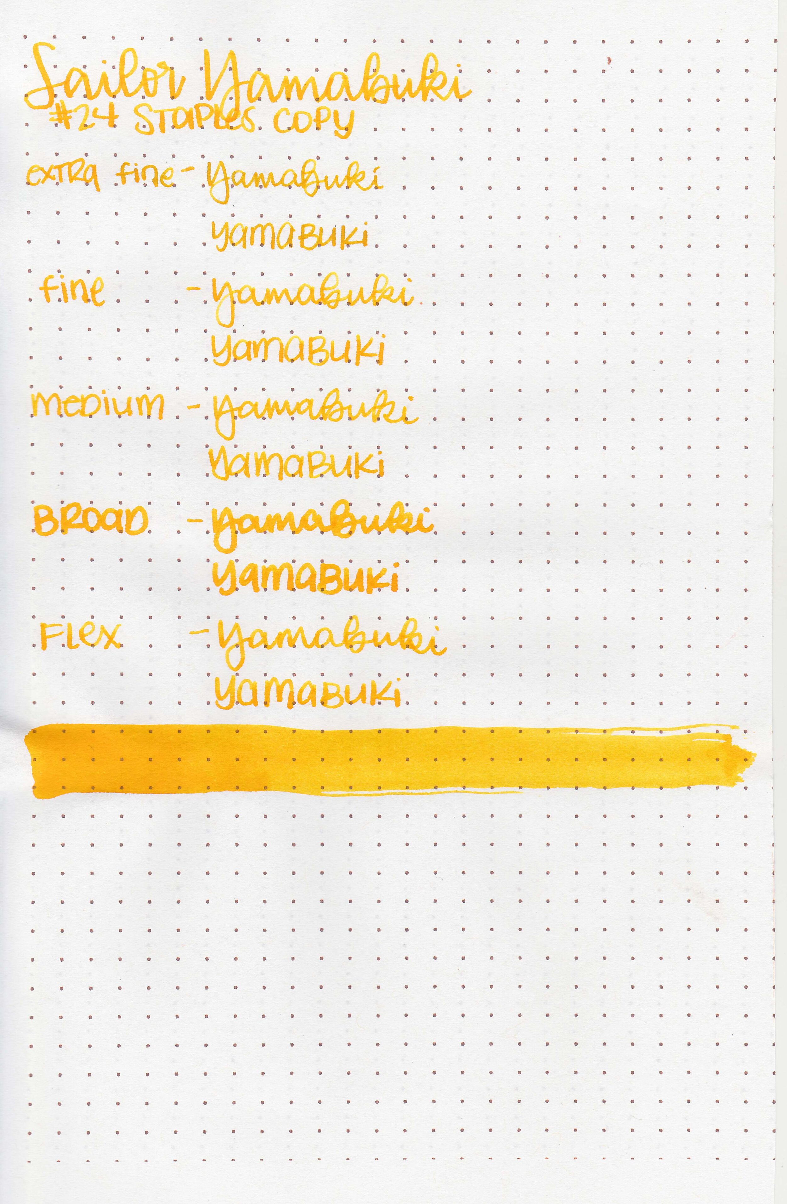
I’m slowly working my way through the new Sailor Manyo inks, so today’s ink is Sailor Manyo Yamabuki. I purchased my bottle of ink from Pen Chalet.

The color:
Yamabuki is a bright yellow-orange.

In large swabs on Tomoe River paper the ink looks more orange, and even shades to red.

Let's take a look at how the ink behaves on fountain pen friendly papers: Rhodia, Tomoe River, and Leuchtturm.
Dry time: 30 seconds
Water resistance: Low
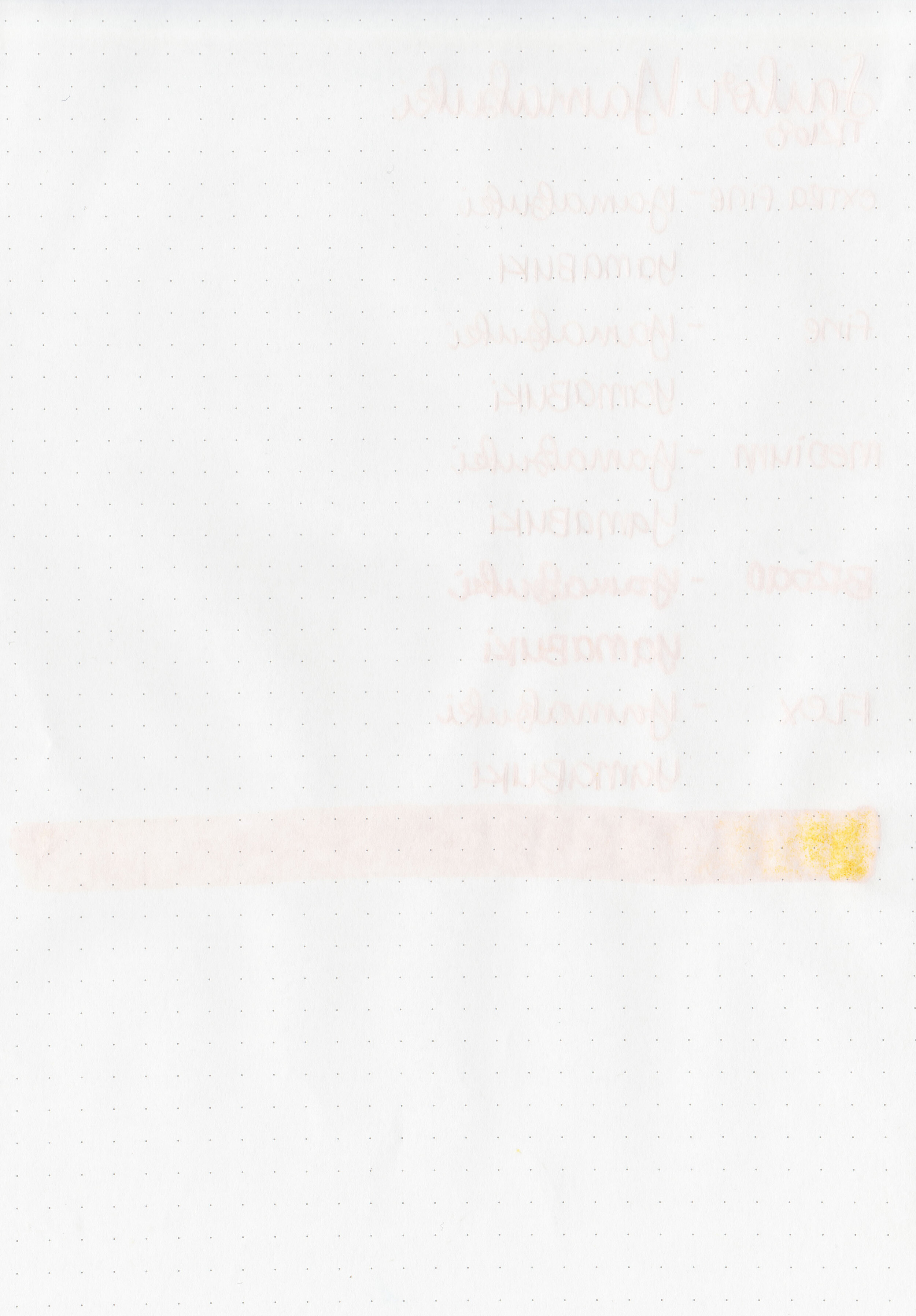
Feathering: None
Show through: Medium
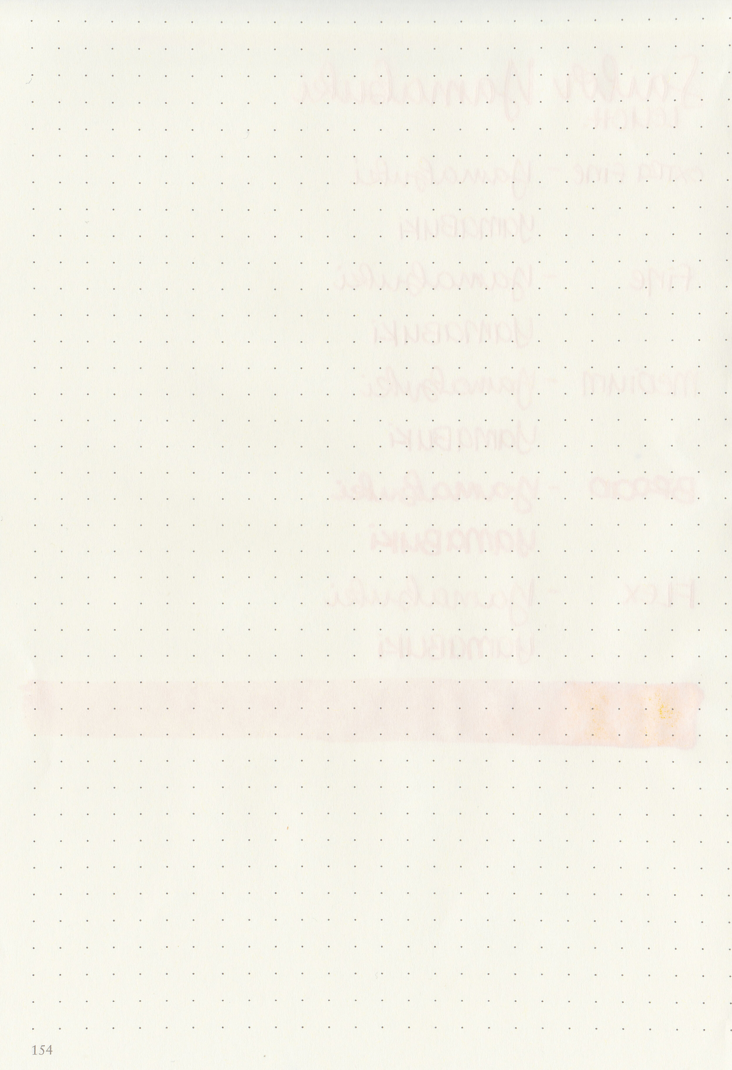
Bleeding: None
Other properties: medium shading, no sheen, and no shimmer.
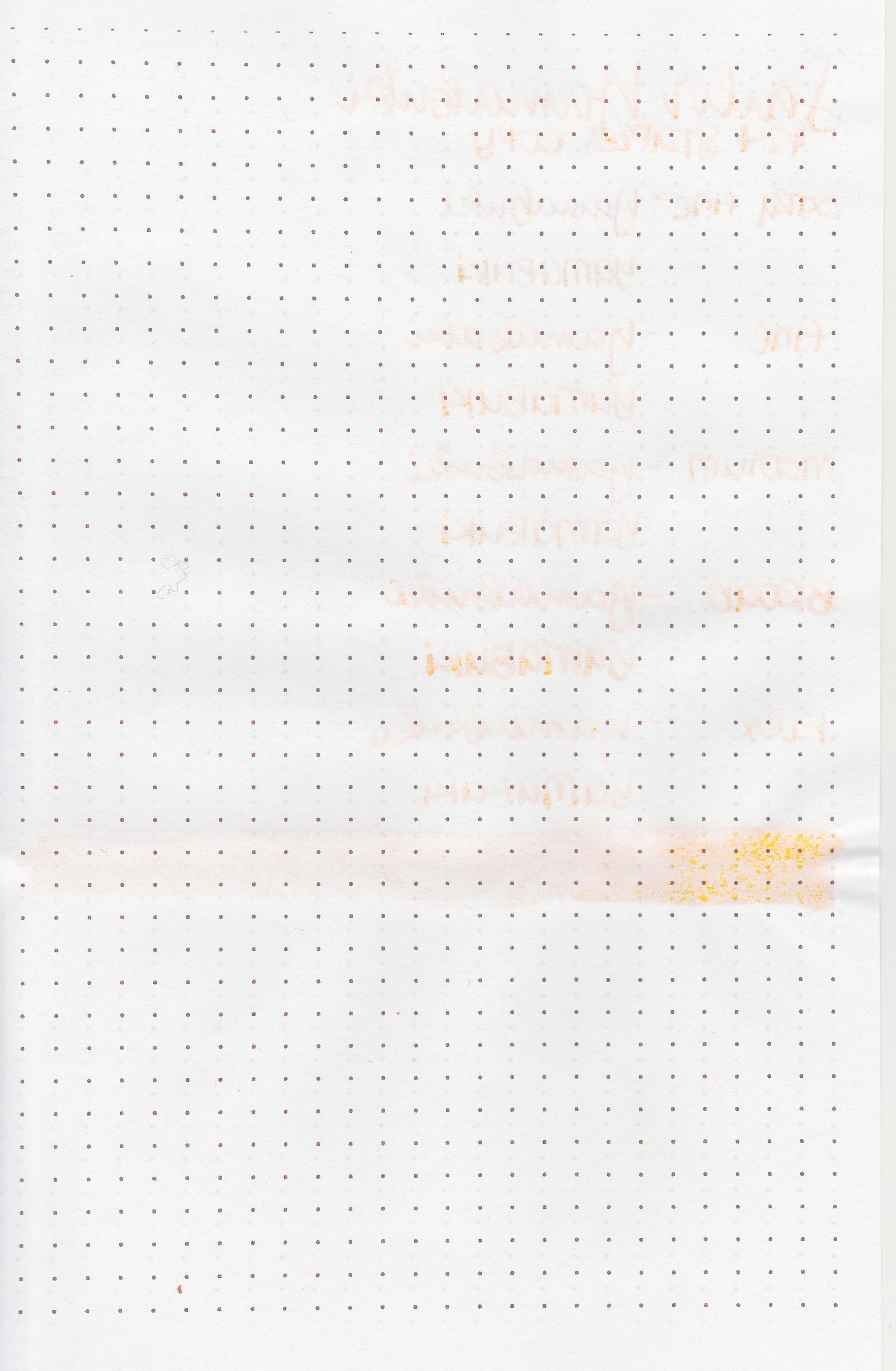
On Staples 24 lb copy paper there was some feathering in most nib sizes and a few dots of bleeding.

Yamabuki is similar to Akkerman Gele Oker van Frans in swabs but closer to Pilot Iroshizuku Daikokuten in writing. Click here to see the Sailor inks together, and click here to see the yellow inks together.

I used a TWSBI Eco-T Yellow with a broad nib on a Taroko Enigma notebook. The ink had an average flow.
Overall, I found this ink to be dark enough on most papers to be easily read. In the future I would stick to broad nibs and white paper to make for the most comfortable read-back. It’s well-behaved and a cheery color.
Disclaimer: I purchased this ink myself, and all photos and opinions are my own. This page does contain affiliate links but this post is not sponsored in any way.

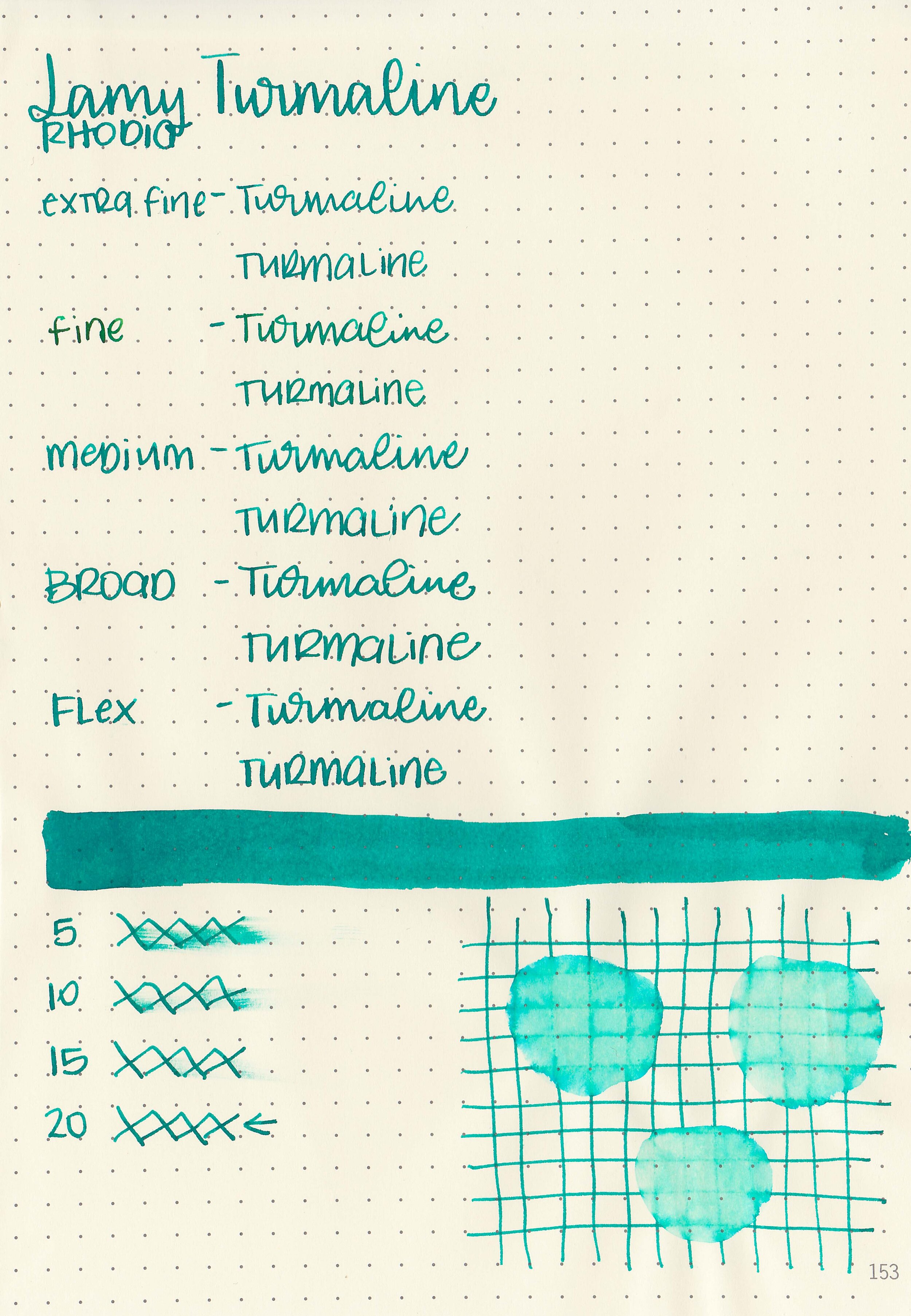
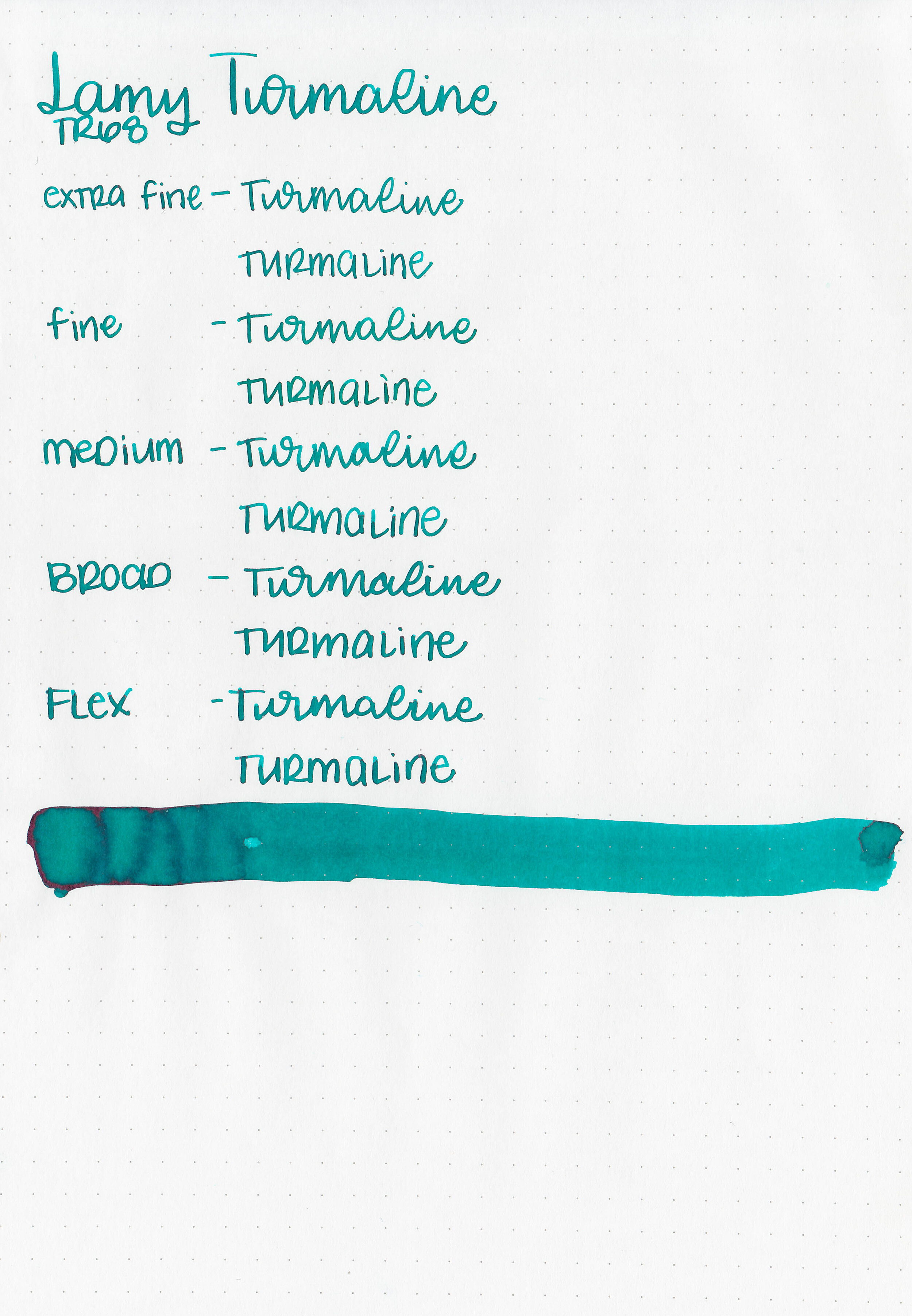
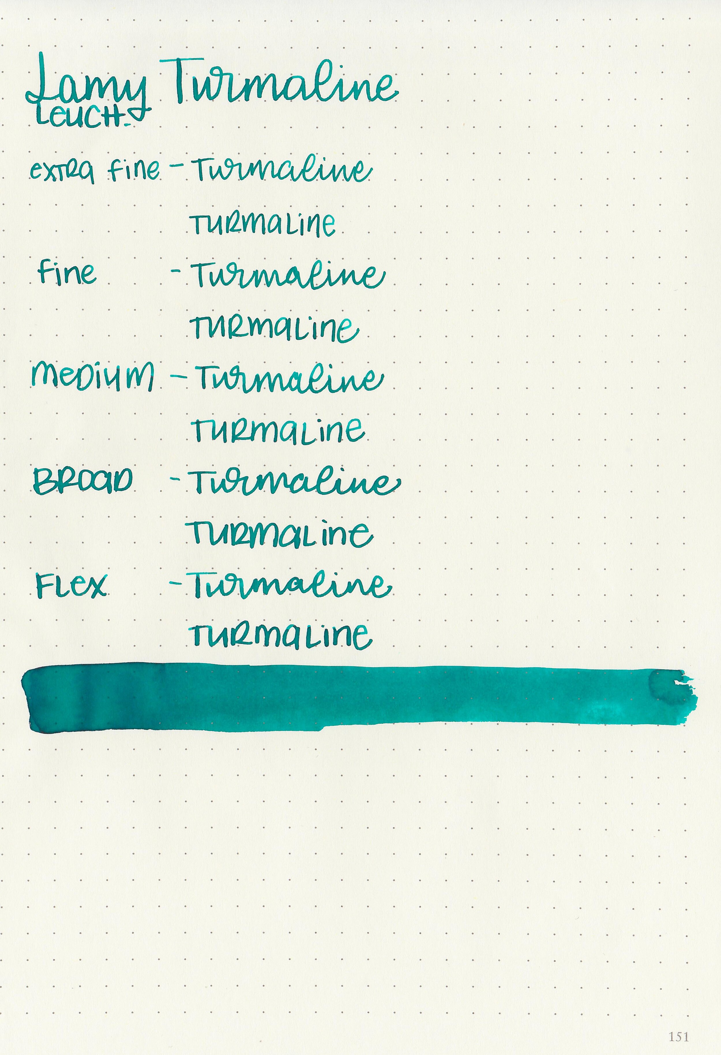
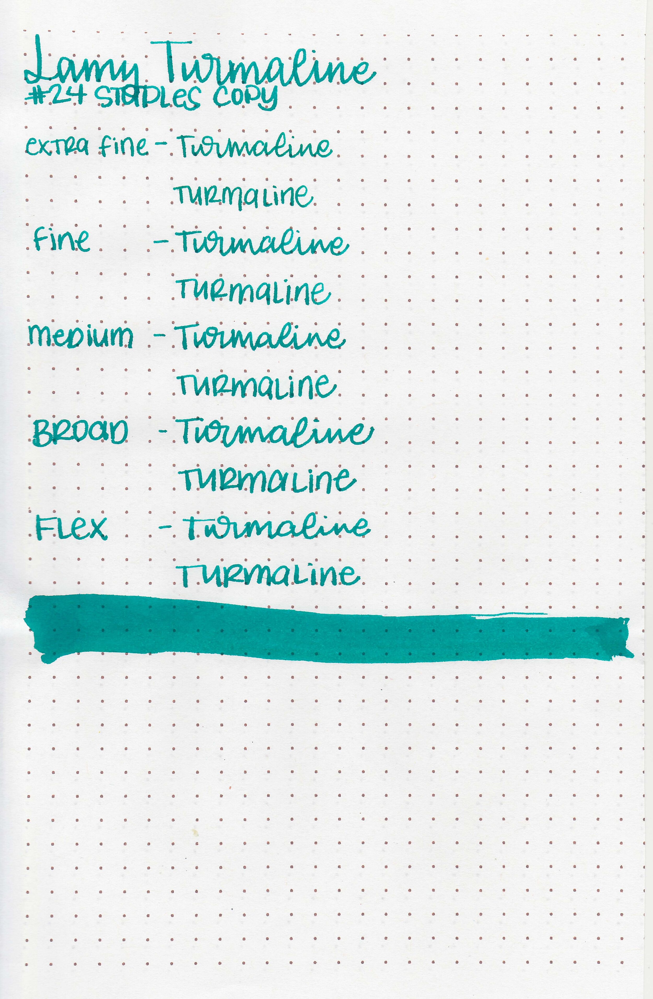
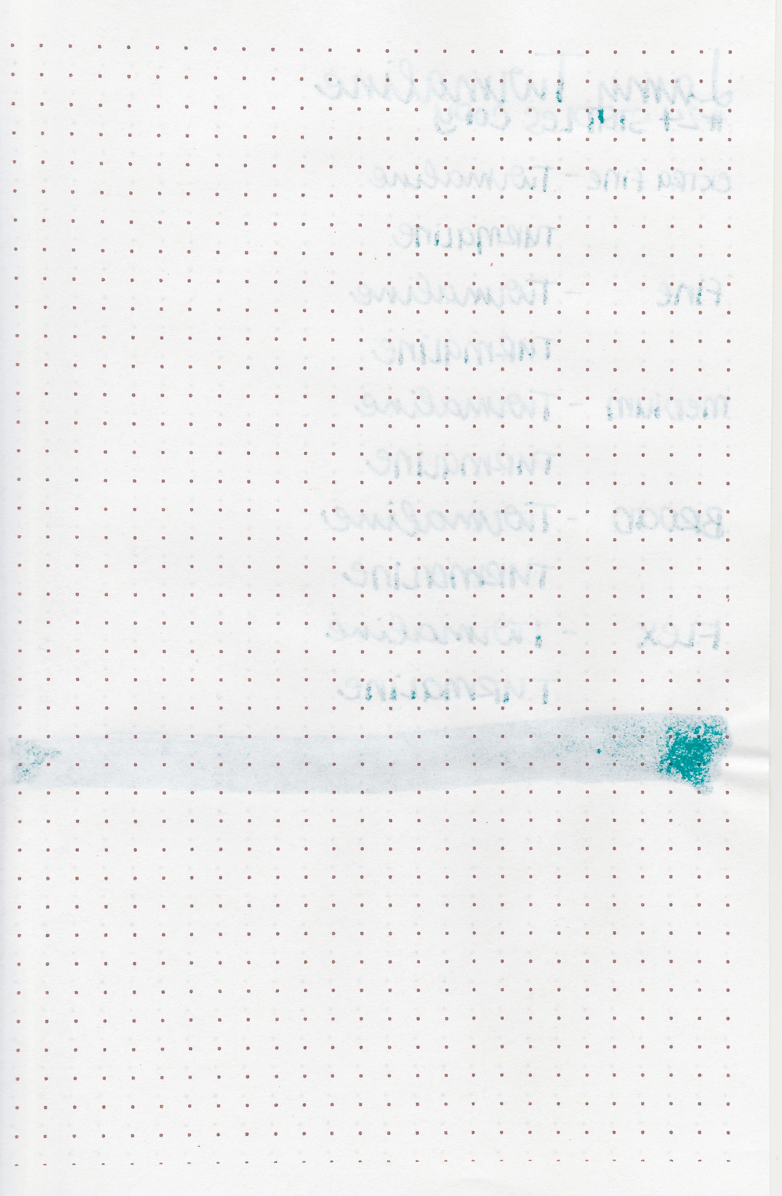
I’ve gotten a lot of requests for a review of Lamy Turmaline, so today’s the day. I purchased my bottle of ink from Pen Chalet.

The color:
Turmaline is a saturated medium teal.

In large swabs on Tomoe River paper the ink has some pretty dark pink sheen.

Let's take a look at how the ink behaves on fountain pen friendly papers: Rhodia, Tomoe River, and Leuchtturm.
Dry time: 20 seconds
Water resistance: Low

Feathering: None
Show through: Medium
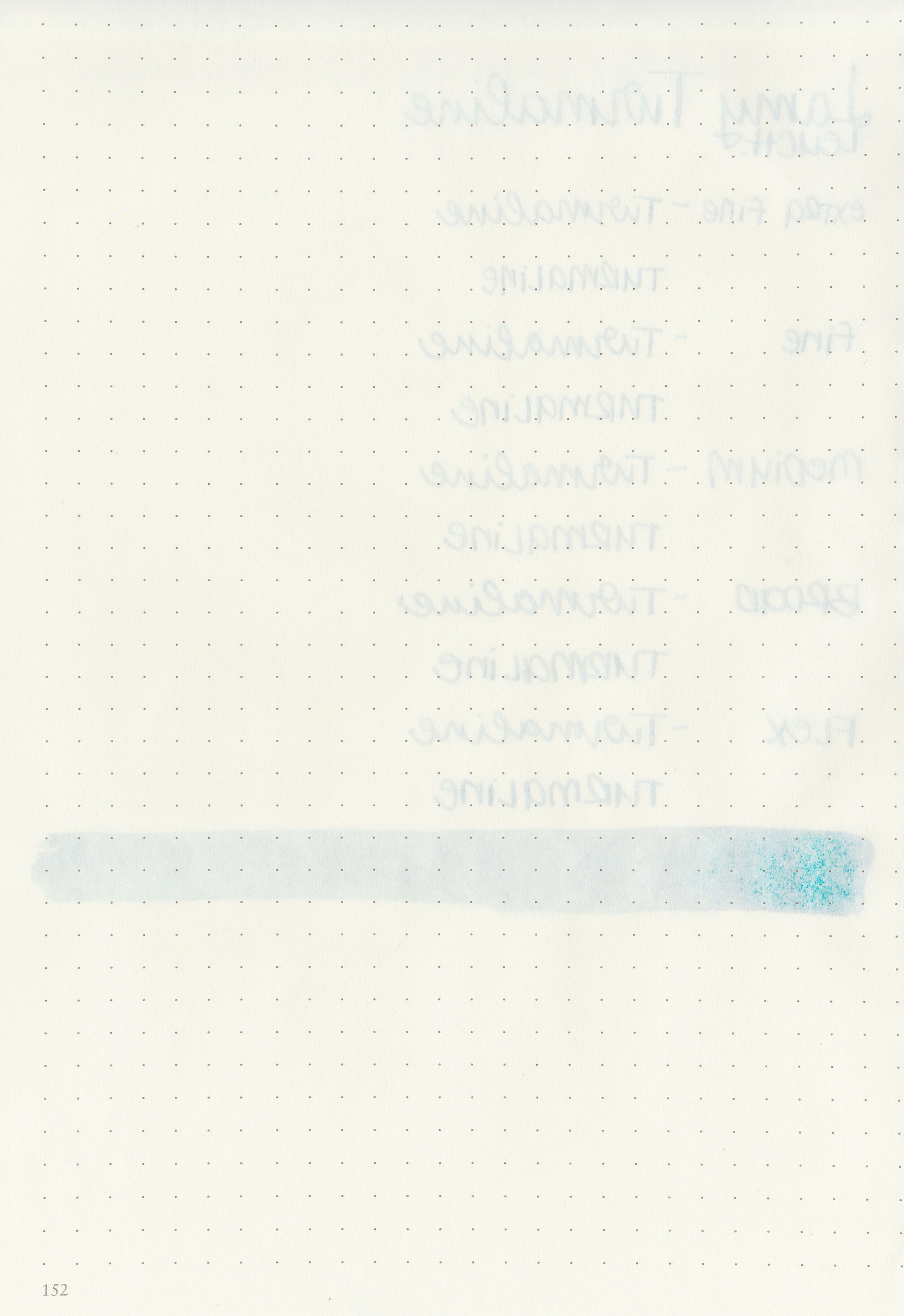
Bleeding: None
Other properties: medium shading, low pink sheen, and no shimmer.
On Staples 24 lb copy paper there was some feathering in most nib sizes and a few dots of bleeding.

Turmaline is a bit darker than Colorverse Morning Star, but not as dark as Troublemaker Bantayan Turquoise. Click here to see the Lamy inks together, and click here to see the teal inks together.

I used a Lamy Al-star Turmaline with a medium nib on a Taroko Enigma notebook. The ink had an average flow.
Overall, I like this ink. It’s a gorgeous color and performs well. I was worried it might be too close to Lamy Pacific Blue, but after trying them both I think there’s a big enough difference that I need both.
Disclaimer: I purchased this ink myself, and all photos and opinions are my own. This page does contain affiliate links but this post is not sponsored in any way.

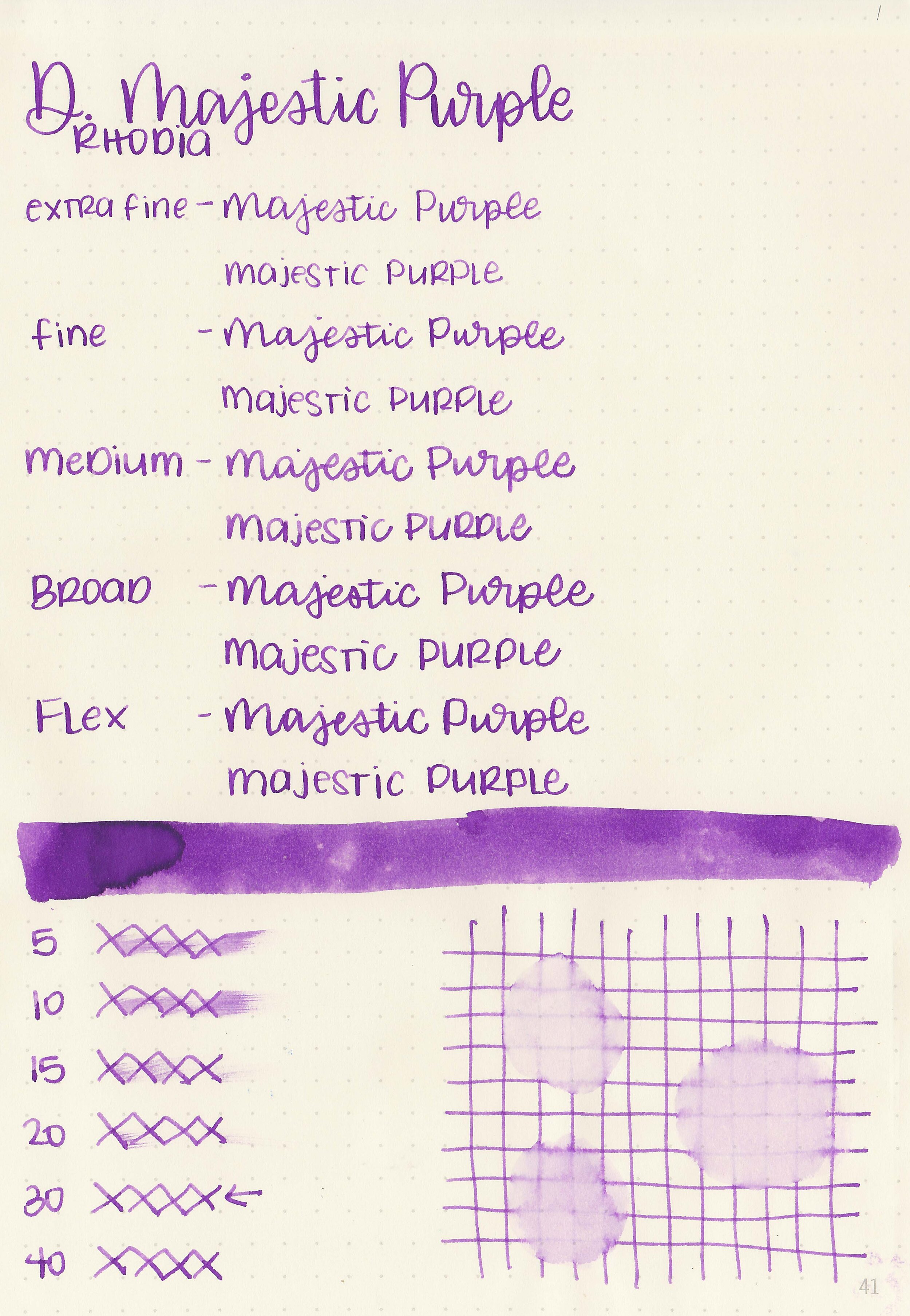
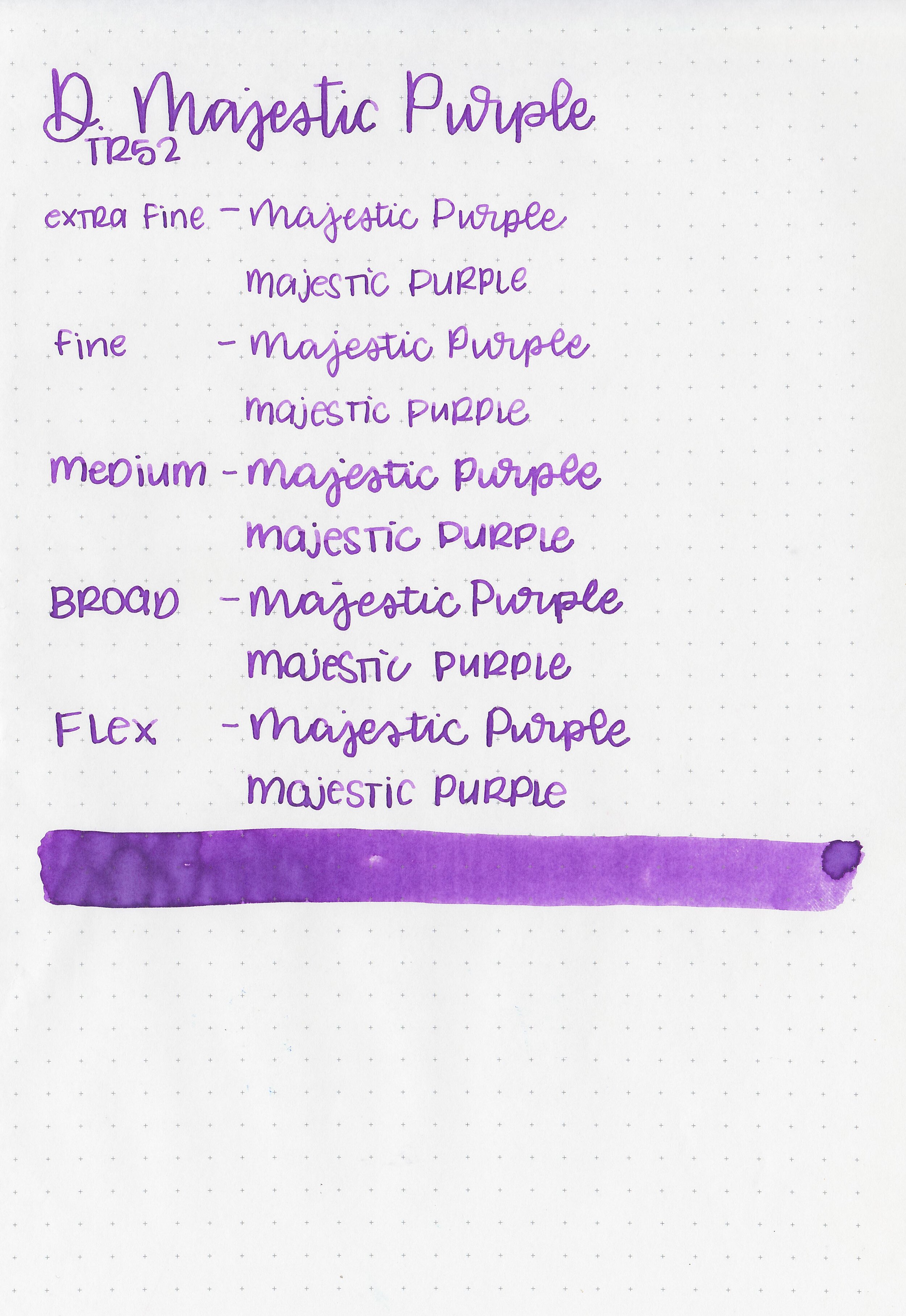
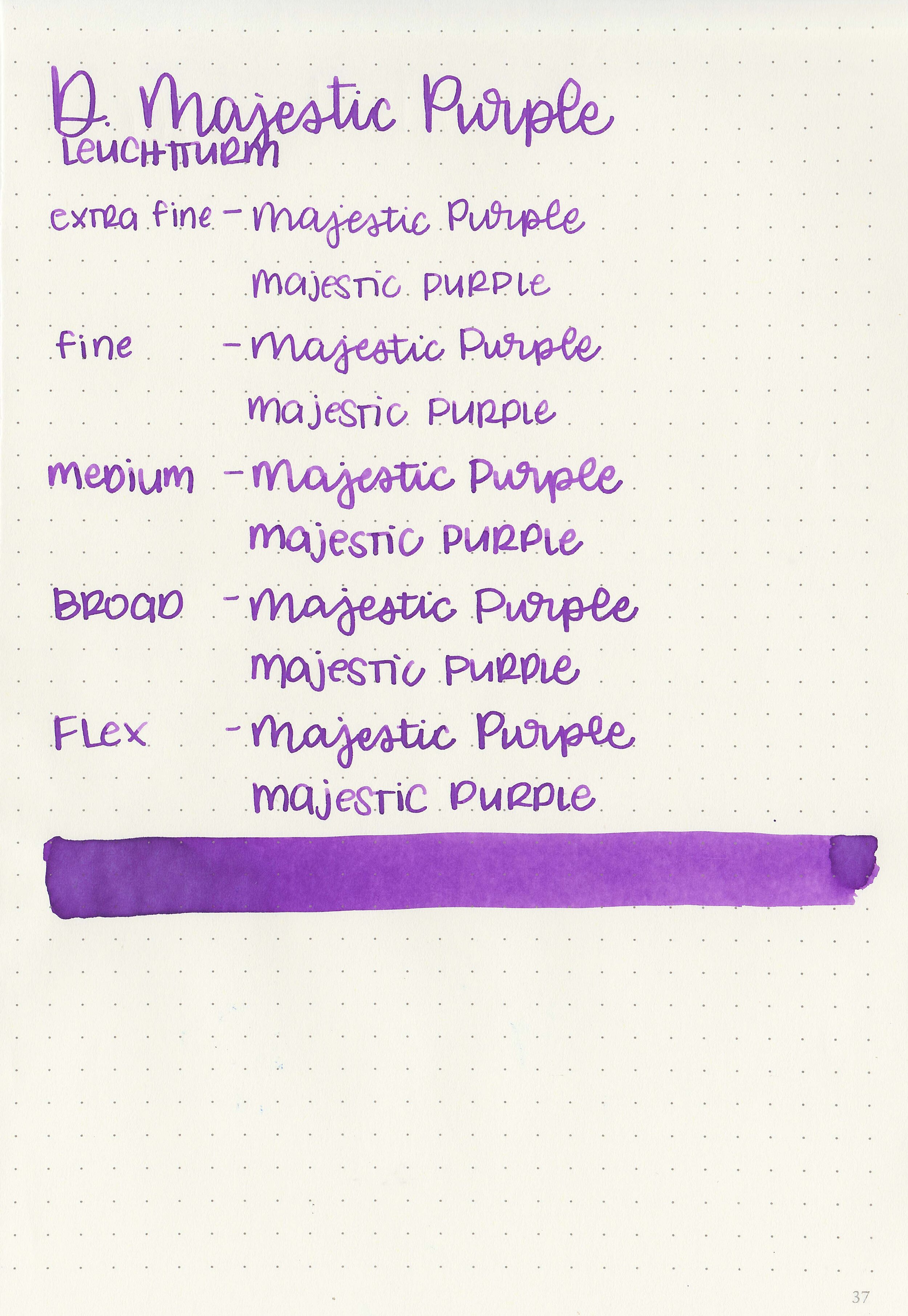
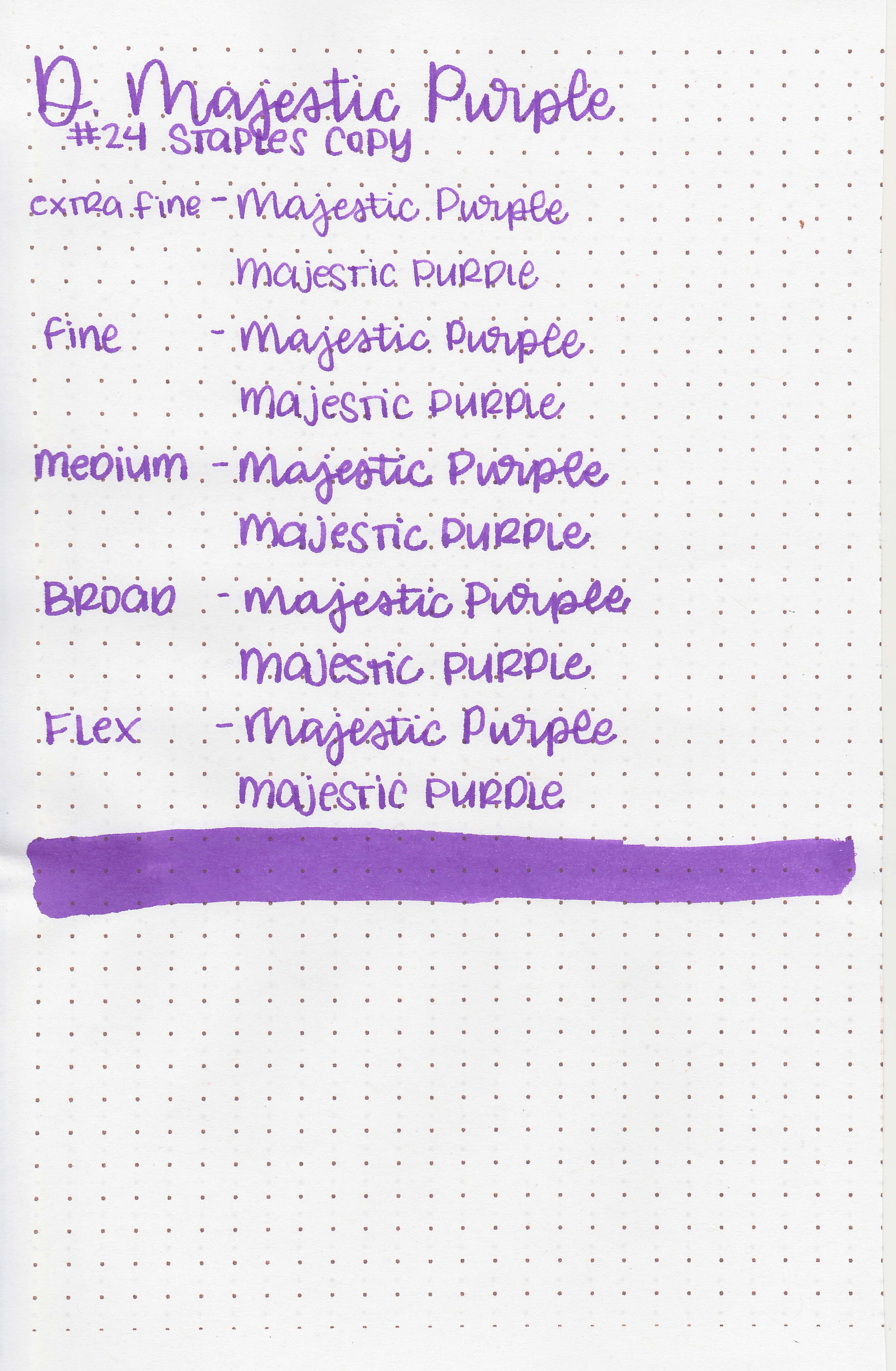
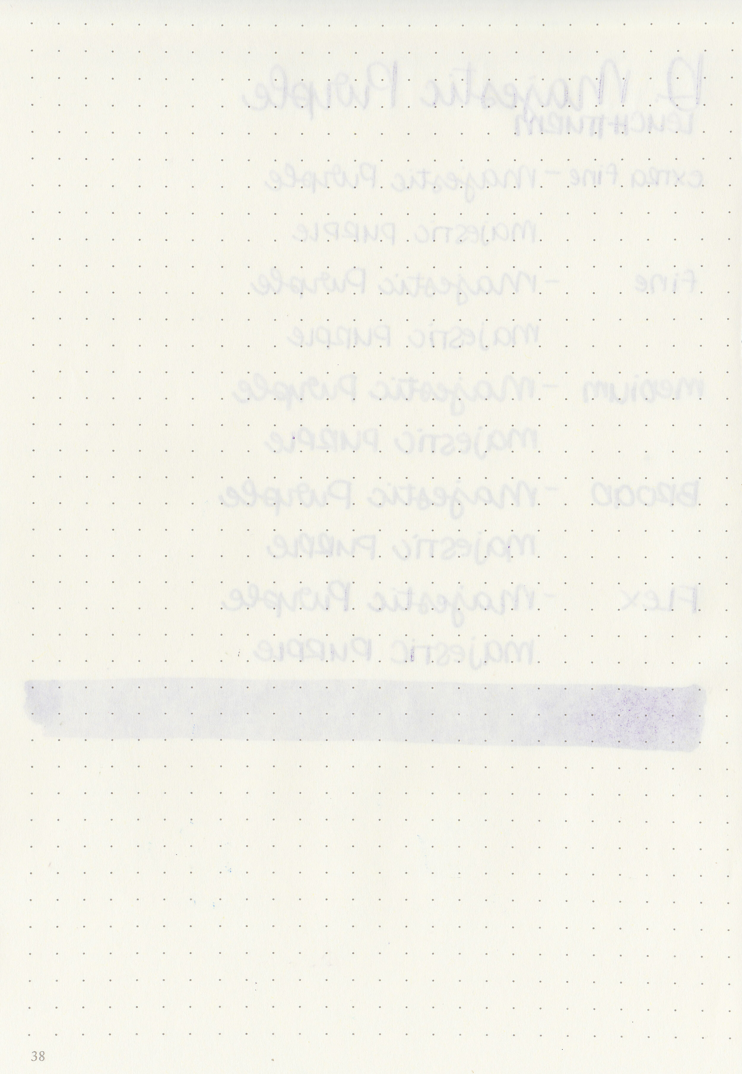
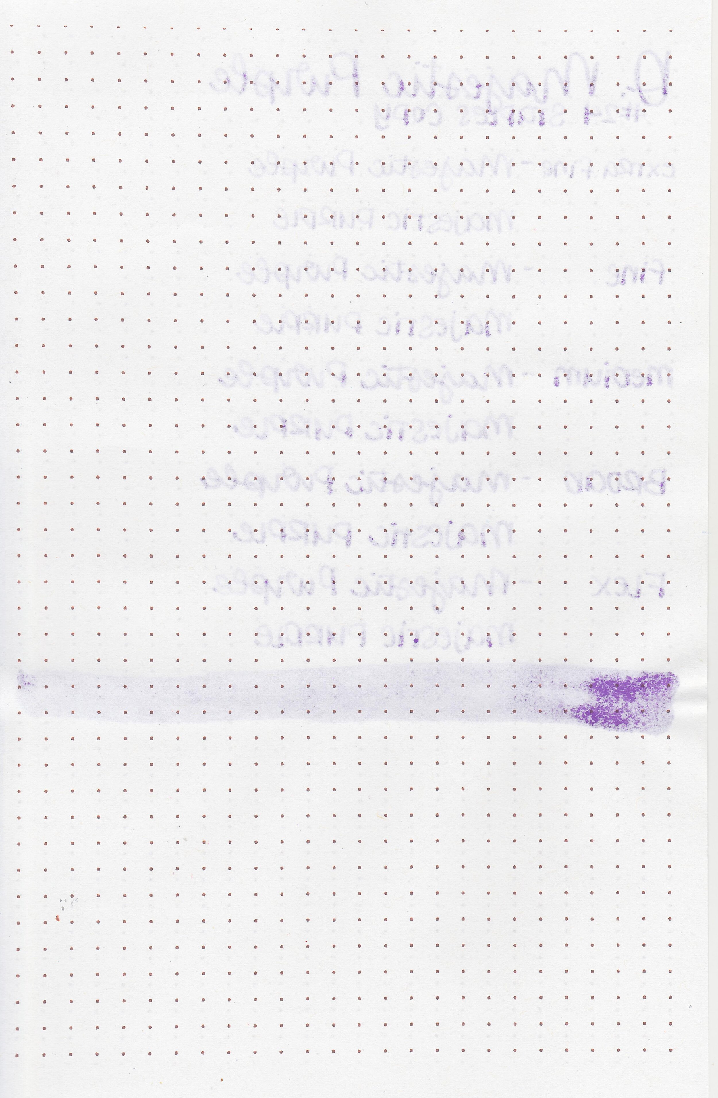
Today’s ink is Diamine Majestic Purple. I purchased my bottle of ink from Cult Pens.

The color:
Majestic Purple is a medium violet purple.

In large swabs on Tomoe River paper the ink has a bit of shading but no sheen.

Let's take a look at how the ink behaves on fountain pen friendly papers: Rhodia, Tomoe River, and Leuchtturm.
Dry time: 30 seconds
Water resistance: Low
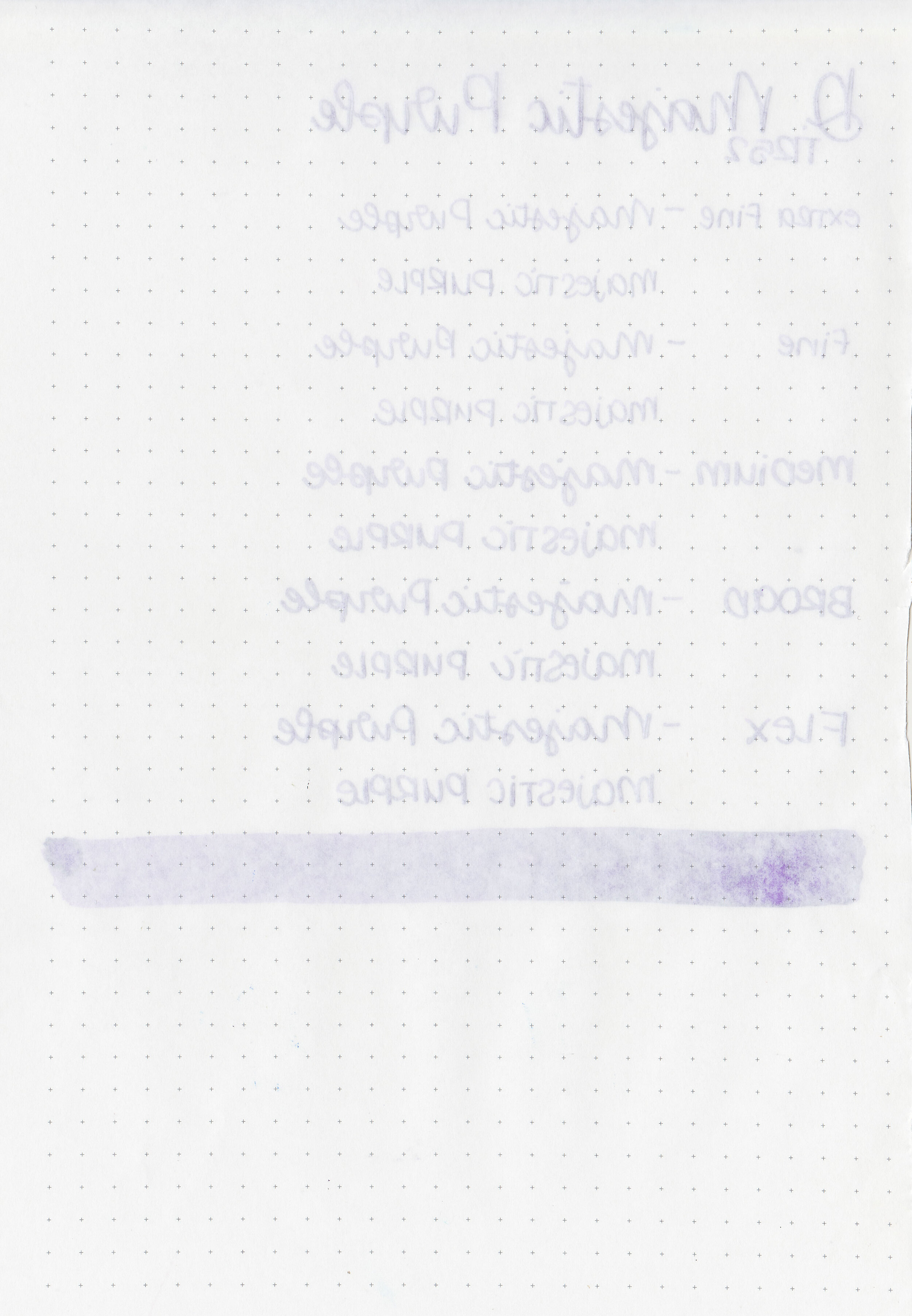
Feathering: None
Show through: Medium
Bleeding: None
Other properties: low shading, no sheen, and no shimmer.
On Staples 24 lb copy paper there was some feathering in most nib sizes and just a few dots of bleeding in the larger nib sizes.

Majestic Purple is more red than Diamine Lavender, but less red than Diamine Imperial Purple. Click here to see the Diamine inks together, and click here to see the purple inks together.

I used a Pilot VP Tropical Turquoise with a medium nib on a Taroko Enigma notebook. The ink had an average flow.
Overall, it’s a lovely ink. It has a nice color and well behaved.
Disclaimer: I purchased this ink myself, and all photos and opinions are my own. This page does not contain affiliate links and this post is not sponsored in any way.

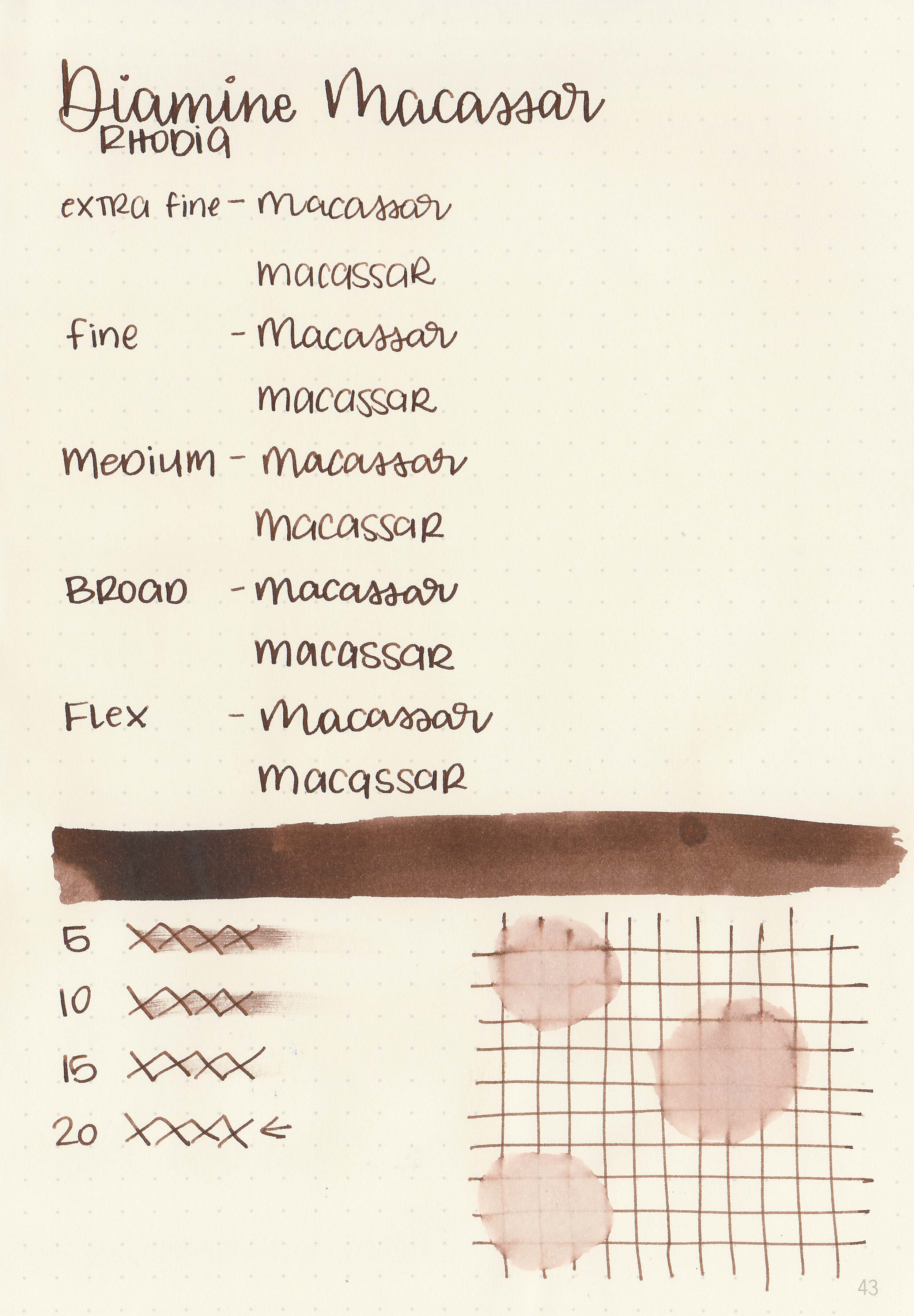
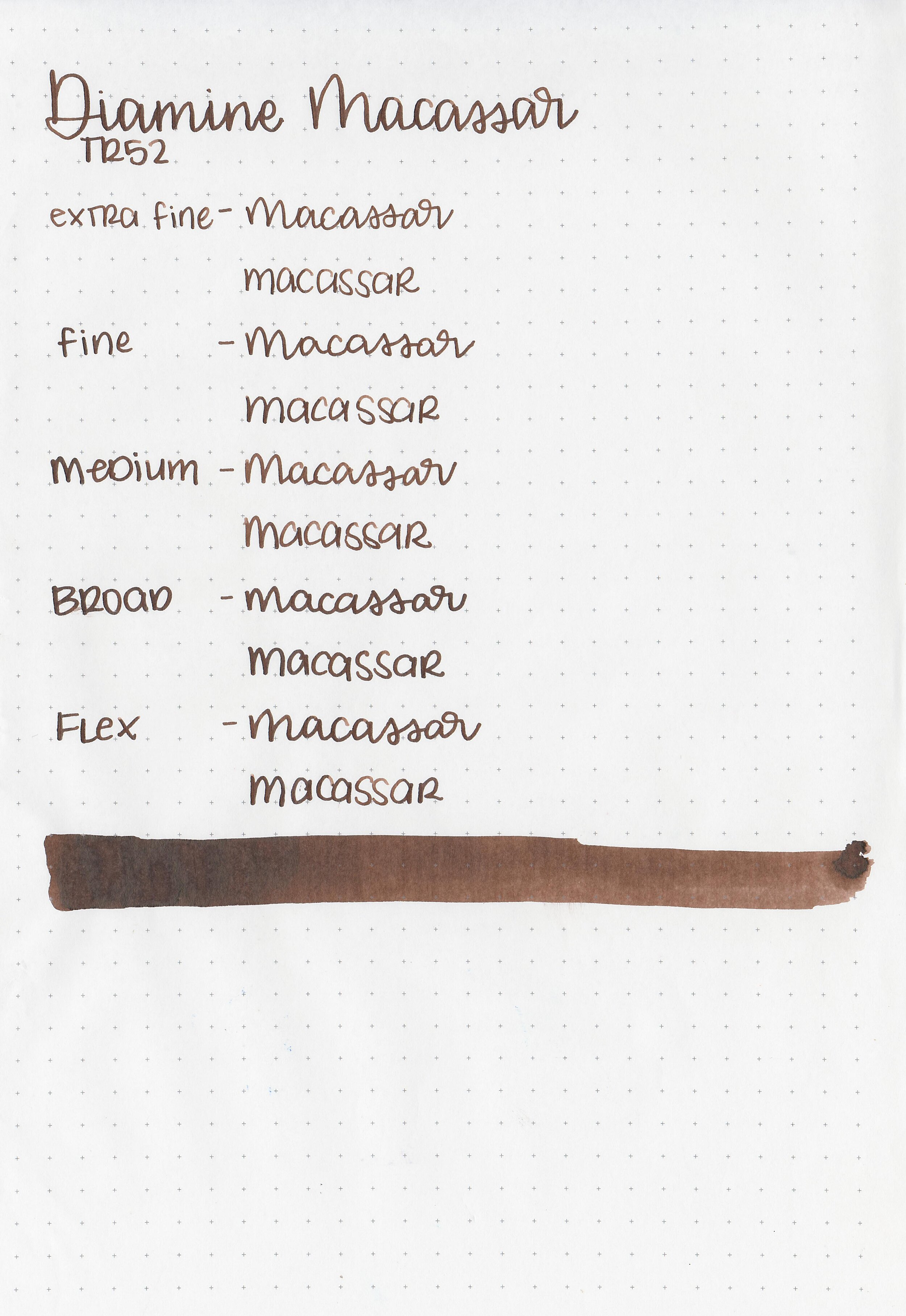
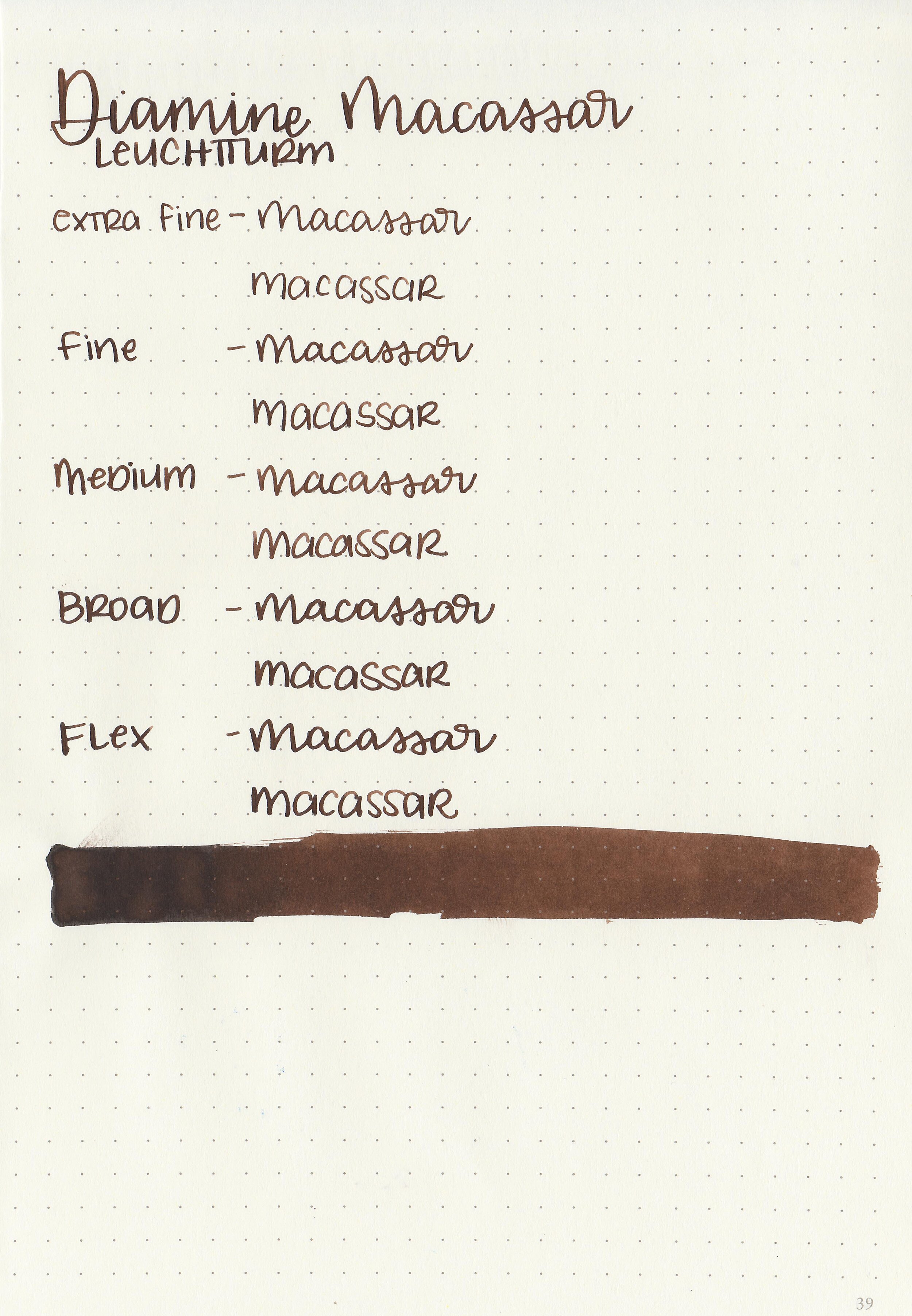
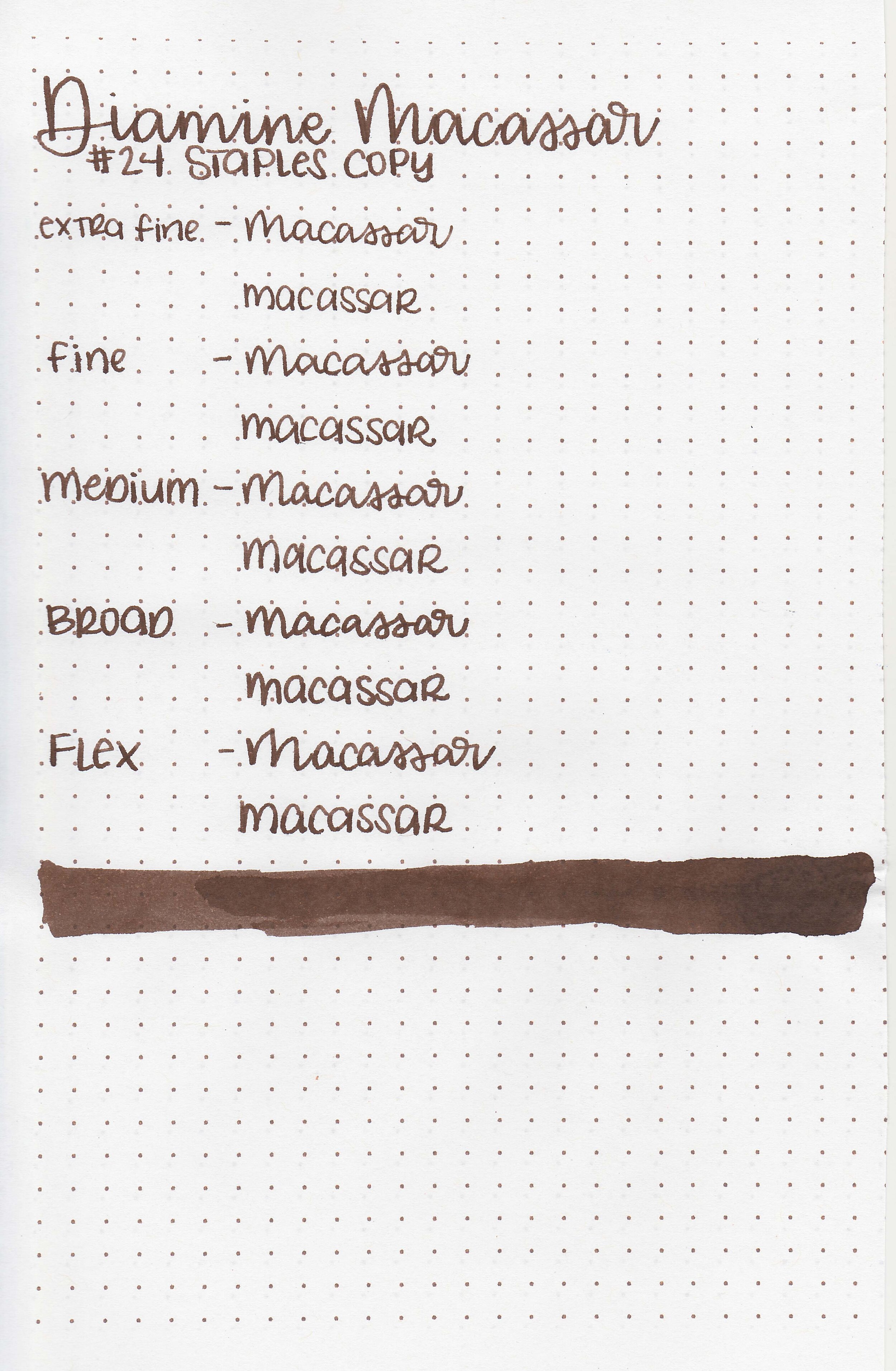
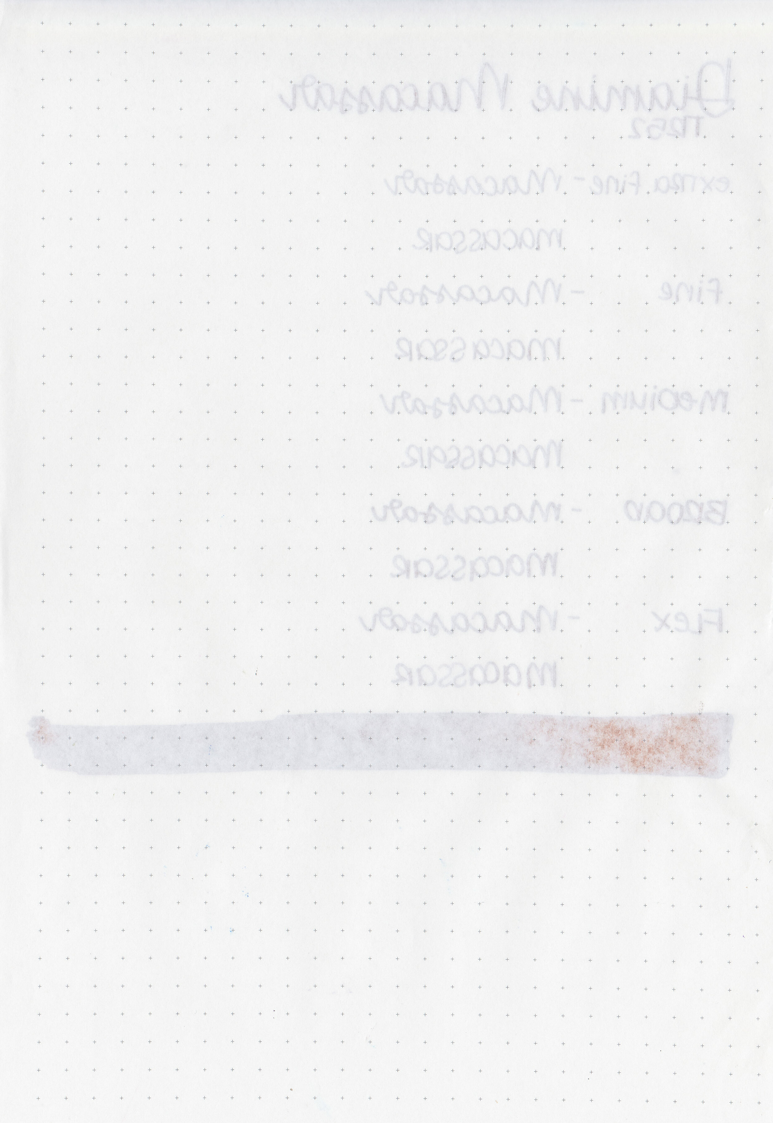
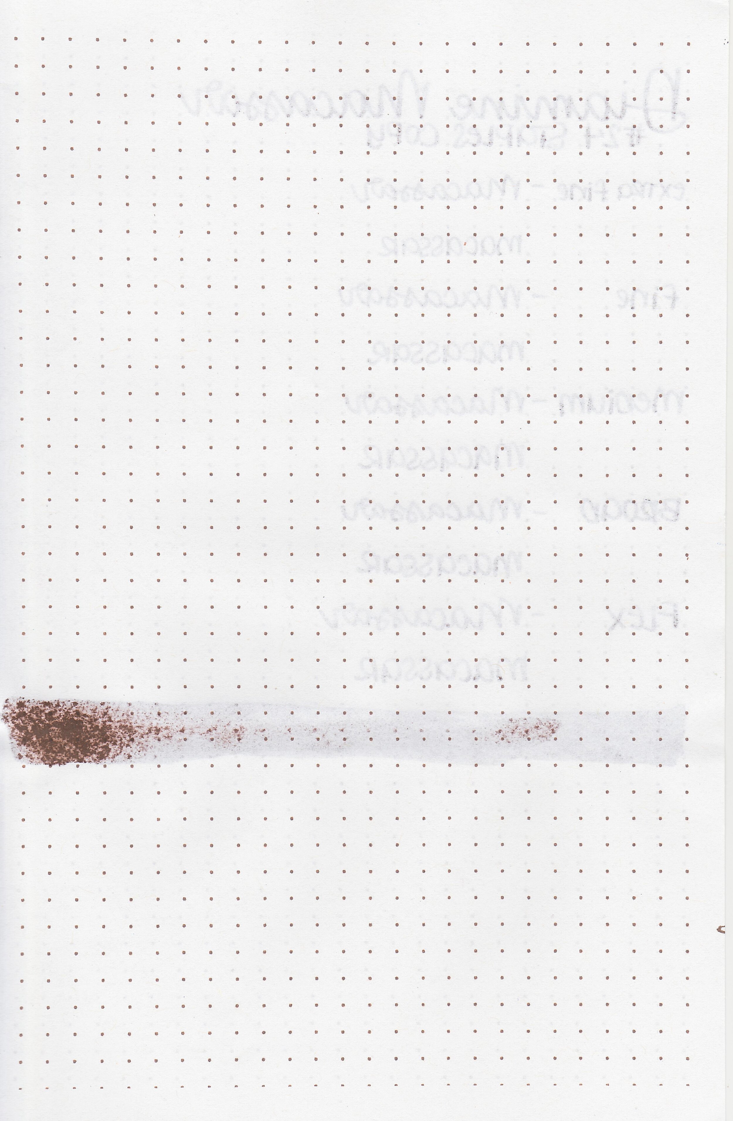
Let’s take a look at Diamine Macassar today. I purchased my bottle of ink from Cult Pens.

The color:
Macassar is a standard dark brown.

In large swabs on Tomoe River paper the ink looks much darker and has a little bit of black sheen.

Let's take a look at how the ink behaves on fountain pen friendly papers: Rhodia, Tomoe River, and Leuchtturm.

Dry time: 20 seconds
Water resistance: Low
Feathering: None
Show through: Medium

Bleeding: None
Other properties: low shading, low black sheen, and no shimmer.
On Staples 24 lb copy paper there was some feathering in most nib sizes and just a few dots of bleeding in the swab.

Macassar is a little less saturated than Diamine Chocolate Brown, and a little bit more red than Diamine Cult Pens Deep Dark Brown. Click here to see the Diamine inks together, and click here to see the brown inks together.

I used a Pelikan M800 Renaissance Brown with a medium nib on a Taroko Enigma notebook. The ink had an average flow.
Overall, it’s a good basic dark brown ink-well behaved and affordable.
Disclaimer: I purchased this ink myself, and all photos and opinions are my own. This page does not contain affiliate links and this post is not sponsored in any way.

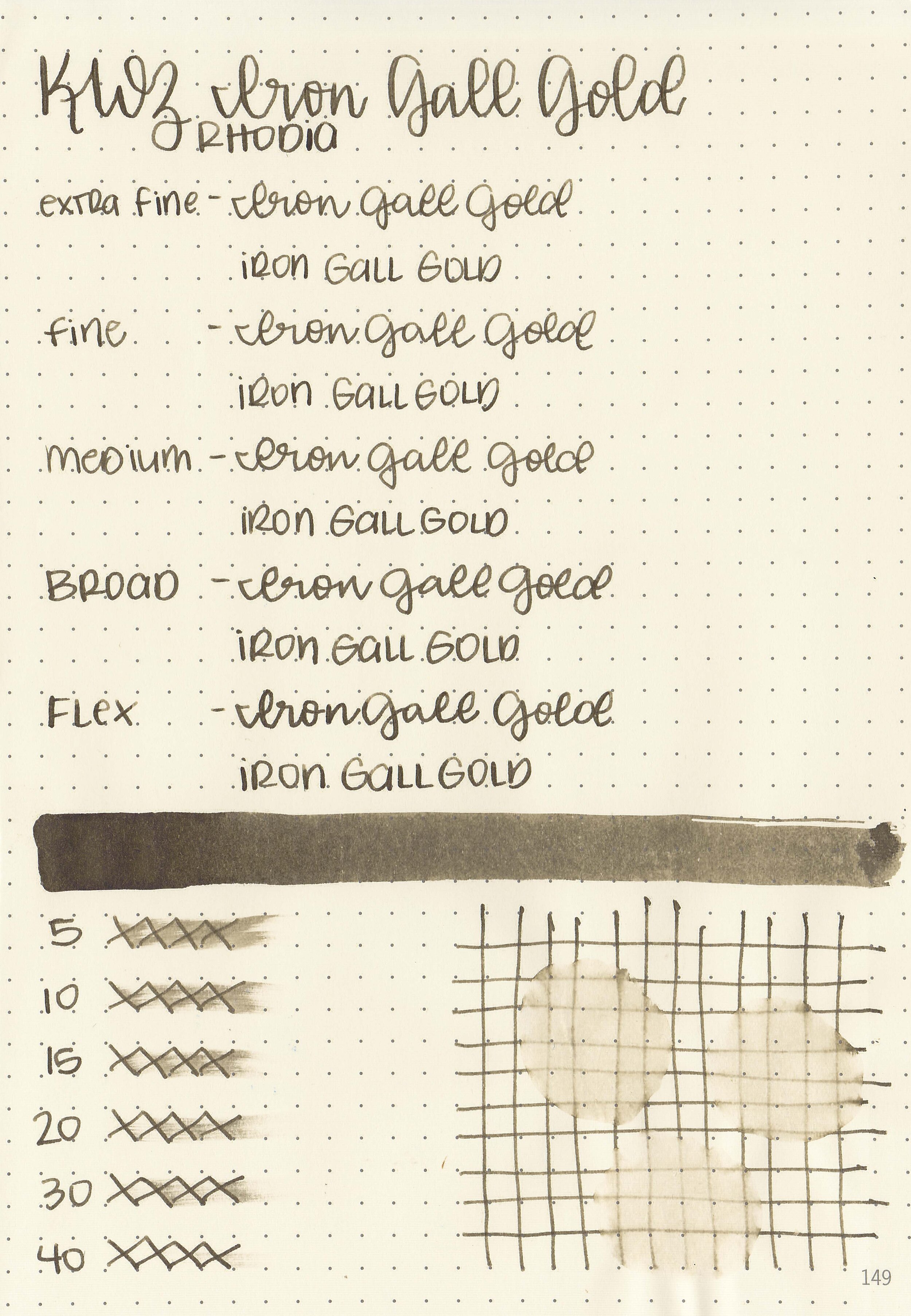
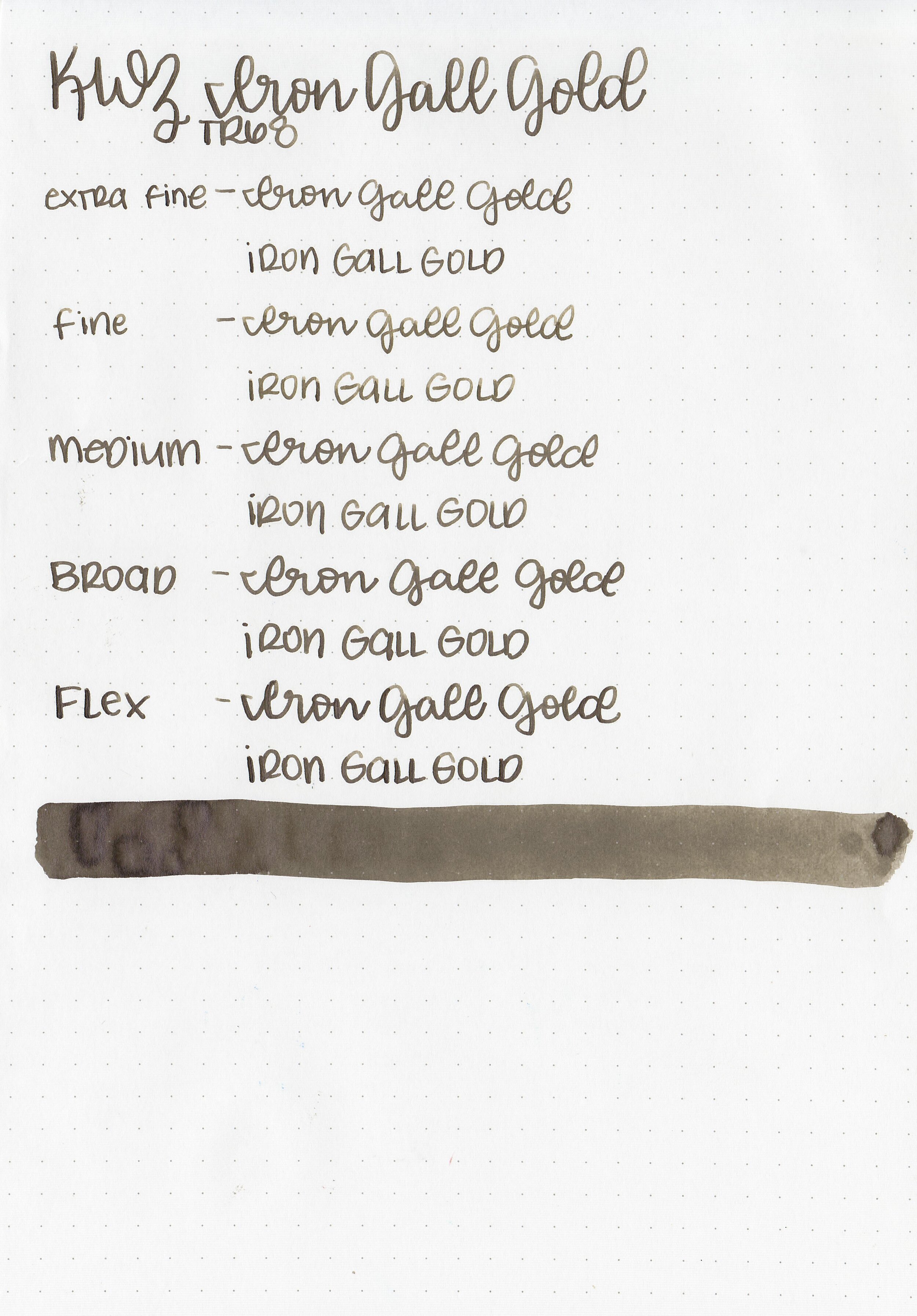
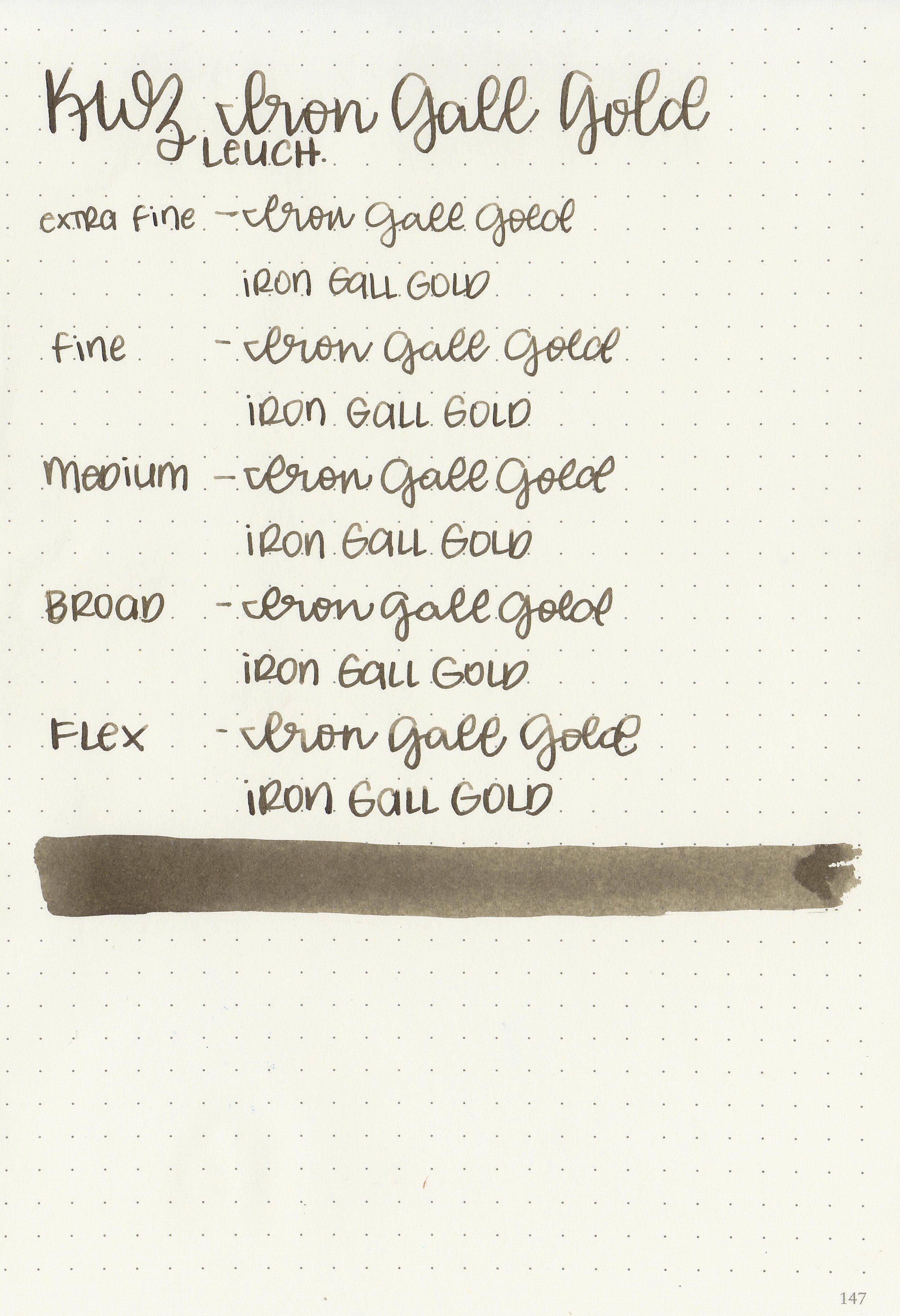
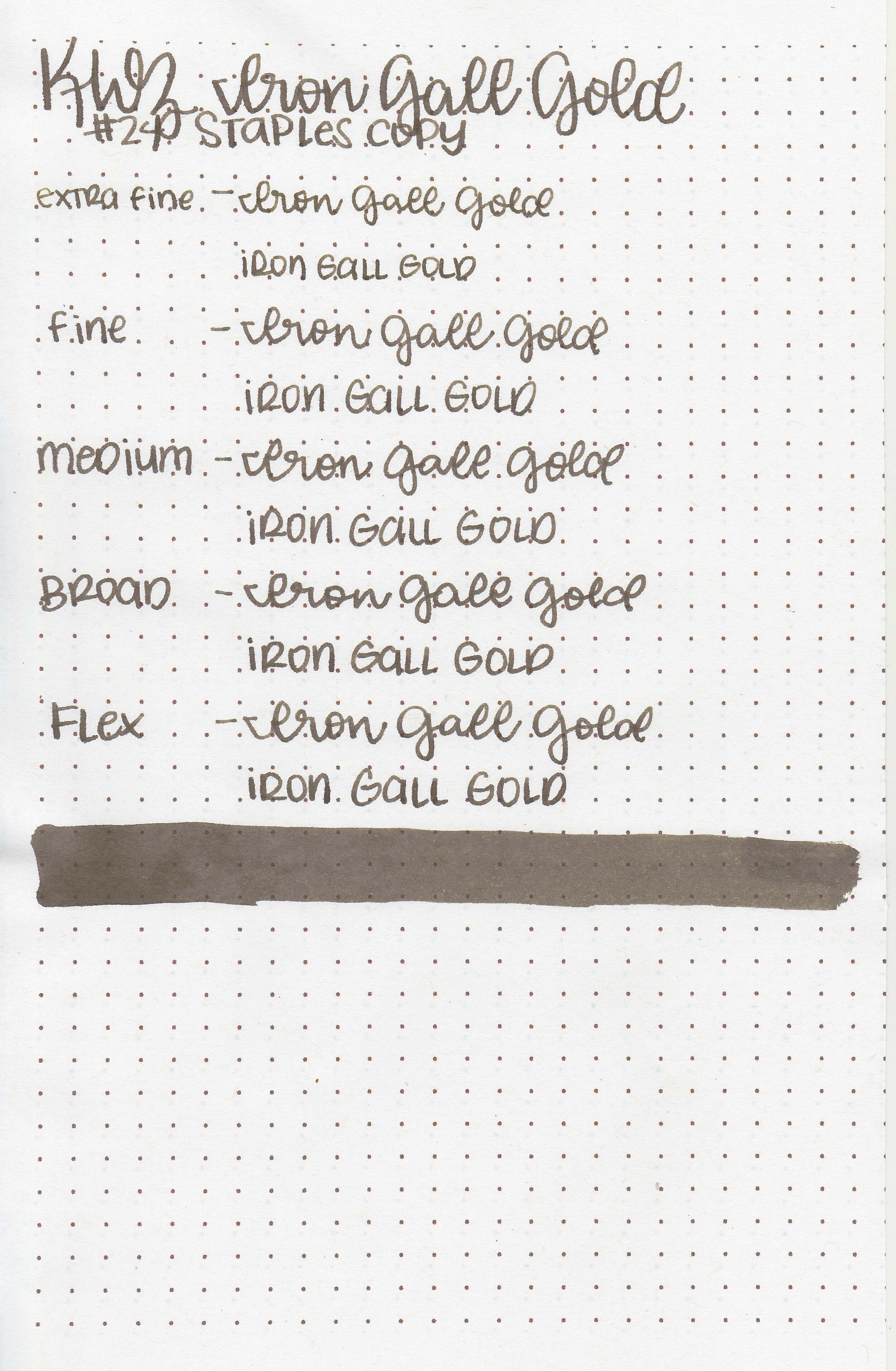
KWZ Iron Gall Gold isn’t really gold to me, it’s more of a very unsaturated brown. This is an iron gall ink so it gets a bit darker as it dries, but be careful how long you leave it in steel nib pens-it can degrade them over time. Thanks to the reader that sent this sample in for review! You can find this ink for sale at Vanness Pens.

The color:
Iron Gall Gold is a dark unsaturated, cool-tone brown.
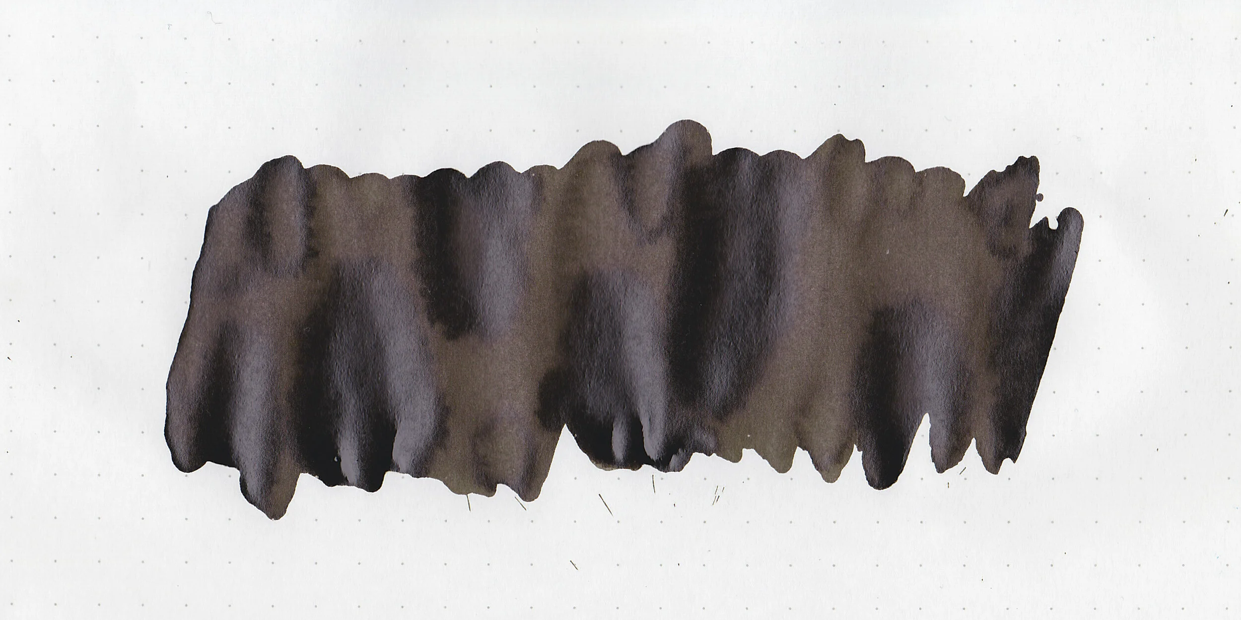
In large swabs on Tomoe River paper the ink dries to a dark shiny finish, but doesn’t actually sheen. After a week of drying the ink drops still look wet.

Let's take a look at how the ink behaves on fountain pen friendly papers: Rhodia, Tomoe River, and Leuchtturm.
Dry time: 50 seconds
Water resistance: Medium-some of the ink washed away, but you might still be able to read it.
Feathering: None
Show through: Medium

Bleeding: None
Other properties: medium shading, no sheen, and no shimmer.
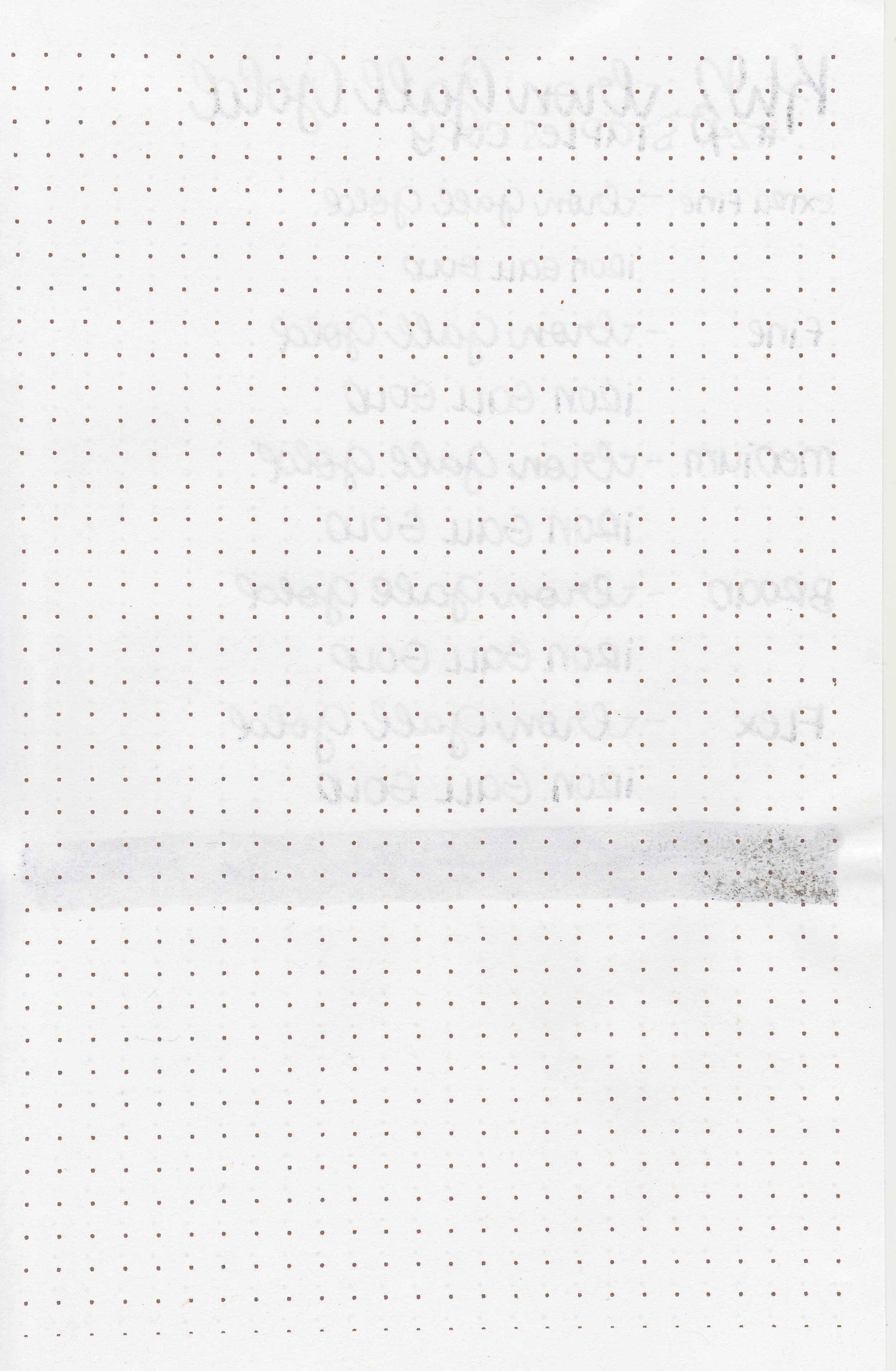
On Staples 24 lb copy paper there was some feathering in all nib sizes but no bleeding.

When compared to other KWZ inks I would consider “gold”, IG Gold is just dark brown. IG Gold is much cooler in tone than any of the other brown inks I have. Click here to see the KWZ inks together, and click here to see the brown inks together.

I used a Pelikan M200 Gold Marbled with a medium nib on a Taroko Enigma notebook. The ink had a dry flow.
Overall, I’m not a big fan of this one. The flow is much drier than I prefer, and I’m not in love with the color.
Disclaimer: This ink was provided by a reader for the purpose of this review. All photos and opinions are my own. This page does not contain affiliate links and this post is not sponsored in any way.

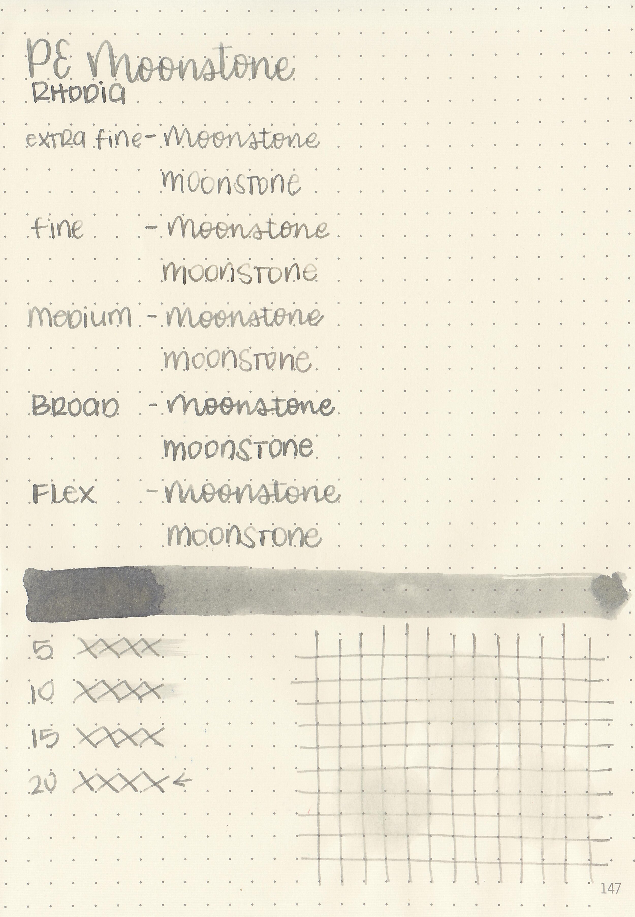
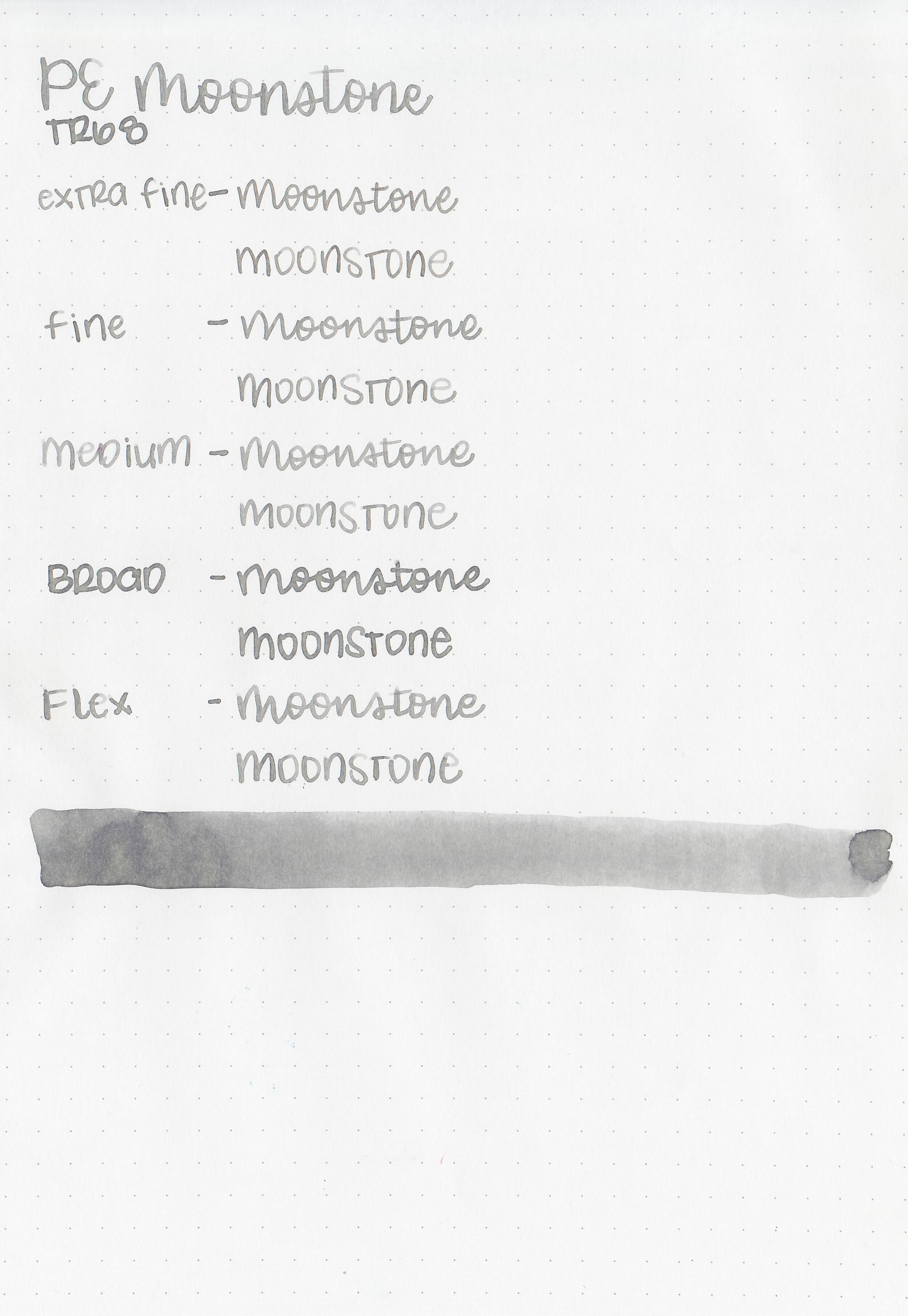
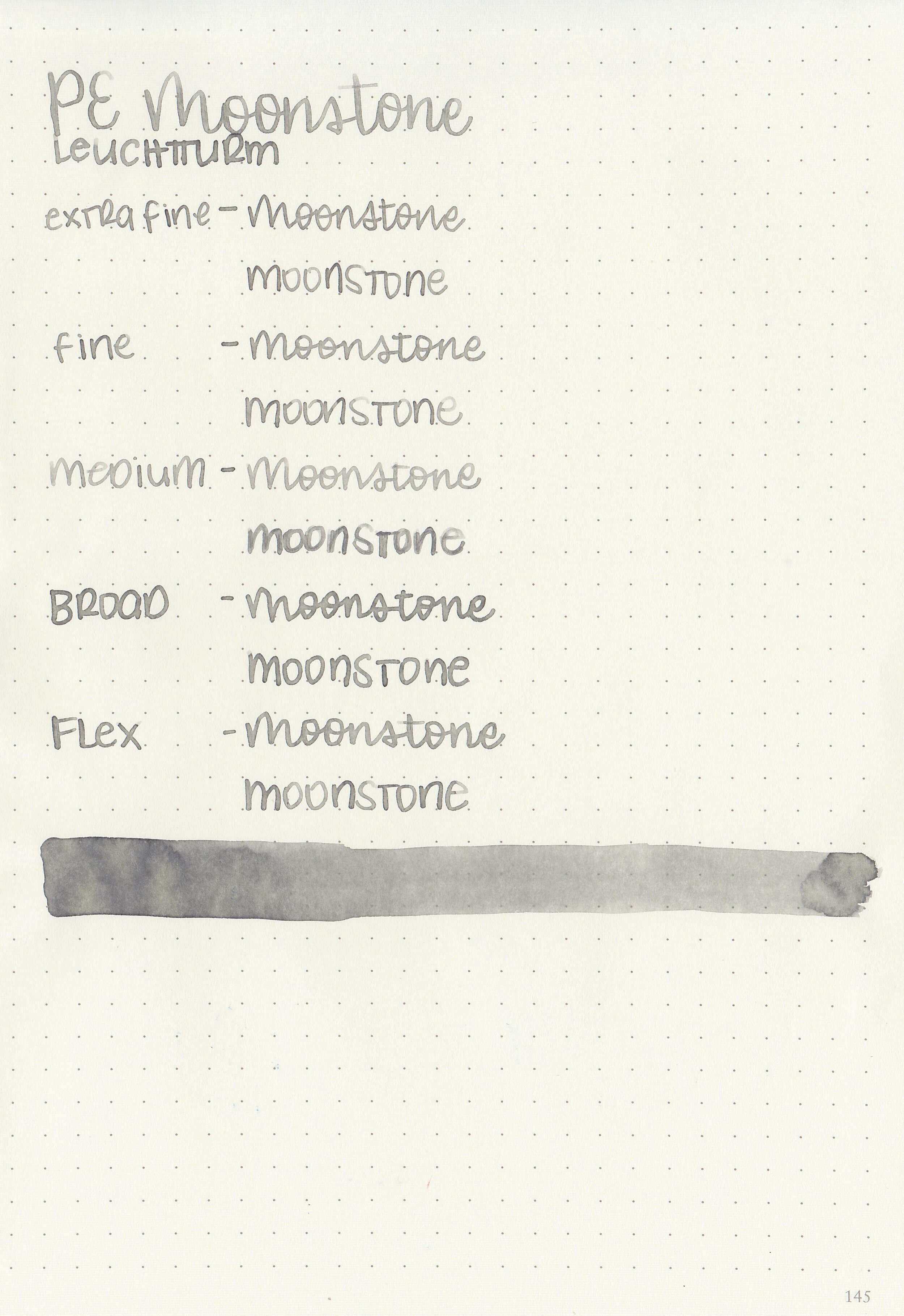
Let’s take a look at Pelikan’s Ink of the Year for 2020, Moonstone. I purchased my sample of ink from Vanness Pens.

The color:
Moonstone is a pale silvery grey.

In large swabs on Tomoe River paper the ink looks a bit more yellow and complex.

Let's take a look at how the ink behaves on fountain pen friendly papers: Rhodia, Tomoe River, and Leuchtturm.
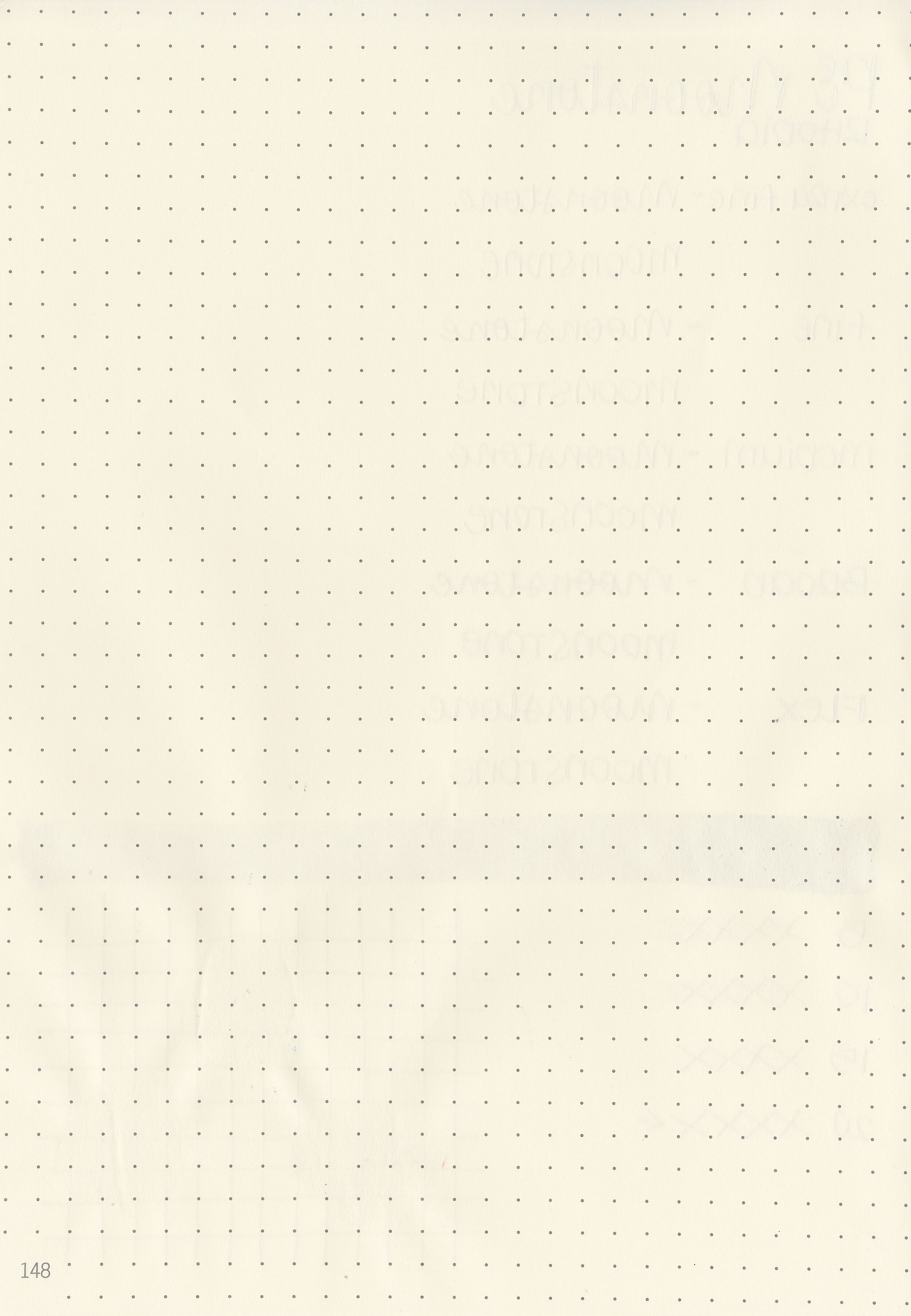
Dry time: 20 seconds
Water resistance: Medium-some of the ink washed away, but you might still be able to read it.
Feathering: None
Show through: Medium
Bleeding: None
Other properties: low shading, no sheen, and no shimmer.
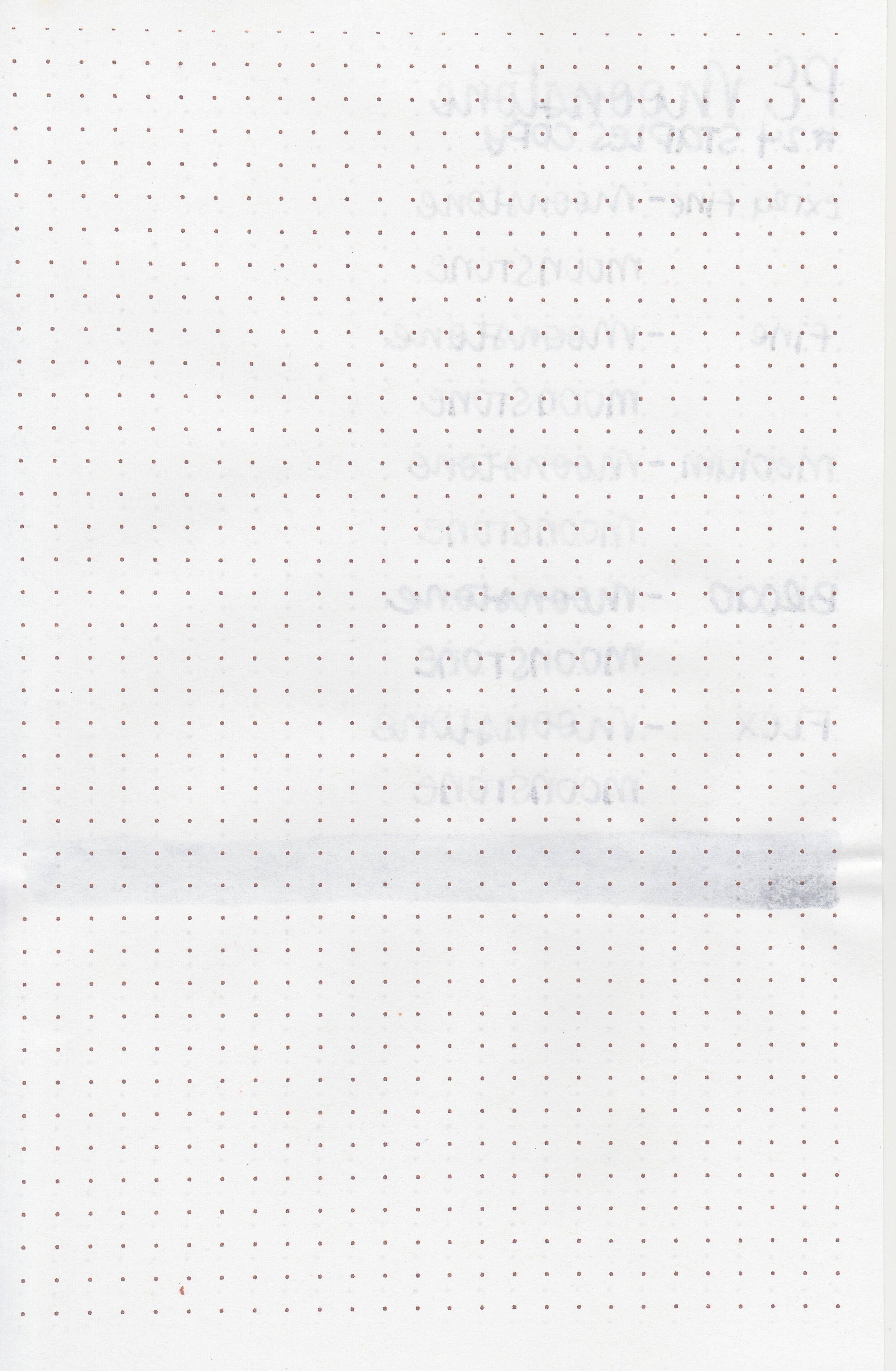
On Staples 24 lb copy paper there was some feathering in most nib sizes but no bleeding.

Moonstone is a bit lighter than Montblanc Spider Gray, and less blue than Diamine Silver Fox. Click here to see the Pelikan inks together, and click here to see the grey inks together.
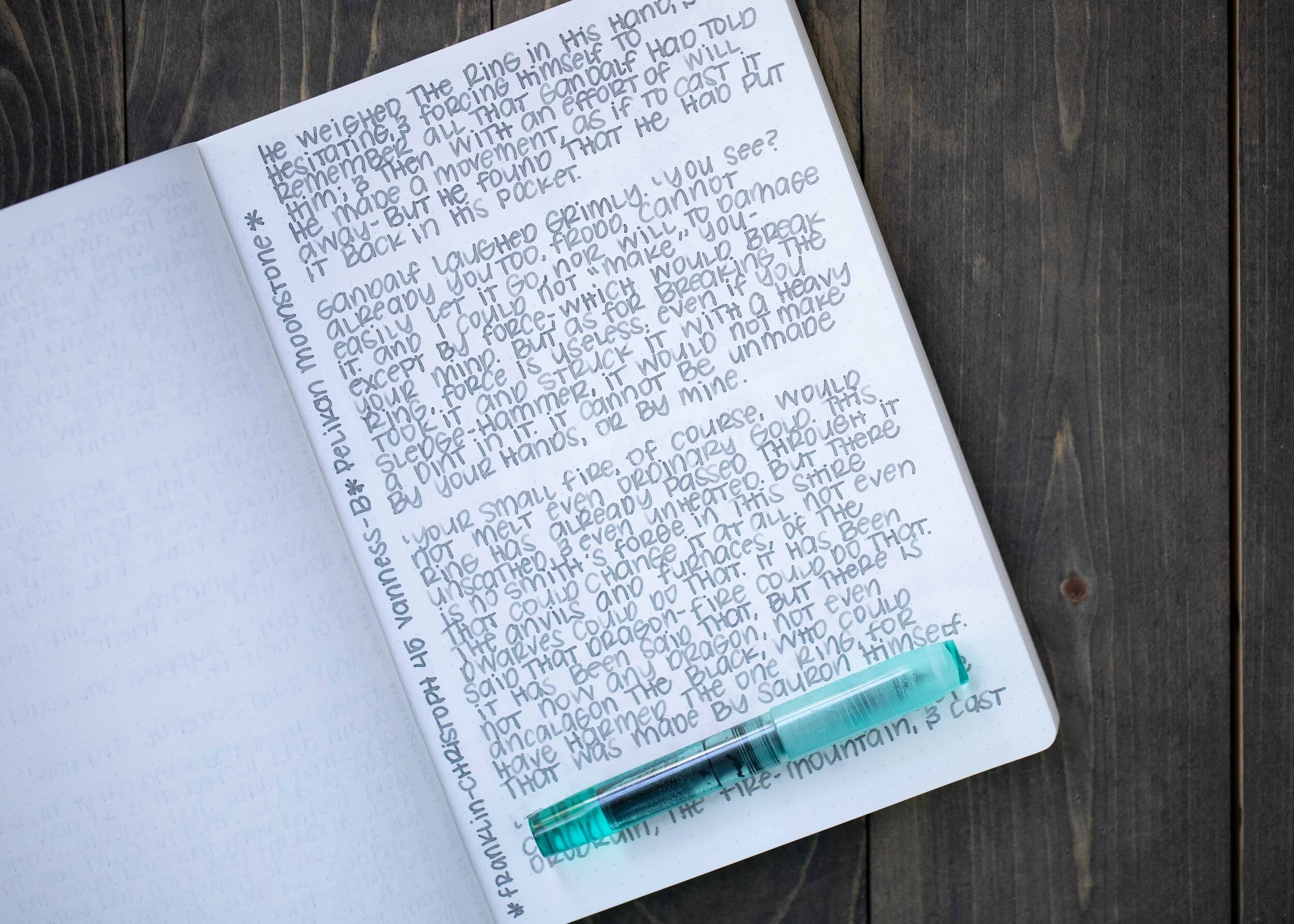
I used a Franklin-Christoph 45 Vanness with a broad nib on a Taroko Enigma notebook. The ink had a drier than average flow. Since this broad nib is pretty wet it did fine with this ink, but I would probably only use it in wet nibs.
Overall, it’s a nice neutral grey, but there’s nothing about it that wows me. The flow is a bit drier than I prefer, but that can be overcome with a wet nib. I’m glad I tried it, but I don’t need a full bottle of this one.
Disclaimer: I purchased this ink myself, and all photos and opinions are my own. This page does not contain affiliate links and this post is not sponsored in any way.
Hi, I’m Kelli, and I’m the brain behind Mountain of Ink. I’m a homeschooling mama of three littles, full-time student, aspiring photographer, amateur chef, and lover of all things stationery. I think any day that doesn’t involve learning and playing with ink is a day wasted. On my site you will find fountain pen, ink, and paper reviews, along with stationery bits and bobs along the way. You can find me @mountainofink on Instagram, Facebook, Twitter, and Pinterest.
Powered by Squarespace.