Ink Review #1142: Troublemaker Petrichor
/
Today’s ink is a bit usual; Troublemaker Petrichor is interesting because it’s green when wet and dries to a different color entirely. I wasn’t really sure what to call this color so I compared it to a lot of other swabs and decided it’s closest to grey, with purple and green shading (yes, I will compare it to some Sailor Ink Studio inks below). Thanks to Shigure Inks for sending a sample over for review!

The color:
Petrichor is a moody grey-purple with pops of green.
Swabs:
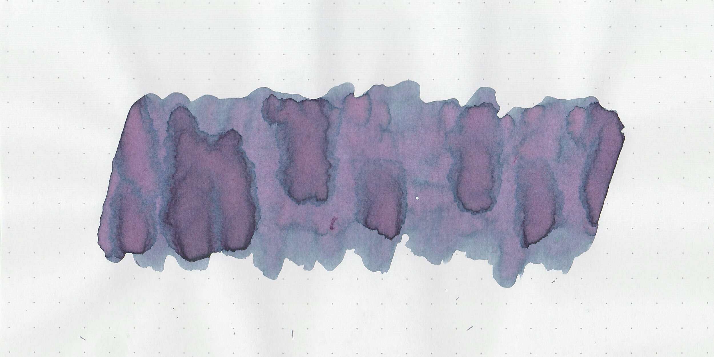
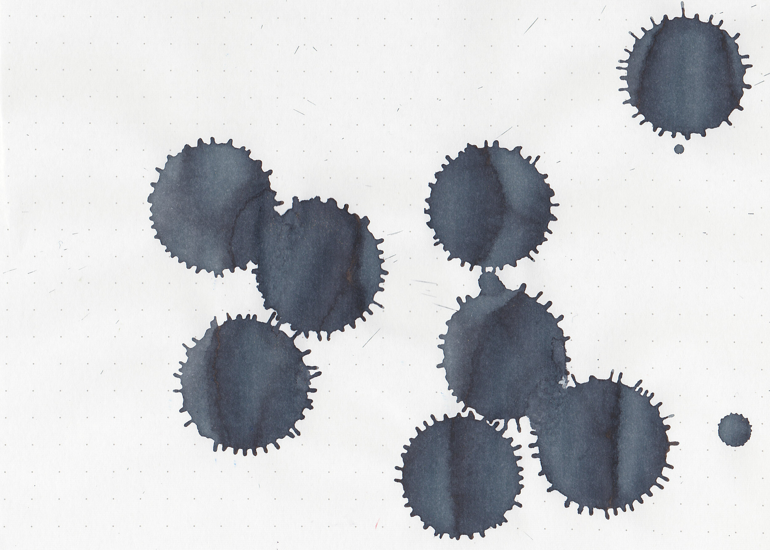
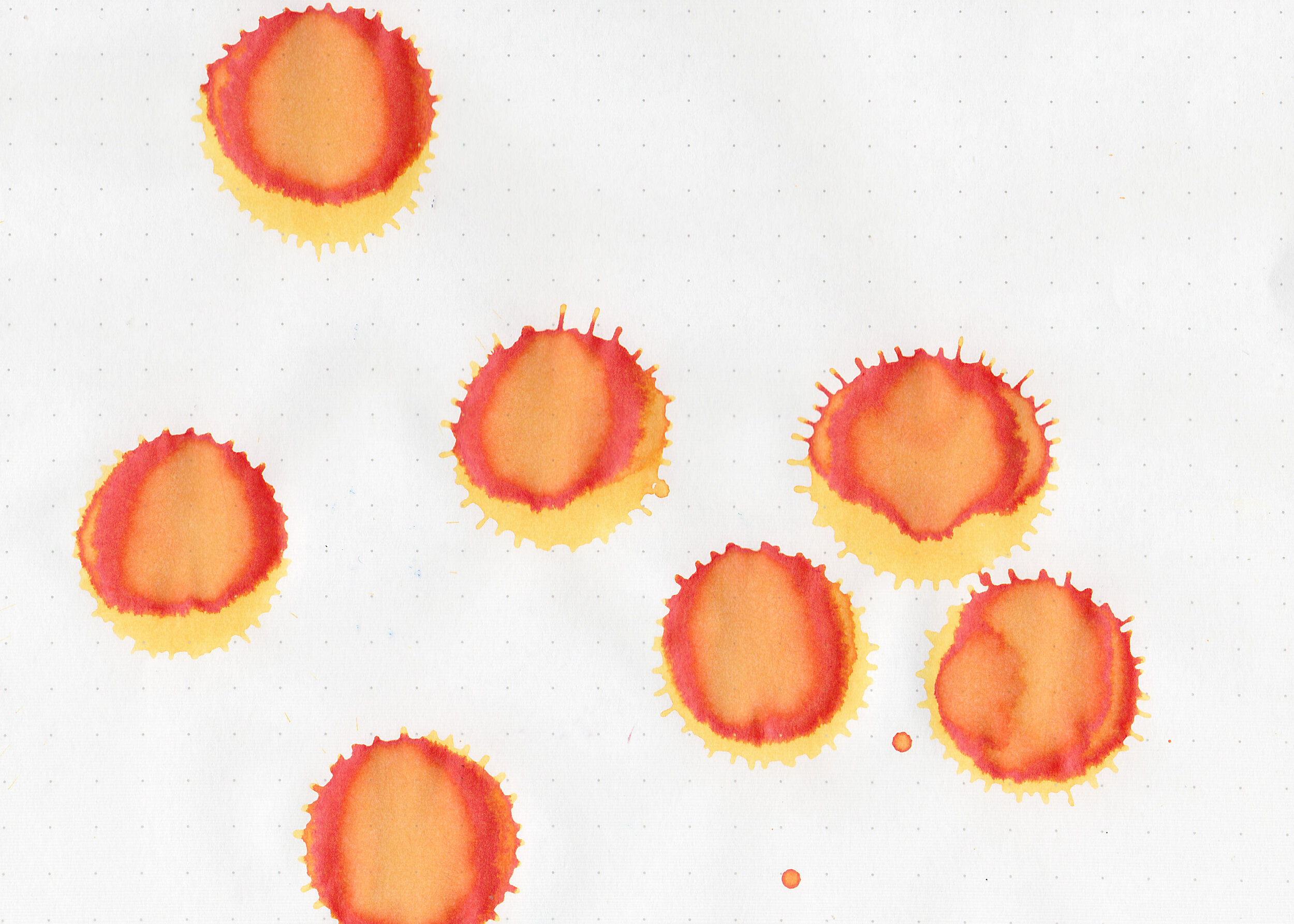
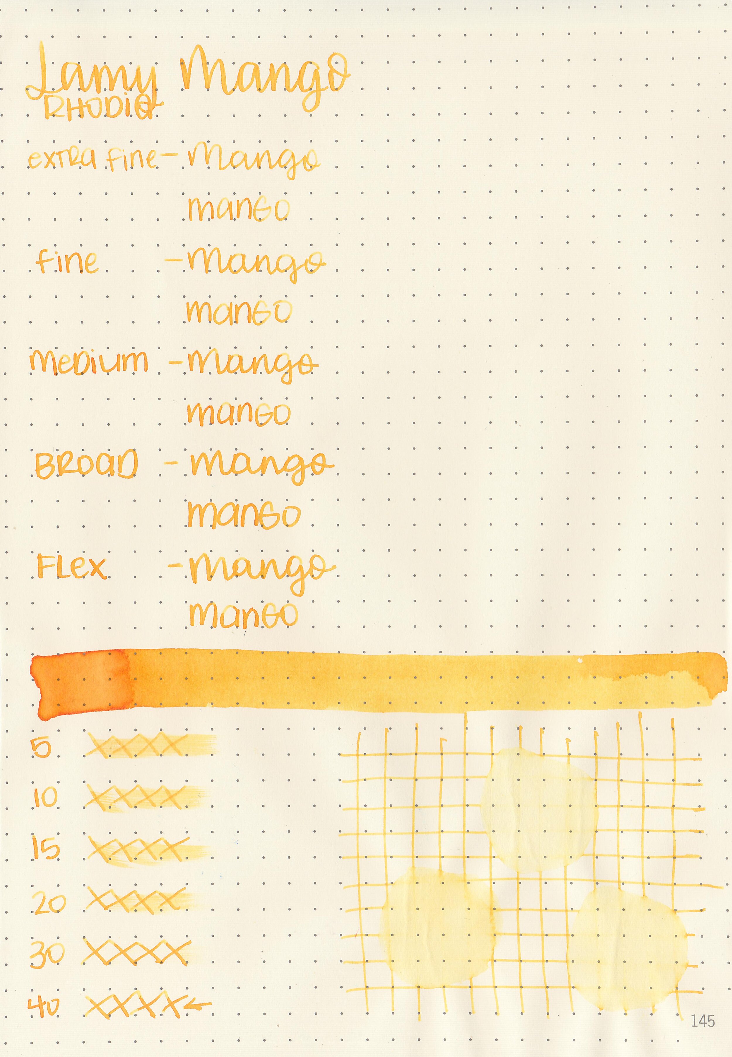
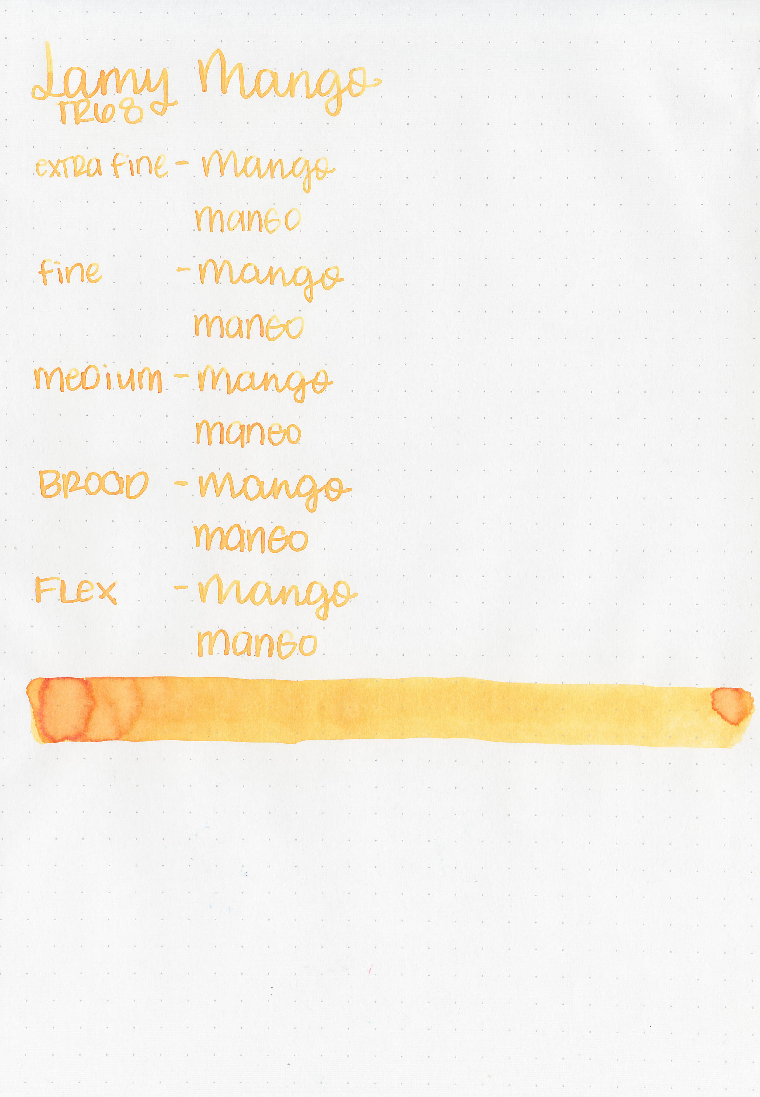
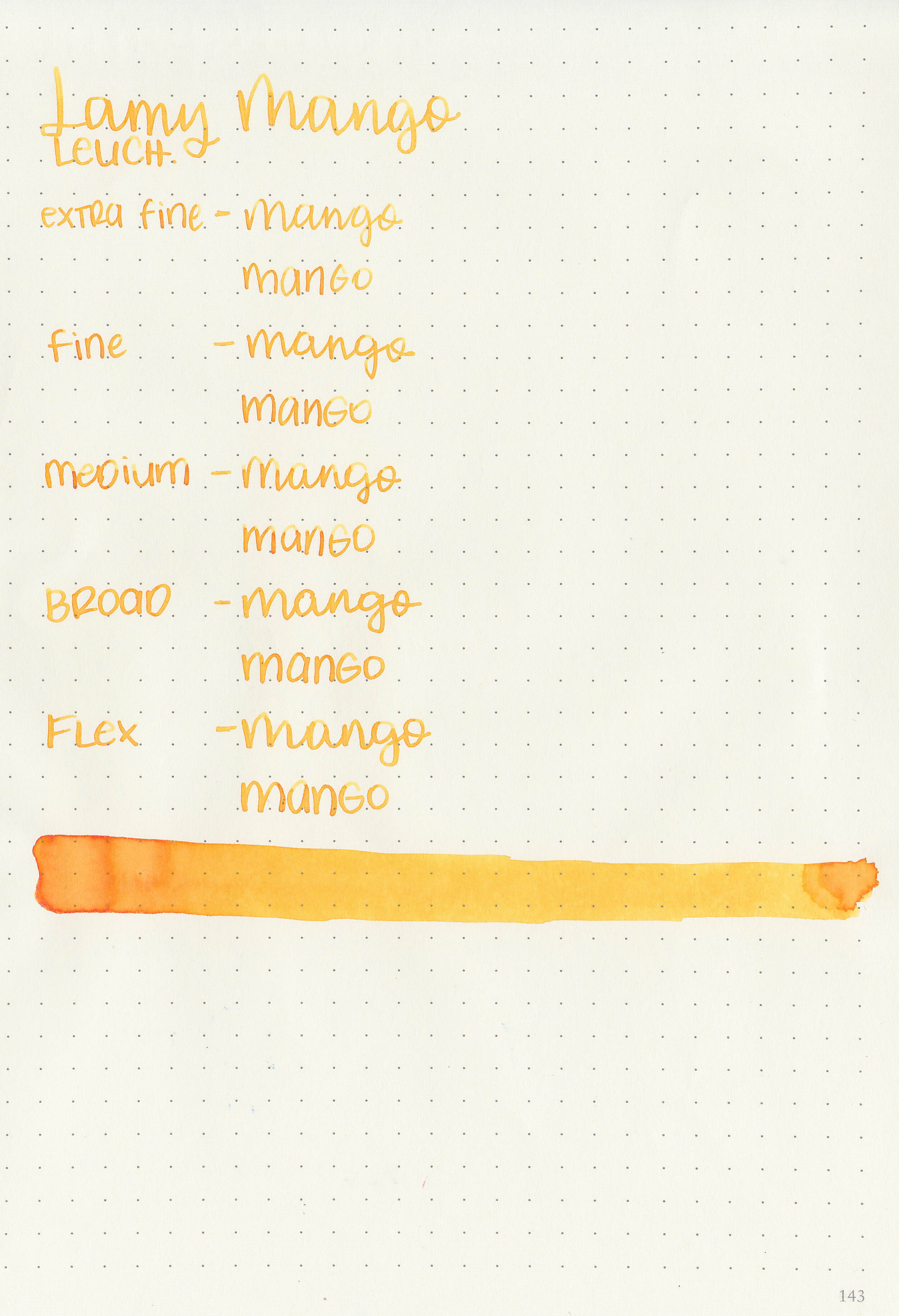
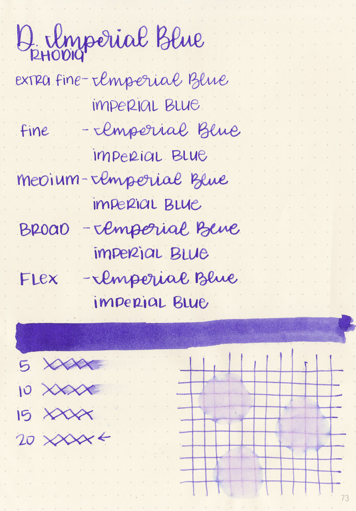
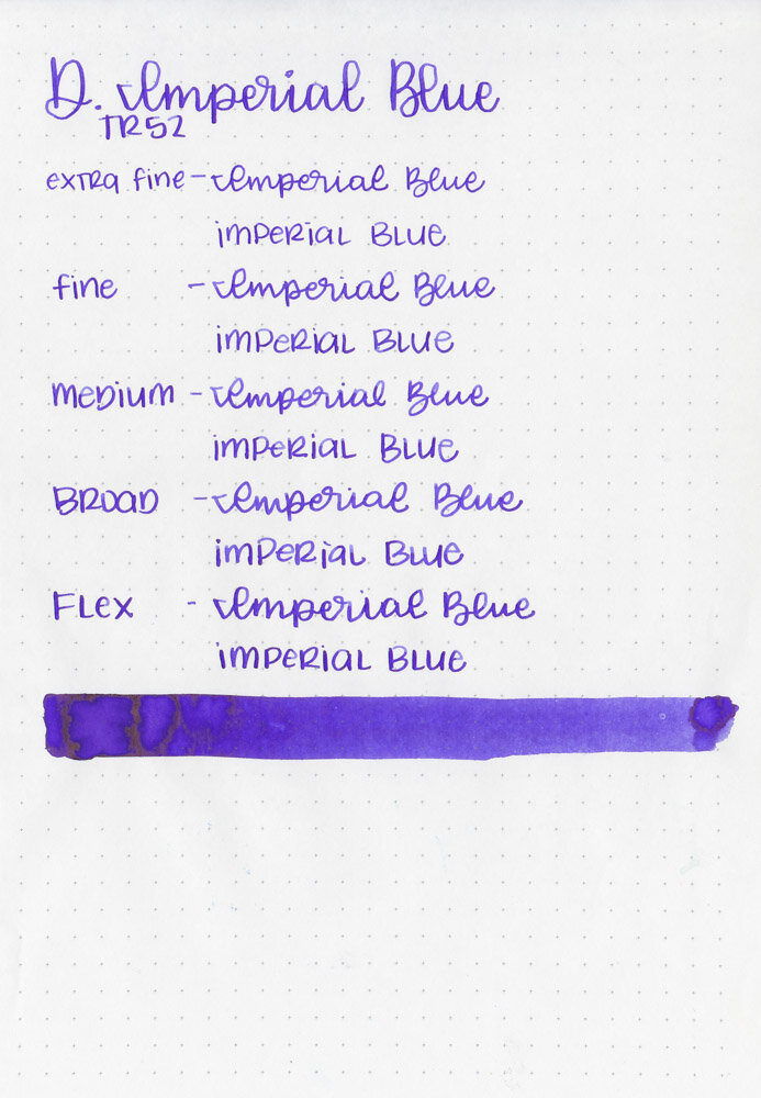
In large swabs on Tomoe River paper the ink looks way more purple than it does in writing, and you don’t see the green as much.

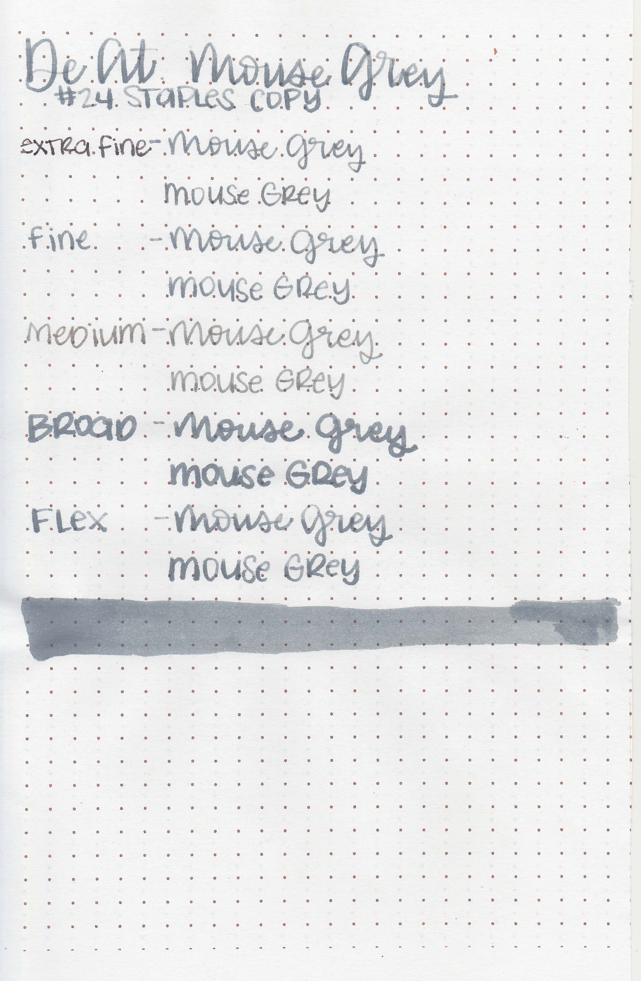
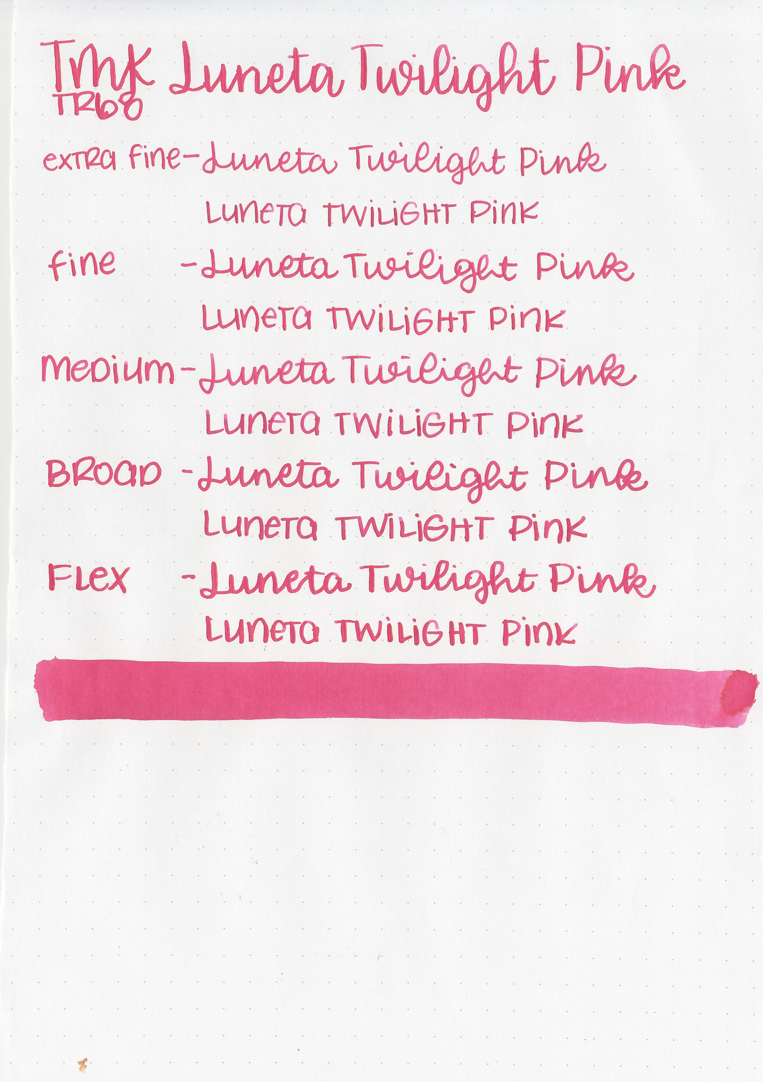
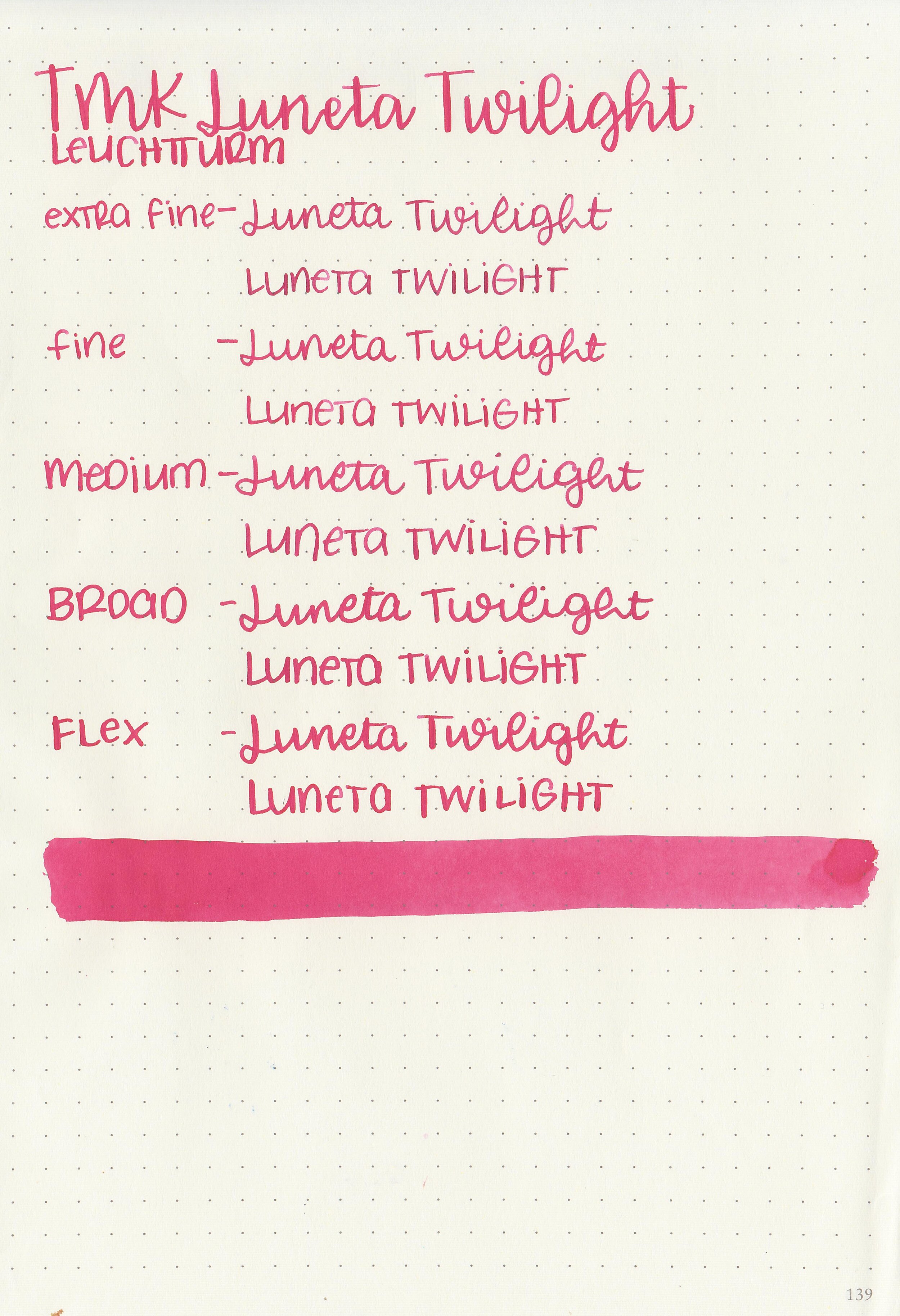
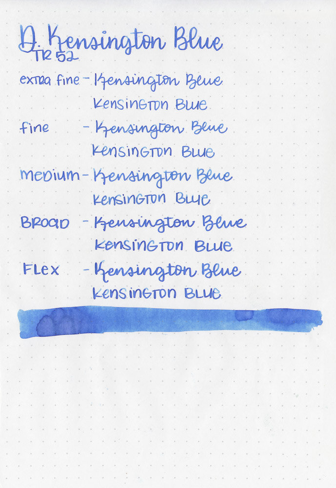
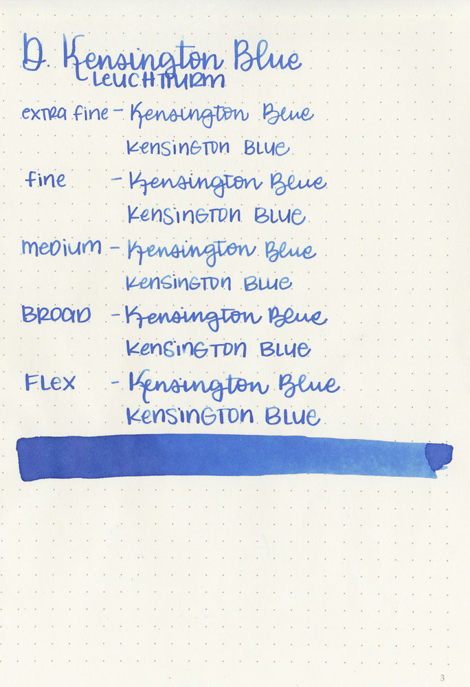
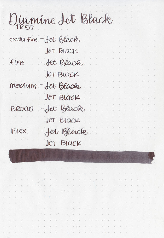
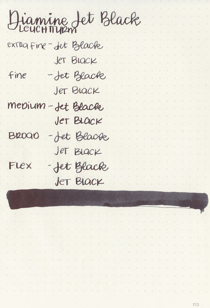
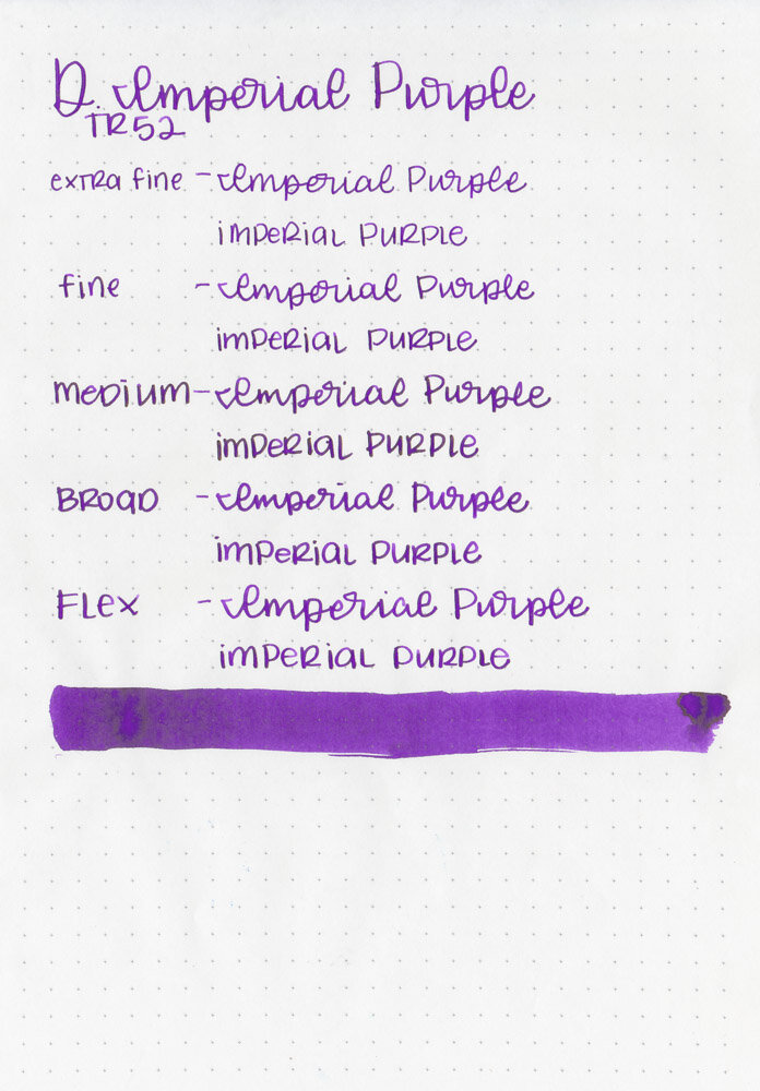
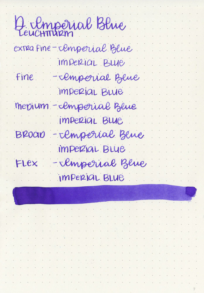
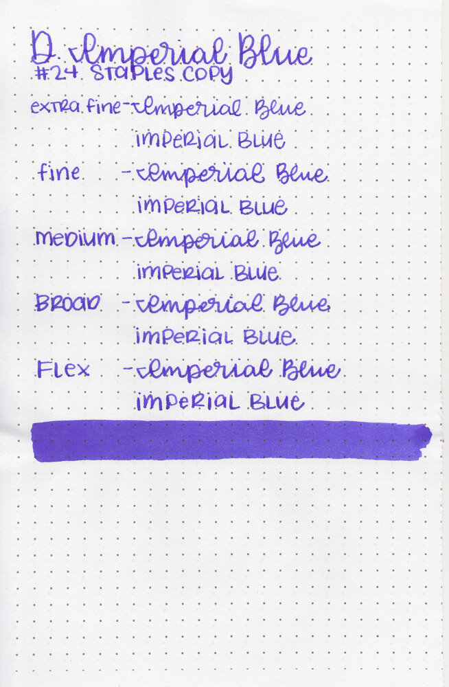
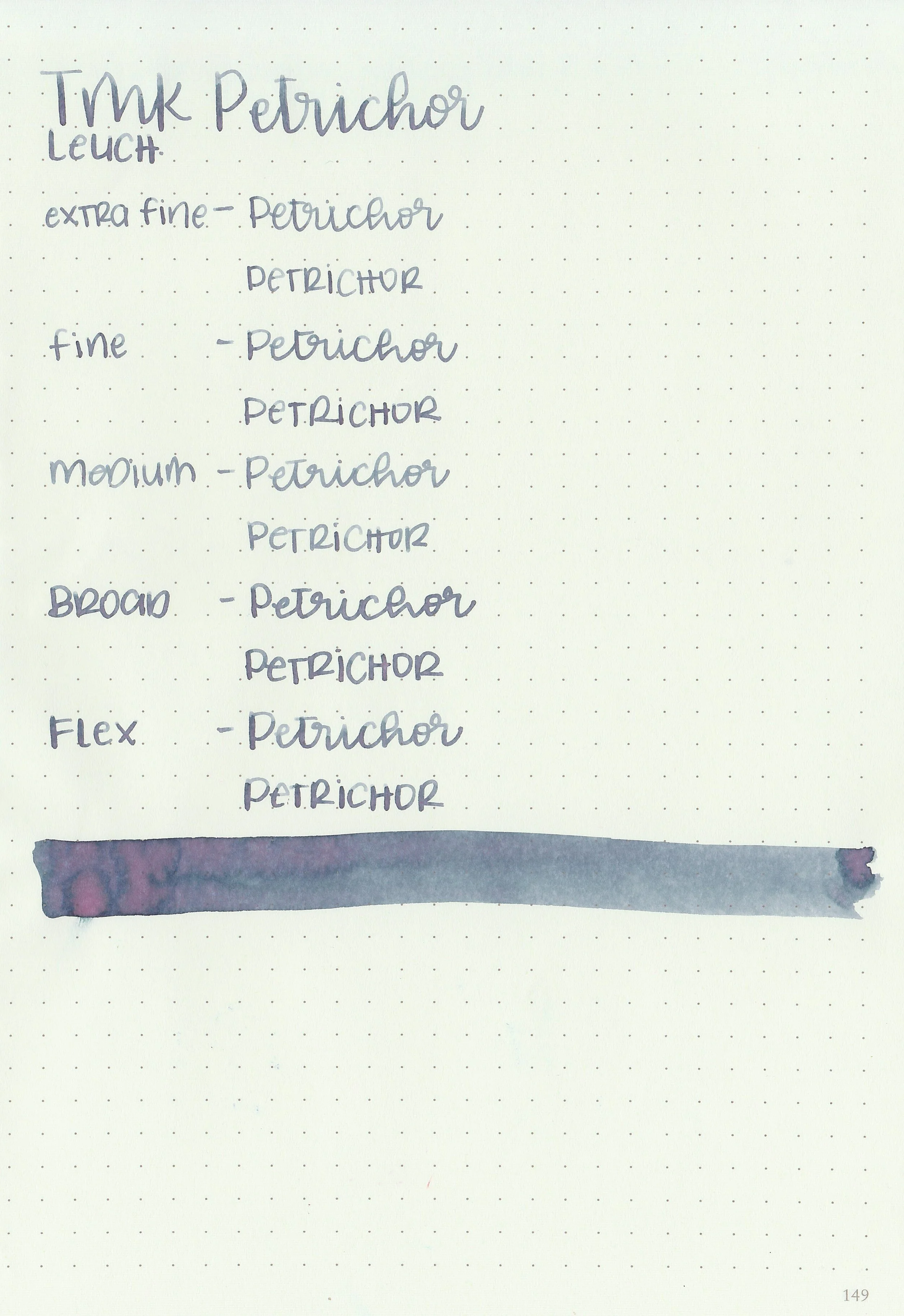
Writing samples:
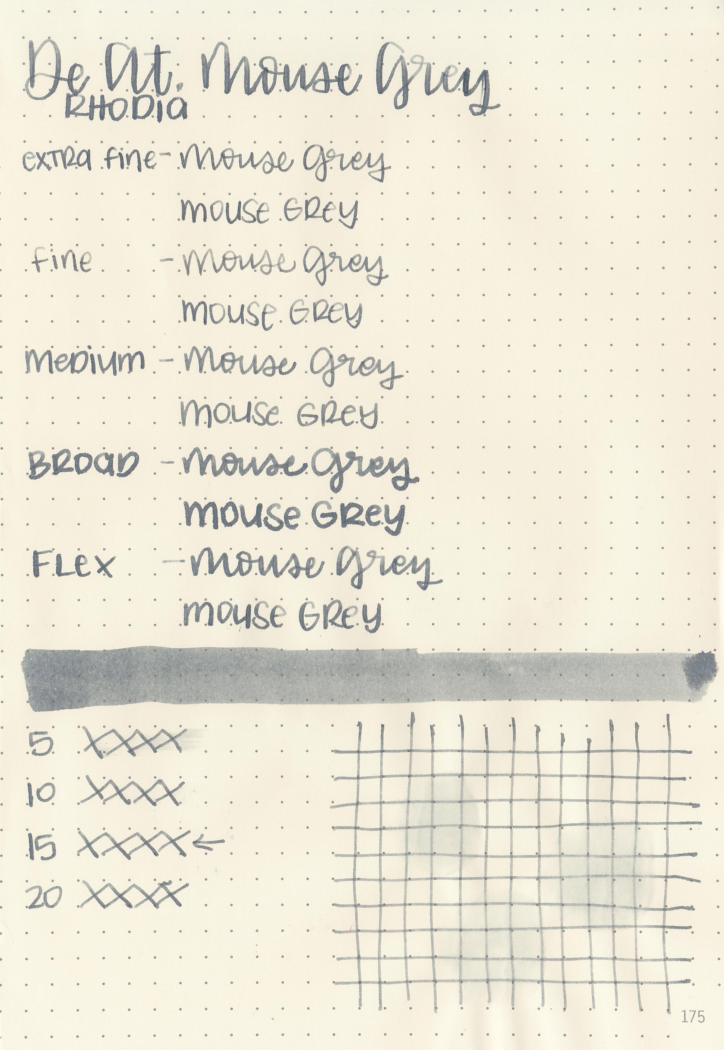
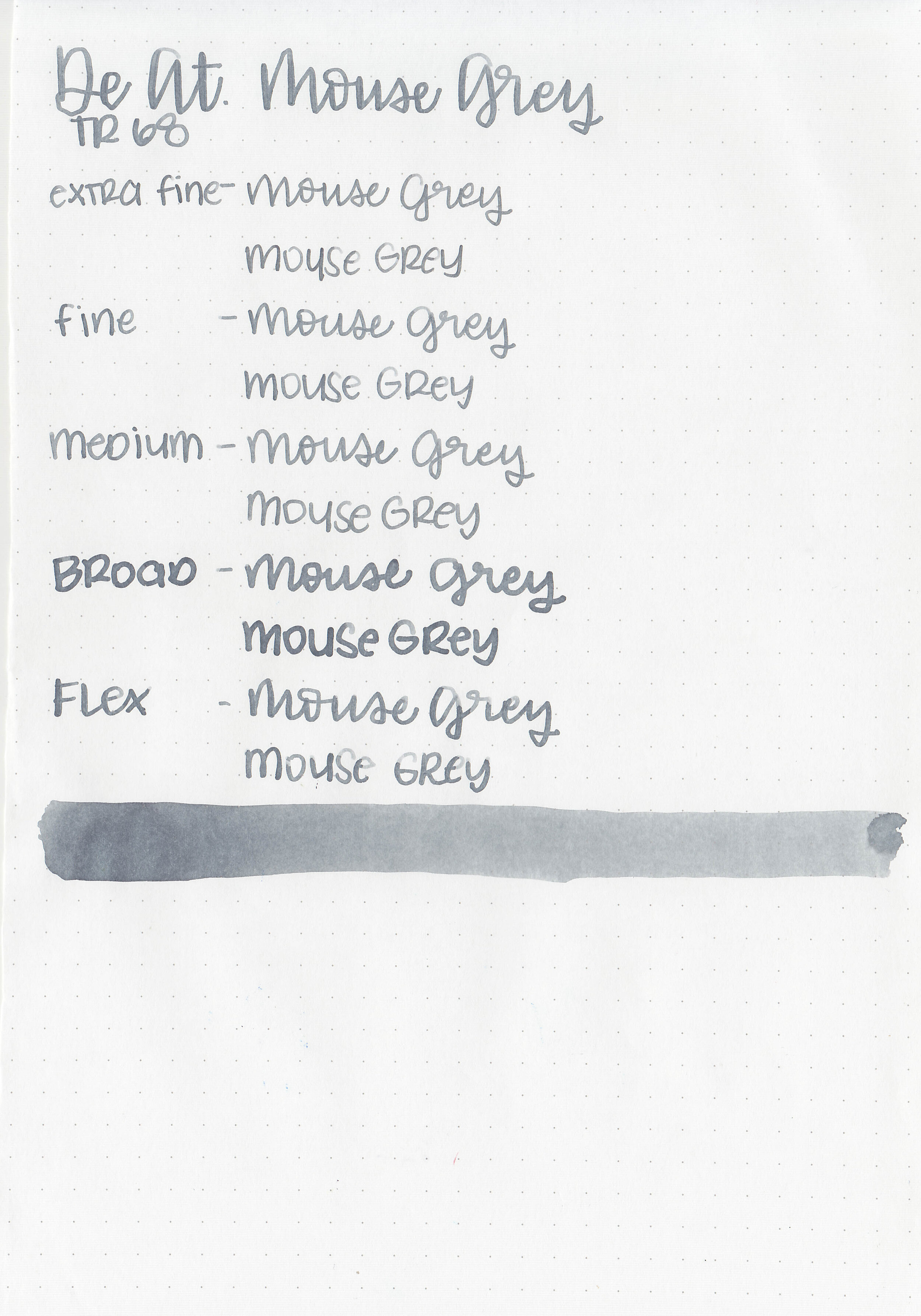
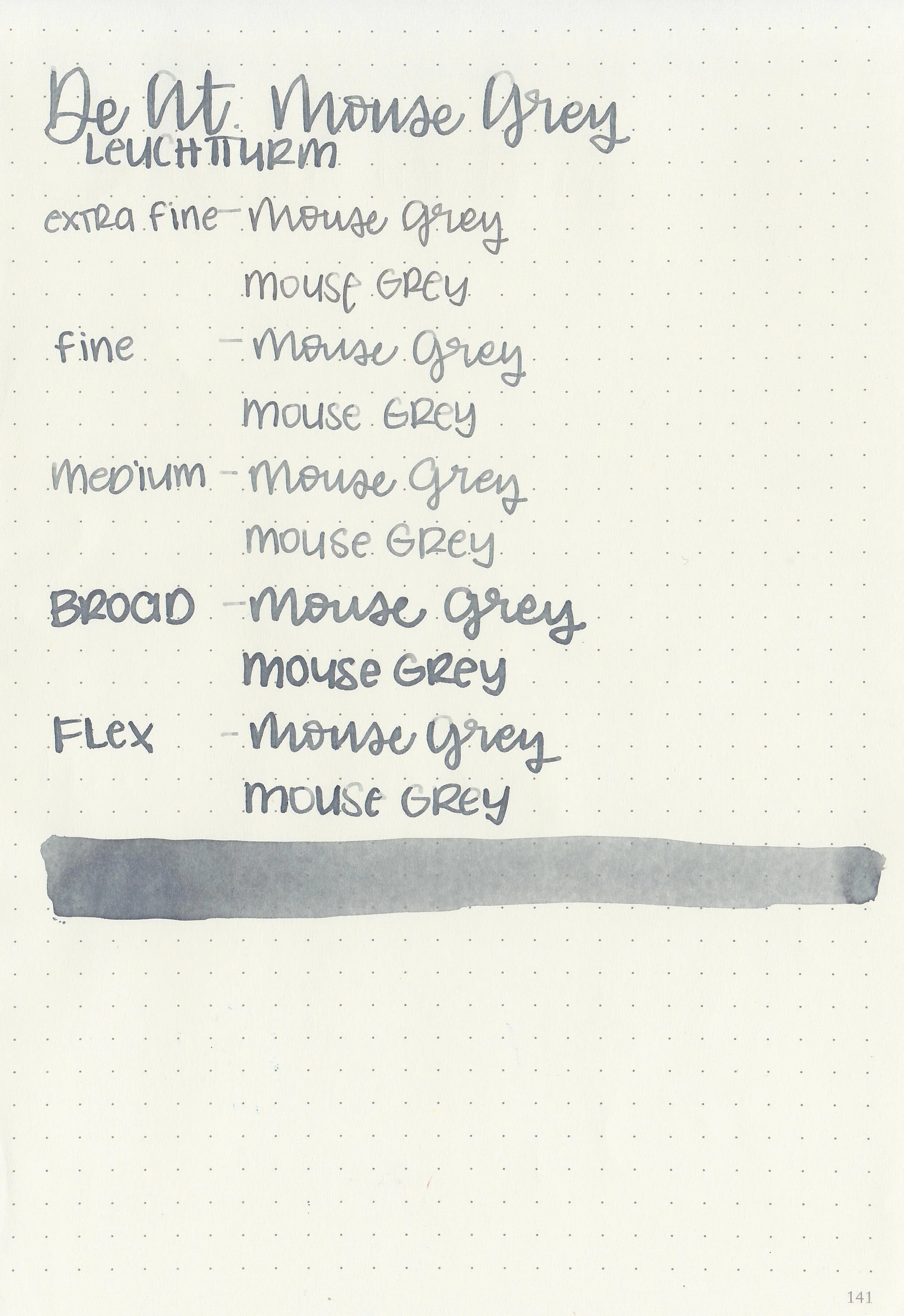
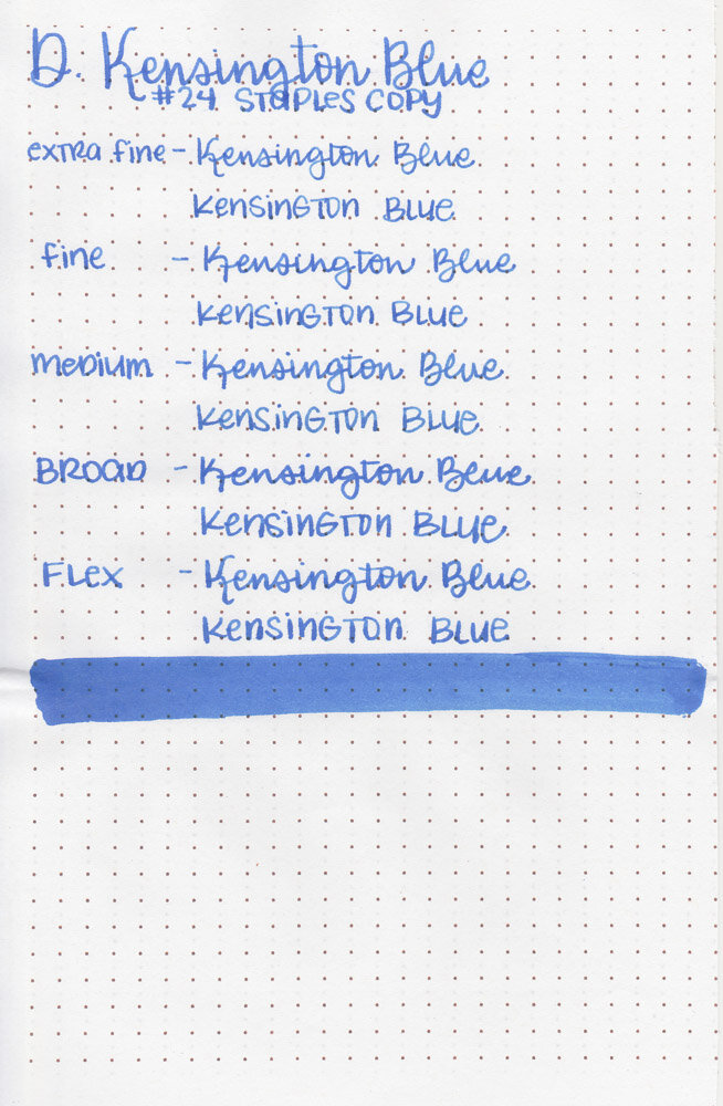
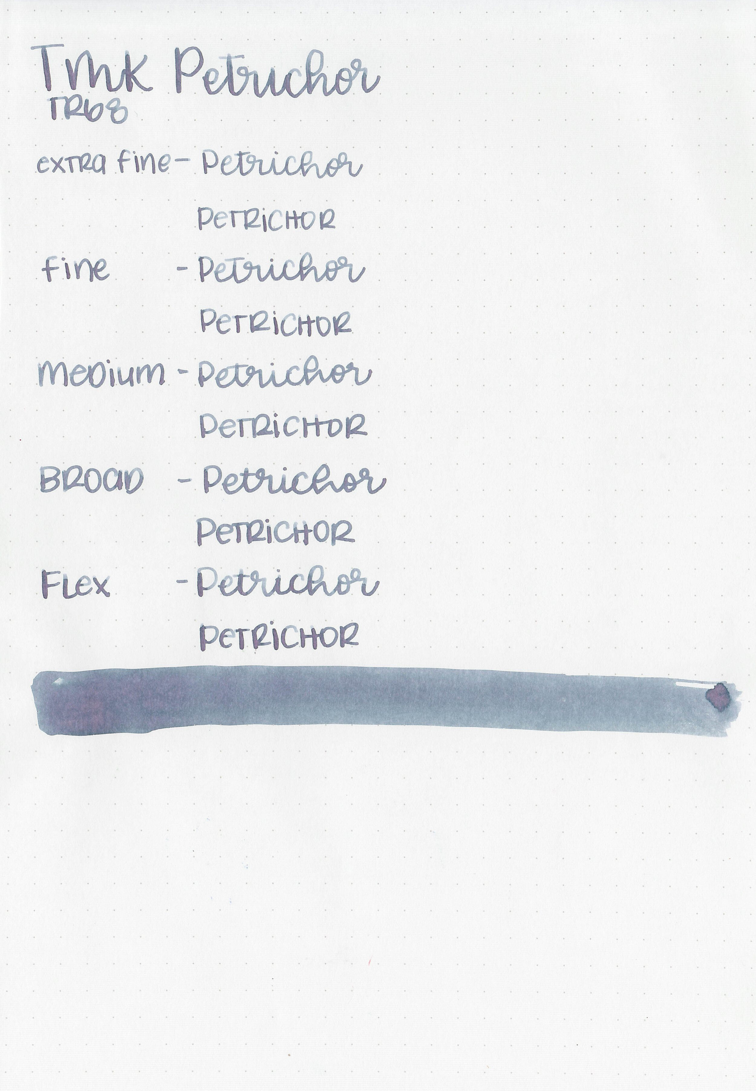
Let's take a look at how the ink behaves on fountain pen friendly papers: Rhodia, Tomoe River, and Leuchtturm.

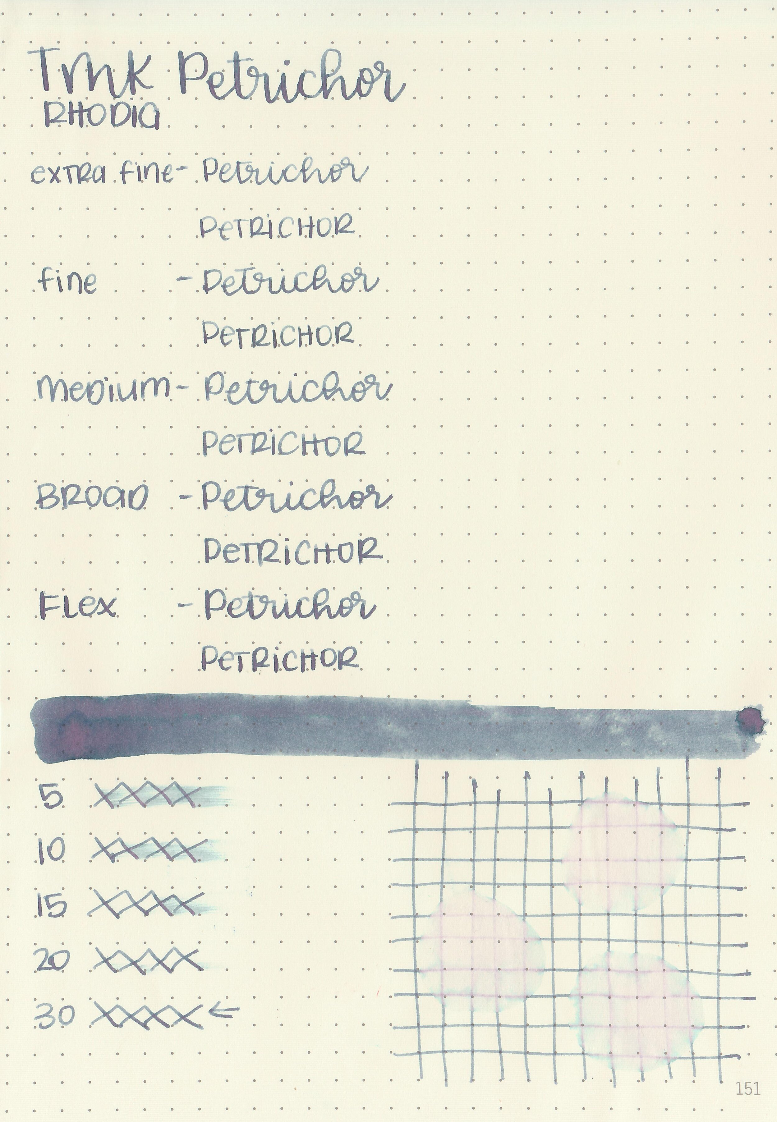
Dry time: 30 seconds
Water resistance: Low

Feathering: None
Show through: Medium

Bleeding: None
Other properties: high shading, no sheen, and no shimmer. The shading was visible in every nib size I tried.
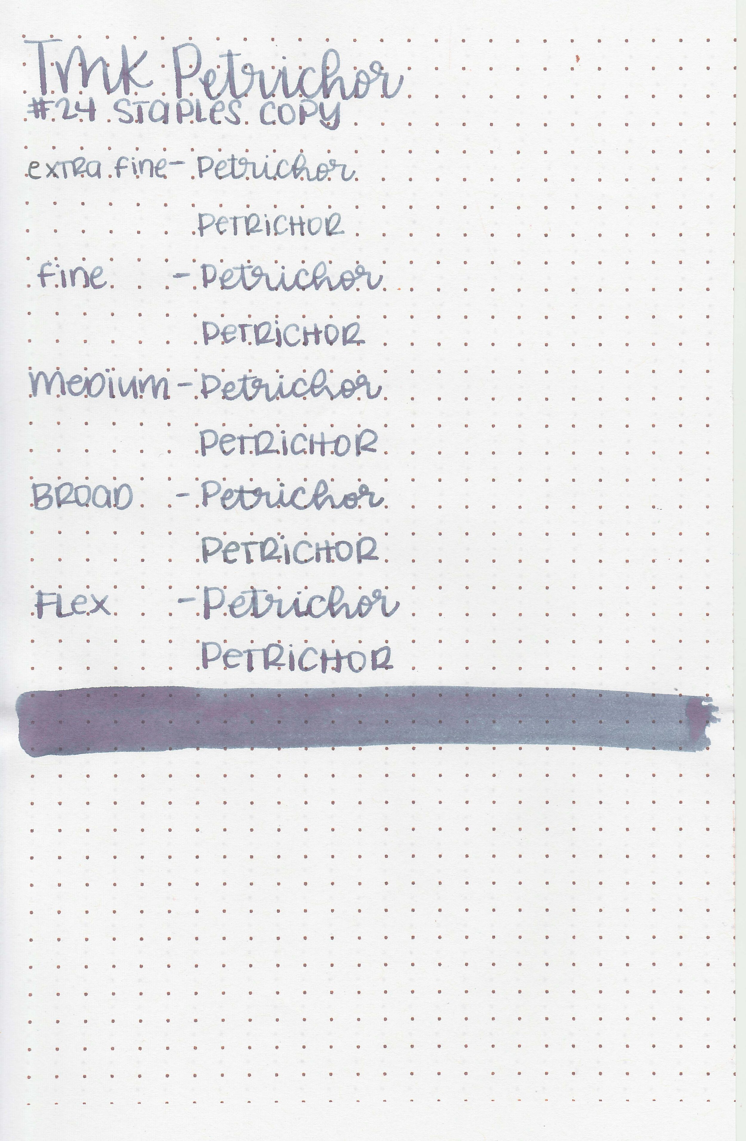
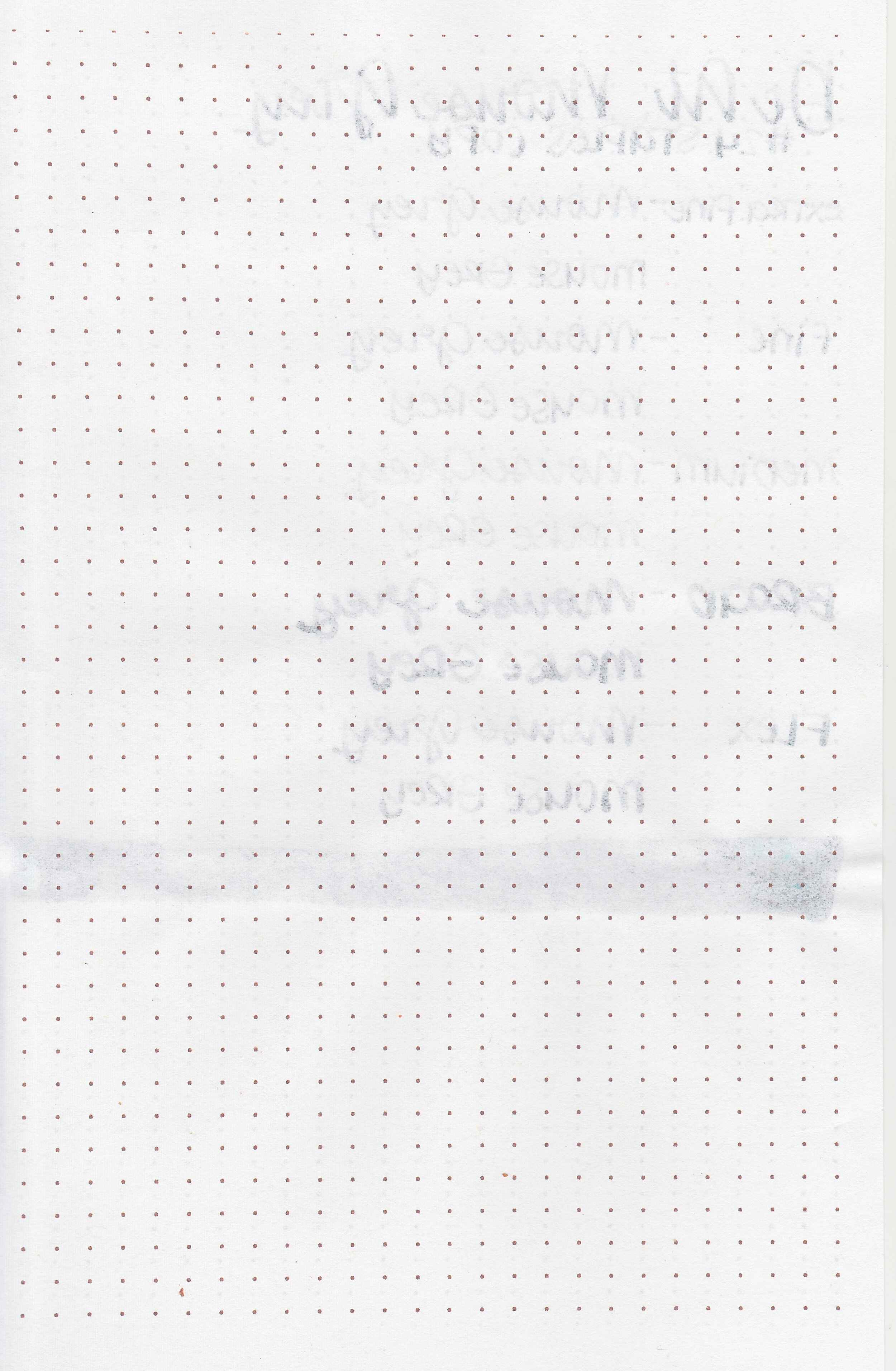
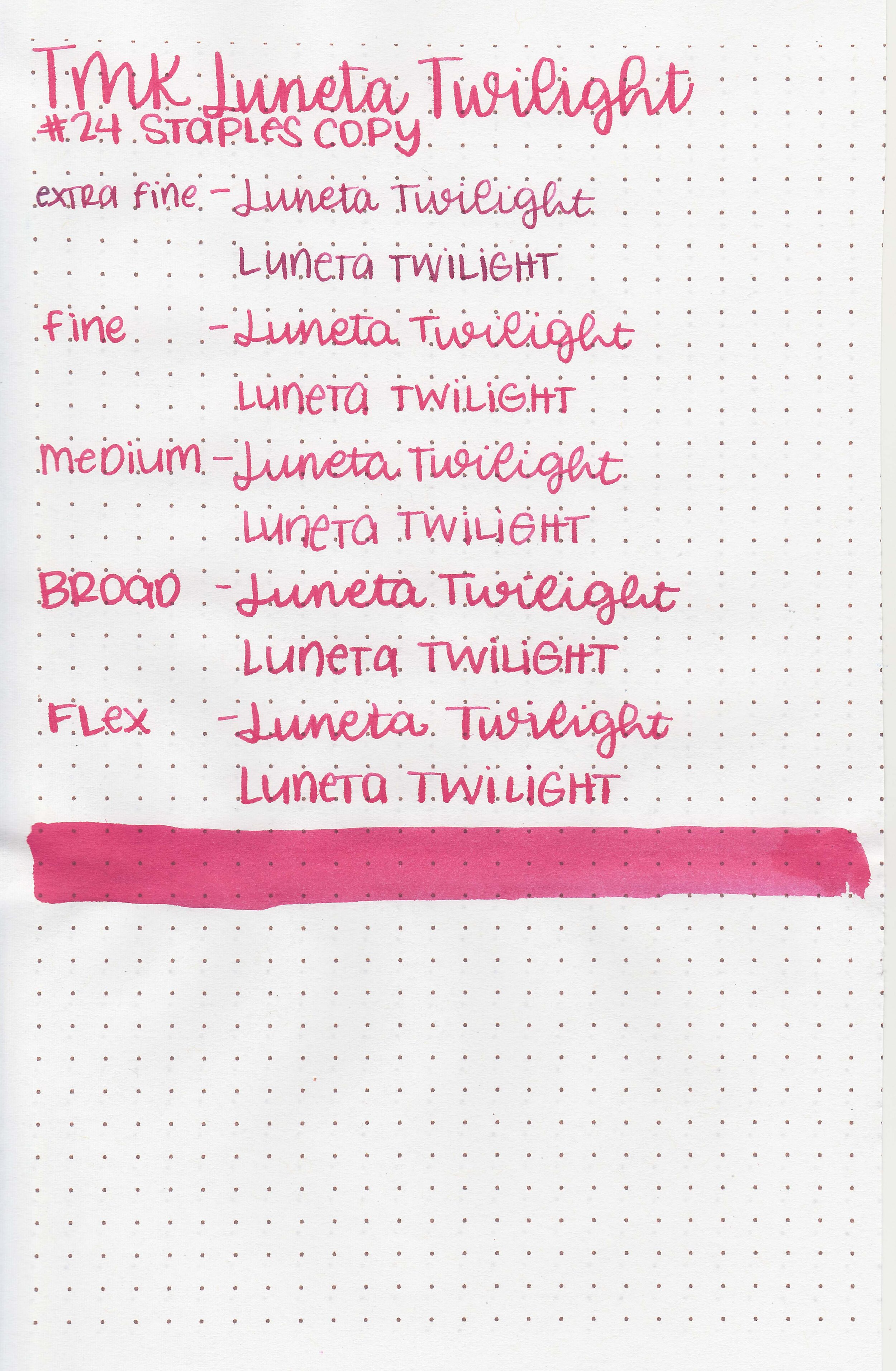
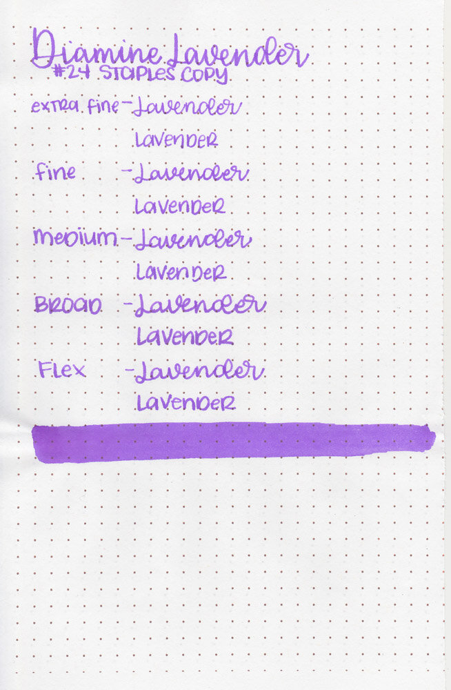
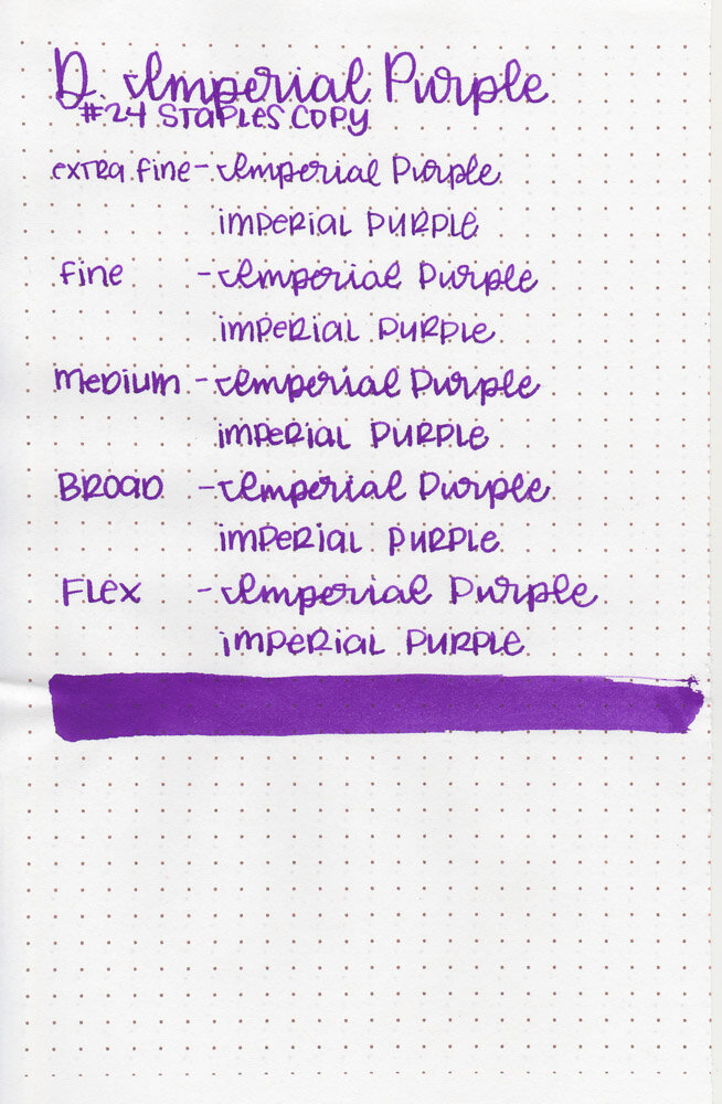
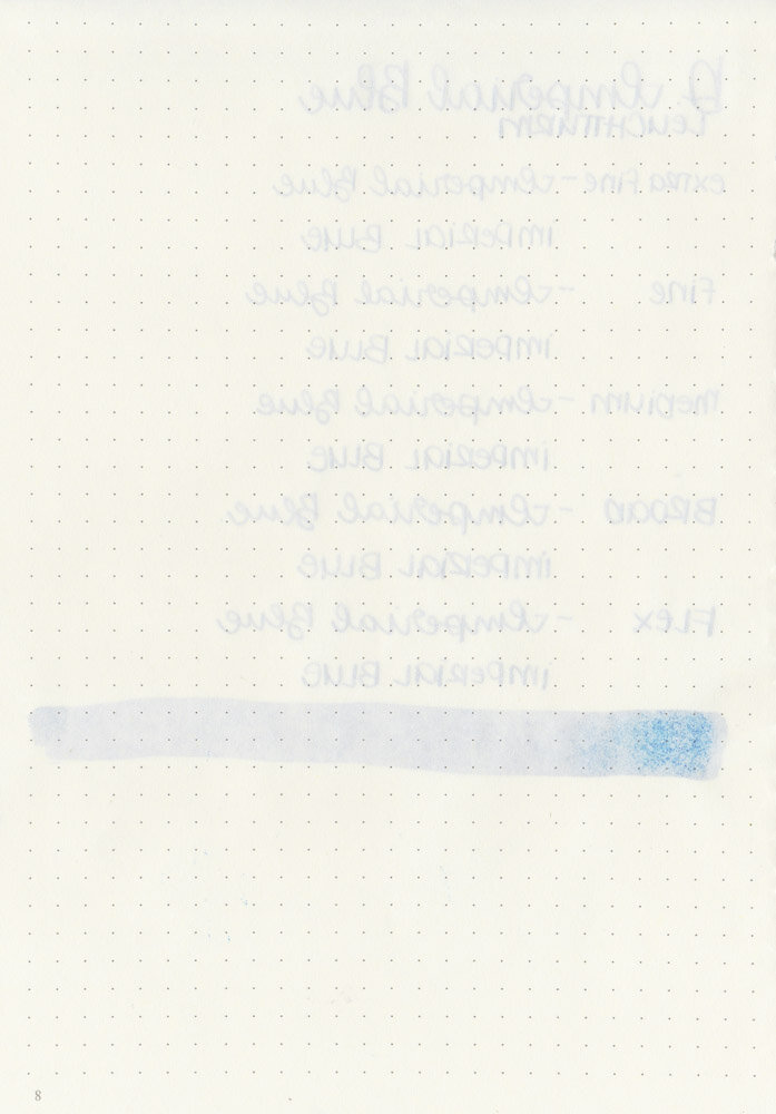
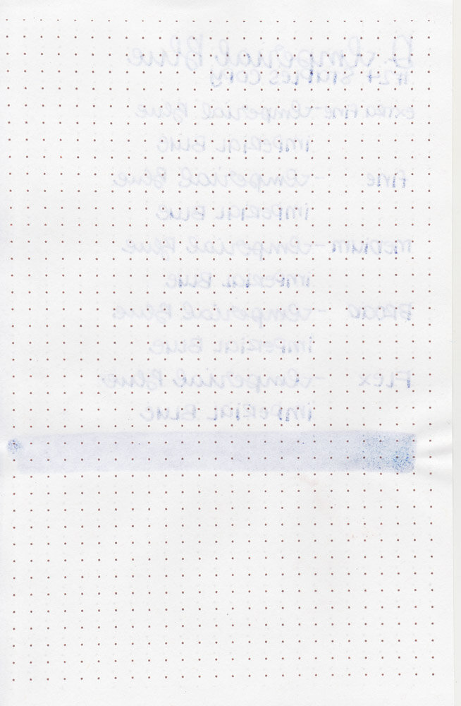
On Staples 24 lb copy paper there was some feathering in most nib sizes and a few dots of bleeding.
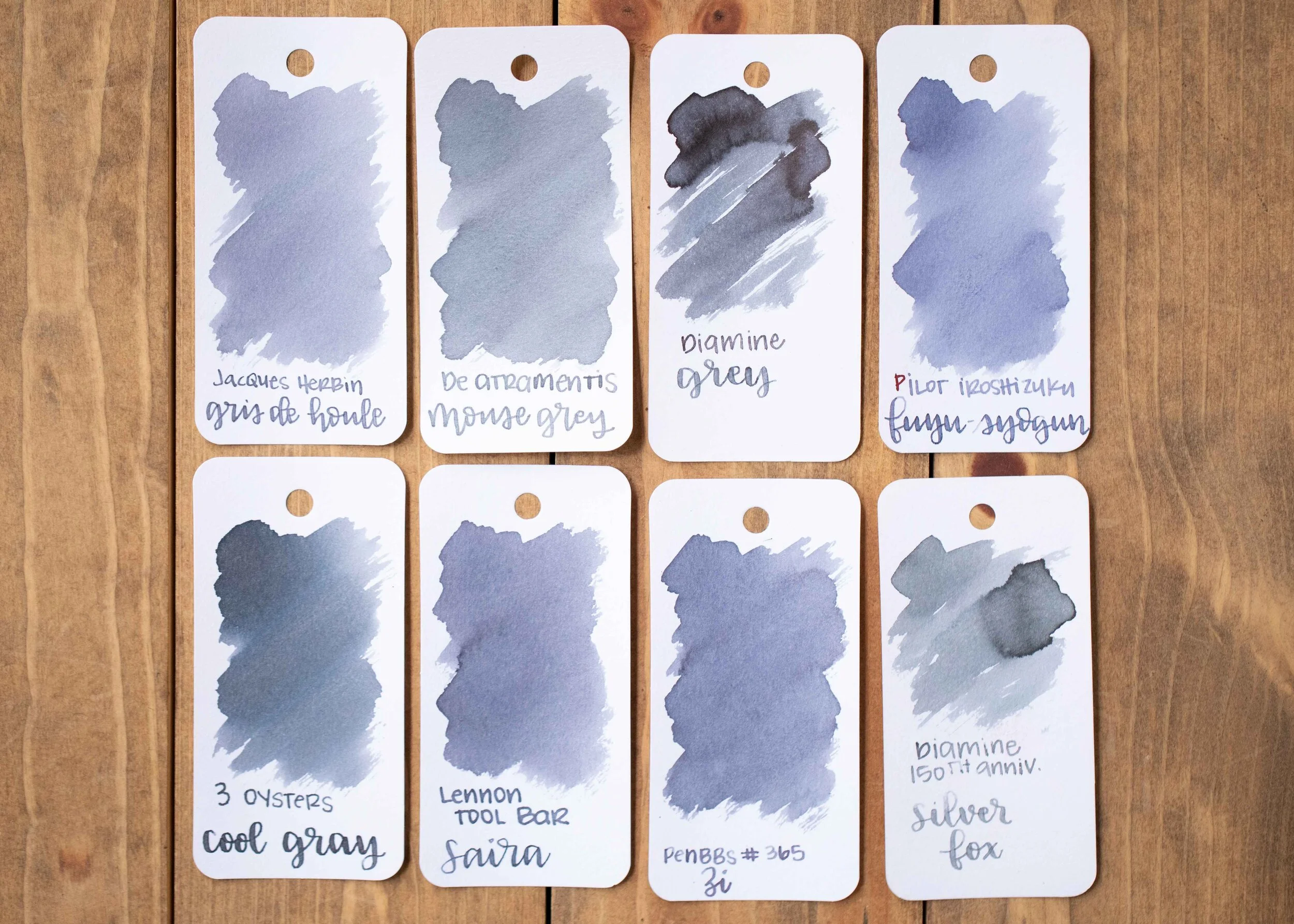
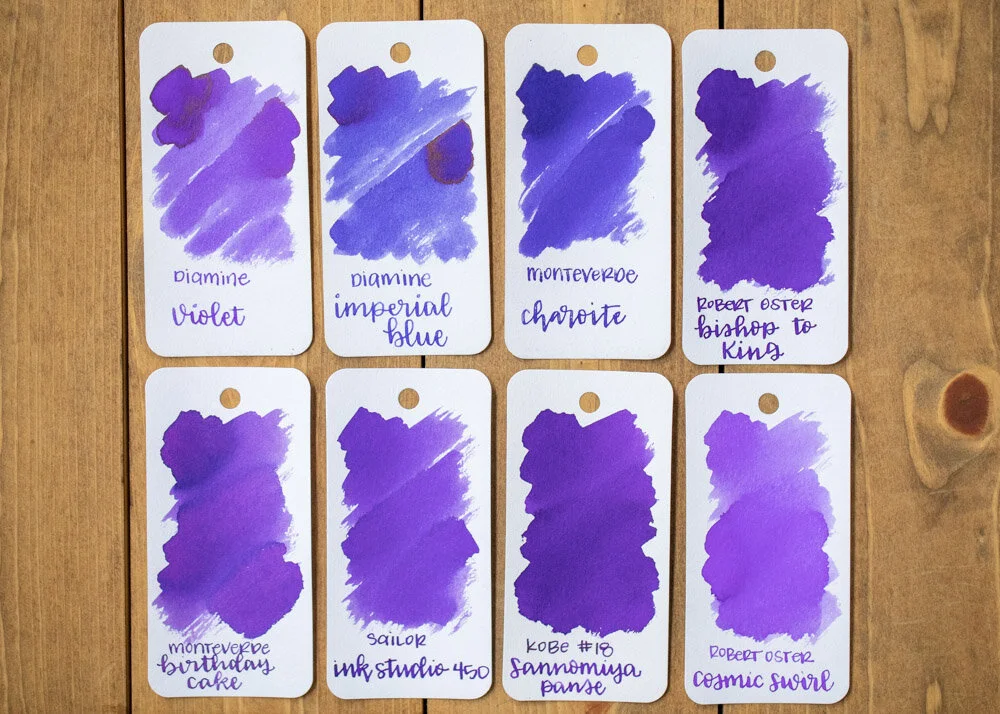
Comparison Swabs:

Petrichor is a bit lighter than Sailor Ink Studio 223, but much darker than 123. It’s also more grey than Vinta Armada. Click here to see the Troublemaker inks together, and click here to see the grey inks together.
Longer writing:

I used a TWSBI Eco Transparent Green with a medium nib on a Taroko Enigma notebook. The ink had a drier than average flow.
Overall, this ink is really interesting. Starts green, dries to purple-grey with purple and green shading. I love playing with this ink, but it can be rather light in some nib sizes, so I wouldn’t use this as an everyday ink just as a fun ink.
Disclaimer: A sample of this ink was provided by Shigure Inks for the purpose of this review. All photos and opinions are my own. This page does not contain affiliate links and this post is not sponsored in any way.