Ink Review #840: Vinta Sikatuna Sandugo 1565
/
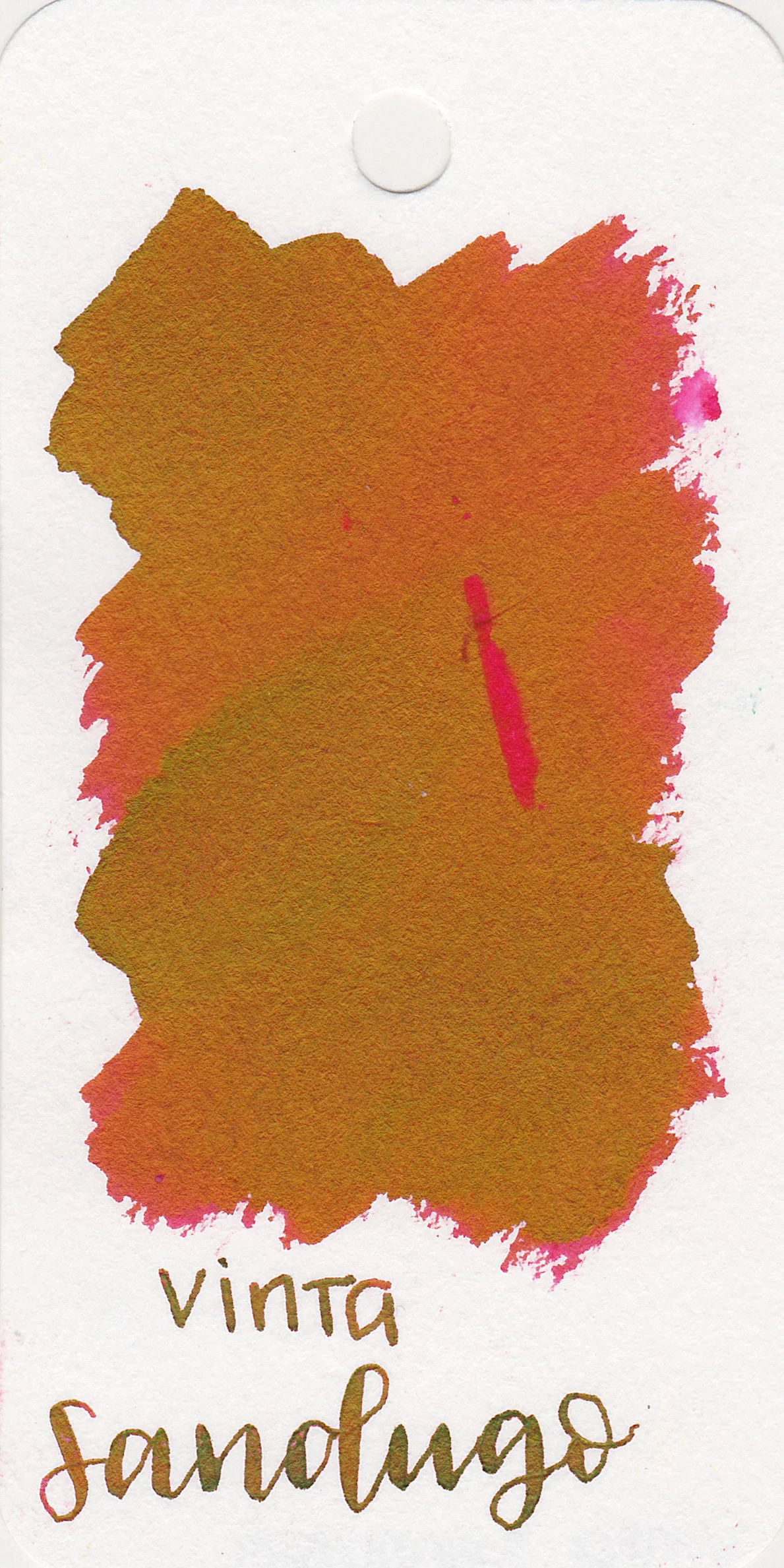
This week it’s time to tackle some of the Vinta Series 1 inks, starting with Vinta Sikatuna Sandugo 1565. According to Vinta’s website, “In 1565, Datu Sikatuna and the Spanish Miguel López de Legazpi made a blood compact, or Sandugo, to seal their friendship with trust. This beautiful dark red ink sheens with green to symbolize both friendship and the lush green landscape of Bohol where the Sandugo was held.” Thanks to Vanness Pens for sending a sample over for review.
As soon as I swabbed this ink it quickly reminded me of J Herbin Rouge Hematite. It feels like a similar red with green sheen, so we will compare the two below.
The color:
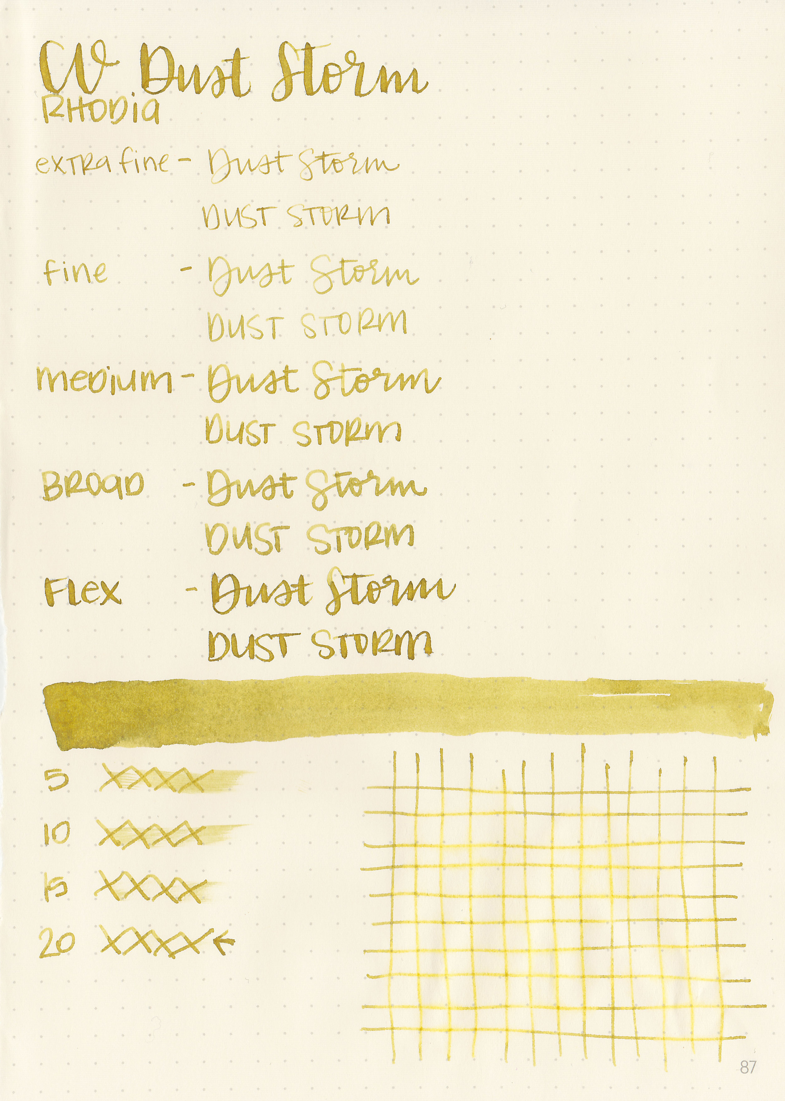
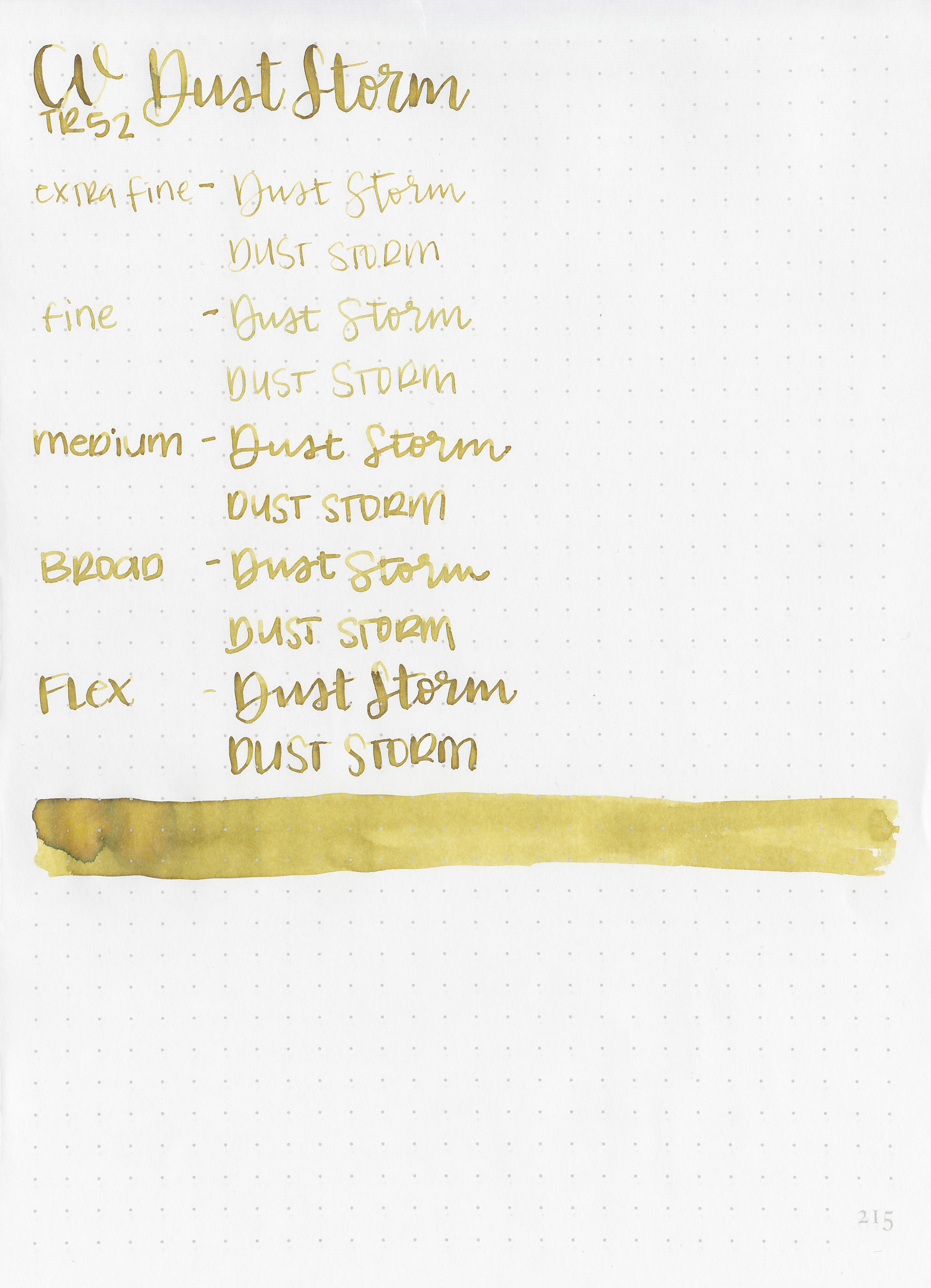
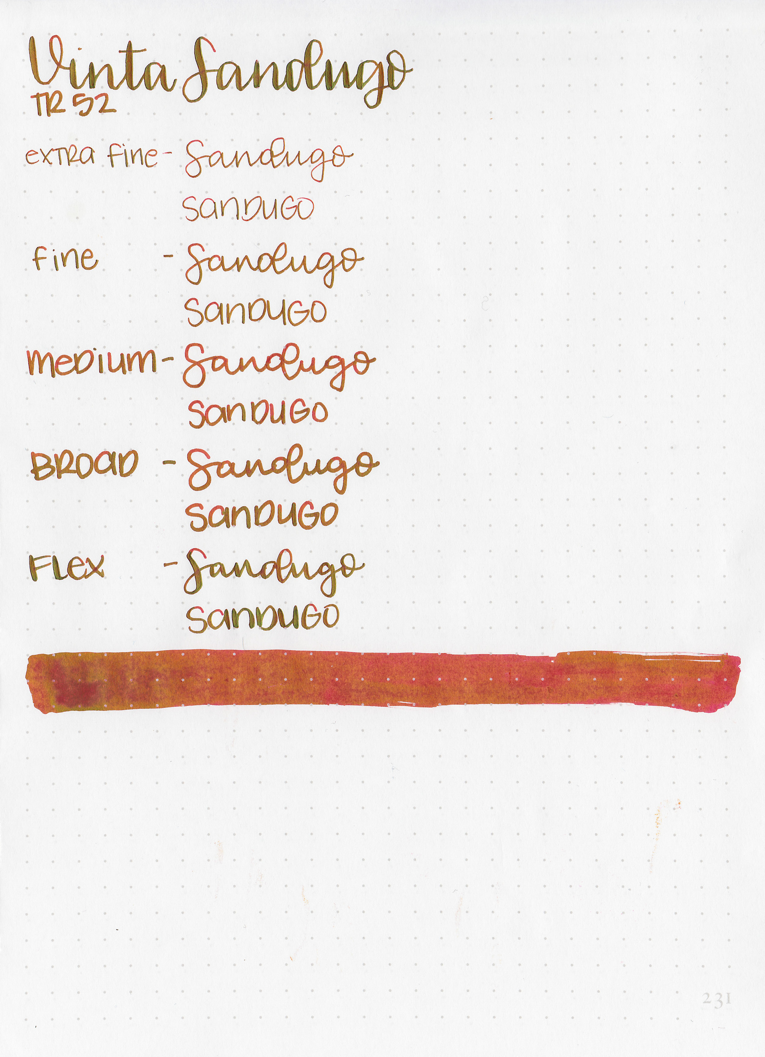
Sandugo is a medium red with lots of green sheen.
Swabs:

In large swabs on Tomoe River paper it’s easy to see the bright green sheen.

Writing samples:
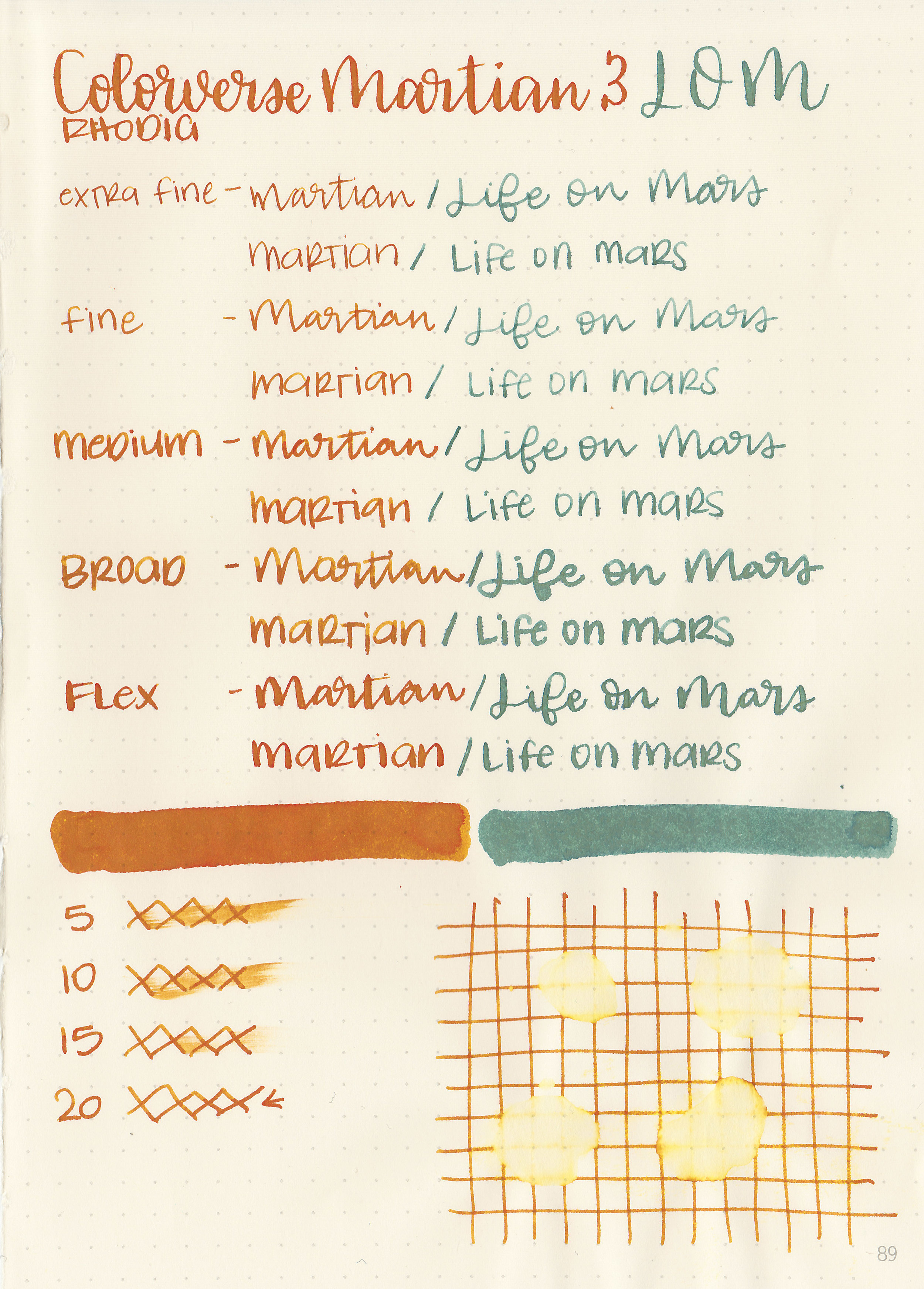
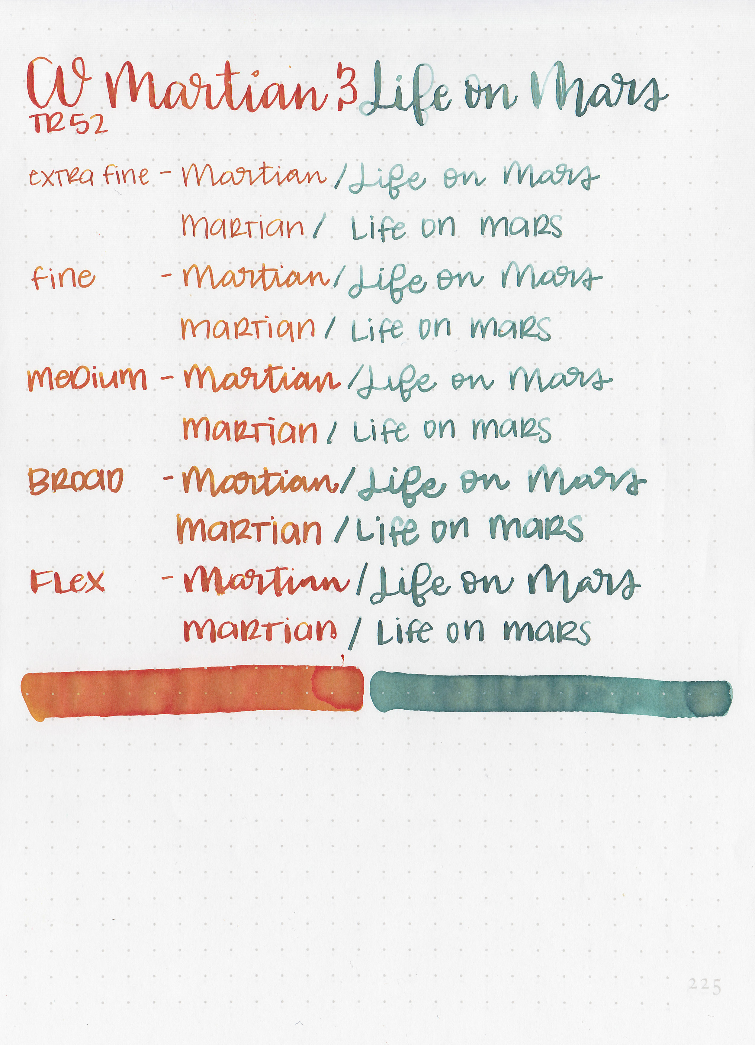
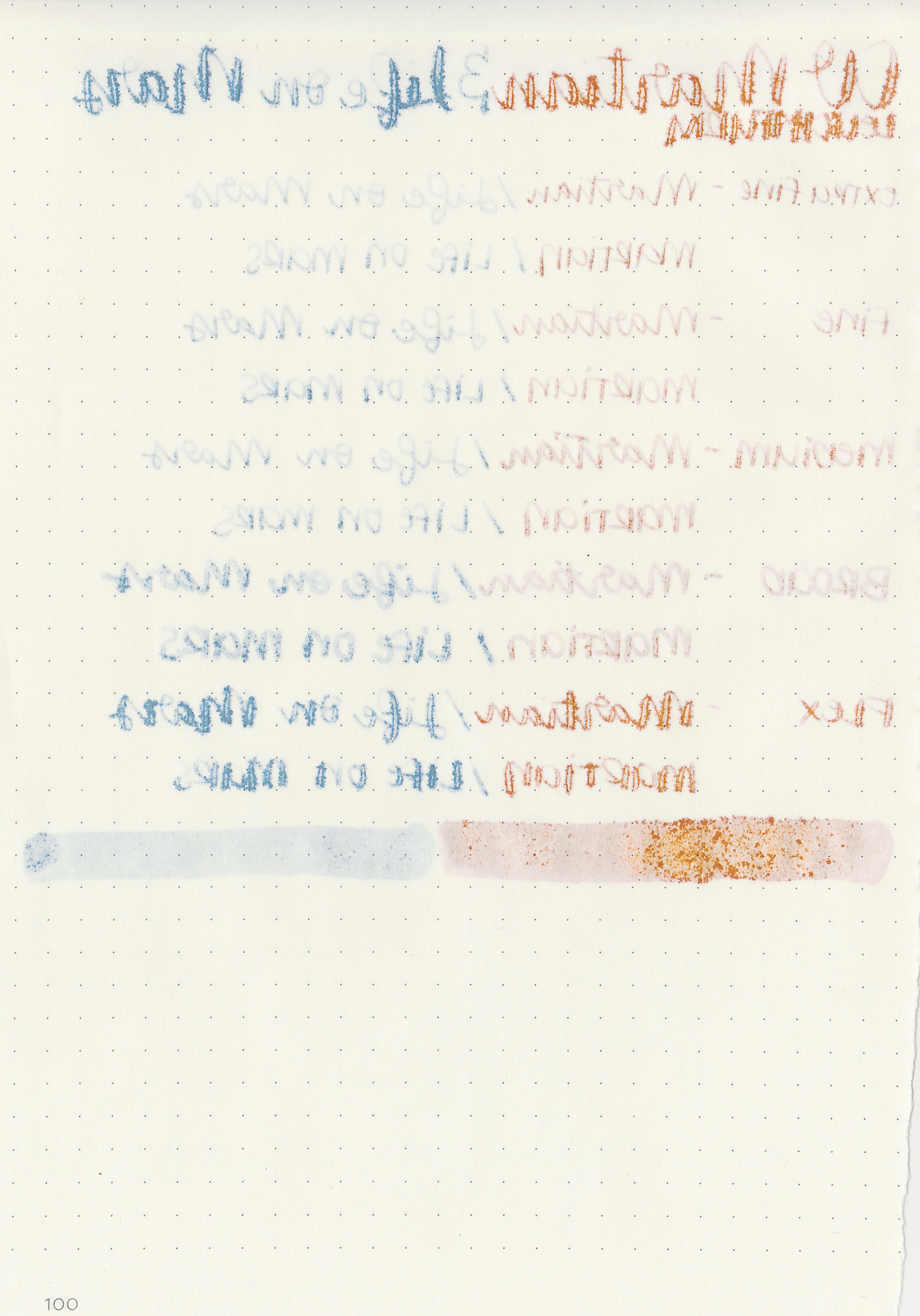
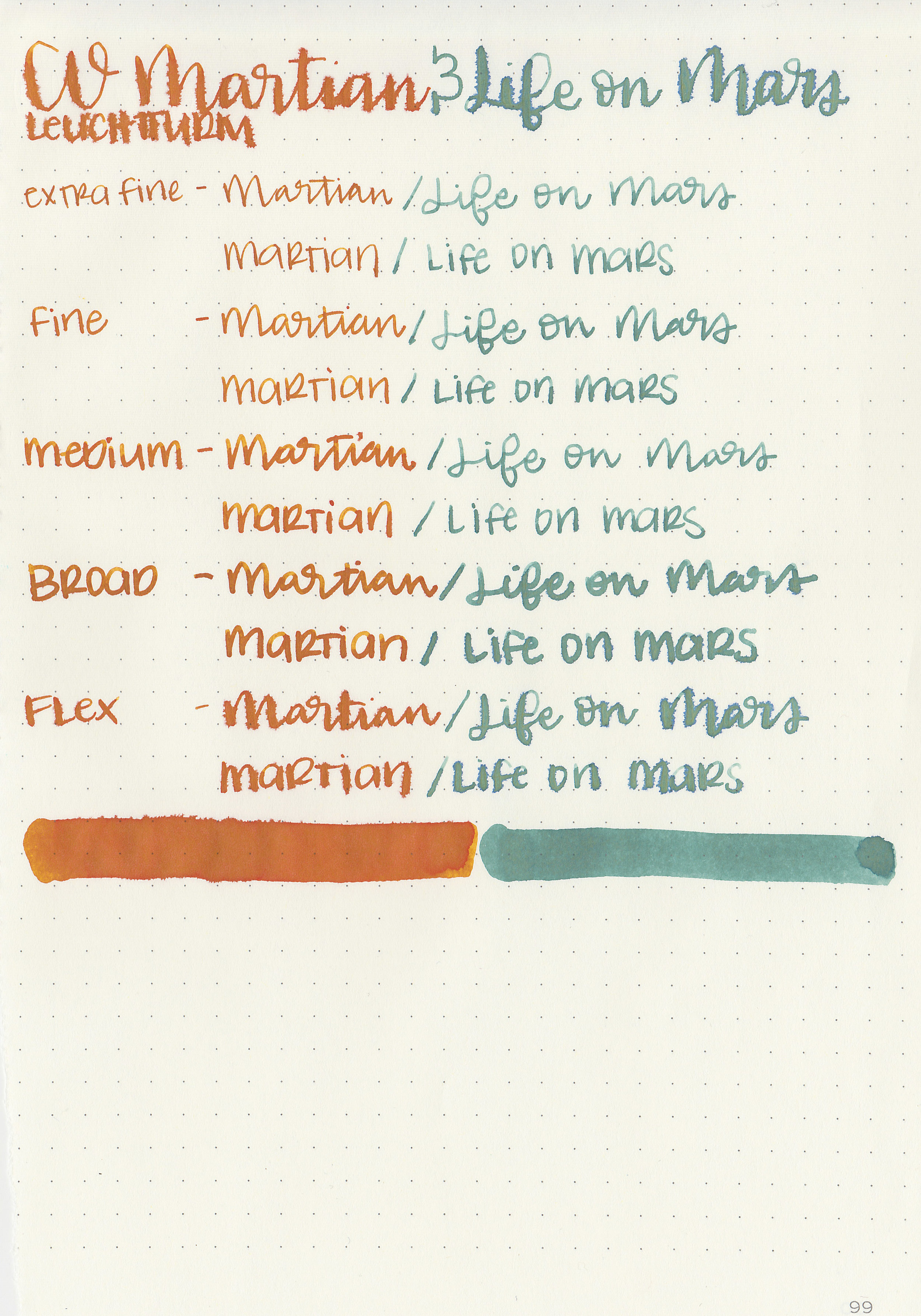
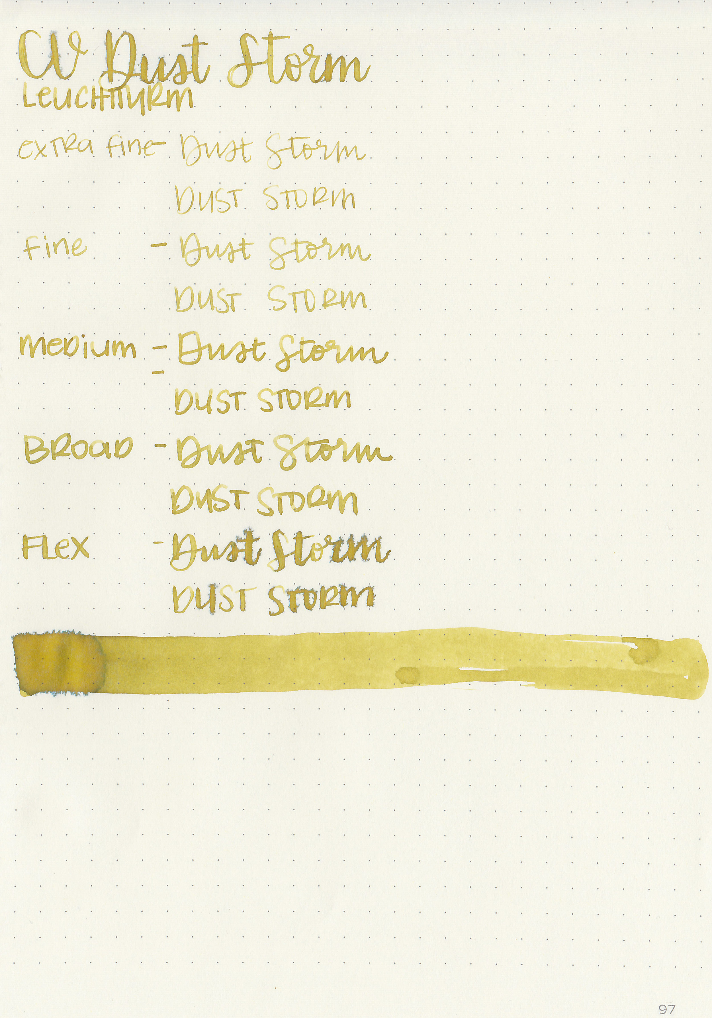
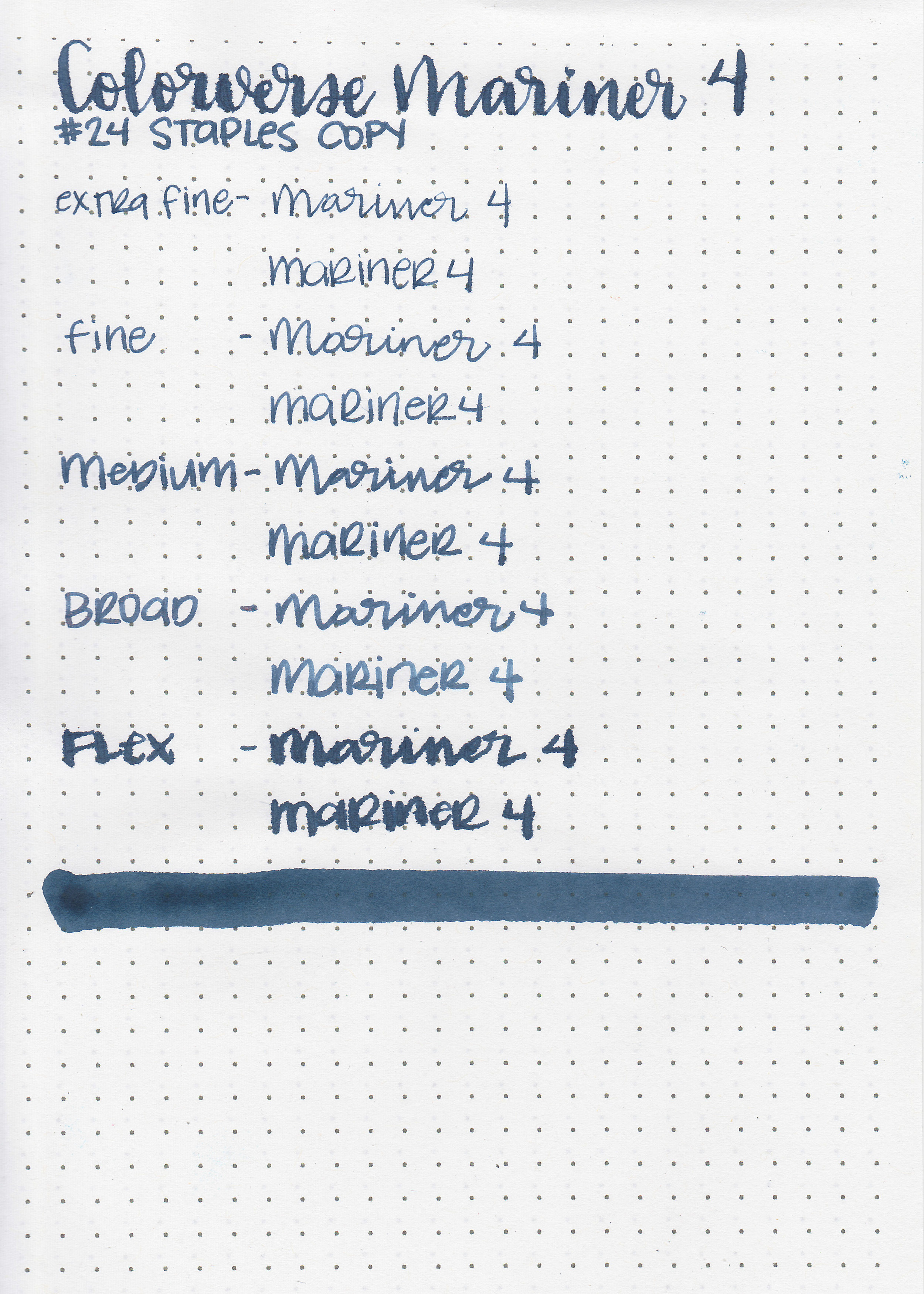
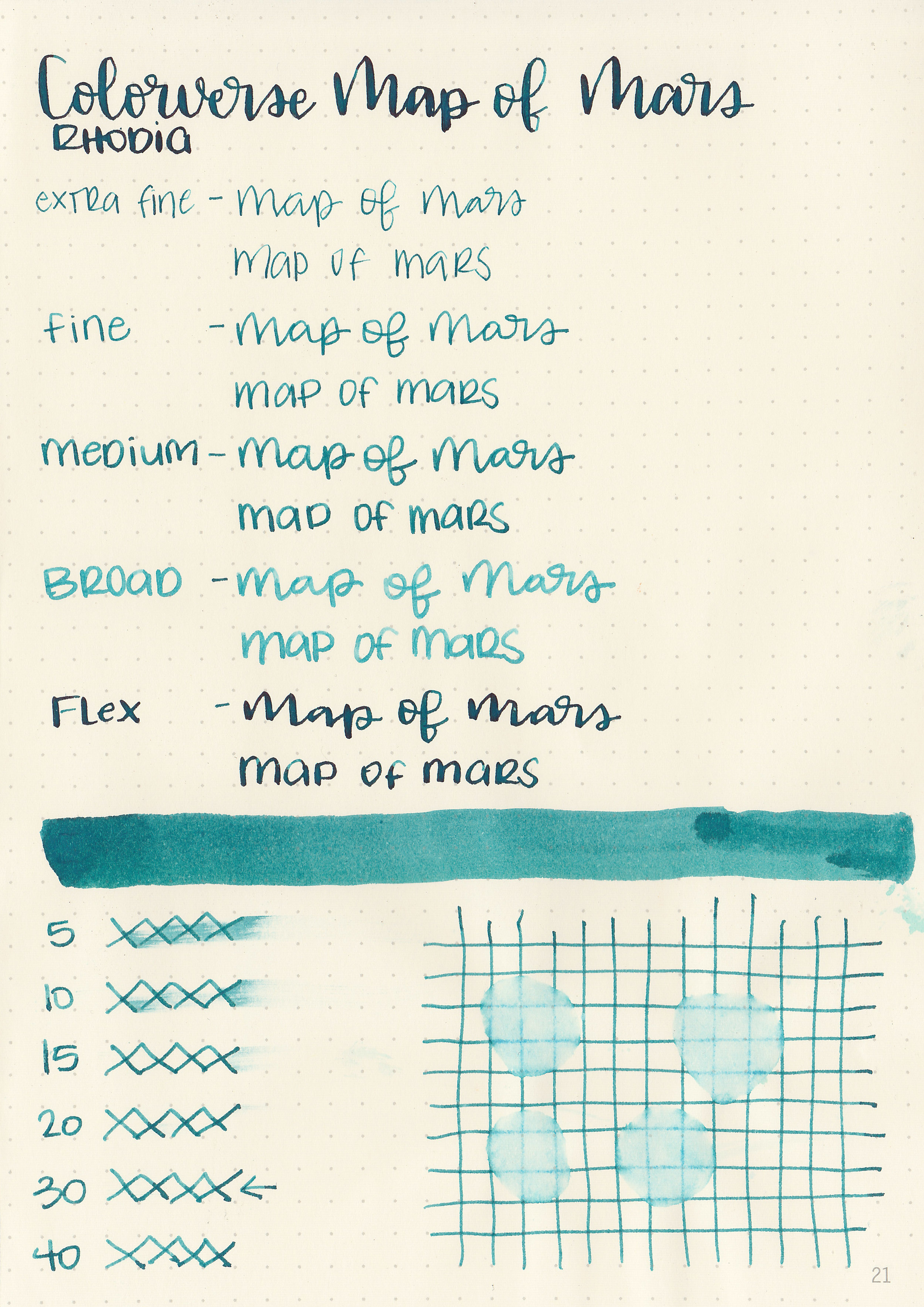
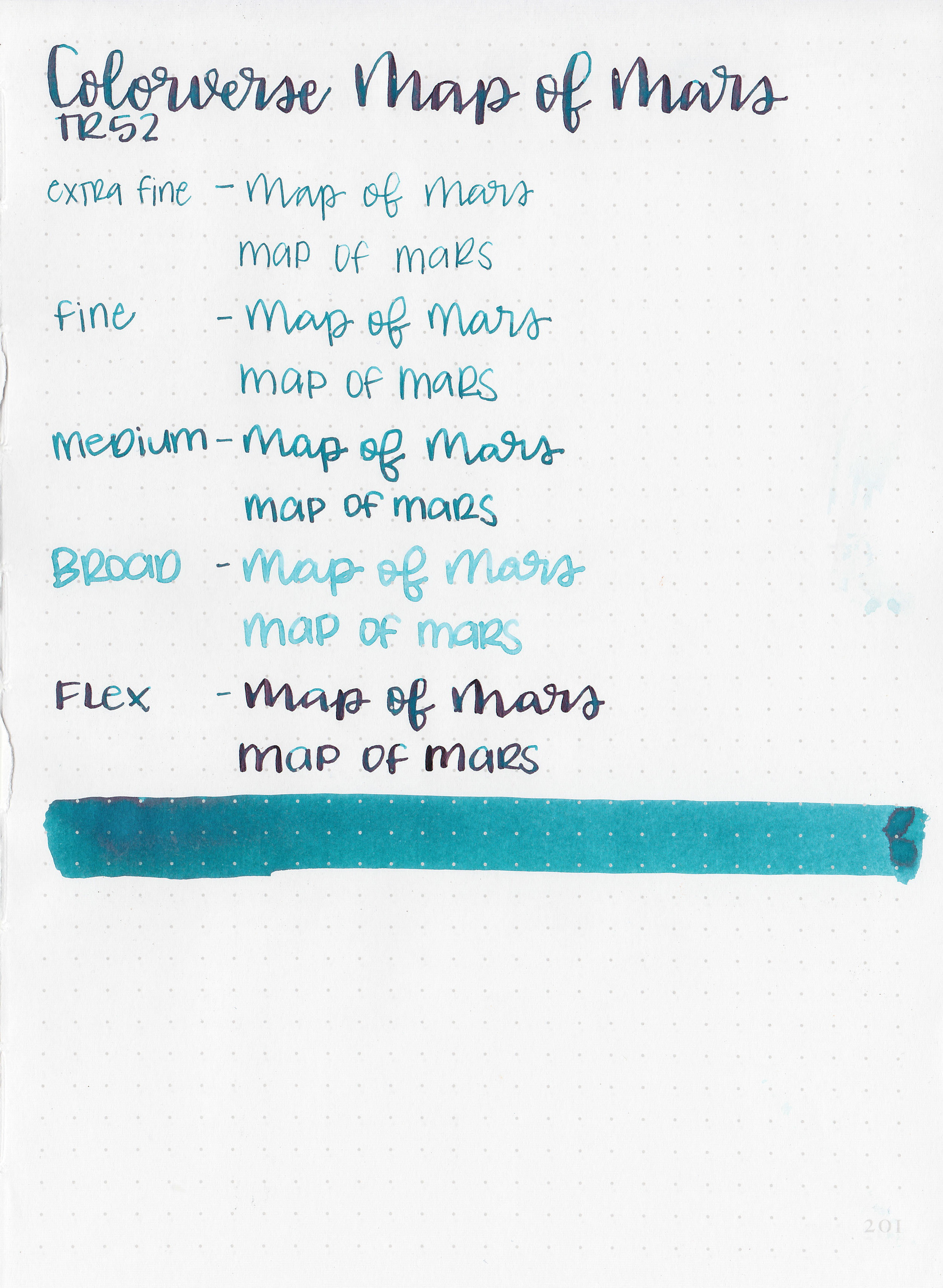
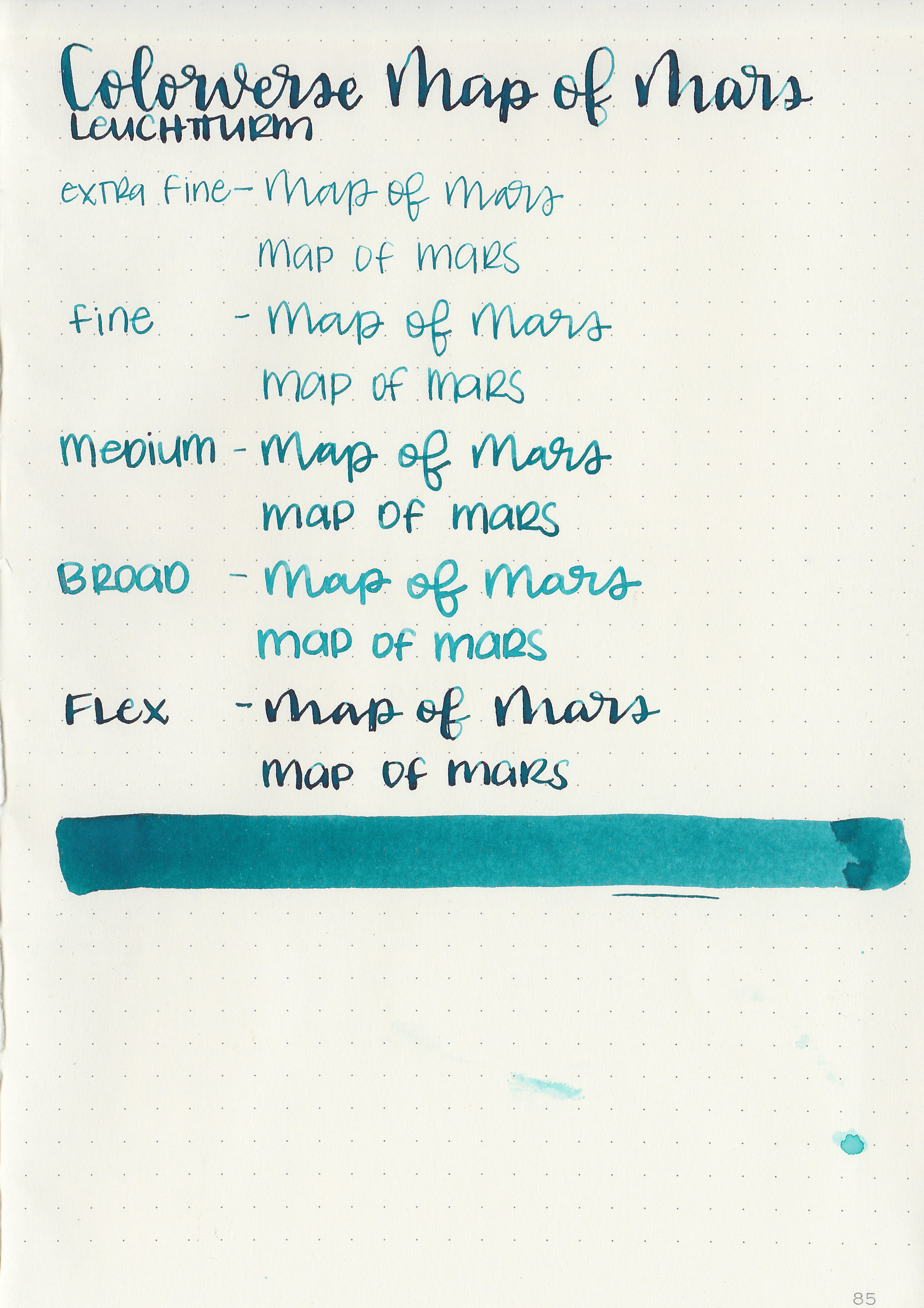
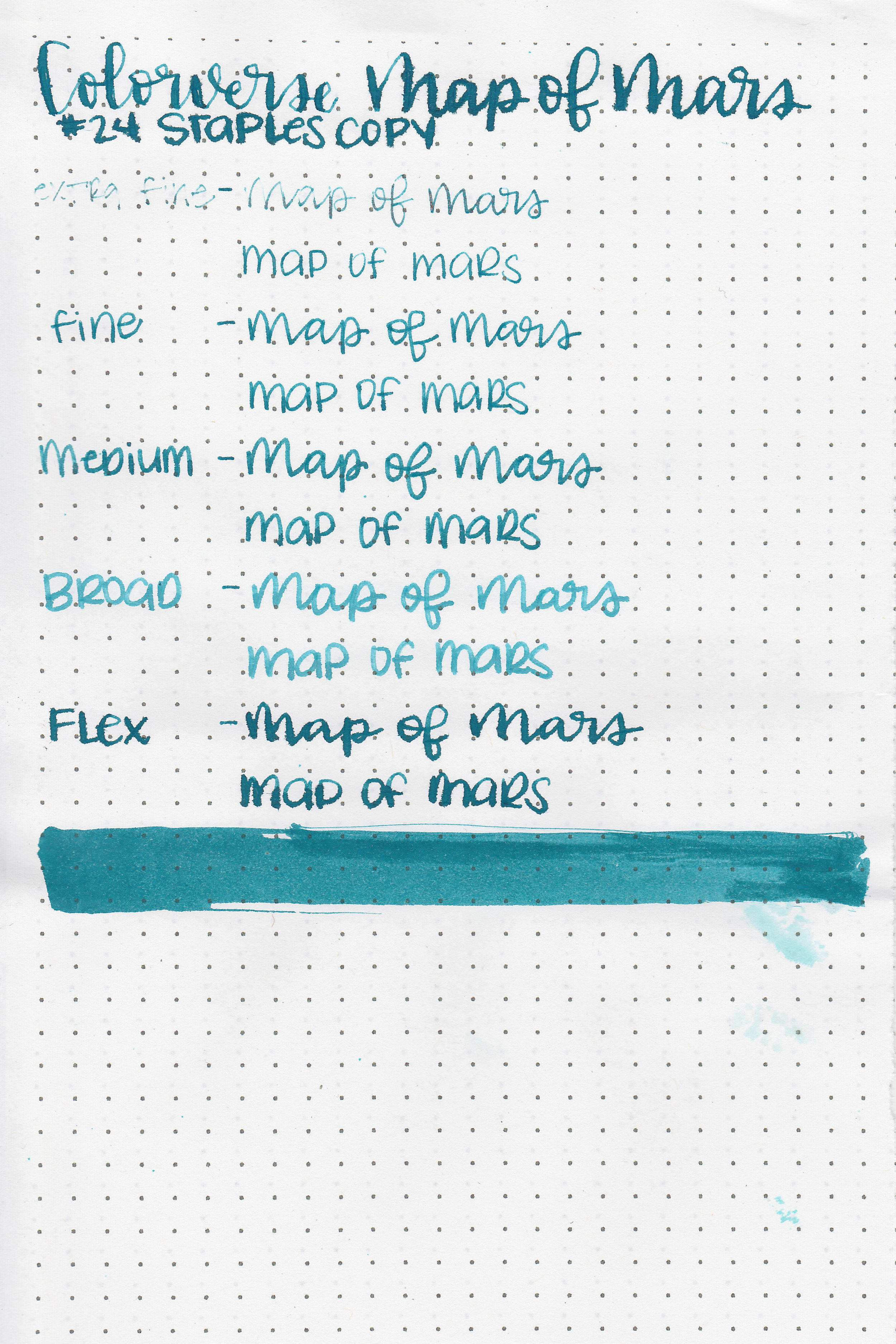
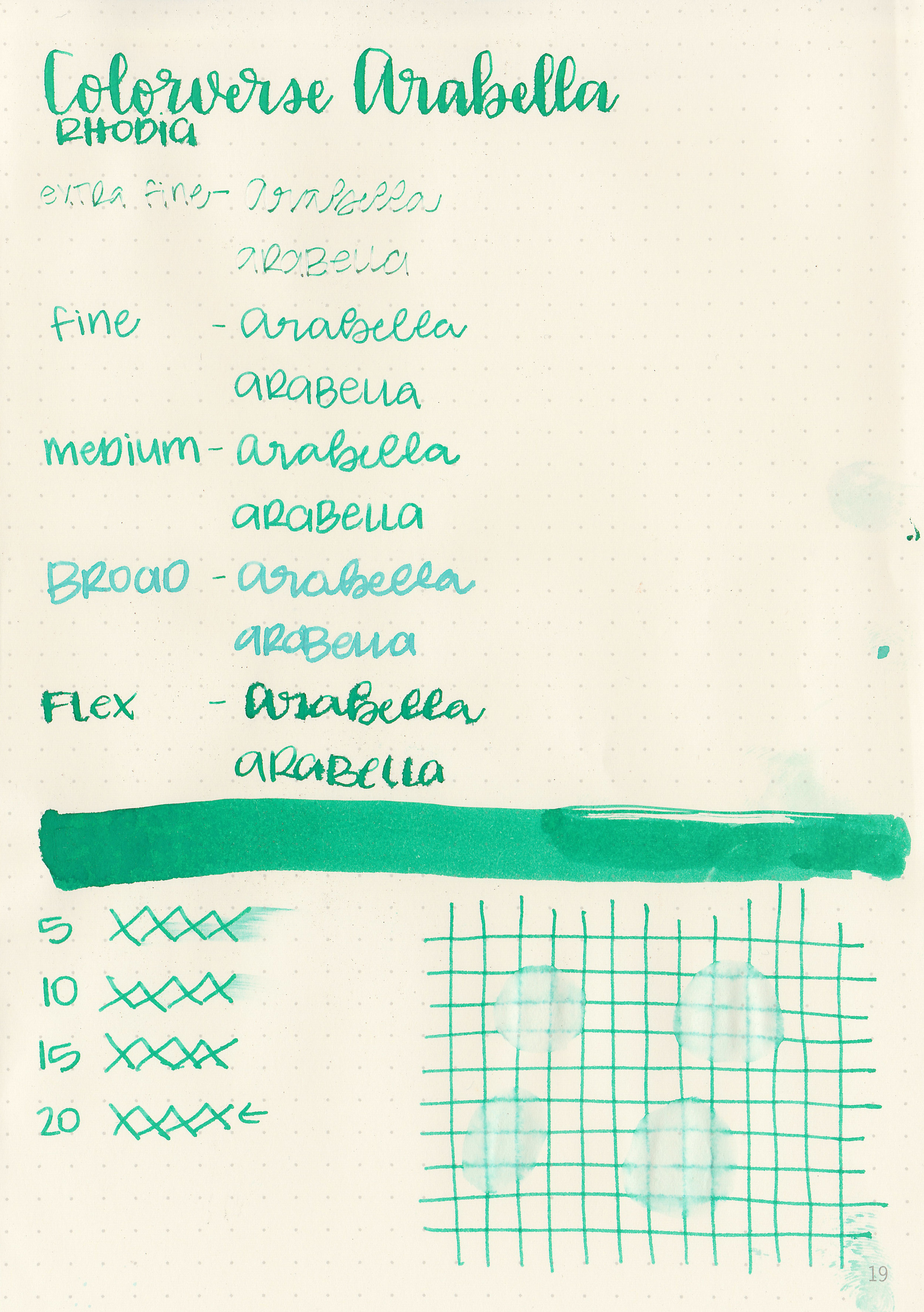
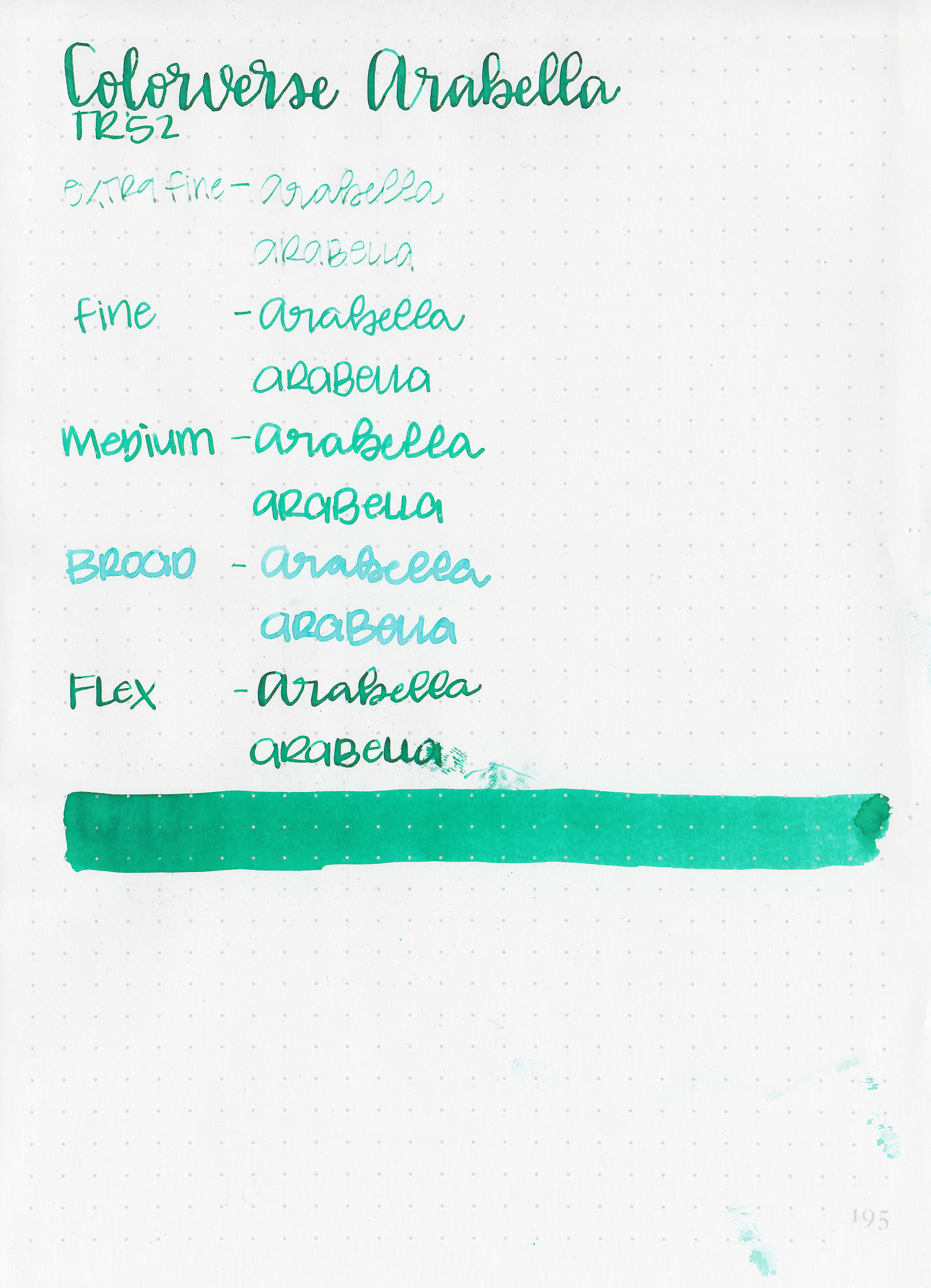
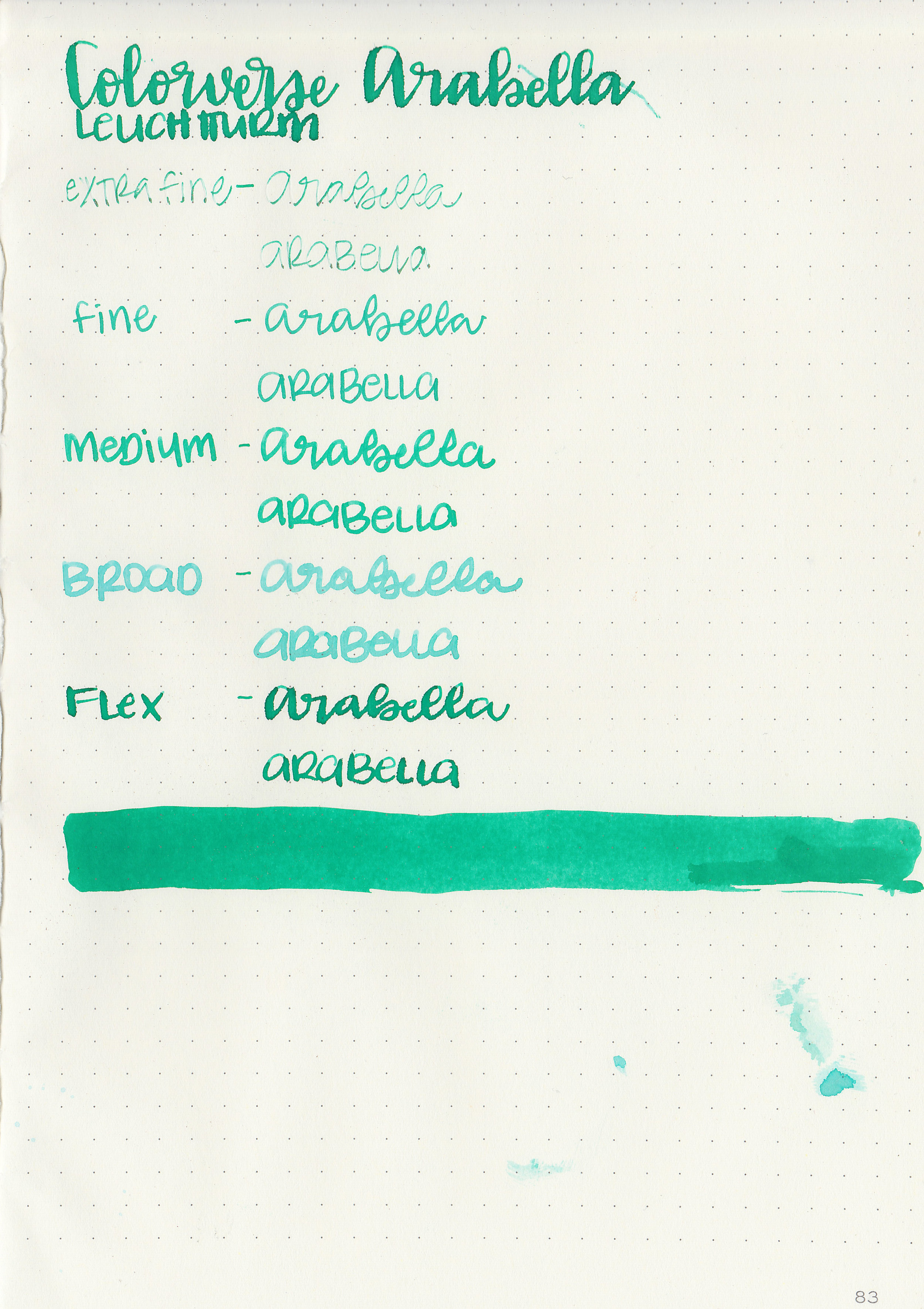
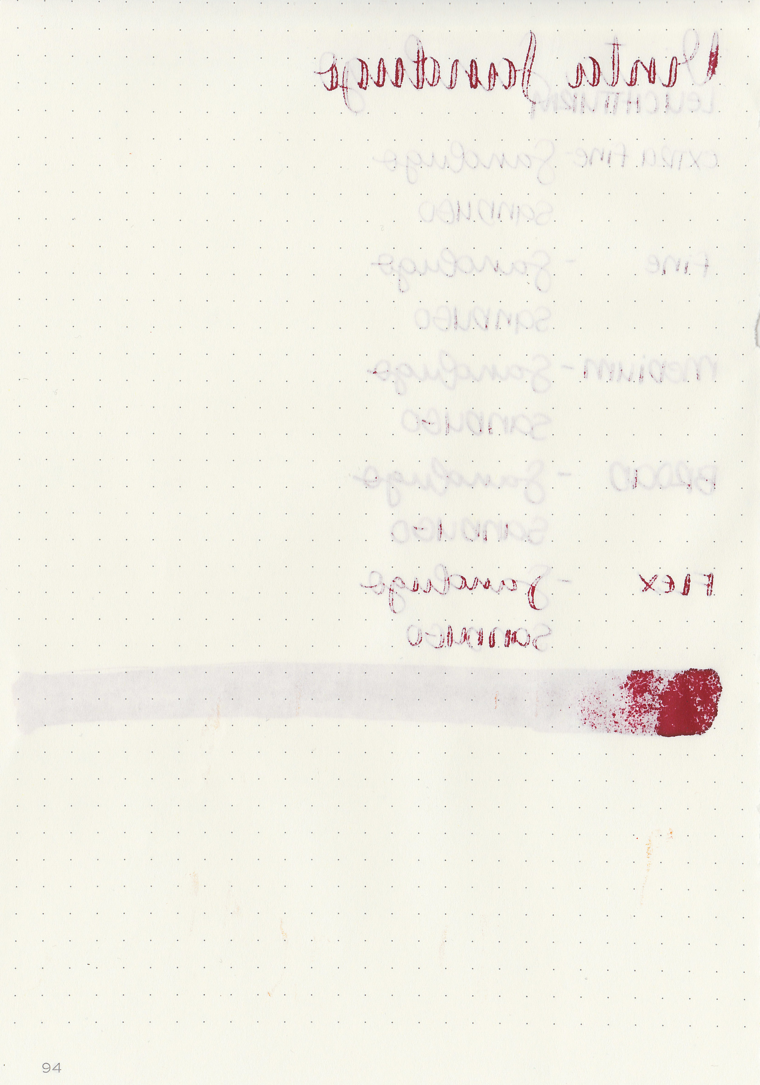
Let's take a look at how the ink behaves on fountain pen friendly papers: Rhodia, Tomoe River, and Leuchtturm.
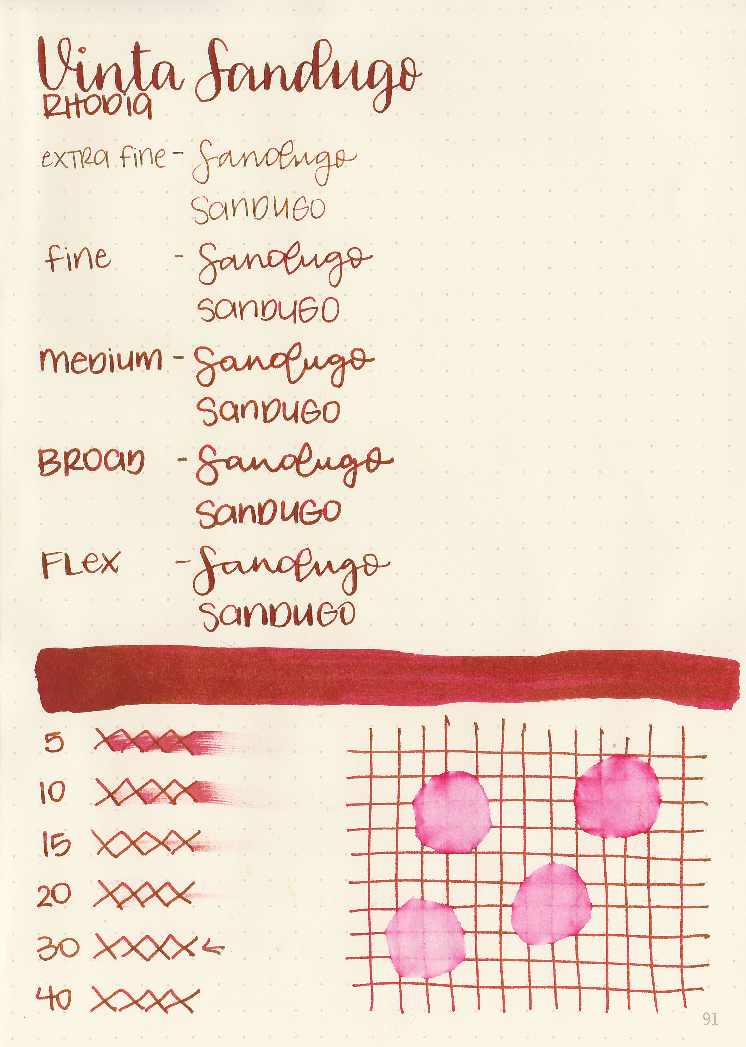
Dry time: 30 seconds
Water resistance: Low
Feathering: None
Show through: Medium
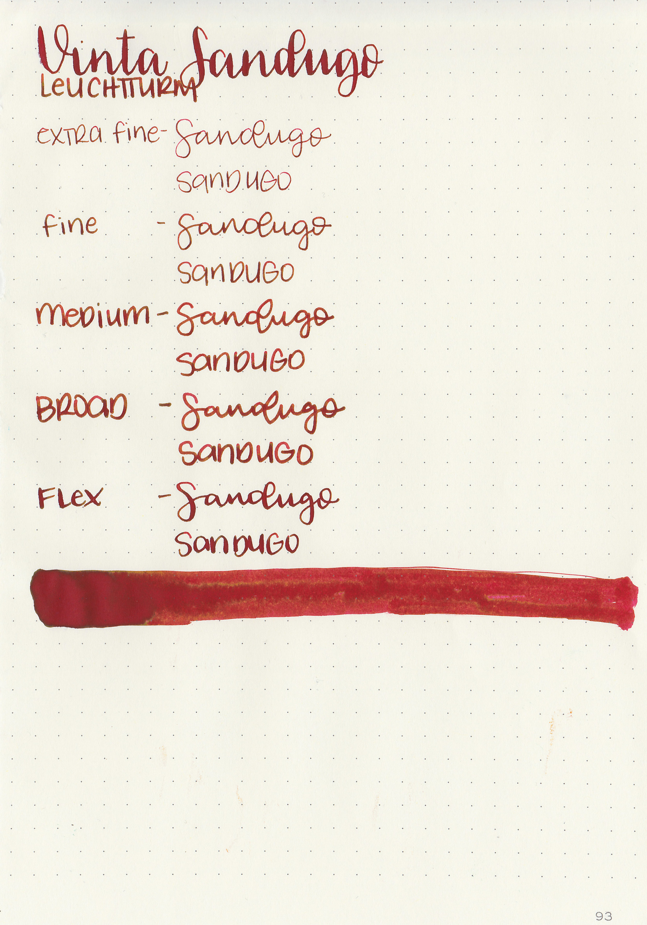
Bleeding: Low-there was some bleeding in the flex nib.
Other properties: low shading, high sheen, and no shimmer. There could be some more shading under there, but if so it’s hidden under all the green sheen. It’s almost a monster sheener, just a little bit short of the mark.
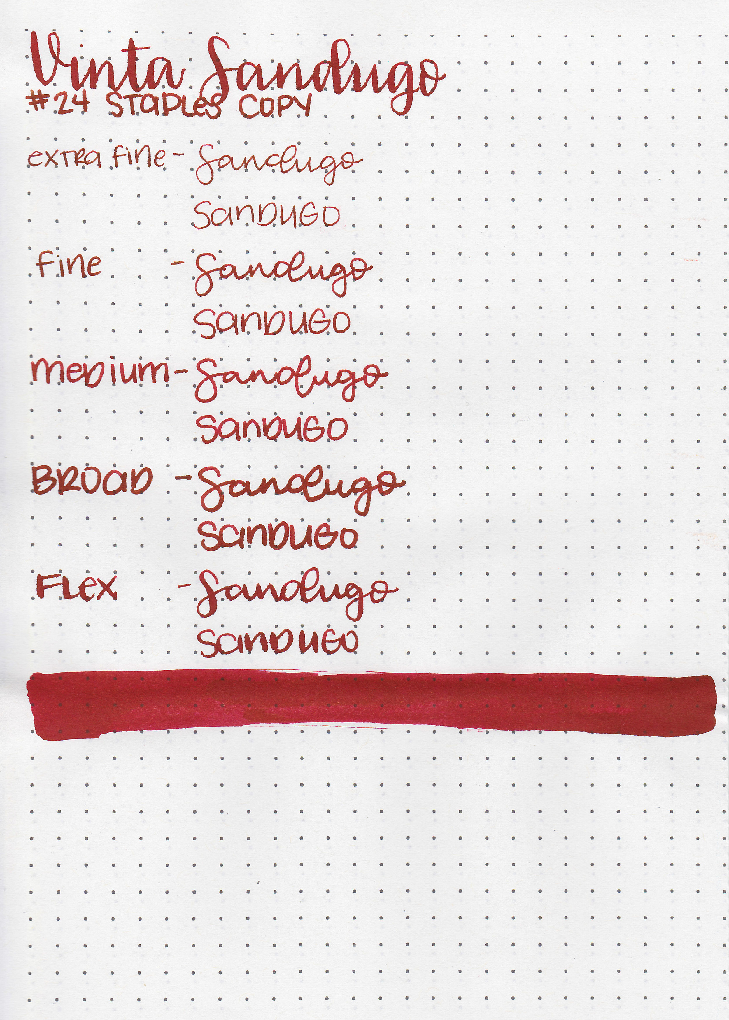
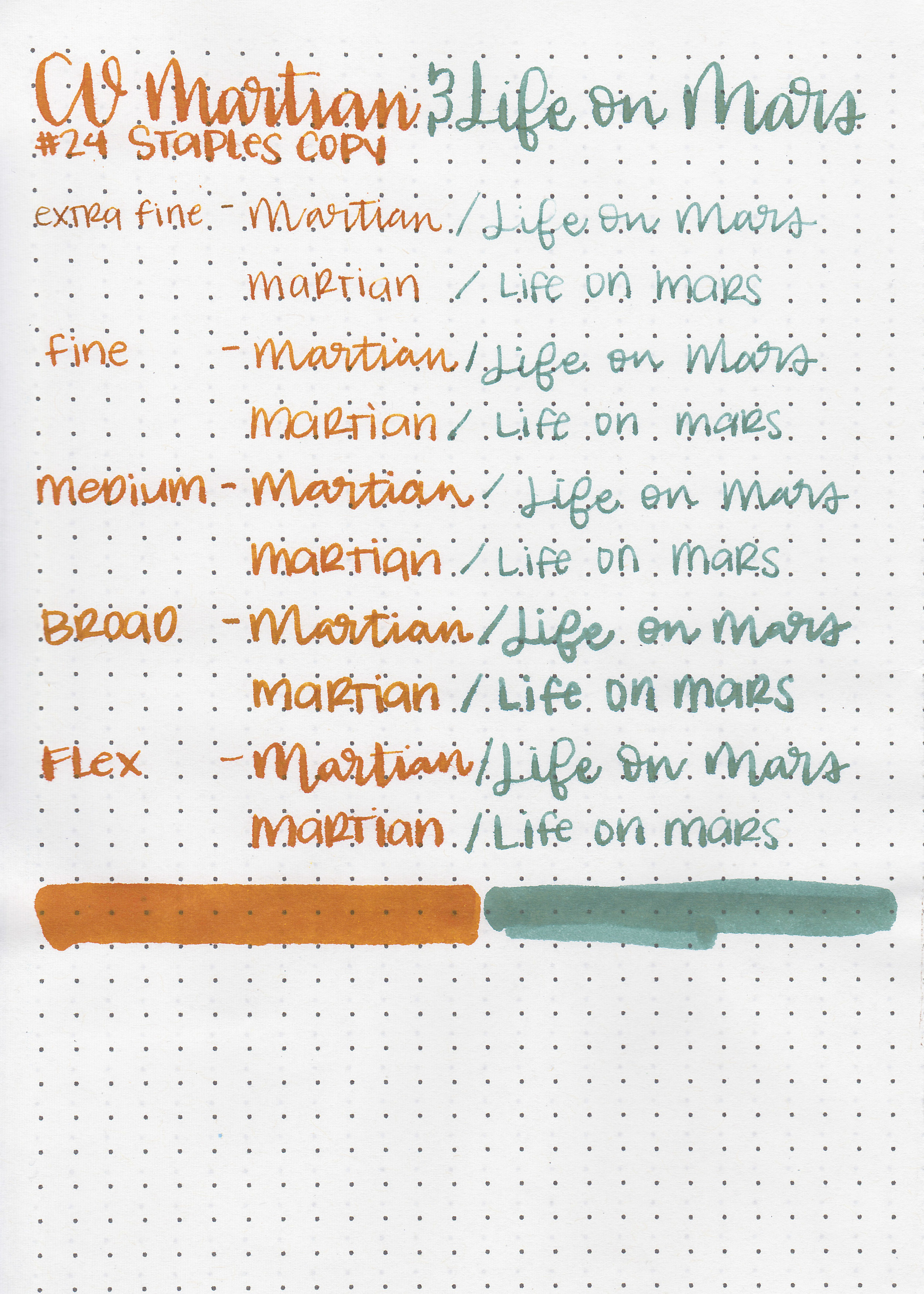
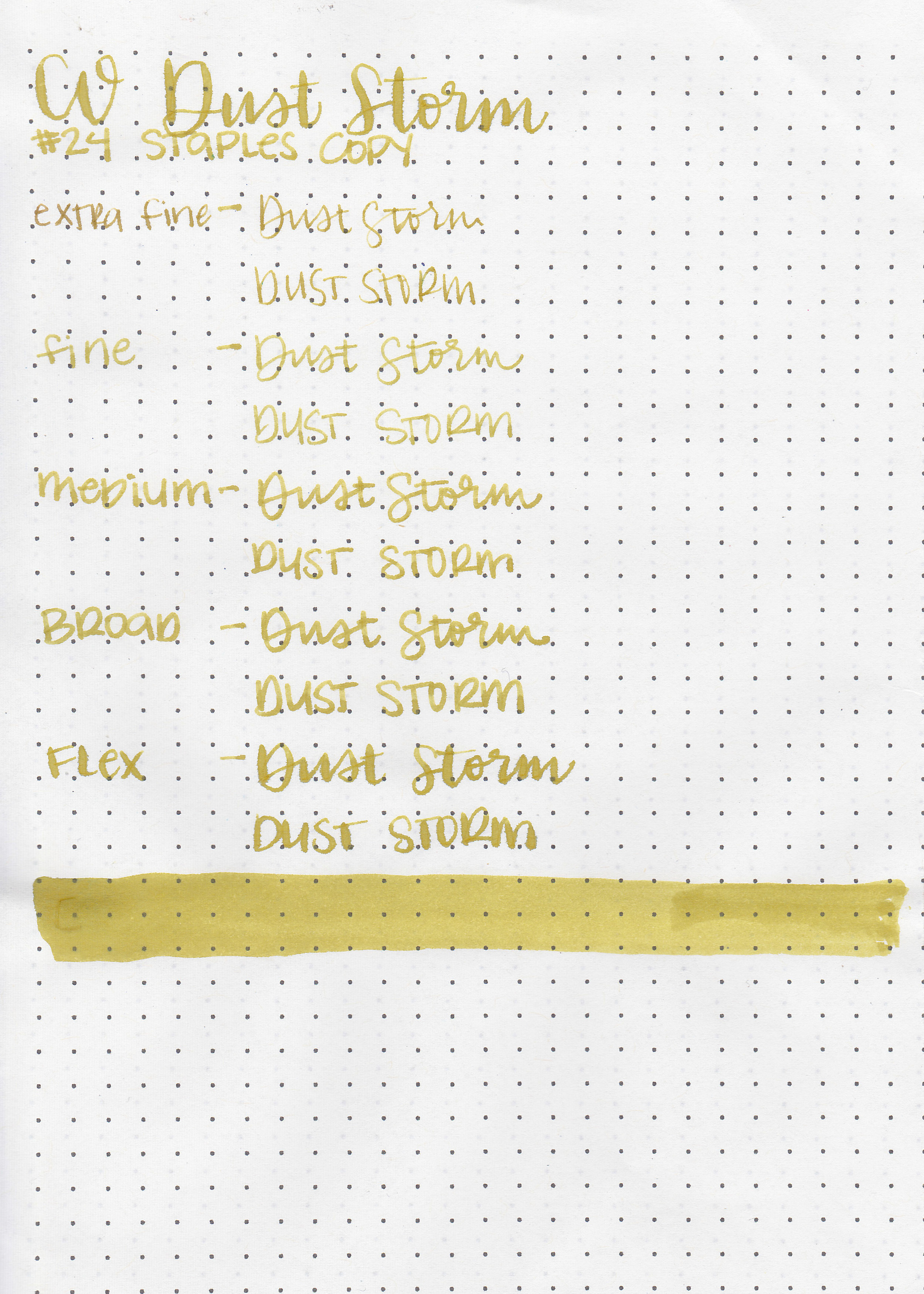
On Staples 24 lb copy paper the ink feathered in all nib sizes and had a little bit of bleeding.
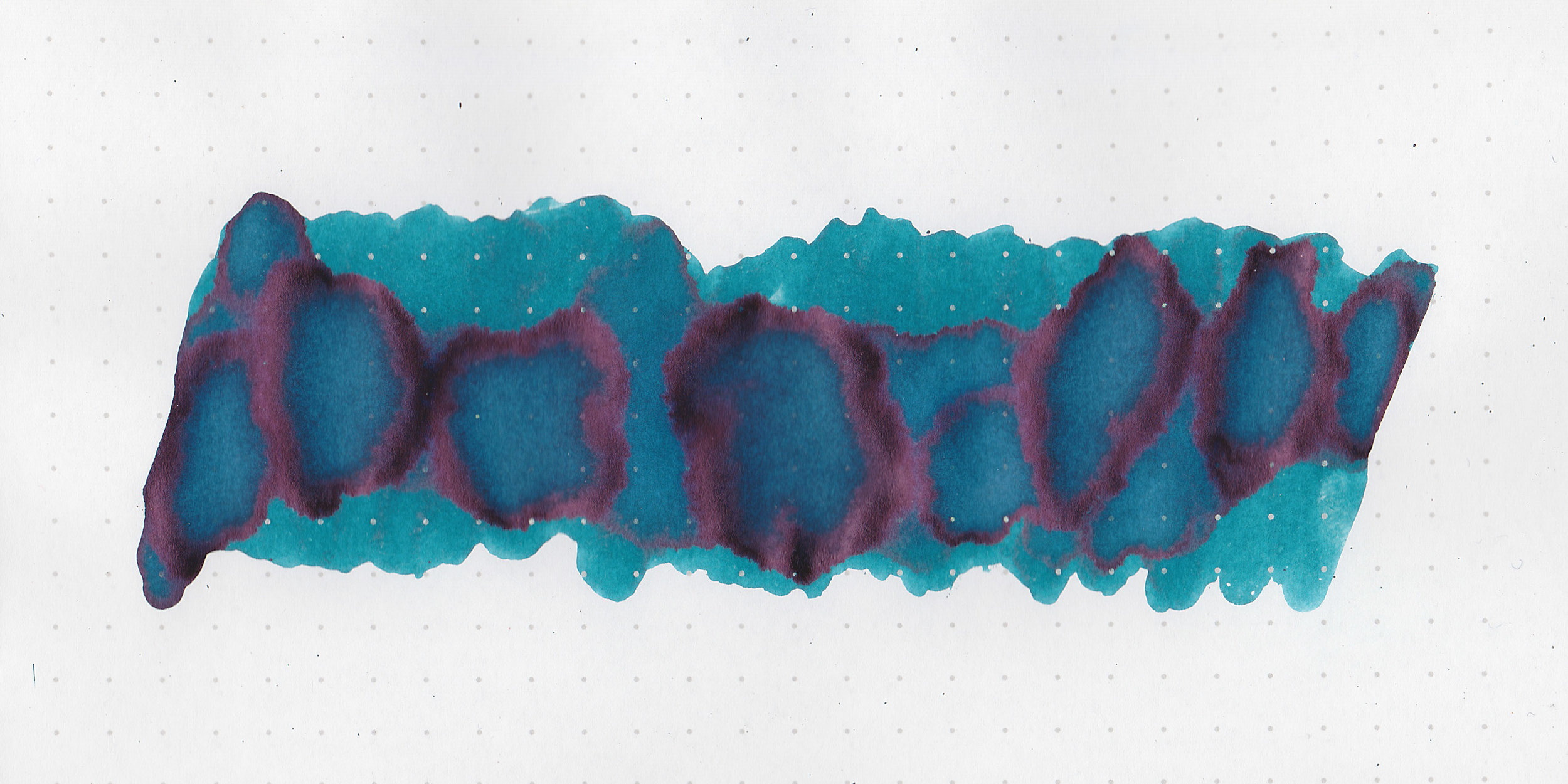
Comparison Swabs:

Sandugo is very similar to Rouge Hematite, the main difference is that Sandugo doesn’t have any shimmer. Other than that they are very close. Click here to see the Vinta inks together, and click here to see the red inks together.
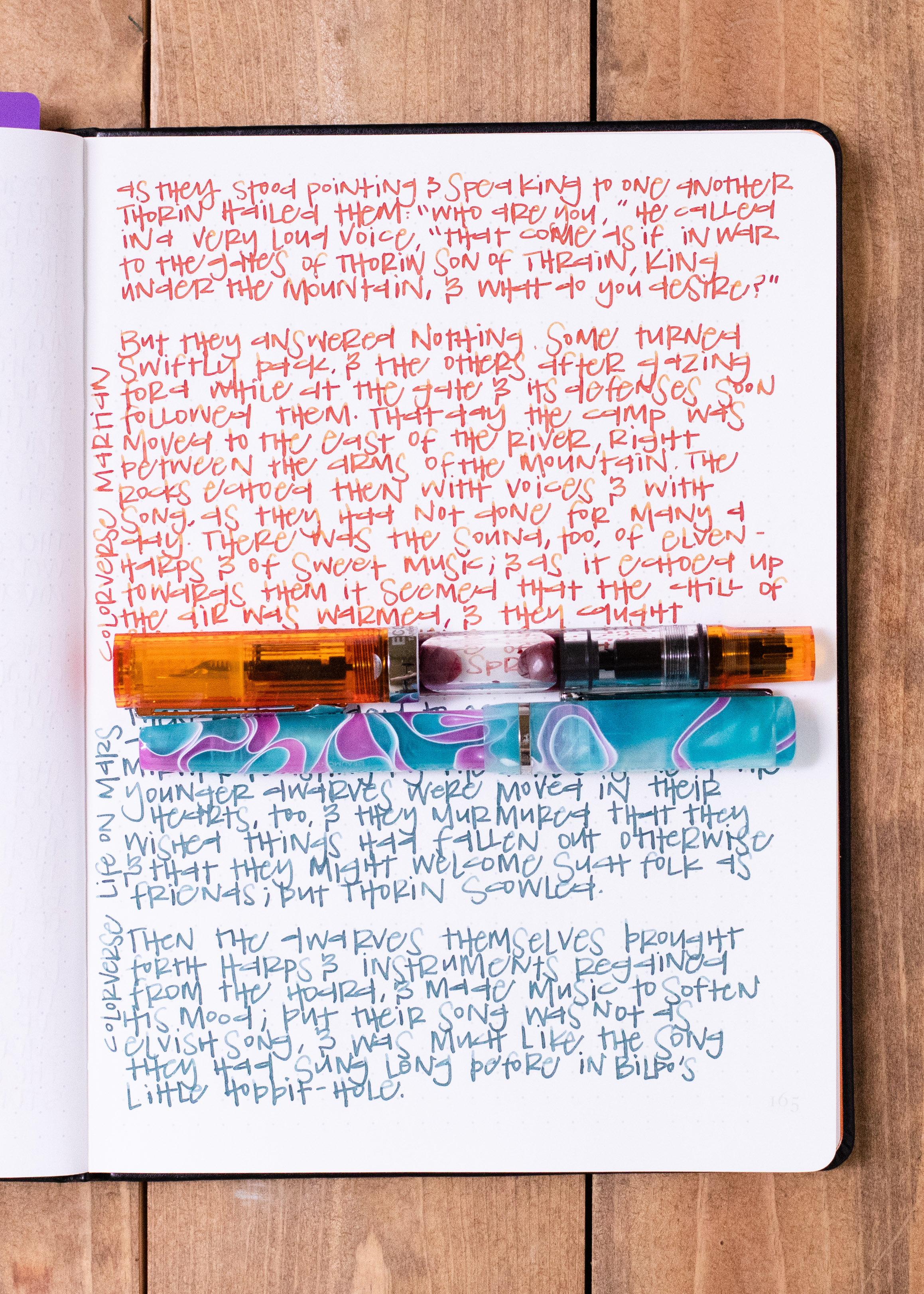
Longer Writing:

I used a TWSBI Eco Coral with a medium nib on Tomoe River paper. The ink had a wet, slightly sticky flow (this sticky quality is common in heavy sheening inks).
Overall, it’s a close match for J Herbin Rouge Hematite, so if you are looking for a non-shimmer version of that ink, this is the one for you. It does have the slightly sticky feeling flow that a lot of heavy sheening inks do. It doesn’t smear as much as the Organics Studio sheening inks, but does smear more than the Diamine sheening inks. This ink is very hard to clean out in pens. It took three rinses as well as two passes in the ultrasonic cleaner before my pens were free of red. While sheening inks are fun, I’m not a fan of the ones you can easily smear, so I would say my feelings are neutral on this ink-I don’t love it due to the smearing, but I don’t hate it either.
Disclaimer: A sample of this ink was provided by Vanness Pens for the purpose of this review. All photos and opinions are my own. This page does not contain affiliate links, and this post is not sponsored in any way.