Ink Review #832: Vinta Cosmic Blue Kosmos 1955
/
Today’s ink is Vinta Cosmic Blue Kosmos 1955. According to Vinta’s website, “In 1865 the Jesuit Padre Faura started the Observatario Meterorologico de Manila to study Philippine and predict the passing of typhoons. This beautiful shimmering ink evokes the image of stars glimmering amidst the backdrop of the Philippine sky.” Thanks to Vanness Pens for sending a sample over for review.

The color:
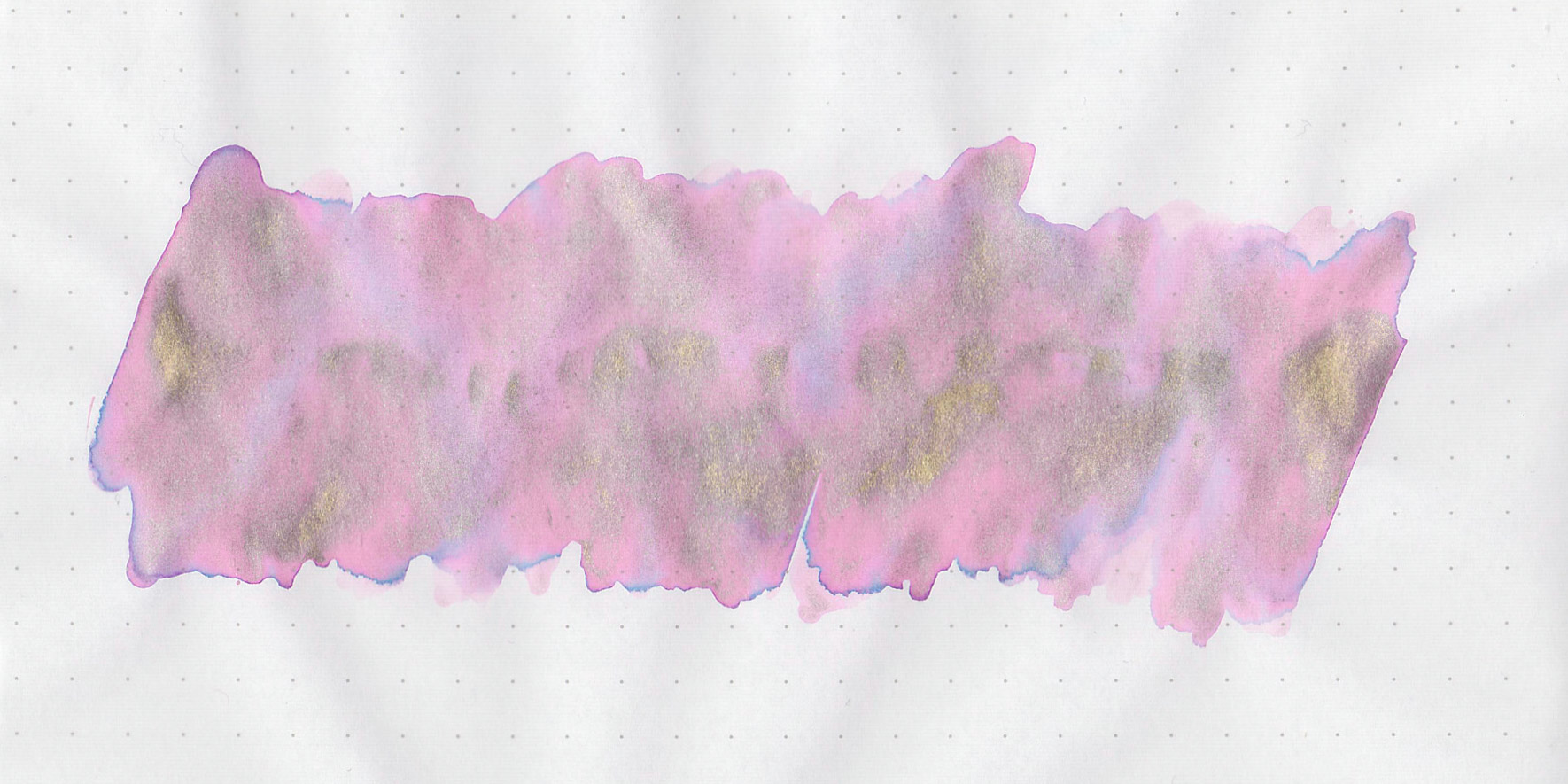
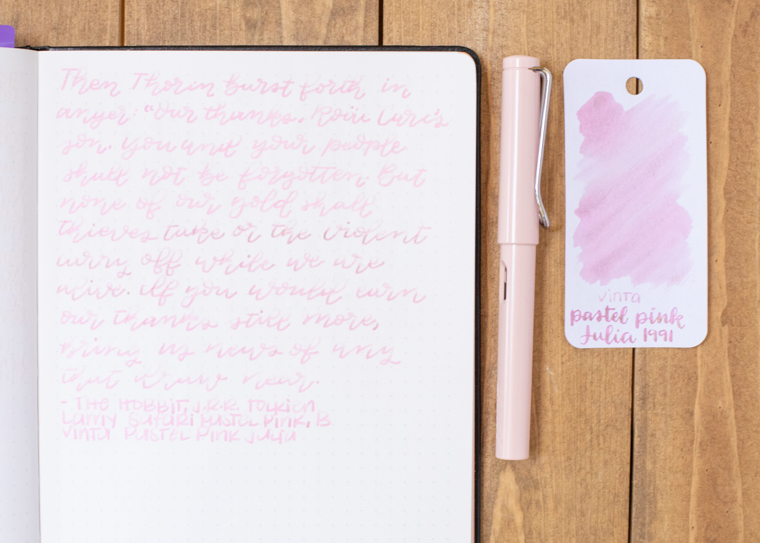
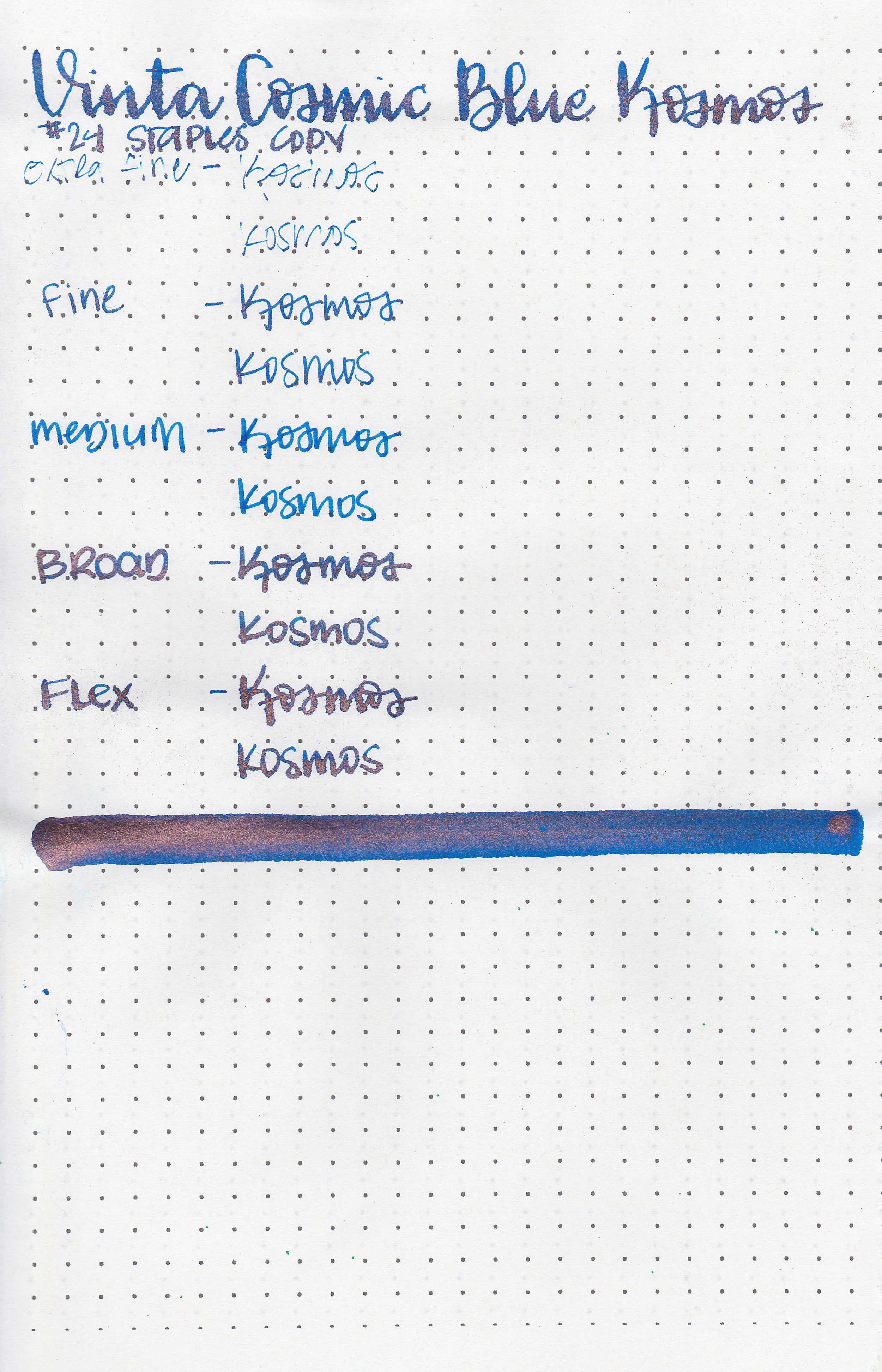
Kosmos is a pretty medium blue with pink sheen and copper shimmer.
Swabs:
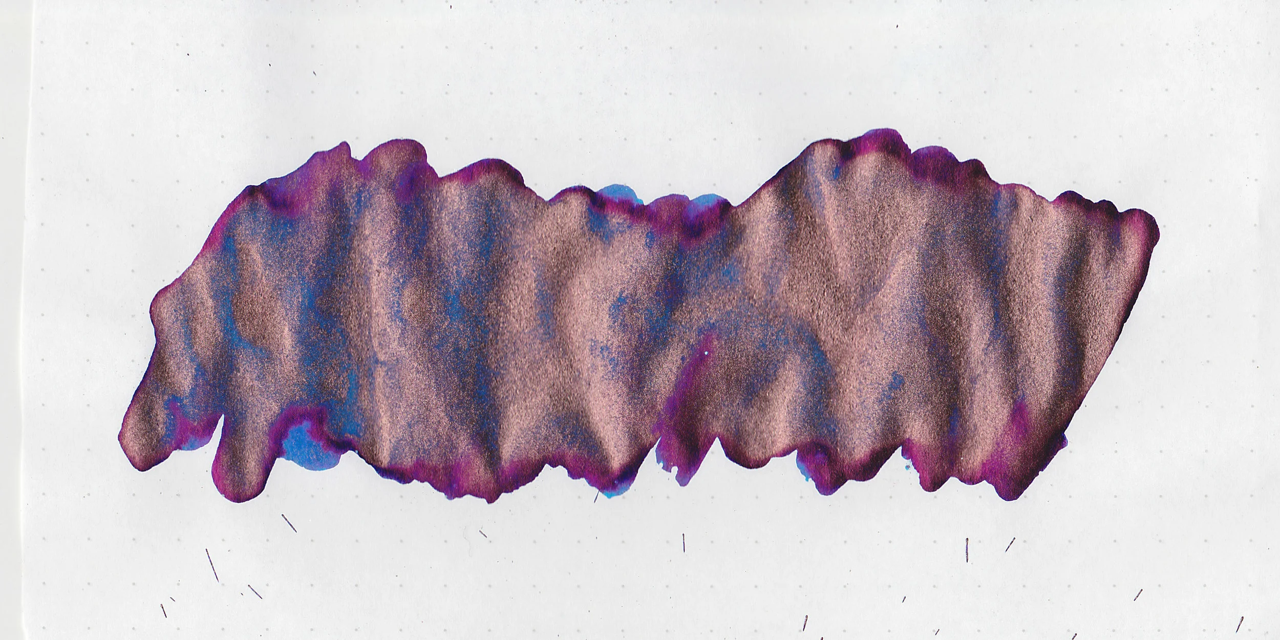
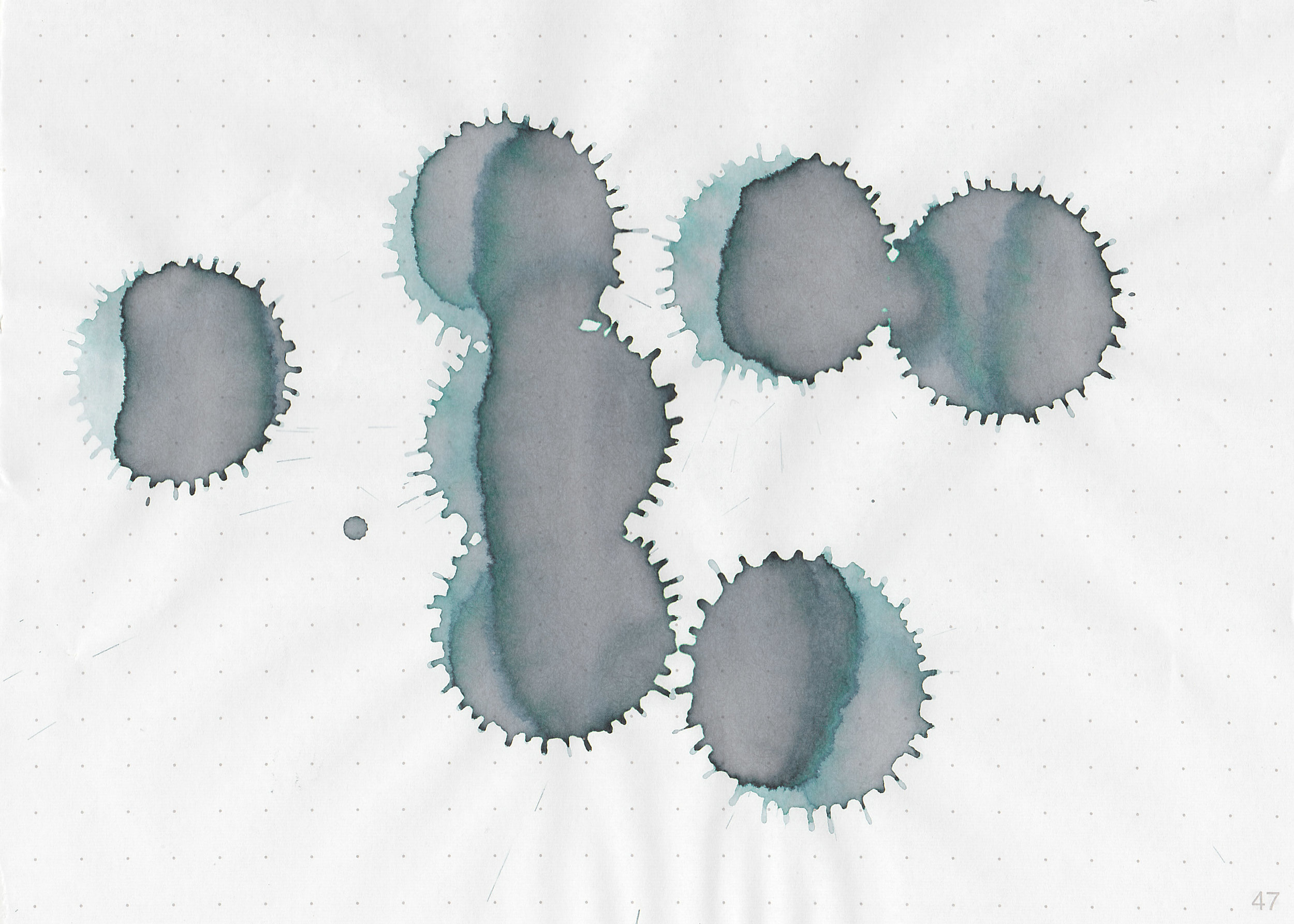
In large swabs on Tomoe River paper the ink looks so pretty-all sheen and shimmer.

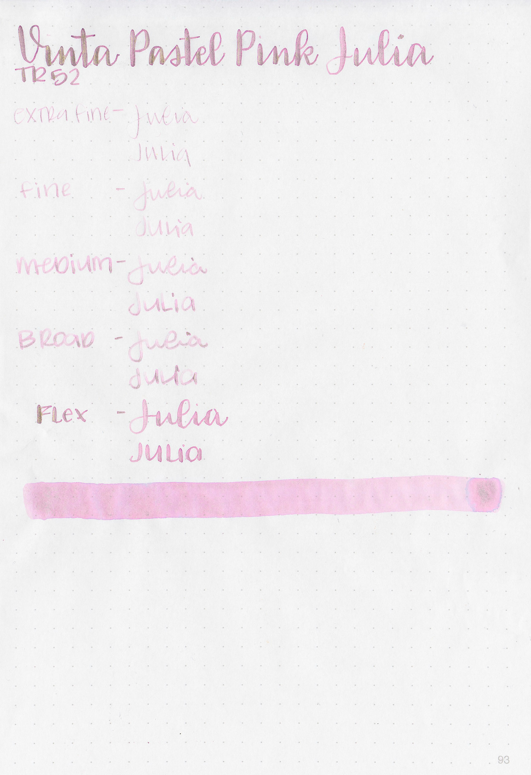
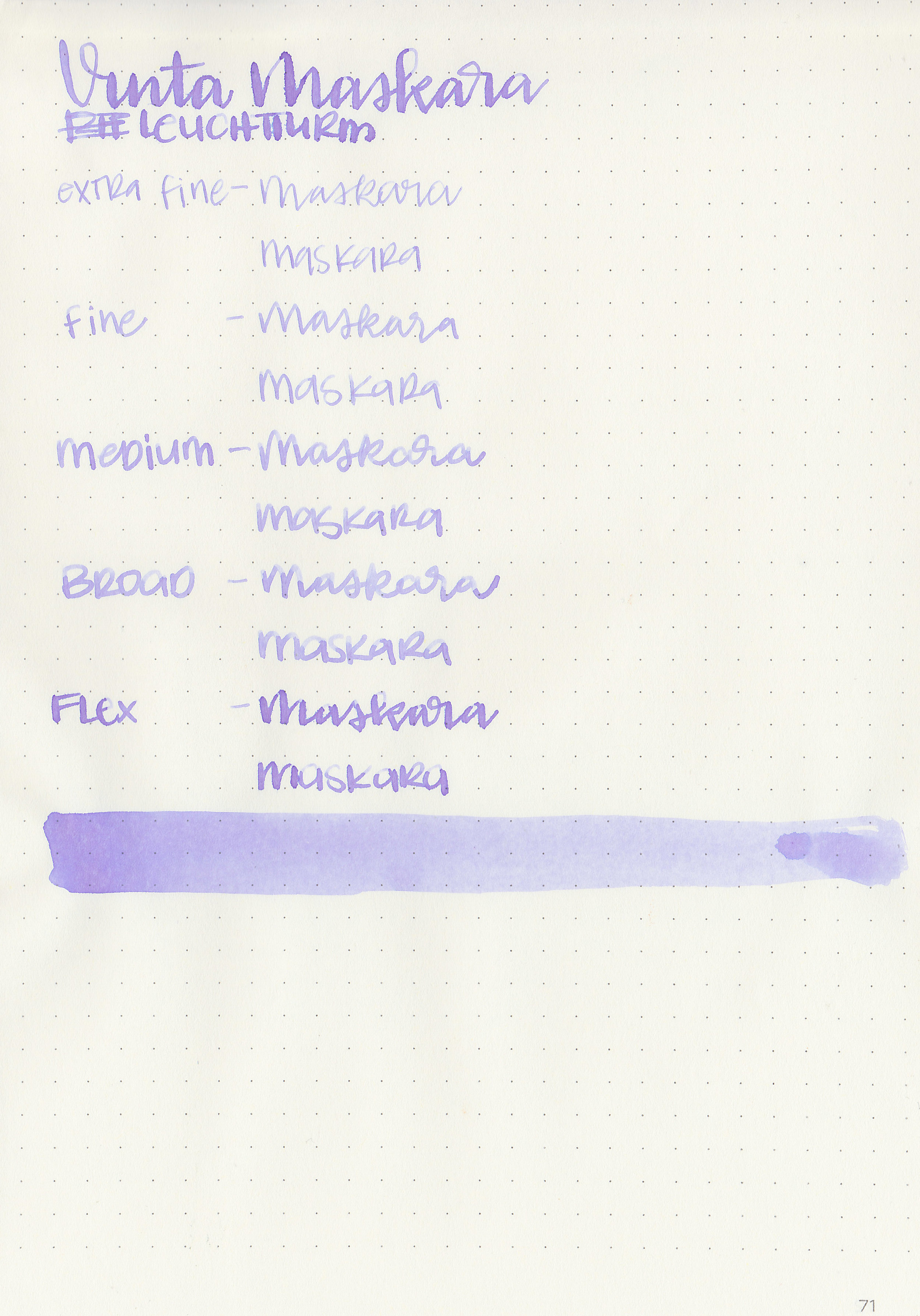
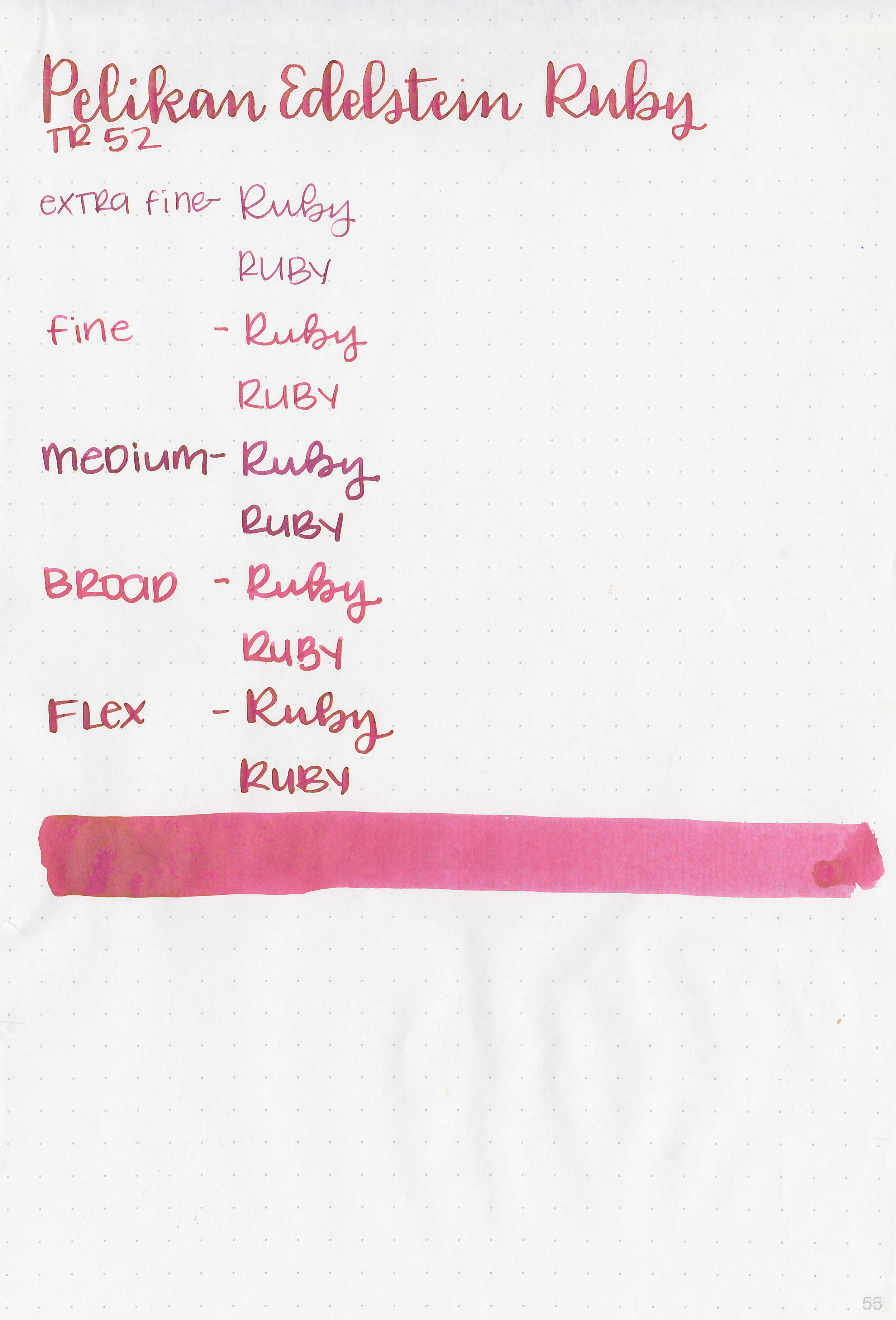
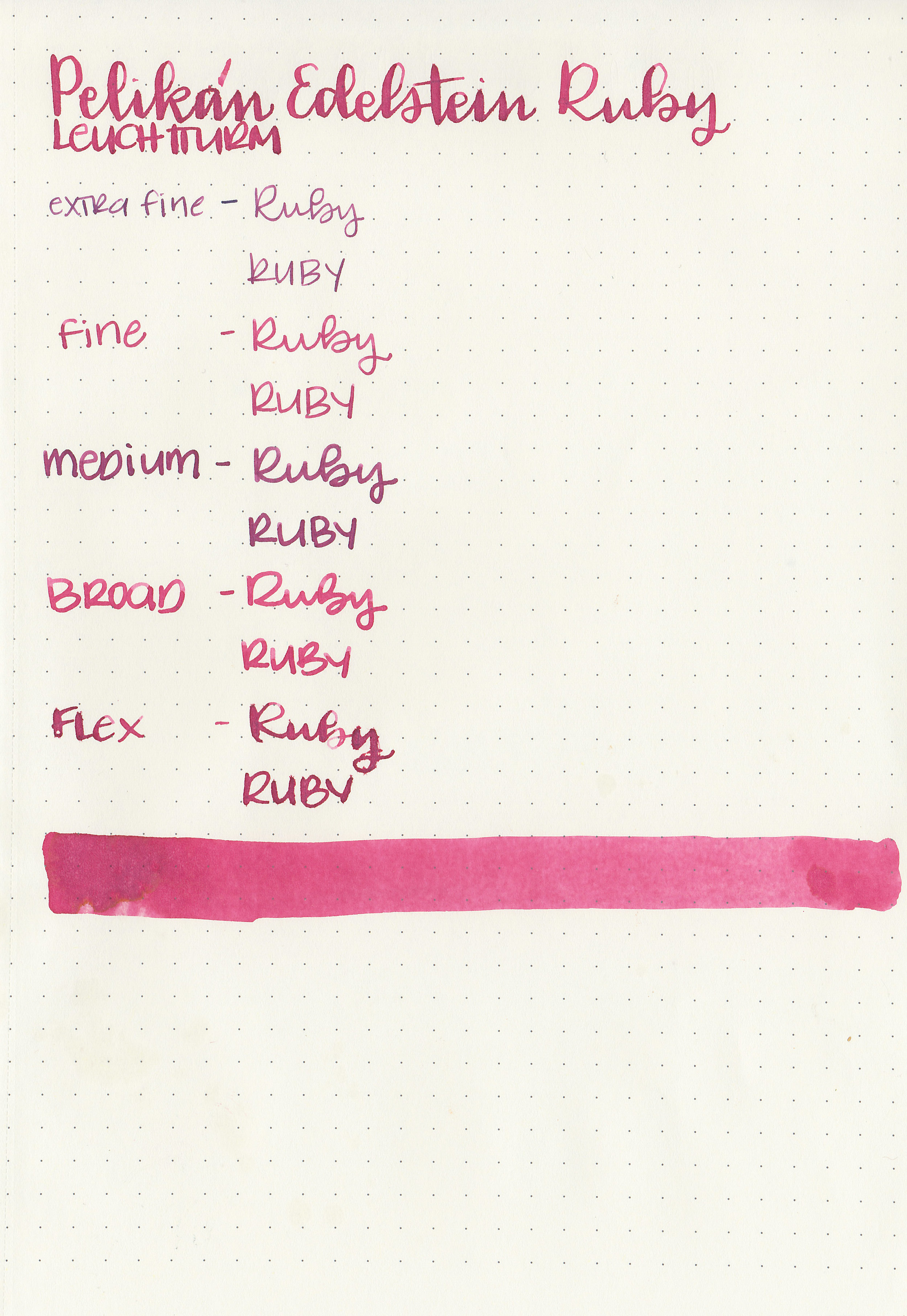
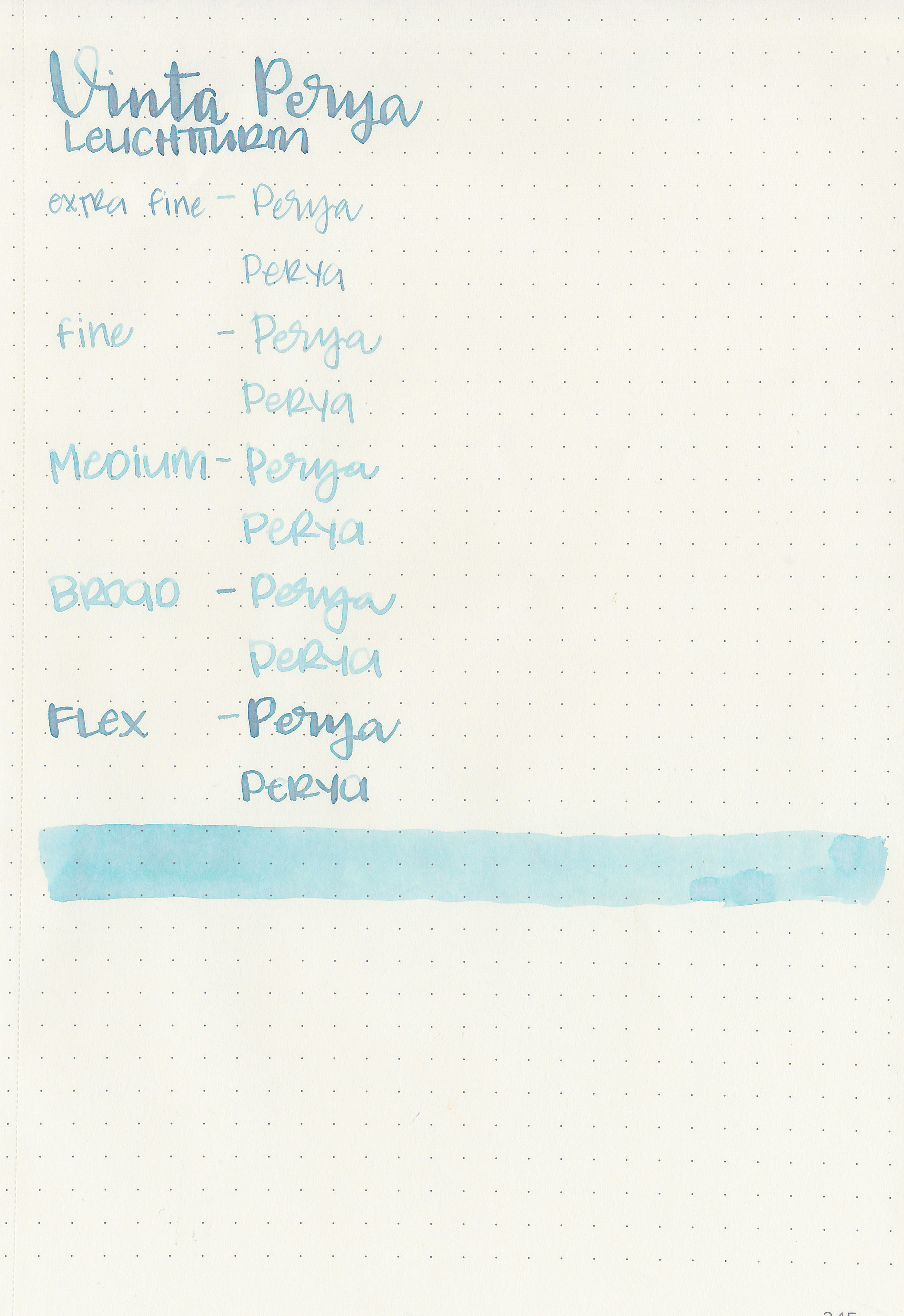
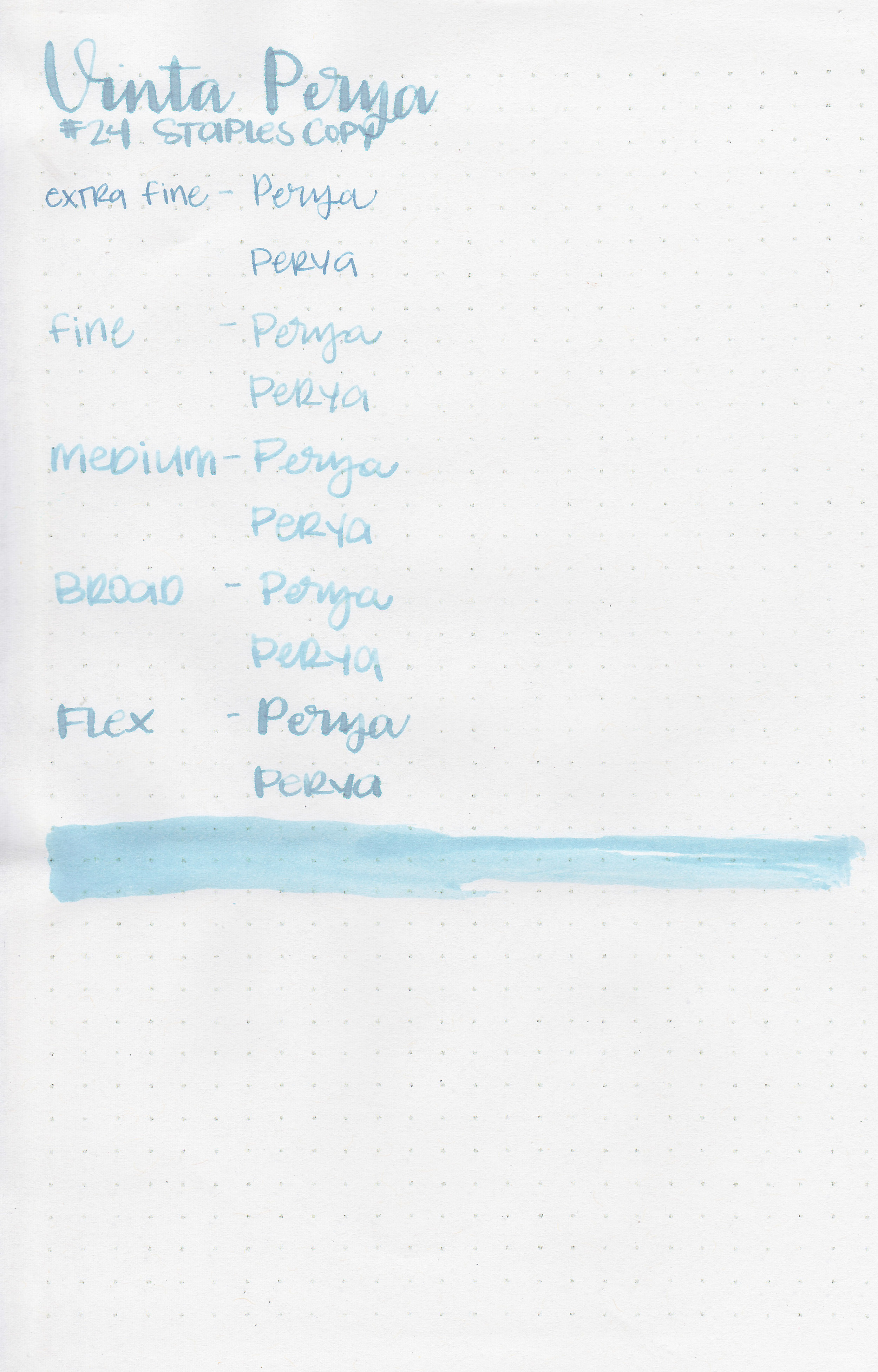
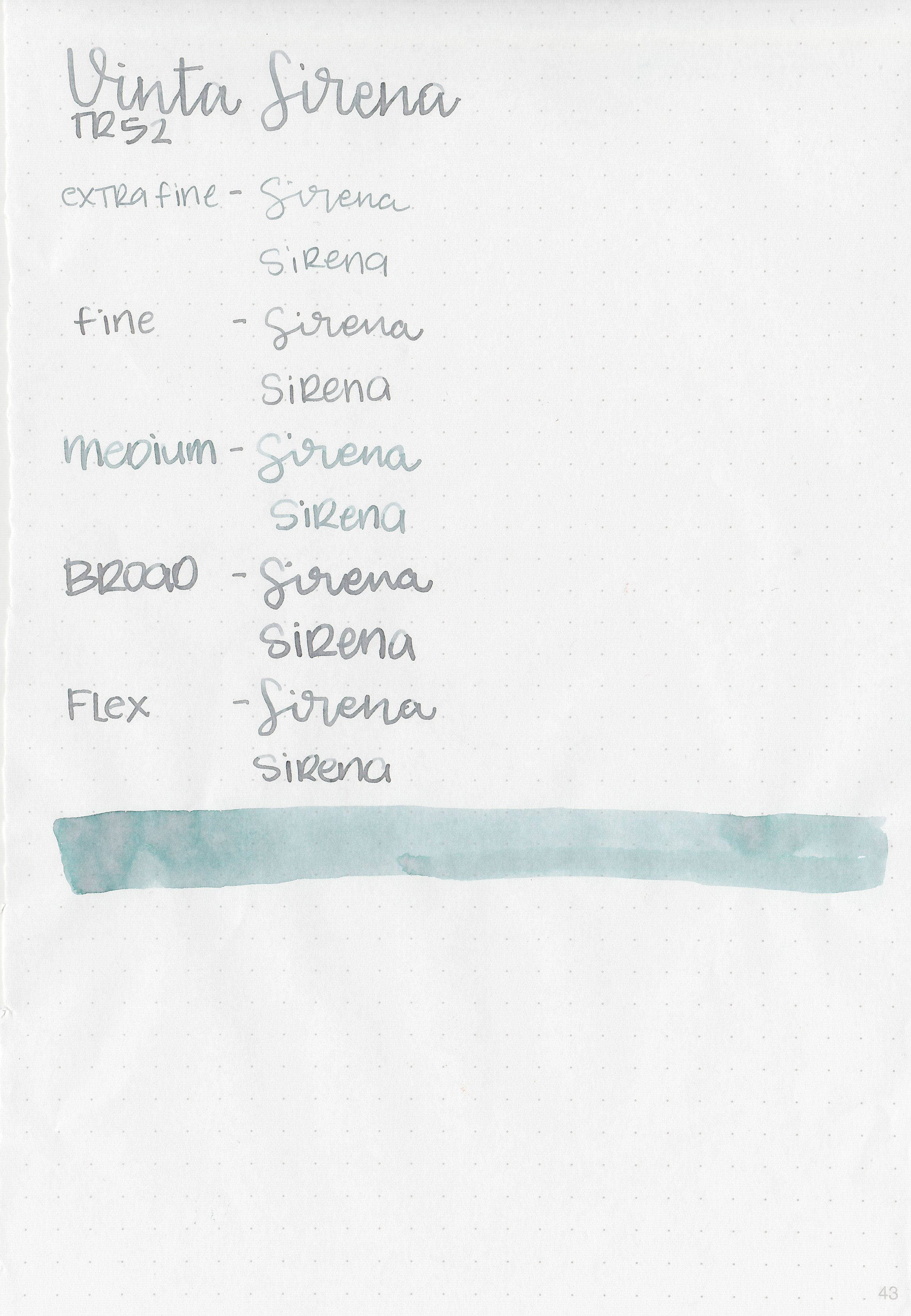
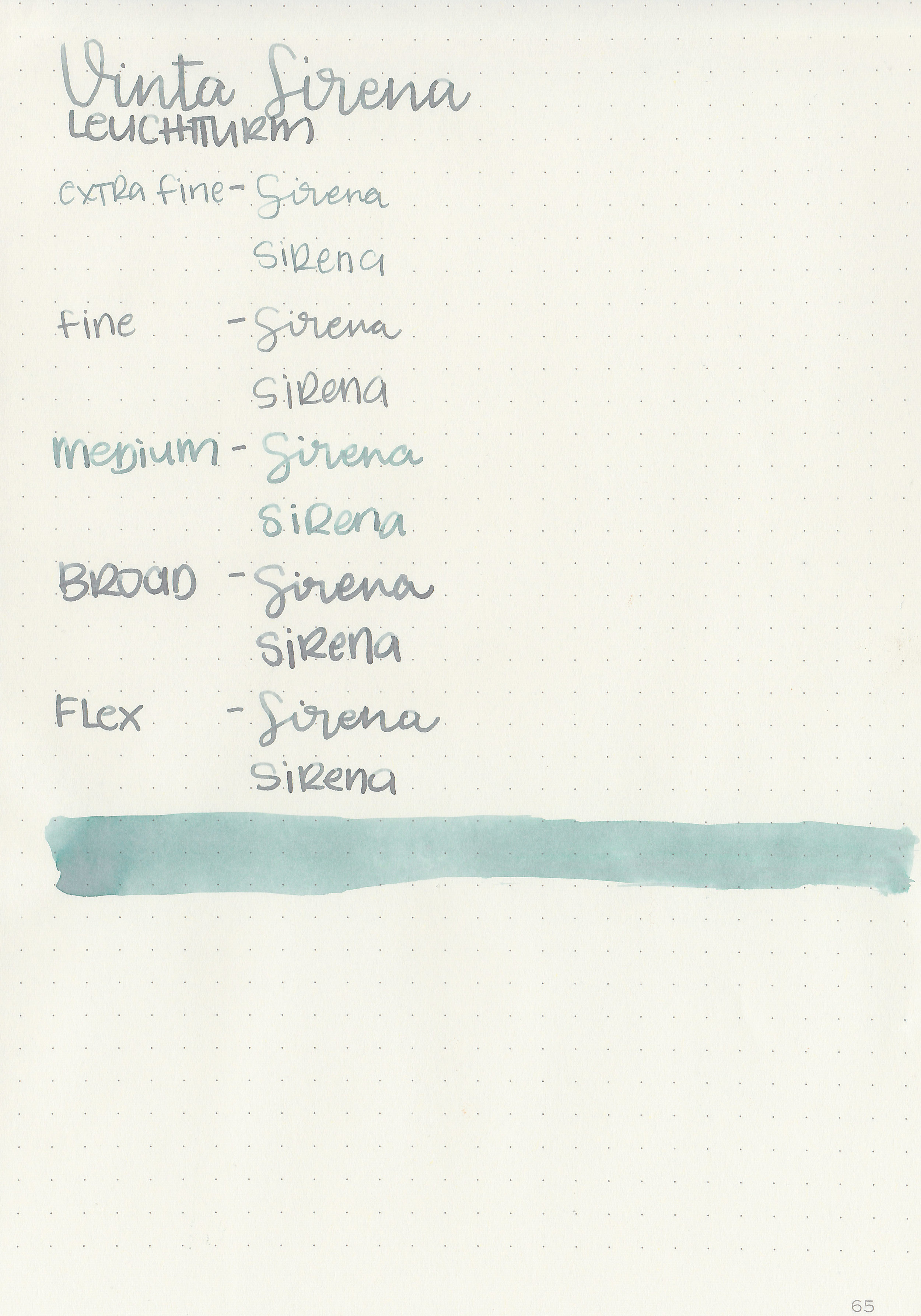
Writing samples:
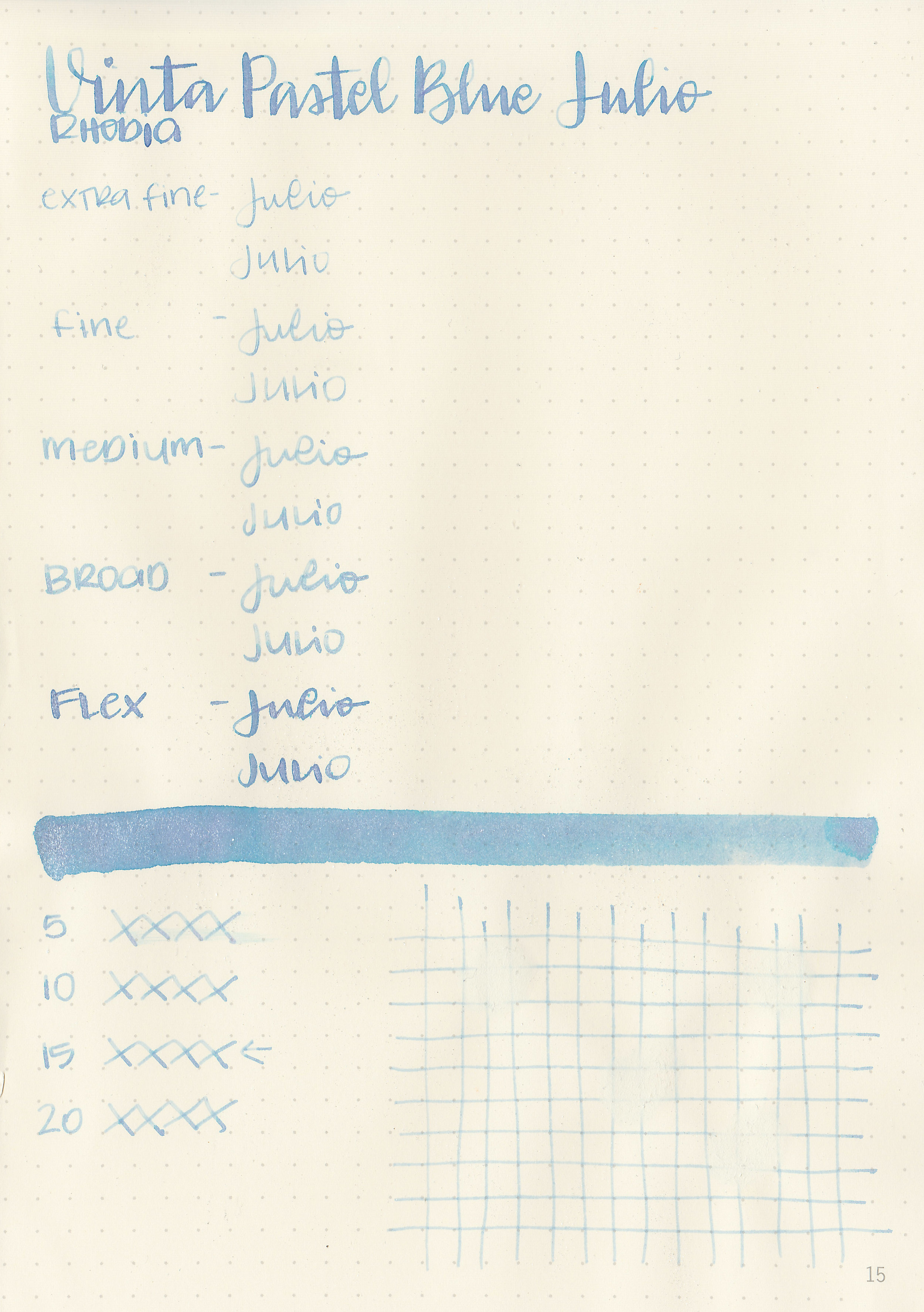
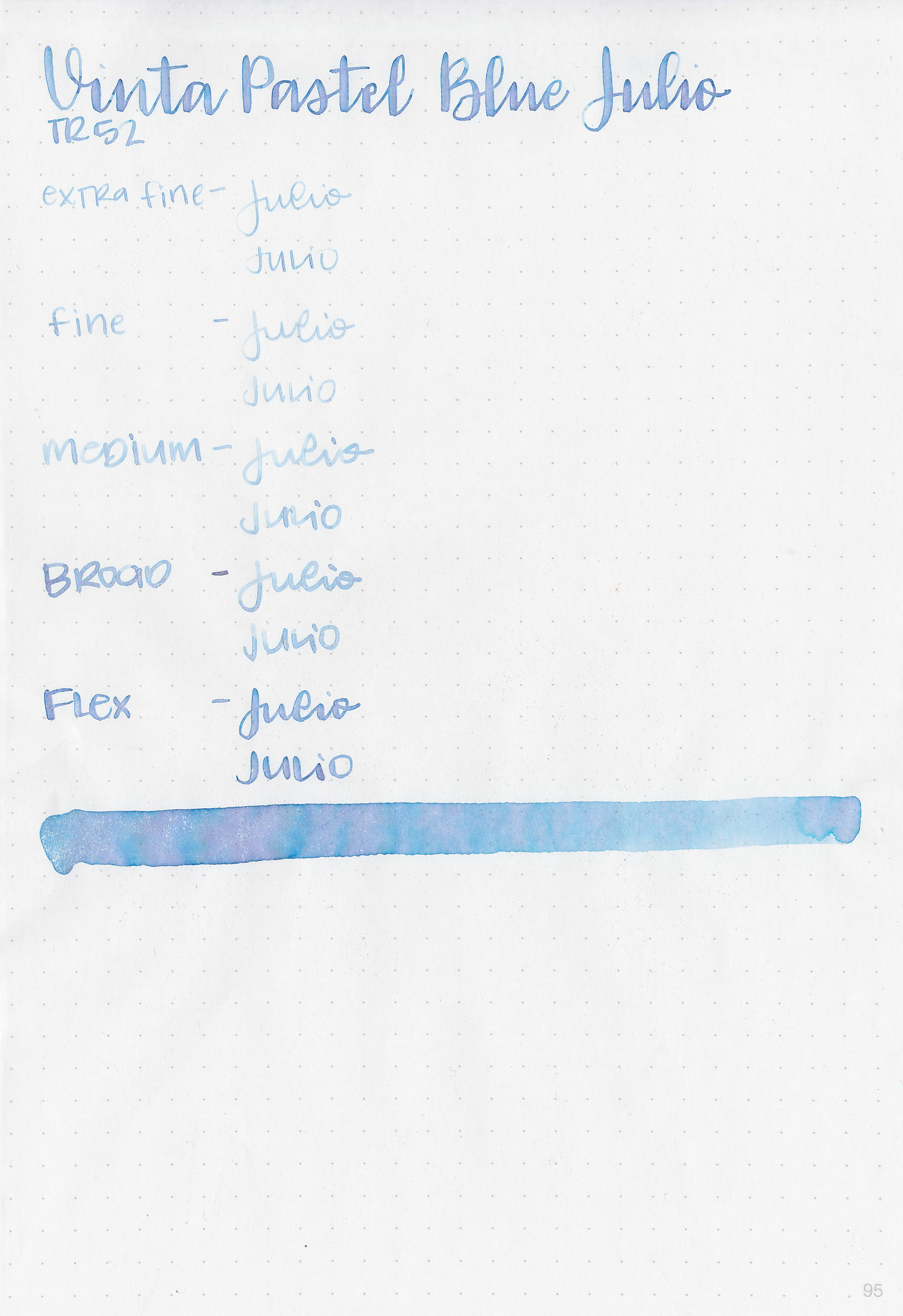
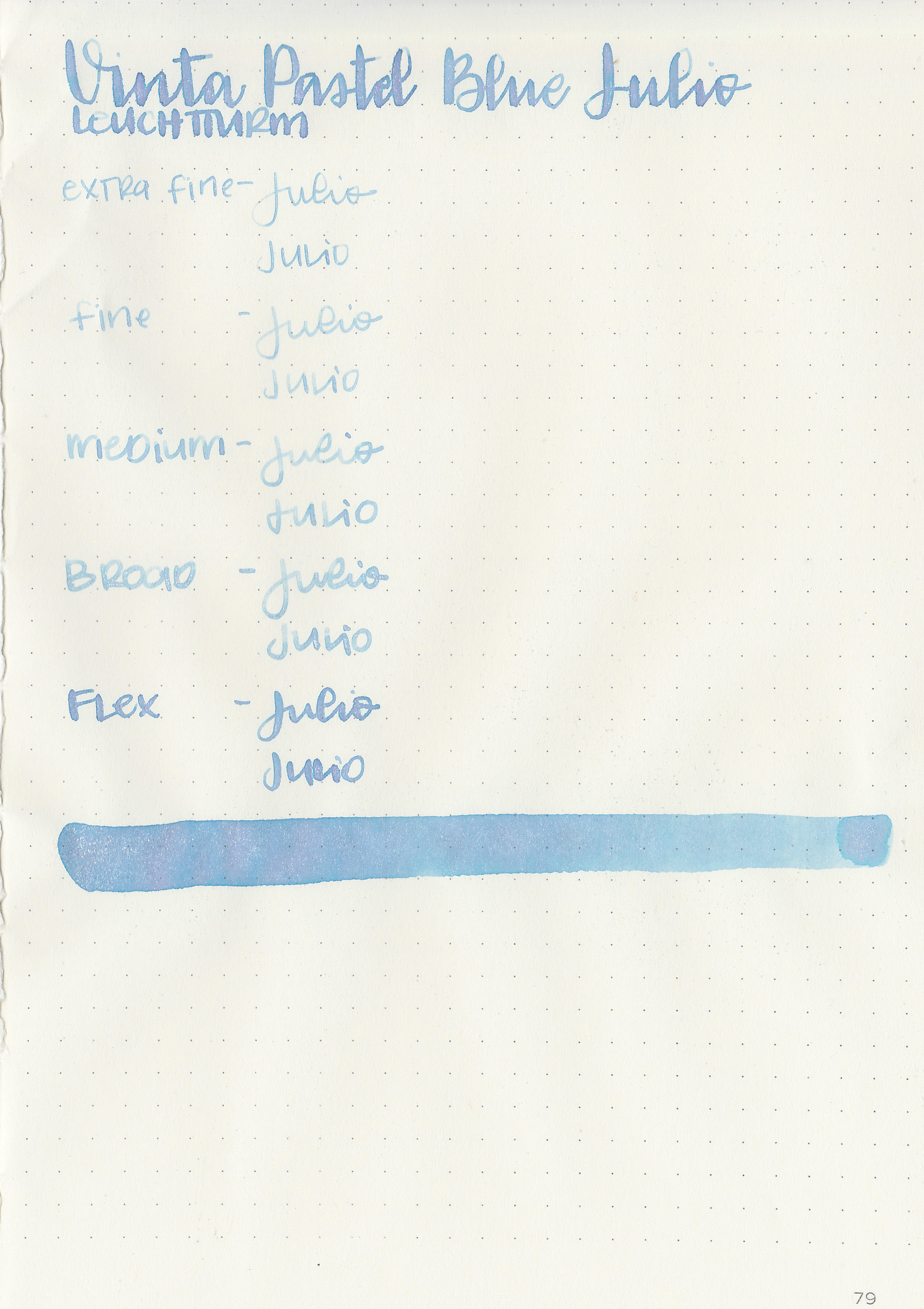
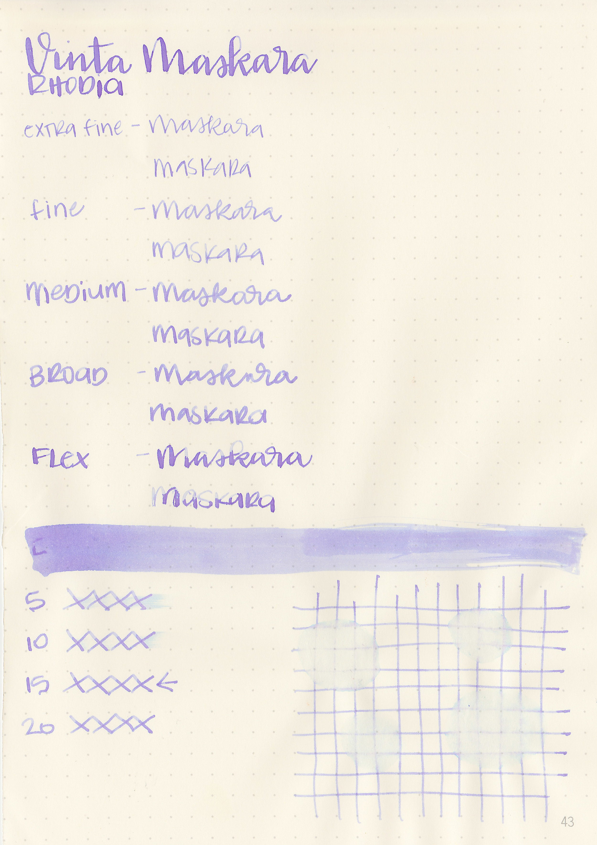
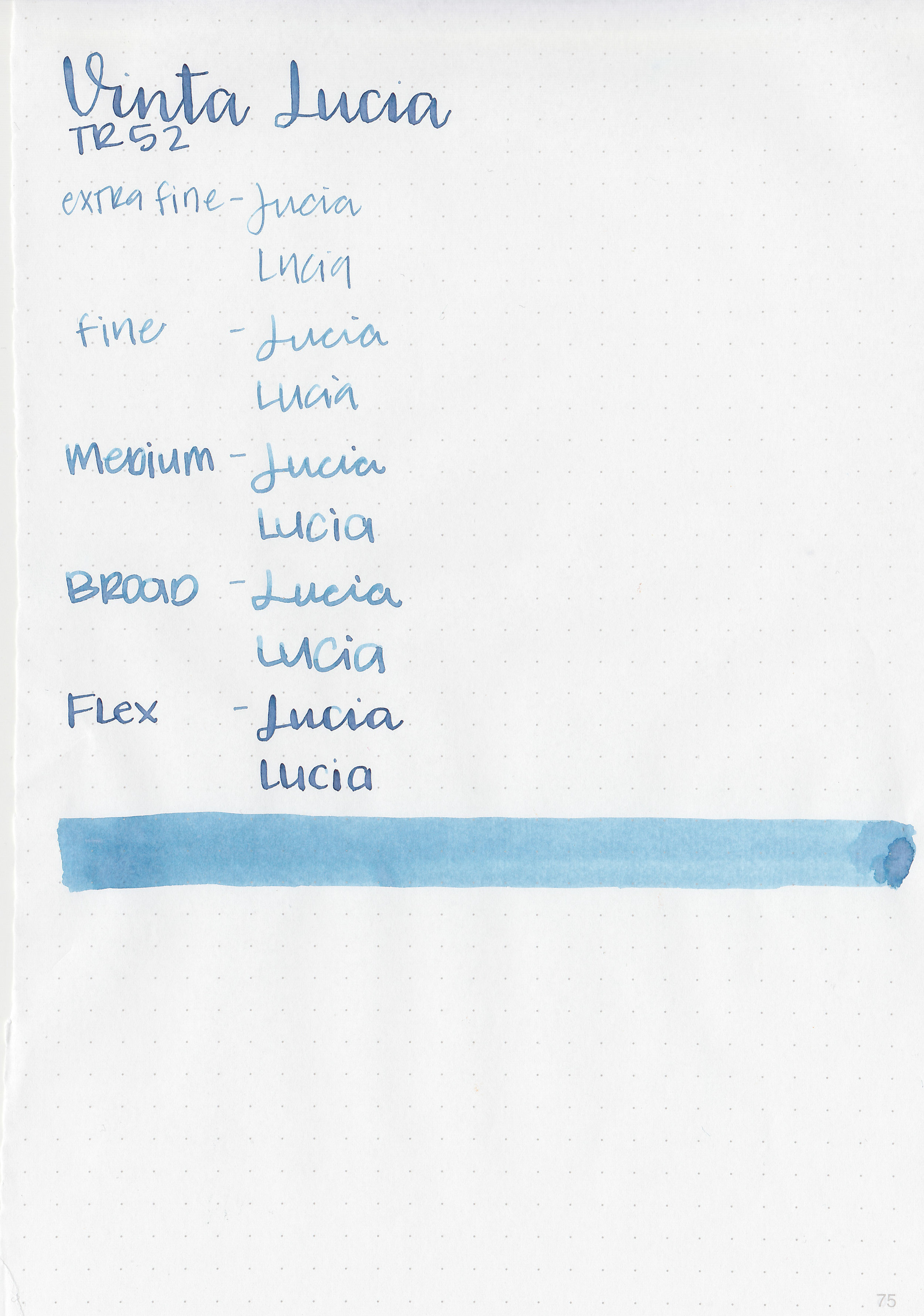
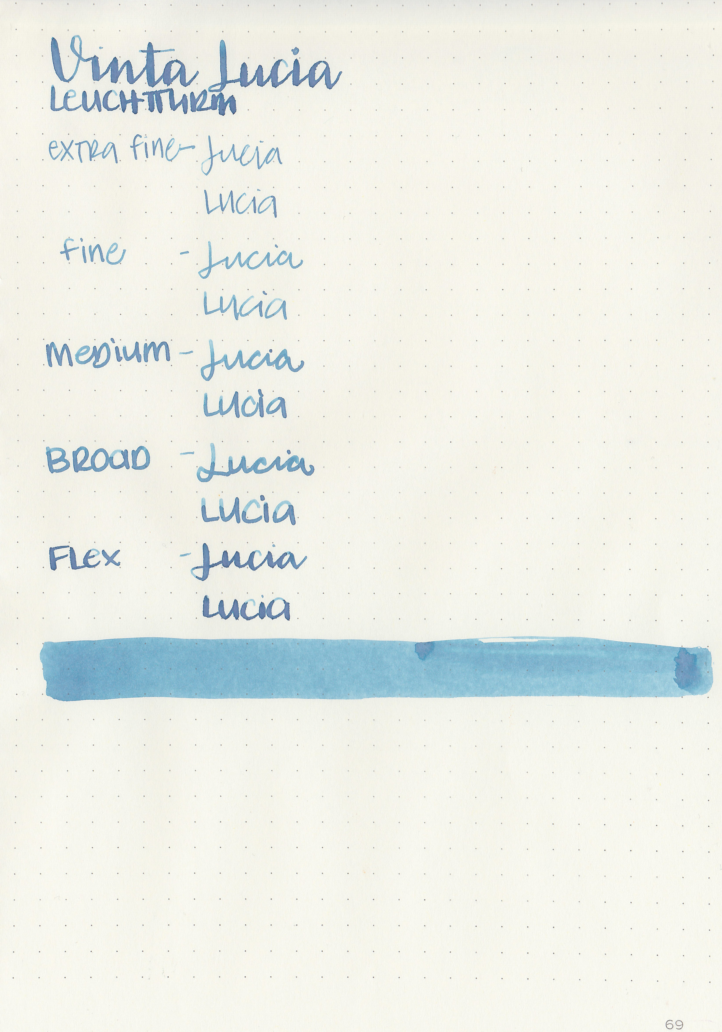
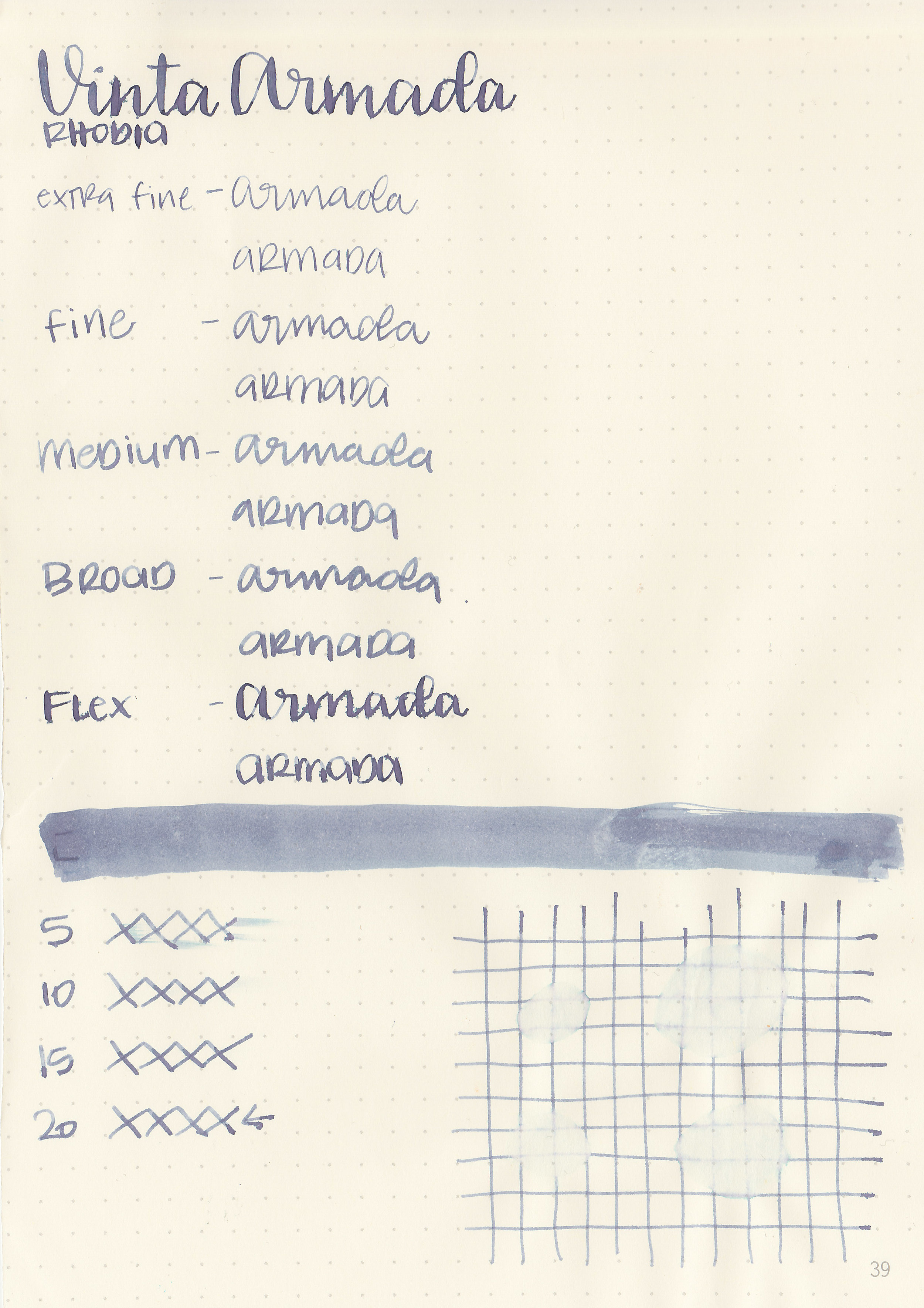
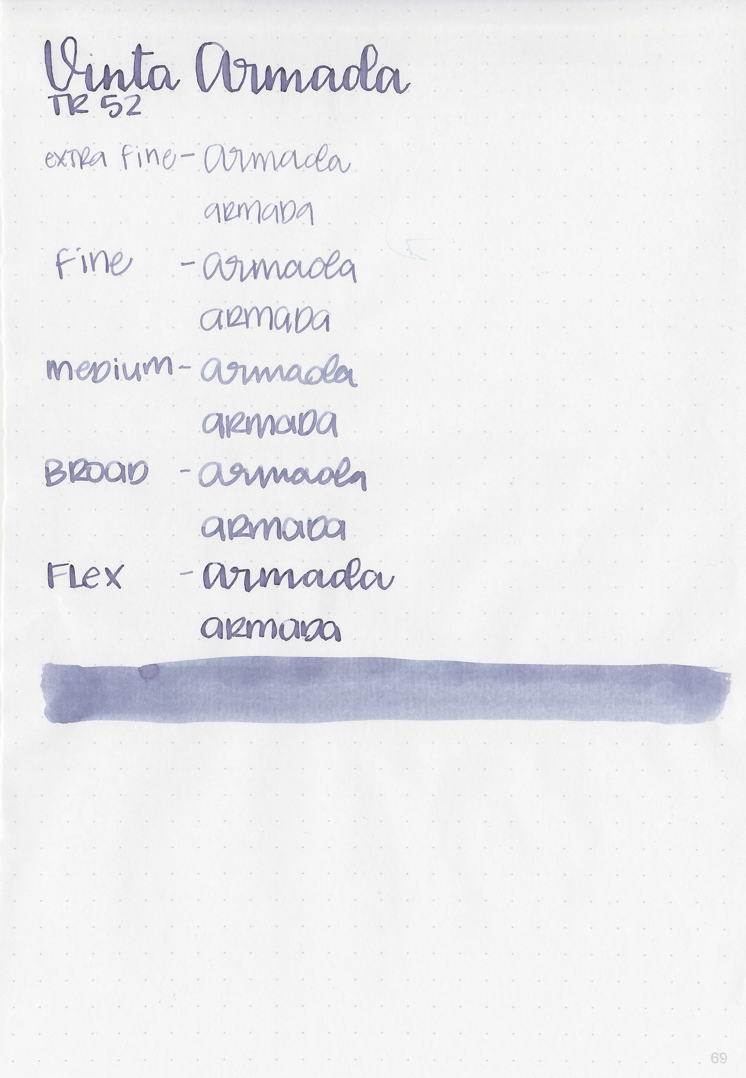
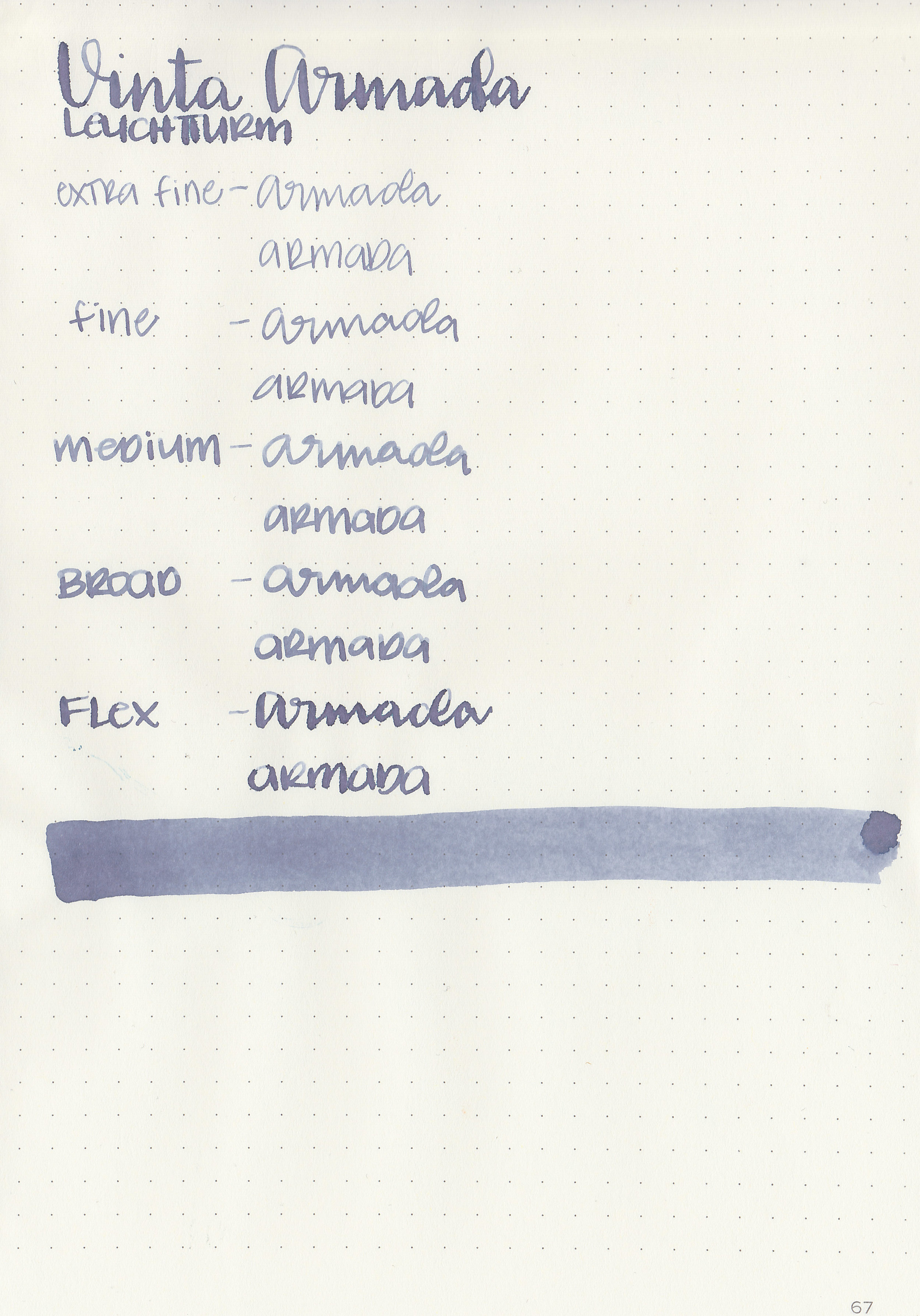
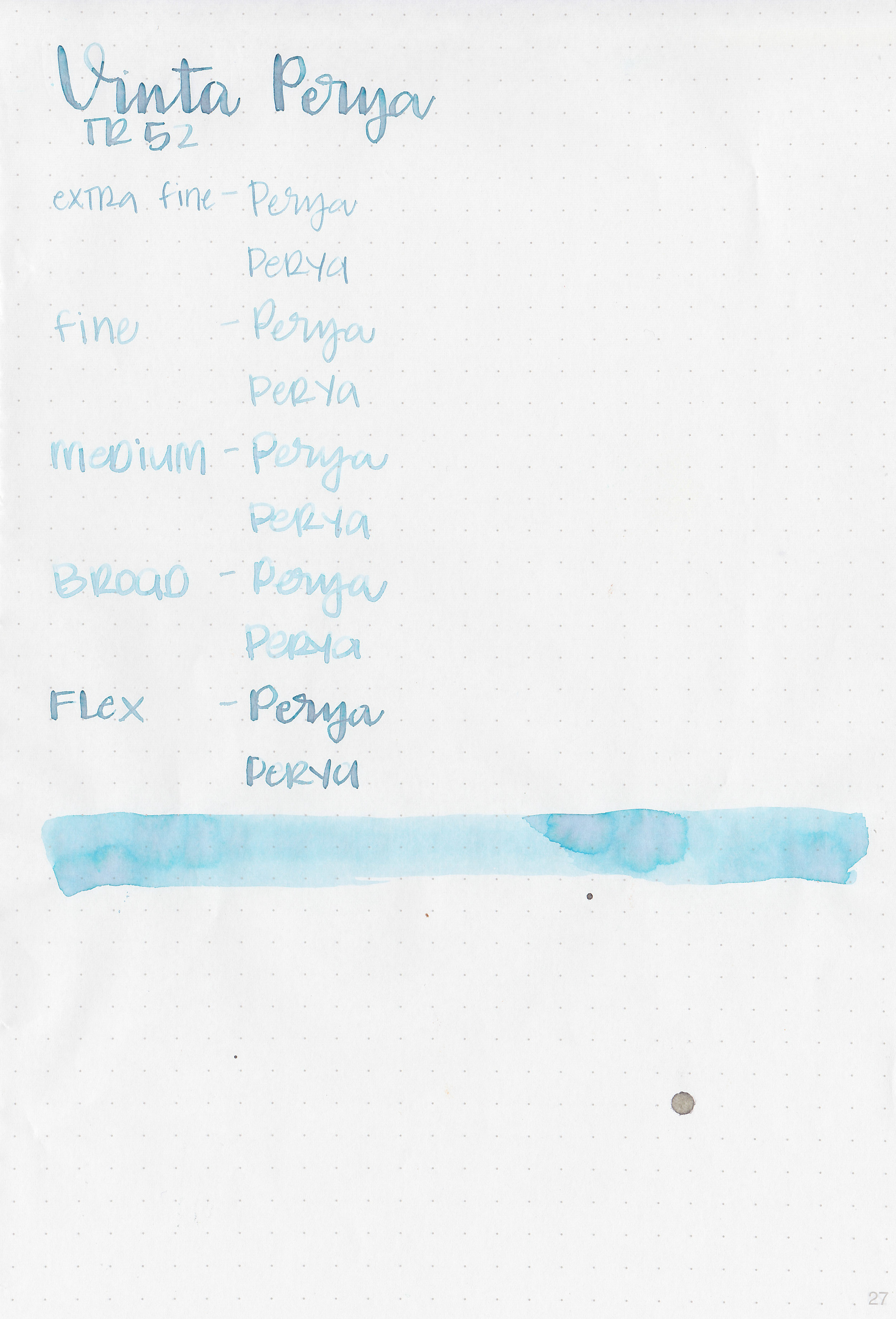
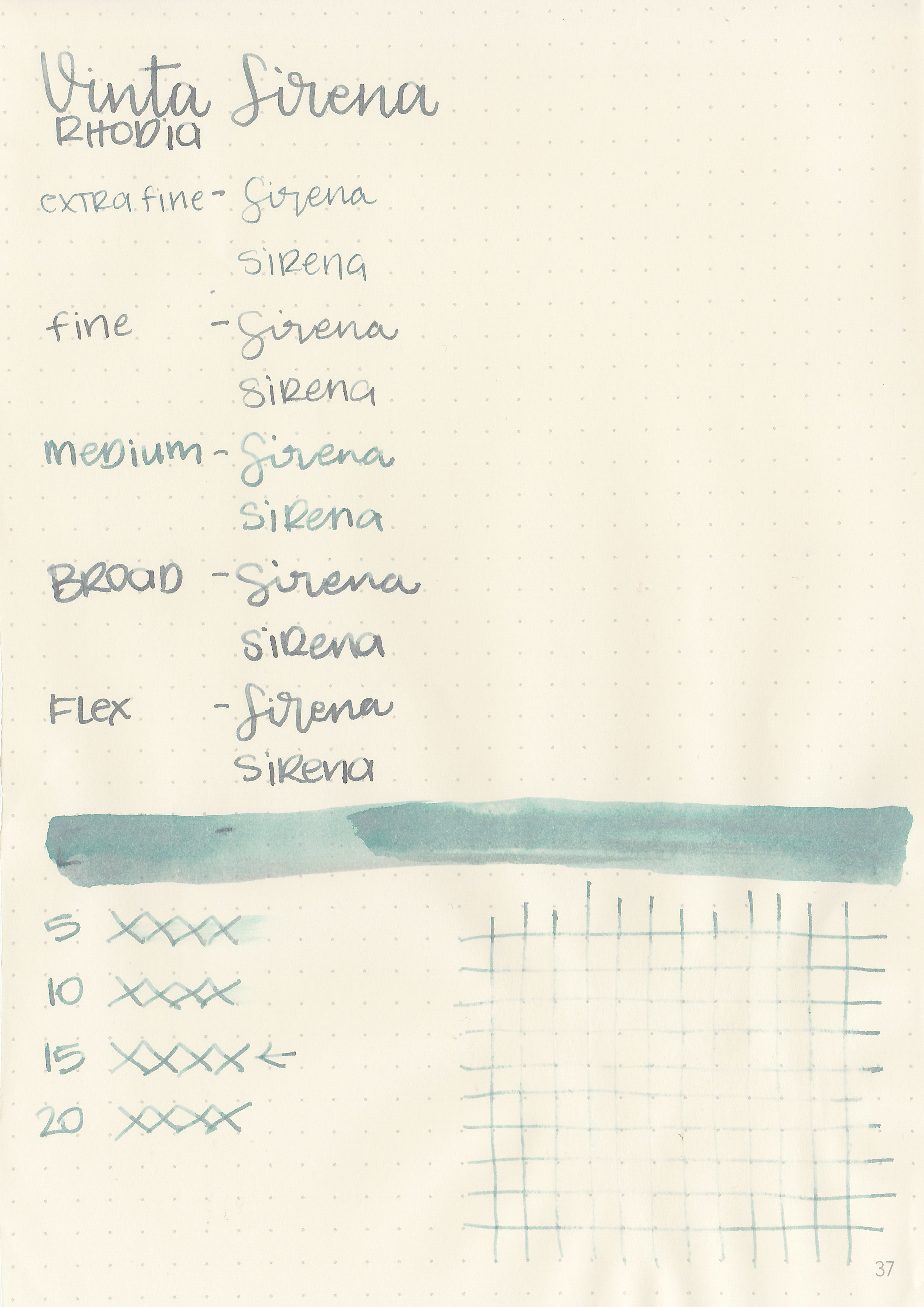
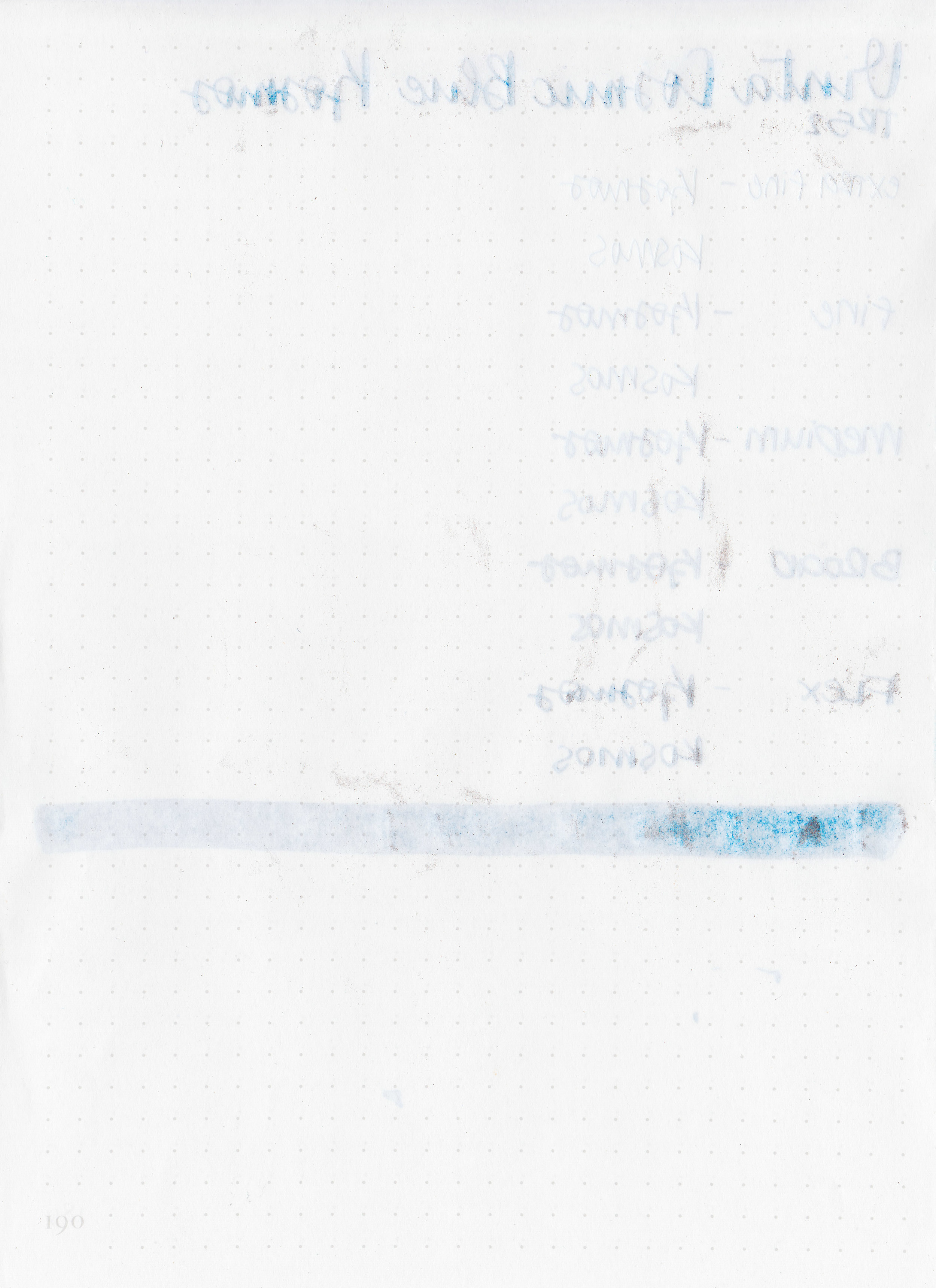
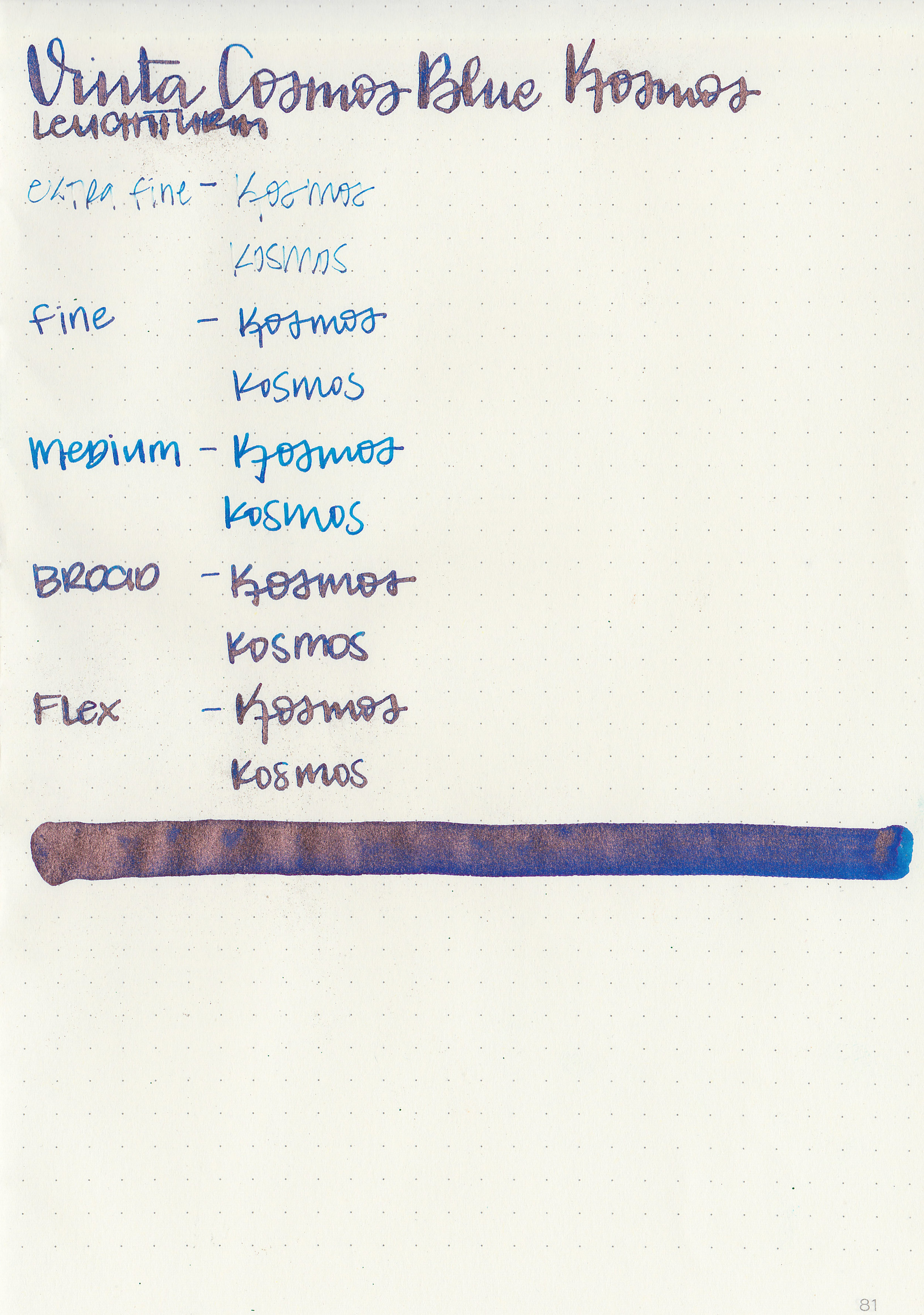
Let's take a look at how the ink behaves on fountain pen friendly papers: Rhodia, Tomoe River, and Leuchtturm.
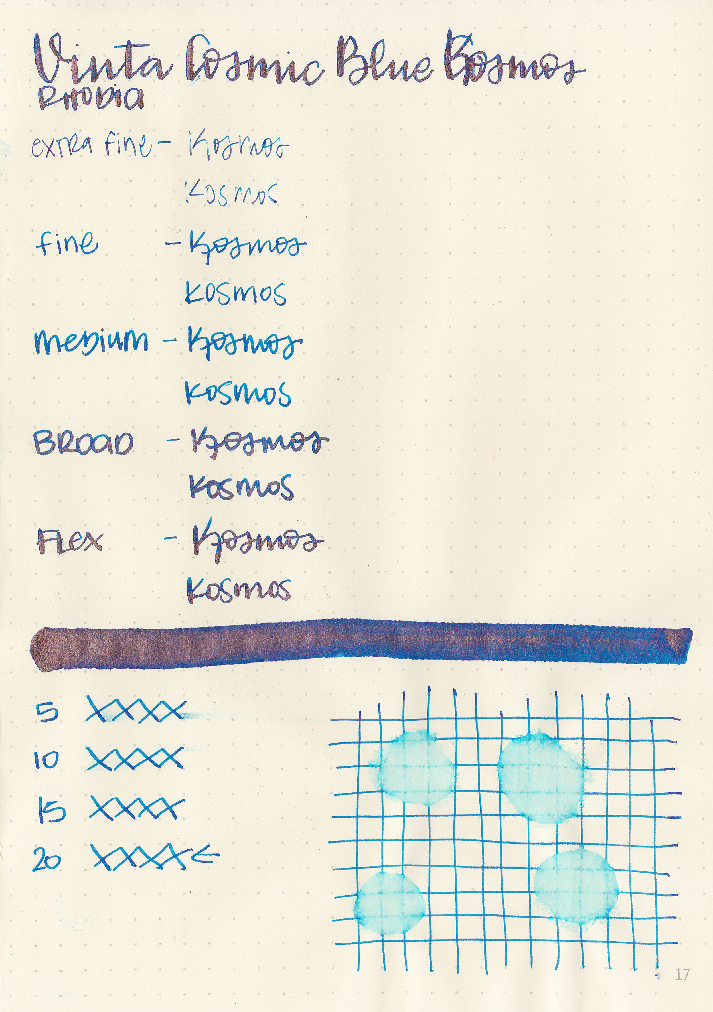
Dry time: 20 seconds
Water resistance: Low
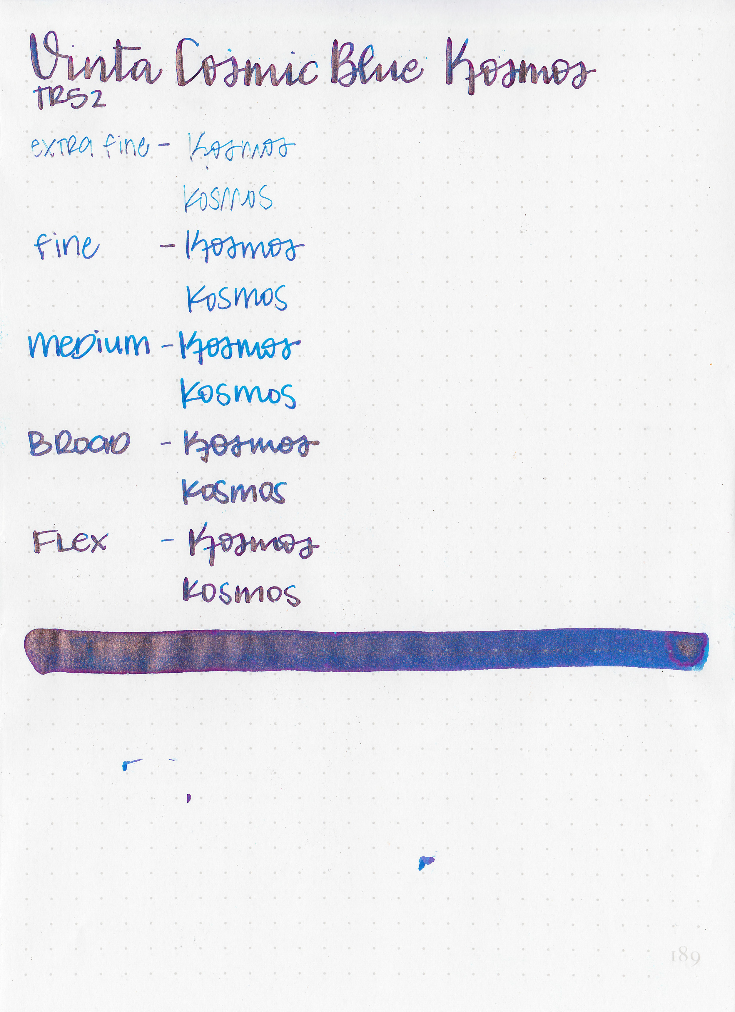
Feathering: None
Show through: Medium
Bleeding: Low-there was some bleeding in the flex nib.
Other properties: low shading, medium sheen, and copper shimmer. There might be some more shading in there, but if there is its hidden underneath all the shimmer and sheen.
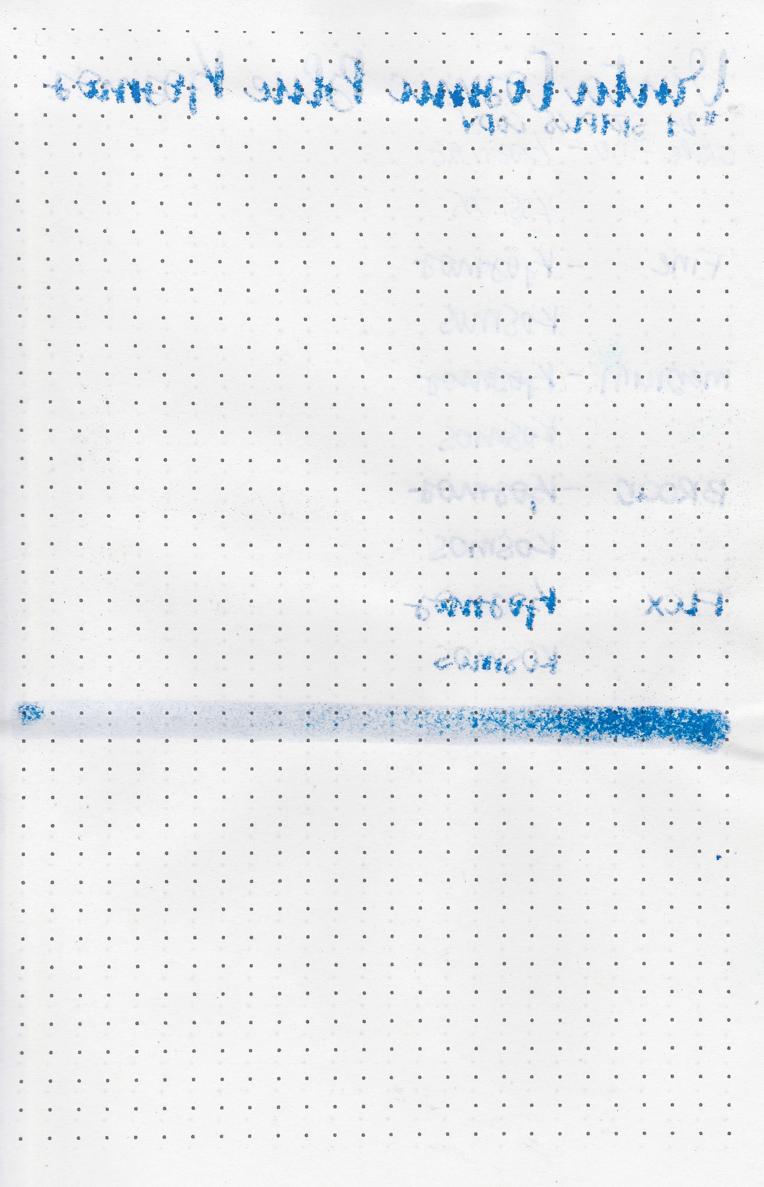
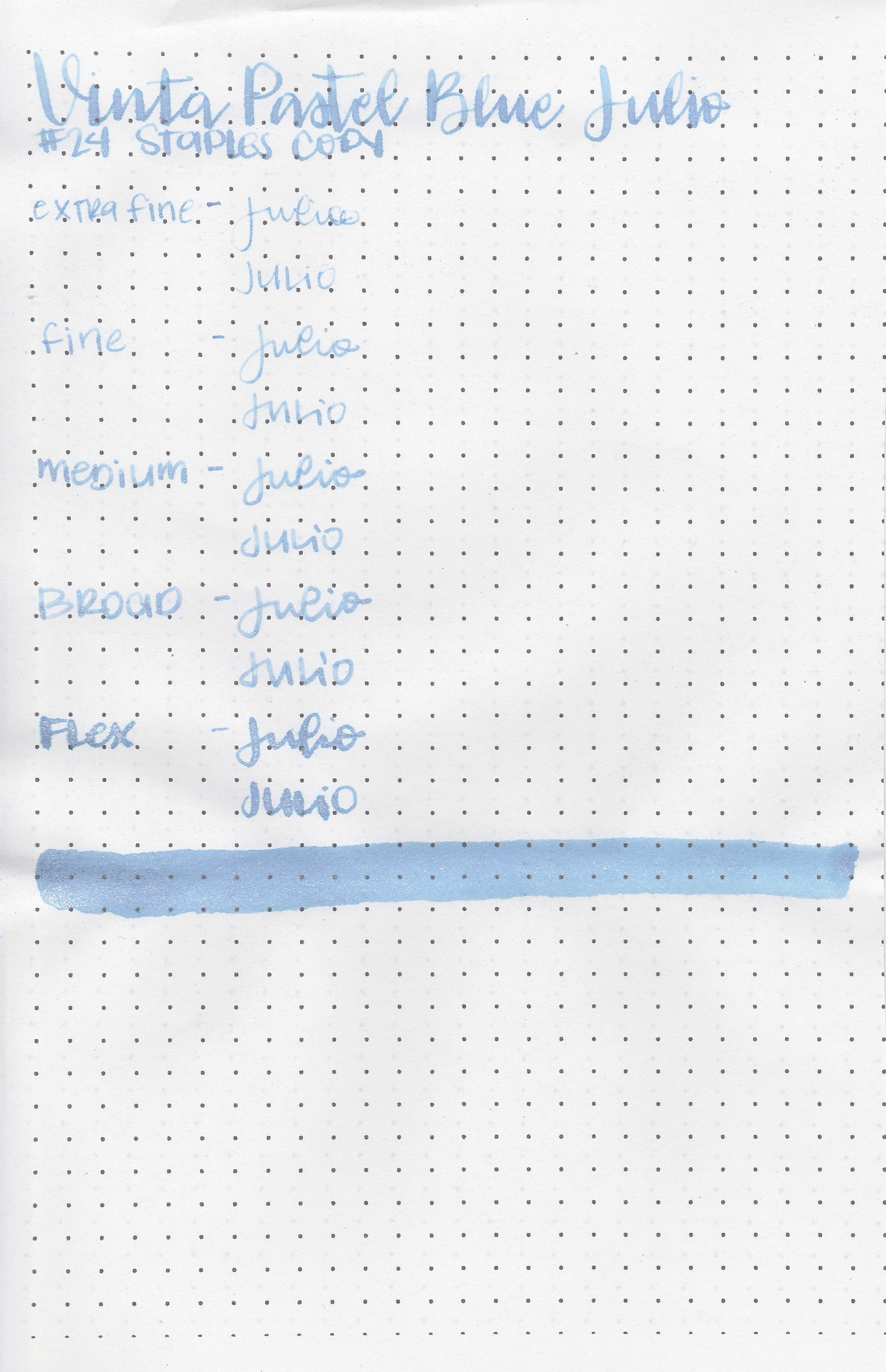
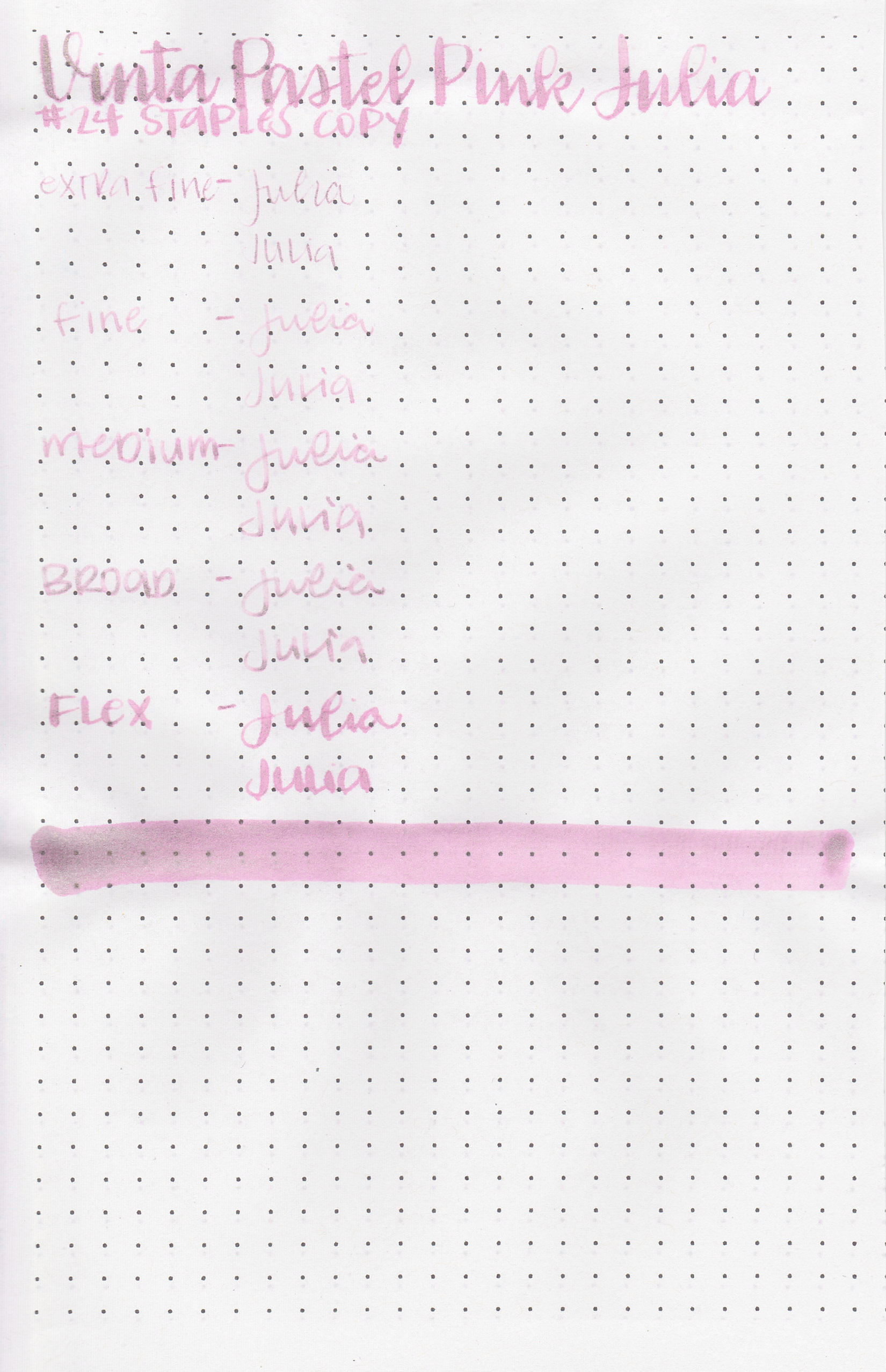
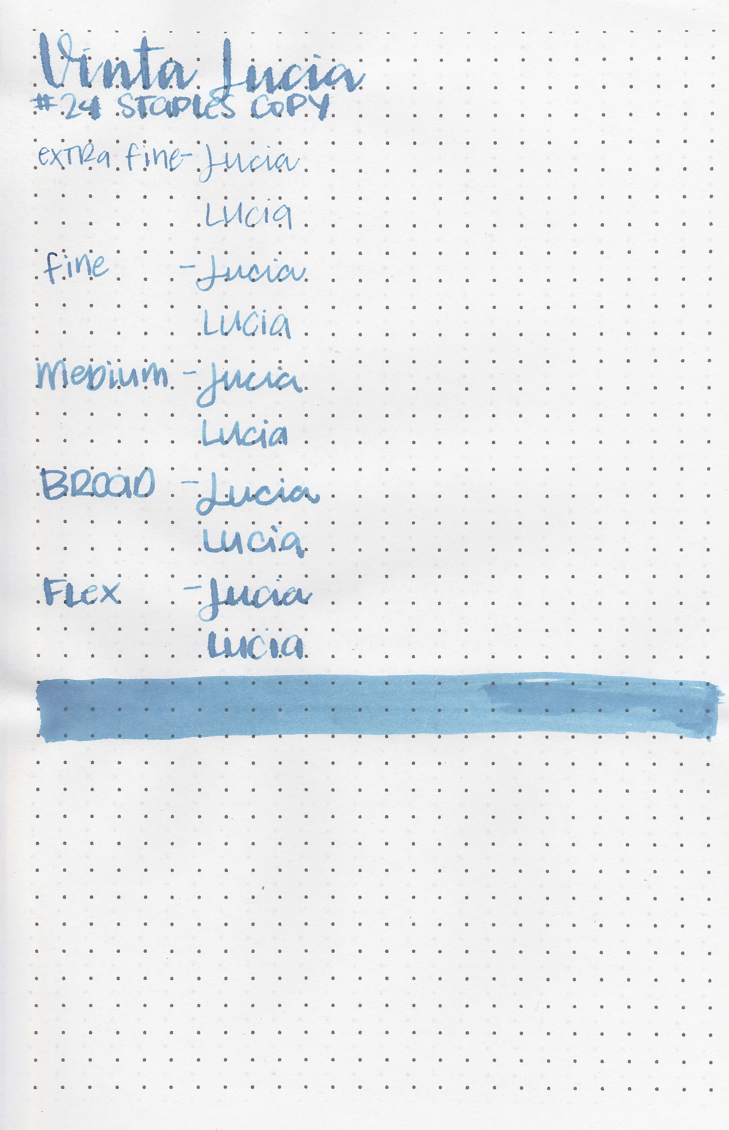
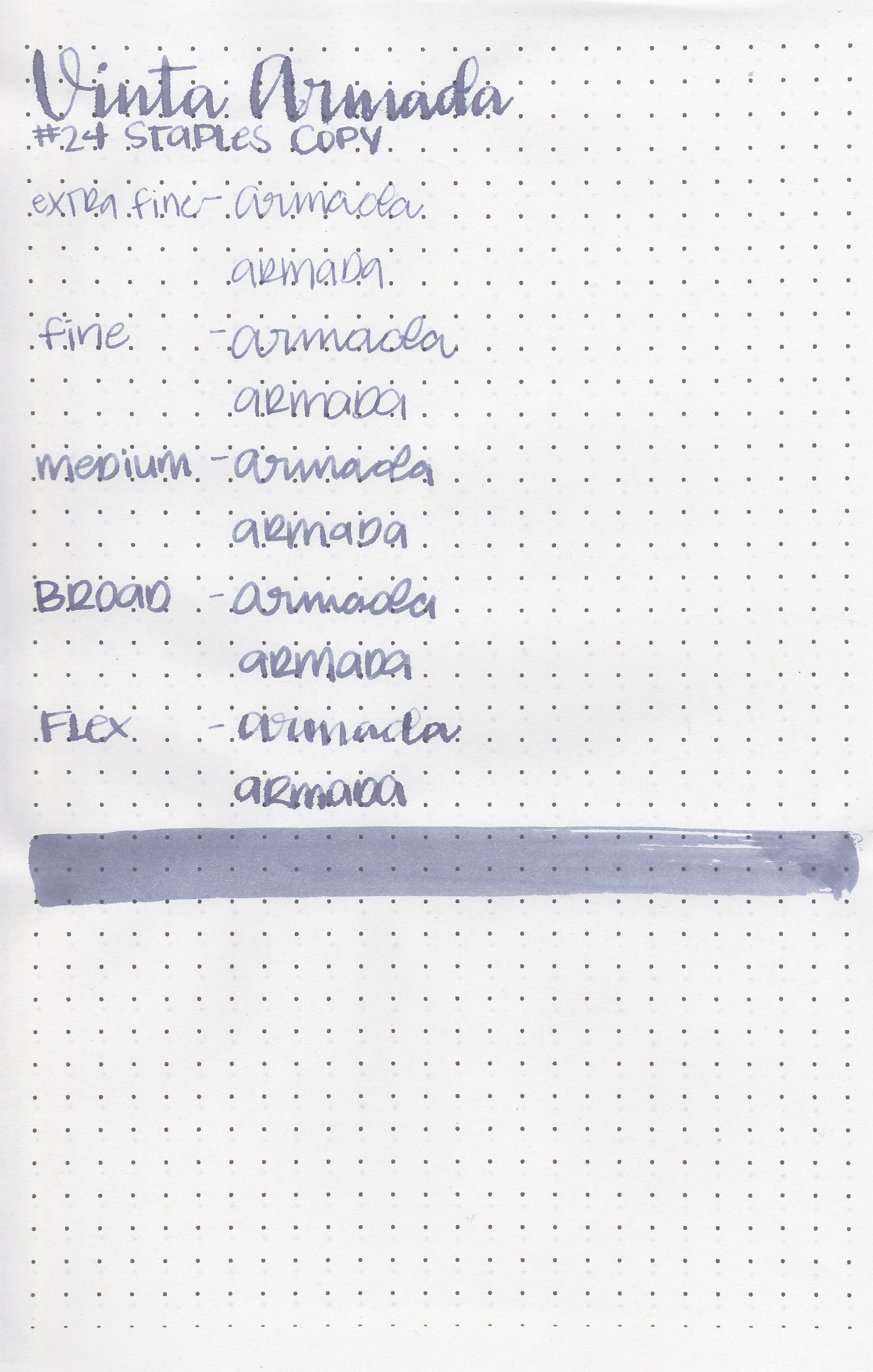
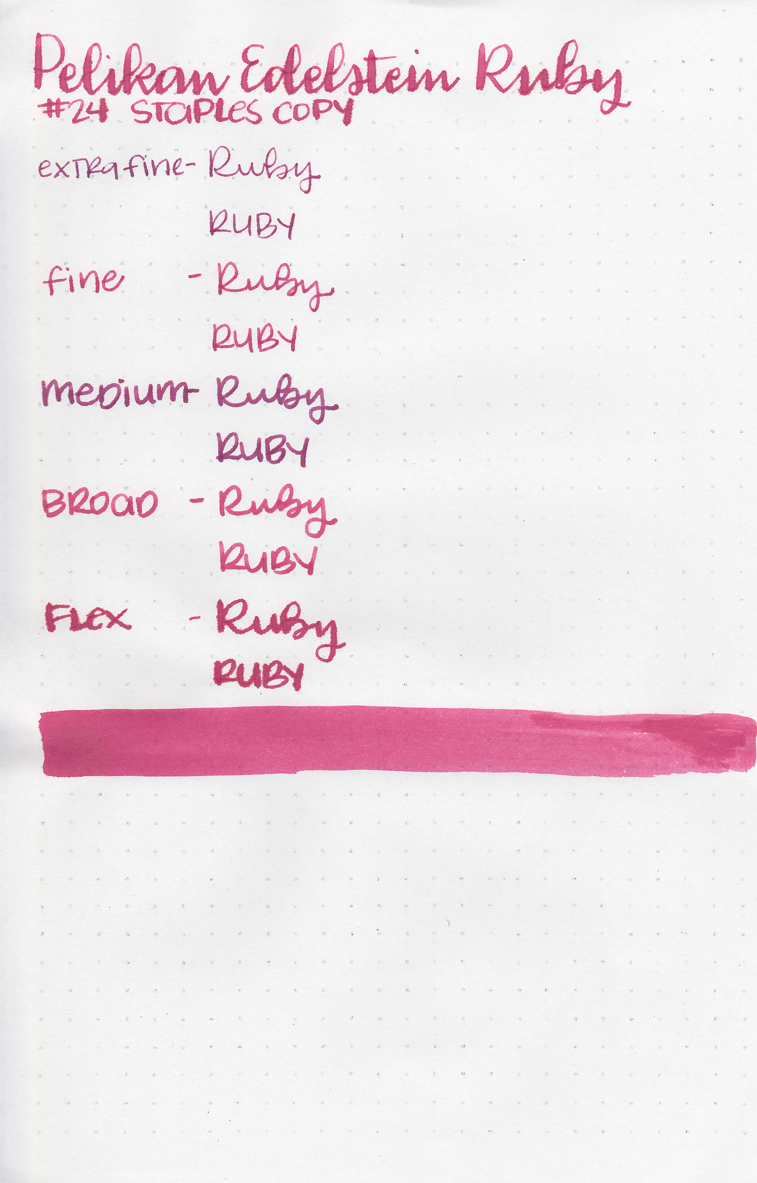
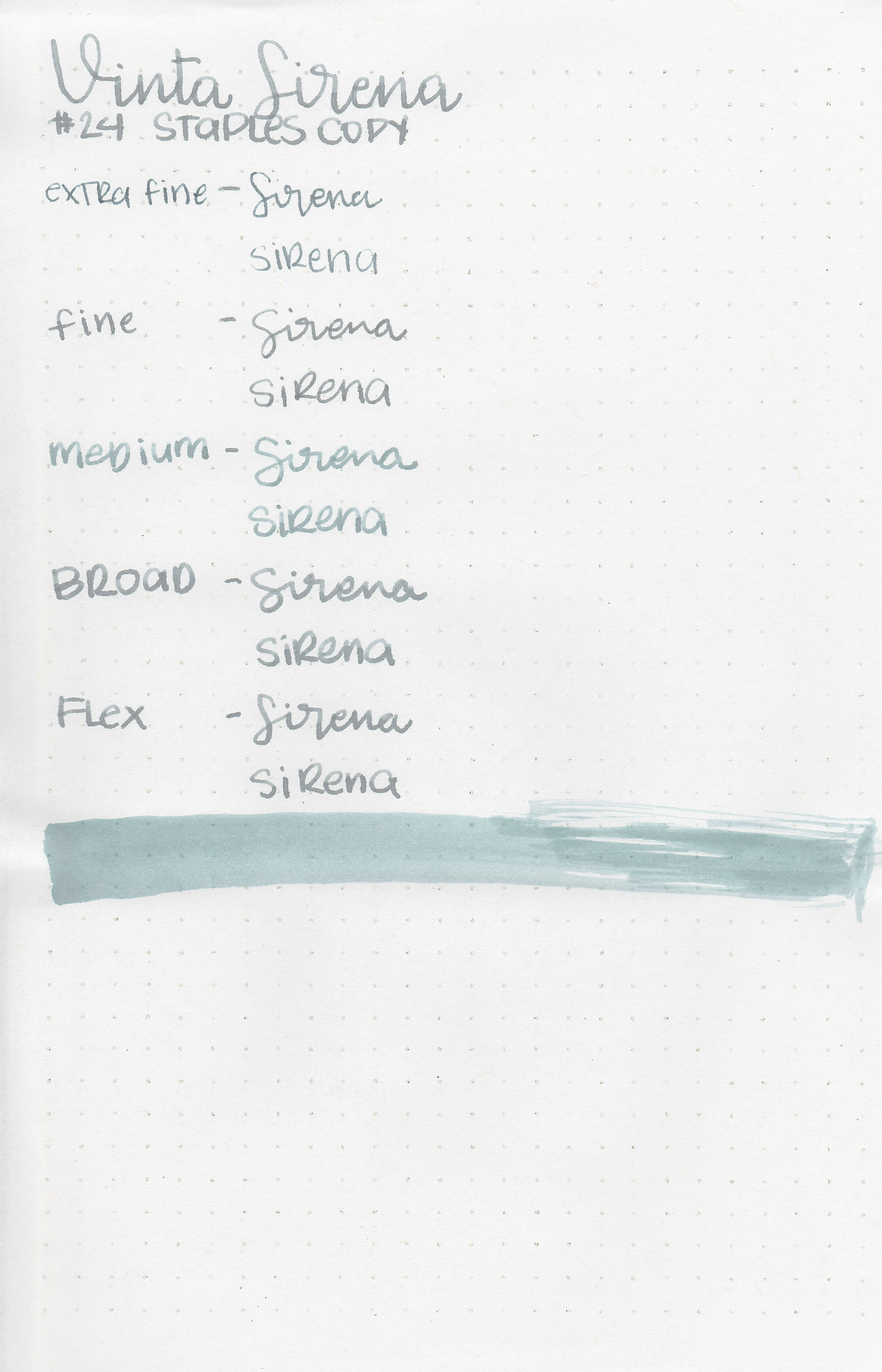
On Staples 24 lb copy paper the ink feathered in the larger nib sizes and had a little bit of bleeding in the flex nib too.
Comparison Swabs:

Kosmos is very similar to De Atramentis Cyan Blue Copper. I do prefer Kosmos over the Cyan Blue simply because it’s slightly better behaved. Robert Oster Blue Water Ice is also similar, but without the shimmer. Click here to see the Vinta inks together, and click here to see the blue inks together.
Longer Writing:

I used a Bonecrusher Studios pen with a Regalia Writing Labs Crossflex nib on Tomoe River paper. The ink did clog the pen often, and I had to prime the feed a few times to make it flow well again.
Overall, I did have issues with clogging in a few different pens, and it was very hard to clean out when I was finished with it. I have a love/hate relationship with shimmer inks. In some pens they look so pretty but they do take some extra work. It is better behaved than some shimmer inks, but not as well behaved as others.
Disclaimer: A sample of this ink was provided by Vanness Pens for the purpose of this review. All photos and opinions are my own. This page does not contain affiliate links, and this post is not sponsored in any way.