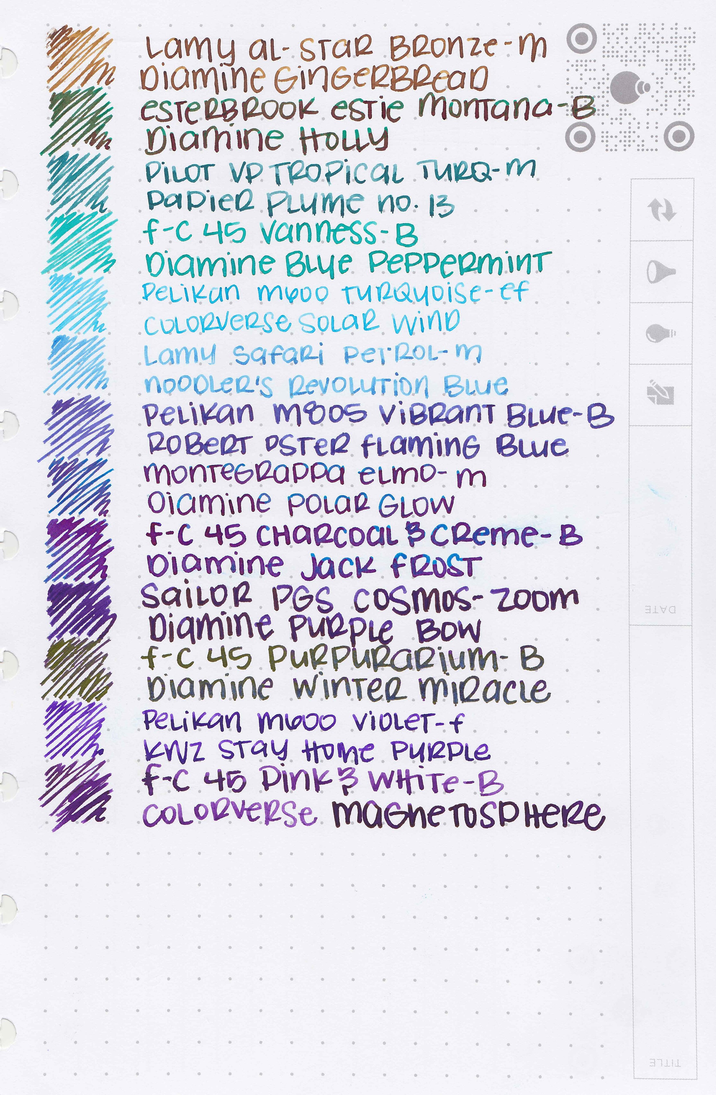
Penlux Inks
/
Swabs and links to Penlux ink reviews.
Read More
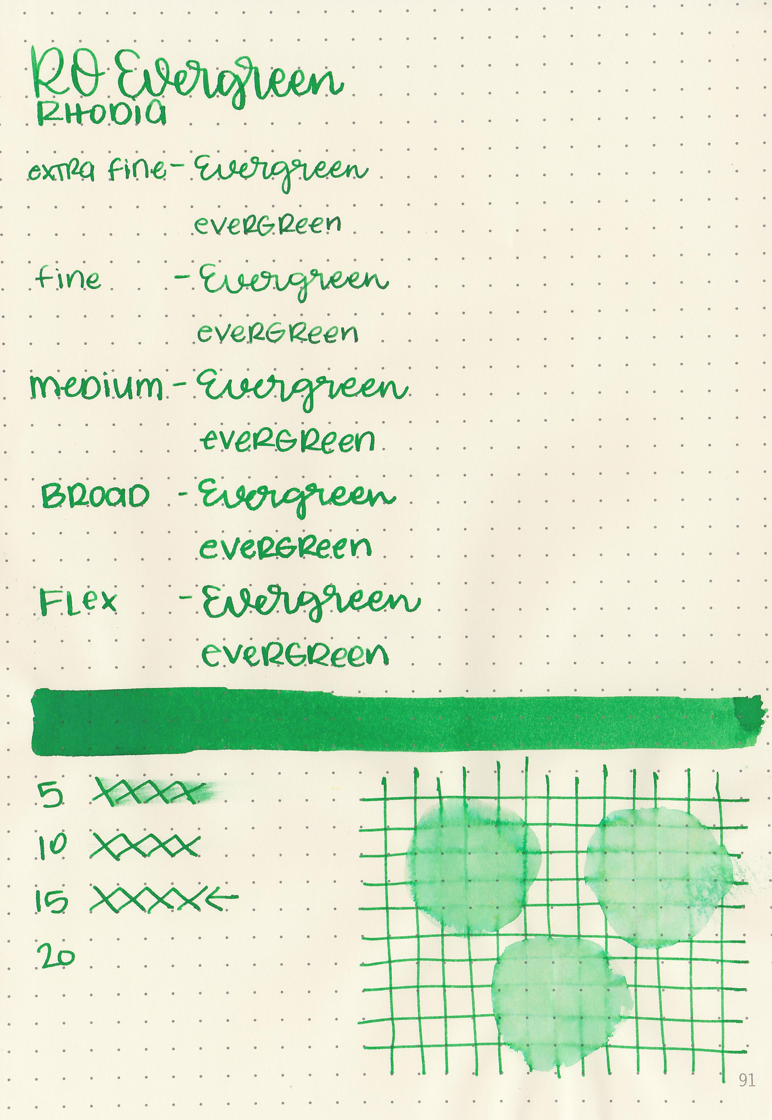
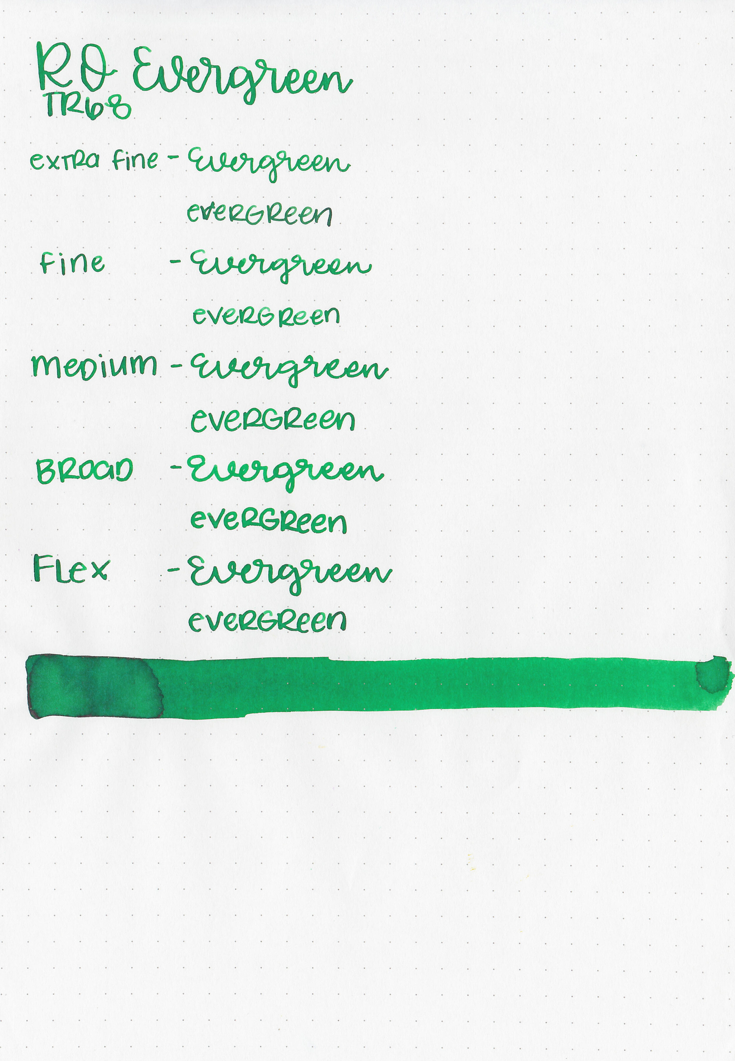
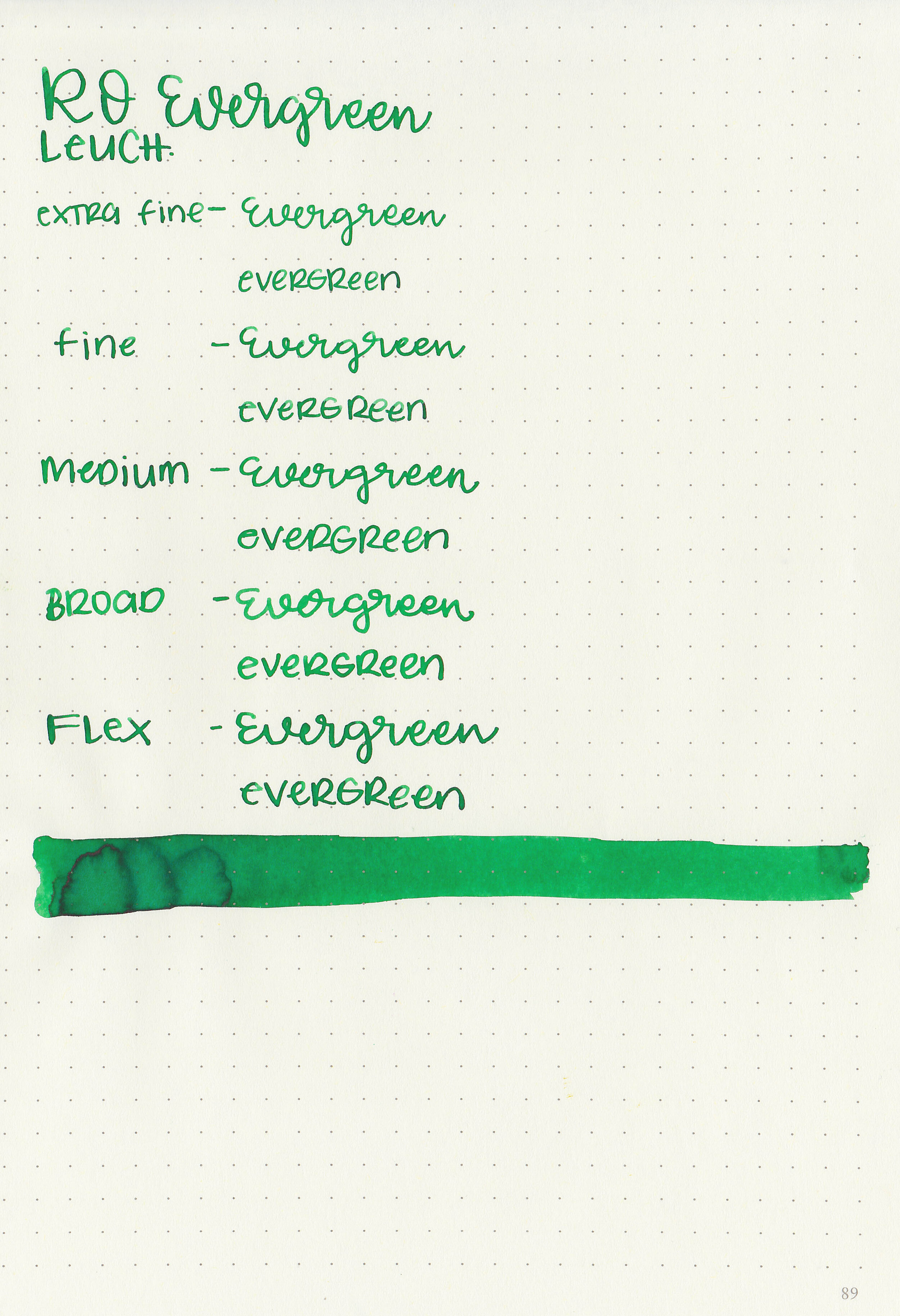
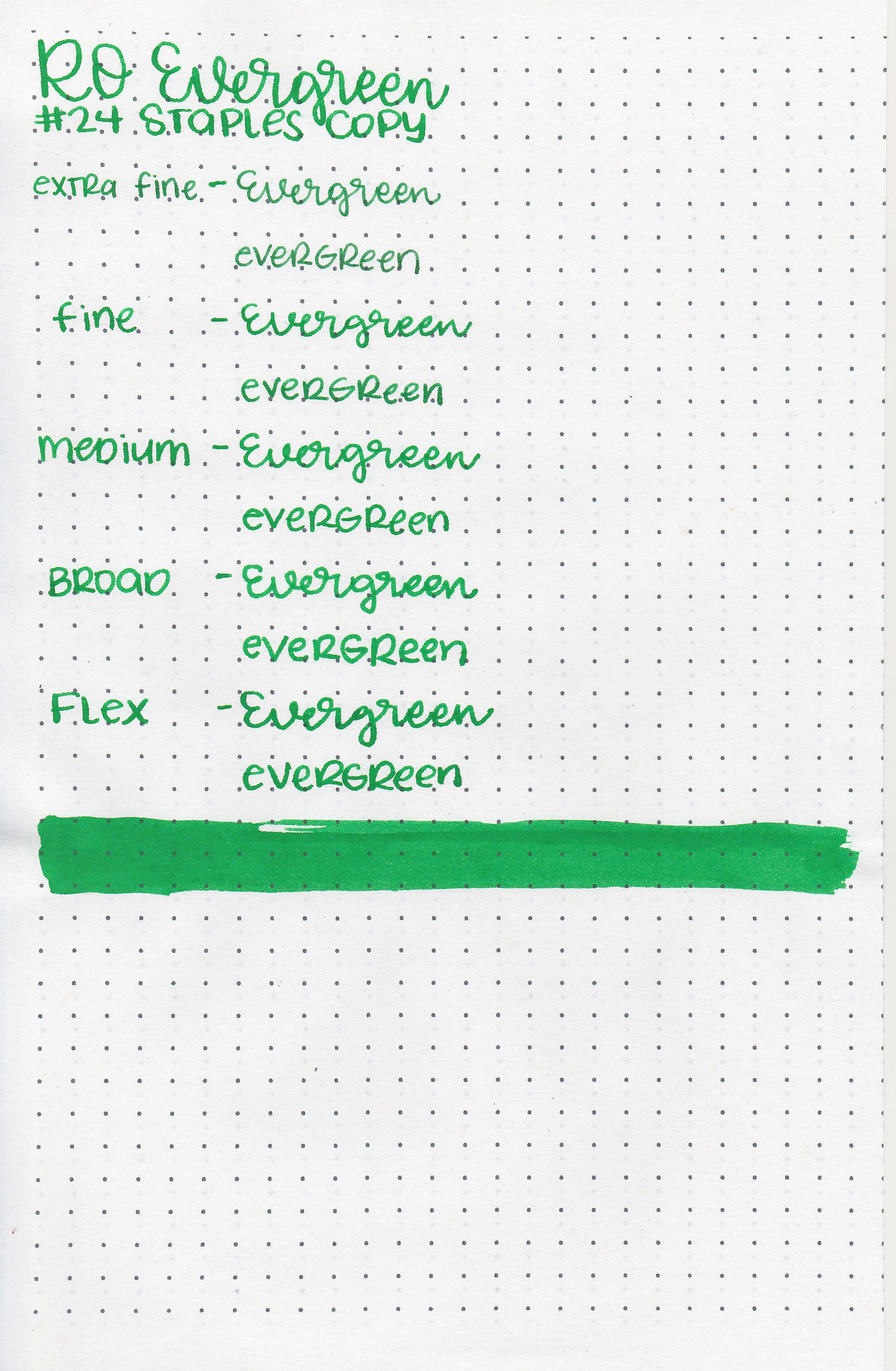
Robert Oster Evergreen is a bright summer green. You can find this ink for sale at most retailers including Pen Chalet (aff. link) and Vanness Pens.

The color:
Evergreen is a medium bright green.
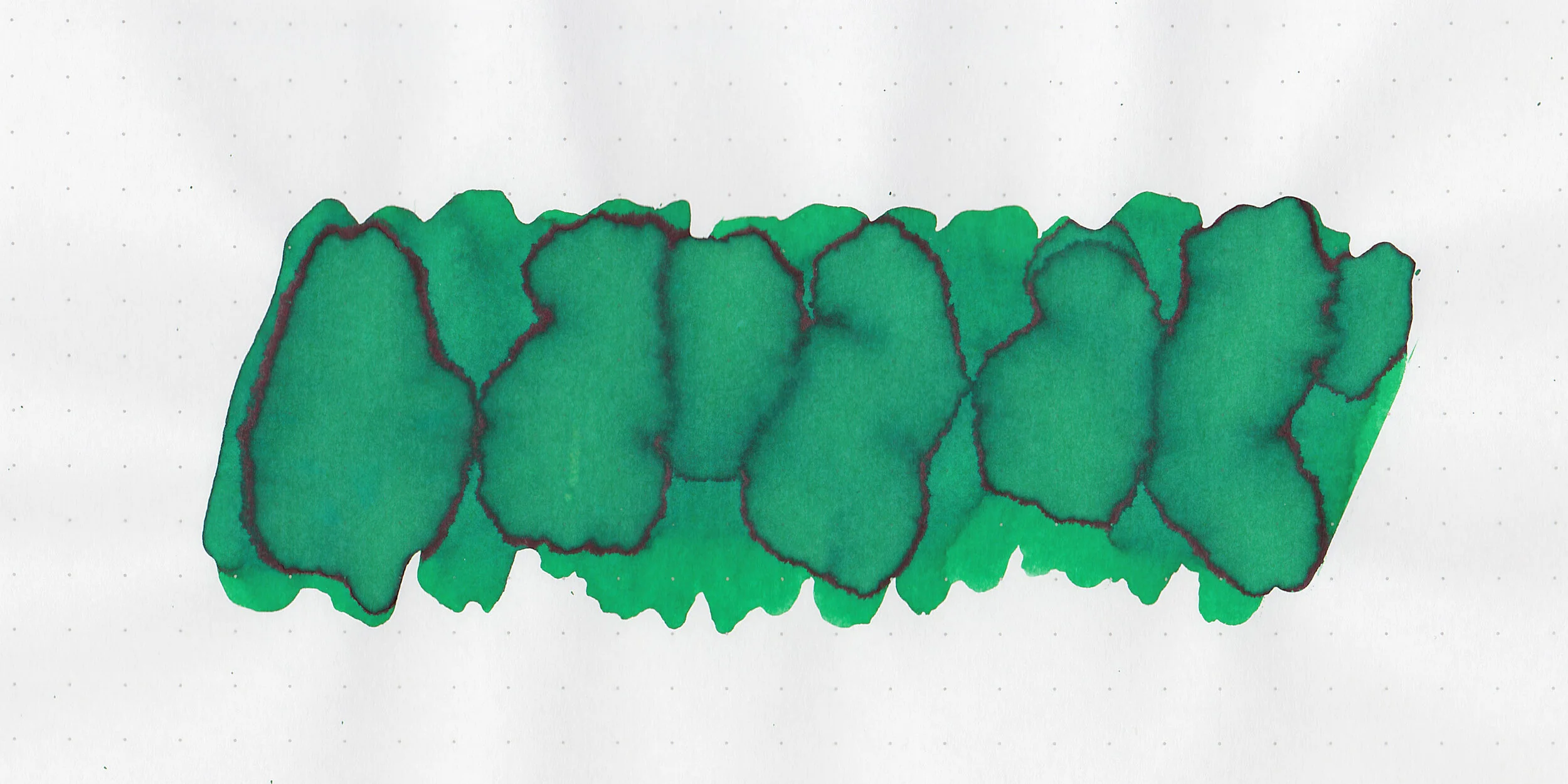
In large swabs on Tomoe River paper the ink has some pretty shading and a little bit of black sheen where the ink pooled.

Let's take a look at how the ink behaves on fountain pen friendly papers: Rhodia, Tomoe River, and Leuchtturm.
Dry time: 15 seconds
Water resistance: Medium
Feathering: None
Show through: Medium
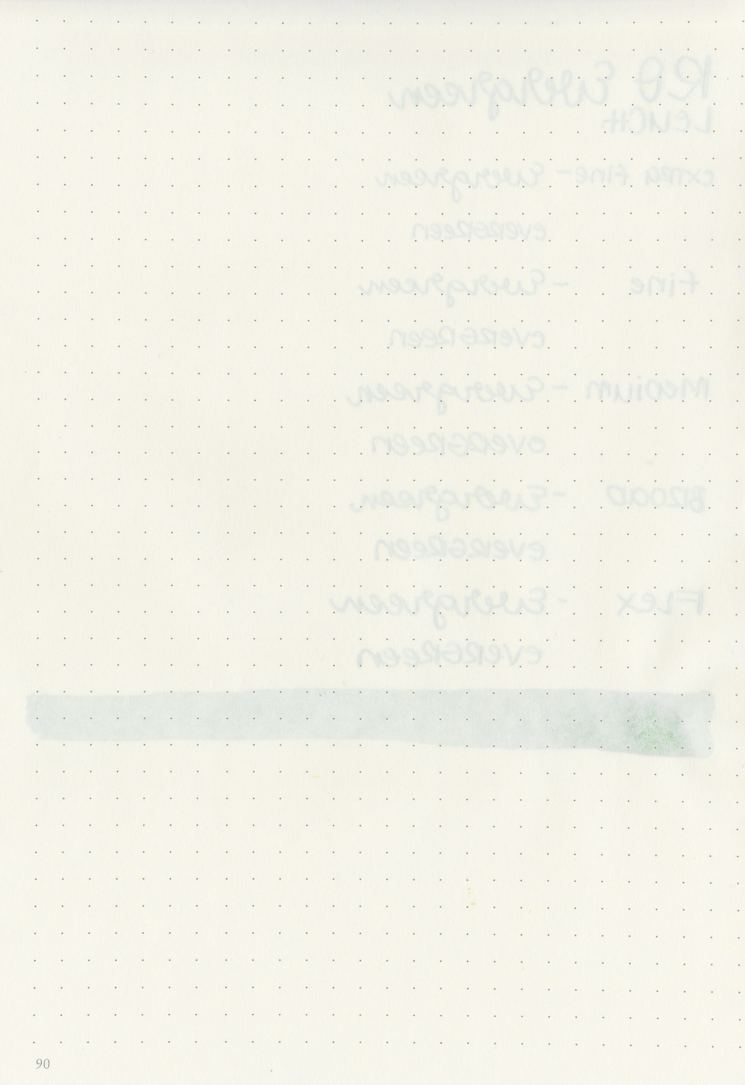
Bleeding: None
Other properties: medium shading, tiny black sheen, and no shimmer. The sheen is only visible in large swabs on Tomoe River Paper.
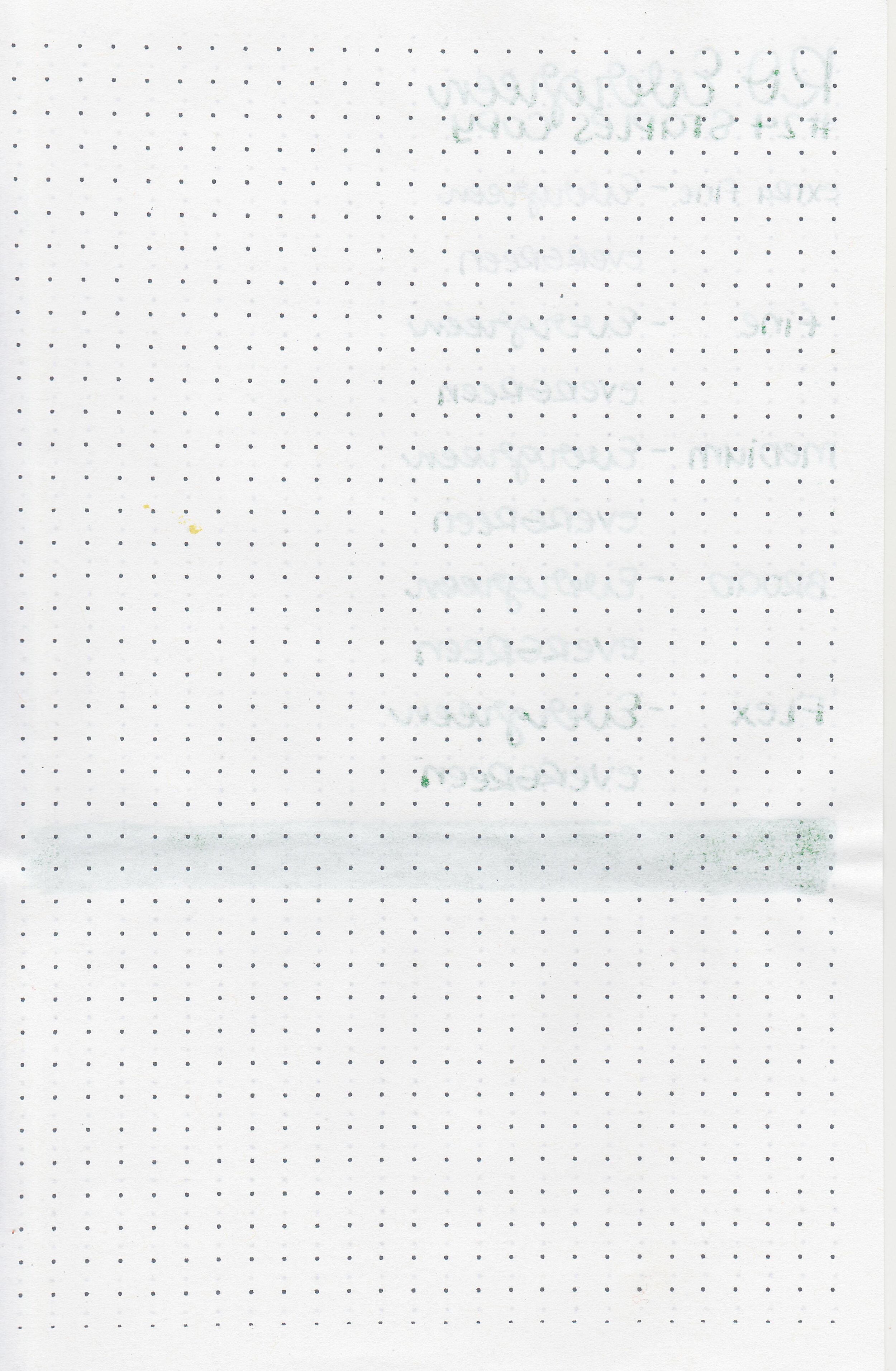
On Staples 24 lb copy paper there was some feathering in all nib sizes.

Evergreen is more yellow than most of these, it’s closest to Monteverde Hope. Click here to see the Robert Oster inks together, and click here to see the green inks together.

I used a Franklin-Christoph 45 Vanness with a broad nib on a Taroko Enigma notebook. The ink had an average flow.
Overall, this is a great summer green, but it might work well as a brighter Christmas green as well. It’s well-behaved, a pretty color and worth a try!
Disclaimer: All photos and opinions are my own. This page does contain affiliate links but this post is not sponsored in any way.

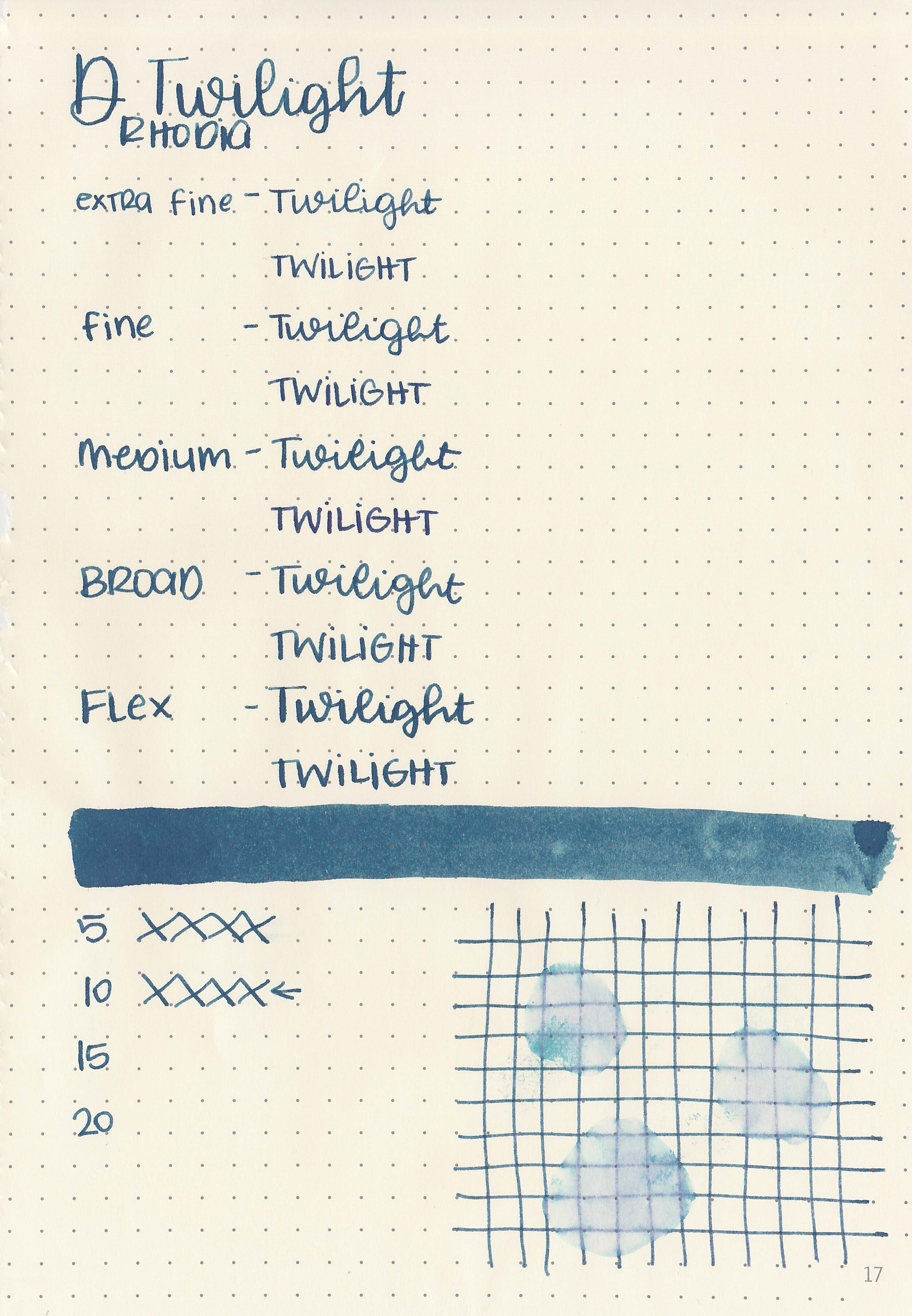
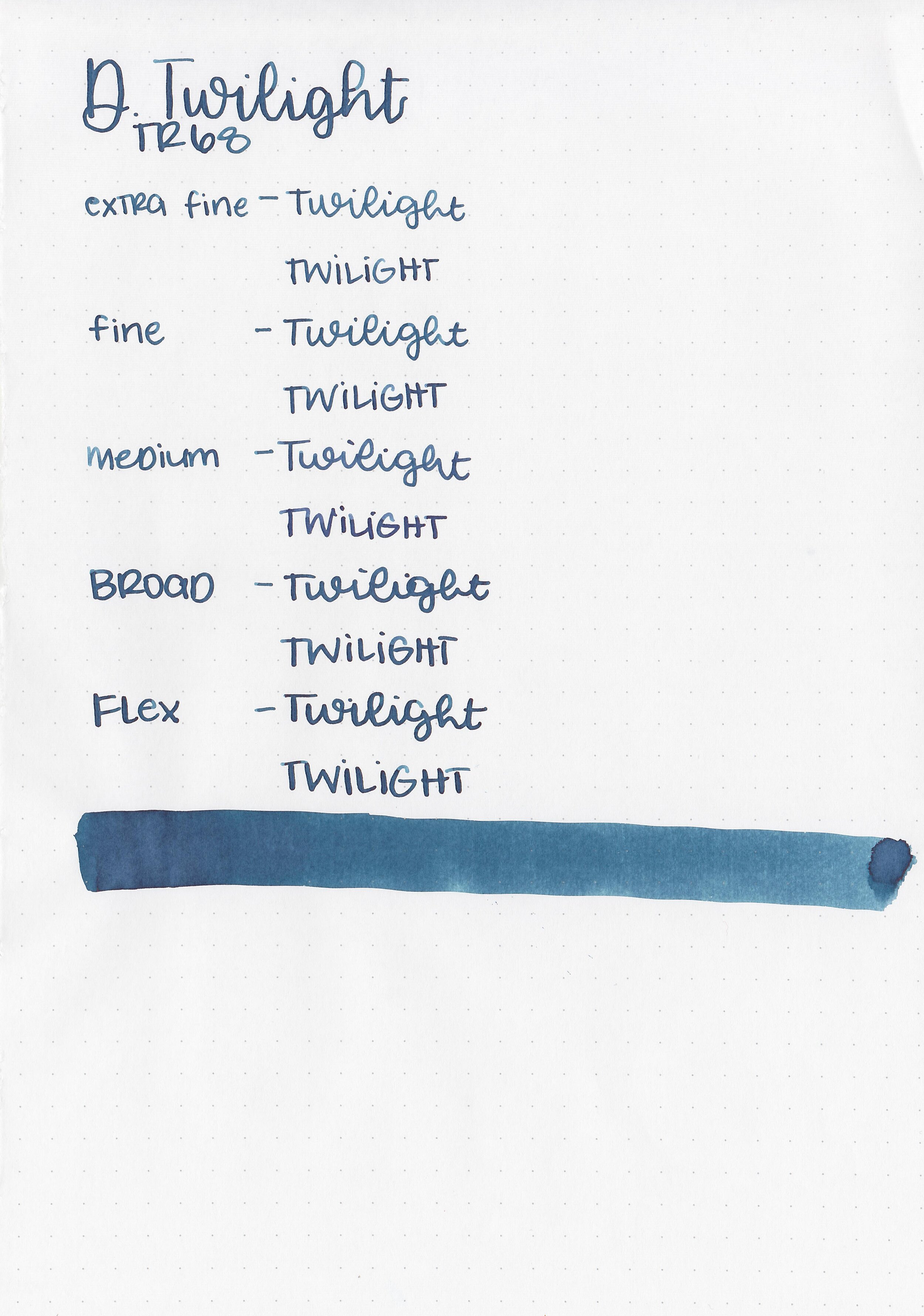
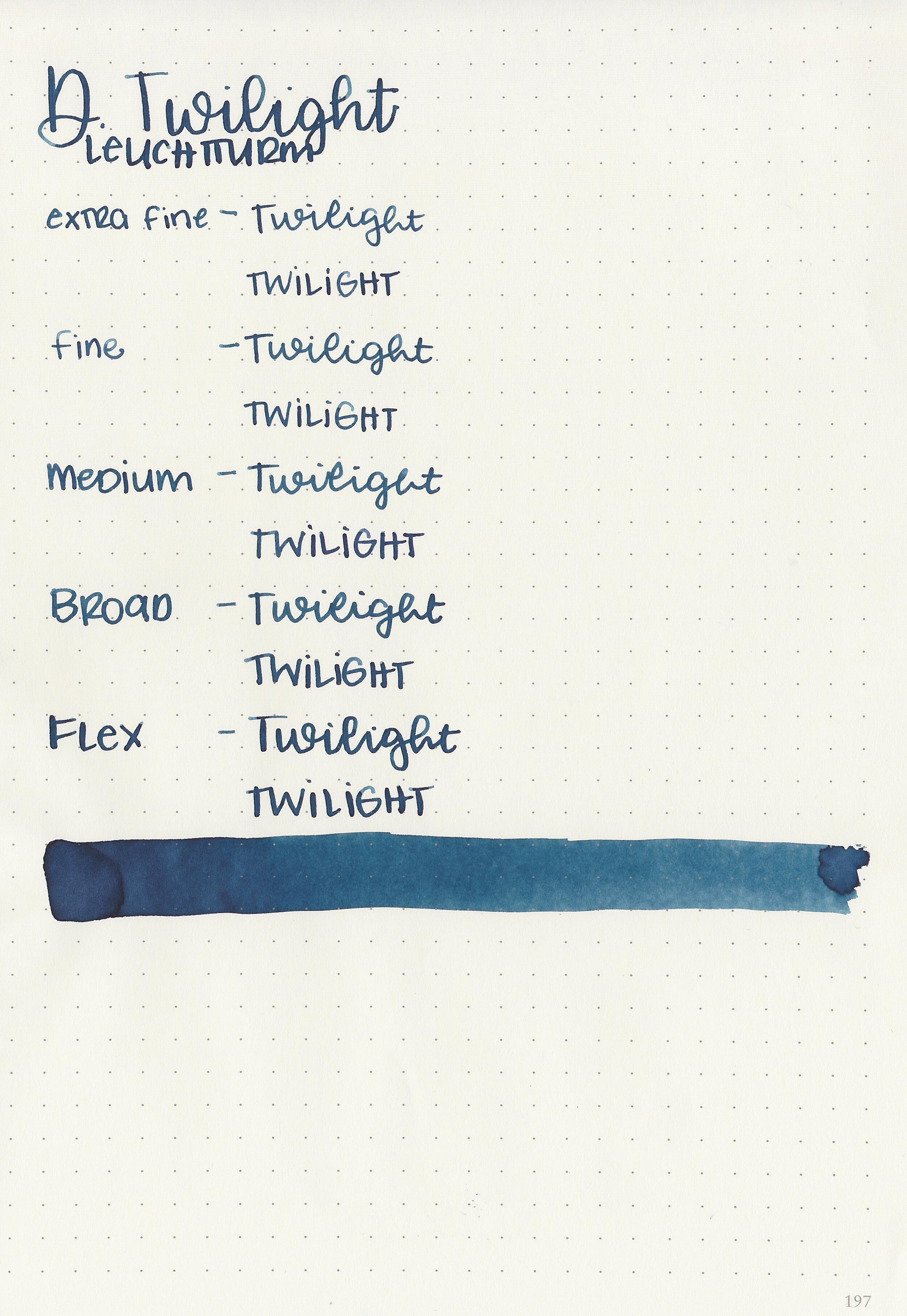
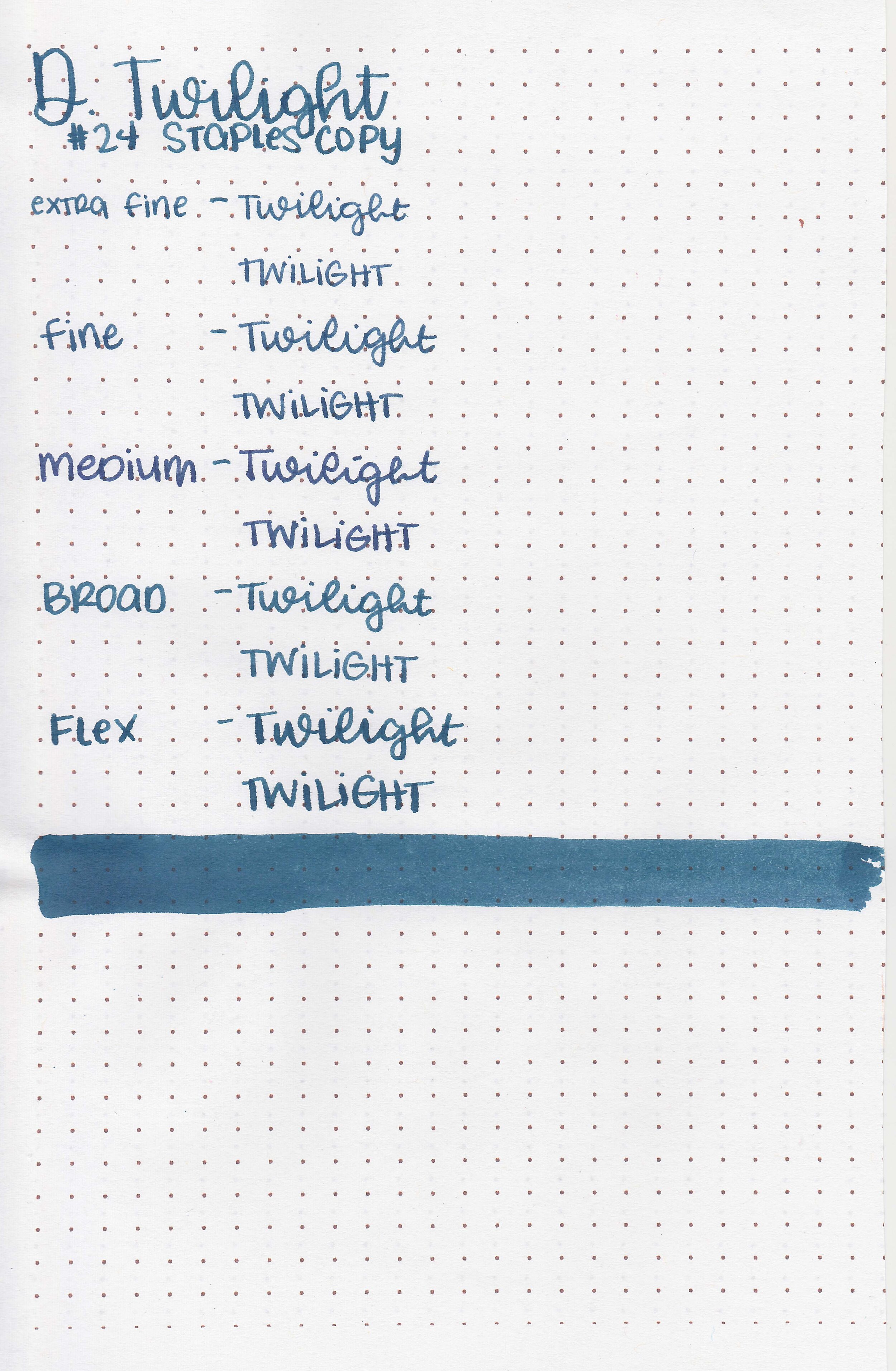
Diamine Twilight is a great color for fall! I purchased my bottle of ink from Cult Pens.

The color:
Twilight is a dark blue with a slight green undertone.

In large swabs on Tomoe River paper the ink has some pretty shading and a little bit of sheen.

Let's take a look at how the ink behaves on fountain pen friendly papers: Rhodia, Tomoe River, and Leuchtturm.
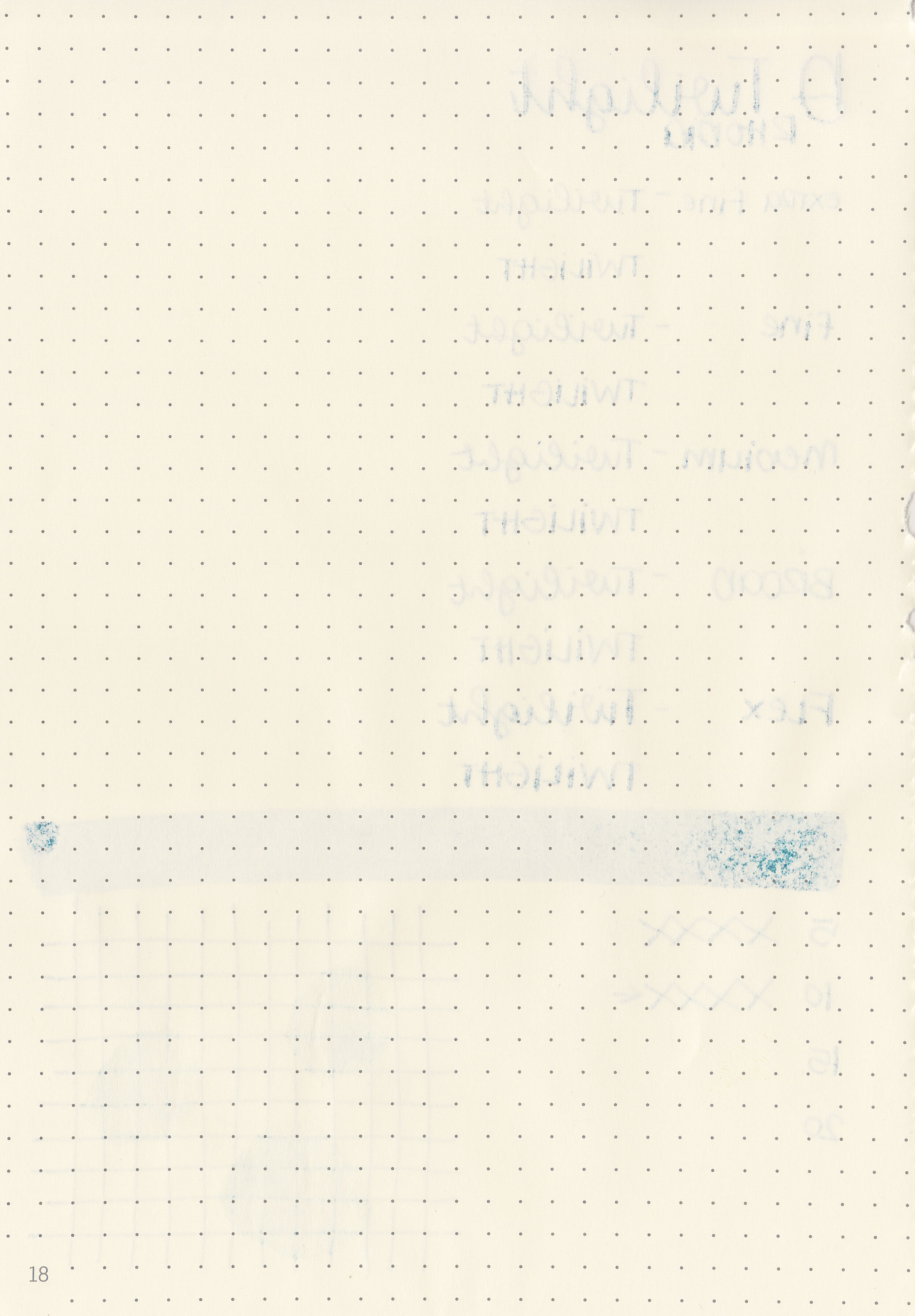
Dry time: 10 seconds
Water resistance: Low
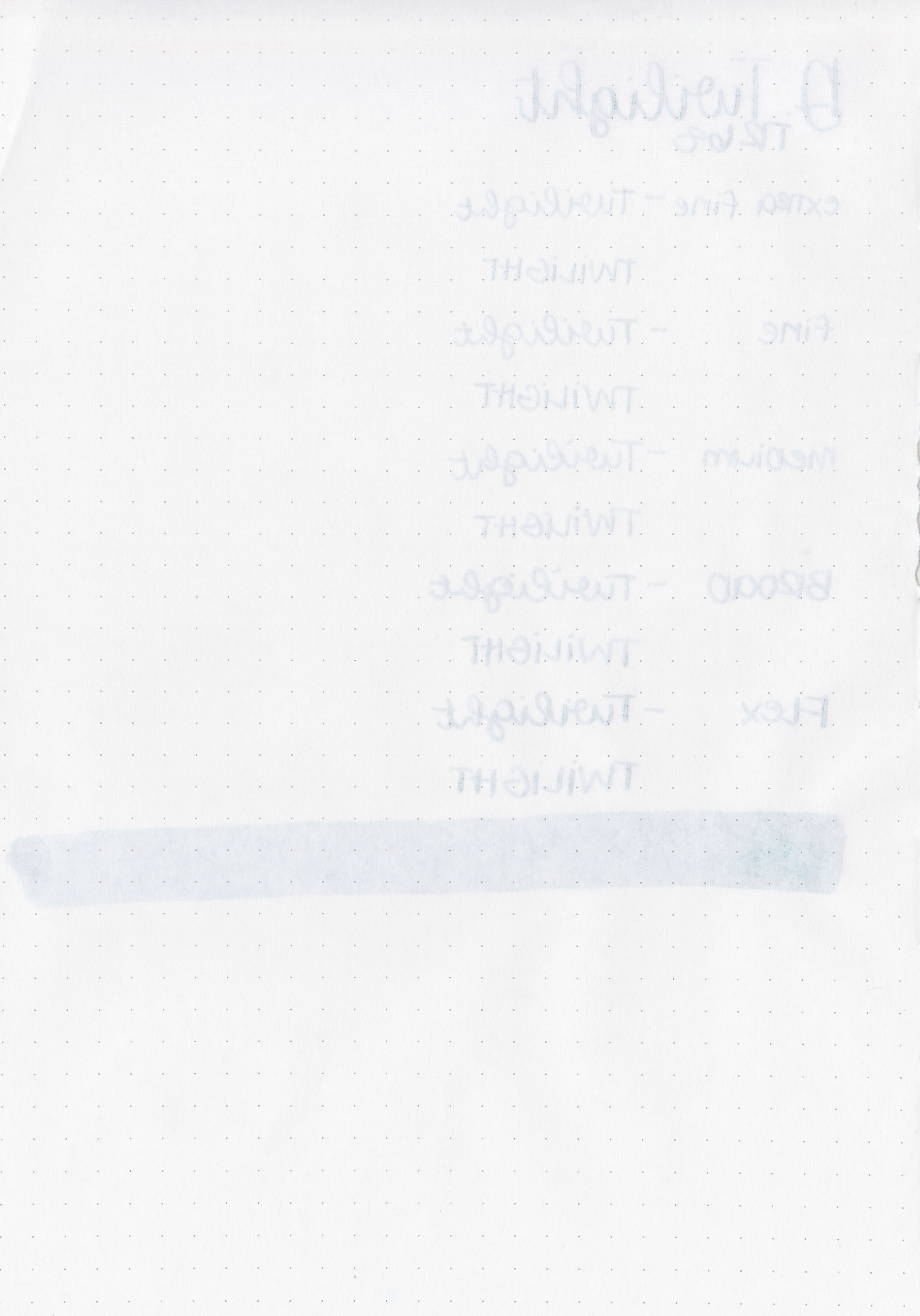
Feathering: Low
Show through: Medium
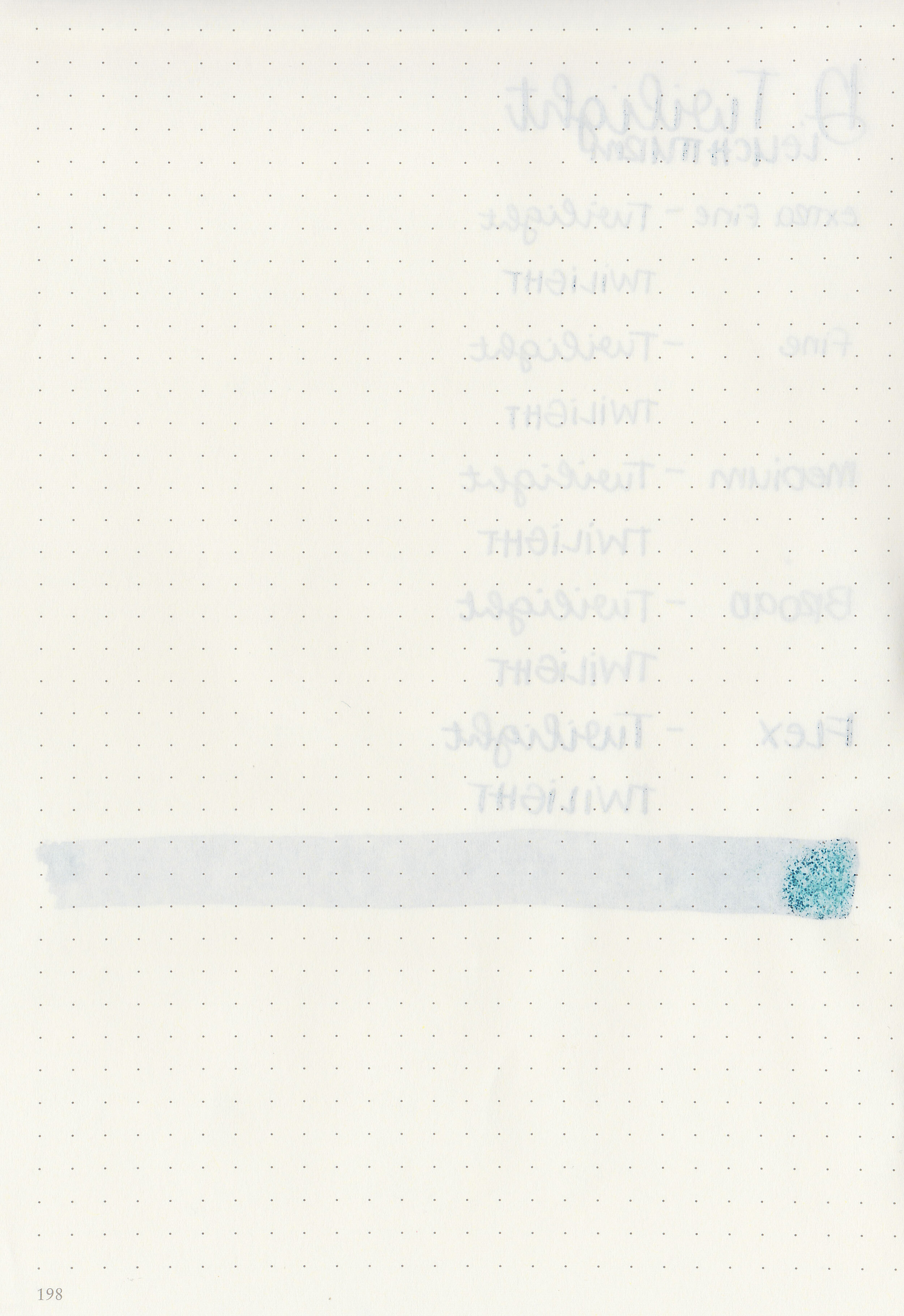
Bleeding: Low
Other properties: medium shading, tiny pink sheen, and no shimmer. The sheen is only visible in very large swabs on Tomoe River paper.
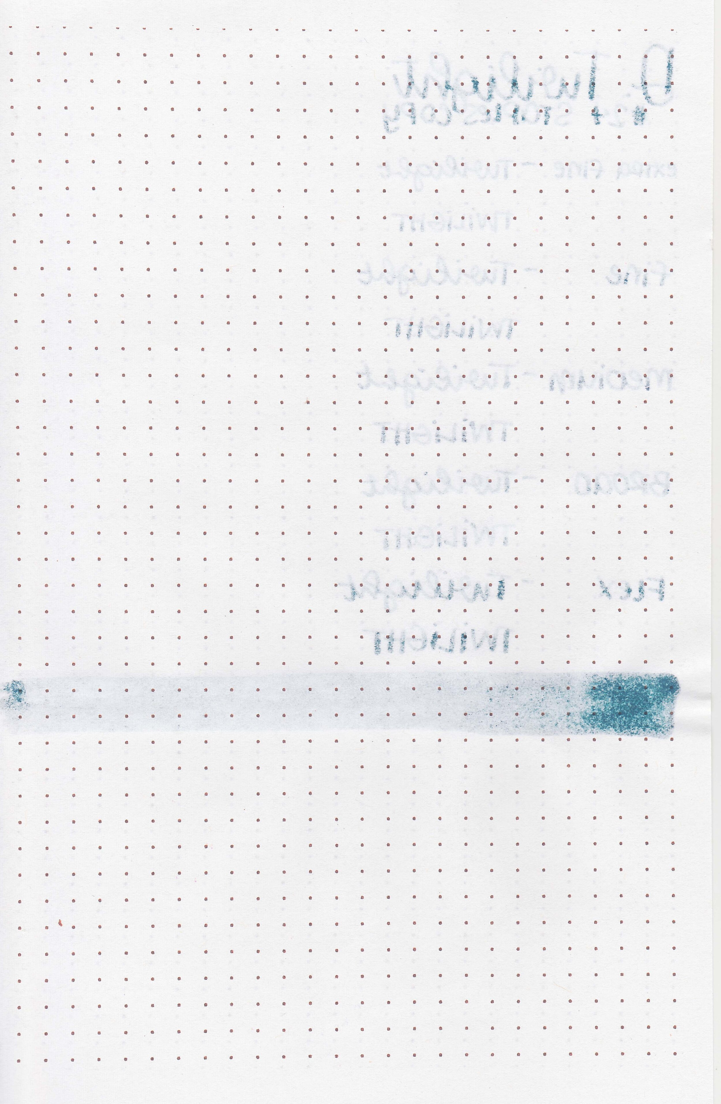
On Staples 24 lb copy paper there was some feathering and bleeding in most nib sizes.

Twilight is darker than Birmingham Cornflower, but greener than Diamine Indigo. Click here to see the Diamine inks together, and click here to see the blue inks together.

I used a Pelikan M805 Stresemann with a medium nib on a Taroko Enigma notebook. The ink had an average flow.
Overall, this is a great color for fall, but it does have a bit more bleeding and feathering than I prefer.
Disclaimer: I purchased this ink myself, and all photos and opinions are my own. This page does not contain affiliate links and this post is not sponsored in any way.
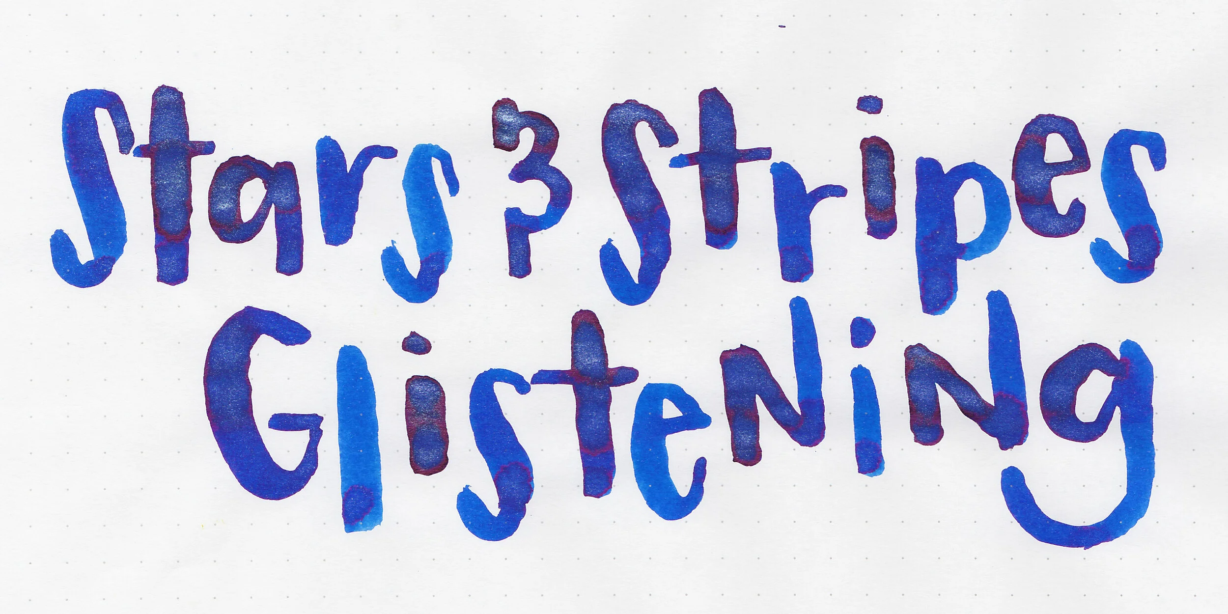
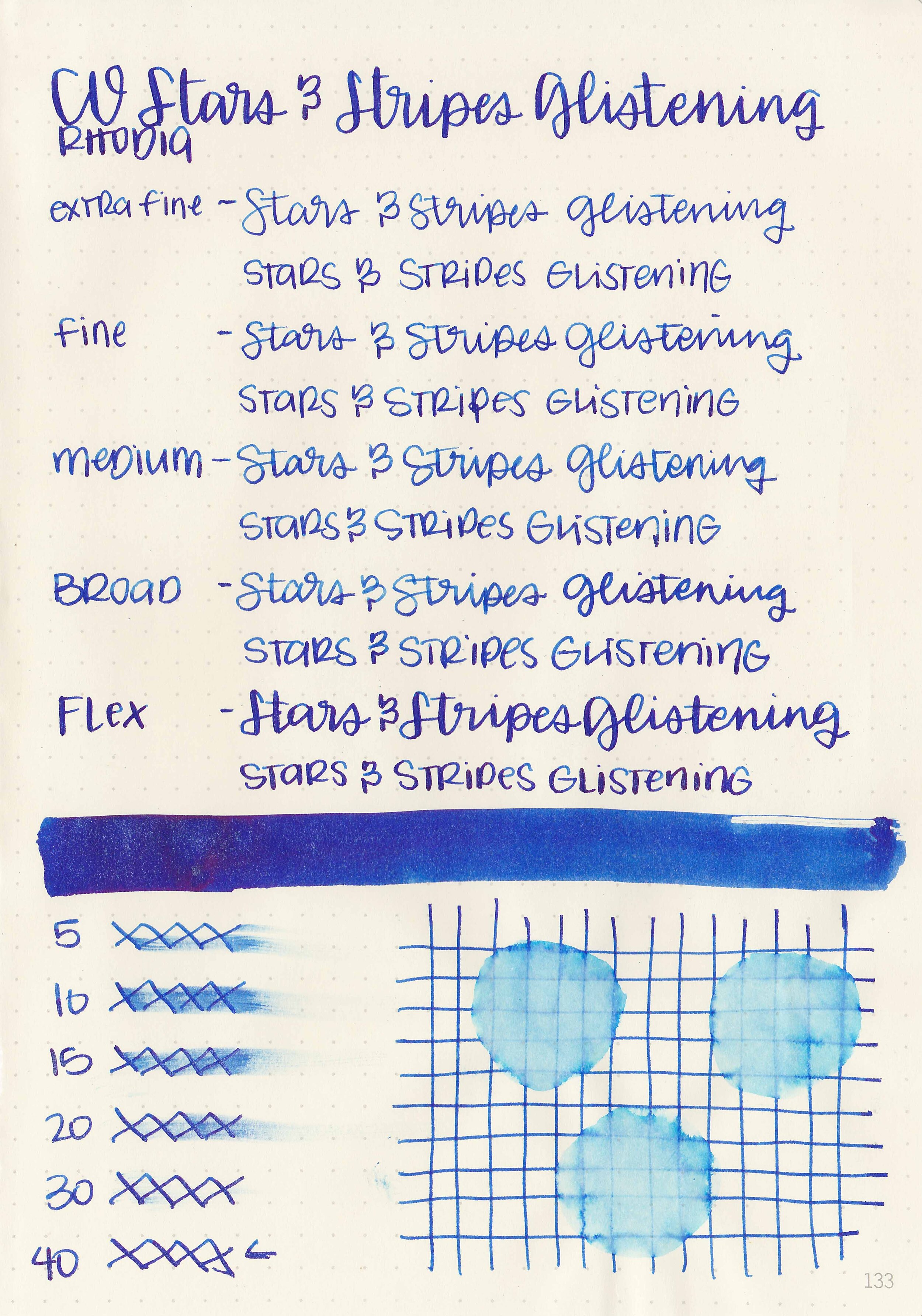
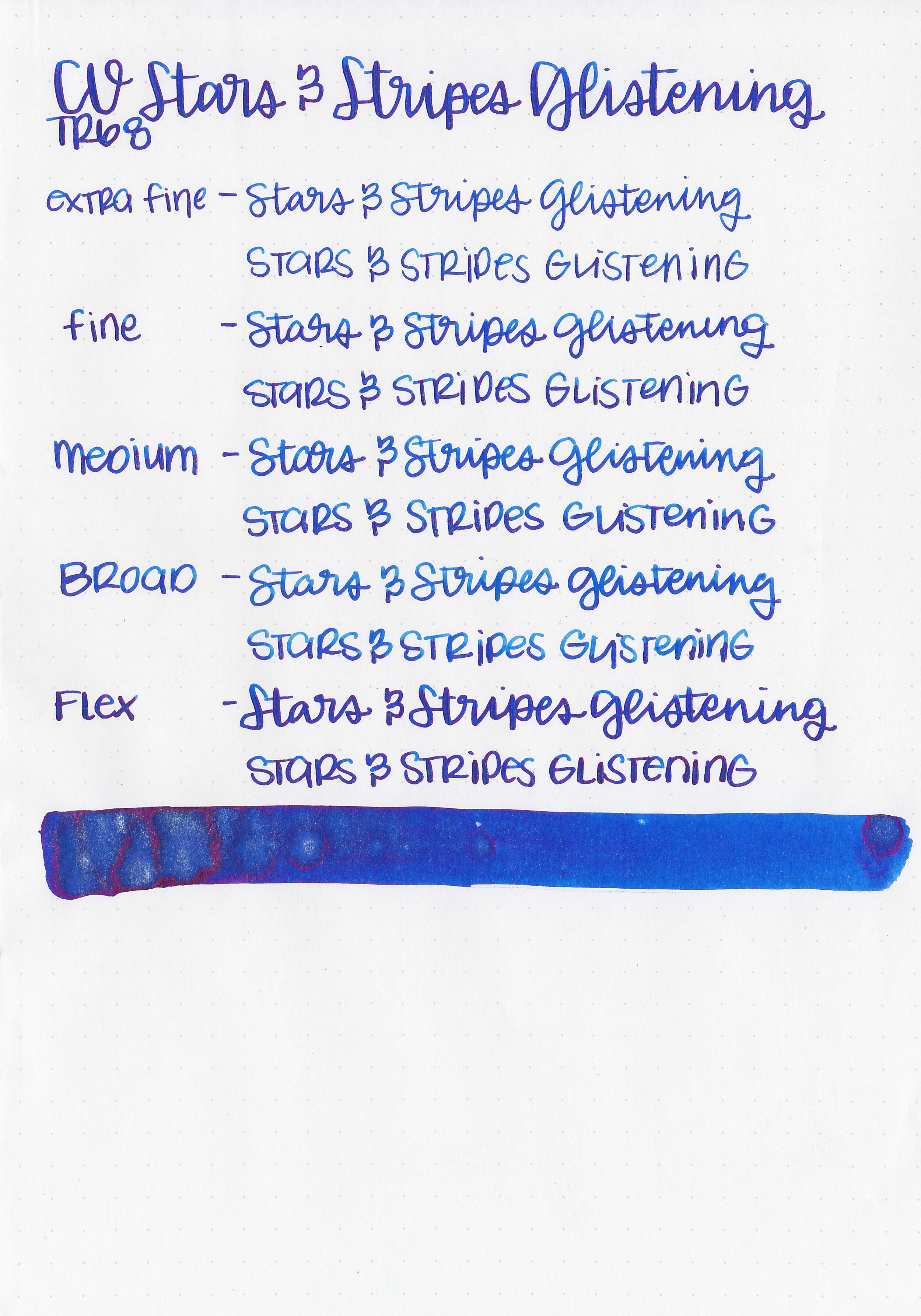
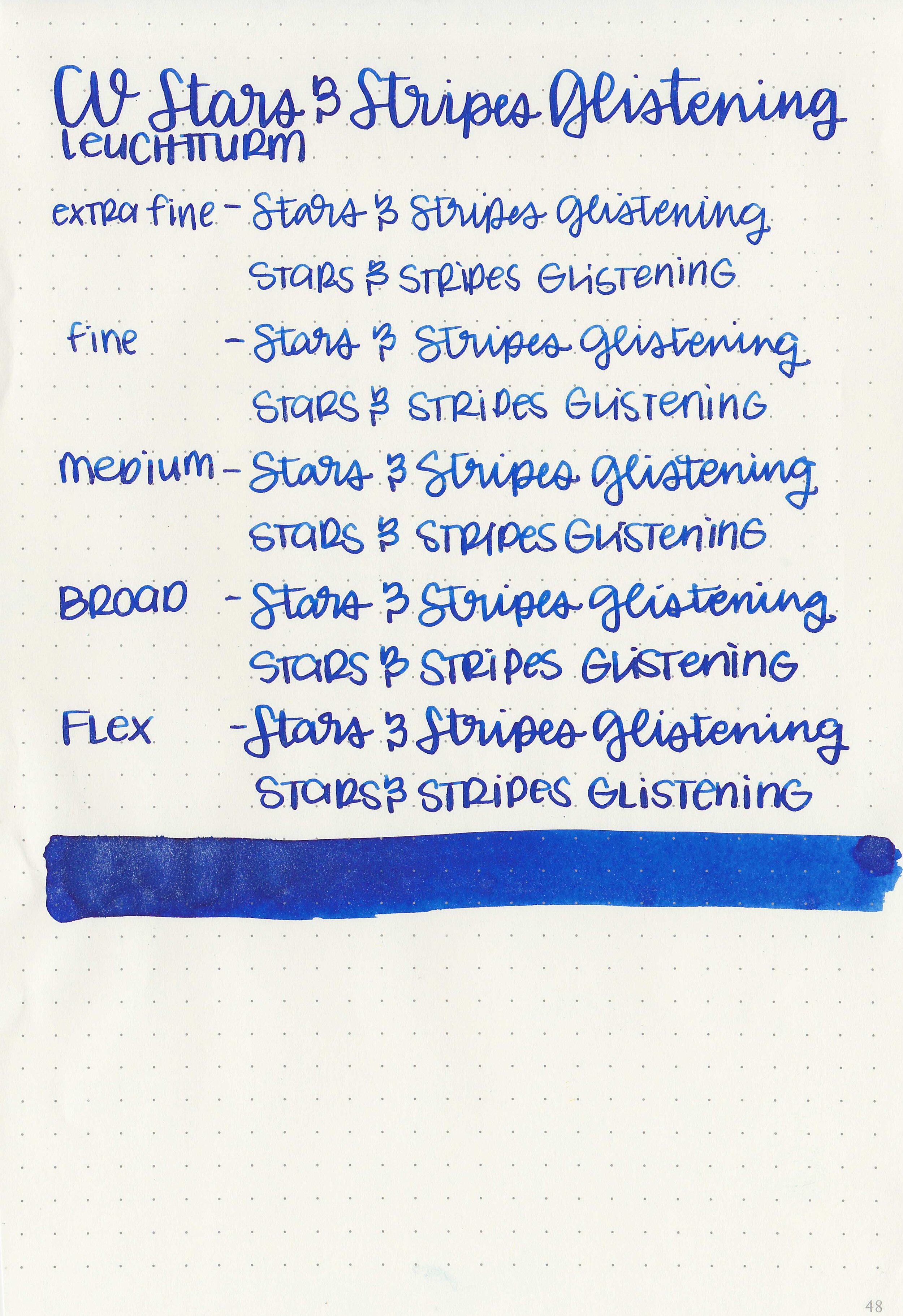
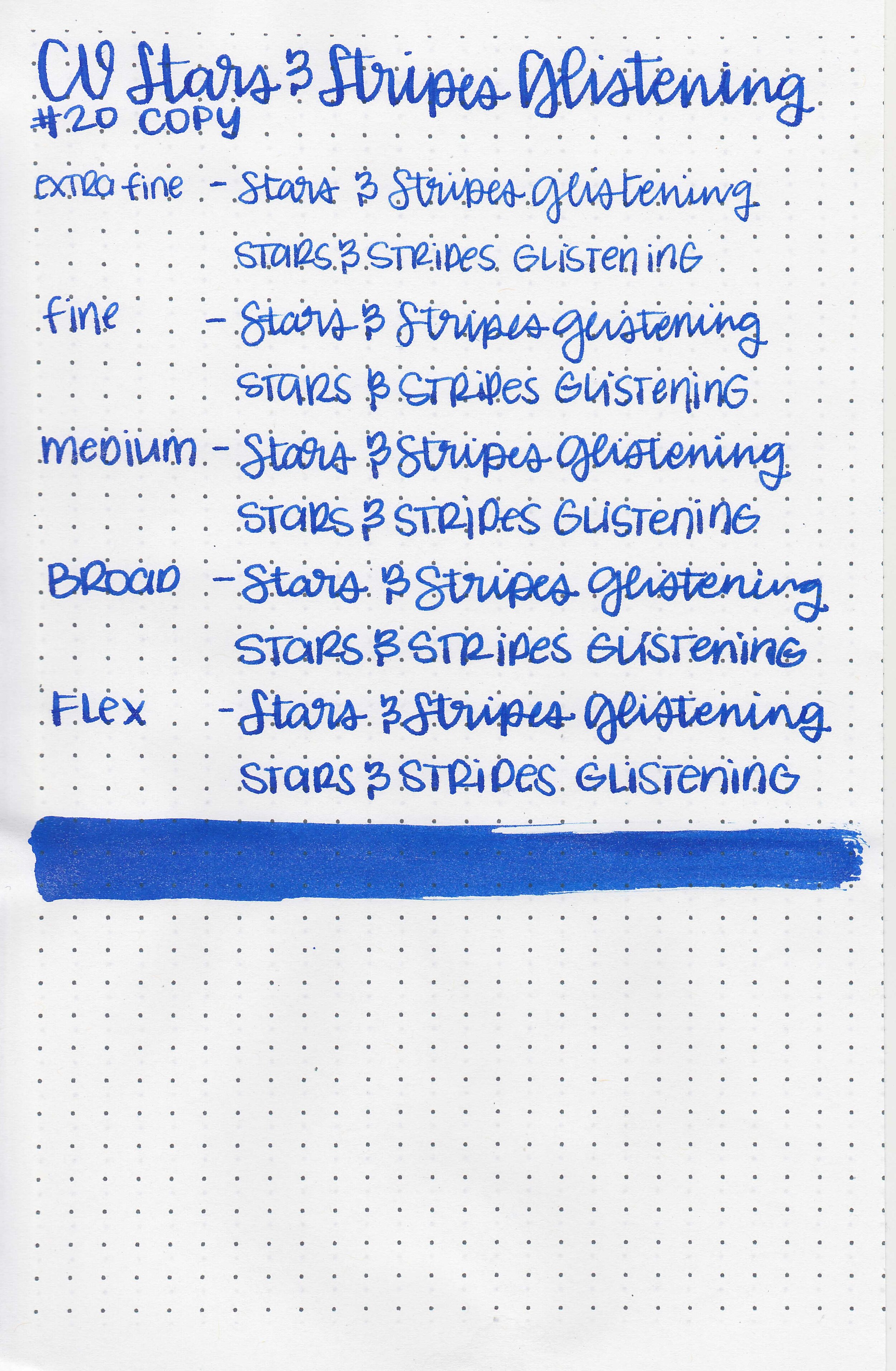
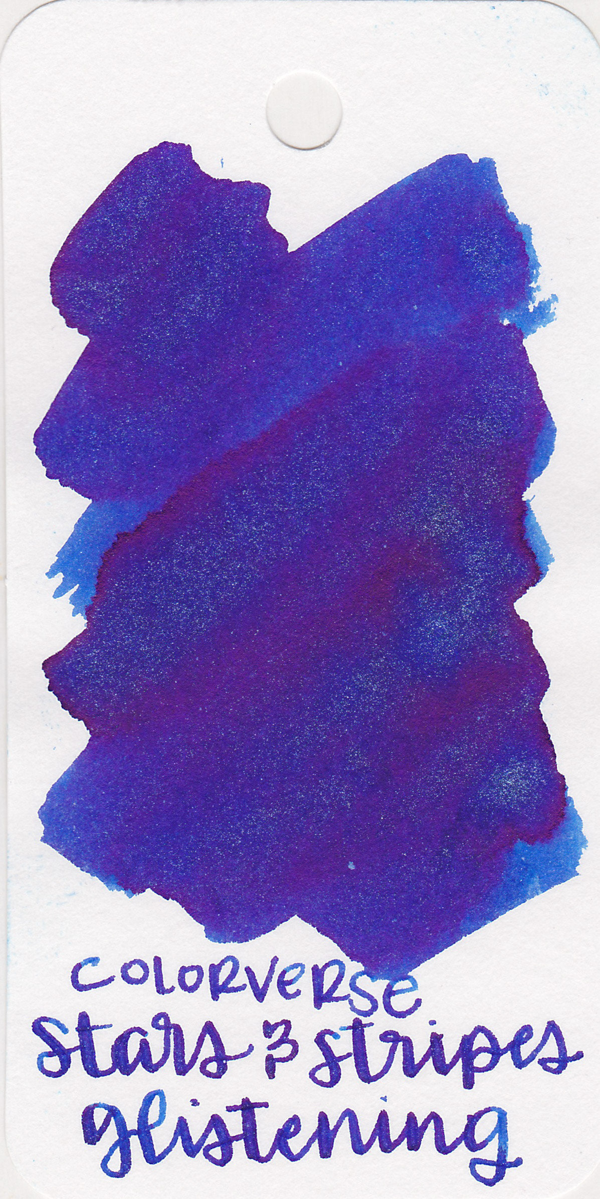
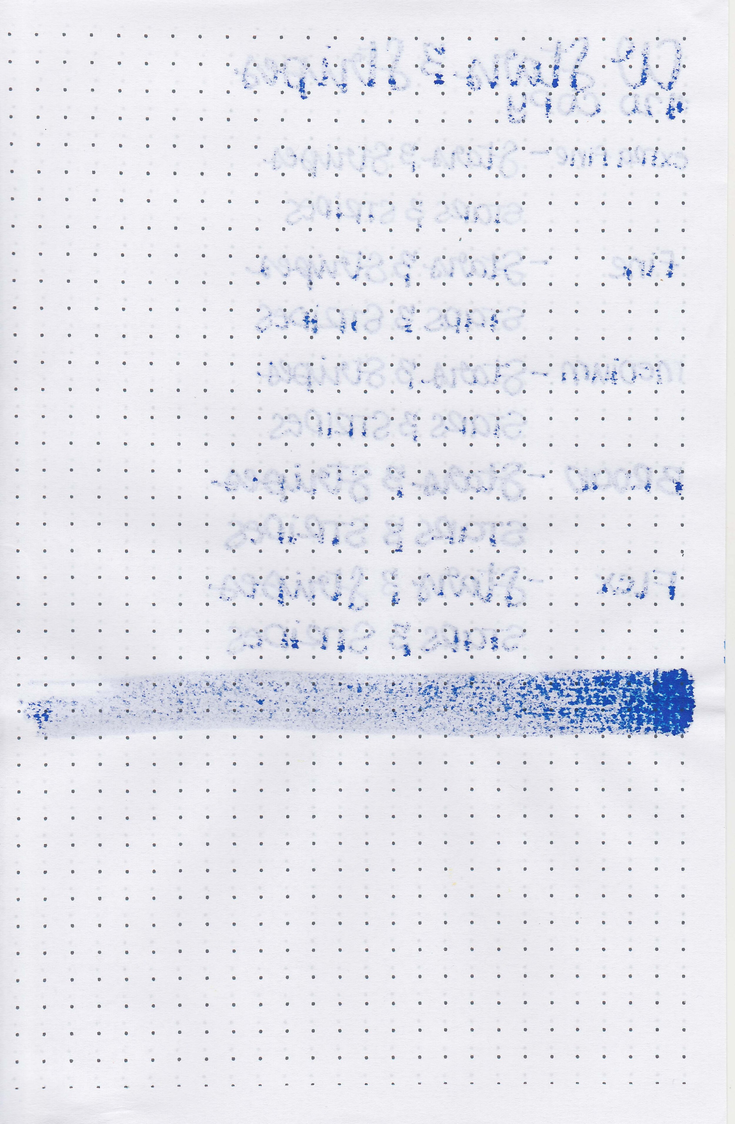
We recently took a look at Colorverse Stars and Stripes, so let’s take a look at the sparkling version today-Stars and Stripes Glistening. Thanks to Goldspot Pens for sending a bottle over for review!
The color:
Stars and Stripes Glistening is a dark blue with pink sheen and light blue shimmer.
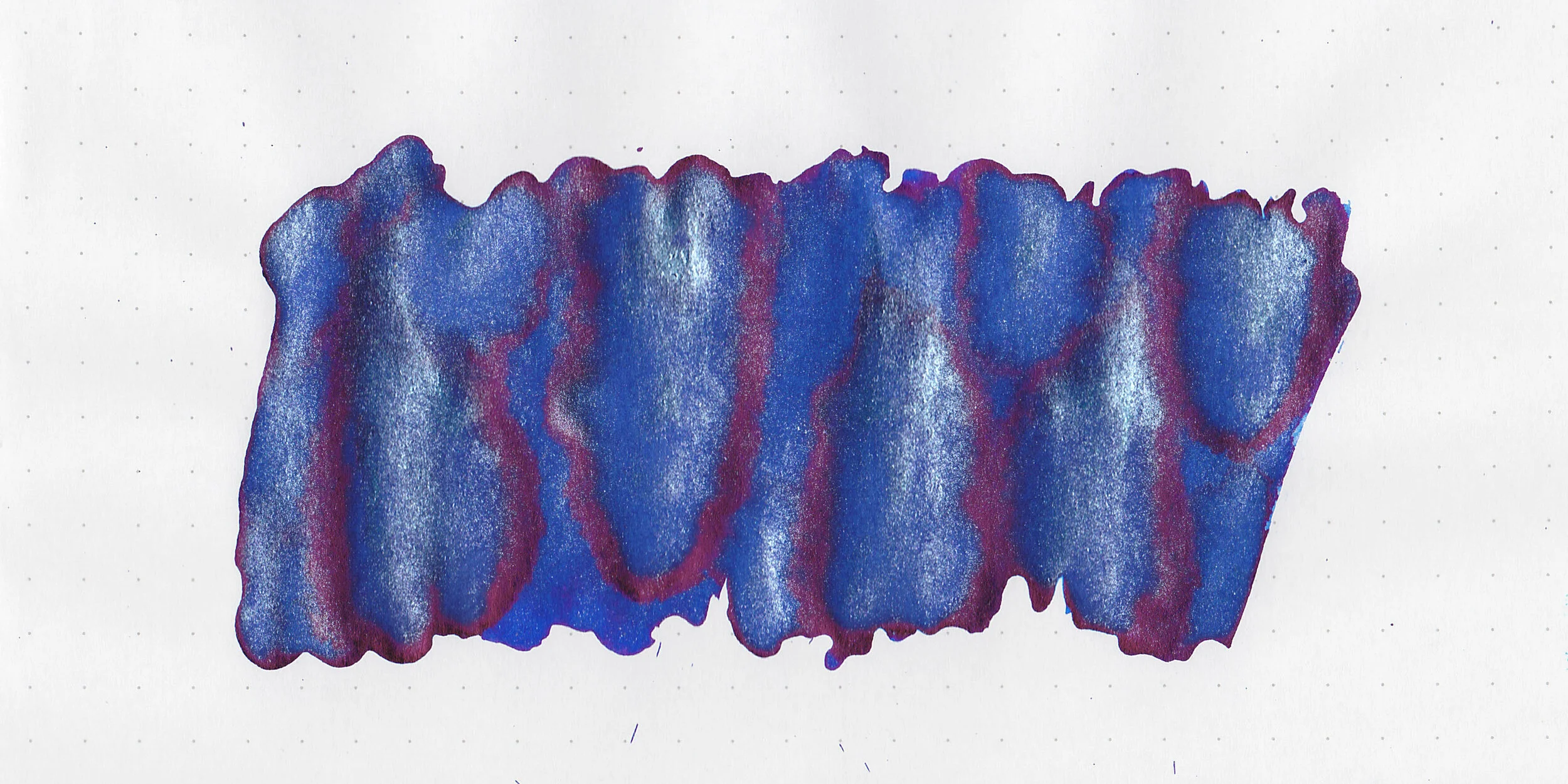
In large swabs on Tomoe River paper the ink has some dark pink sheen and light blue shimmer.

Let's take a look at how the ink behaves on fountain pen friendly papers: Rhodia, Tomoe River, and Leuchtturm.
Dry time: 40 seconds
Water resistance: Medium
Feathering: None
Show through: Medium
Bleeding: Low
Other properties: medium shading, high pink sheen, and light blue shimmer.
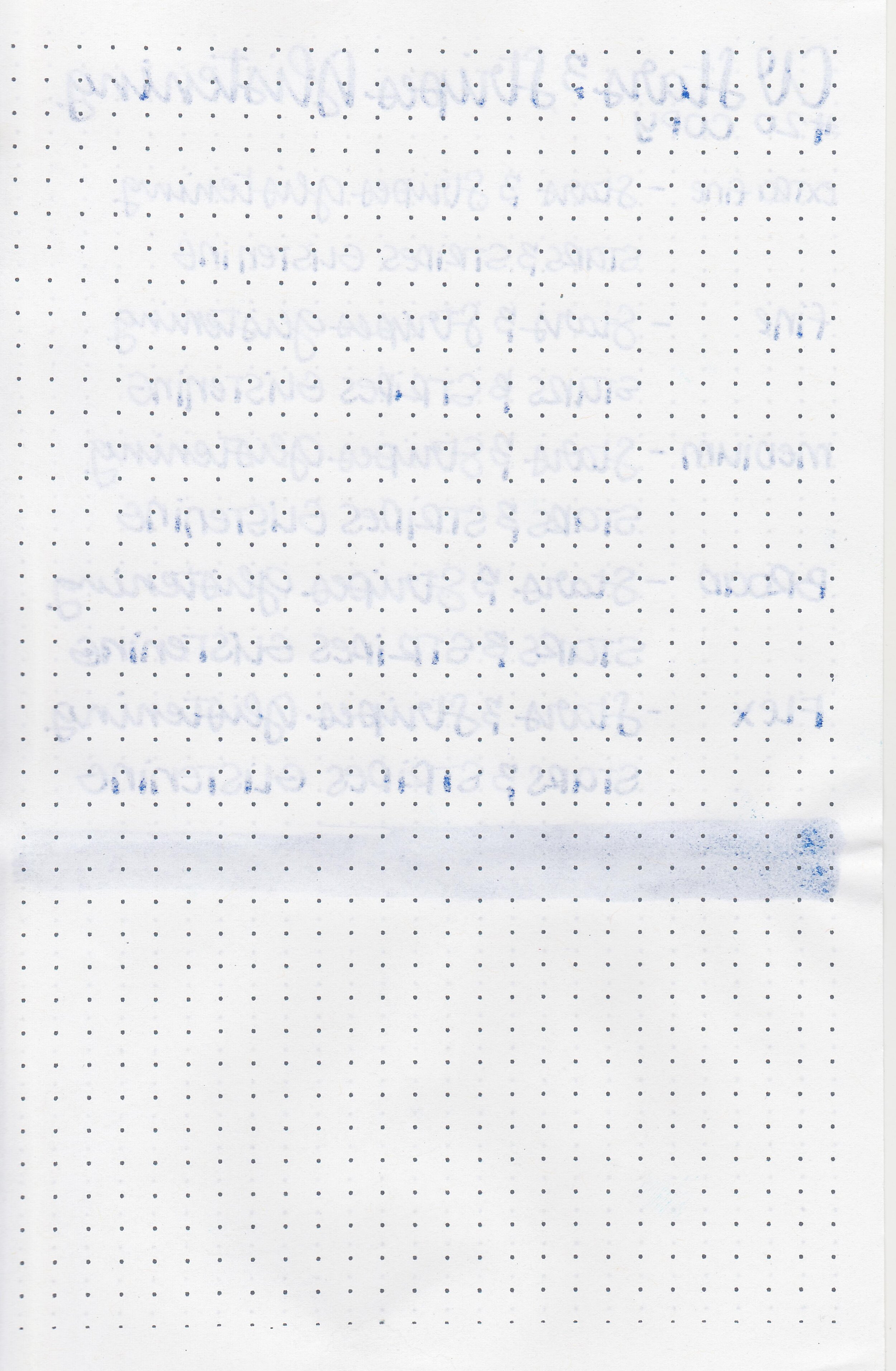
On Staples 24 lb copy paper there was some feathering and bleeding in most nib sizes.

Colorverse Stars and Stripes Glistening is the shimmer version of Colorverse Stars and Stripes. It’s closest to Diamine Blue Pearl. Click here to see the Colorverse inks together, and click here to see the blue inks together.
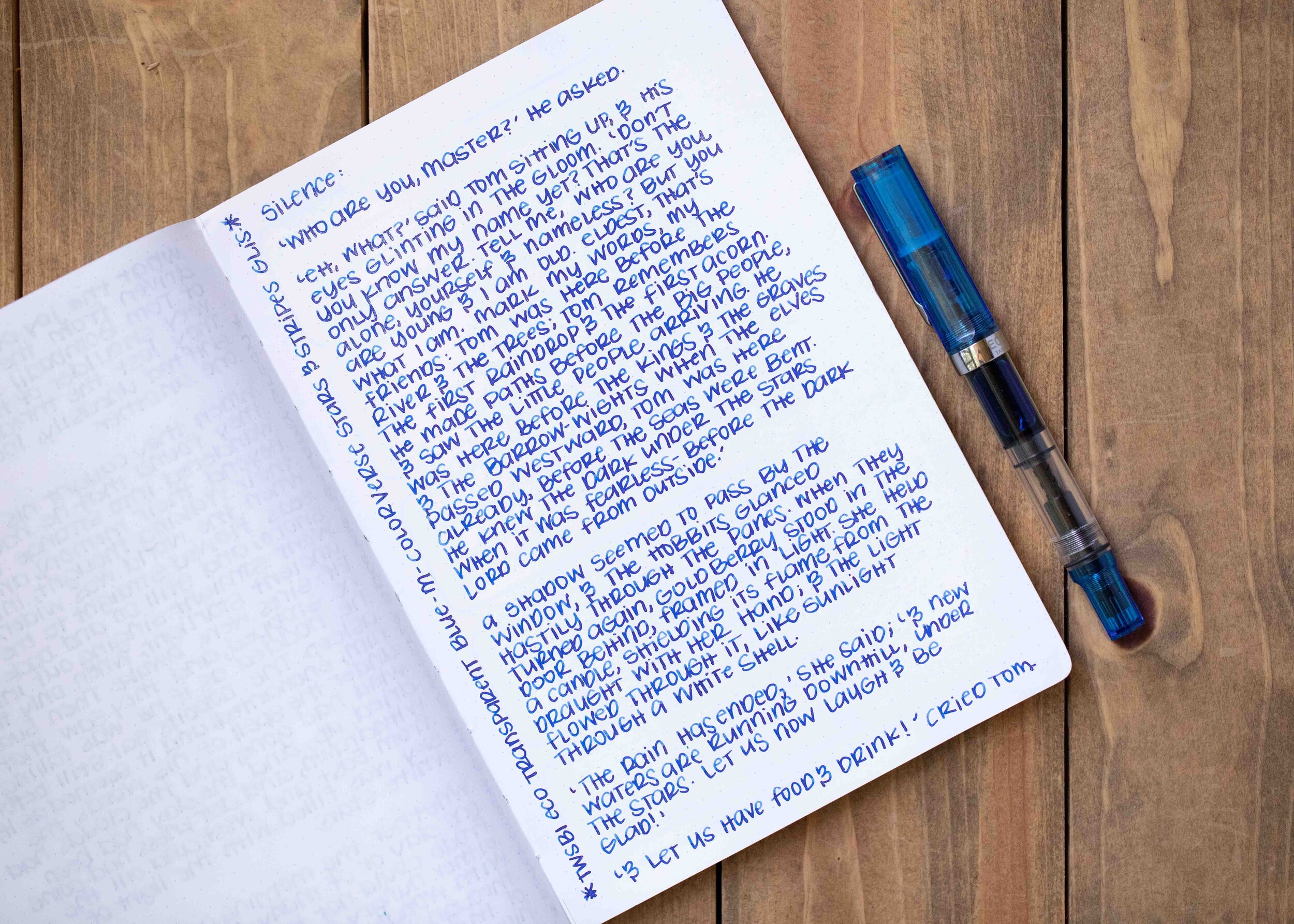
I used a TWSBI Eco Transparent Blue with a medium nib on a Taroko Enigma notebook. The ink had an average flow.
Overall, this is a fun ink! It’s generally well behaved, and I didn’t have any issues with clogging or smearing.
Disclaimer: This ink was provided by Goldspot Pens for the purpose of this review. All photos and opinions are my own. This page does not contain affiliate links and this post is not sponsored in any way.

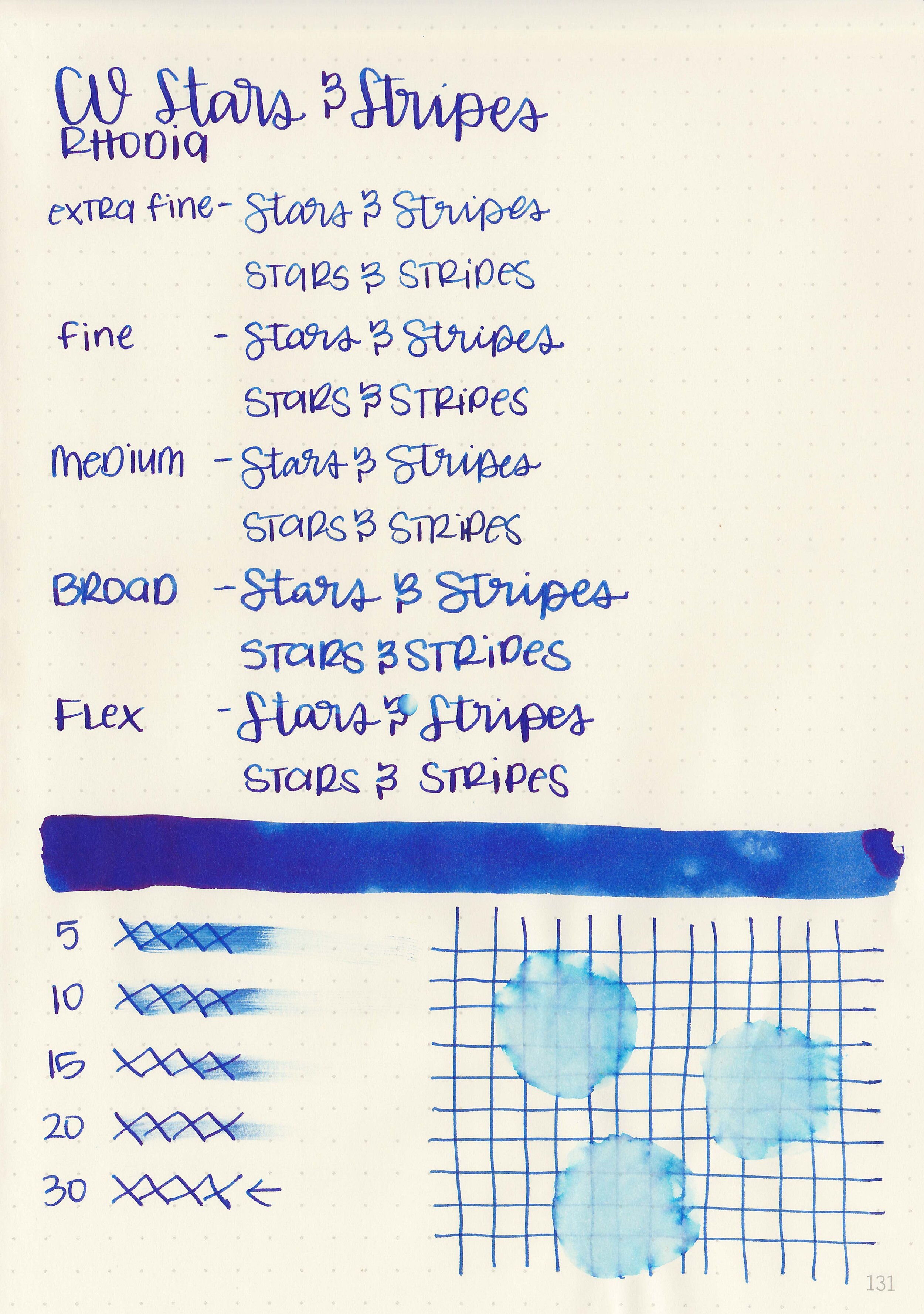
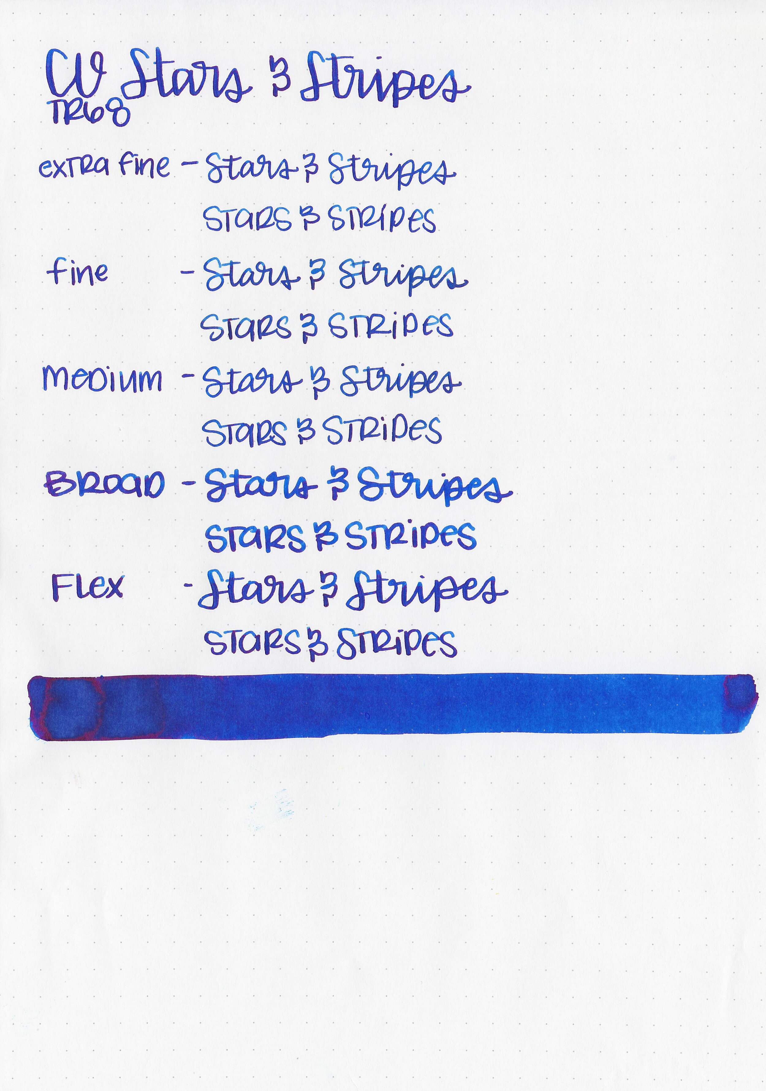
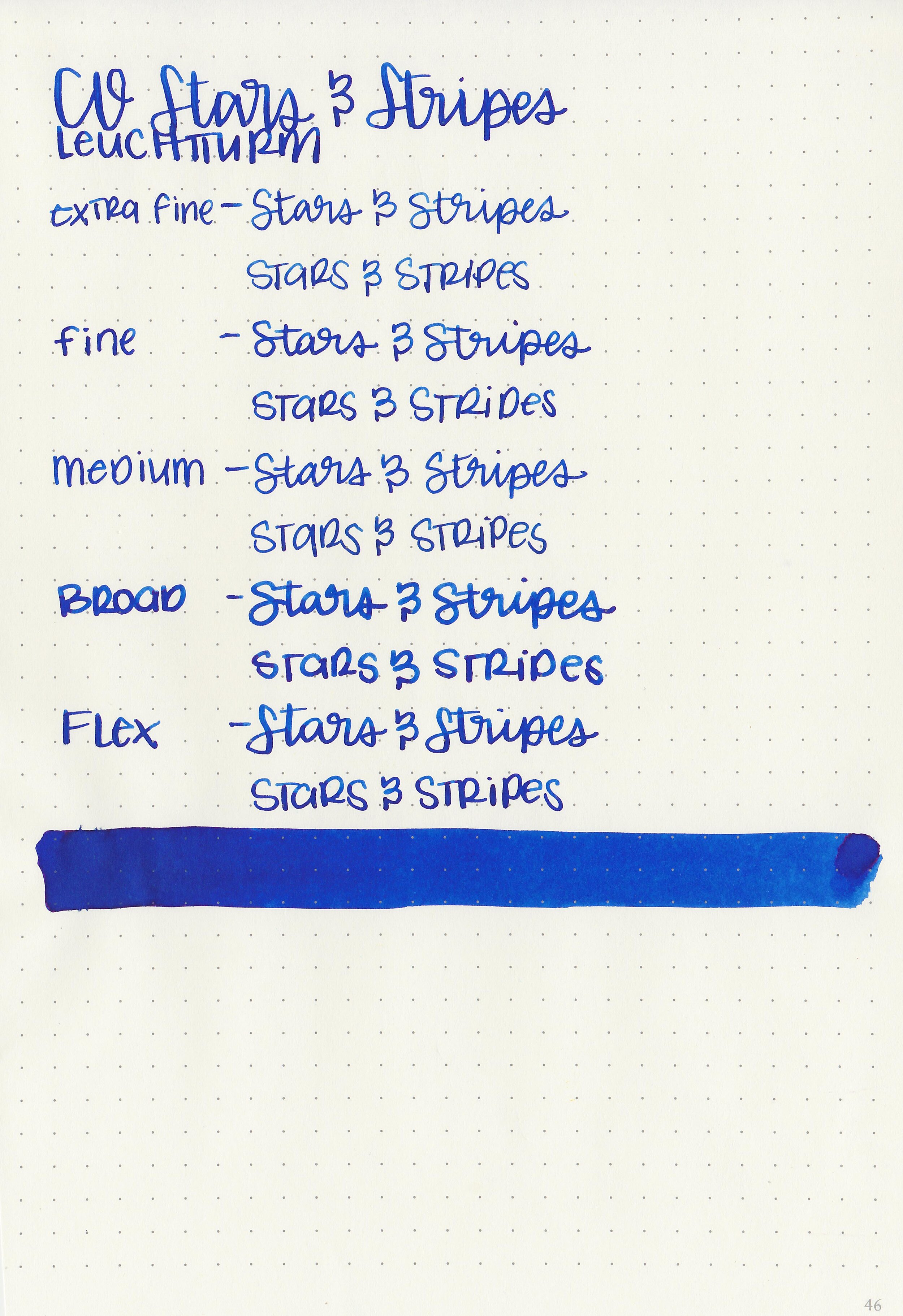
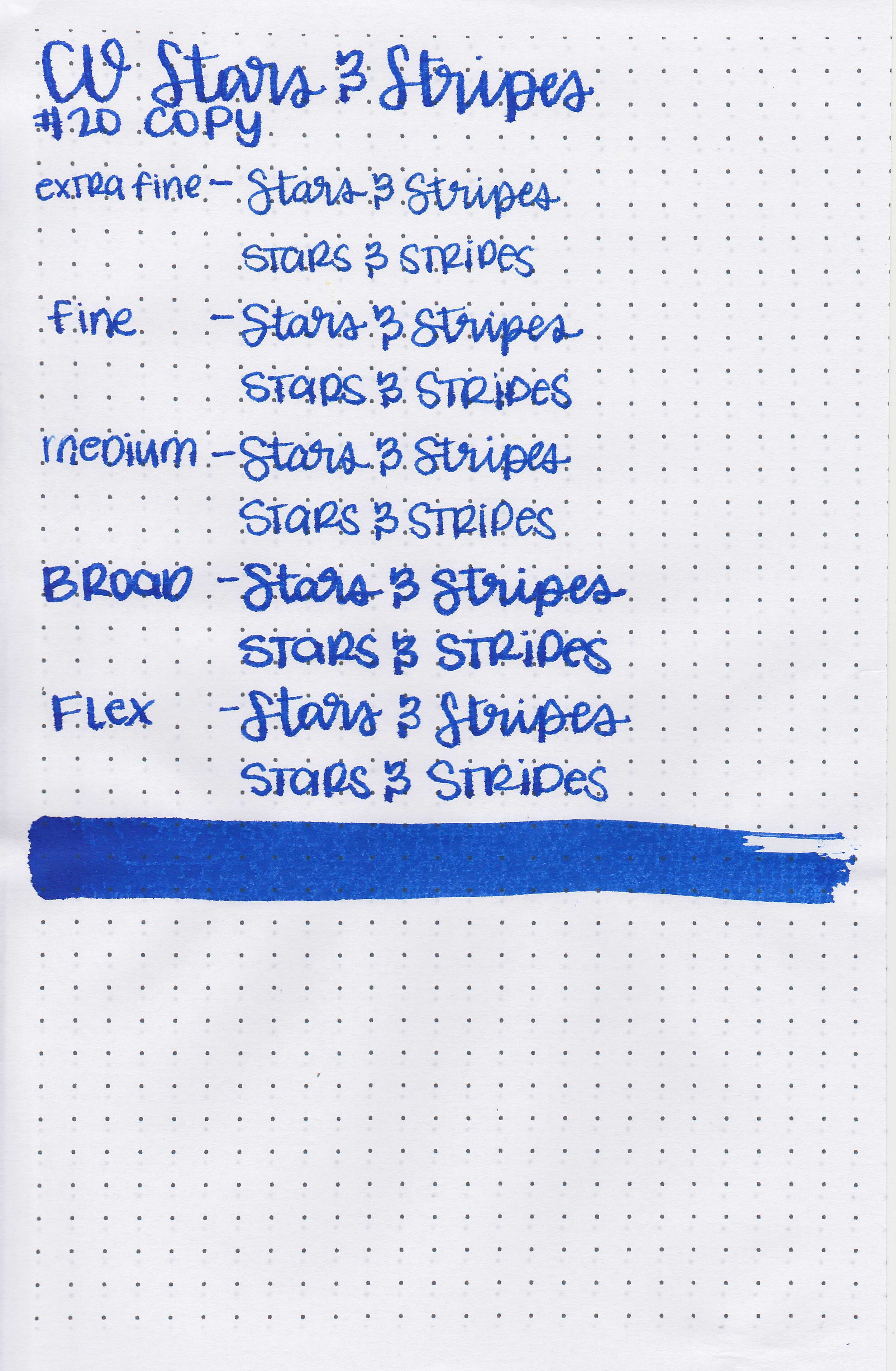
Colorverse recently came out with two American Special inks: Stars and Stripes and Stars and Stripes Glistening. Today we are looking at the standard Stars and Stripes, and tomorrow we will take a look at the glistening version. Thanks to Goldspot Pens for sending a bottle over for review!

The color:
Stars and Stripes is a beautiful dark but vibrant blue.

In large swabs on Tomoe River paper the ink has some pretty dark pink sheen.

Let's take a look at how the ink behaves on fountain pen friendly papers: Rhodia, Tomoe River, and Leuchtturm.
Dry time: 30 seconds
Water resistance: Low
Feathering: None
Show through: Medium
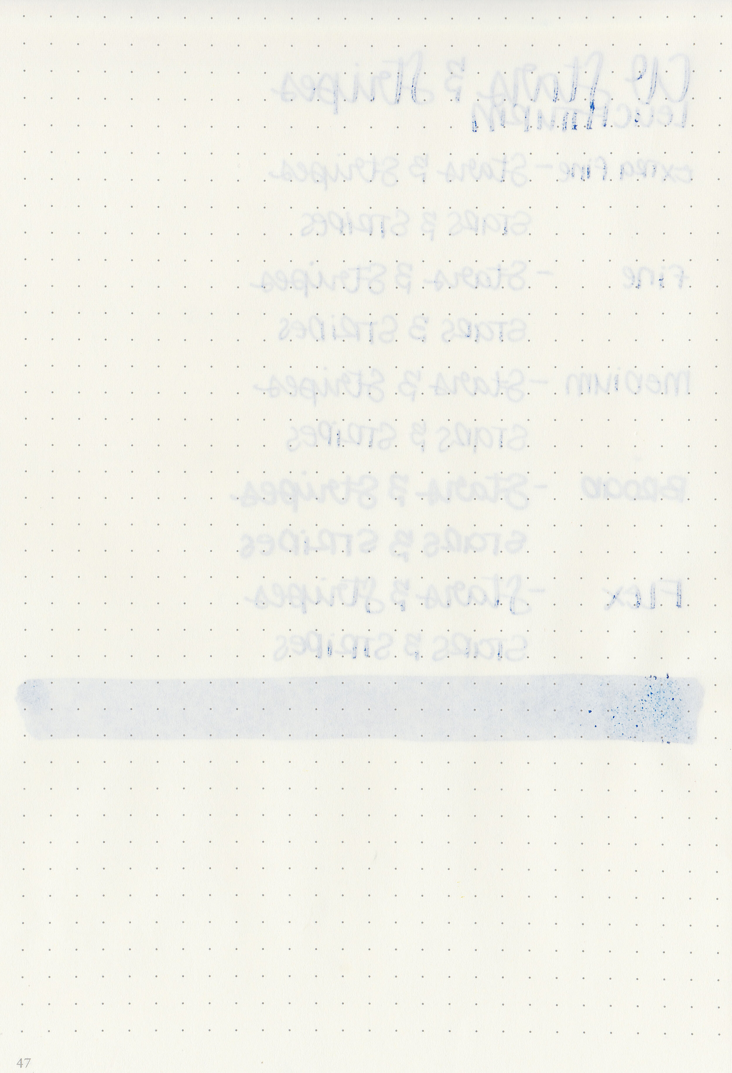
Bleeding: None
Other properties: high shading, high pink sheen, and no shimmer.
On Staples 24 lb copy paper there was some feathering and bleeding in all nib sizes.

Stars and Stripes is a little bit lighter than Colorverse Quasar, but a bit darker than Diamine Blue Velvet. Click here to see the Colorverse inks together, and click here to see the blue inks together.

I used a Pelikan M805 Vibrant Blue with a broad nib on a Taroko Enigma notebook. The ink had a slightly wet flow.
Overall, I really enjoyed this ink. It has high shading and sheen, is a gorgeous blue and flows well. It’s a lovely ink and worth a try!
Disclaimer: This ink was provided by Goldspot Pens for the purpose of this review. All photos and opinions are my own. This page does not contain affiliate links and this post is not sponsored in any way.

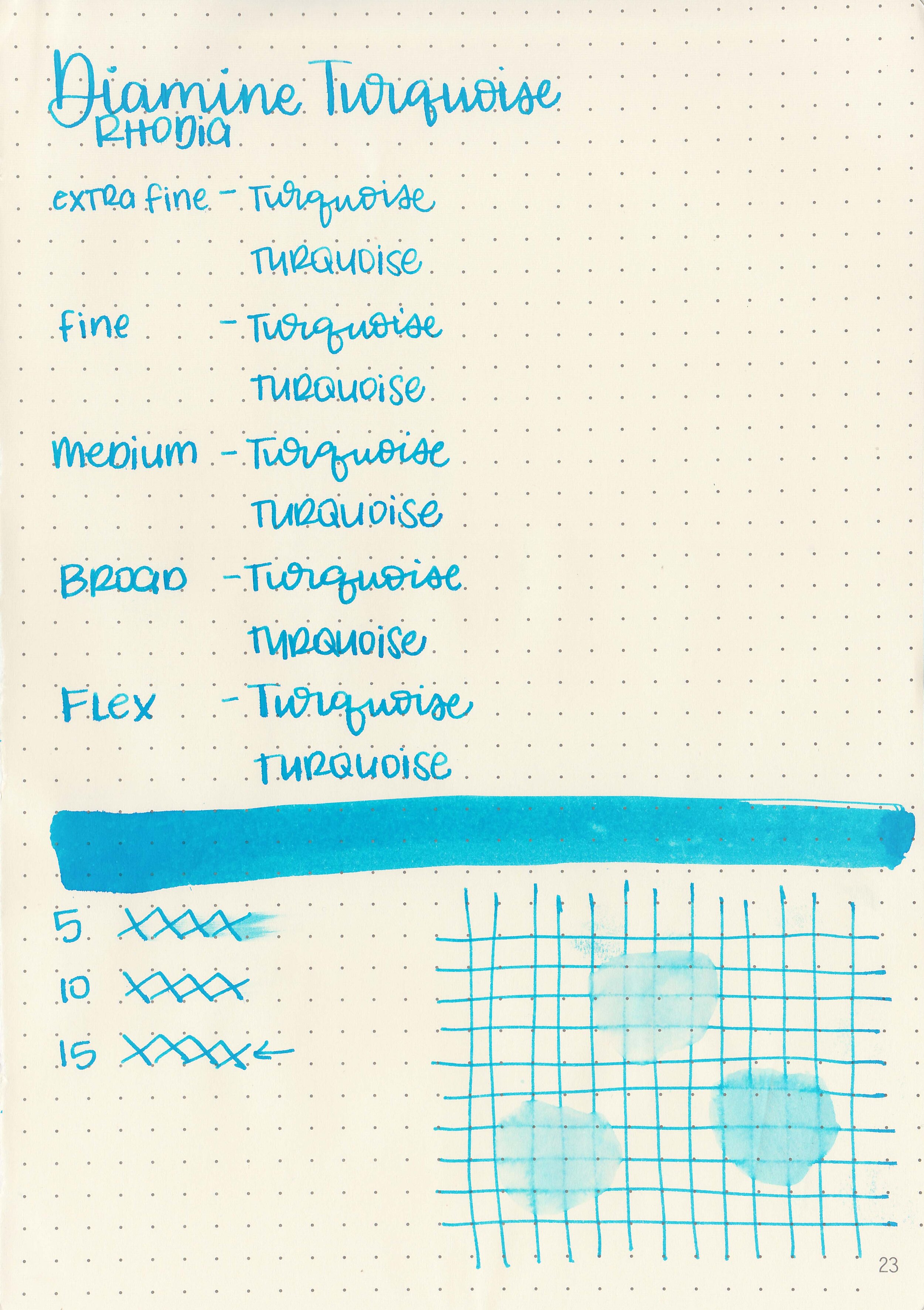
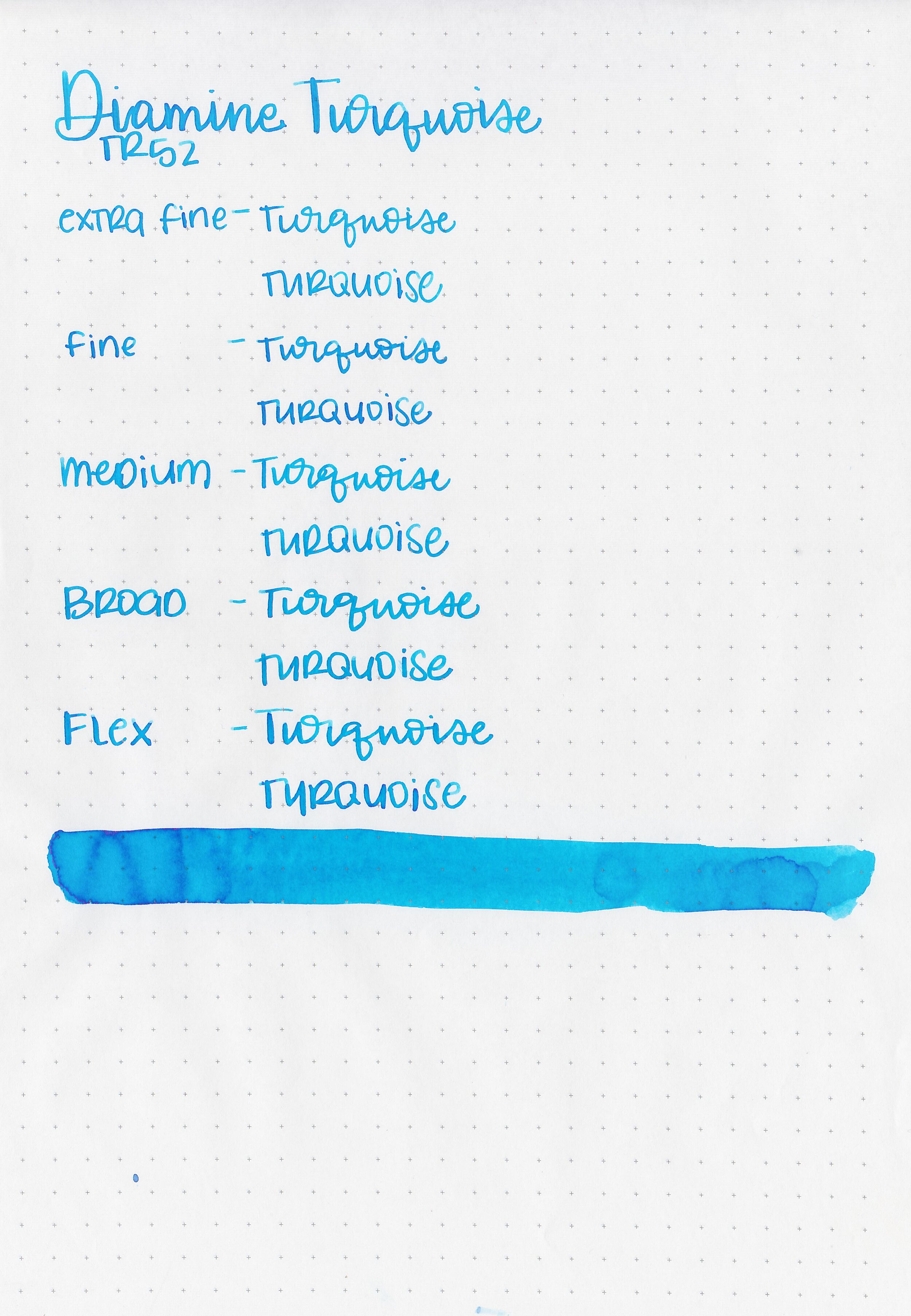
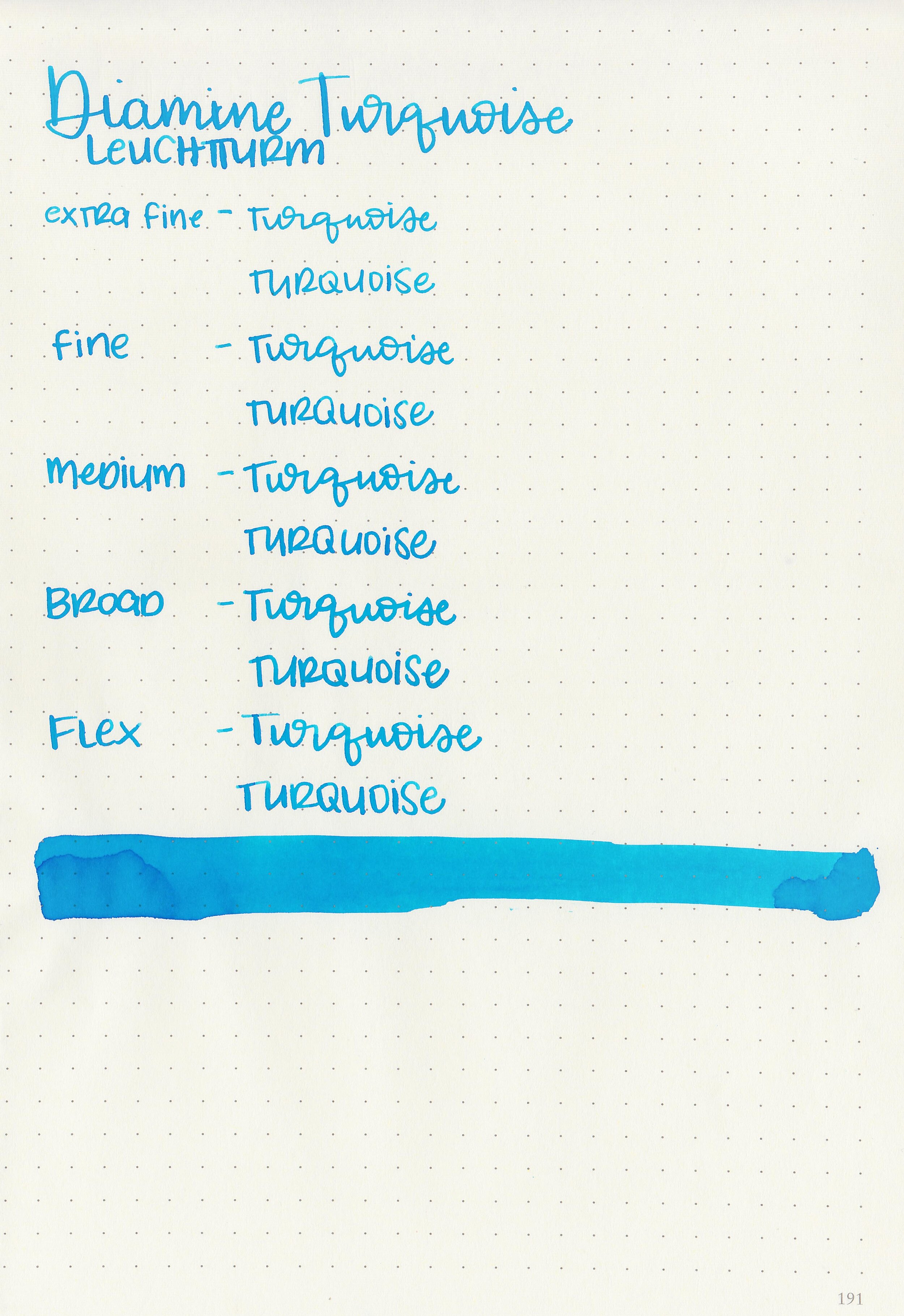
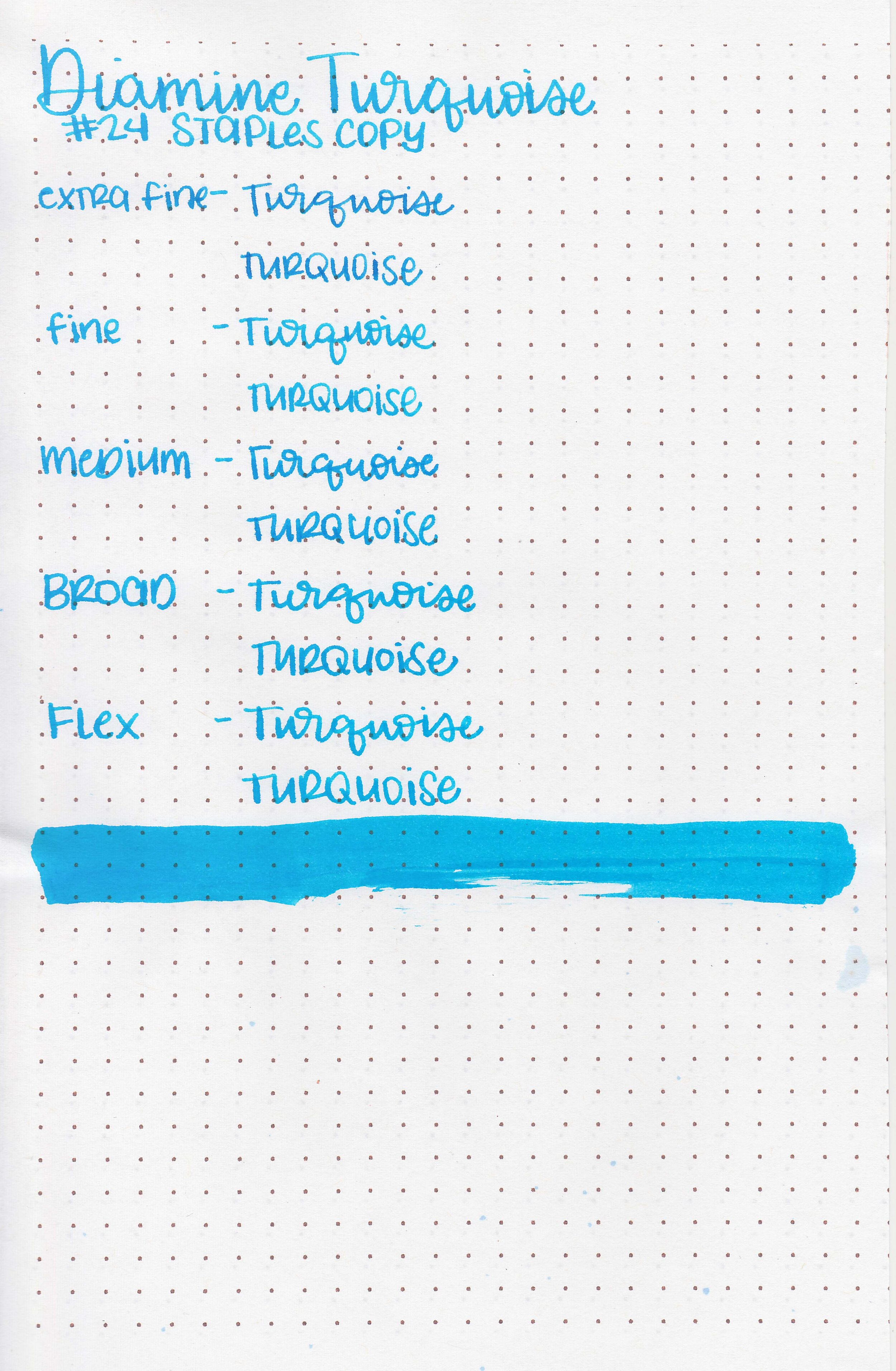
Diamine Turquoise is an ink I’ve meant to review for a long time, but never got around to it so it is time! I purchased my bottle of ink from Cult Pens.

The color:
Turquoise is a bright, summery sky blue.

In large swabs on Tomoe River paper the ink has some pretty shading.

Let's take a look at how the ink behaves on fountain pen friendly papers: Rhodia, Tomoe River, and Leuchtturm.
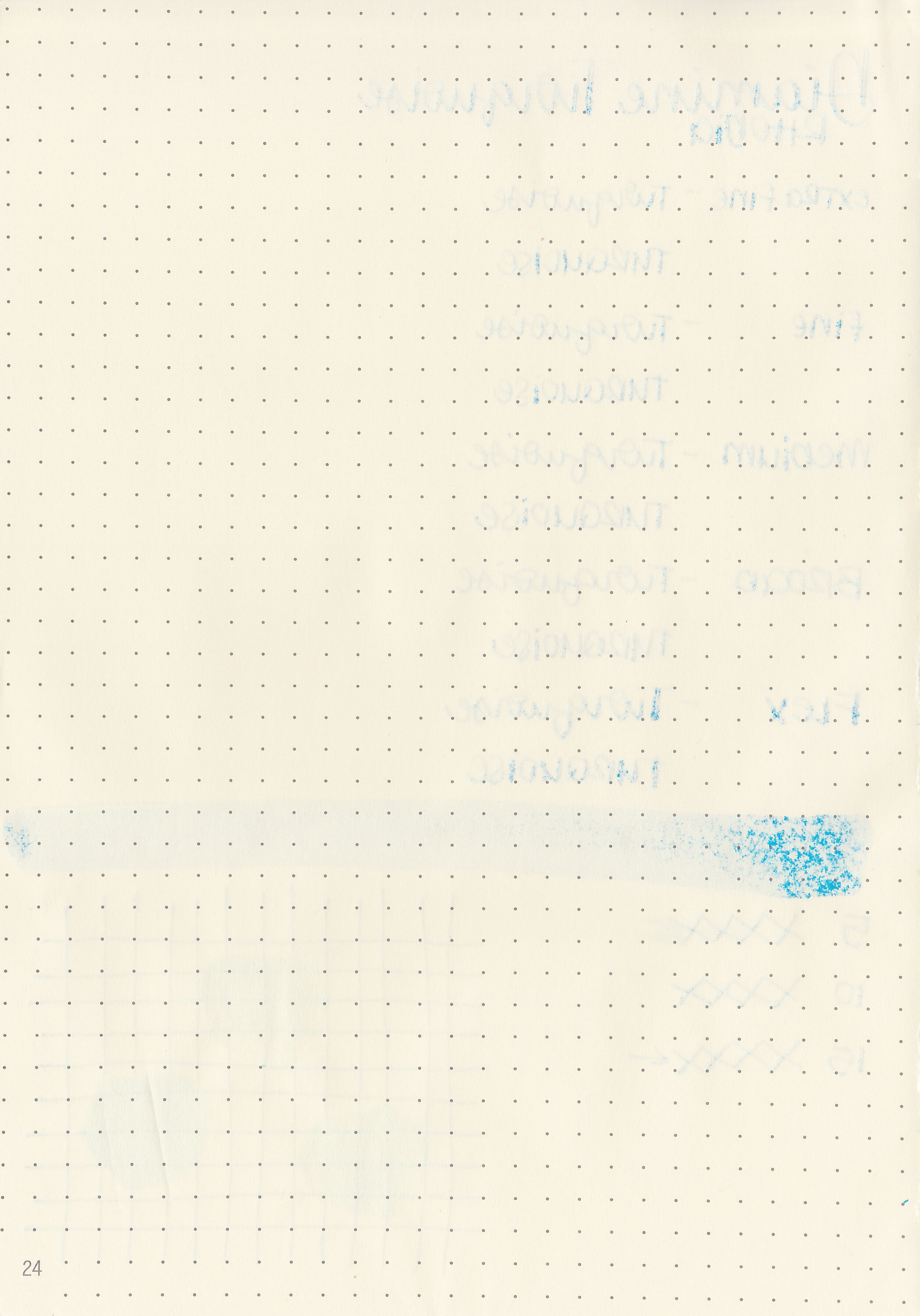
Dry time: 15 seconds
Water resistance: Low
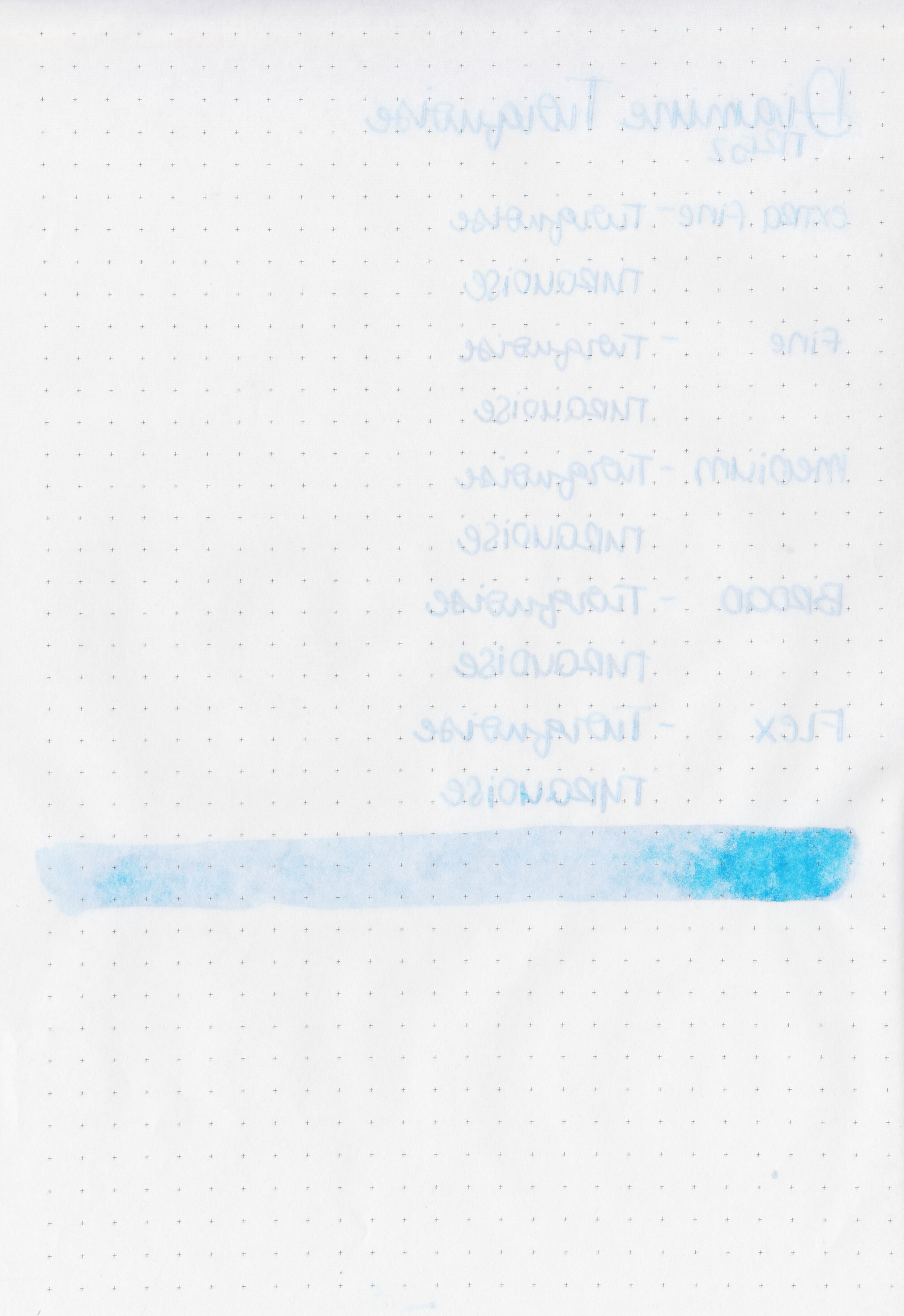
Feathering: Low
Show through: Medium
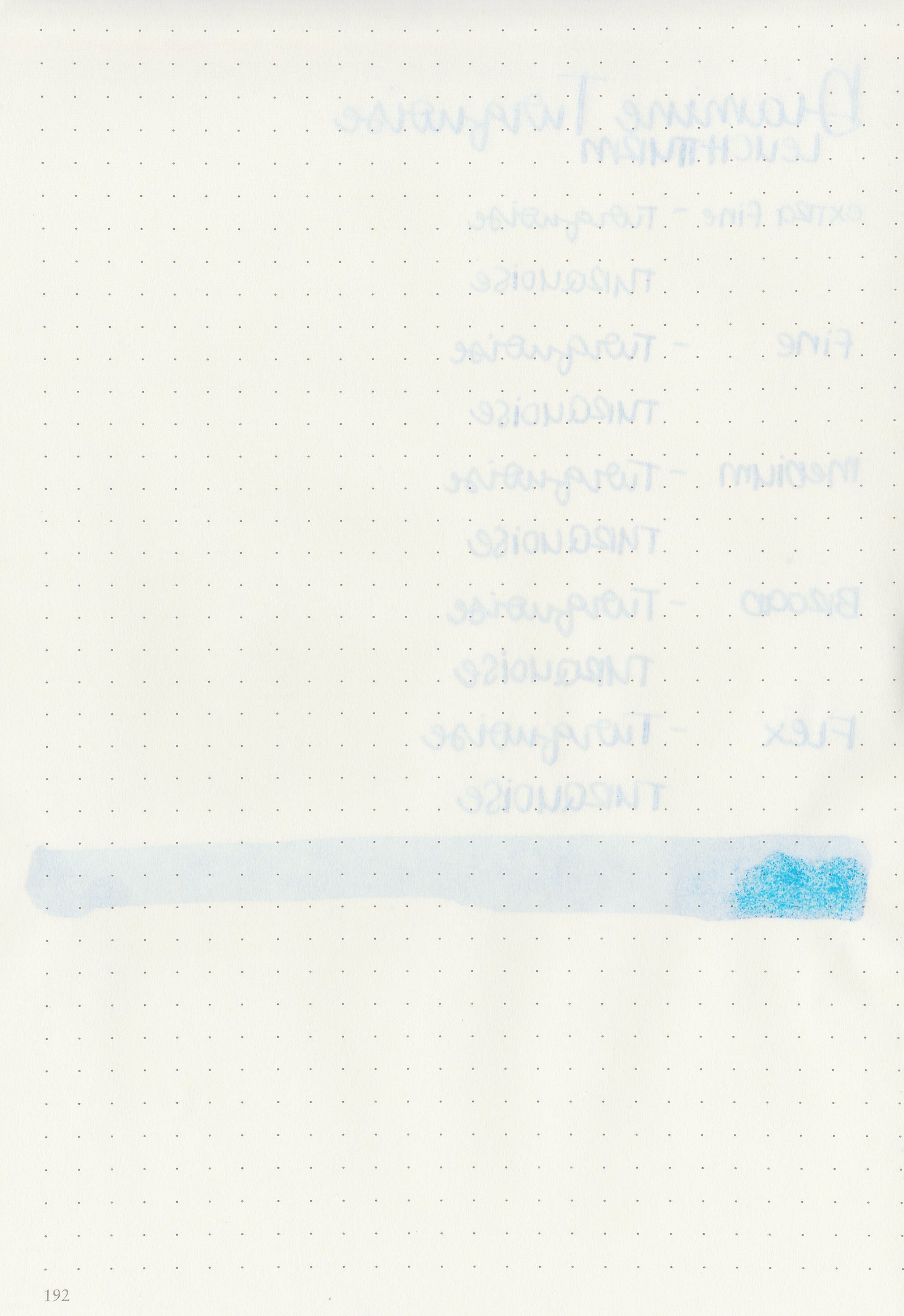
Bleeding: Low
Other properties: low shading, tiny sheen, and no shimmer. The sheen is only visible in very large swabs on Tomoe River paper.
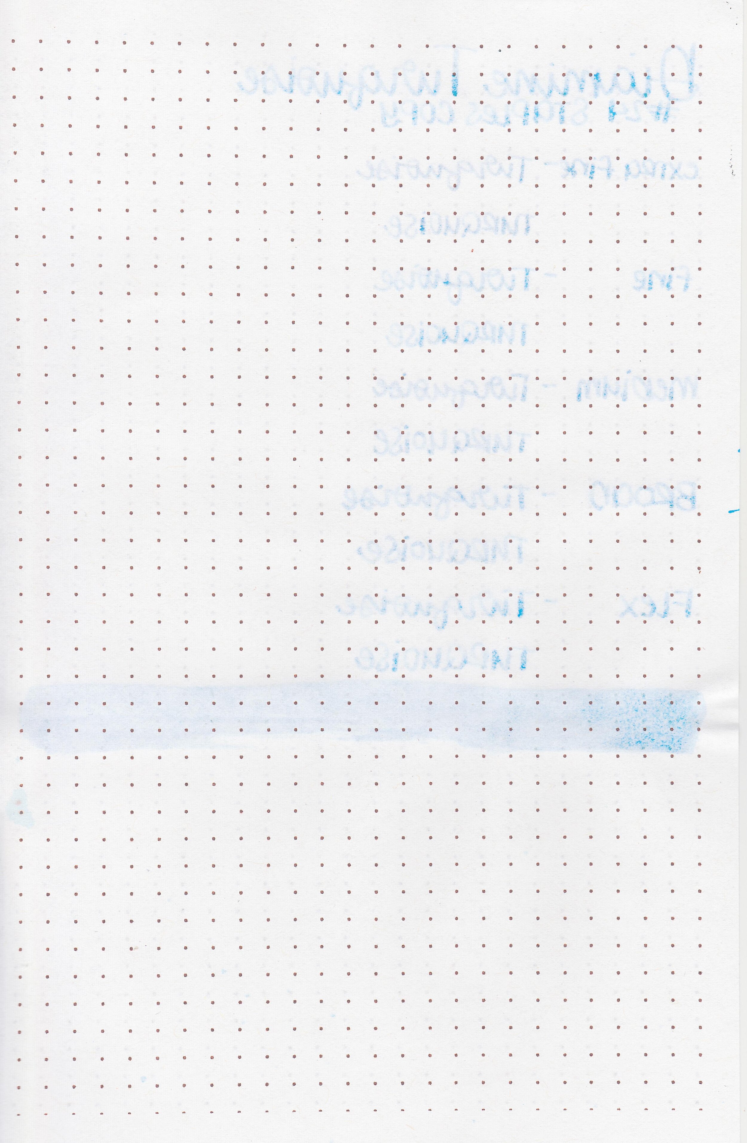
On Staples 24 lb copy paper there was some feathering in most nib sizes.

Turquoise is very similar to Diamine Havasu Turquoise and Diamine Aqua Blue. Click here to see the Diamine inks together, and click here to see the blue inks together.

I used a Lamy Al-Star Pacific Blue with a medium nib on a Taroko Enigma notebook. The ink had an average flow.
Overall, while it’s very well behaved, it is very similar to both Diamine Havasu Turquoise and Diamine Aqua Blue. If you have either of those already you probably don’t need this one too.
Disclaimer: I purchased this ink myself, and all photos and opinions are my own. This page does not contain affiliate links and this post is not sponsored in any way.

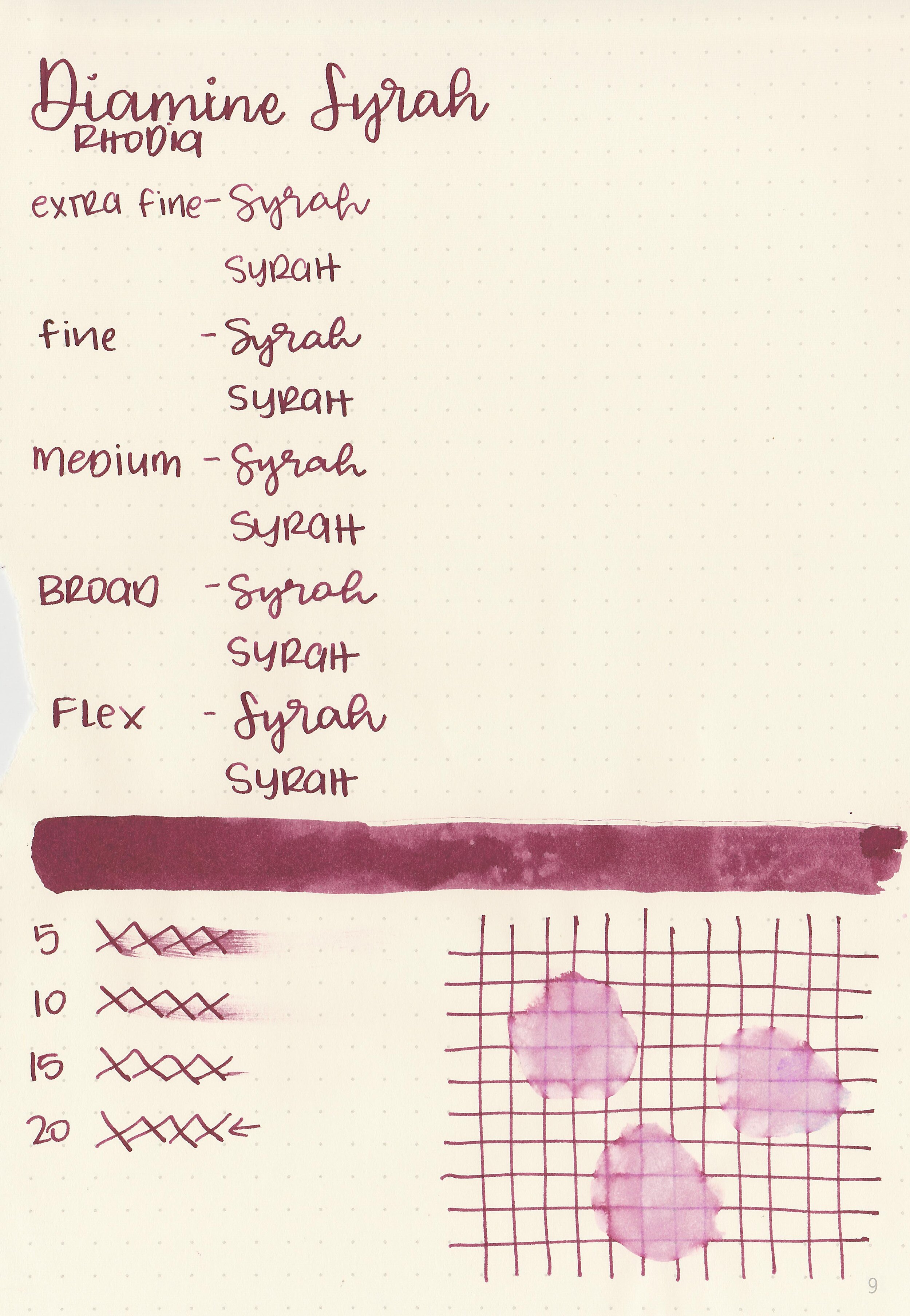
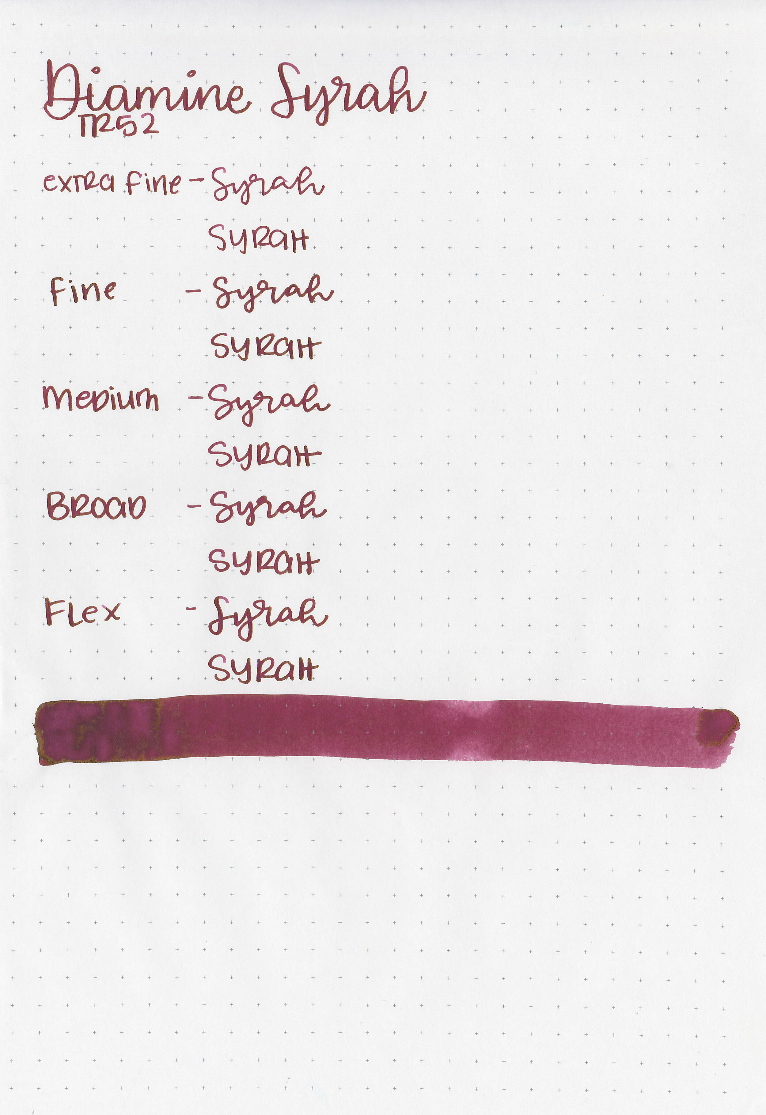
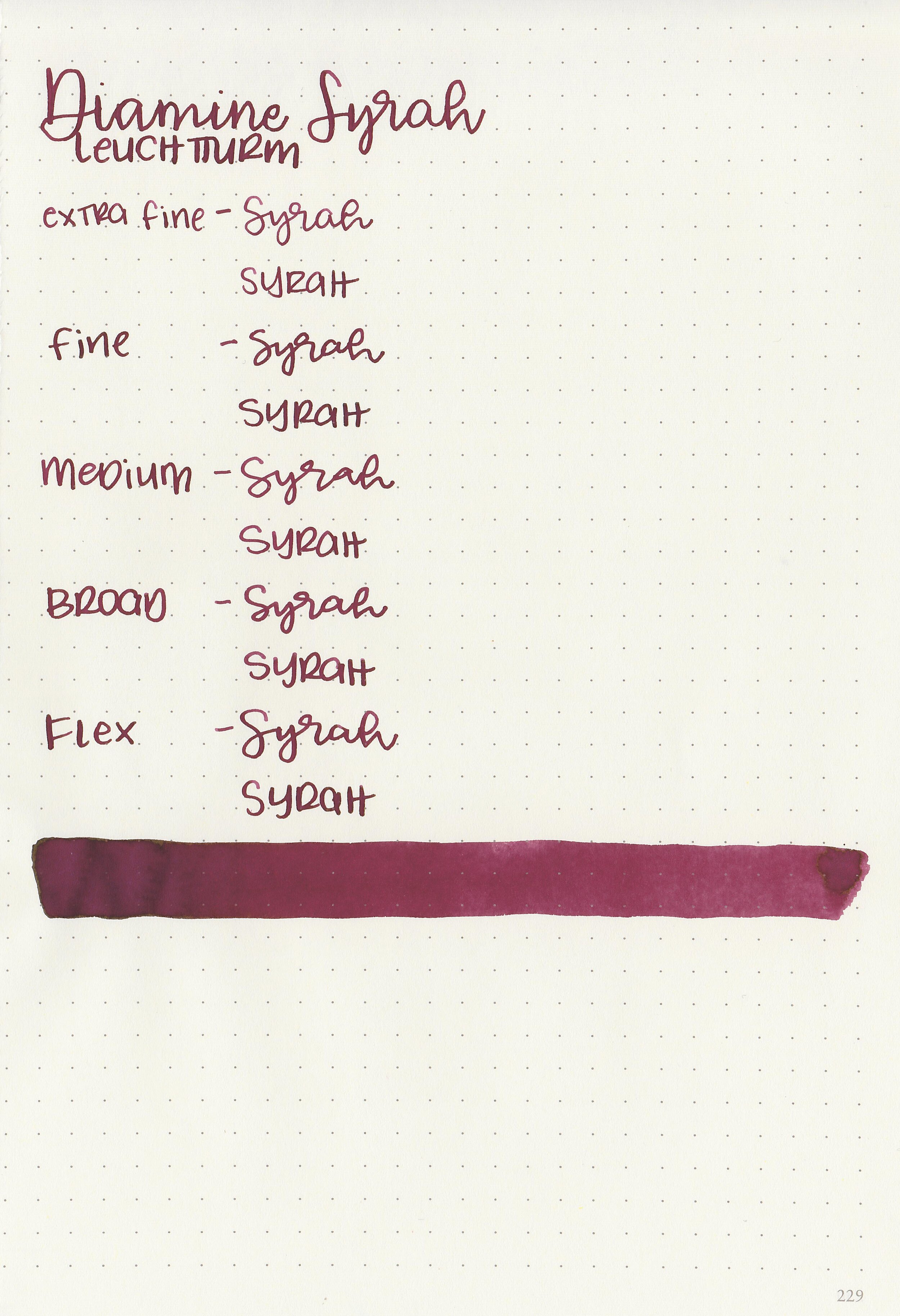
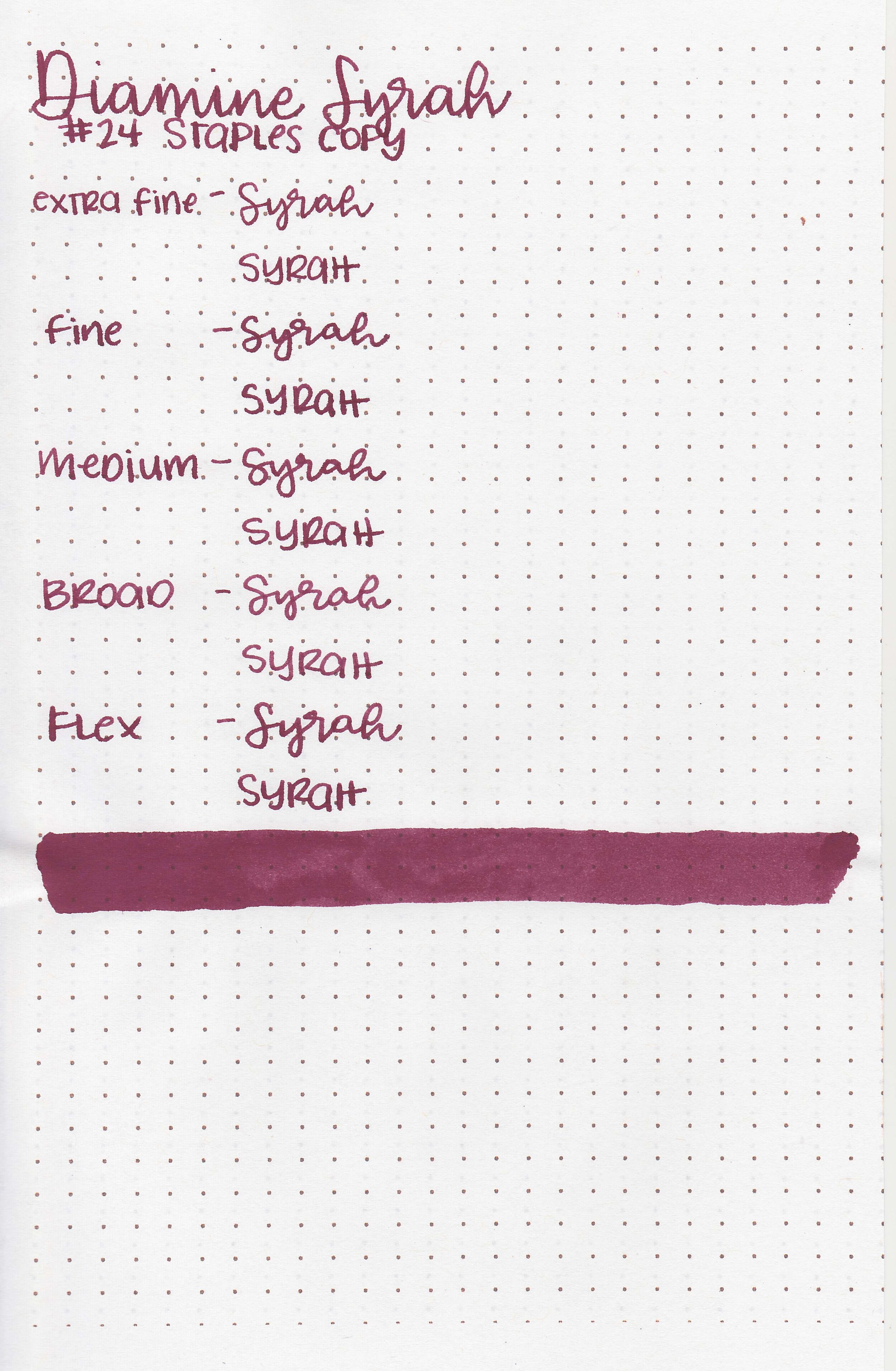
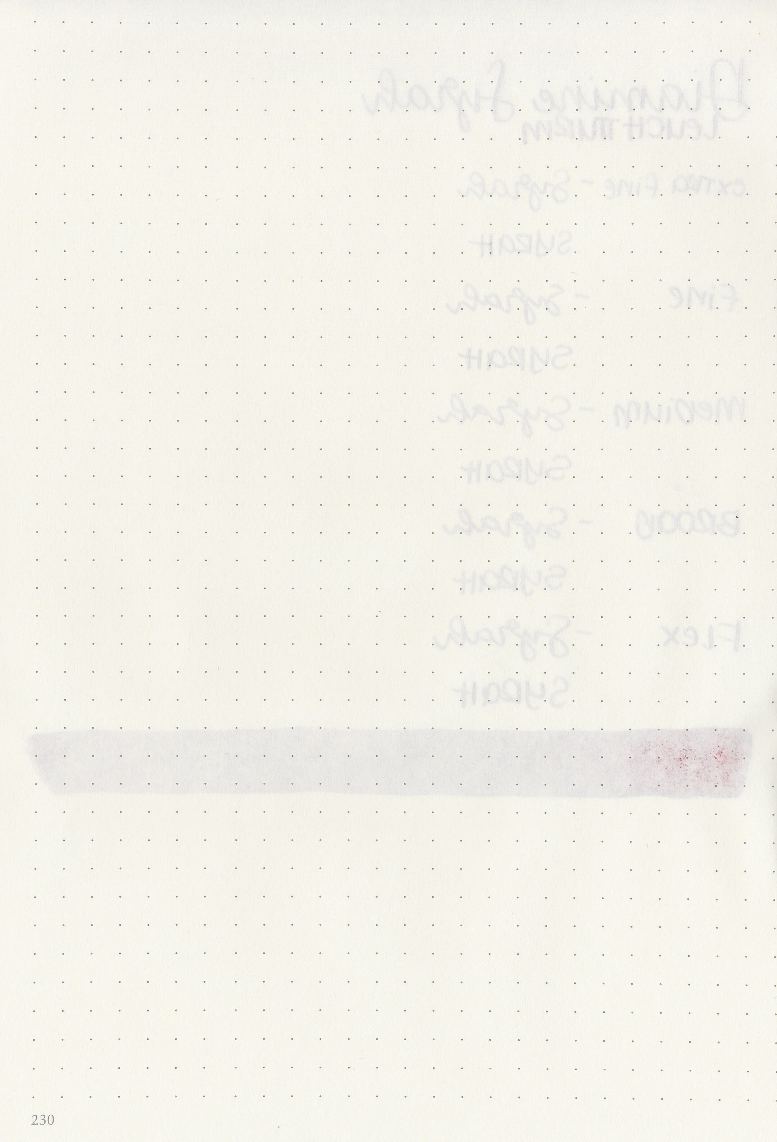
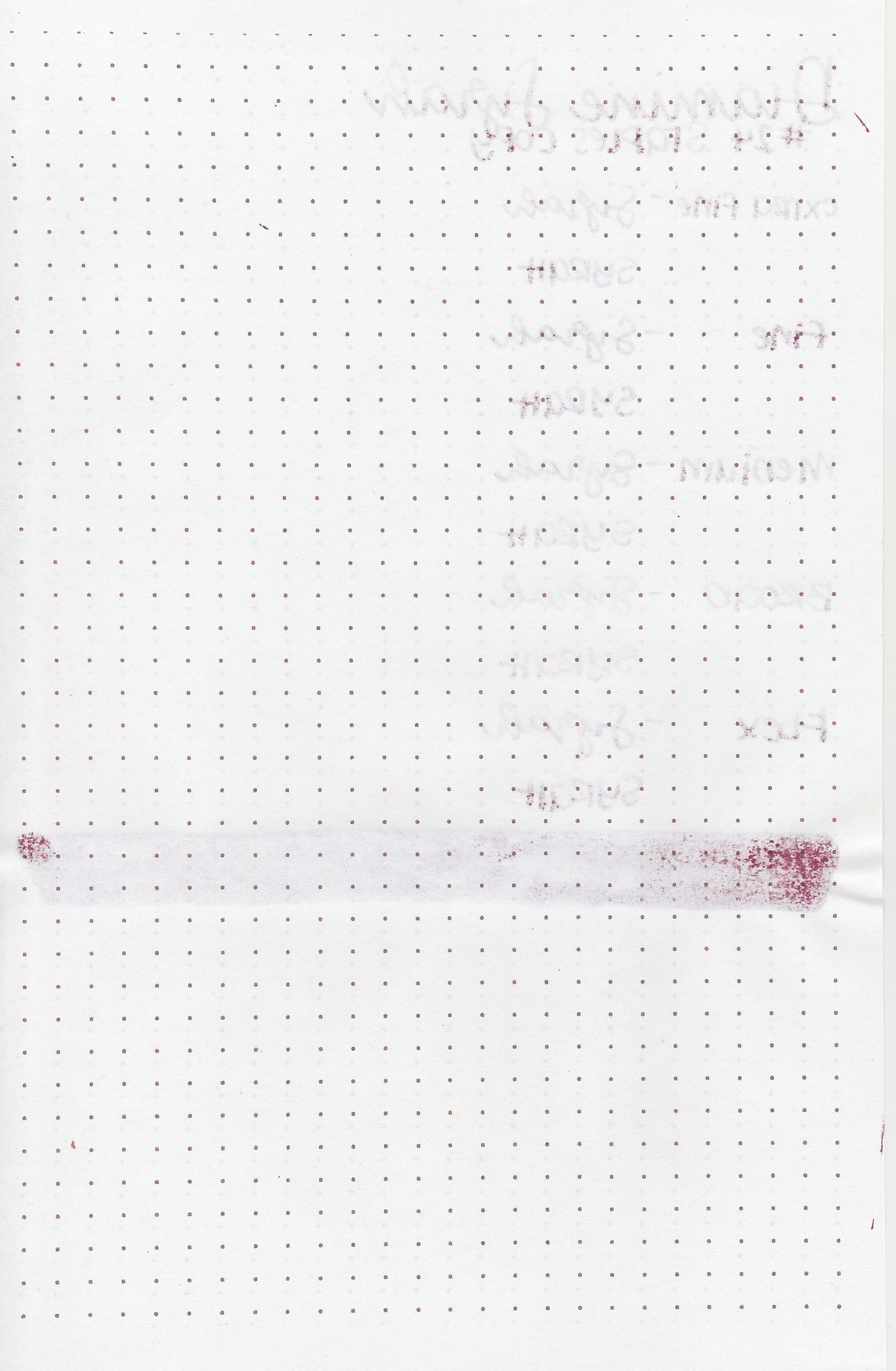
A reader sent me a sample of Diamine Syrah quite a while ago, so it’s time to finally take a look at it. Thanks to the reader that sent a sample in for review! You can find this ink for sale at most retailers including Pen Chalet.

The color:
Syrah is a dark wine red.

In large swabs on Tomoe River paper the ink doesn’t show much shading but has some pretty green sheen.

Let's take a look at how the ink behaves on fountain pen friendly papers: Rhodia, Tomoe River, and Leuchtturm.
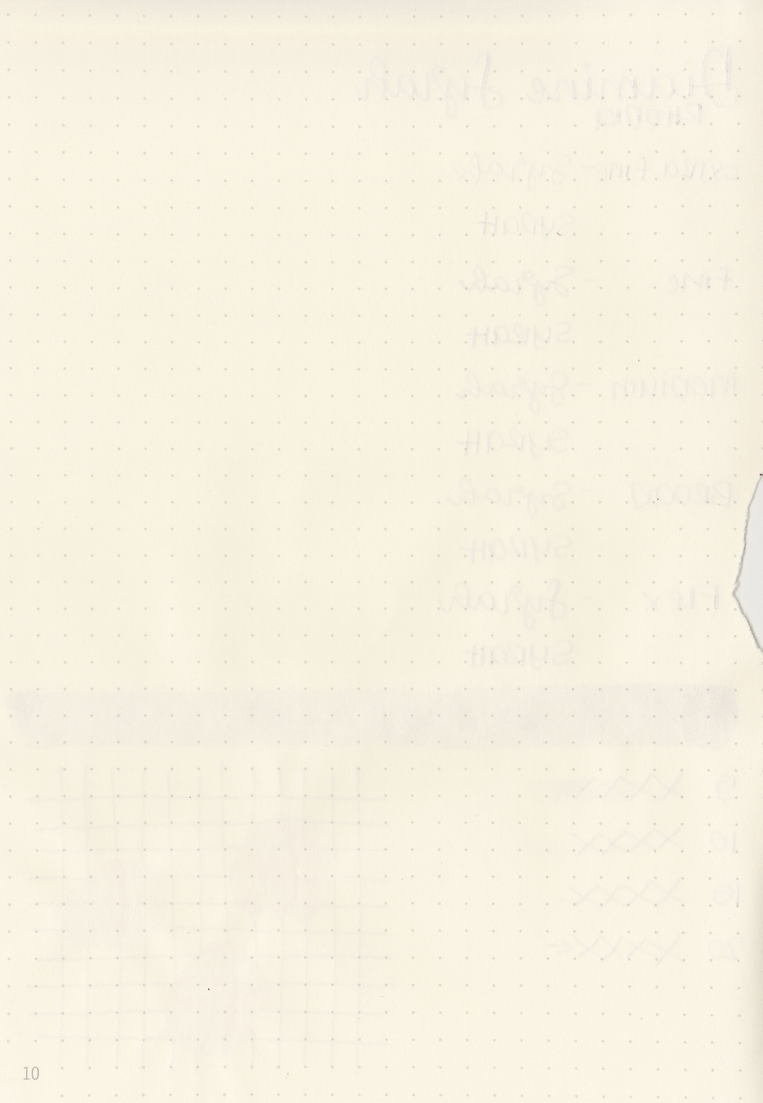
Dry time: 20 seconds
Water resistance: Low
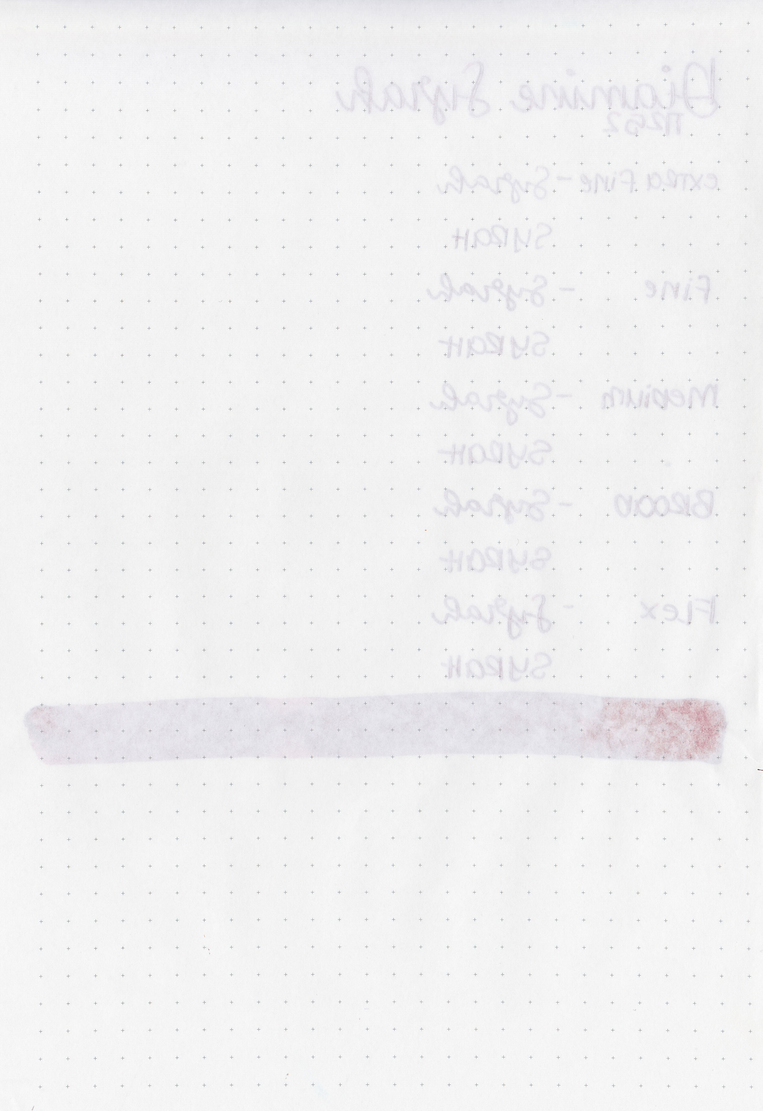
Feathering: None
Show through: Medium
Bleeding: None
Other properties: low shading, low sheen, and no shimmer.
On Staples 24 lb copy paper there was some feathering and bleeding in most nib sizes.

Syrah is a little bit brighter than Sailor Jentle Oku-yama. Click here to see the Diamine inks together, and click here to see the red inks together.

I used a Montegrappa Copper Mule with a fine nib on a Taroko Enigma notebook. The ink had an average flow.
Overall, I love the color of this ink. It’s a great color for fall and winter. I wish it had just a little bit more shading, but it’s well-behaved. It’s absolutely worth a try, especially for the price.
Disclaimer: A sample of this ink was provided by a reader for the purpose of this review. All photos and opinions are my own. This page does contain affiliate links but this post is not sponsored in any way.

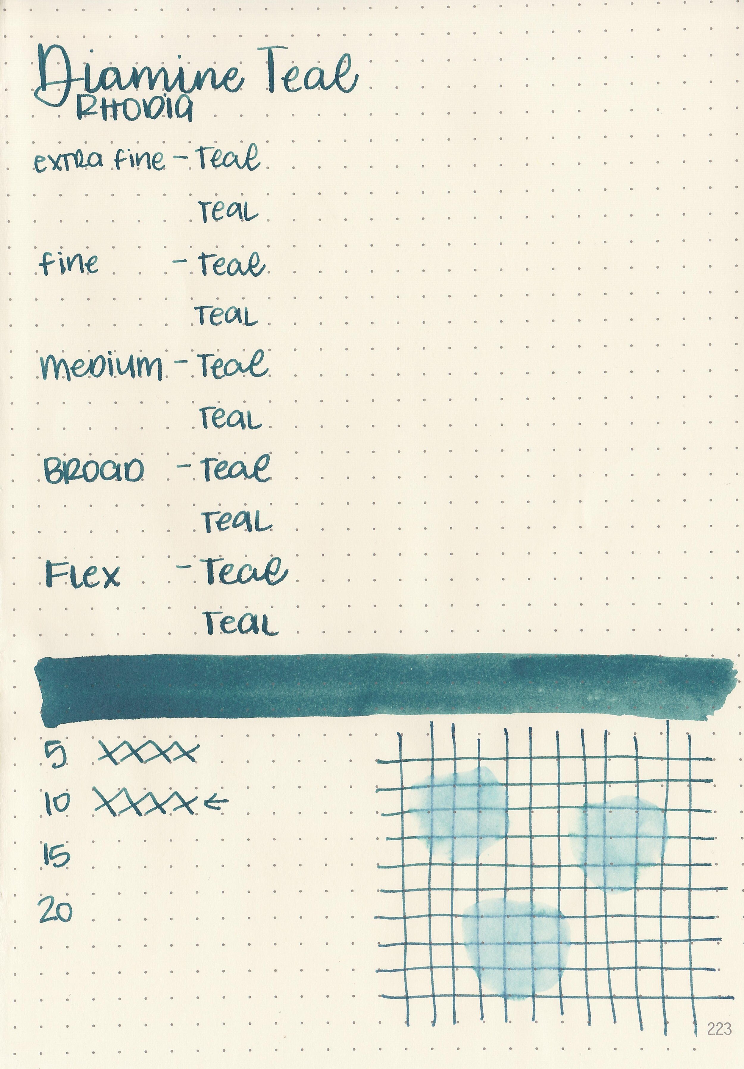
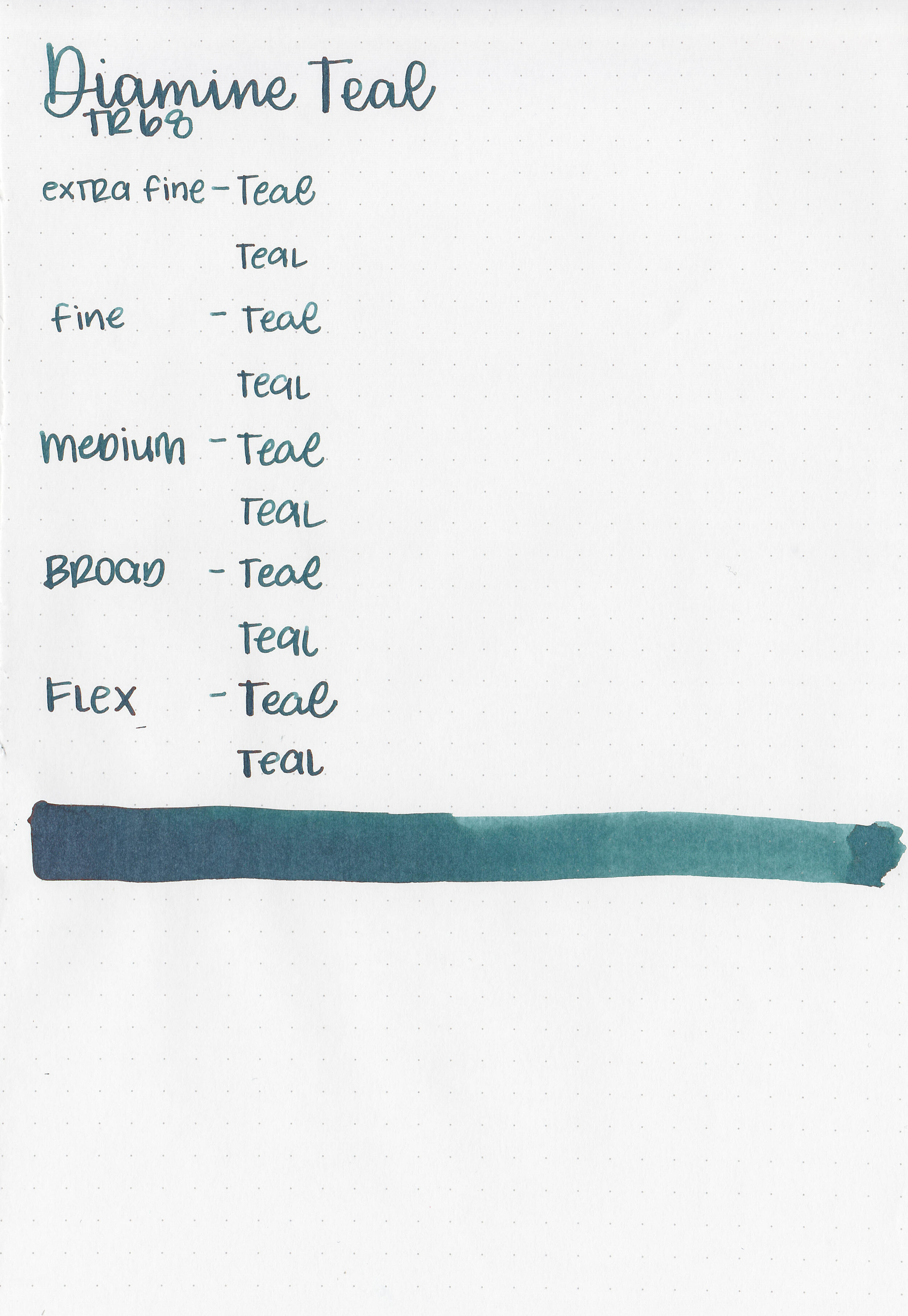
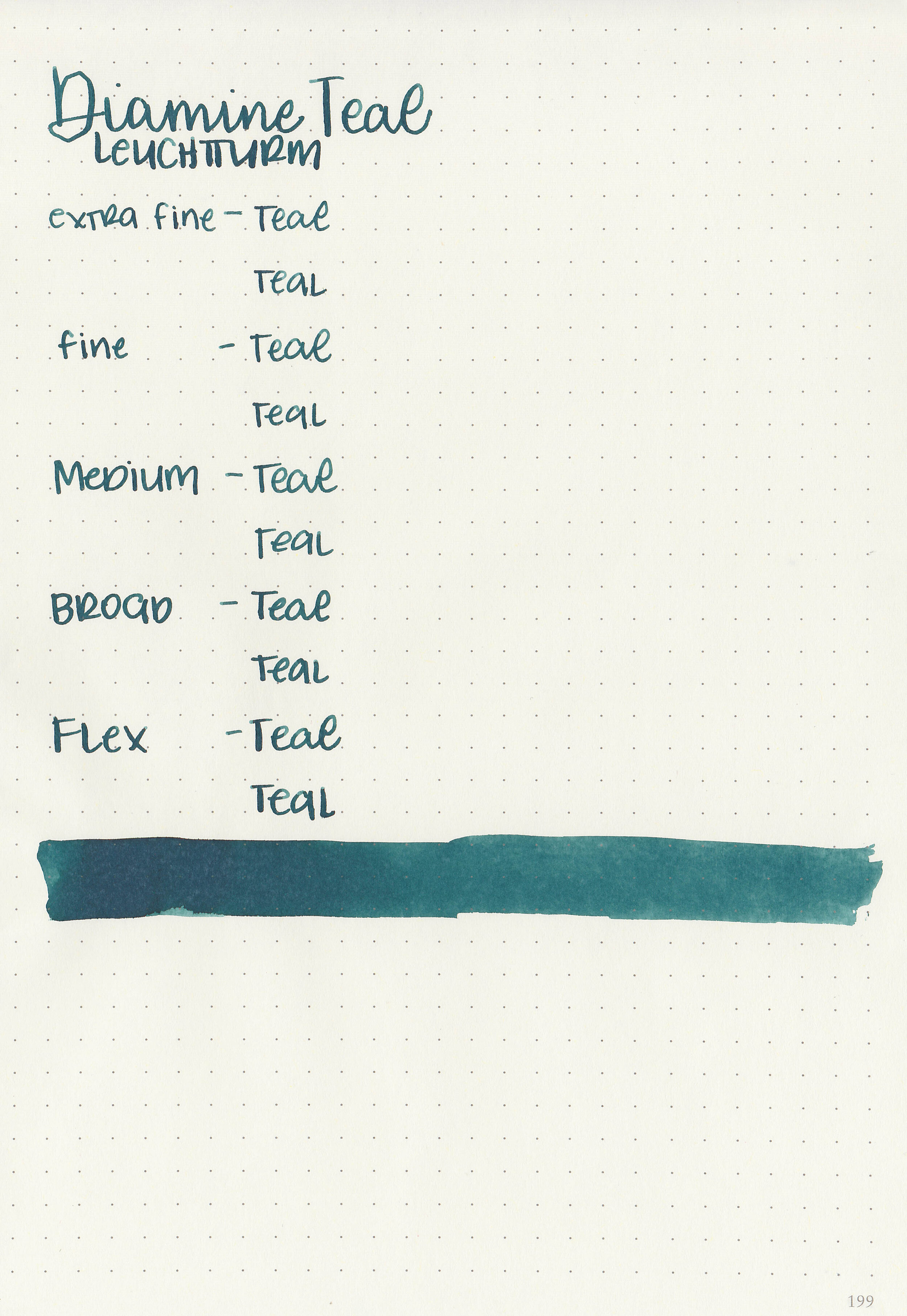
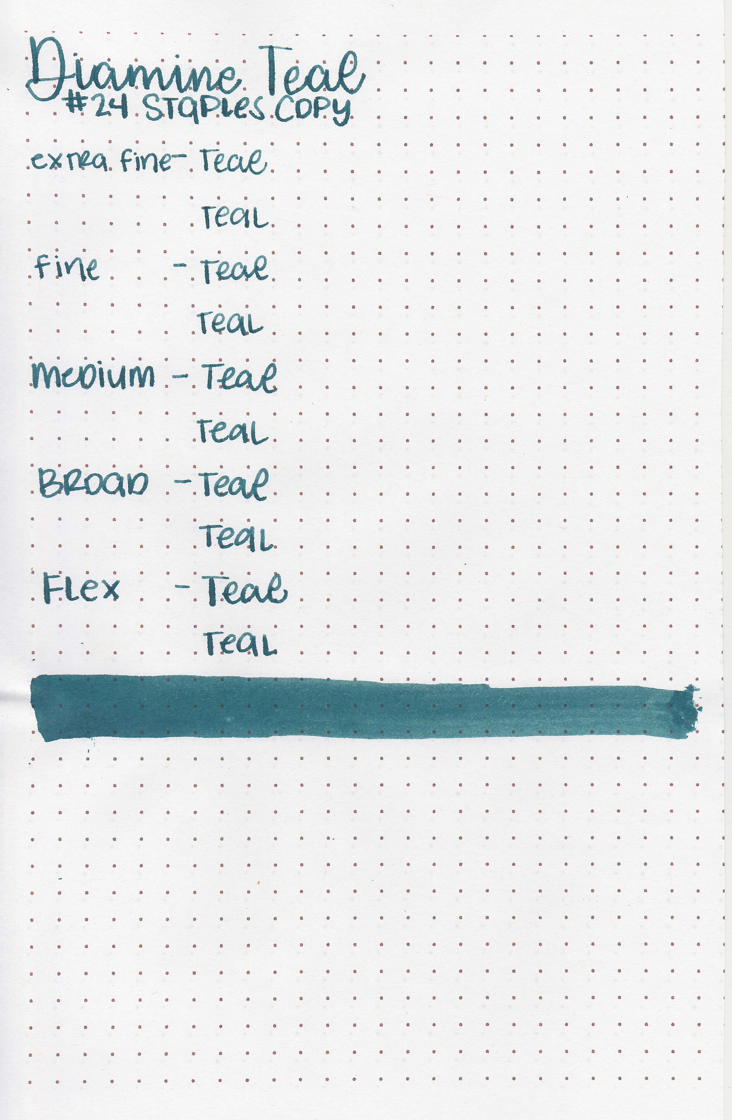
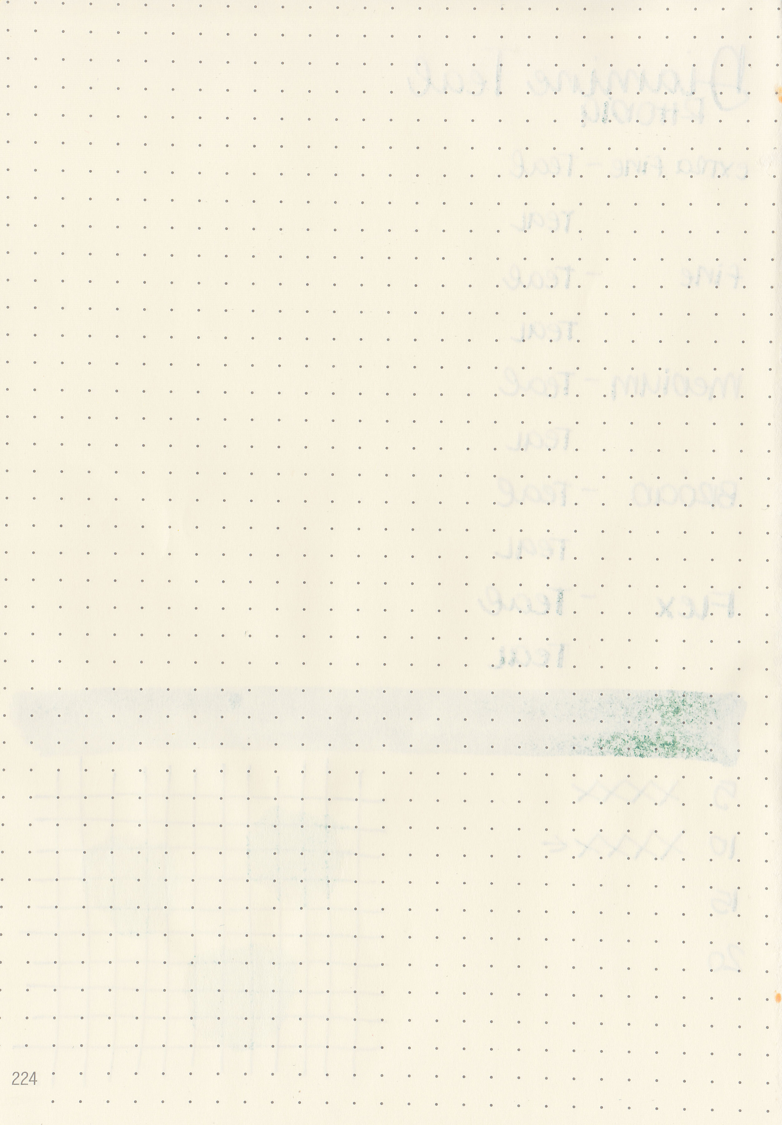
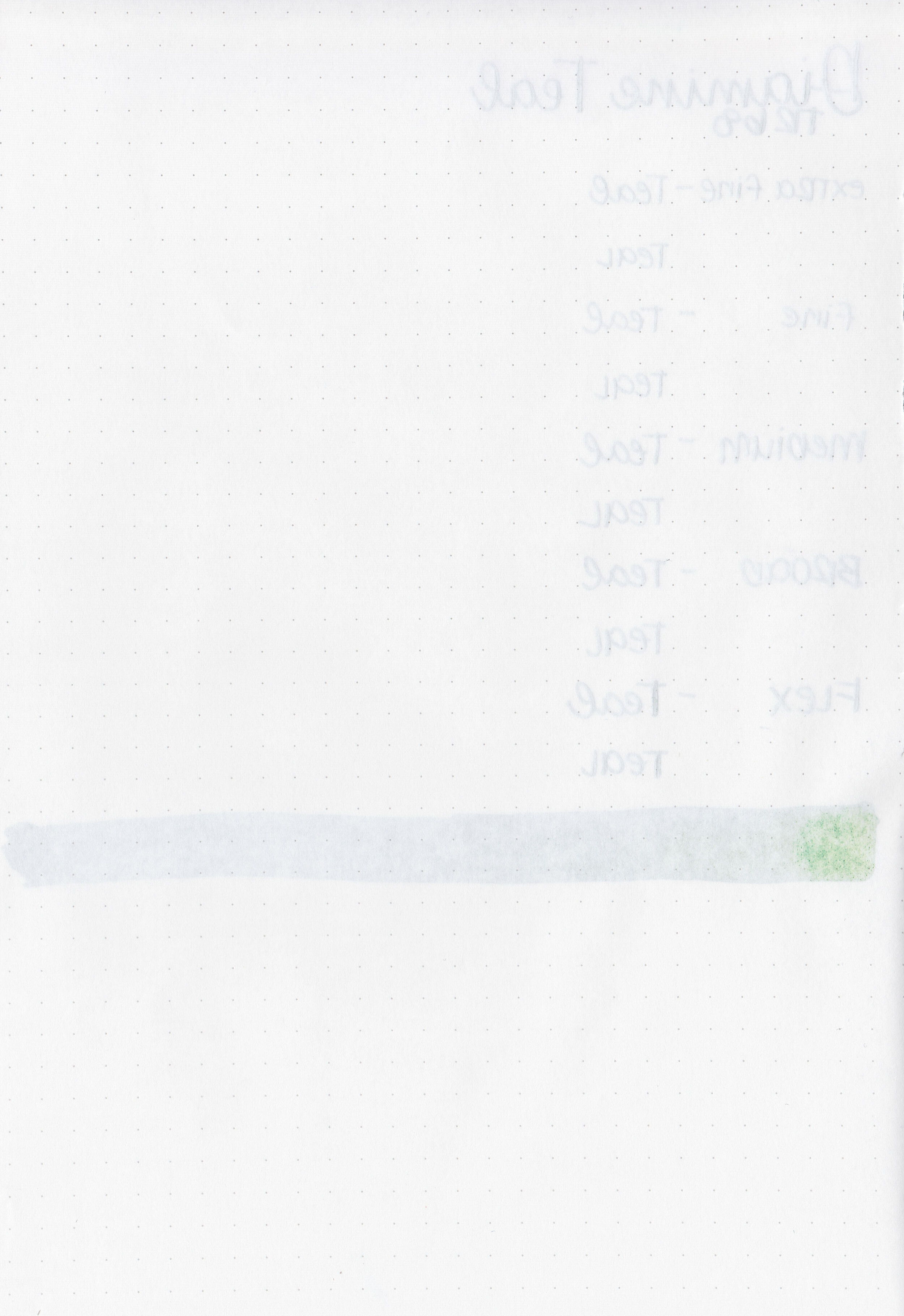
Diamine Teal is a lovely dark teal. It reminds me of late fall, early winter when I still want color, but much more muted tones. I purchased my bottle of ink from Cult Pens.

The color:
Teal is a dark moody teal.

In large swabs on Tomoe River paper the ink looks much darker.

Let's take a look at how the ink behaves on fountain pen friendly papers: Rhodia, Tomoe River, and Leuchtturm.
Dry time: 10 seconds
Water resistance: Medium
Feathering: None
Show through: Medium
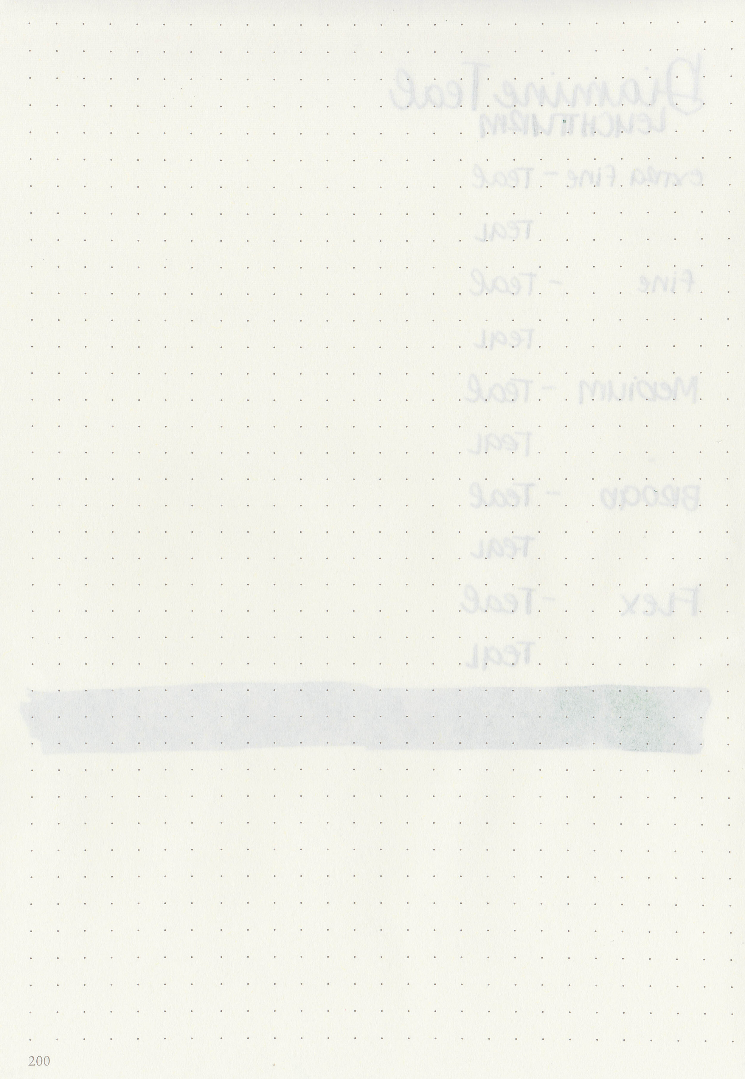
Bleeding: Low
Other properties: low shading, no sheen, and no shimmer.
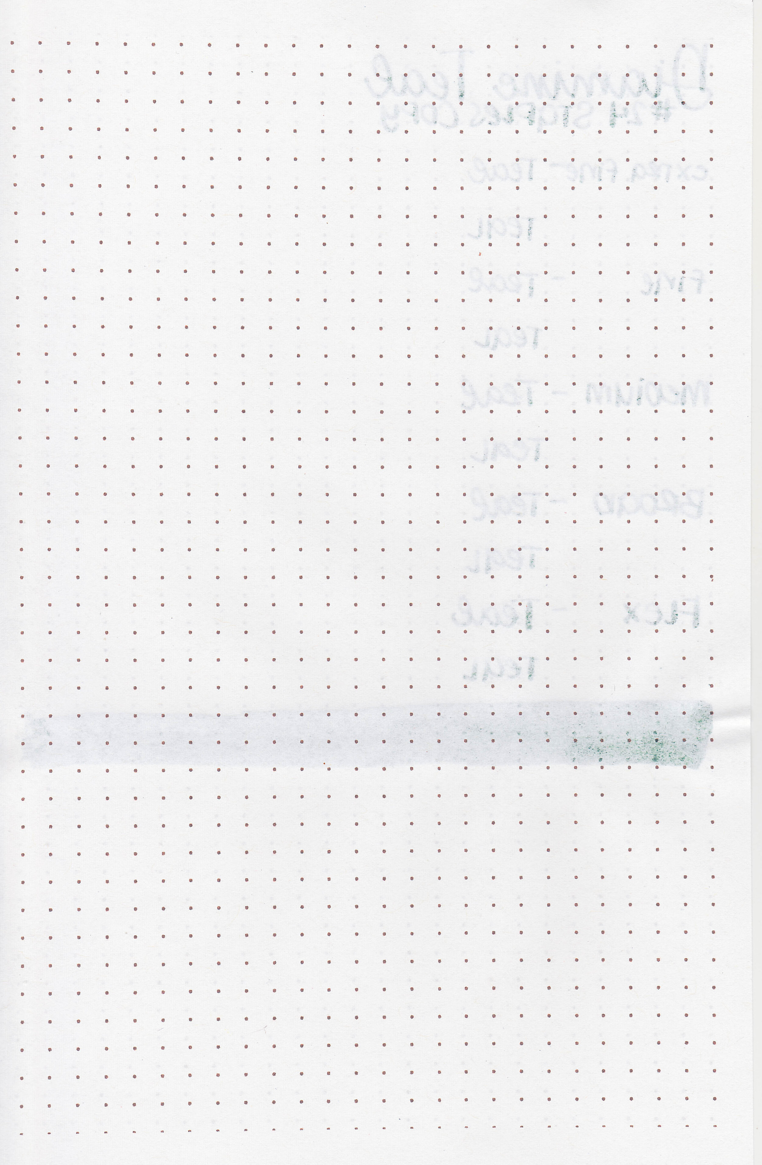
On Staples 24 lb copy paper there was some feathering in most nib sizes.

Teal is closest to Pilot Iroshizuku Syo-ro, but is much less saturated. Click here to see the Diamine inks together, and click here to see the teal inks together.
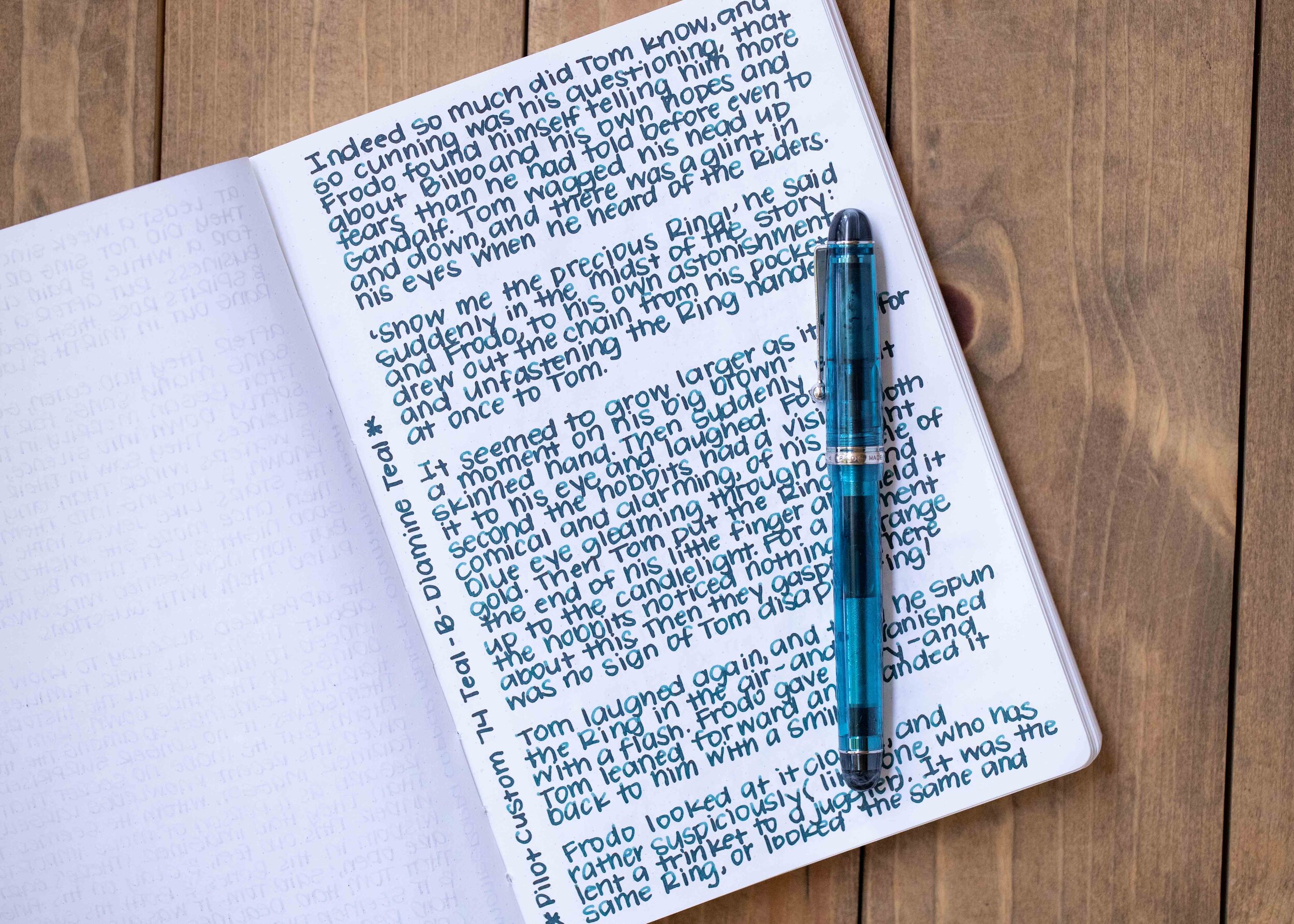
I used a Pilot Custom 74 Teal with a broad nib on a Taroko Enigma notebook. The ink had an average flow. I loved this ink/pen combo together, it wrote so smoothly but I did wish for just a little bit more shading.
Overall, I really like this ink, especially for the price. It’s definitely worth a try for the fall and winter seasons!
Disclaimer: I purchased this ink myself, and all photos and opinions are my own. This page does not contain affiliate links and this post is not sponsored in any way.
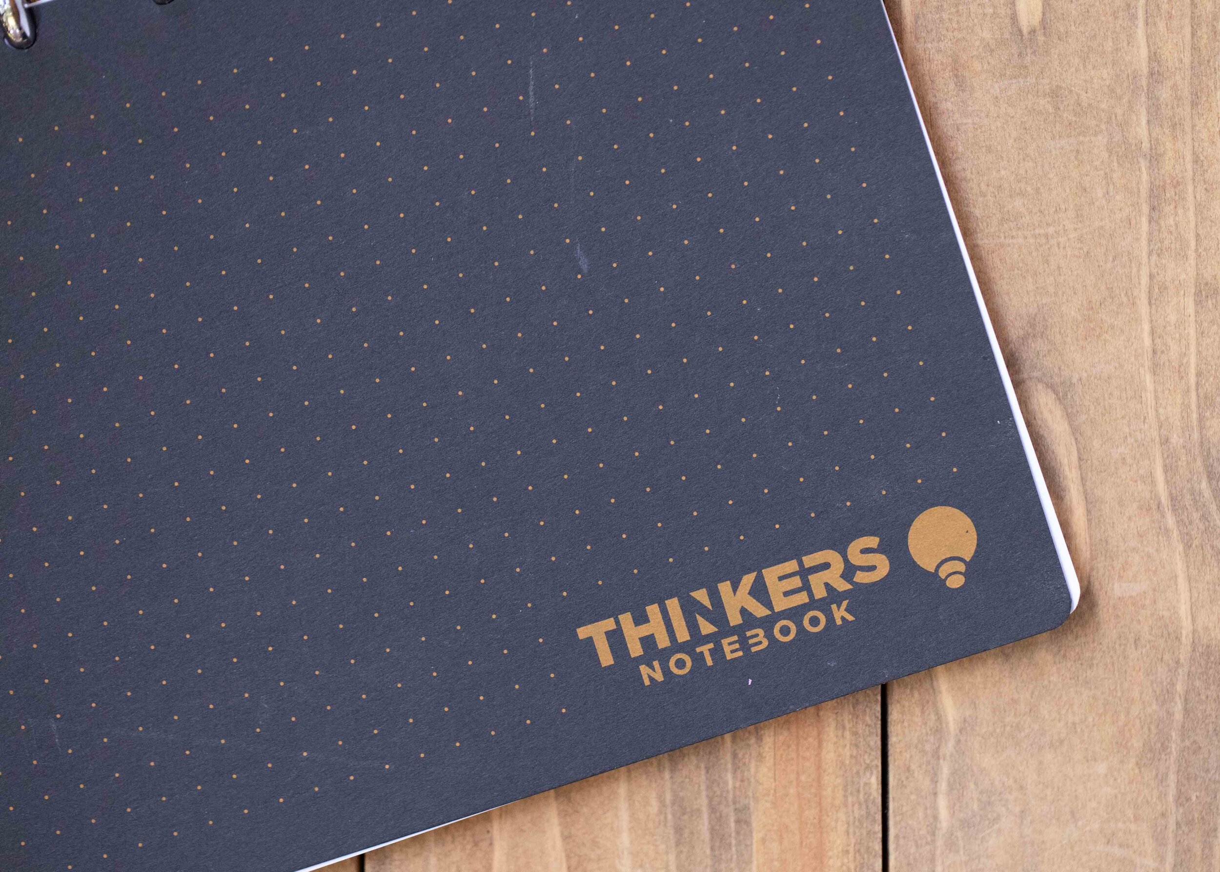
A few months ago Thinkers Notebook sent me their new notebook to try out. The notebook measures 9” by 6”. The cover is 300 gsm and has a recycled chipboard backing.

The paper is white, 100gsm paper. Each page has one dot grid side and one college-ruled lined side. This notebook is designed to be used horizontally rather than vertically. The disc-bound binding utilizes 9, 3/4” silver discs.

One side is a light dot grid with spaces for the title, date and four icons you can check off. Each page also has its own code to be used with the app.

The other side of the page is lined college-ruled with space for the same information as the dot grid side. Refills and extra covers are available separately.
All of the pen/ink combos I tried performed really well, no feathering or bleeding.

When uploading pages to the app I had some issues since I prefer vertical orientation and the app is designed to be used horizontally.
Overall, the paper in this notebook works really well for fountain pens, I didn’t have any problems there. I don’t love the horizontal orientation of the notebook though, I use notebooks vertically. The discs worked well for the most part, but I did have some problems with the pages tearing around the rings over time. I like the paper, but I don’t love some of the other aspects of the notebook design.
Disclaimer: This notebook was provided by Thinkers Notebook for the purpose of this review. All photos and opinions are my own. There are no affiliate links on this page and this post is not sponsored in any way.

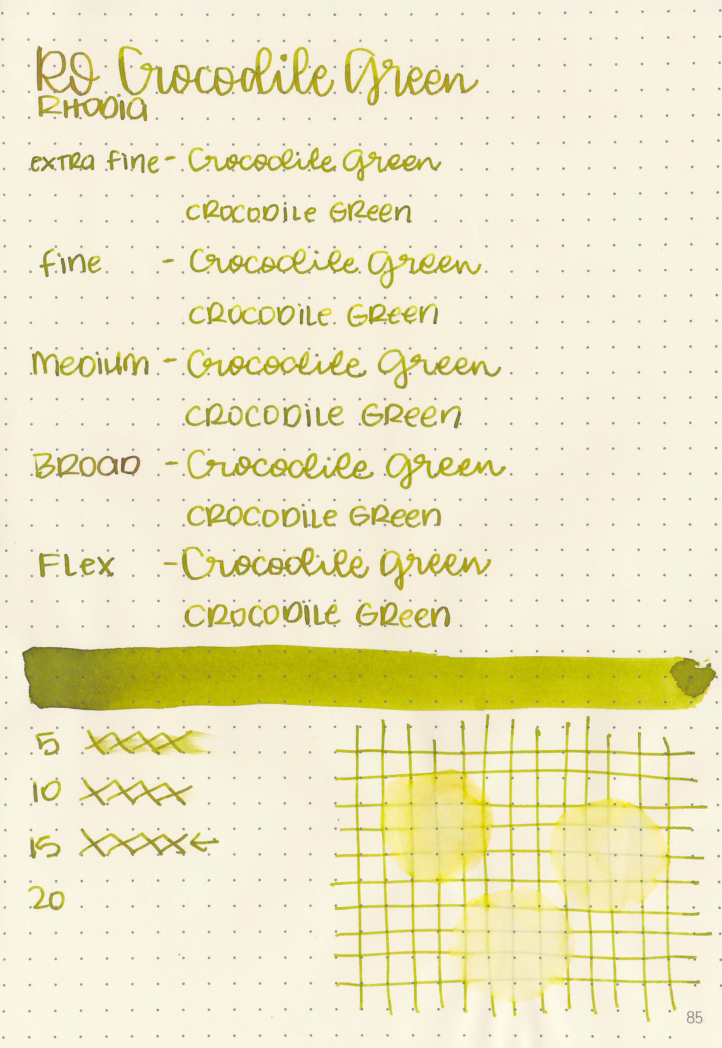
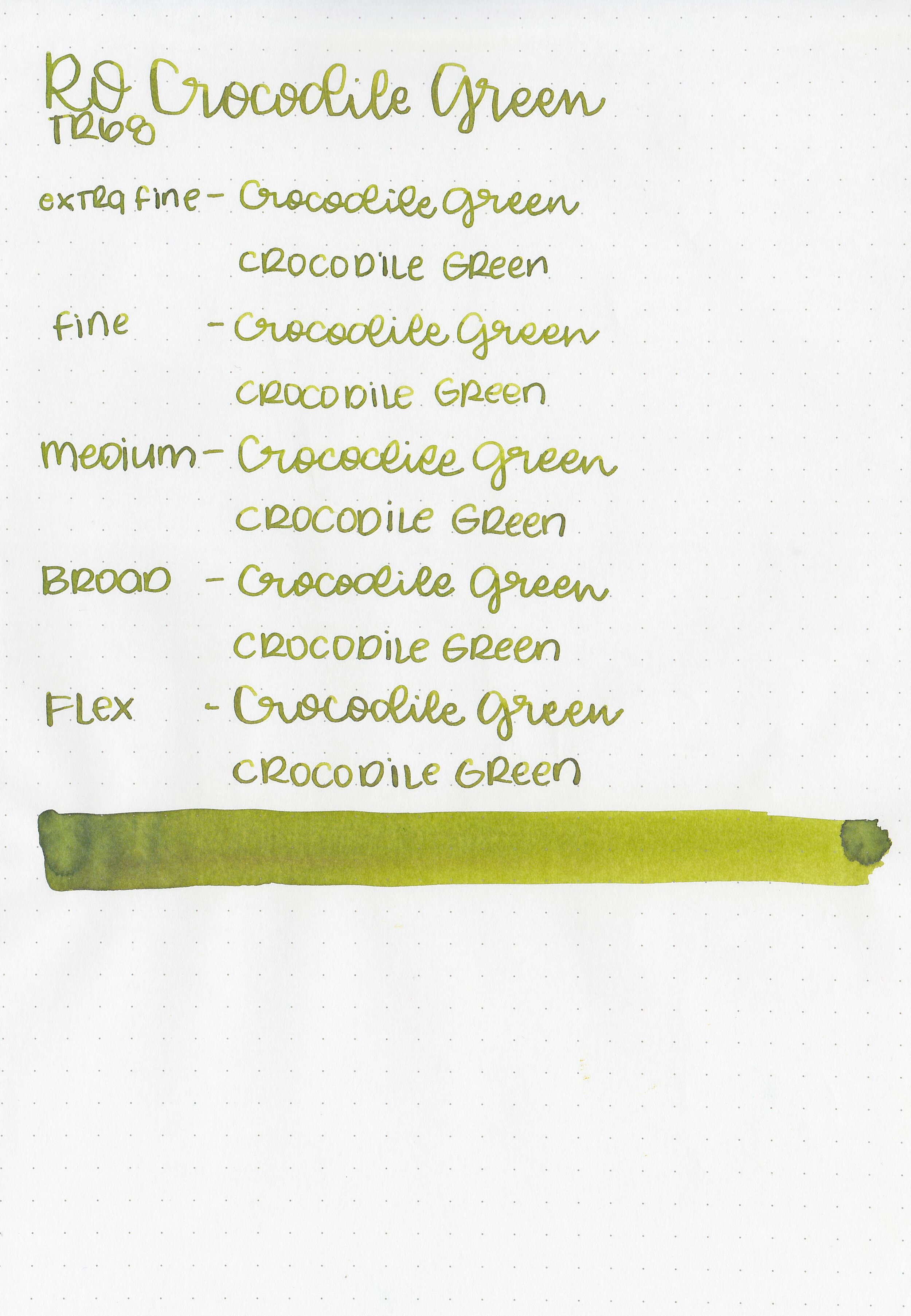
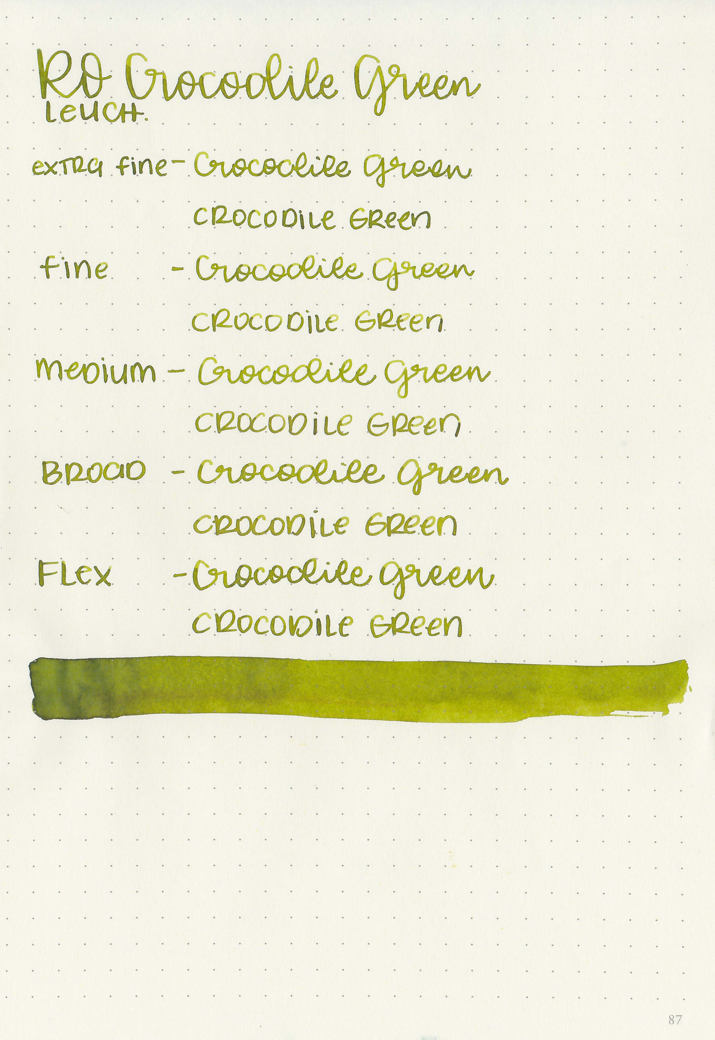
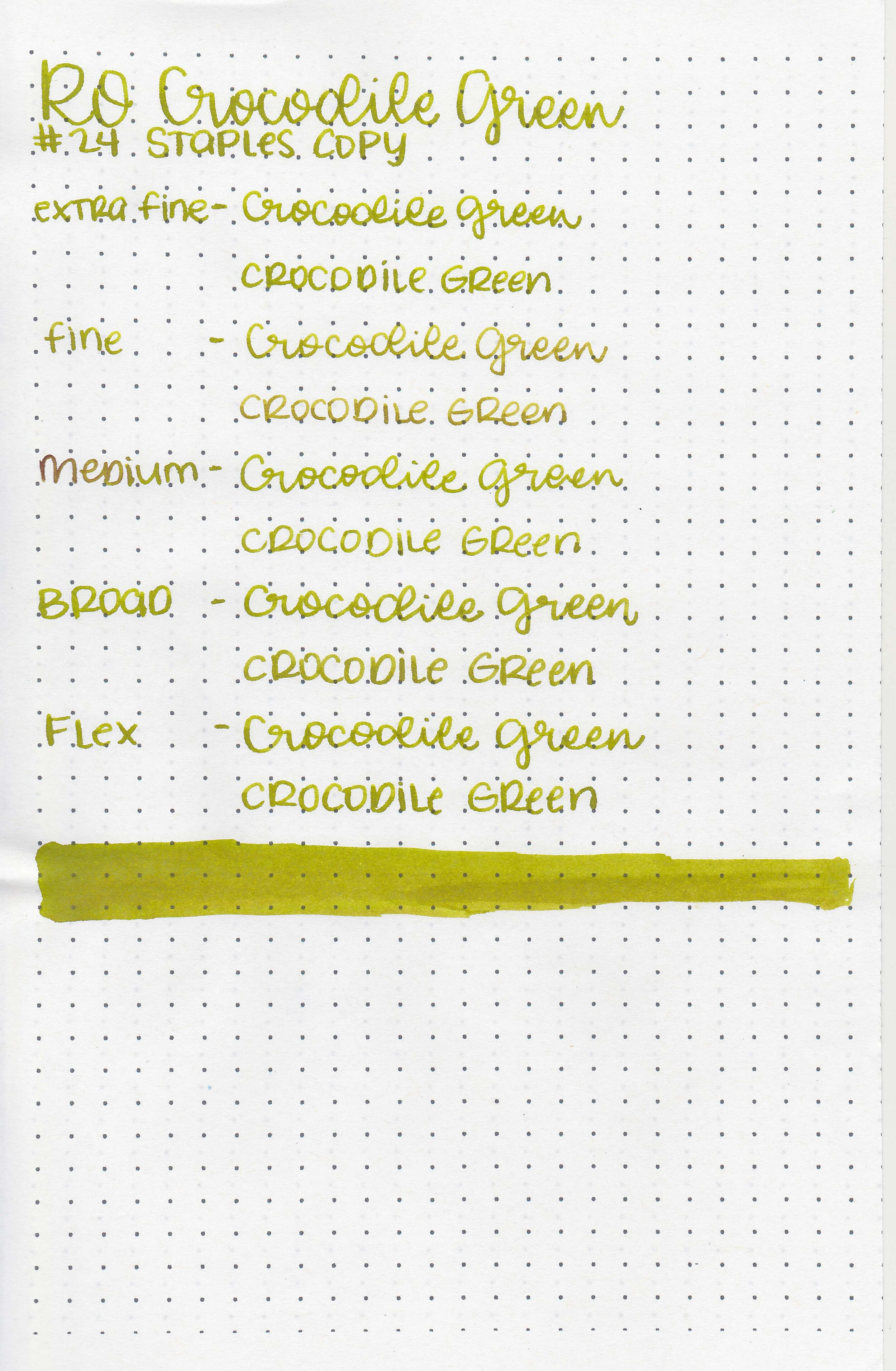
Let’s take a look at Robert Oster Crocodile Green. I purchased my sample of ink from Pen Chalet (aff. link).

The color:
Crocodile Green is a medium yellow-green. This color of green is sometimes called venom or fern green.
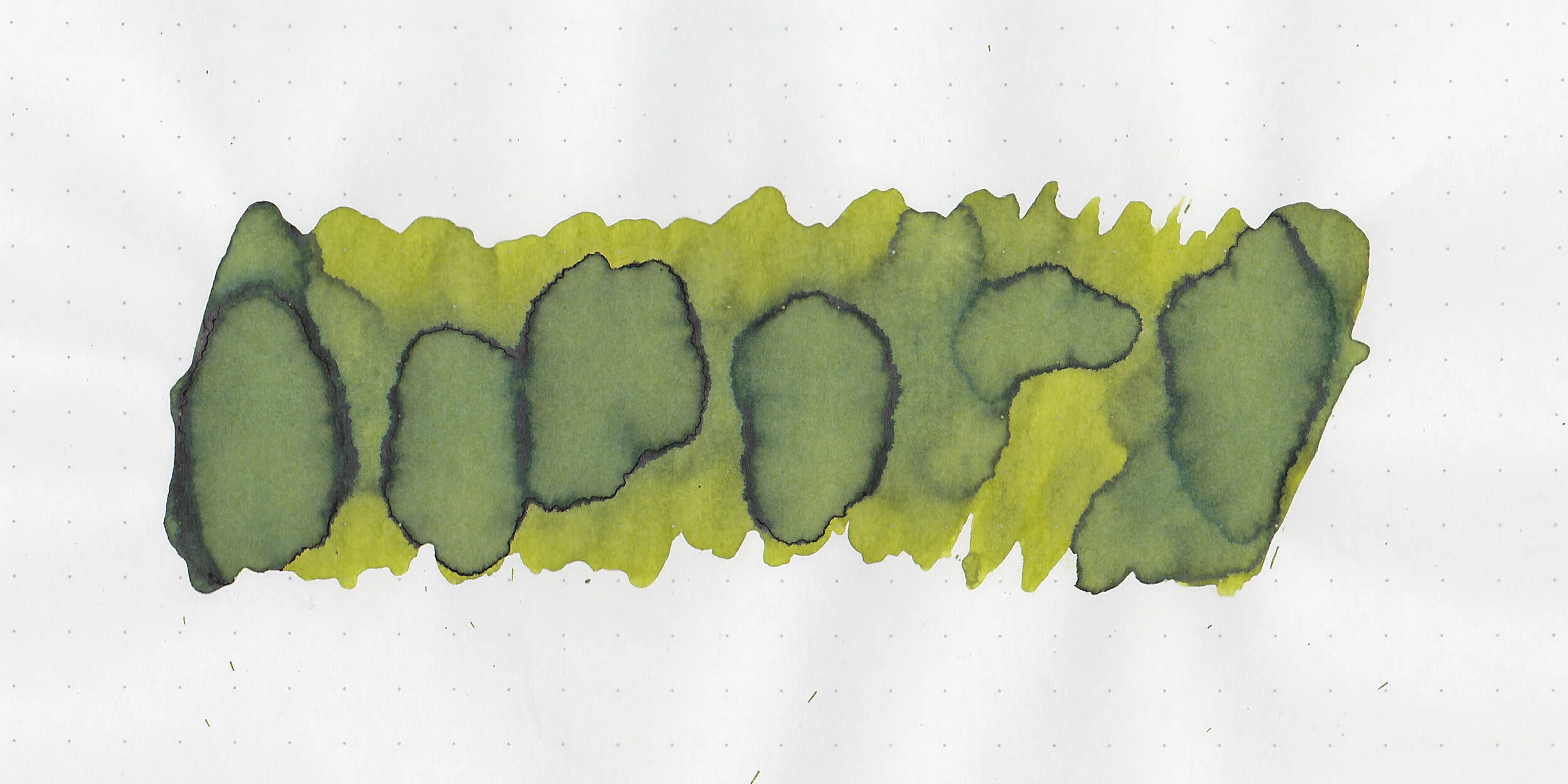
In large swabs on Tomoe River paper the ink has some pretty shading and a little bit of black sheen where the ink pooled.
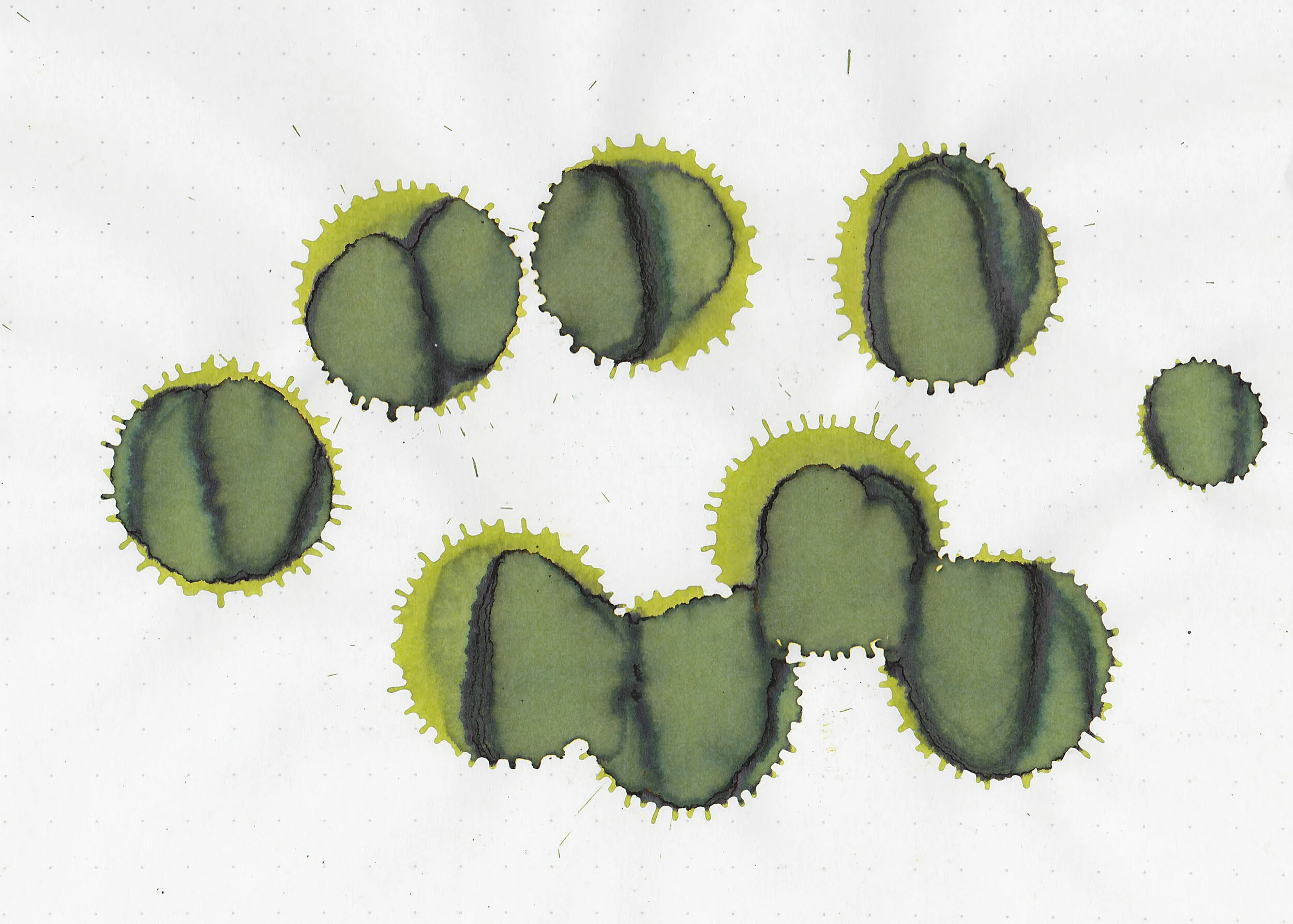
Let's take a look at how the ink behaves on fountain pen friendly papers: Rhodia, Tomoe River, and Leuchtturm.

Dry time: 15 seconds
Water resistance: Medium
Feathering: None
Show through: Medium
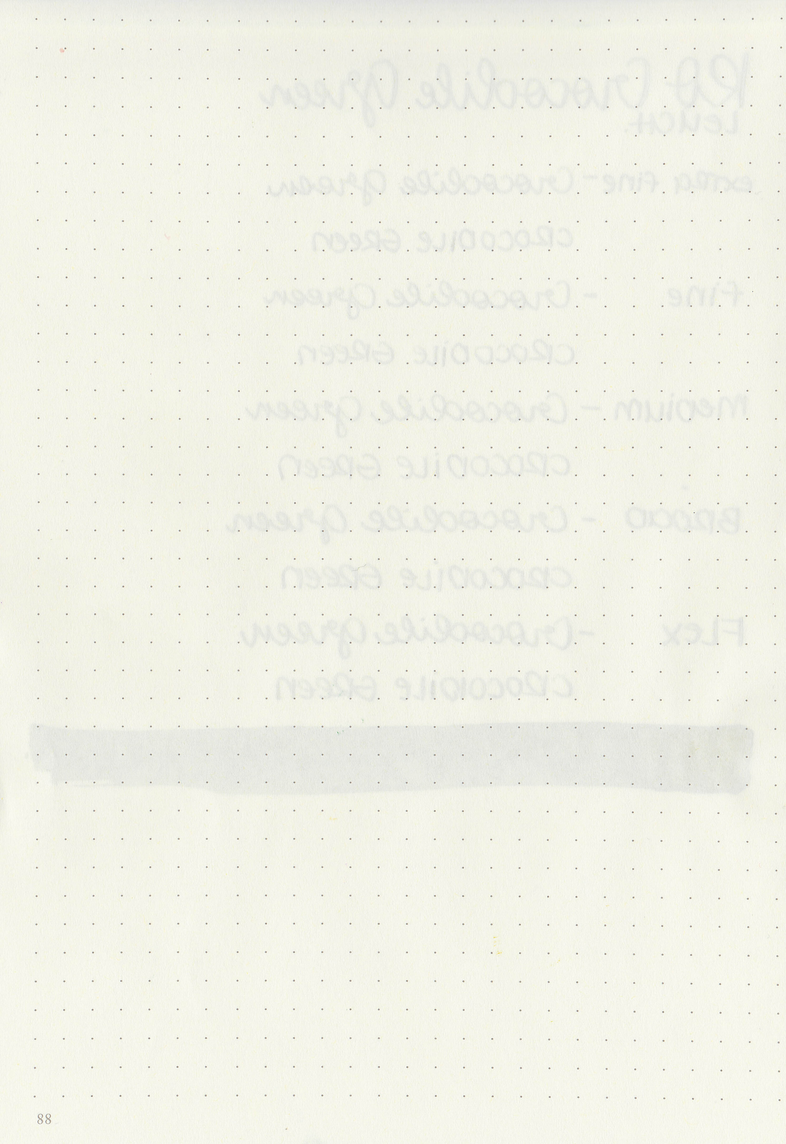
Bleeding: None
Other properties: medium shading, tiny black sheen, and no shimmer. The sheen is only visible in large swabs on Tomoe River Paper.
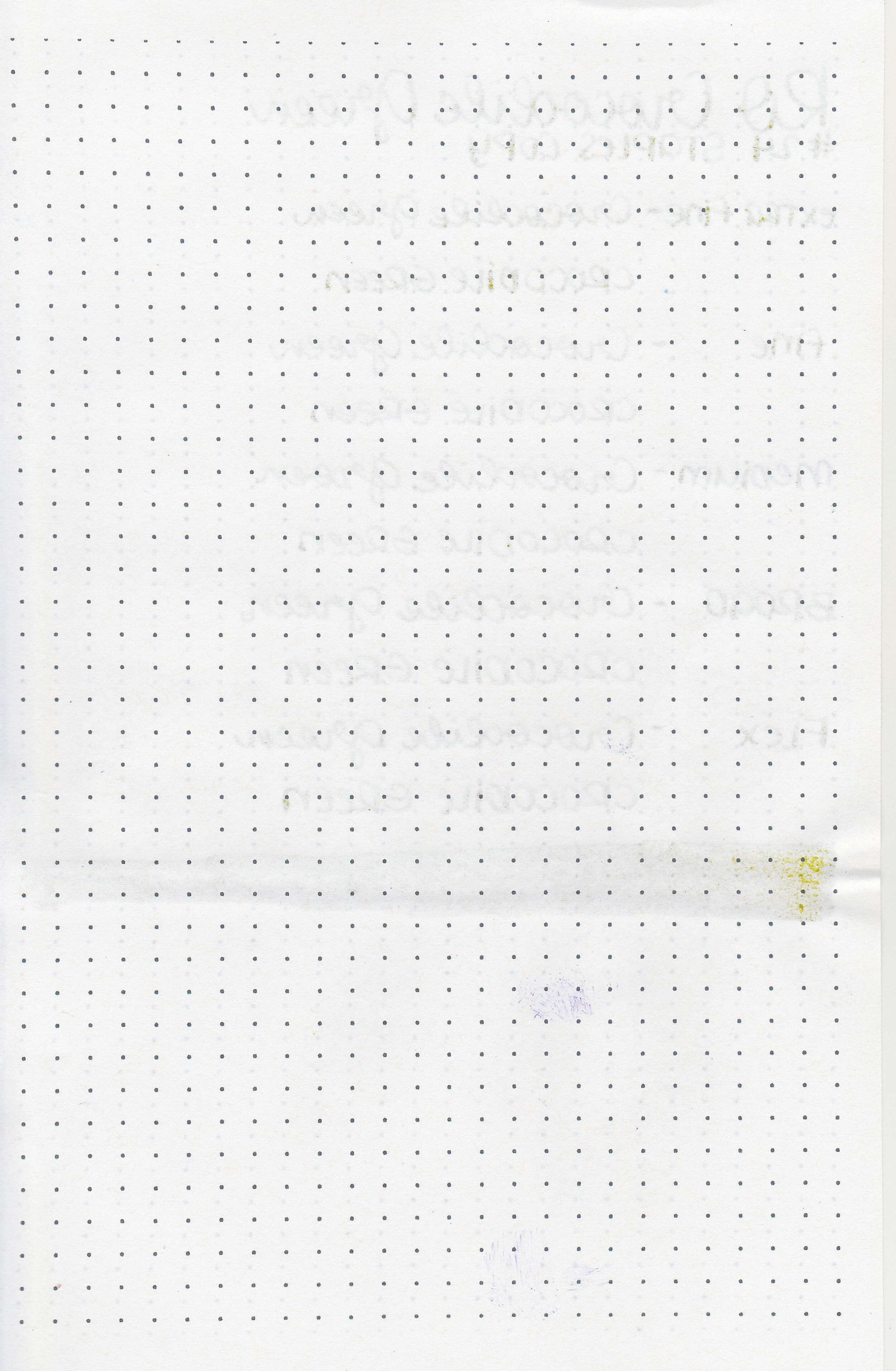
On Staples 24 lb copy paper there was some feathering in all nib sizes.

Crocodile Green is closest to Sailor Jentle Waka-uguisu. Click here to see the Robert Oster inks together, and click here to see the green inks together.

I used a Pelikan Vibrant Green with a fine nib on a Taroko Enigma notebook. The ink had an average flow.
Overall, I enjoyed this ink. It’s an interesting color, has some nice shading and even a tiny bit of sheen. For me it’s worth a try.
Disclaimer: I purchased this ink myself, and all photos and opinions are my own. This page does contain affiliate links but this post is not sponsored in any way.
Hi, I’m Kelli, and I’m the brain behind Mountain of Ink. I’m a homeschooling mama of three littles, full-time student, aspiring photographer, amateur chef, and lover of all things stationery. I think any day that doesn’t involve learning and playing with ink is a day wasted. On my site you will find fountain pen, ink, and paper reviews, along with stationery bits and bobs along the way. You can find me @mountainofink on Instagram, Facebook, Twitter, and Pinterest.
Powered by Squarespace.