1100 Inks!
/
Current favorites from the first 1100 ink reviews!
Read More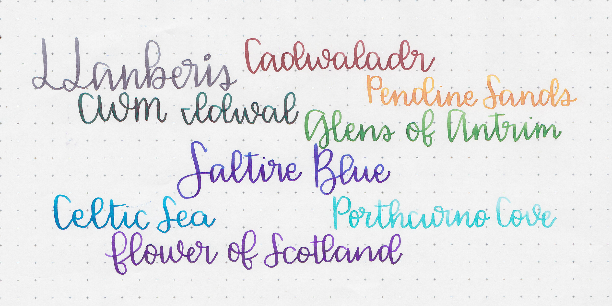
I love testing out different brands and it’s time to try out some Pure Pens inks. I managed to snag a few samples in a group buy a while ago, and another few from a kind reader. Thanks to the reader that sent some samples in!

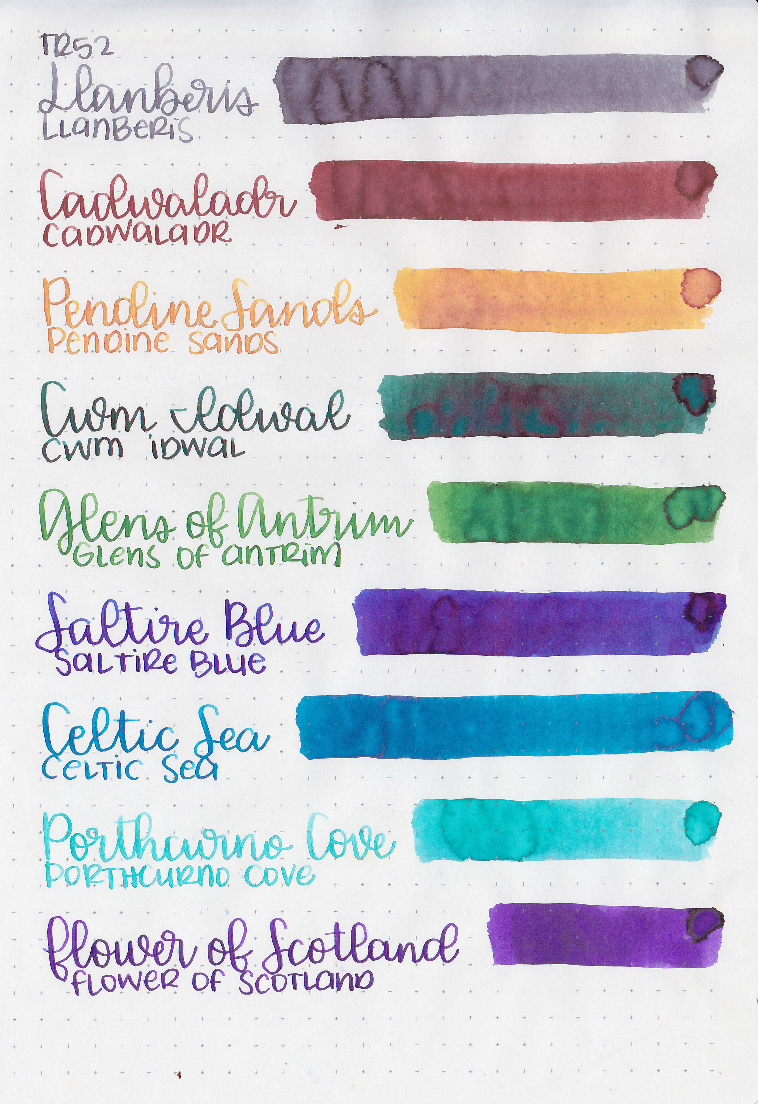
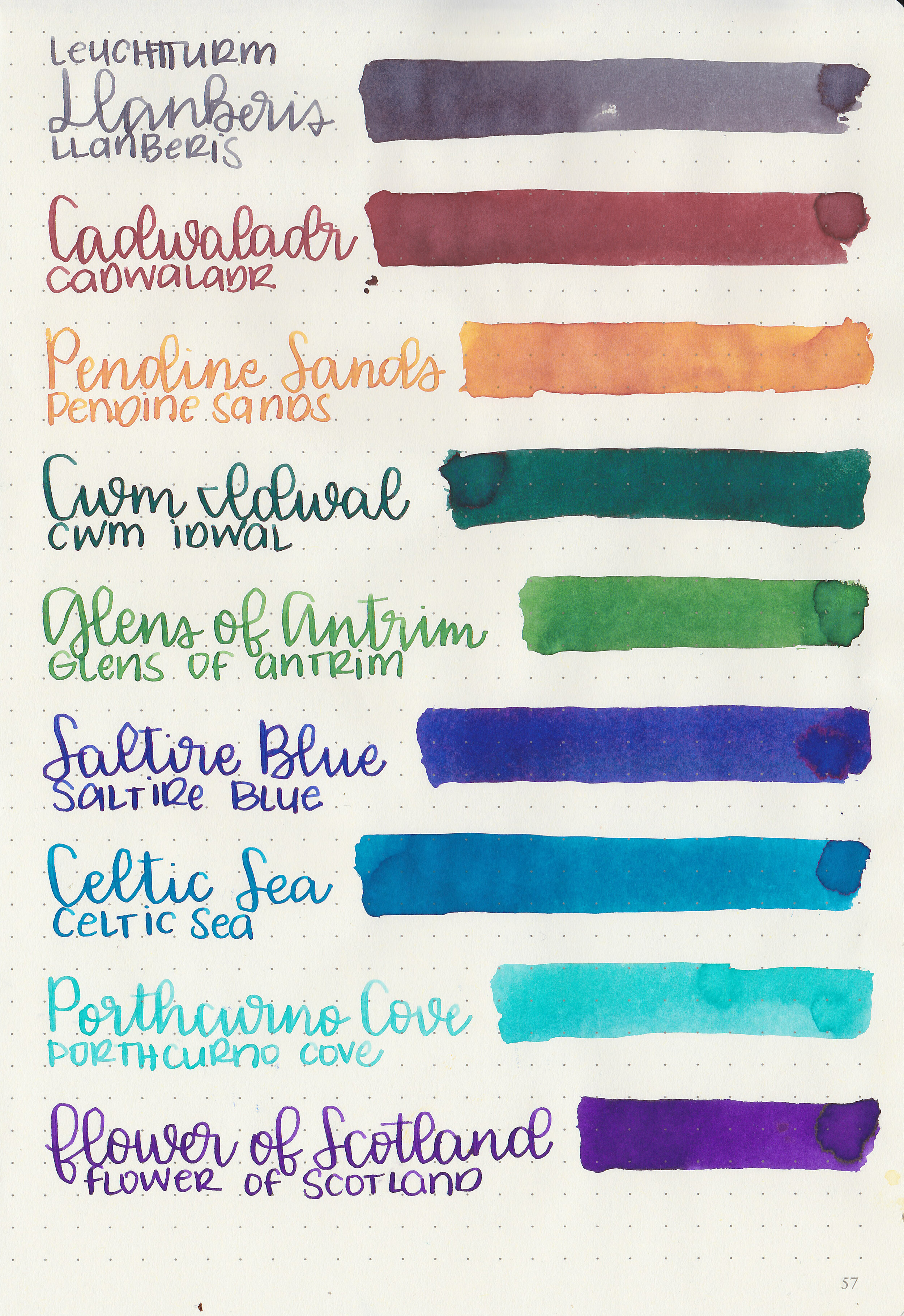
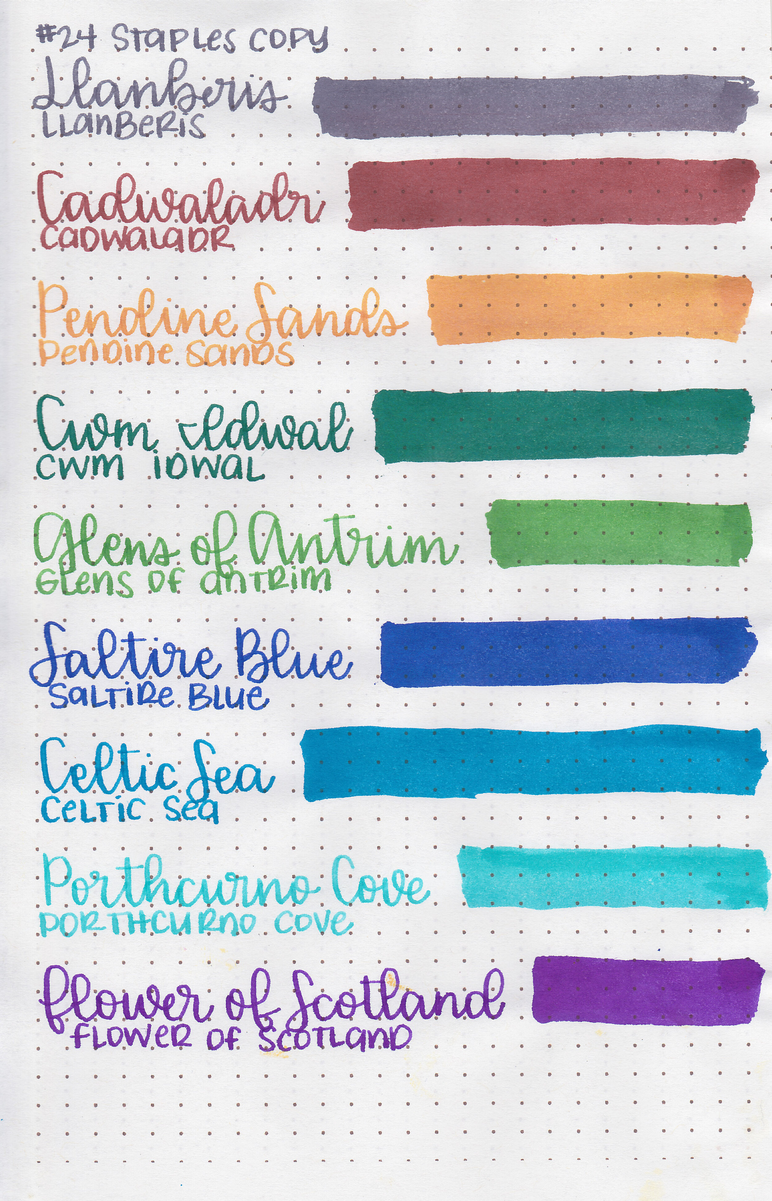
Left to right: Llanberis, Cadwaladr, Pendine Sands, Cwm Idwal, Glens of Antrim, Saltire Blue, Celtic Sea, Porthurno Cove and Flower of Scotland.
Let's take a look at how the ink behaves on fountain pen friendly papers: Rhodia, Tomoe River, and Leuchtturm.
Water resistance: Medium
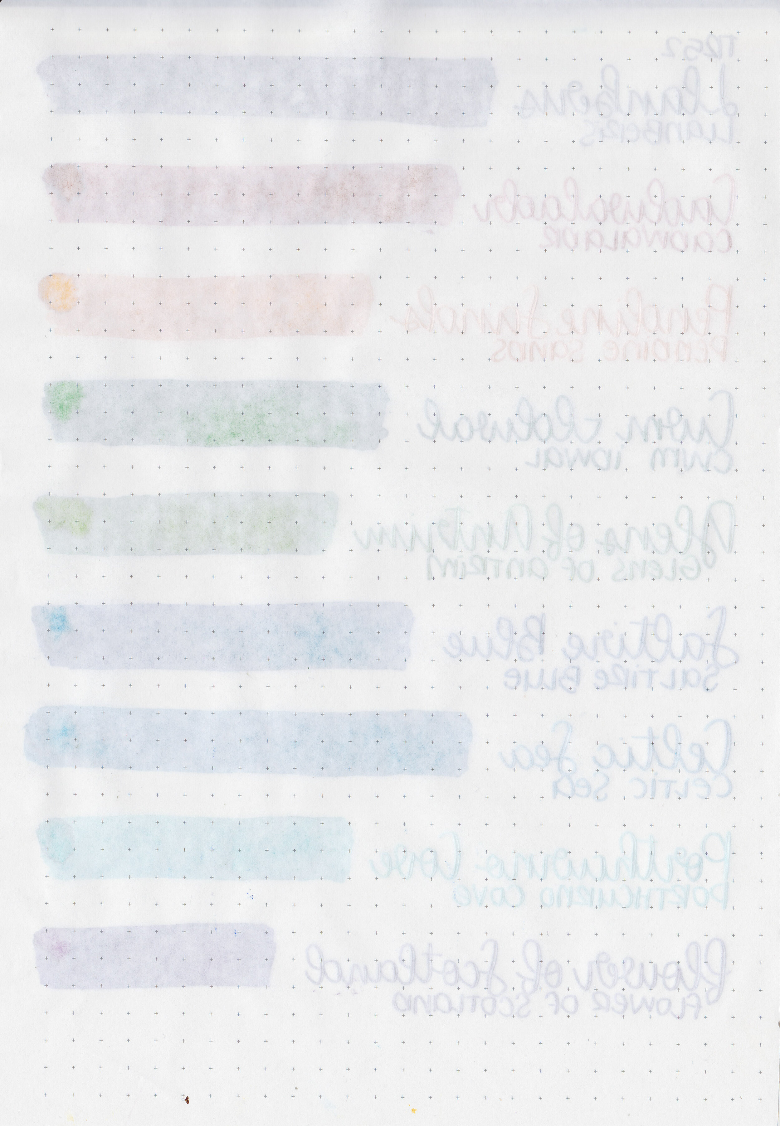
Feathering: None
Show through: Medium
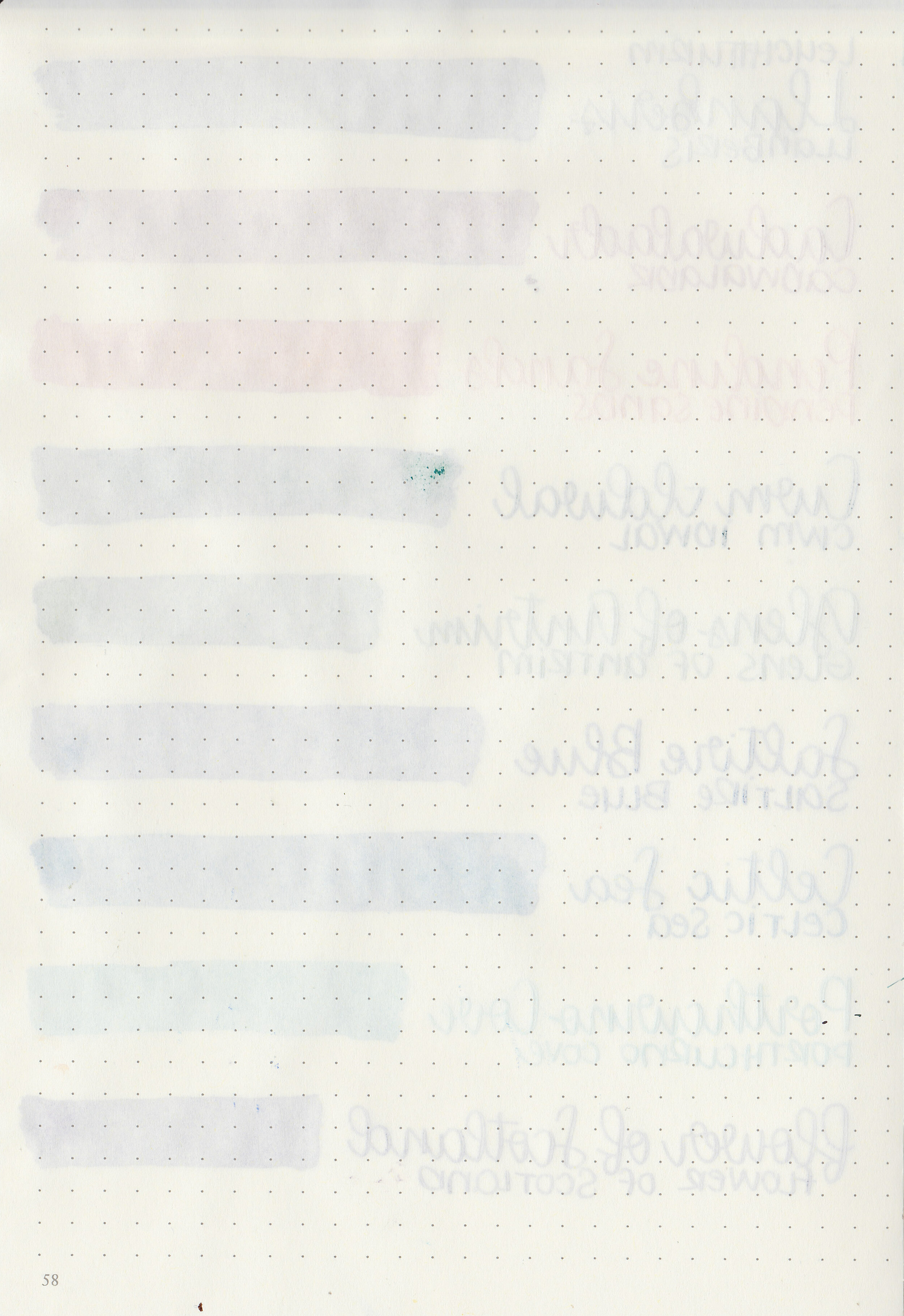
Bleeding: None
Other properties: low shading, some sheen, and no shimmer. Cwm Idwal, Saltire Blue and Flower of Scotland all have a little bit of sheen on Tomoe River paper.
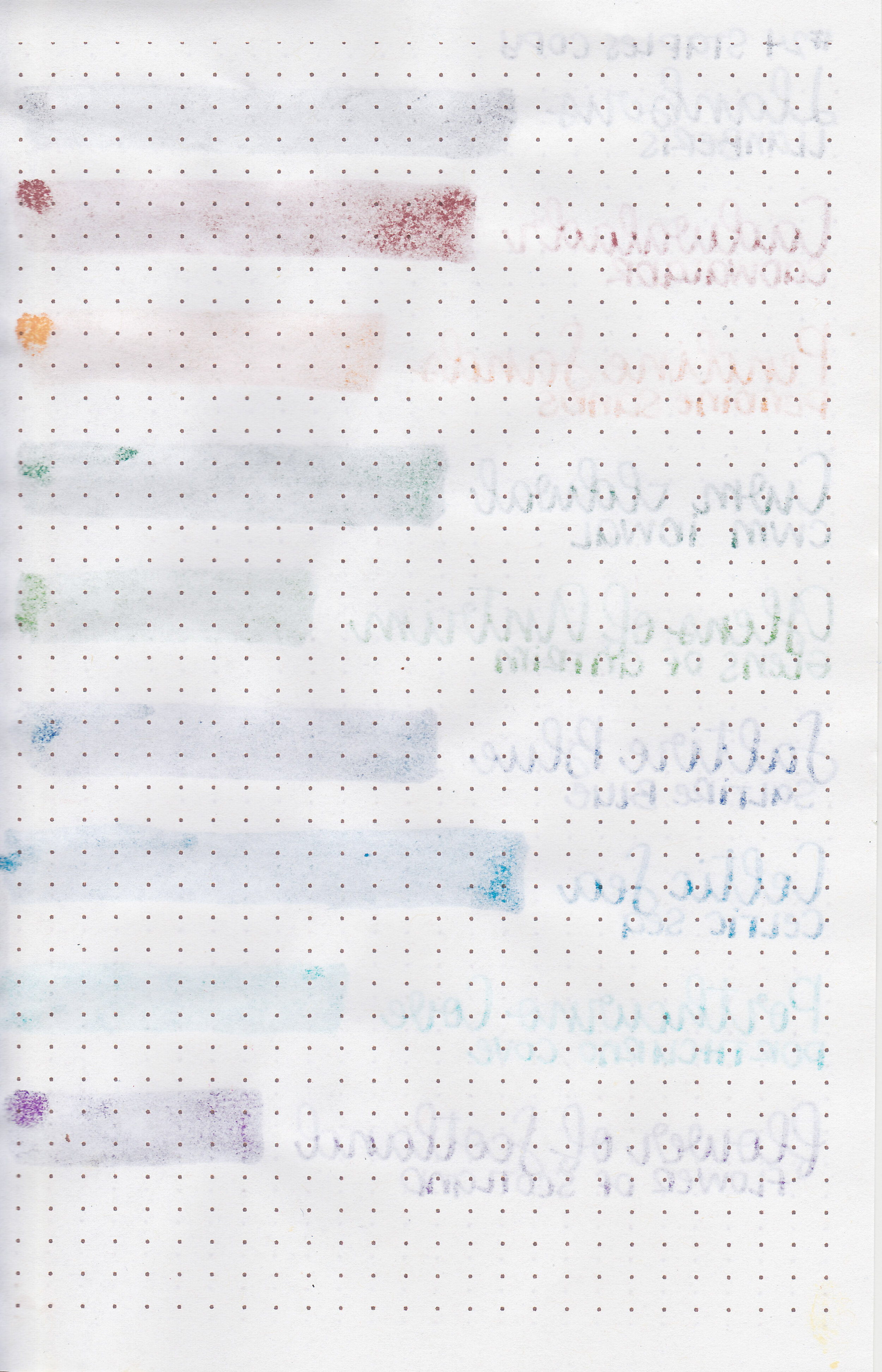
On Staples 24 lb copy paper there was lots of feathering in every nib size as well as a little bleeding.

Llanberis is similar to Sailor Jentle Chu-shu.

Cadwaladr is similar to Franklin Christoph Sweet Maroon.

Pendine Sands is close to Robert Oster Red Orange.

Cwm Idwal is a bit more blue than Ferris wheel Press Peppermint Drop.

Glens of Antrim is a bit brighter than Colorverse Sea of Tranquility.

Saltire Blue is a bit more purple than Monteverde Peace.

Celtic Sea is a bit darker than Robert Oster Blue Lagoon.
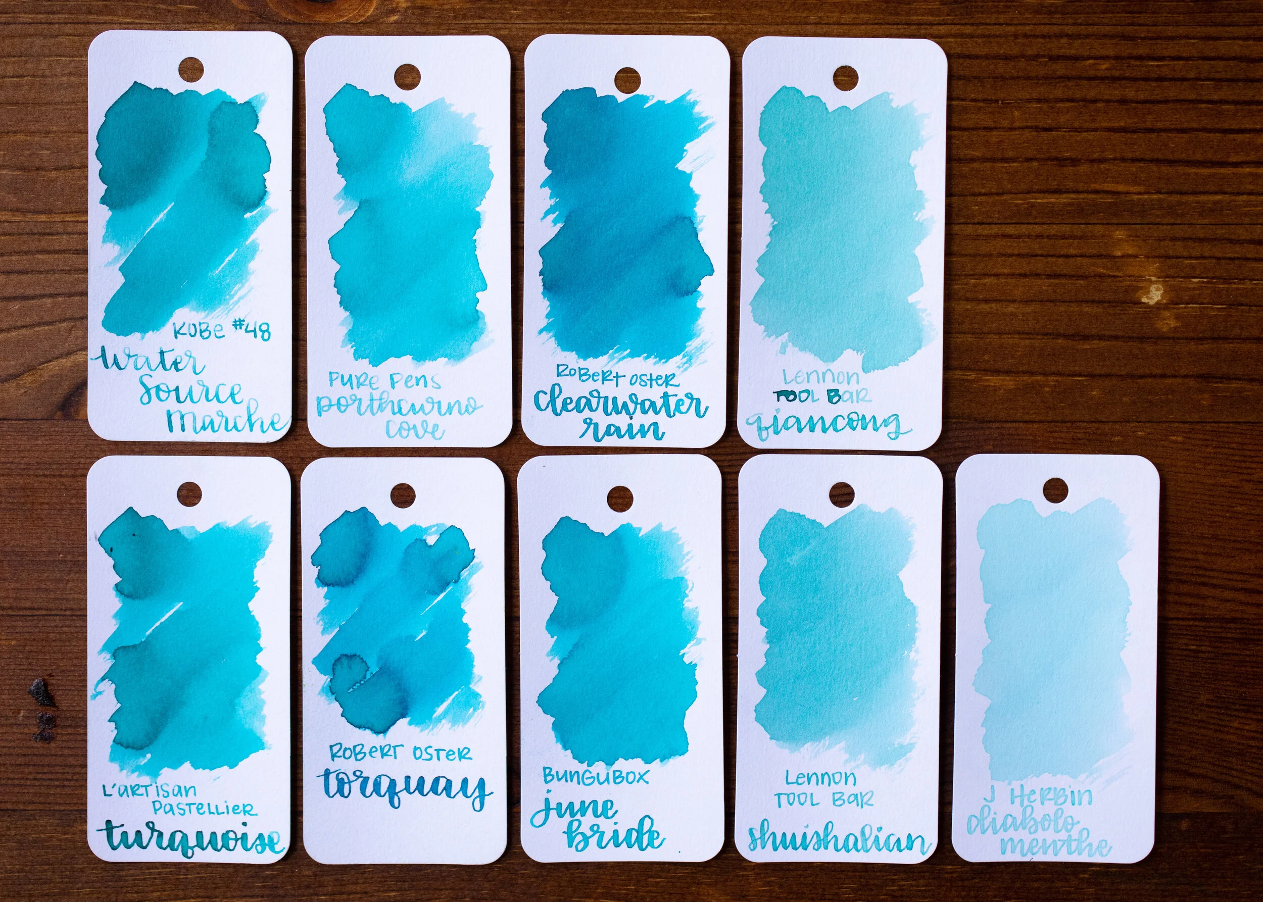
Porthcurno Cove is a bit lighter than L’artisan Pastellier Turquoise.

Flower of Scotland is warmer than Kobe Sannomiya Panse.

I used a Mabie Todd swan on a Taroko Enigma notebook. All of the inks had an average flow.
Overall, I found these inks to be well behaved and lovely colors. I need to get the rest of their inks to try out.
Disclaimer: I purchased some of these inks, and some were provided by a reader for the purpose of this review. All photos and opinions are my own. This page does not contain affiliate links, and is not sponsored in any way.

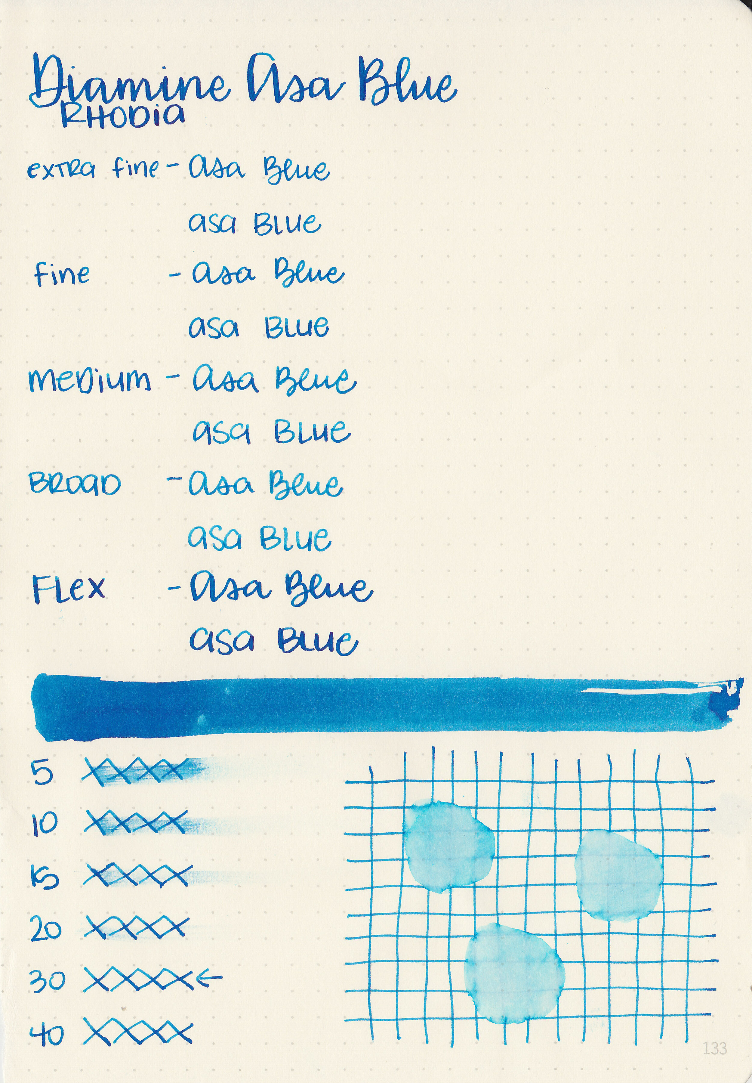
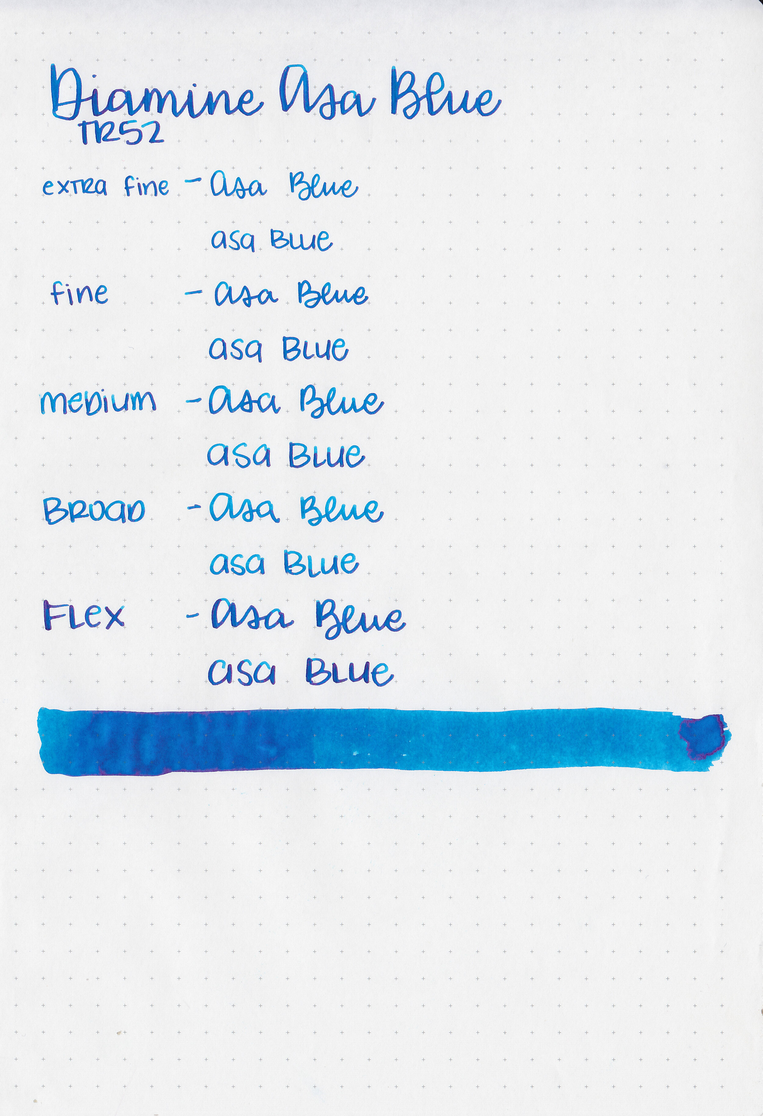
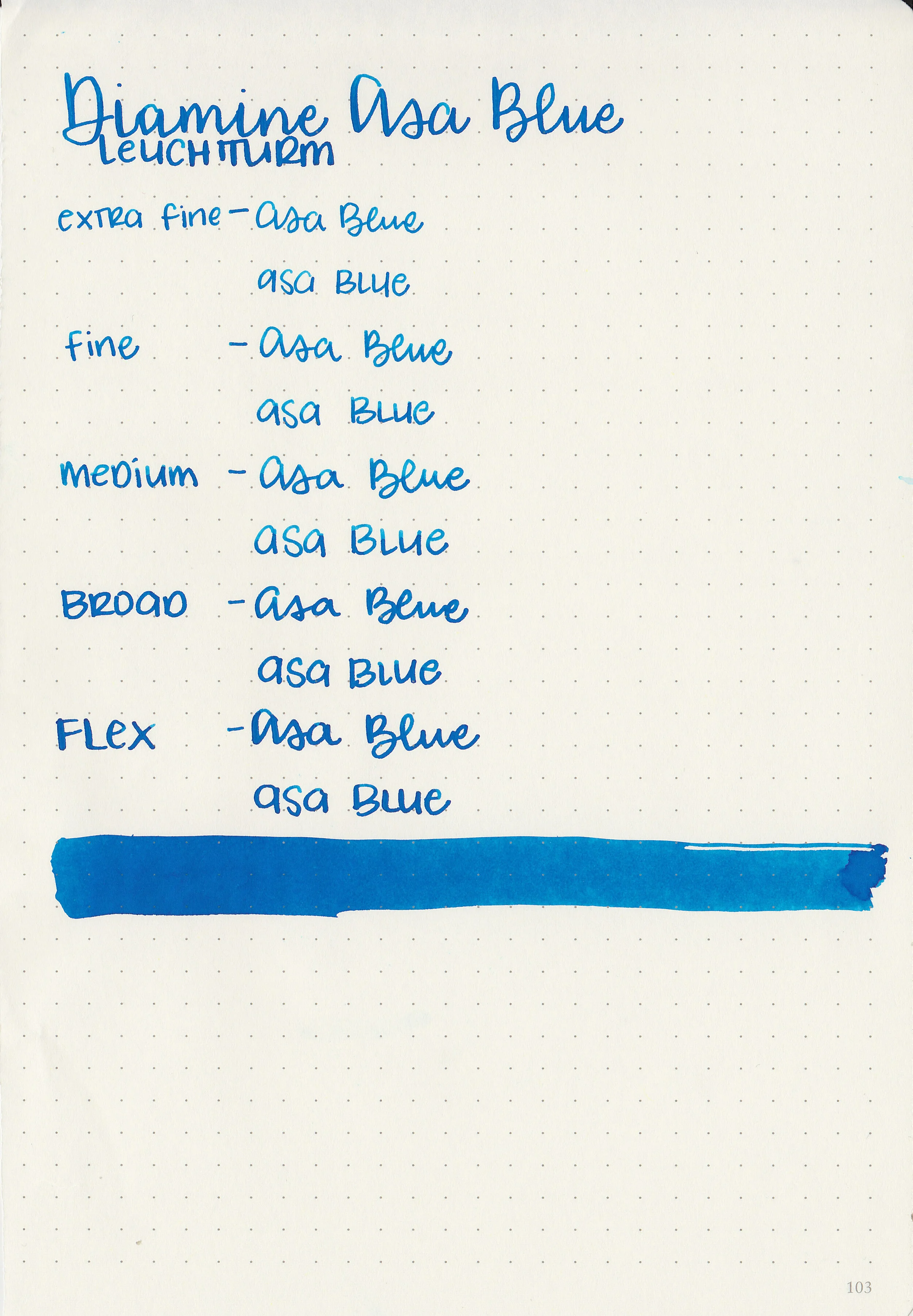
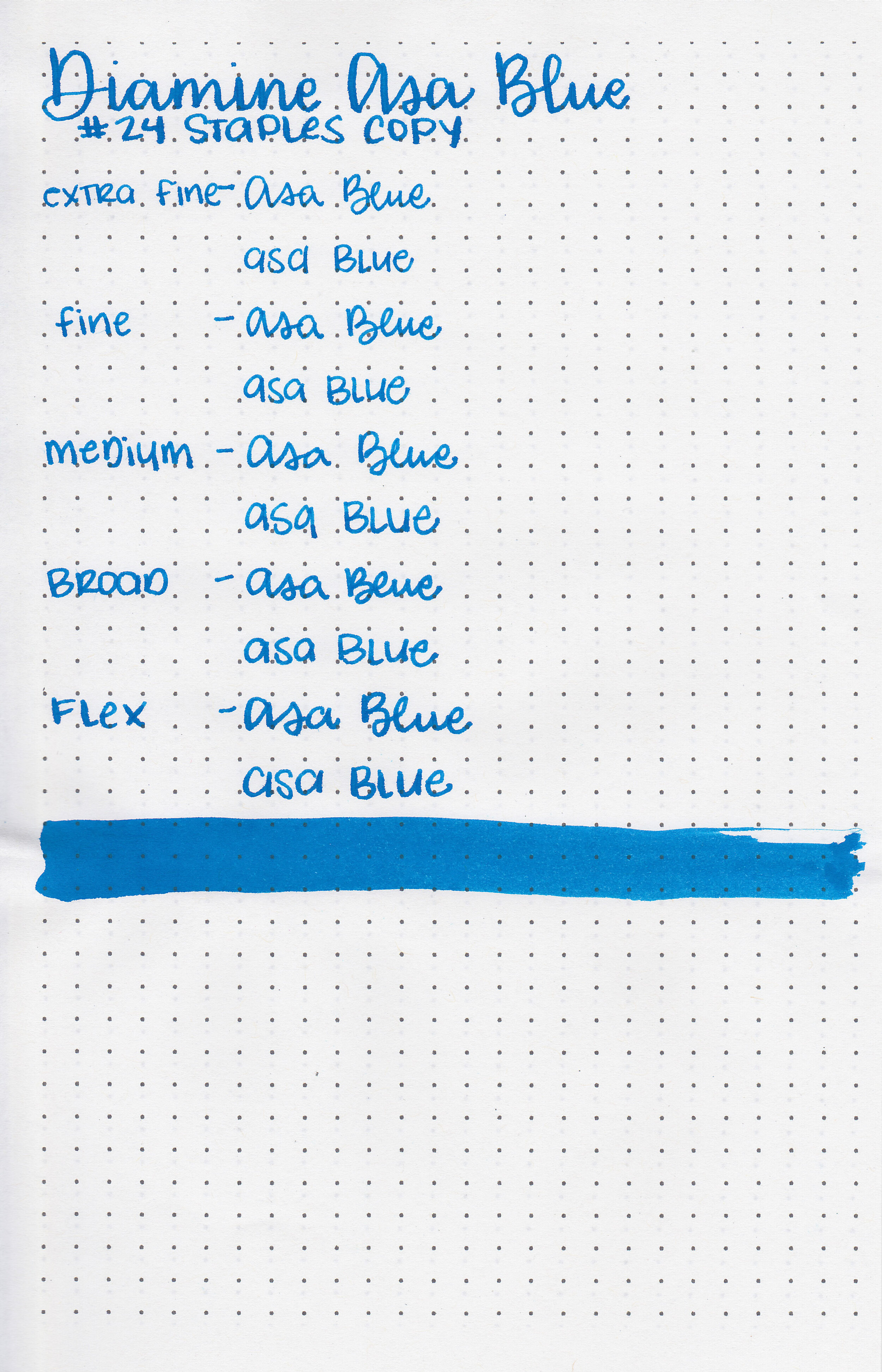
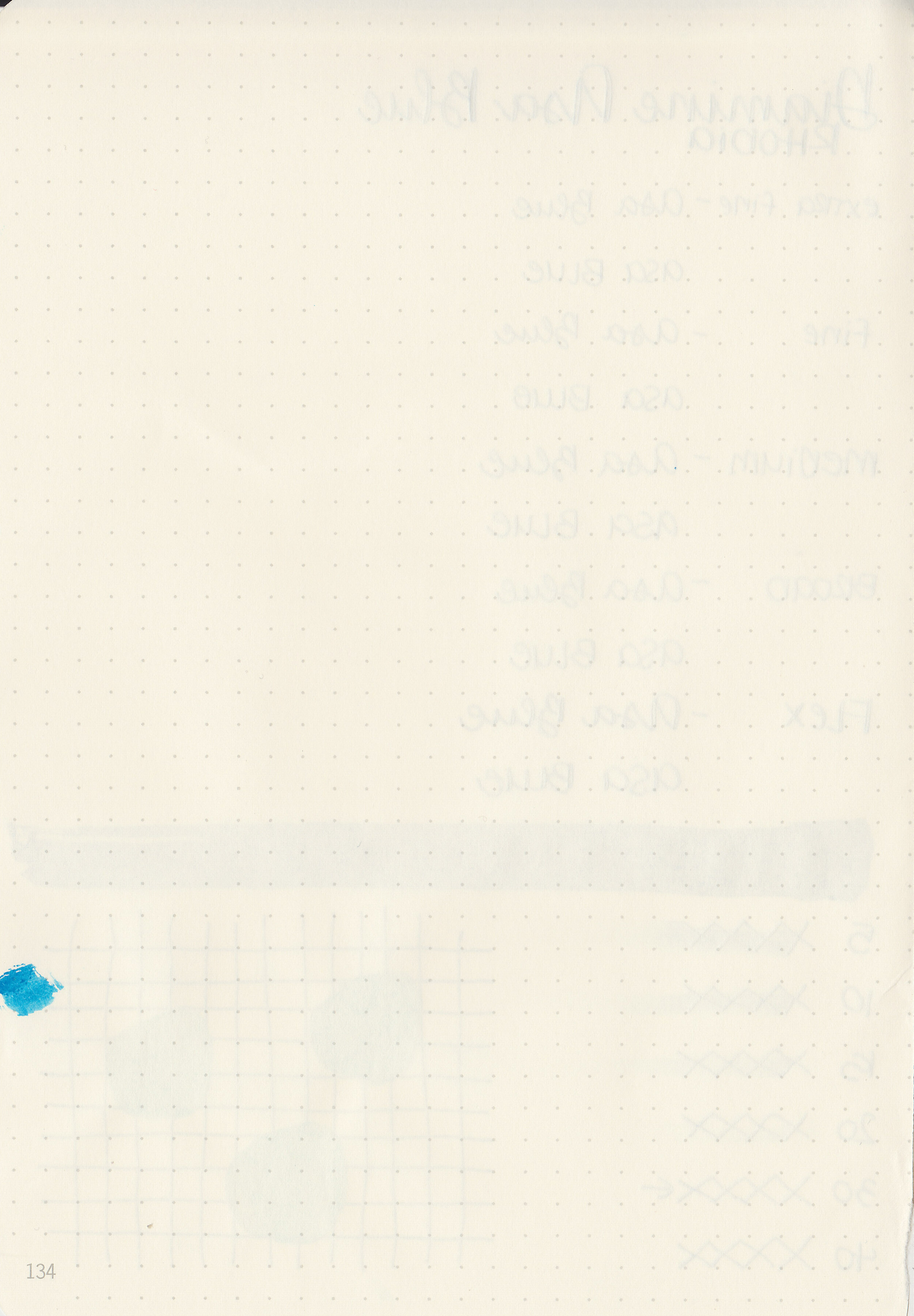
Let’s take a look at one more Diamine ink this week before we move onto some new inks-Diamine Asa Blue. I purchased my bottle of ink from Cult Pens about 3 years ago.

The color:
Asa Blue is a vibrant medium blue.

In large swabs on Tomoe River paper the ink has some pretty pink sheen.

Let's take a look at how the ink behaves on fountain pen friendly papers: Rhodia, Tomoe River, and Leuchtturm.
Dry time: 30 seconds
Water resistance: Low
Feathering: None
Show through: Medium
Bleeding: Low-there was just a little bit of bleeding in the larger nib sizes.
Other properties: medium shading, medium sheen, and no shimmer.
On Staples 24 lb copy paper there was some feathering in most nib sizes and bleeding in the flex nib only.

Asa Blue is a little bit darker than Colorverse Supernova, KWZ Hawaii Blue and Blackstone Barrier Reef Blue. Click here to see the Diamine inks together, and click here to see the blue inks together.

I used a Bonecrusher Studios pen with a Regalia Writing Labs Crossflex nib on a Yoseka A5 notebook. The ink had an average flow.
Overall, it’s a nice medium blue but there are a lot of inks this color.
Disclaimer: I purchased this ink myself, and all photos and opinions are my own. This page does not contain affiliate links and this post is not sponsored in any way.

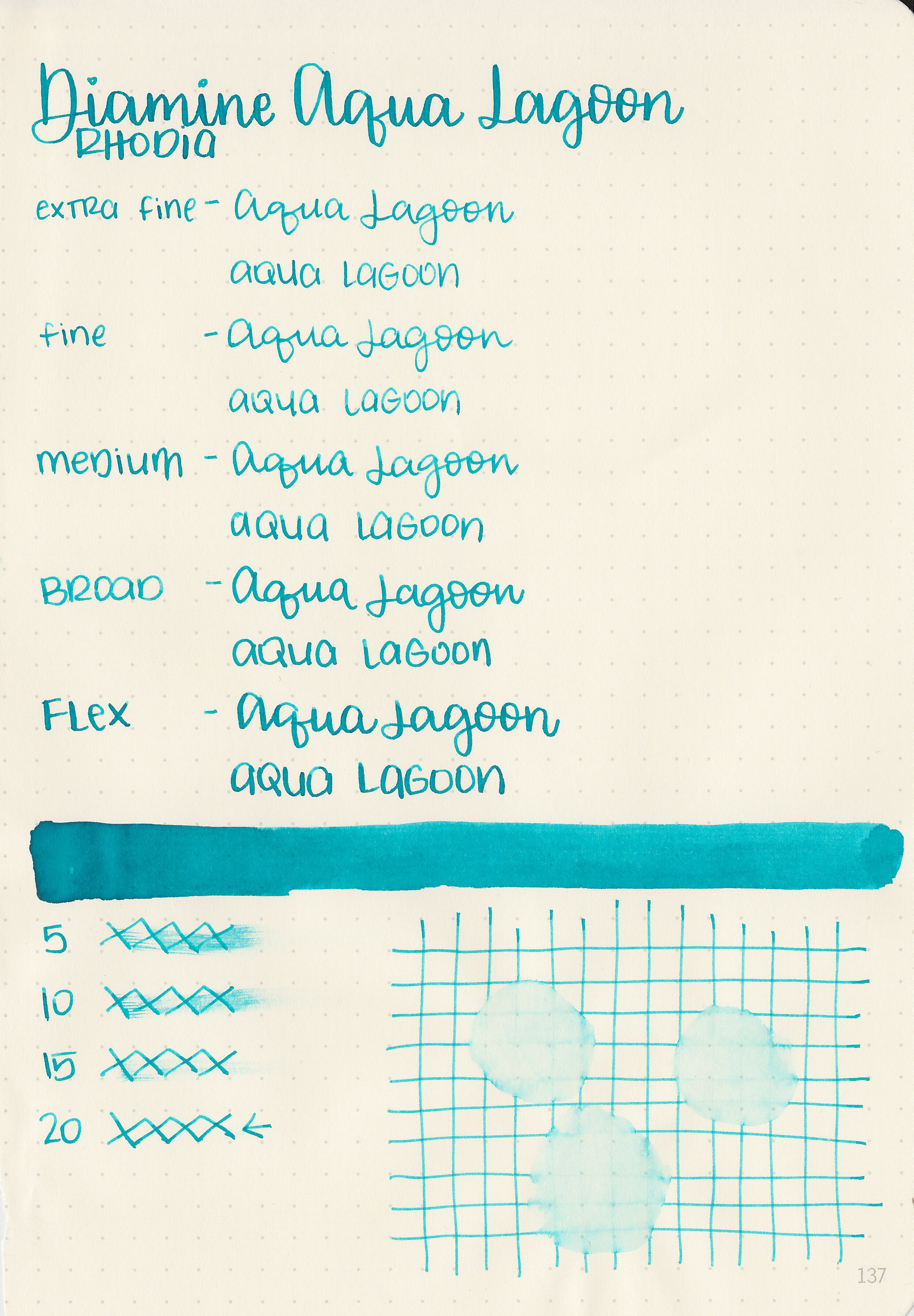
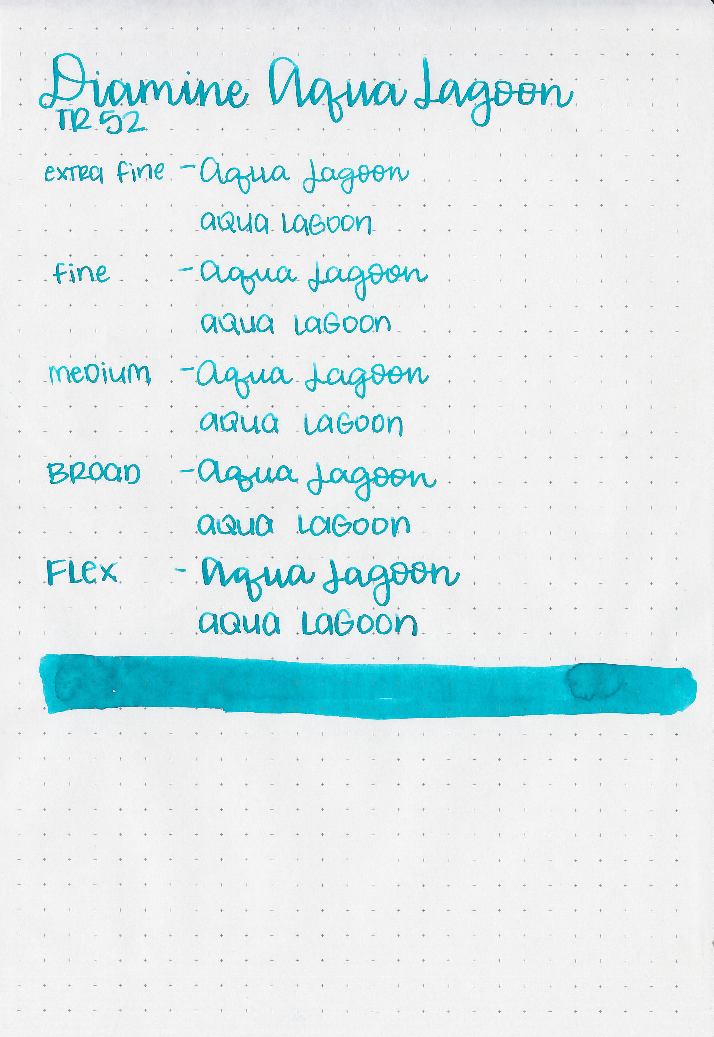
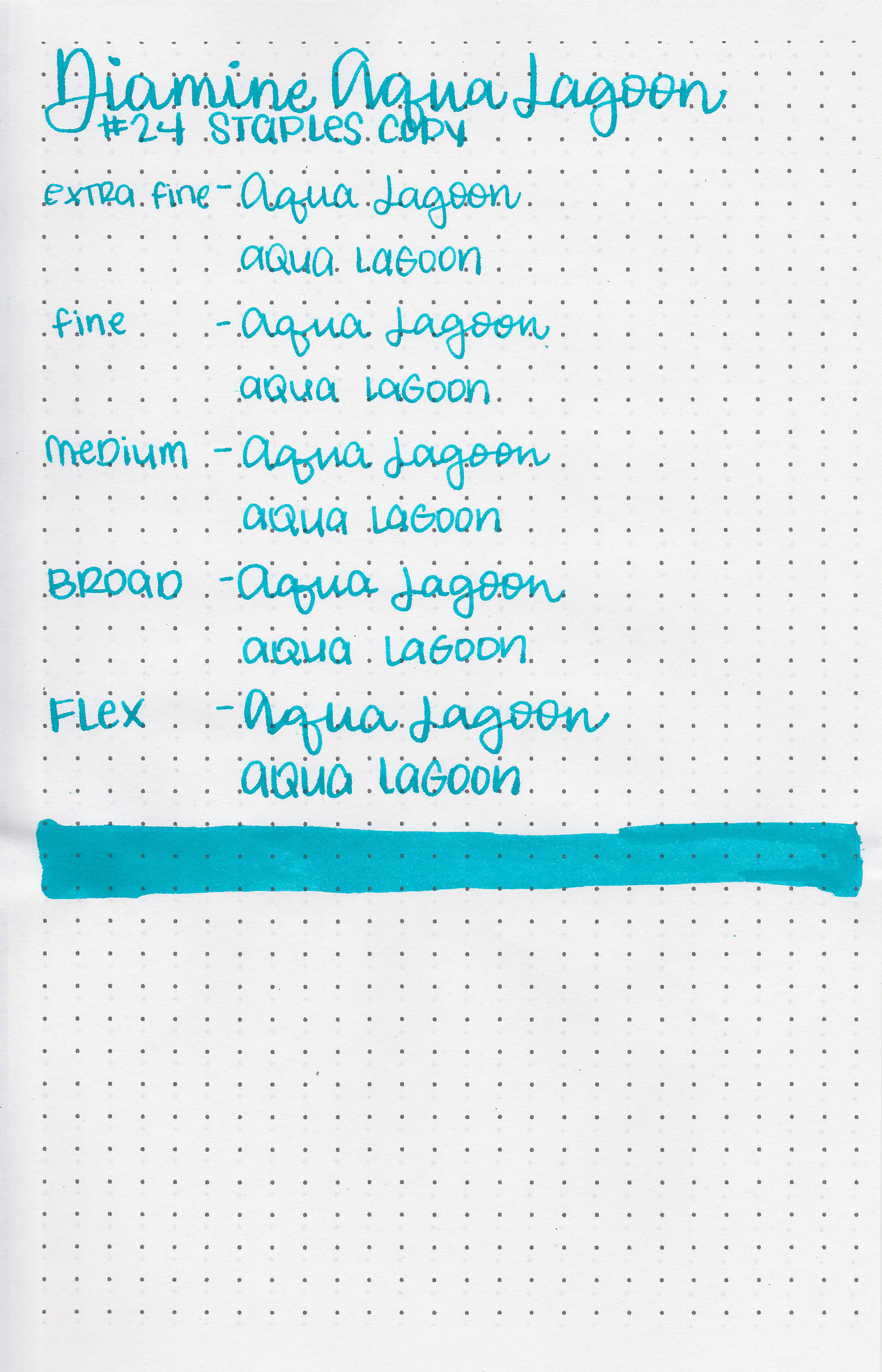
I’m sticking with yesterday’s bright theme today with Diamine Aqua Lagoon. I purchased my bottle of ink from Cult Pens.

The color:
Aqua Lagoon is a medium vibrant blue. It has just a hint of green in it, but not enough to make it a teal.

In large swabs on Tomoe River paper the ink looks a bit more green and has just a touch of pink sheen.

Let's take a look at how the ink behaves on fountain pen friendly papers: Rhodia, Tomoe River, and Leuchtturm.
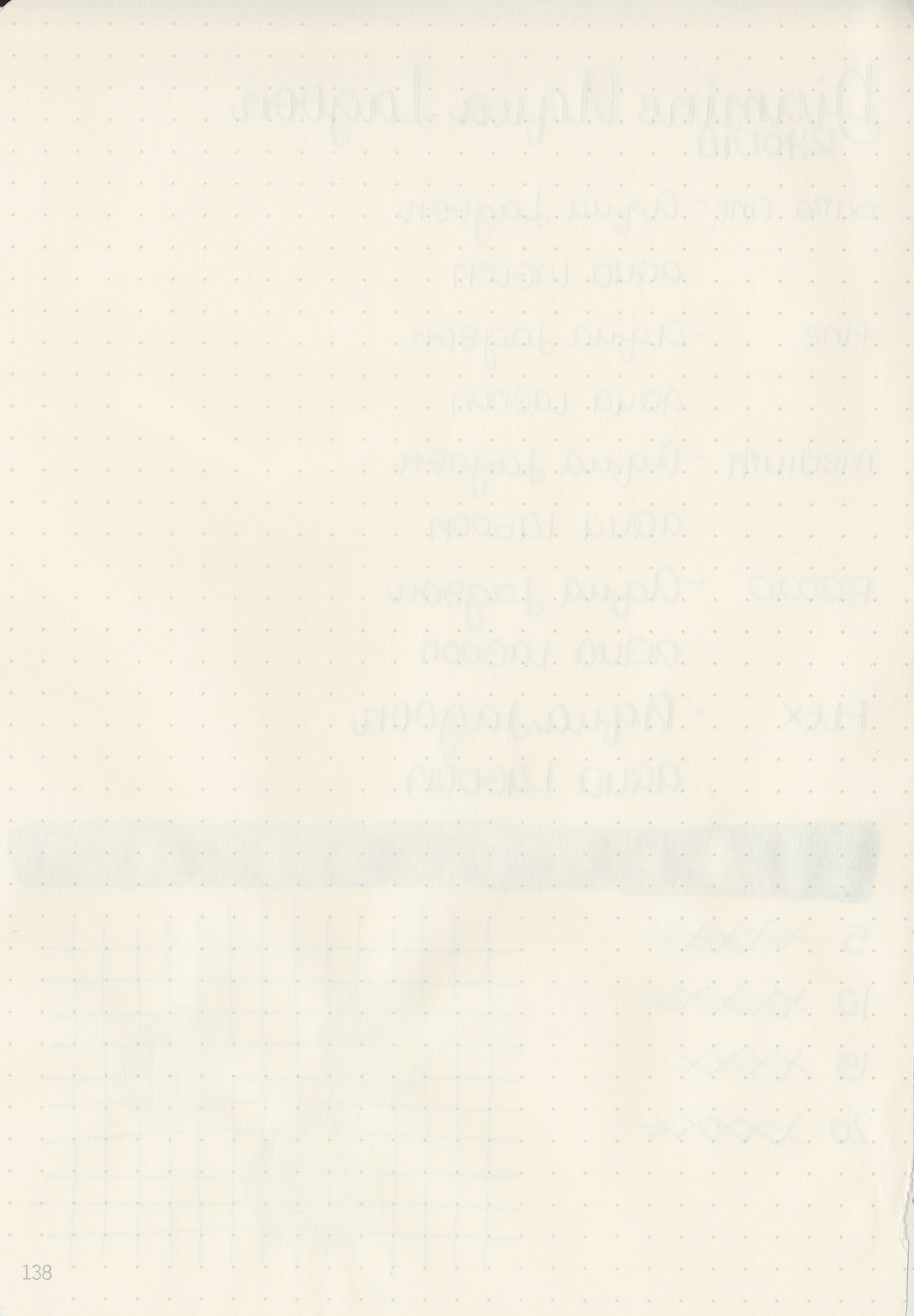
Dry time: 20 seconds
Water resistance: Low
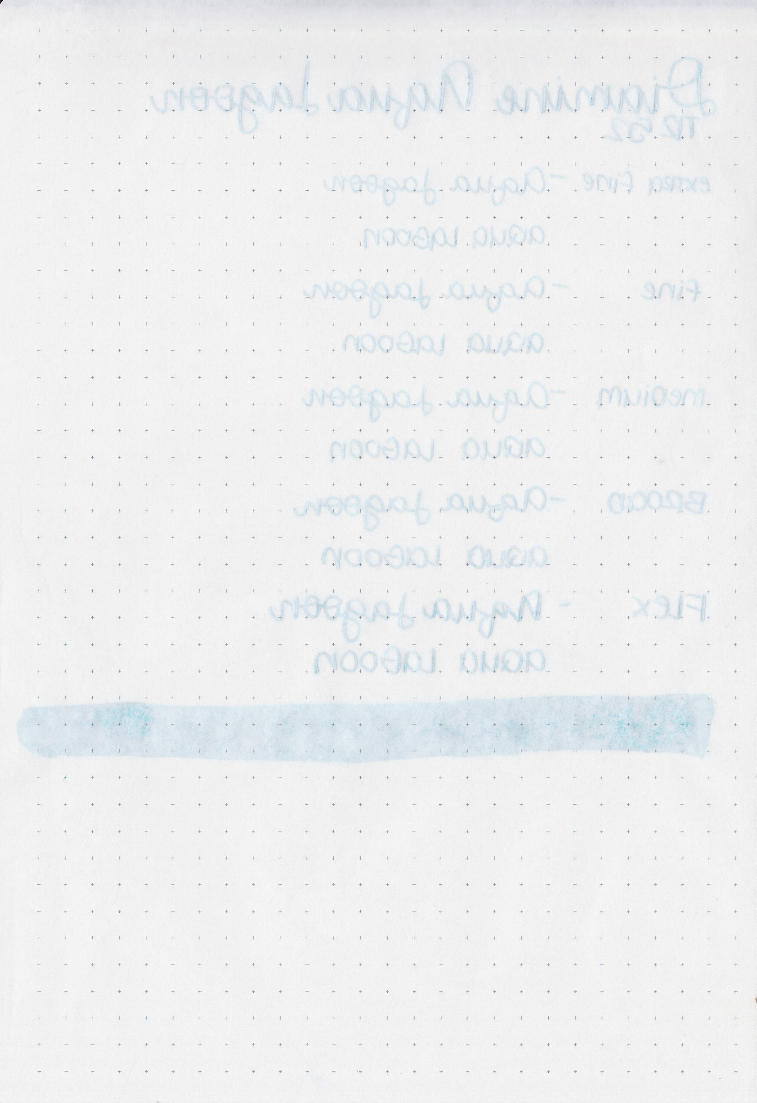
Feathering: None
Show through: Medium
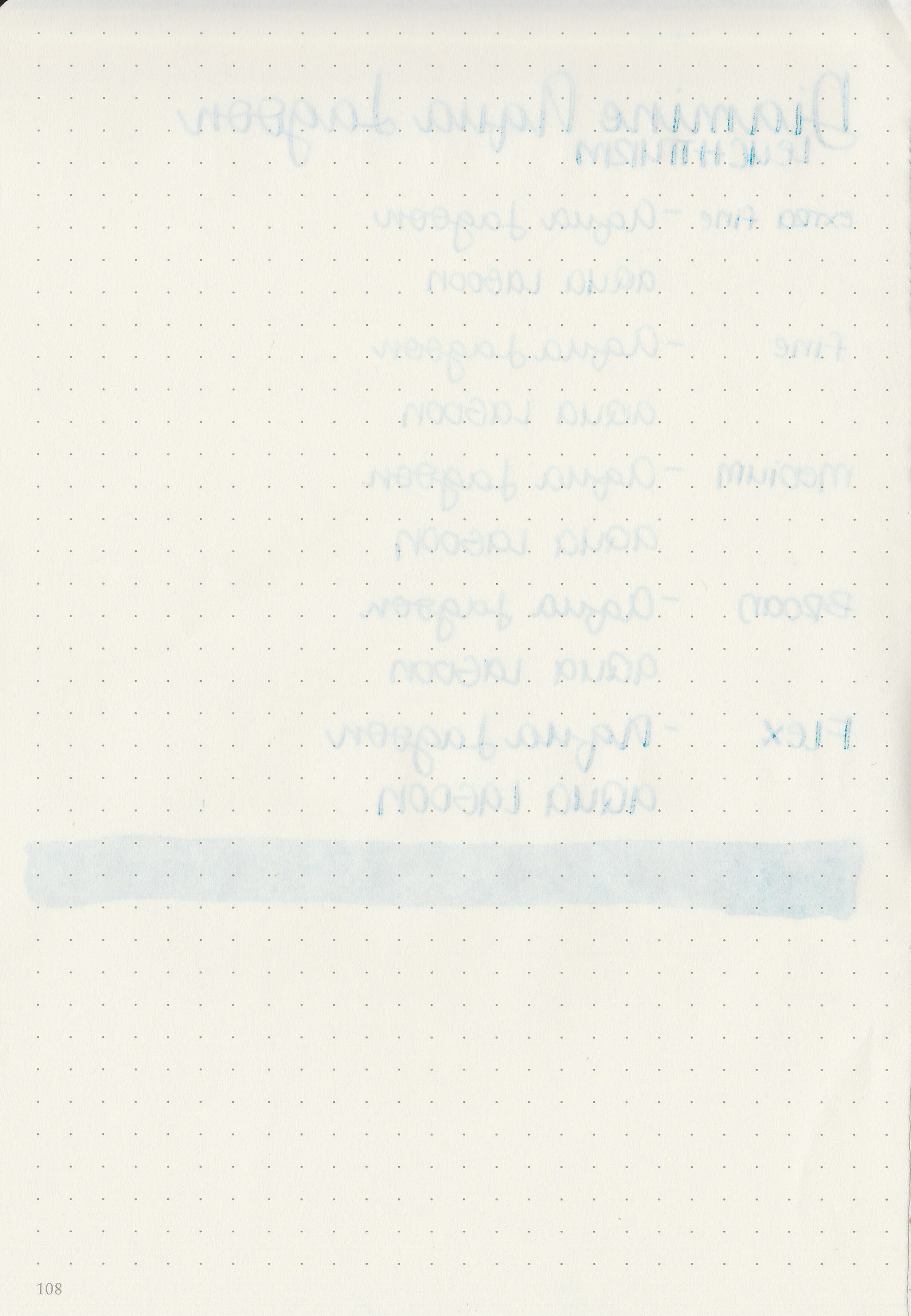
Bleeding: None
Other properties: medium shading, tiny sheen, and no shimmer. The sheen was only visible in large swabs on Tomoe River paper.
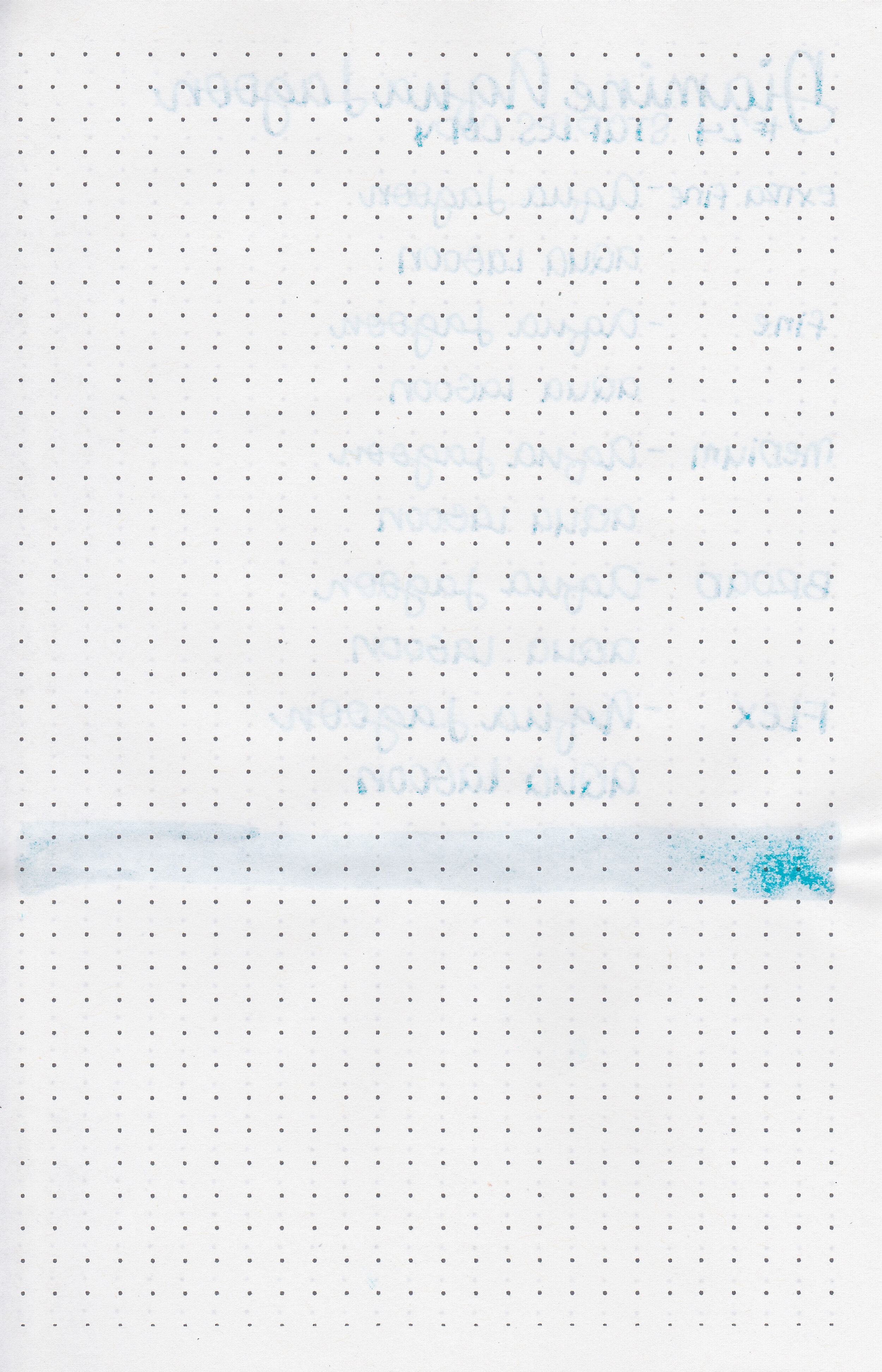
On Staples 24 lb copy paper there was some feathering but no bleeding.

Aqua Lagoon is just a little bit more vibrant than Robert Oster Clearwater Rain. Click here to see the Diamine inks together, and click here to see the blue inks together.

I used a Lamy Al-star Bronze with a fine nib on a Yoseka A5 notebook. The ink had an average flow and some really great shading.
Overall, it’s a great vibrant blue ink-well behaved and a pretty color. I reach for this ink every summer when I want a bright blue.
Disclaimer: I purchased this ink myself, and all photos and opinions are my own. This page does not contain affiliate links and this post is not sponsored in any way.

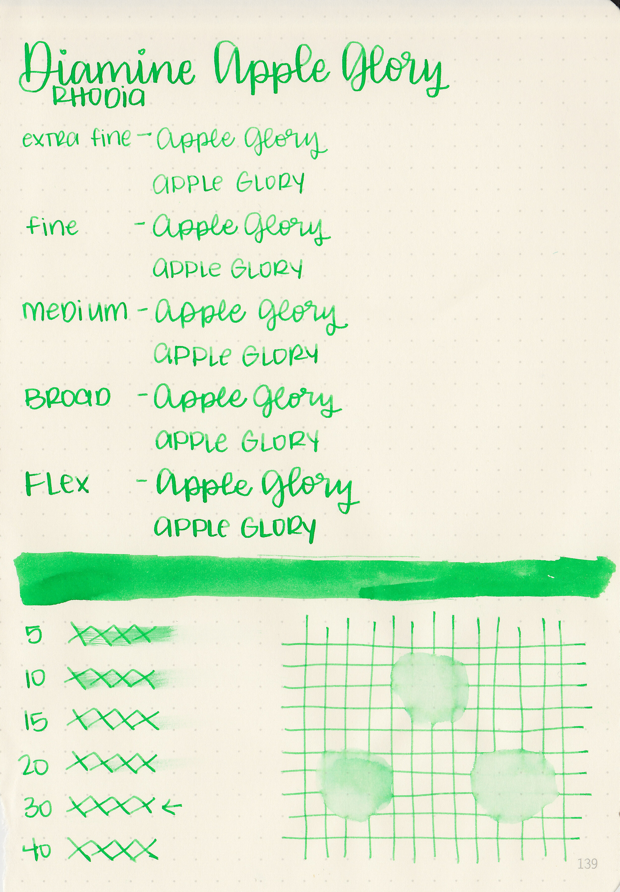
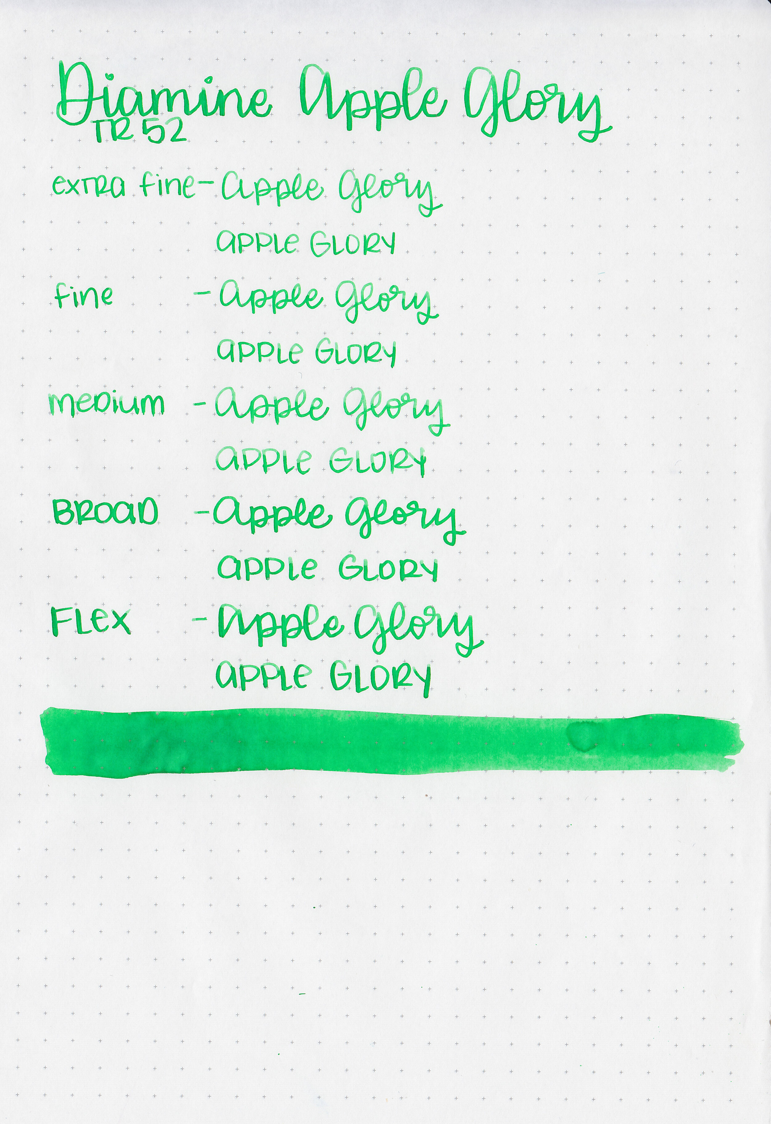
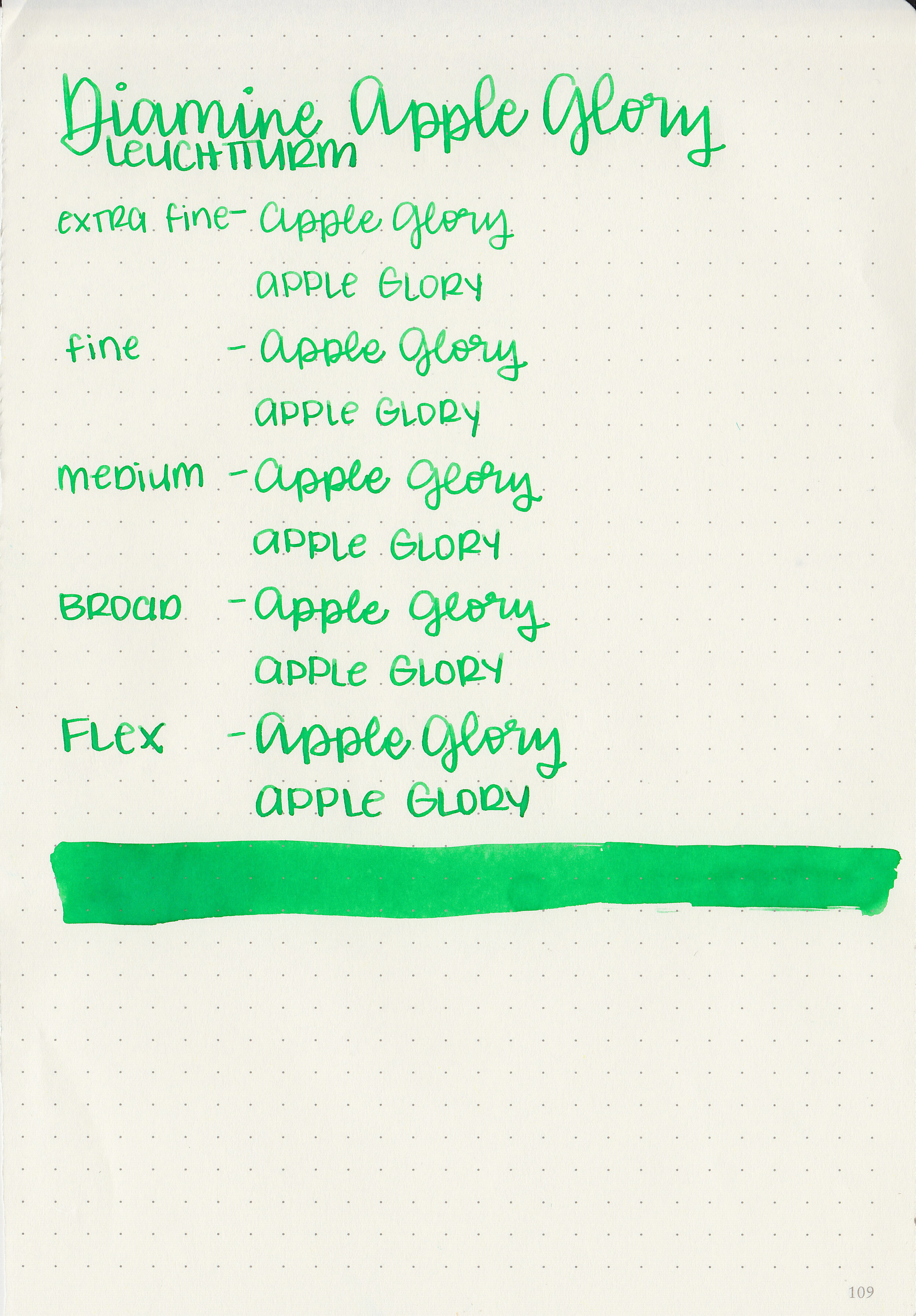
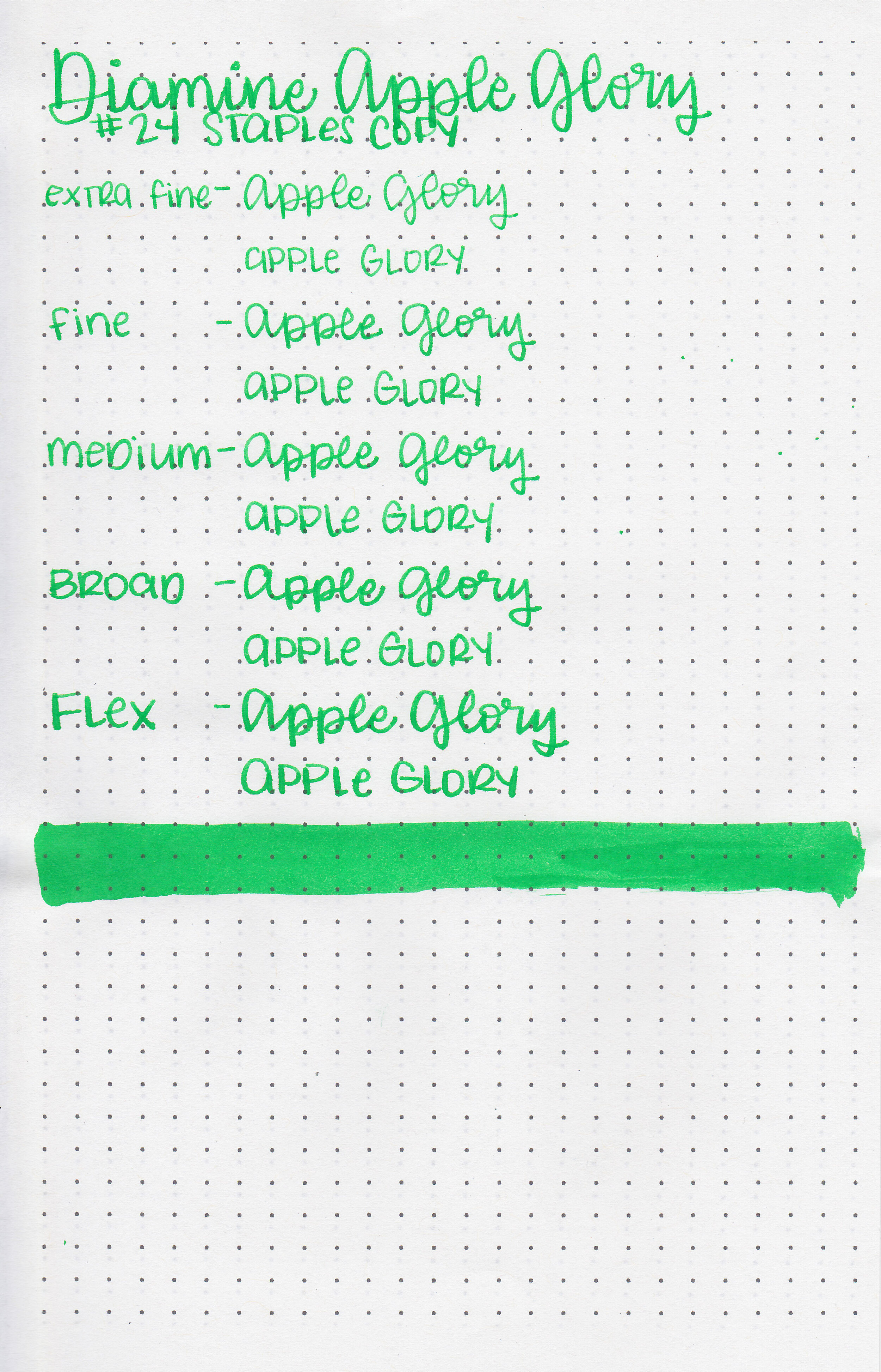
I’ve been in the mood for more color lately. I’m sick of winter and absolutely ready for spring, and bright colors will magically bring it, right? Let’s take a look at Diamine Apple Glory. I purchased my bottle of ink from Cult Pens.

The color:
Apple Glory is a vibrant medium green.

In large swabs on Tomoe River paper the ink looks darker, and has just a little bit of black sheen where it pooled.

Let's take a look at how the ink behaves on fountain pen friendly papers: Rhodia, Tomoe River, and Leuchtturm.
Dry time: 30 seconds
Water resistance: Low

Feathering: None
Show through: Medium
Bleeding: None
Other properties: medium shading, tiny sheen, and no shimmer. The sheen was only visible in large swabs on Tomoe River paper.
On Staples 24 lb copy paper there was some feathering but no bleeding.

Apple Glory is a little more vibrant than Sailor Ink Studio 460. Click here to see the Diamine inks together, and click here to see the green inks together.

I used a Pelikan M600 Vibrant Green with an extra fine nib on a Yoseka A5 notebook. The ink had an average flow, almost borderline dry, just a little bit.
Overall, I like this ink. I love the color, but I wish the flow was just a little bit wetter. It’s a great color match for my Pelikan M600 Vibrant Green.
Disclaimer: I purchased this ink myself, and all photos and opinions are my own. This page does not contain affiliate links and this post is not sponsored in any way.

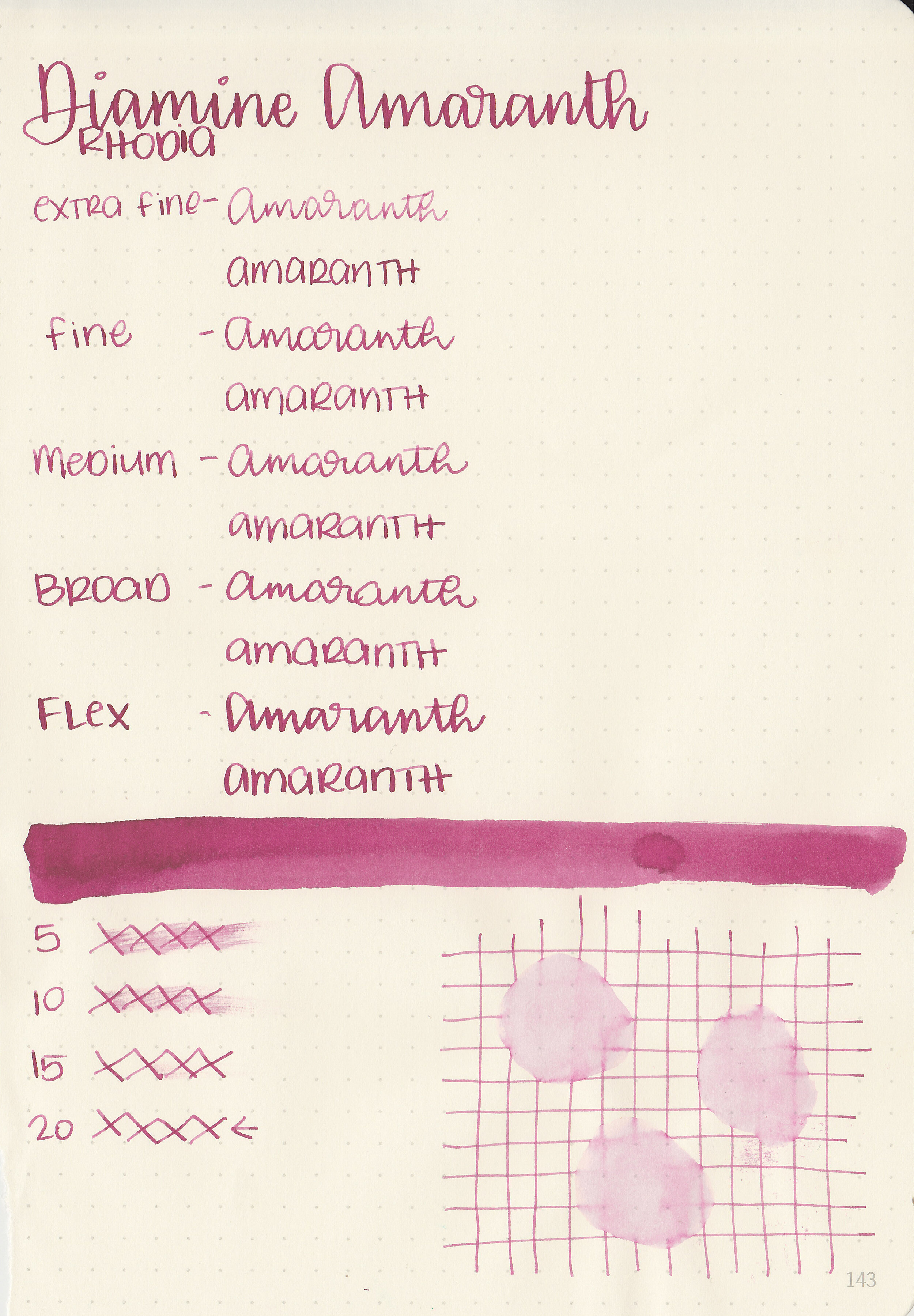
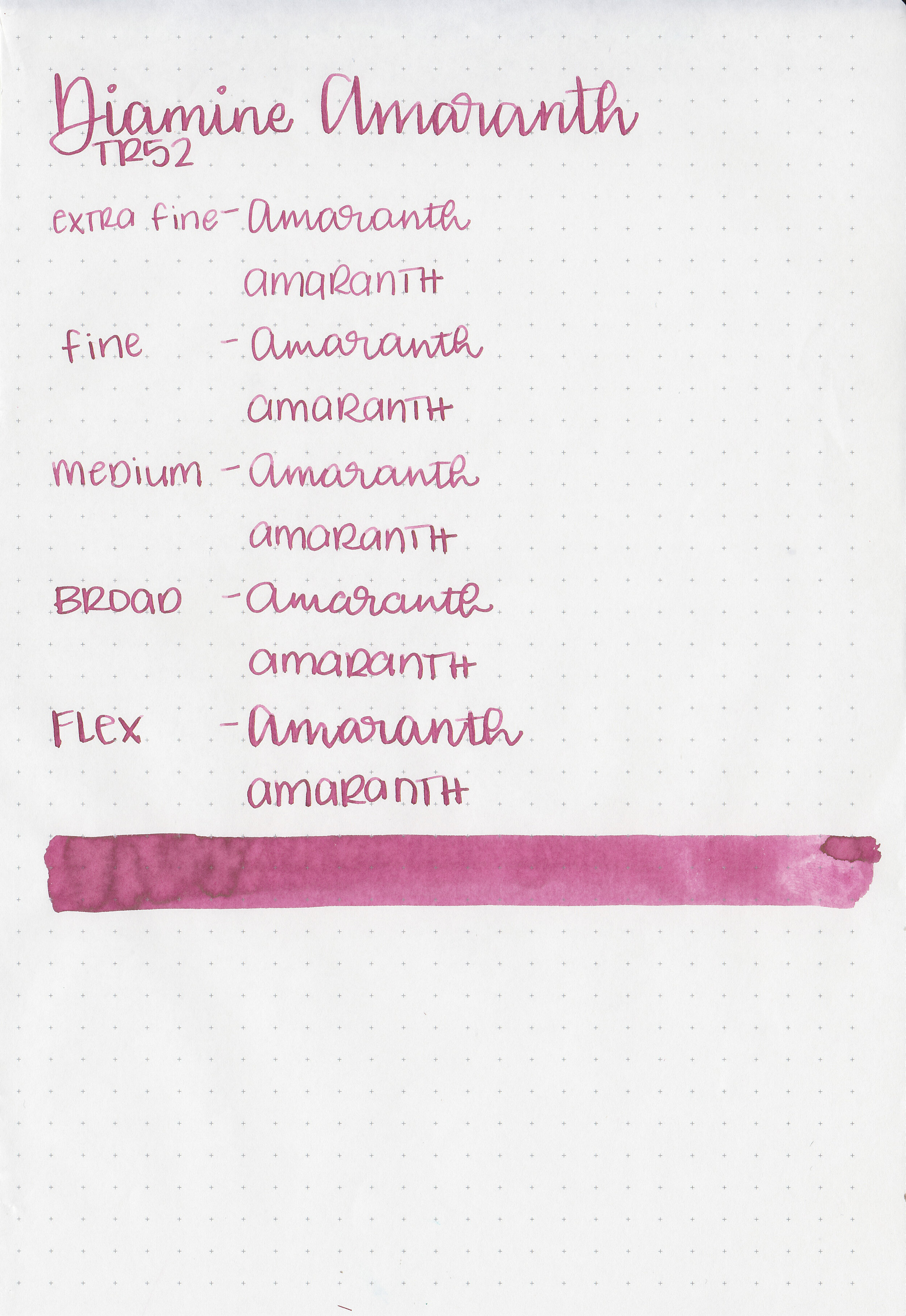
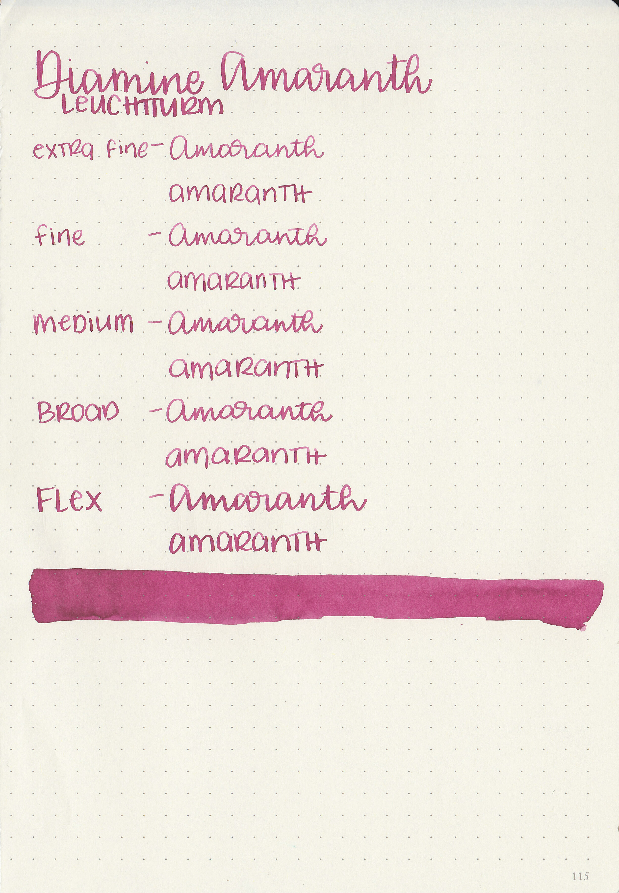
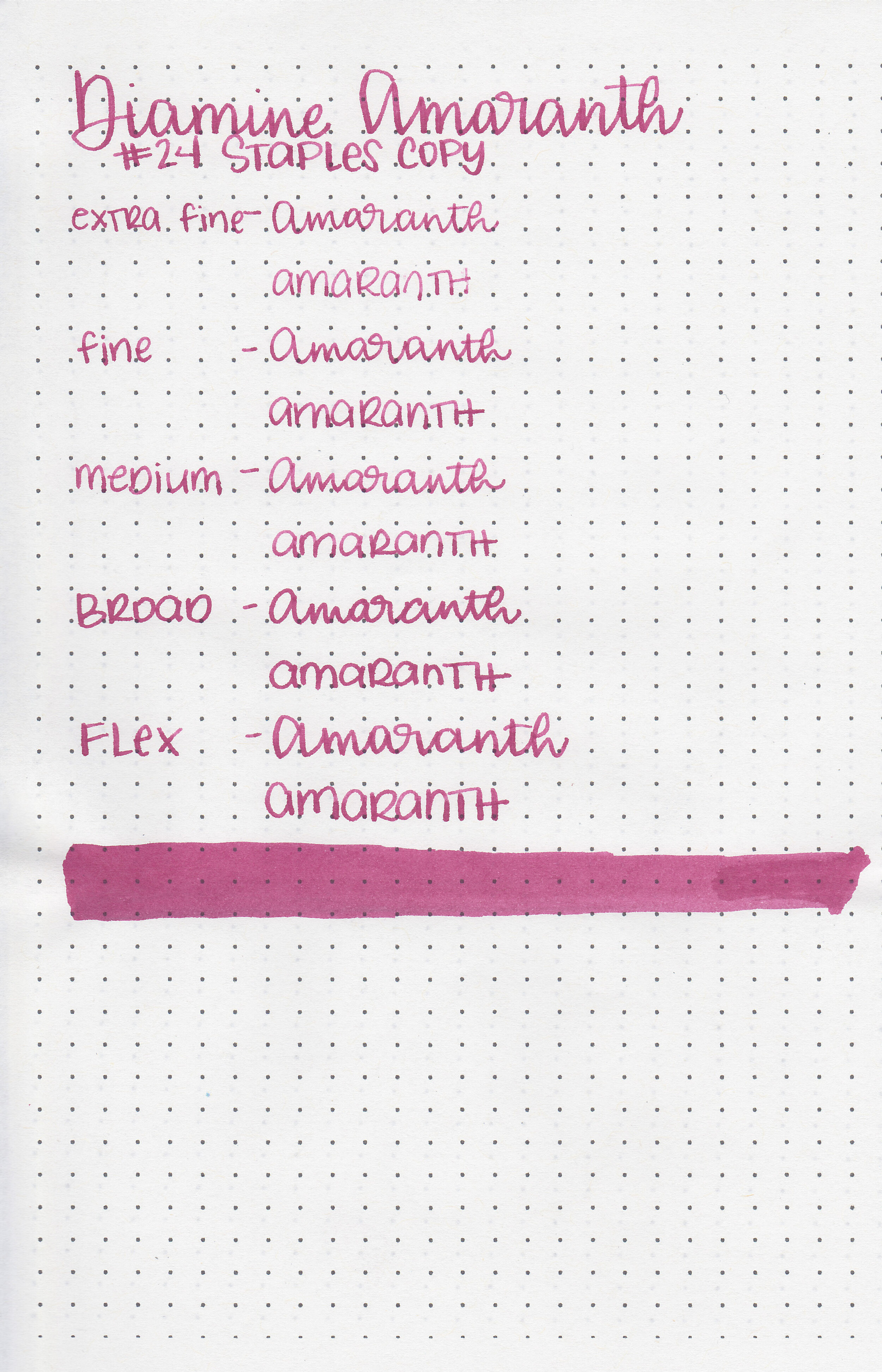
I tried a sample of Diamine Amaranth not too long after I bought my first fountain pen and then quickly forgot about it. A reader recently sent in a sample and I was happy to give it another go. Thanks to the reader that sent this ink in! You can find this ink for sale at most pen retailers including Vanness Pens.

The color:
Amaranth is an unsaturated burgundy.
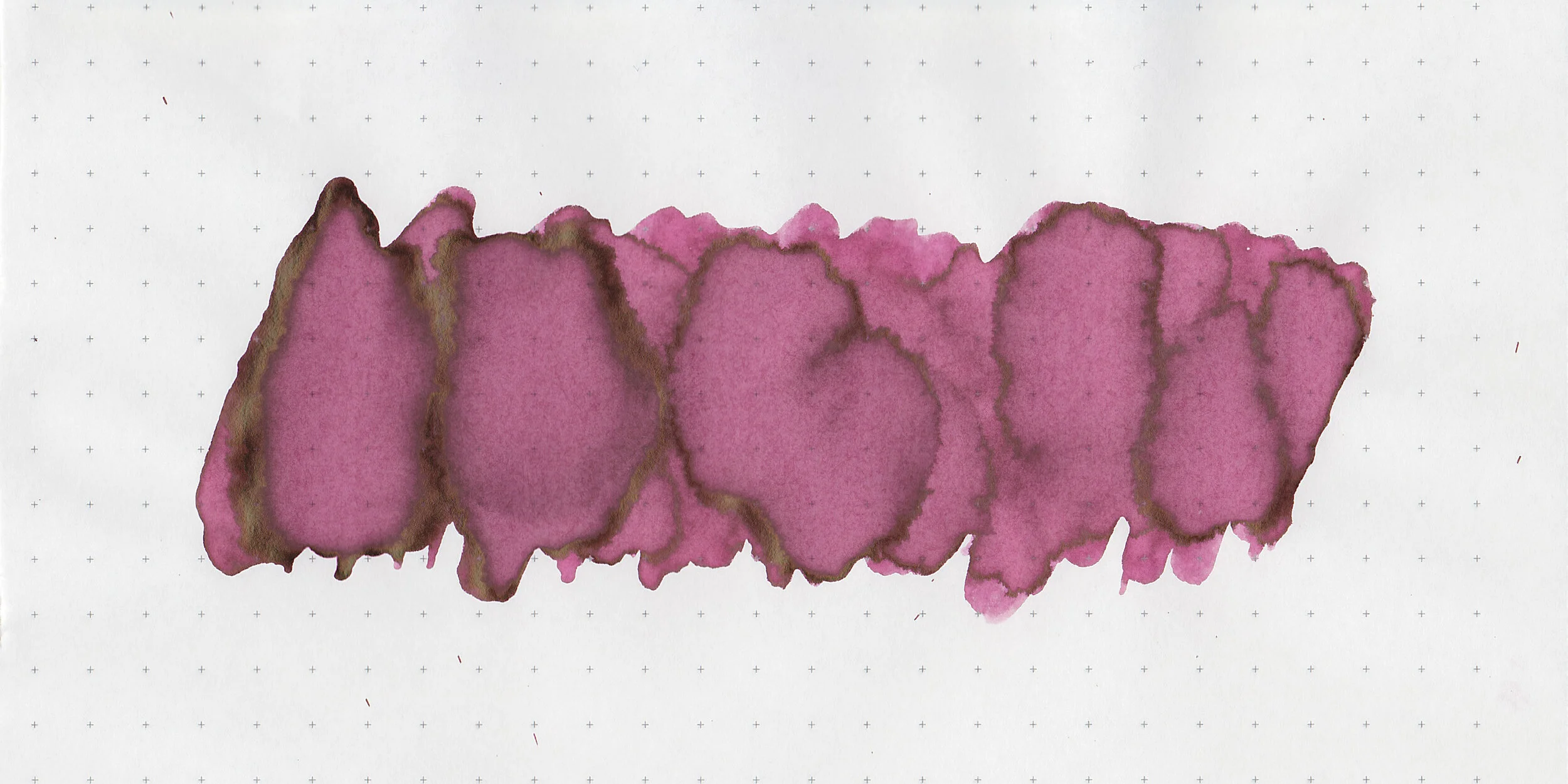
In large swabs on Tomoe River paper the ink has some warm brown sheen.

Let's take a look at how the ink behaves on fountain pen friendly papers: Rhodia, Tomoe River, and Leuchtturm.
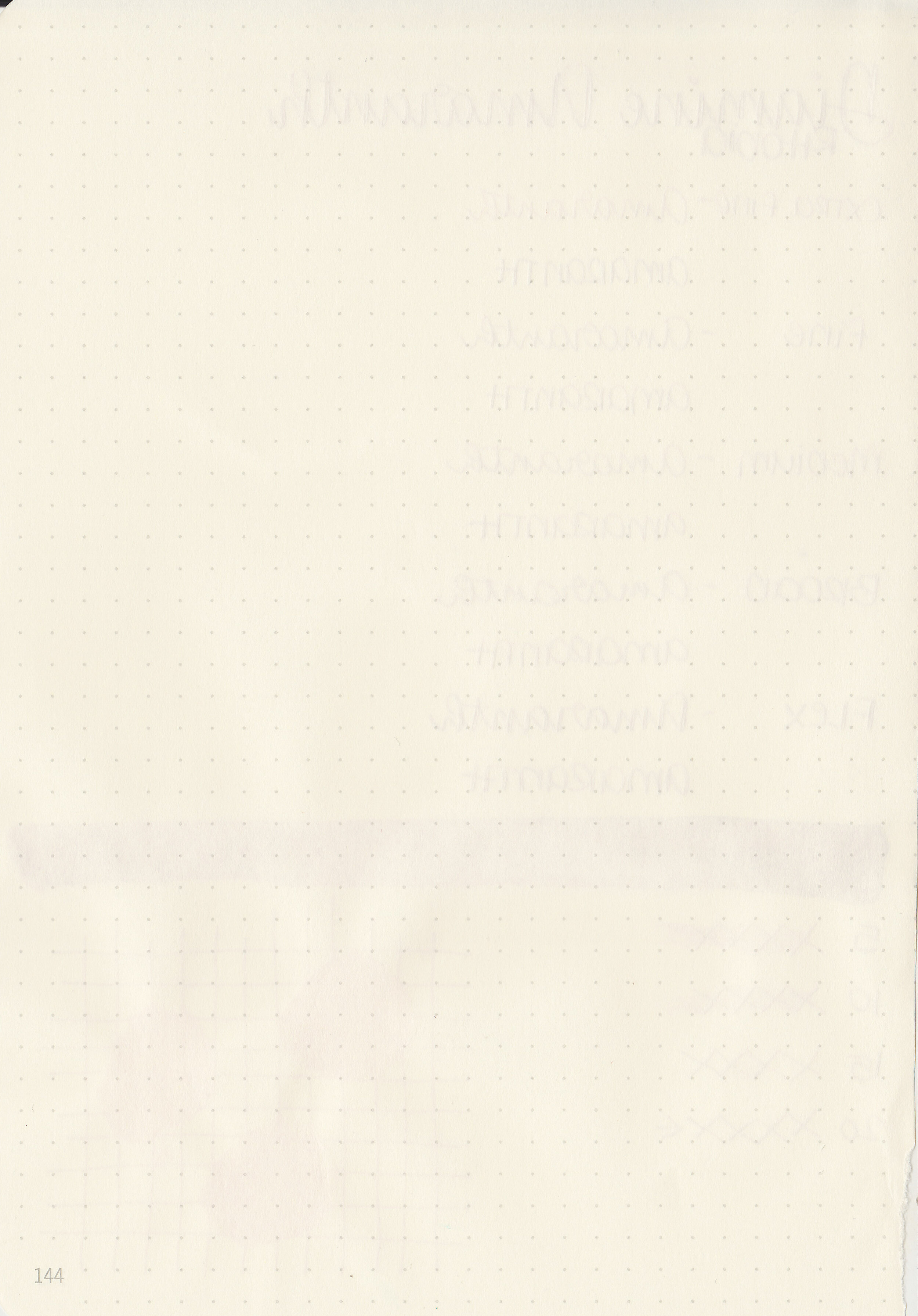
Dry time: 20 seconds
Water resistance: Low
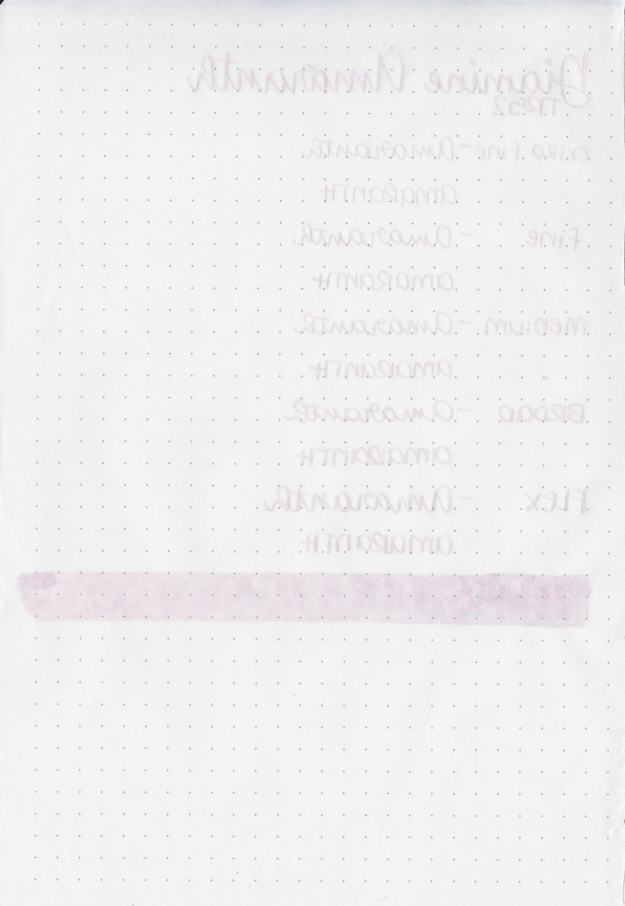
Feathering: None
Show through: Medium
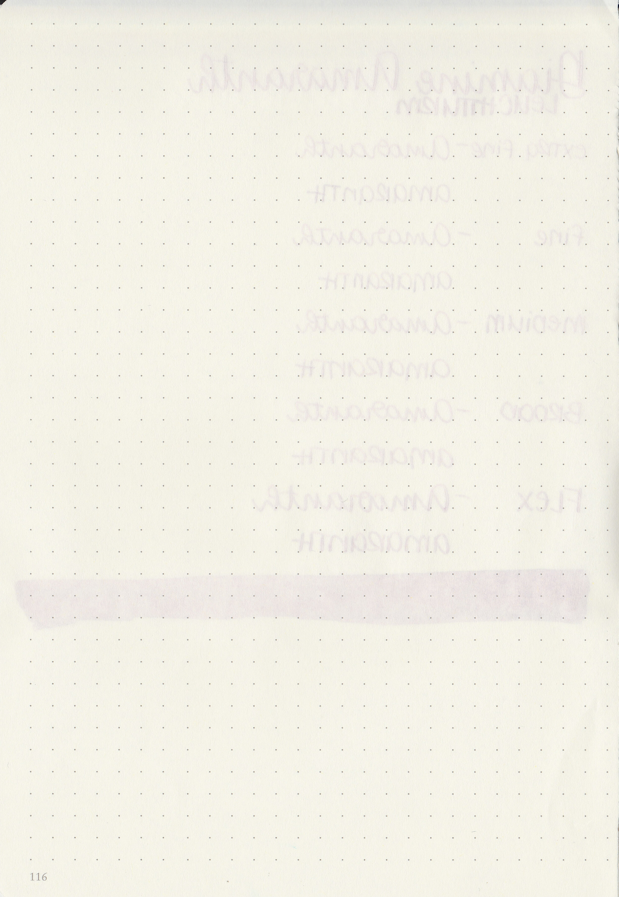
Bleeding: None
Other properties: medium shading, tiny sheen, and no shimmer. The sheen was only visible in large swabs on Tomoe River paper.
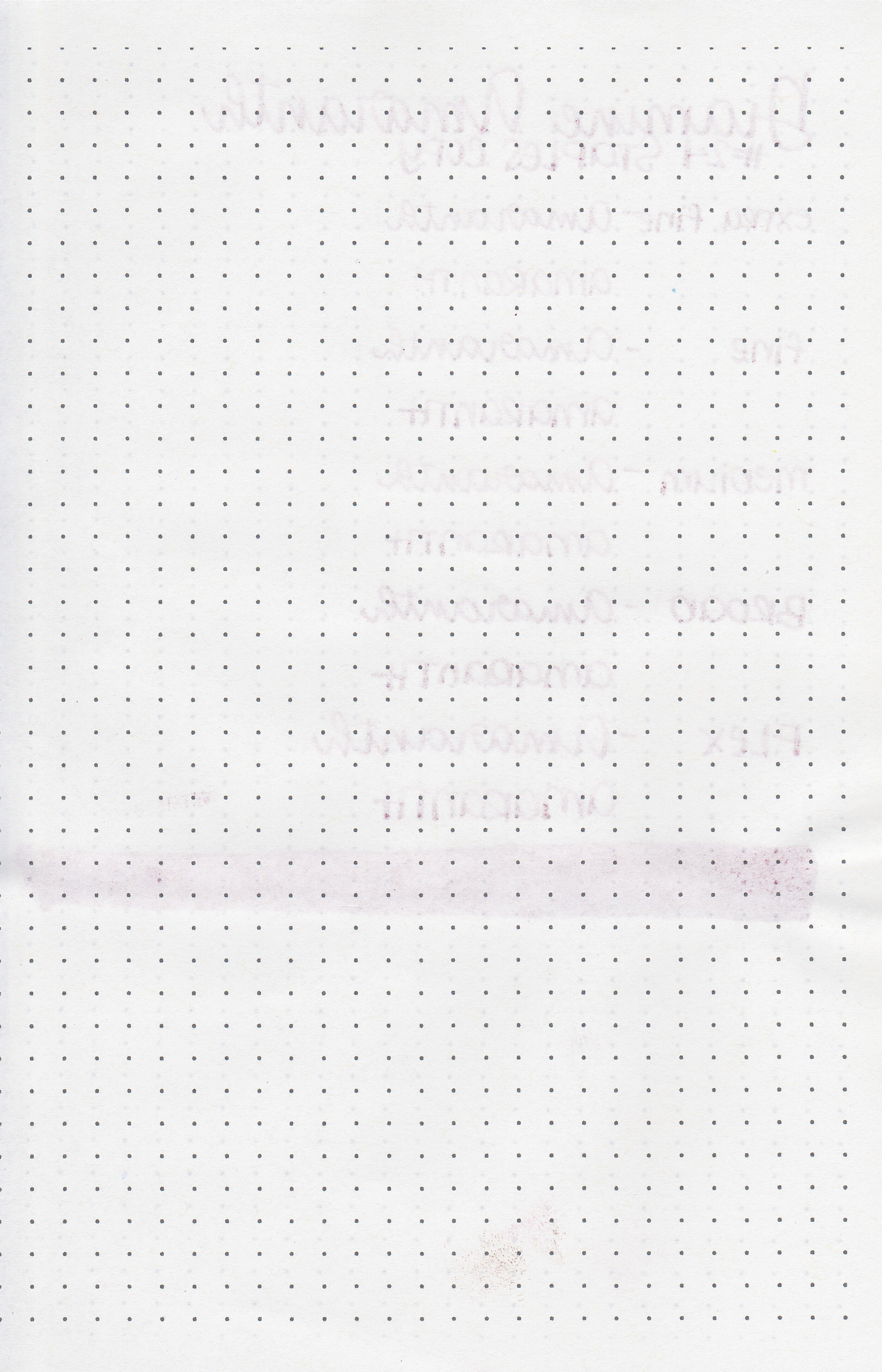
On Staples 24 lb copy paper there was some feathering but no bleeding.

Amaranth is similar to Noodler’s Black Swan in Australian Roses. Click here to see the Diamine inks together, and click here to see the red inks together.

I used a Pilot Custom 74 Merlot with a medium nib on a Yoseka A5 notebook. The ink had an average flow.
Overall, I enjoyed this ink. It’s a nice color and pretty well behaved too. It’s a great alternative for those who like the color of Noodler’s Black Swan in Australian Roses.
Disclaimer: A sample of this ink was provided by a reader for the purpose of this review. All photos and opinions are my own. This page does not contain affiliate links and this post is not sponsored in any way.

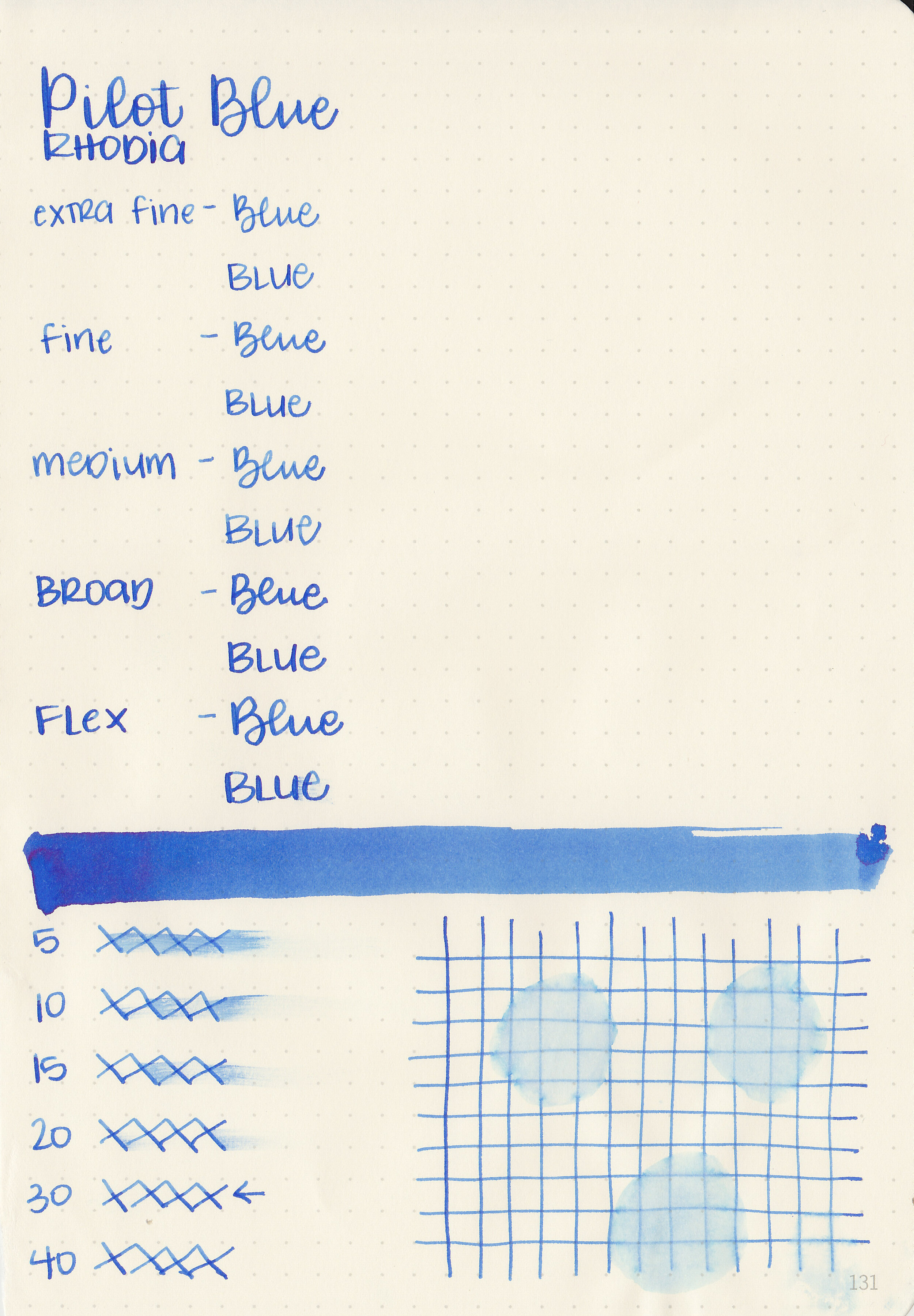
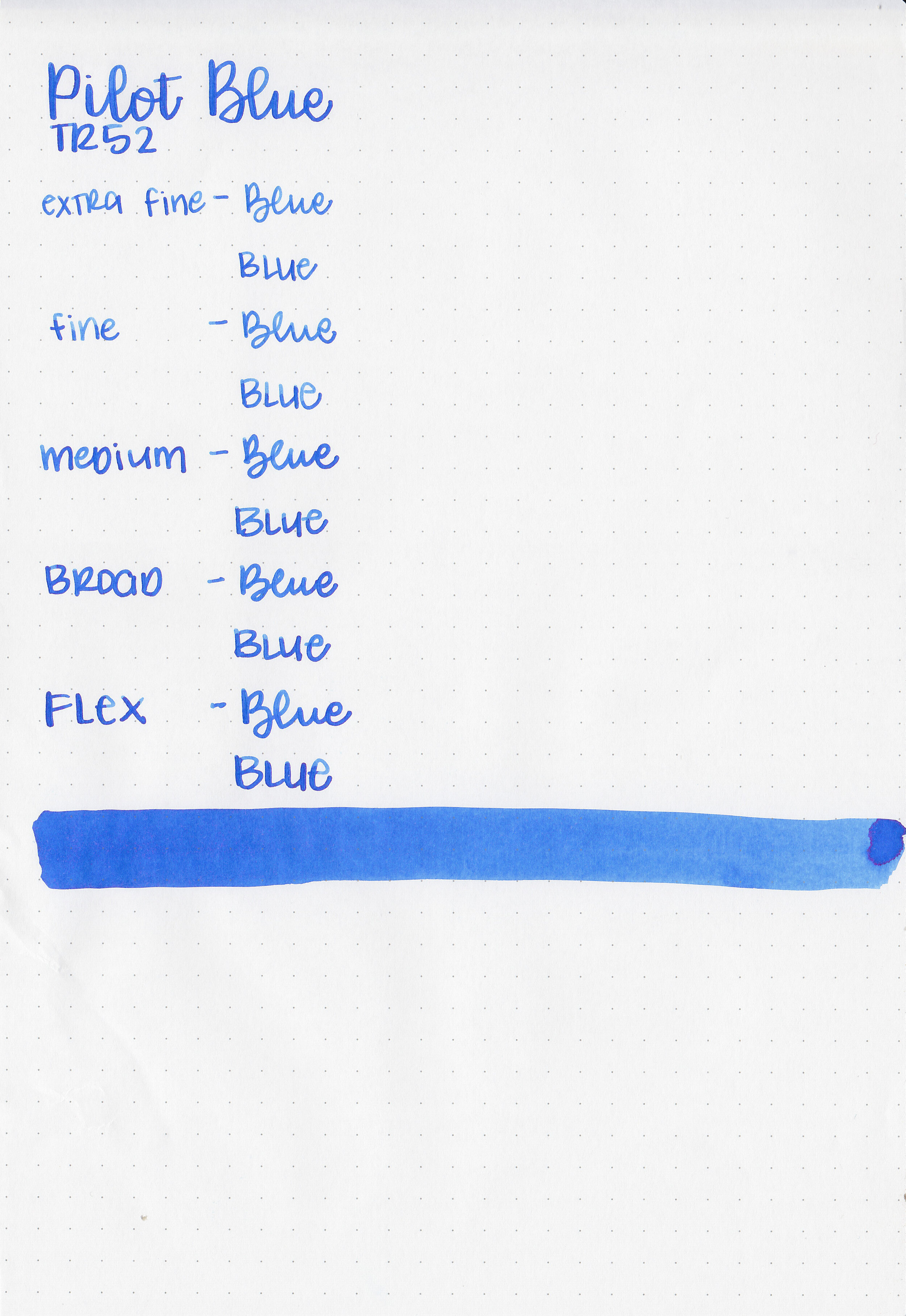
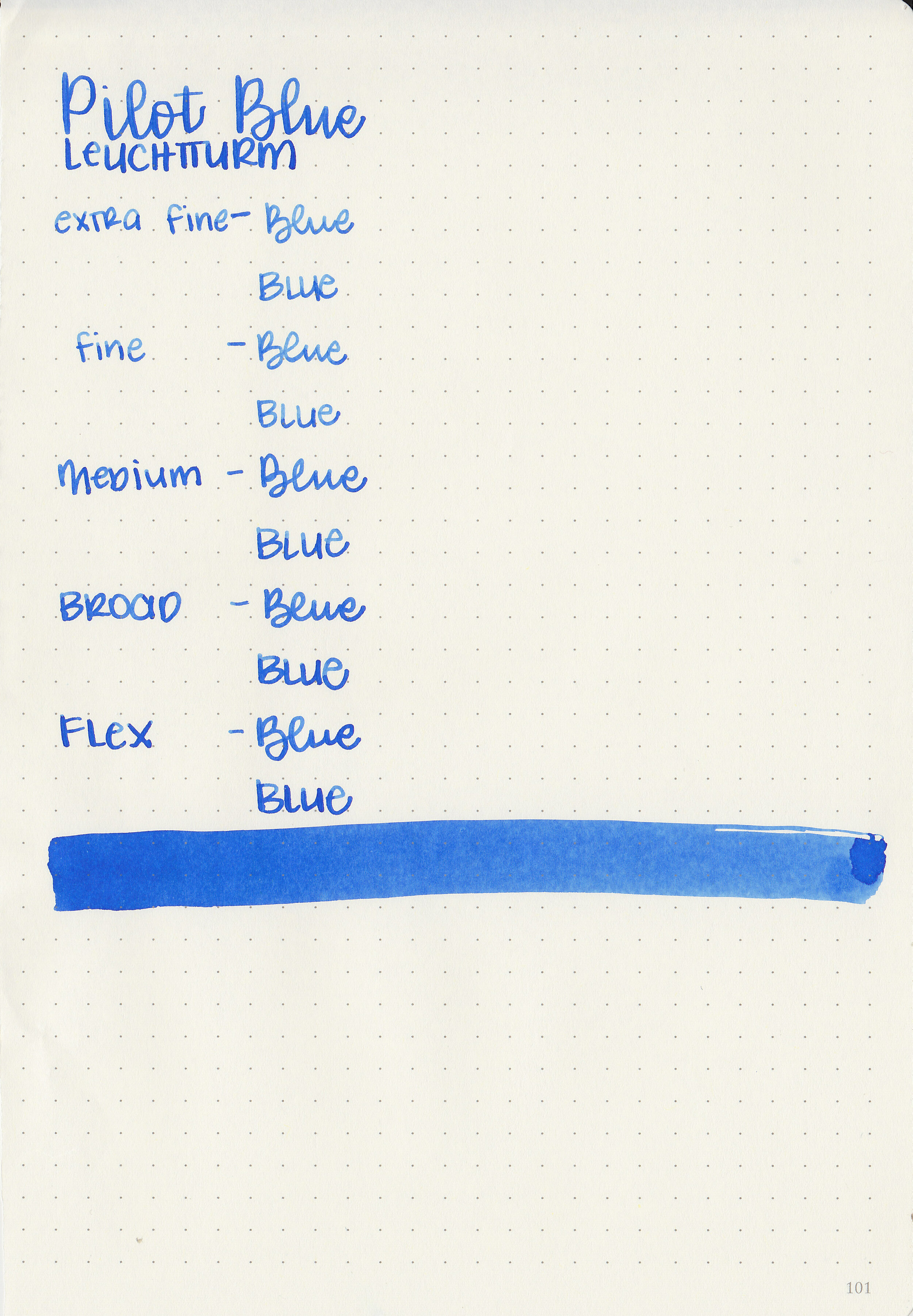
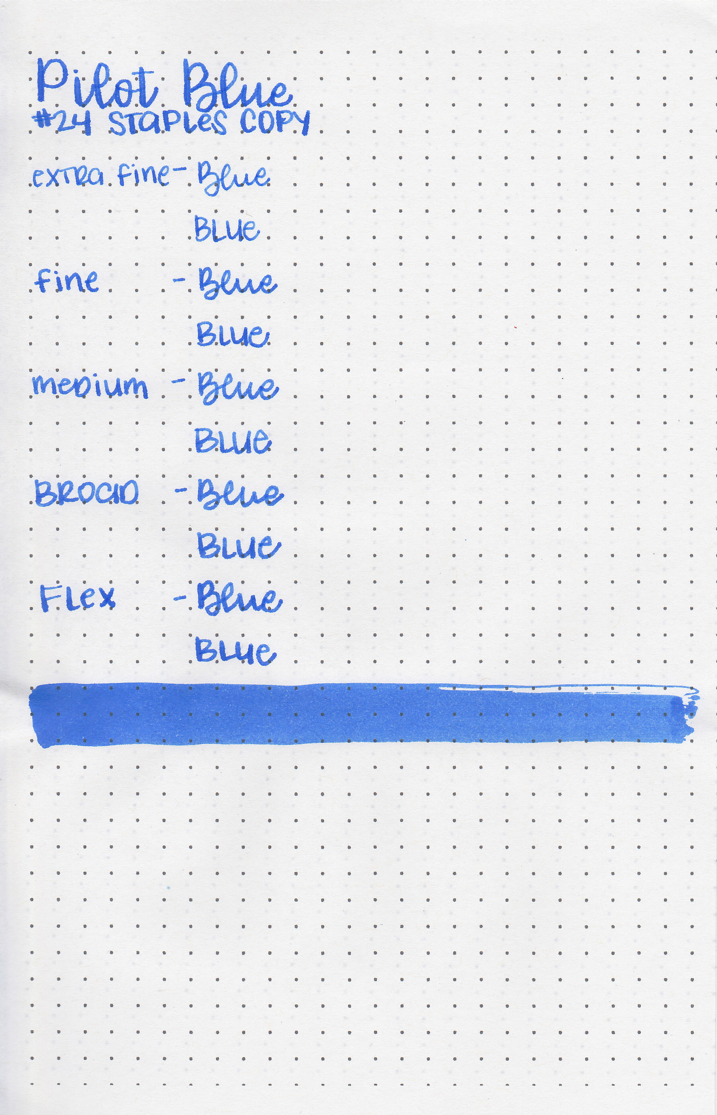
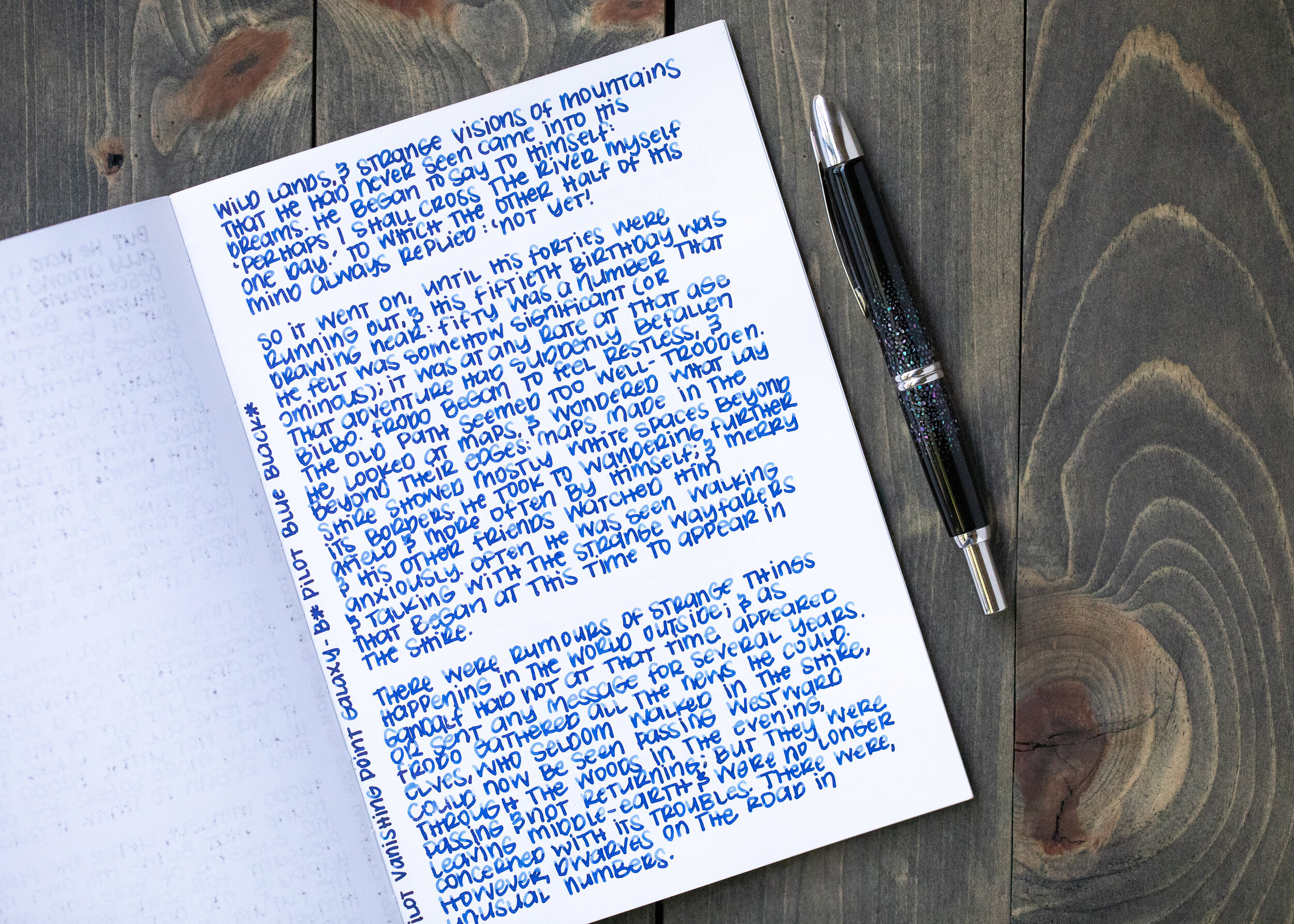
When I purchased my Pilot Custom 823 Smoke with a broad nib, there was a bottle of Pilot Blue ink included in the box. I’m 100% in love with my 823 by the way-it’s amazing and my only regret is that I didn’t buy a second one with a medium nib at the same time (in a different color of course!). So let’s take a look at Pilot Blue! I purchased my 823 with the included ink from Pen Chalet, but you can buy Pilot Blue on its own from Vanness Pens.
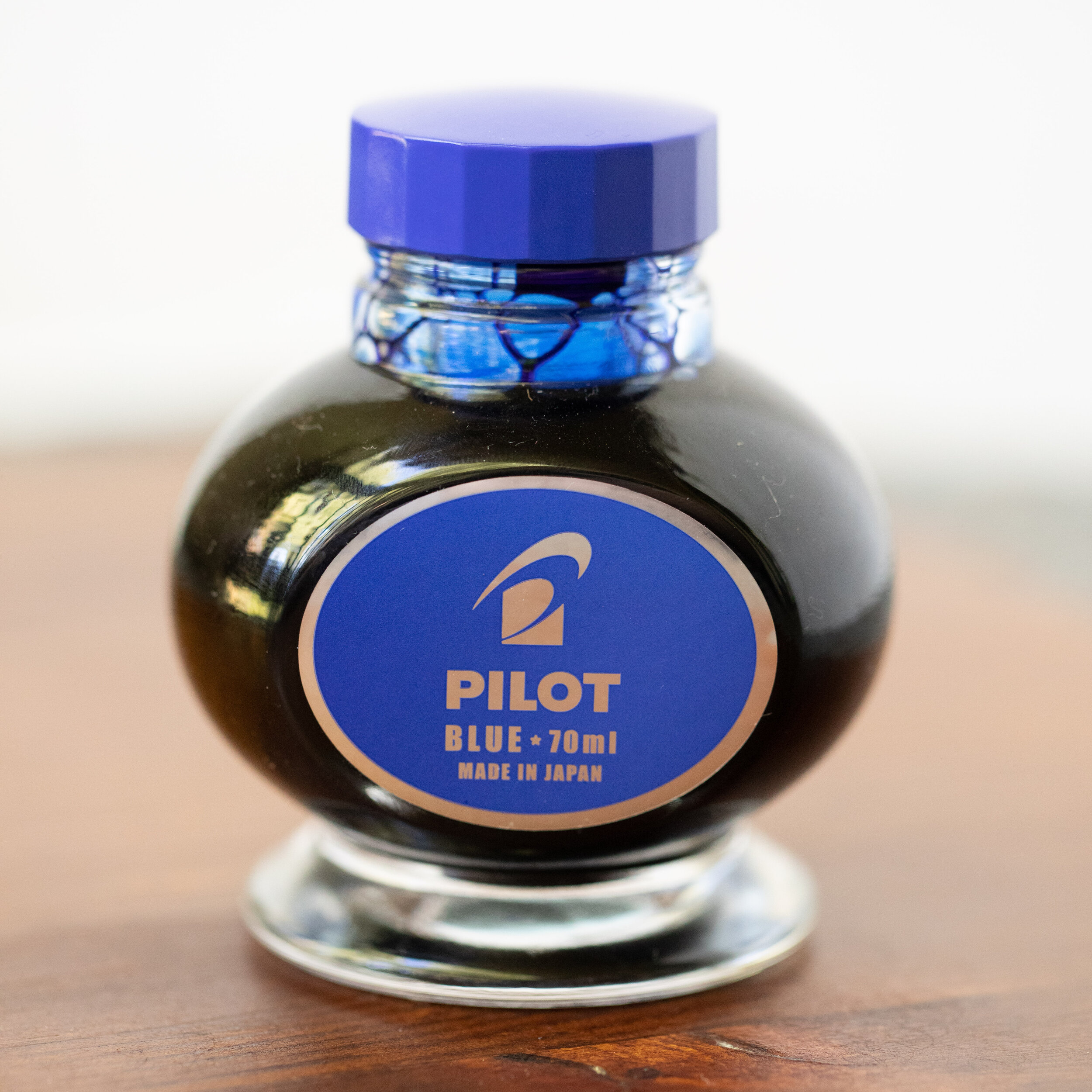
The Bottle:
The bottle is a heavy glass 70ml.

The color:
Pilot Blue is a standard classroom and work appropriate blue.

In large swabs on Tomoe River paper the ink has some coppery sheen.

Let's take a look at how the ink behaves on fountain pen friendly papers: Rhodia, Tomoe River, and Leuchtturm.
Dry time: 30 seconds
Water resistance: Low
Feathering: None
Show through: Medium
Bleeding: None
Other properties: medium shading, tiny sheen, and no shimmer. The sheen was only visible in large swabs on Tomoe River paper.
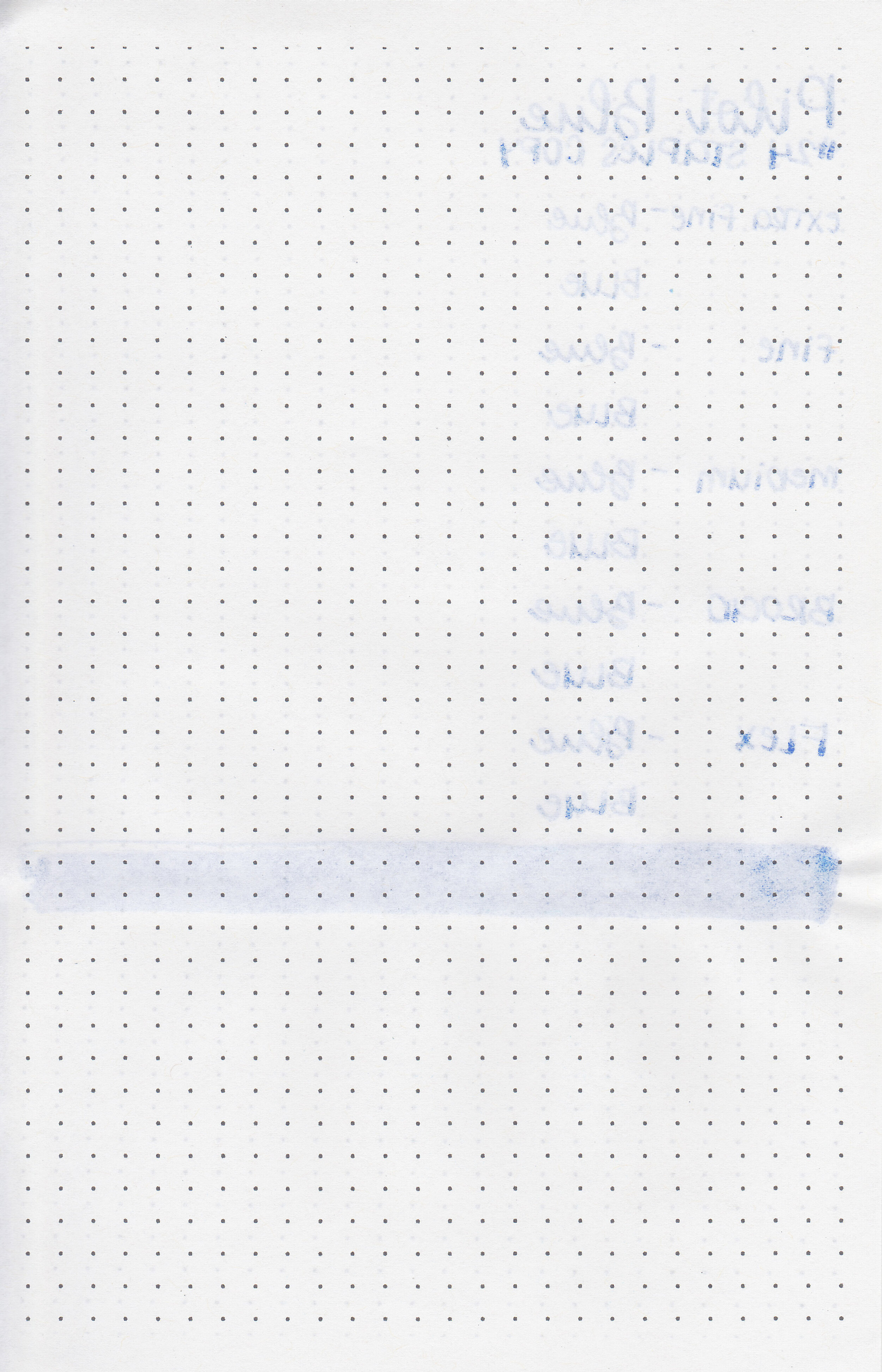
On Staples 24 lb copy paper there was some feathering and a few spots of bleeding.

Pilot Blue is less vibrant than Pilot Iroshizuku Tsuyu-kusa. Click here to see the Pilot inks together, and click here to see the blue inks together.

I used a Montegrappa Copper Mule with a fine nib on a Yoseka A5 notebook. The ink had a slightly wet flow.
Overall, it’s a good basic blue. I found it to be just a little bit better behaved than Pilot Black or Blue Black. It is a large 70ml bottle so it will take me a long time to go through that much ink.
Disclaimer: I purchased this ink myself, and all photos and opinions are my own. This page does contain affiliate links but this post is not sponsored in any way.

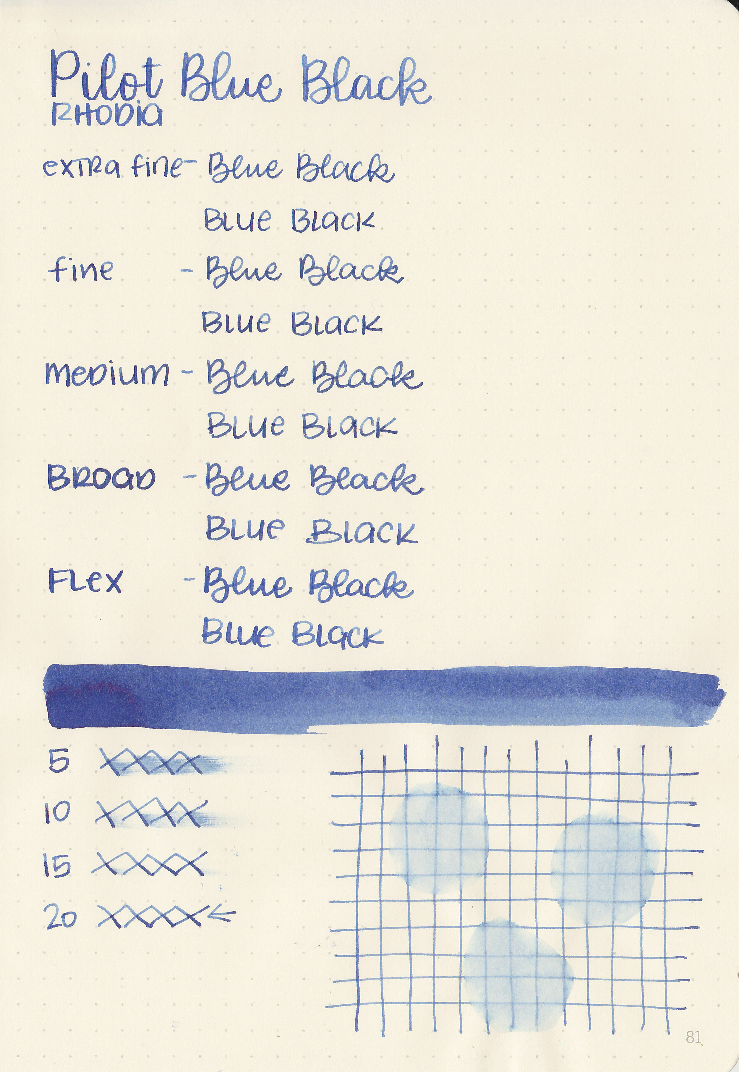
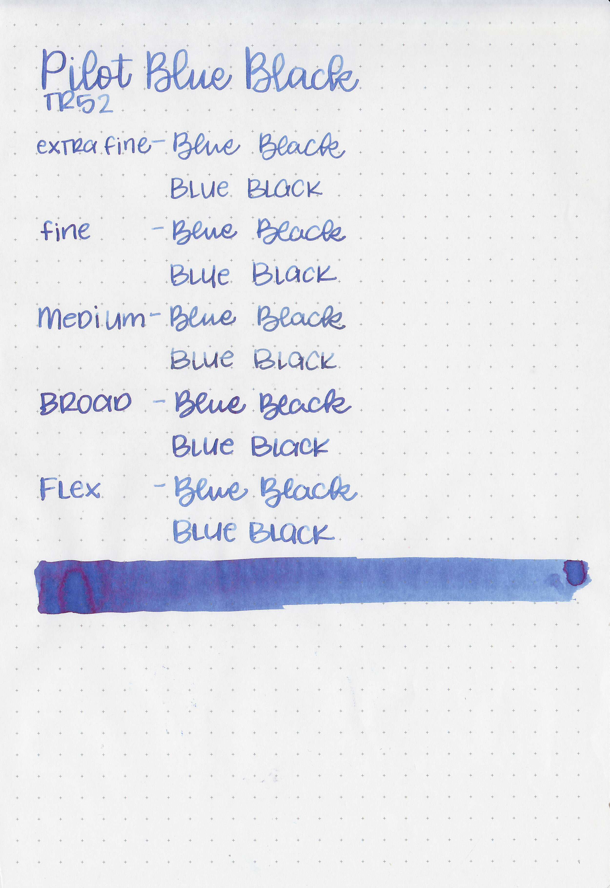
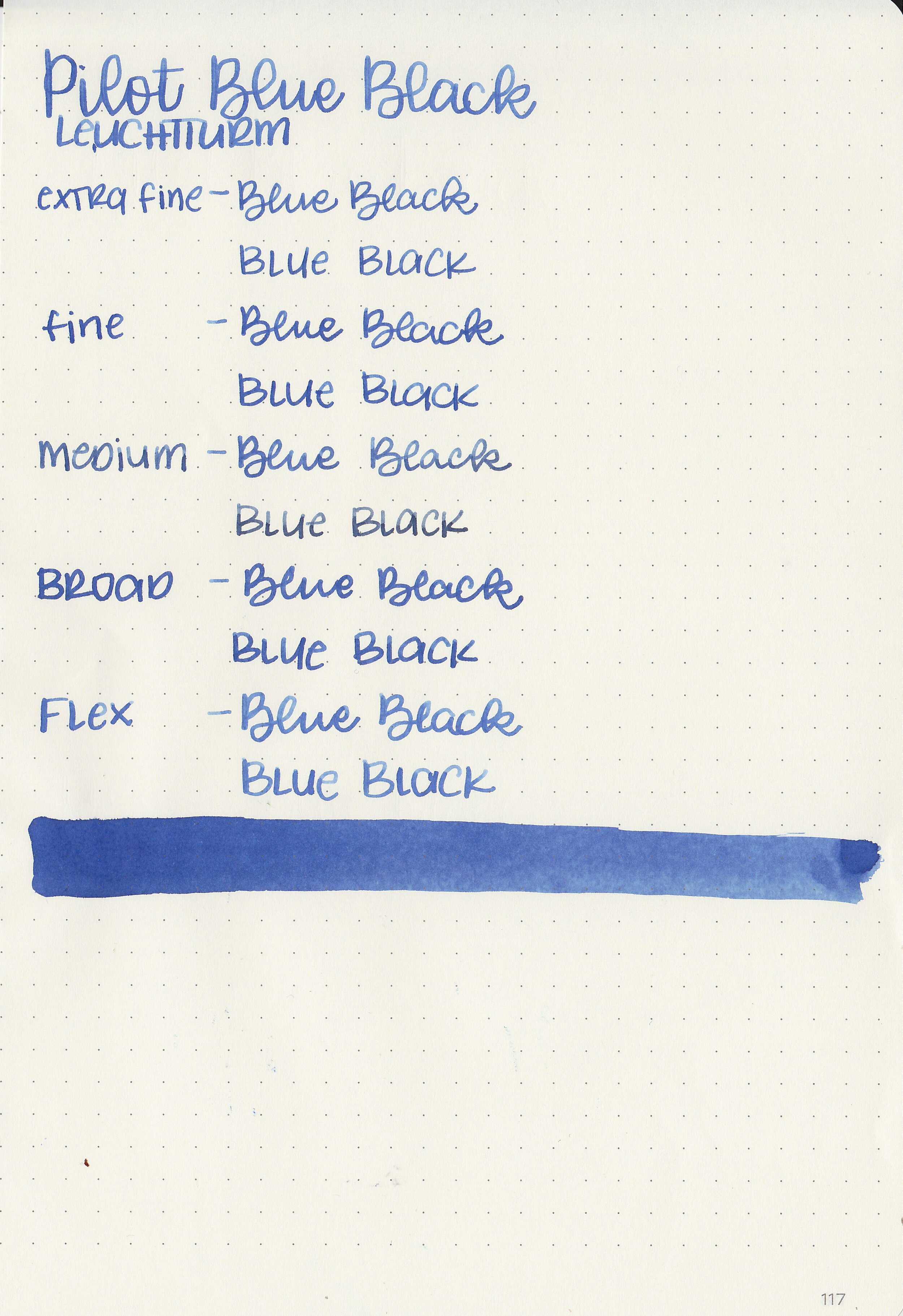
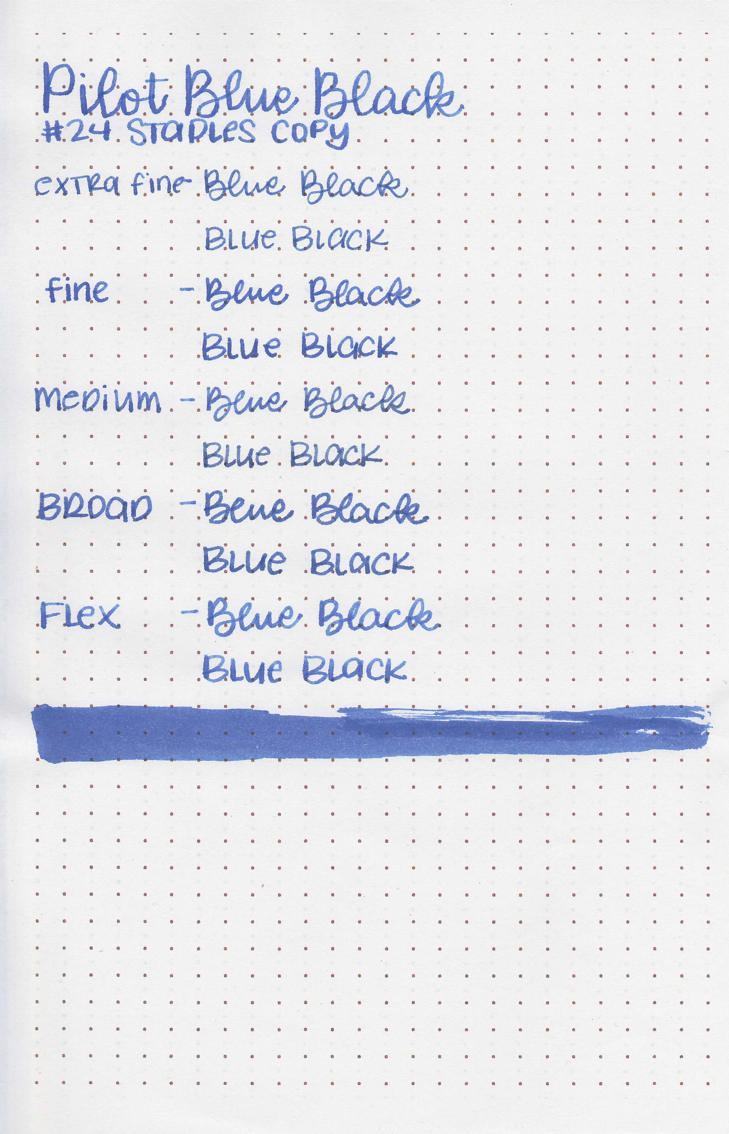
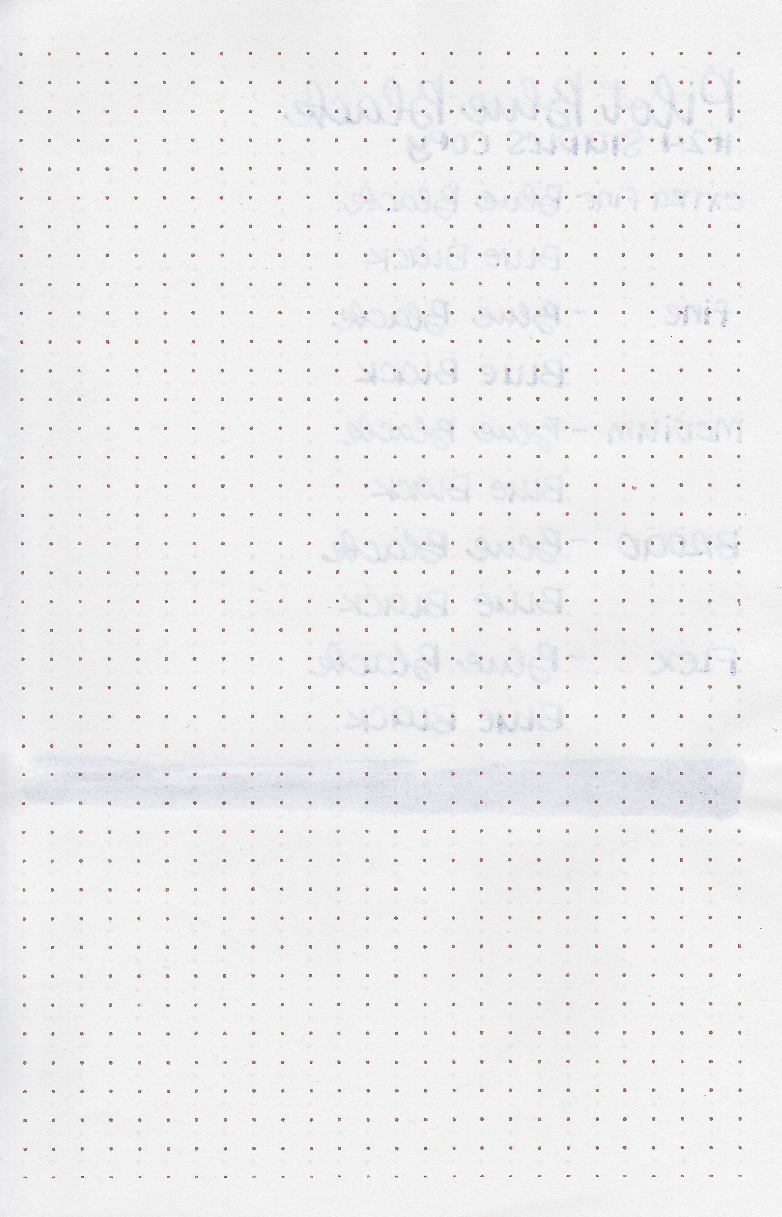
Let’s take a look at another standard Pilot ink, Pilot Blue Black. Thanks to Vanness Pens for providing a sample for review!

The color:
Blue Black is a classic blue black.
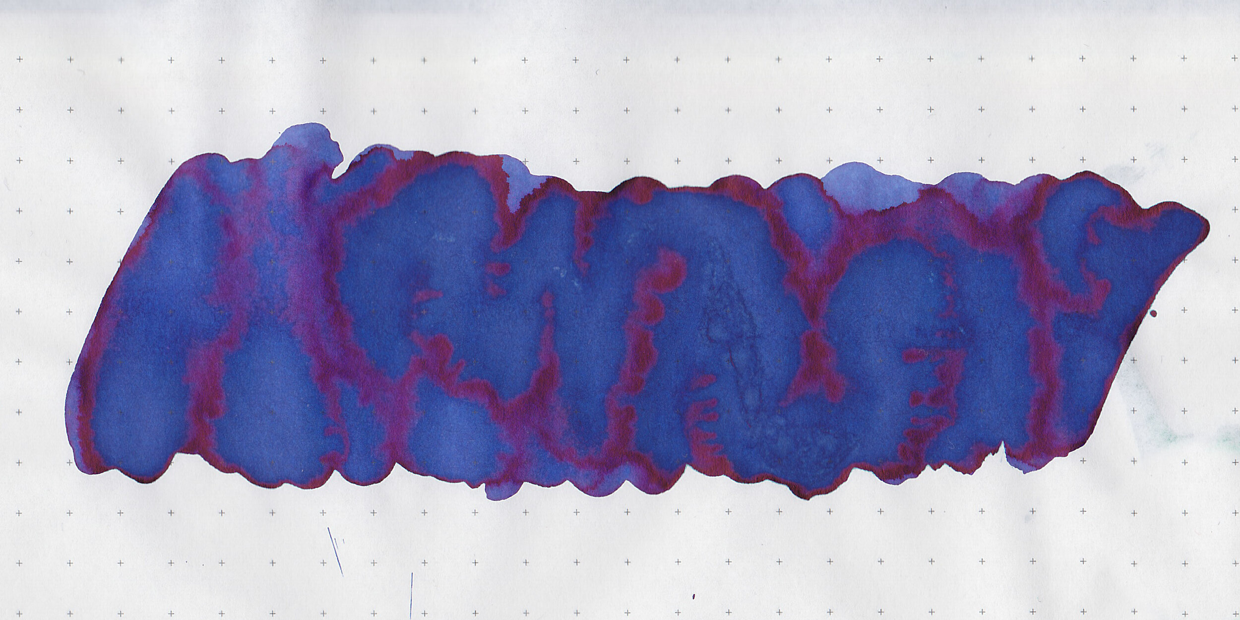
In large swabs on Tomoe River paper the ink has some red sheen.

Let's take a look at how the ink behaves on fountain pen friendly papers: Rhodia, Tomoe River, and Leuchtturm.
Dry time: 20 seconds
Water resistance: Low
Feathering: Low-there was a bit of feathering on Rhodia and Leuchtturm in the larger nib sizes.
Show through: Medium
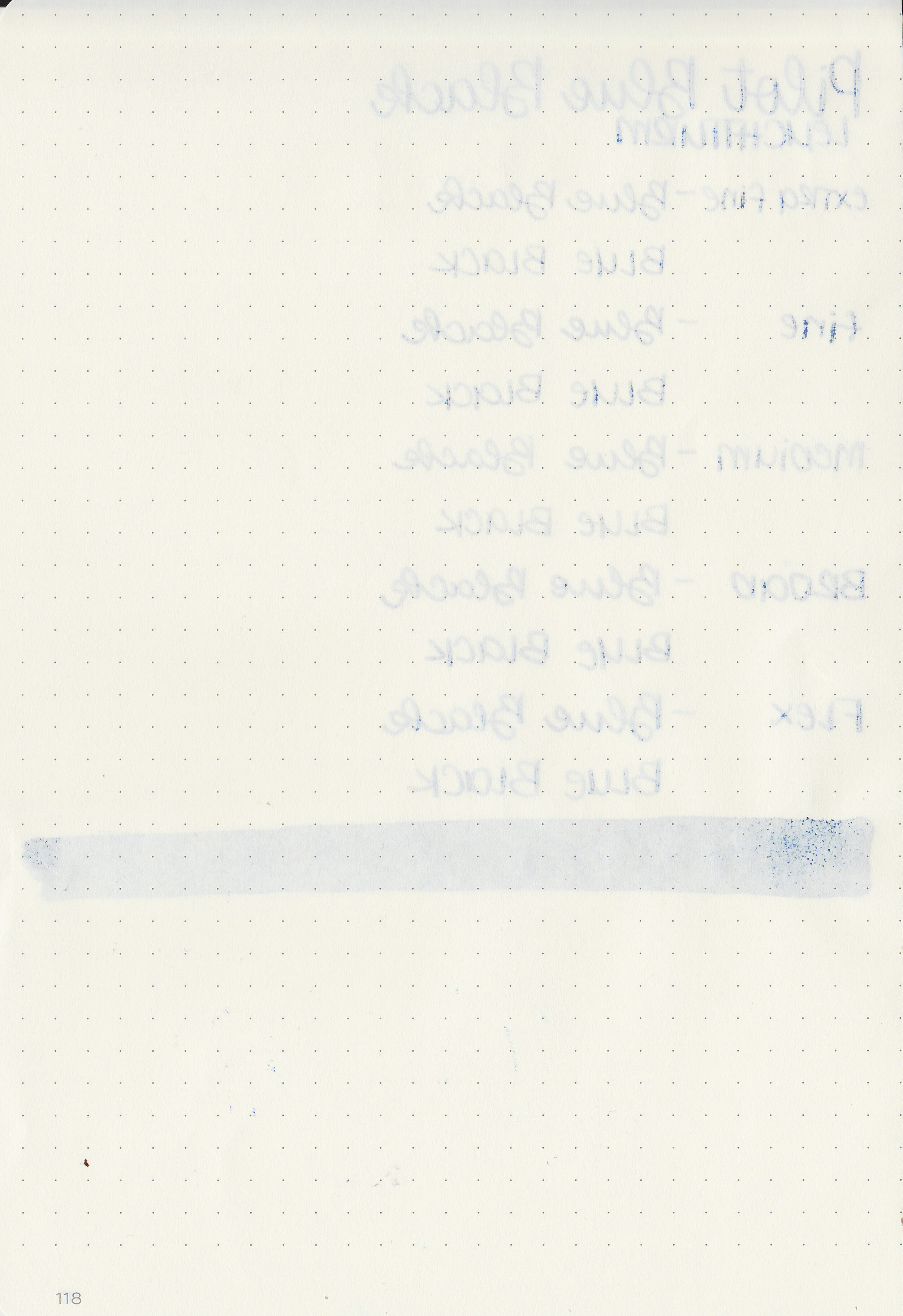
Bleeding: Low-there was a bit of bleeding on Leuchtturm.
Other properties: medium shading, medium sheen, and no shimmer.
On Staples 24 lb copy paper there was some feathering but no bleeding.

Blue Black is a bit darker than Sailor Jentle Blue. Click here to see the Pilot inks together, and click here to see the blue black inks together.
I used a Pilot Vanishing Point Galaxy with a broad nib on a Yoseka A5 notebook. The ink had a slightly wet flow.
Overall, just like the Pilot Black I reviewed yesterday, I enjoyed this ink, but it does have a bit more feathering and bleeding than I like on some papers. While it’s a good basic blue black, there are better blue black inks out there.
Disclaimer: A sample of this ink was provided by Vanness Pens. All photos and opinions are my own. This page does not contain affiliate links and this post is not sponsored in any way.

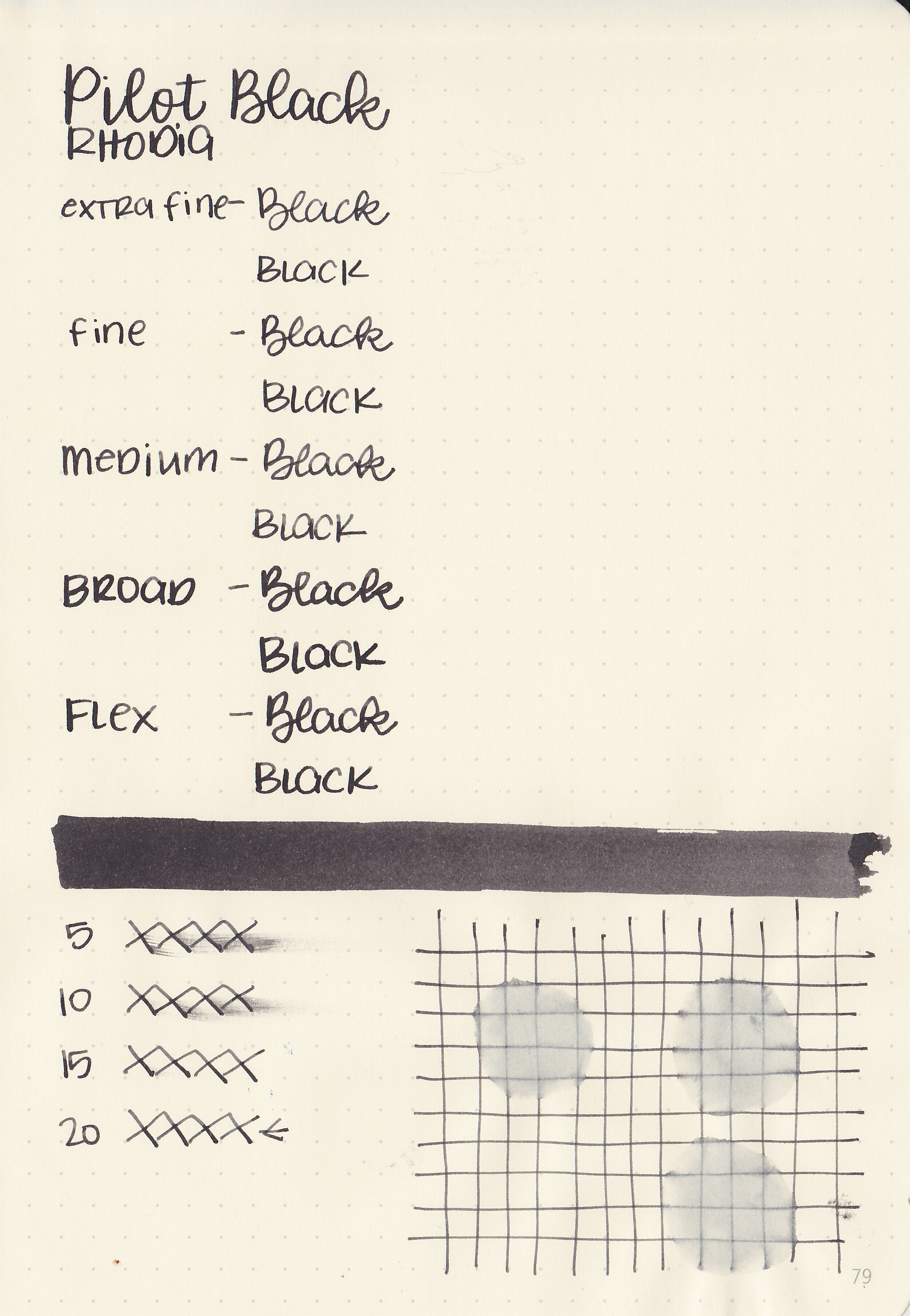
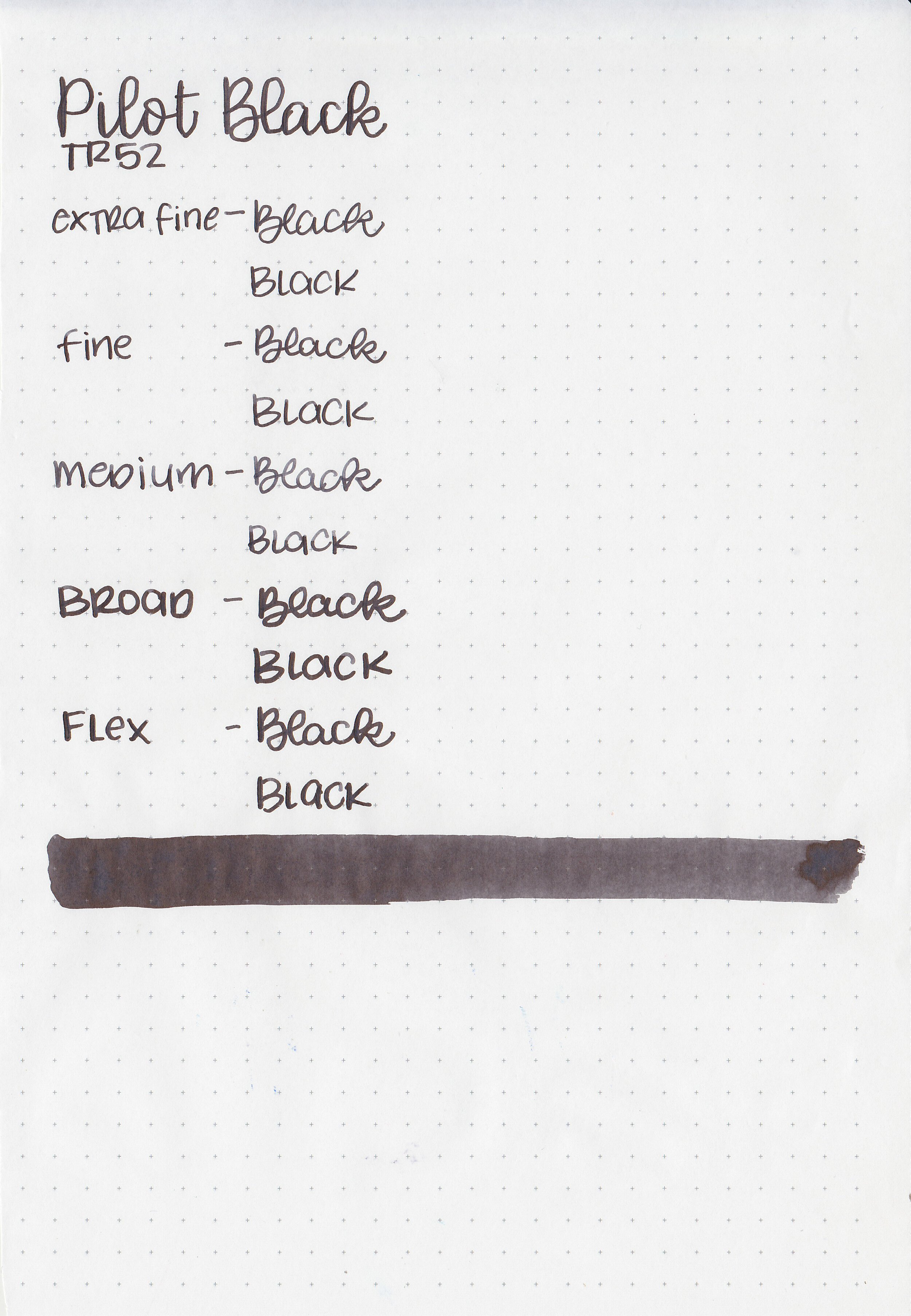
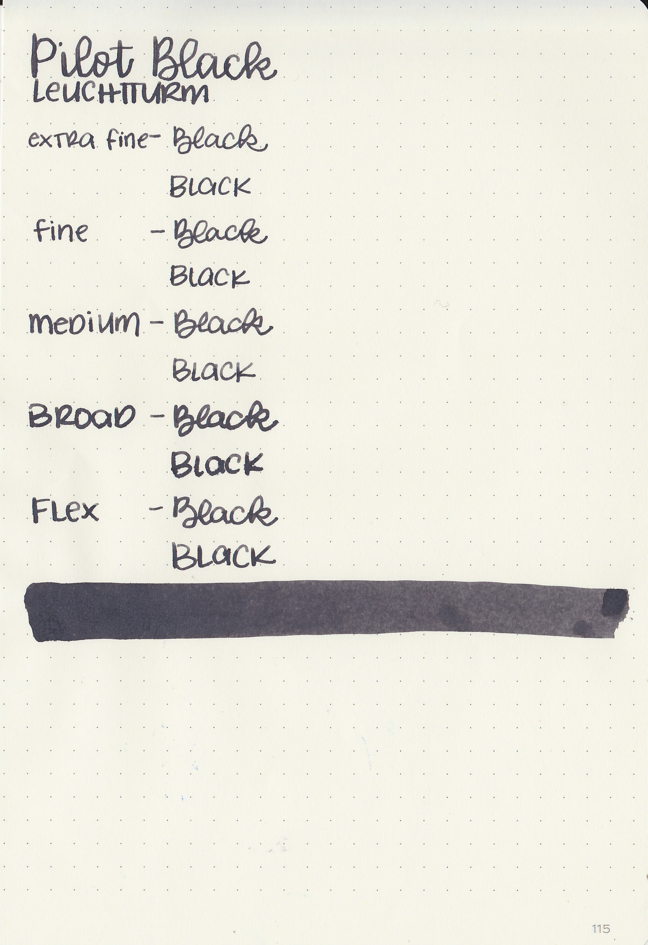
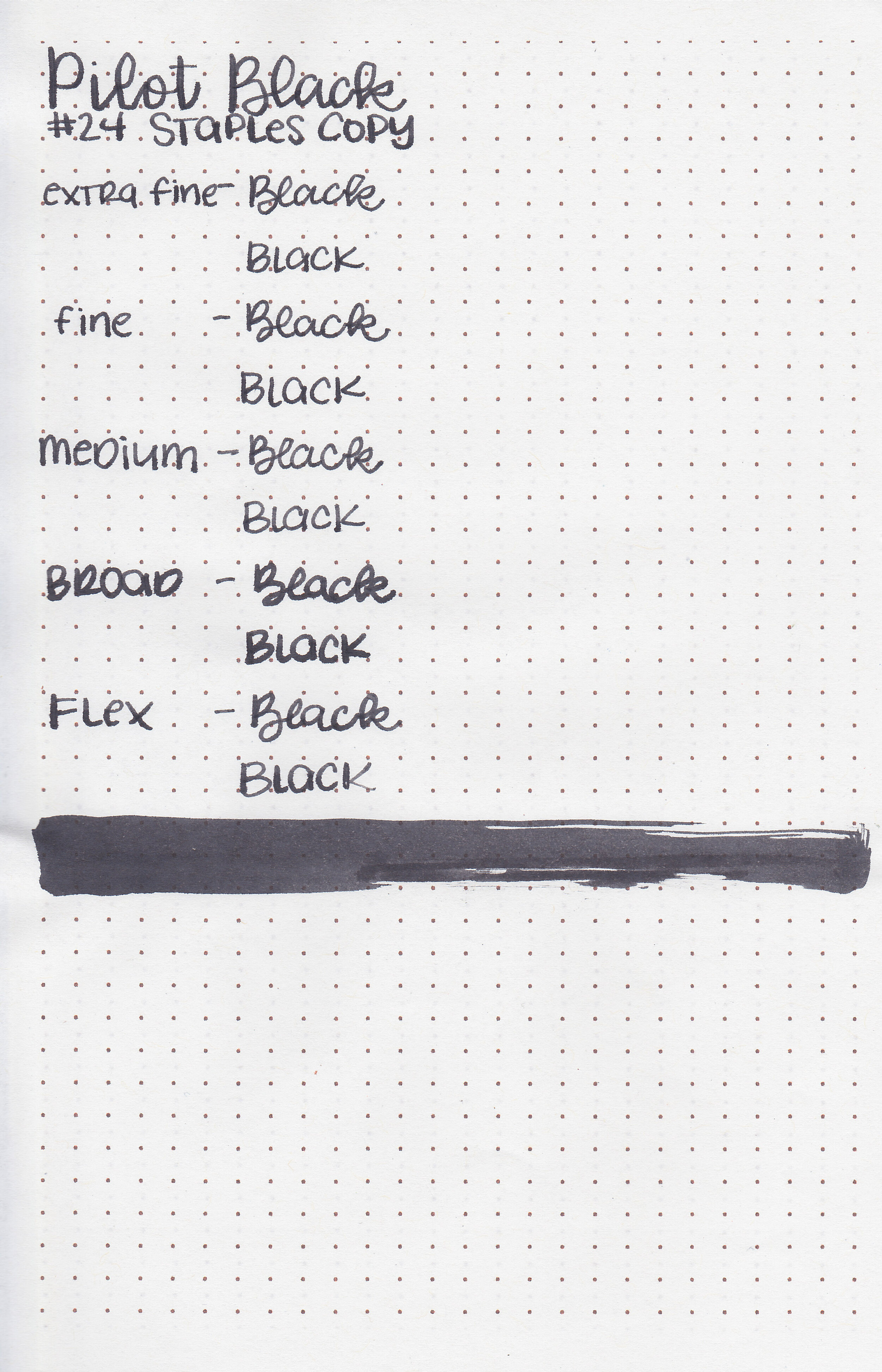
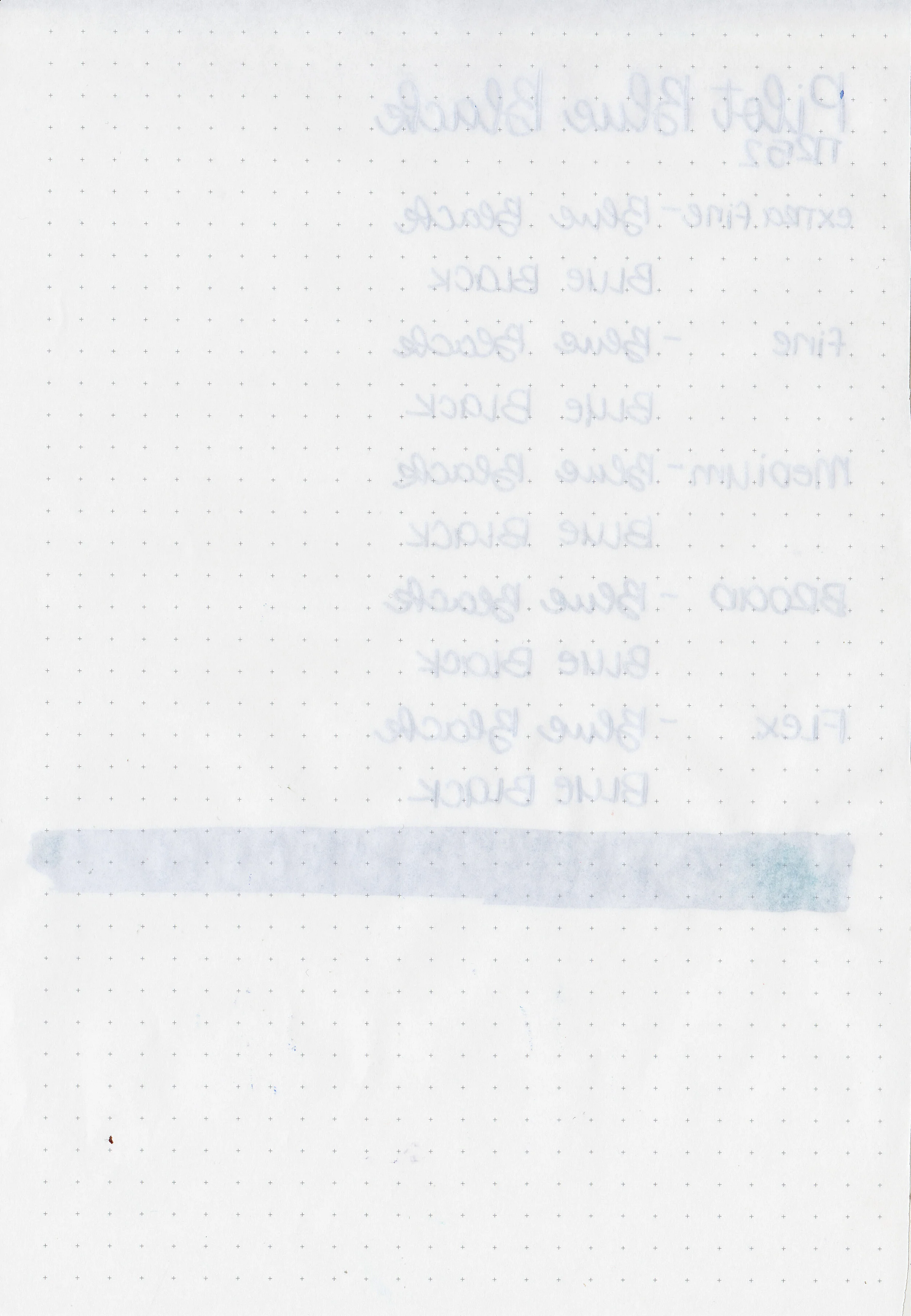
Now that I’ve made it through all of the Pilot Iroshizuku inks I want to get the Pilot standard inks reviewed too, starting with Pilot Black. Thanks to Vanness Pens for providing a sample for review.

The color:
Pilot Black is a classic, standard black ink.
In large swabs on Tomoe River paper the ink has some black sheen.

Let's take a look at how the ink behaves on fountain pen friendly papers: Rhodia, Tomoe River, and Leuchtturm.
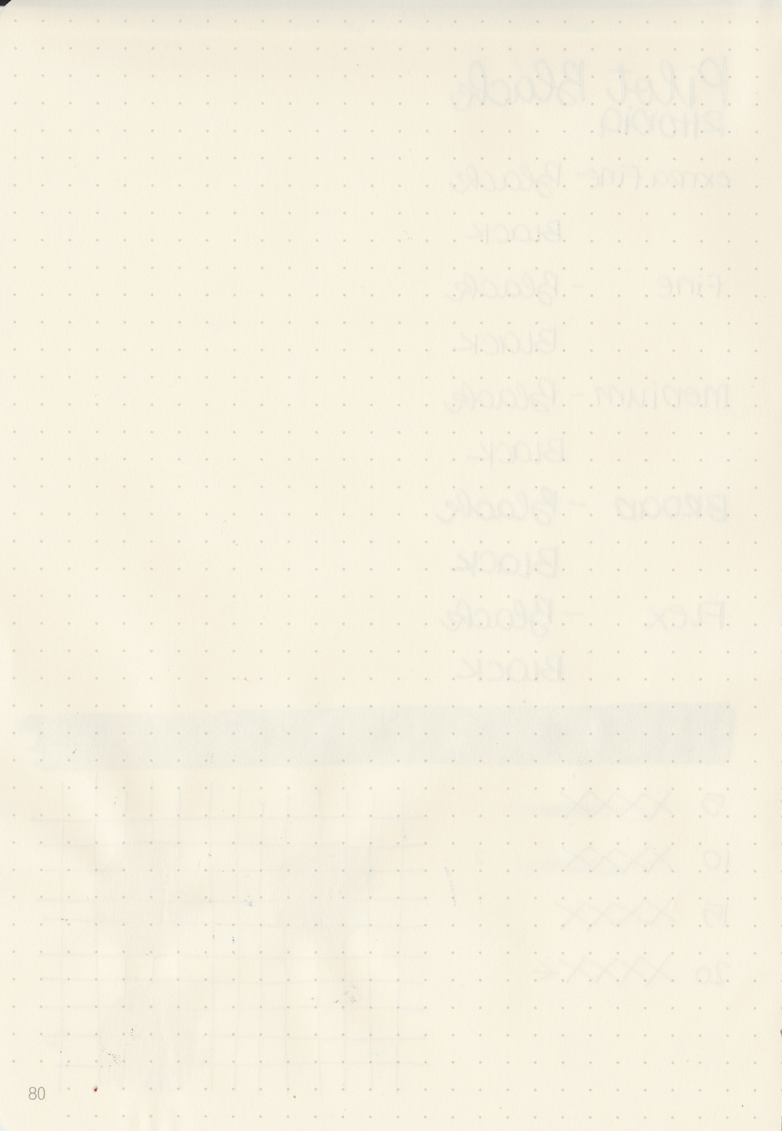
Dry time: 20 seconds
Water resistance: Low
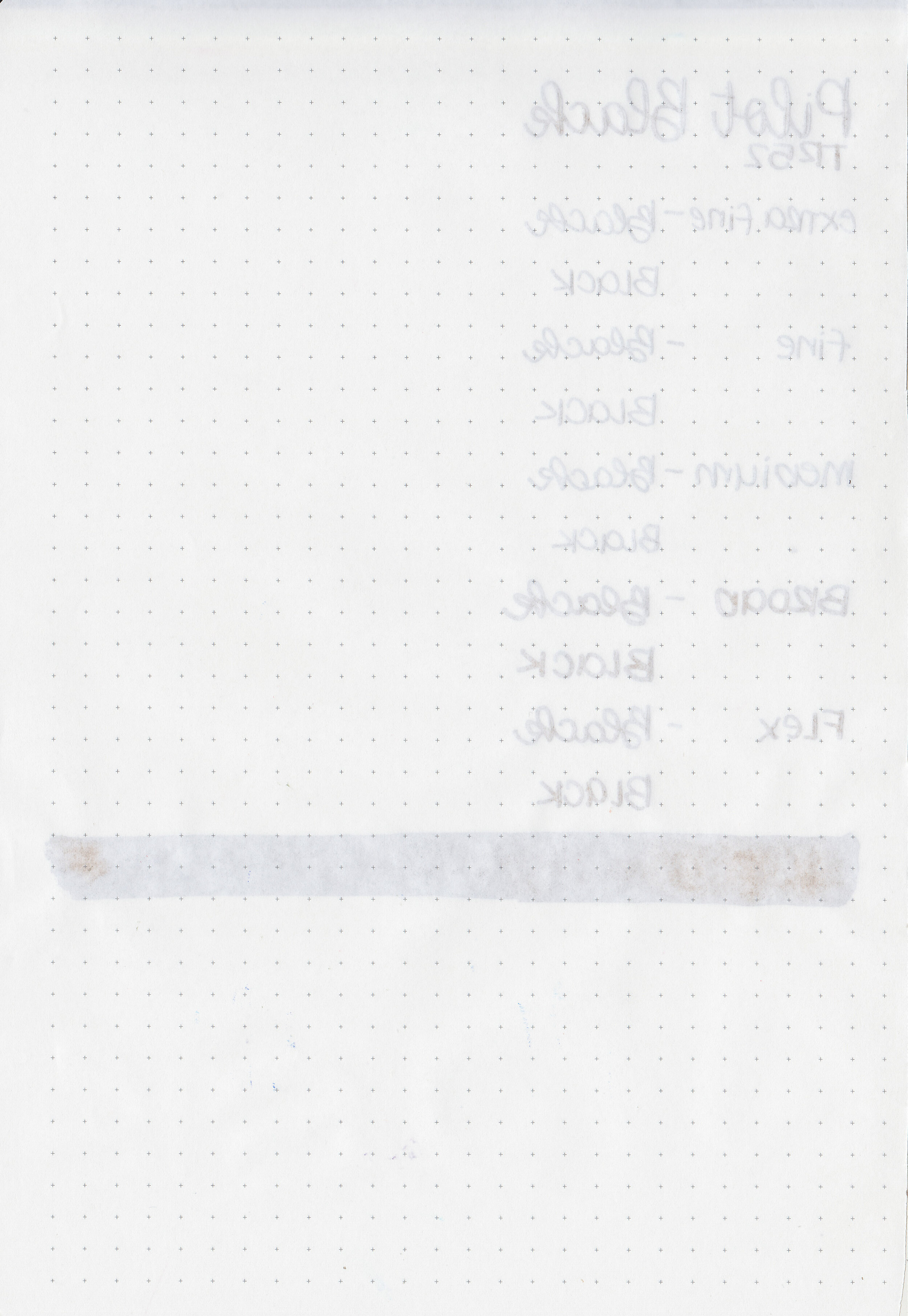
Feathering: Low-there was a bit of feathering on Rhodia and Leuchtturm in the larger nib sizes.
Show through: Medium
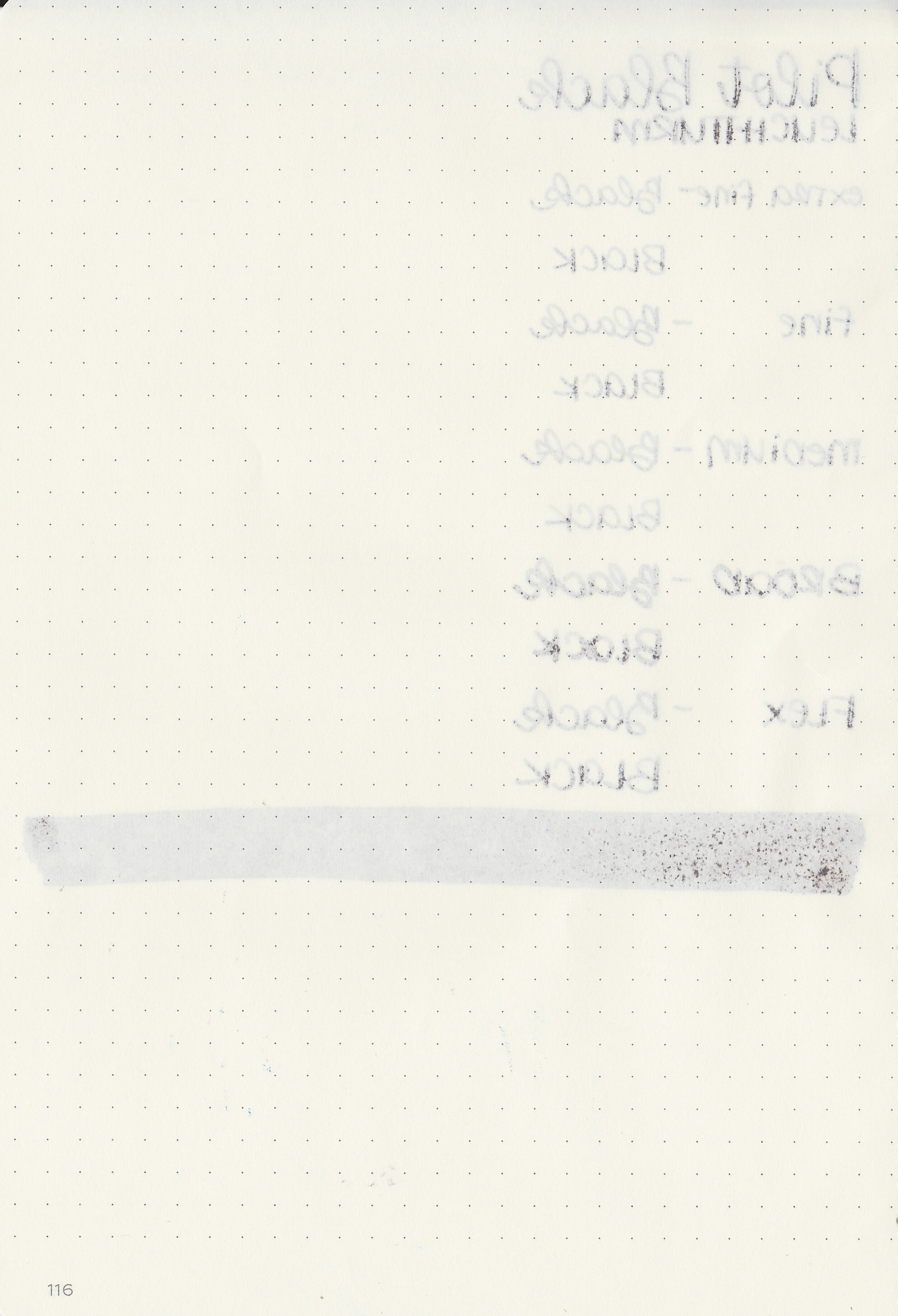
Bleeding: Low-there was a bit of bleeding on Leuchtturm.
Other properties: low shading, medium sheen, and no shimmer.
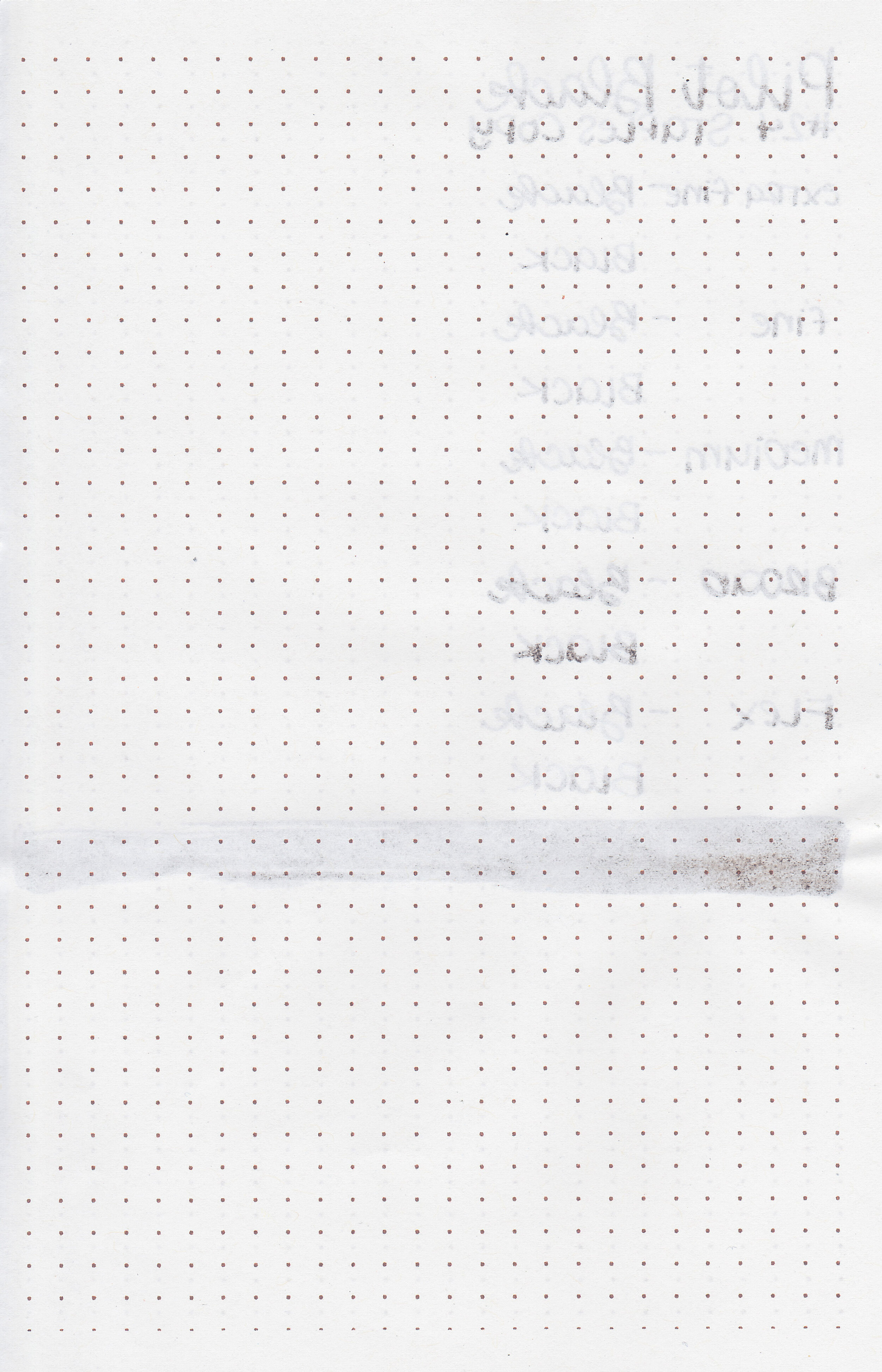
On Staples 24 lb copy paper there was some feathering and a few spots of bleeding.
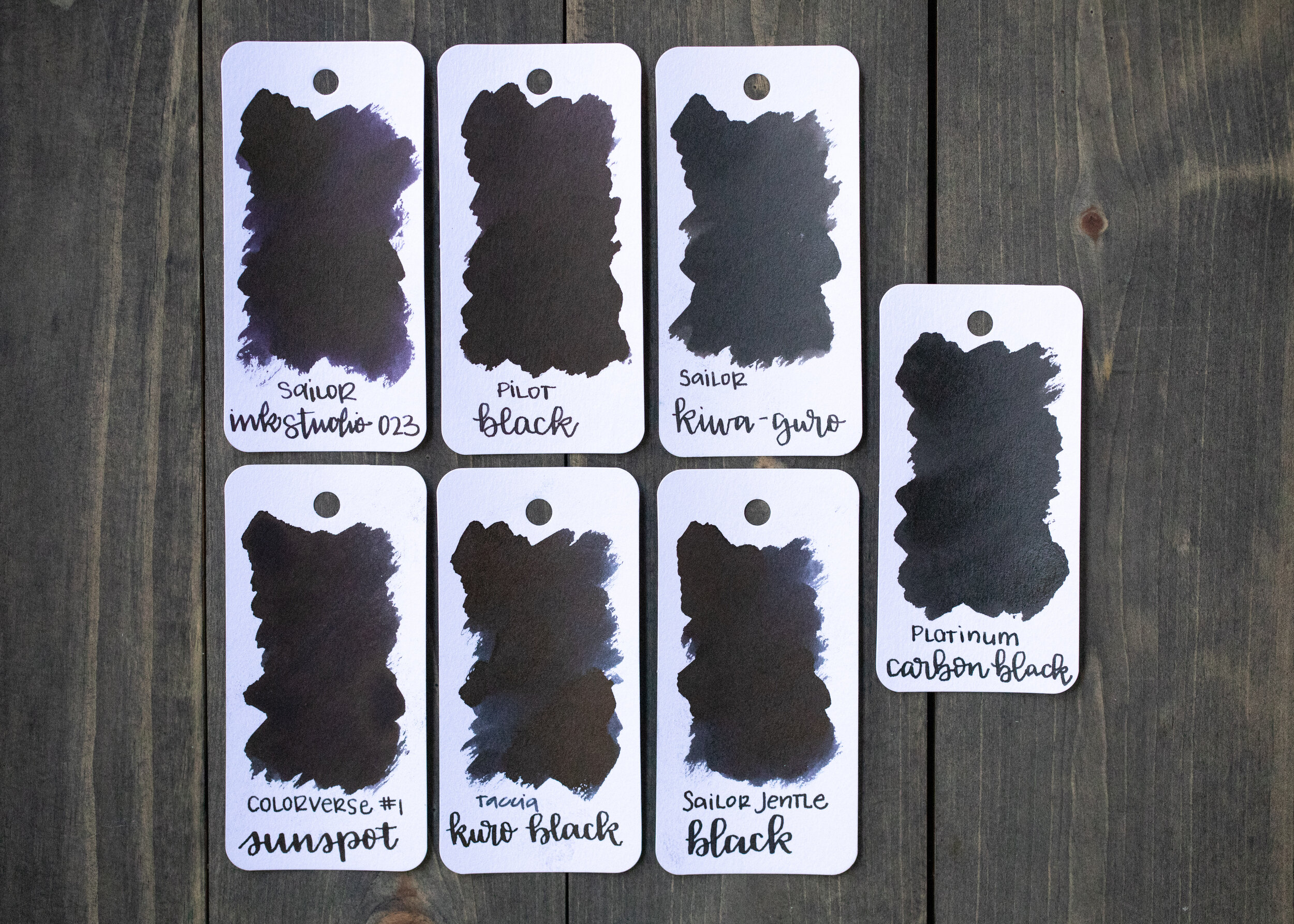
Pilot Black is similar in color to Colorverse Sunspot. Click here to see the Pilot inks together, and click here to see the black inks together.

I used a Pilot Custom 823 Smoke with a broad nib on a Yoseka A5 notebook. The ink had a slightly wet flow.
Overall, I enjoyed this ink, but it does have a bit more feathering and bleeding than I like on some papers. I would call it a good black ink but not a great one.
Disclaimer: A sample of this ink was provided by Vanness Pens. All photos and opinions are my own. This page does not contain affiliate links and this post is not sponsored in any way.
Hi, I’m Kelli, and I’m the brain behind Mountain of Ink. I’m a homeschooling mama of three littles, full-time student, aspiring photographer, amateur chef, and lover of all things stationery. I think any day that doesn’t involve learning and playing with ink is a day wasted. On my site you will find fountain pen, ink, and paper reviews, along with stationery bits and bobs along the way. You can find me @mountainofink on Instagram, Facebook, Twitter, and Pinterest.
Powered by Squarespace.