Tono & Lims Baby Color SE Inks
/
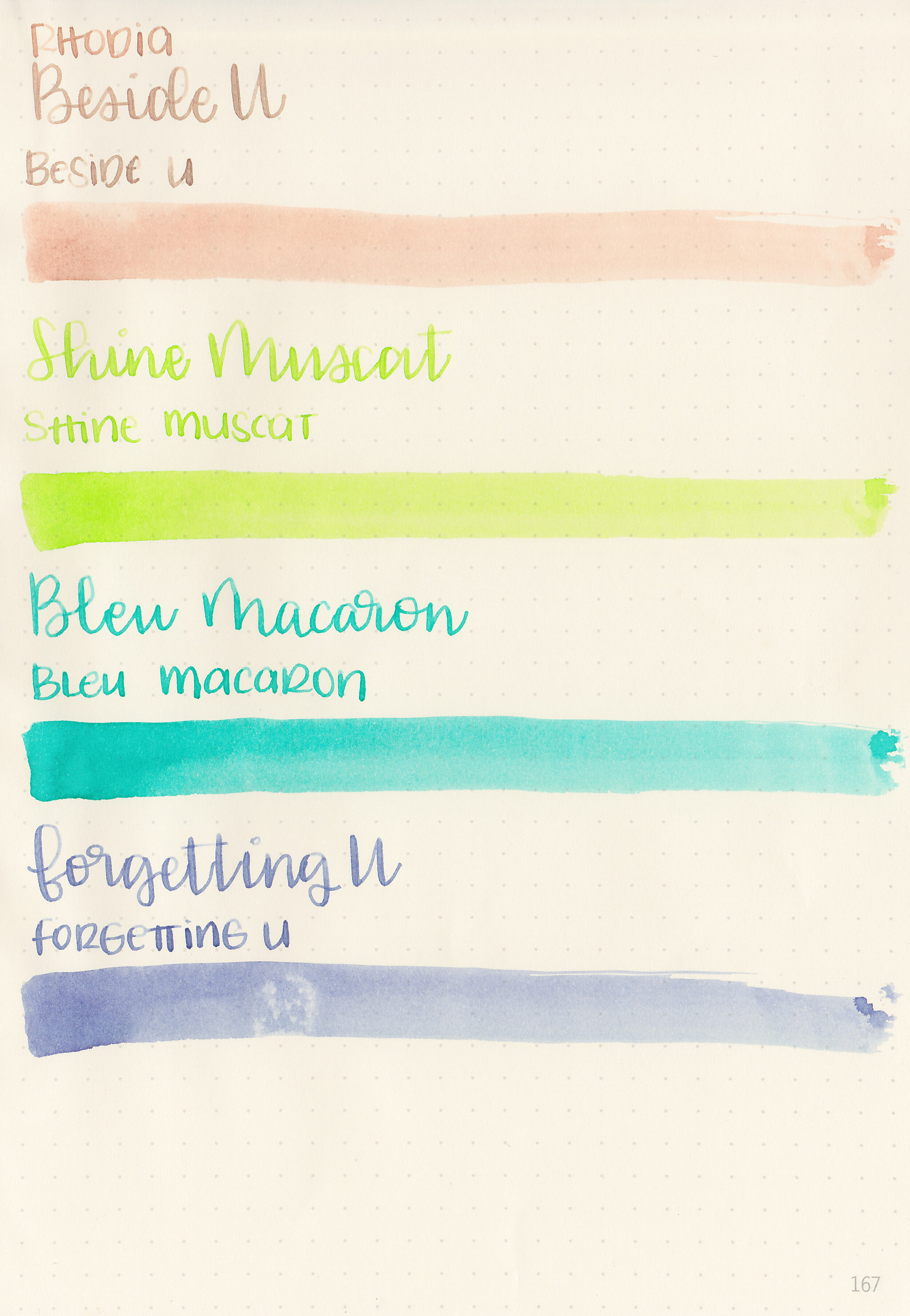
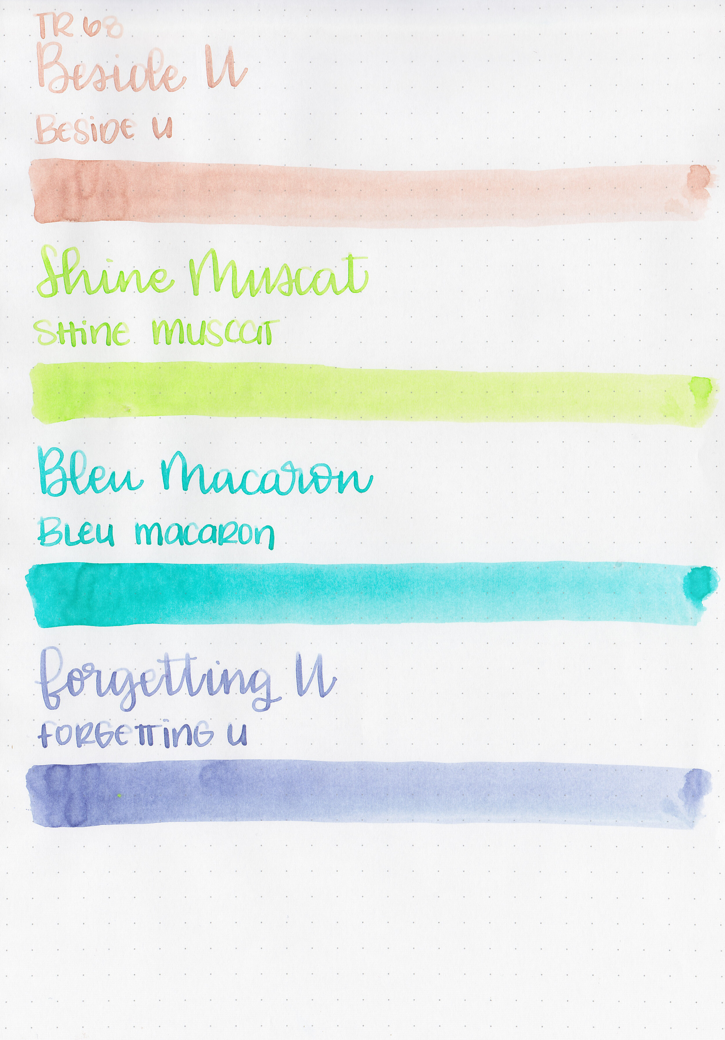
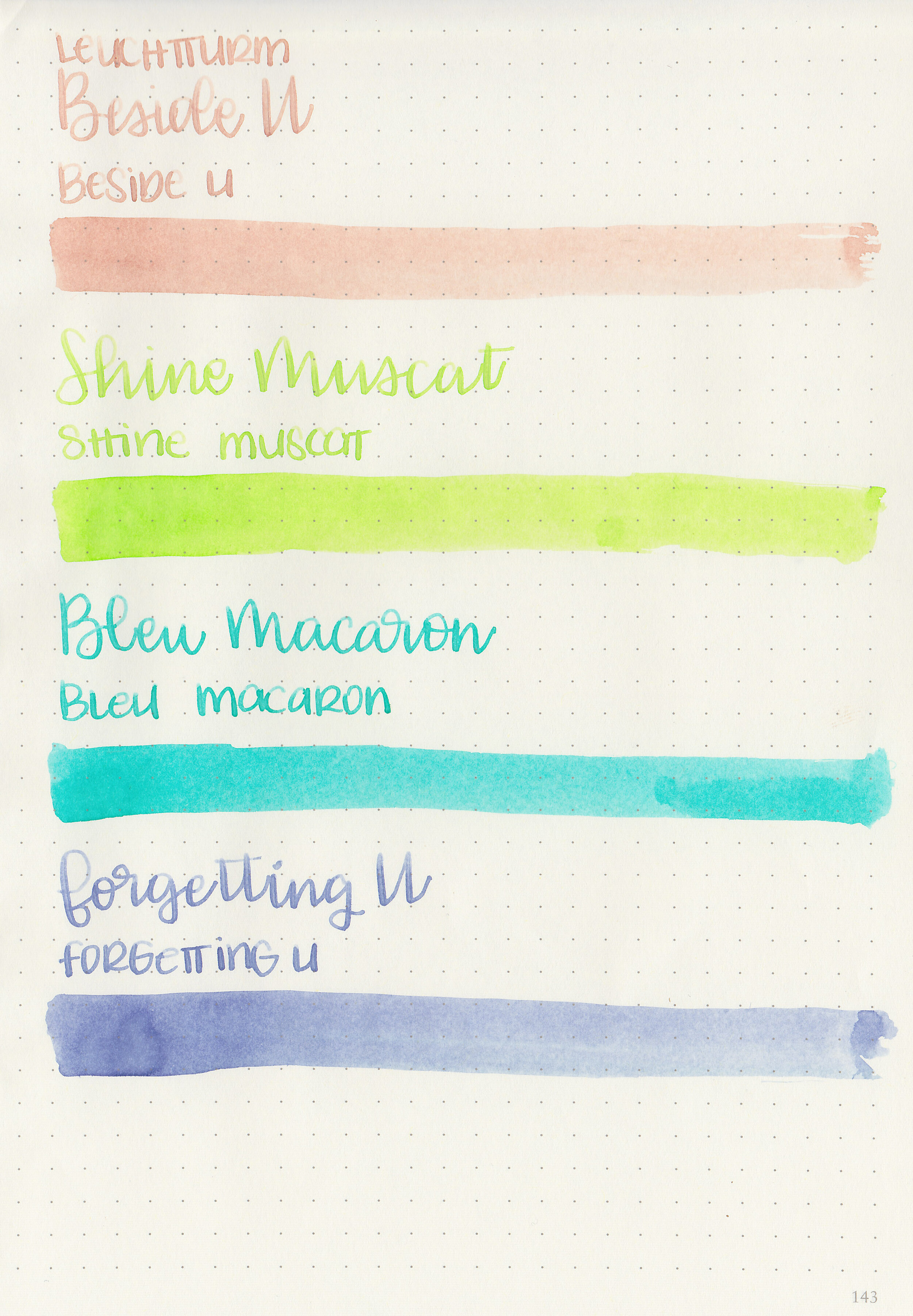
Let’s take a look at four inks from the Tono & Lims Baby Color SE collection: Beside U, Shine Muscat, Bleu Macaron and Forgetting U. These inks come in square 30ml glass bottles. Thanks to Shigure Inks for sending samples over for review!
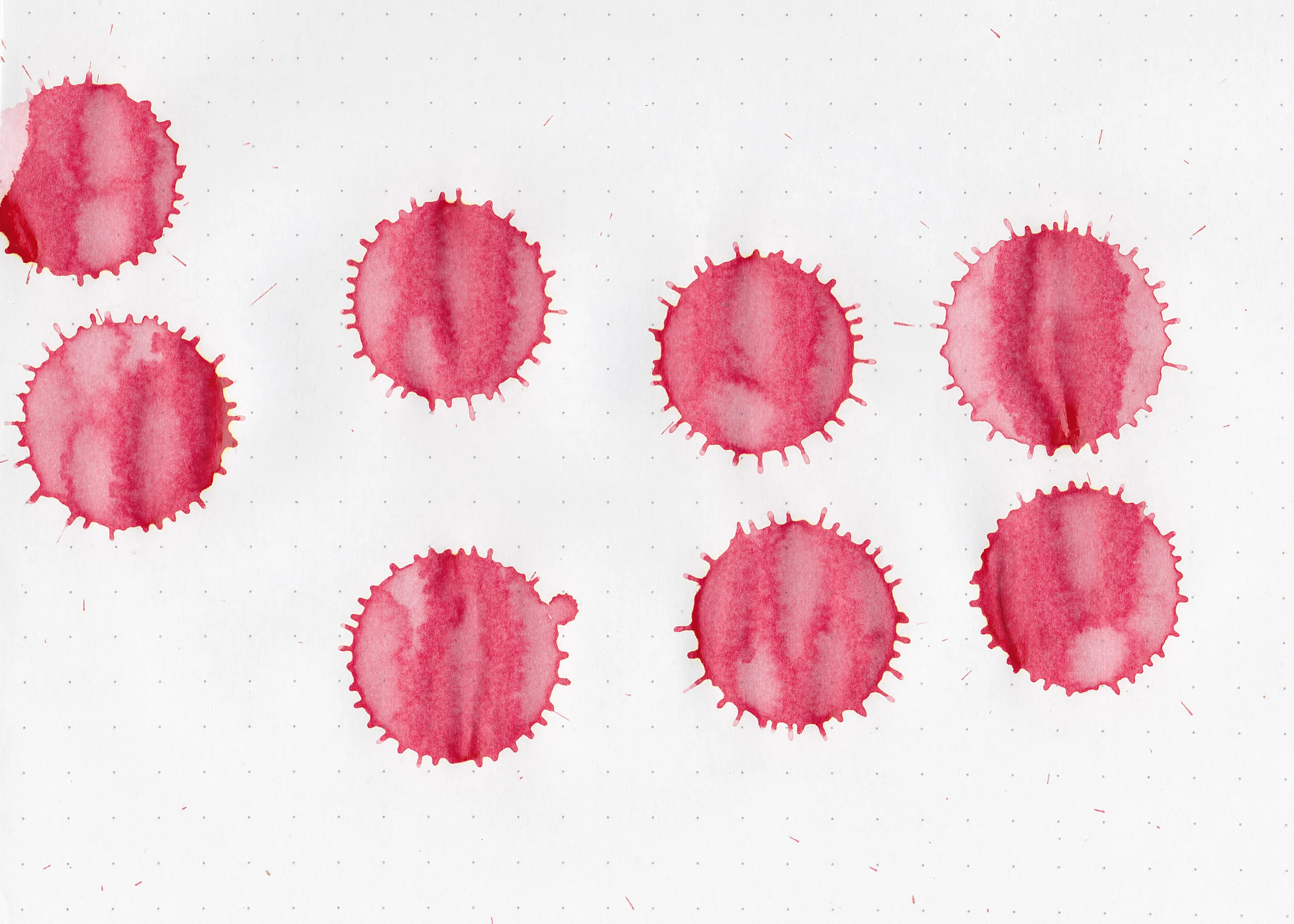
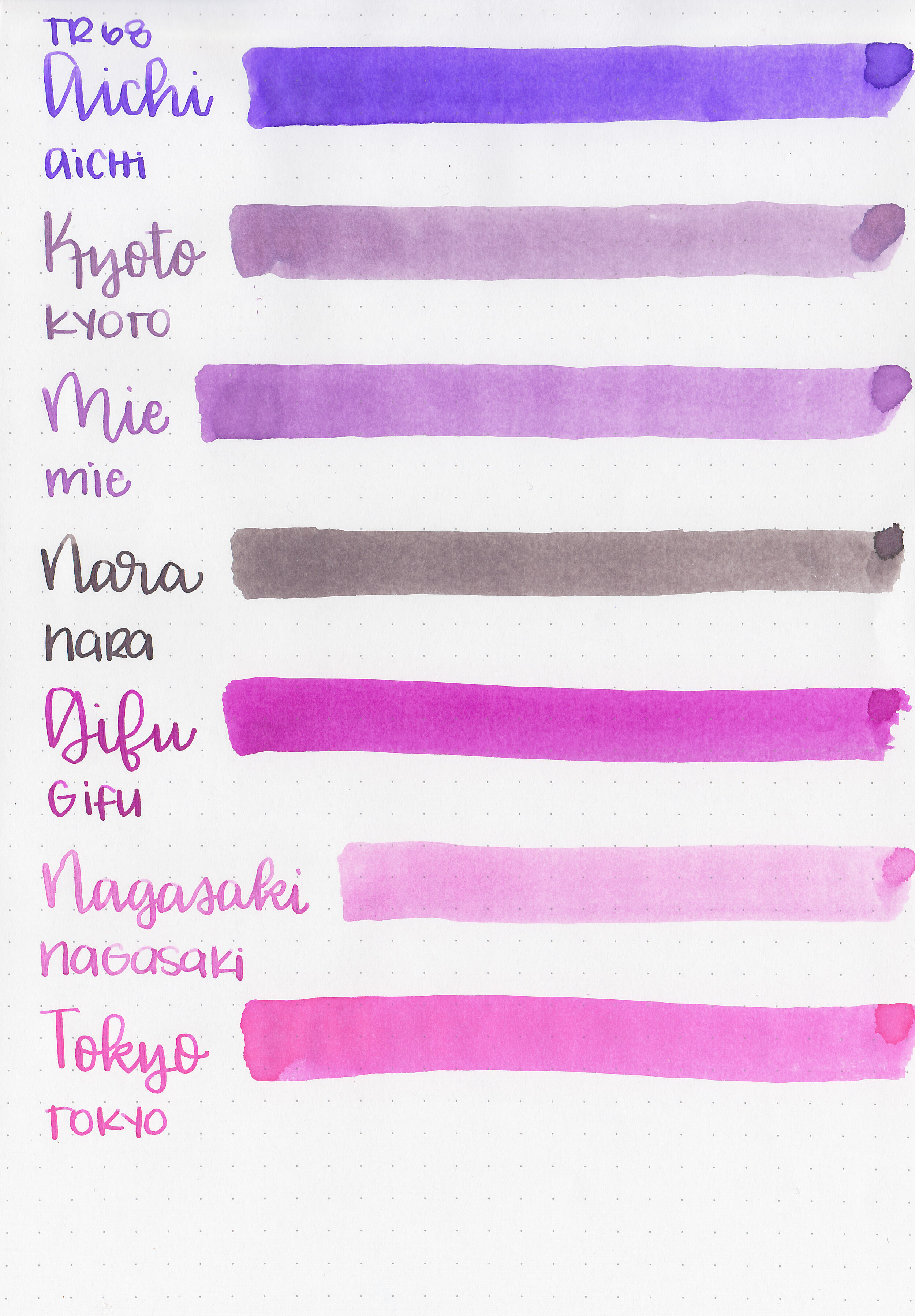
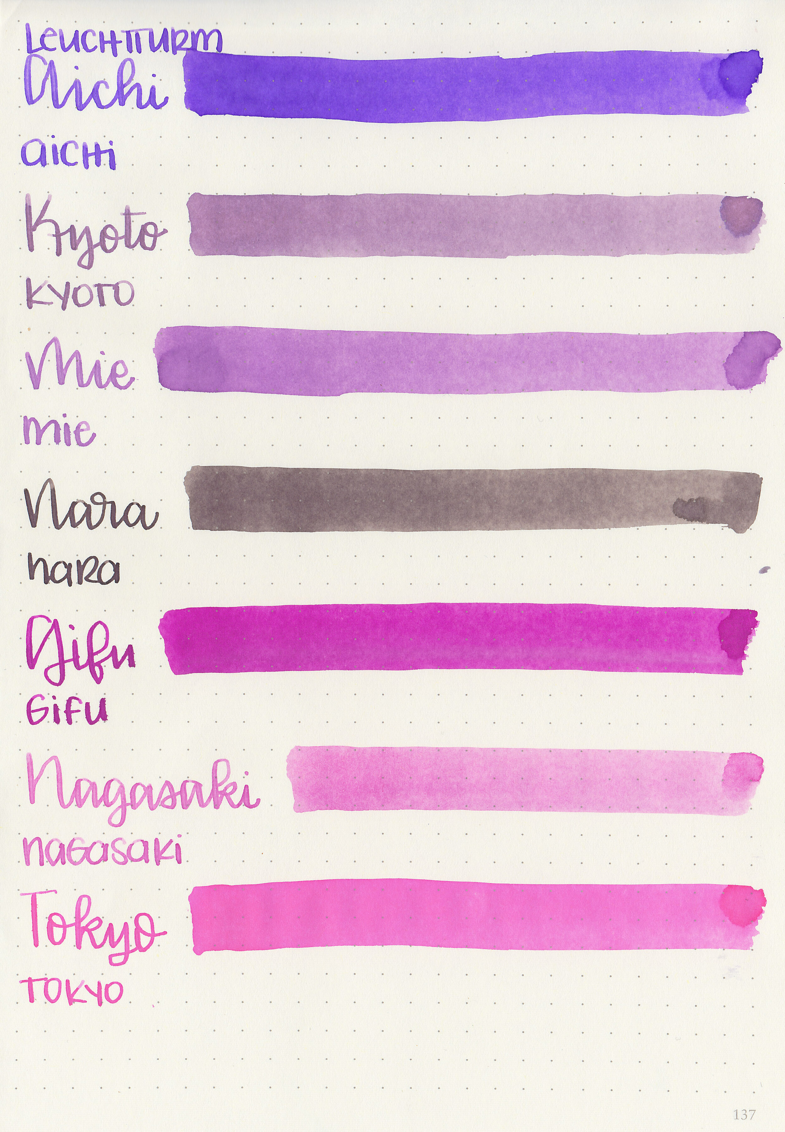
Swabs:

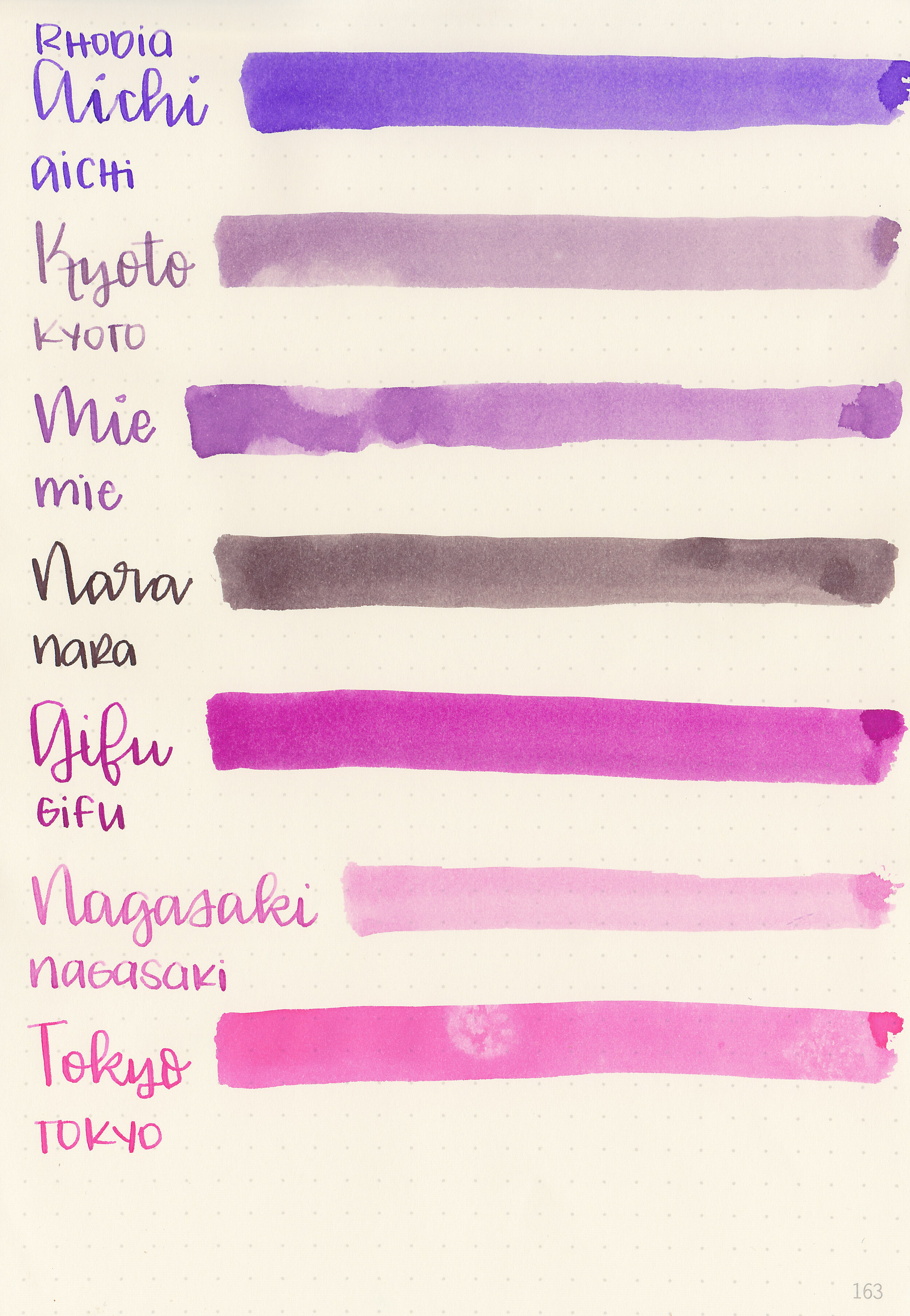
Left to right: Forgetting U, Bleu Macaron, Shine Muscat and Beside U.
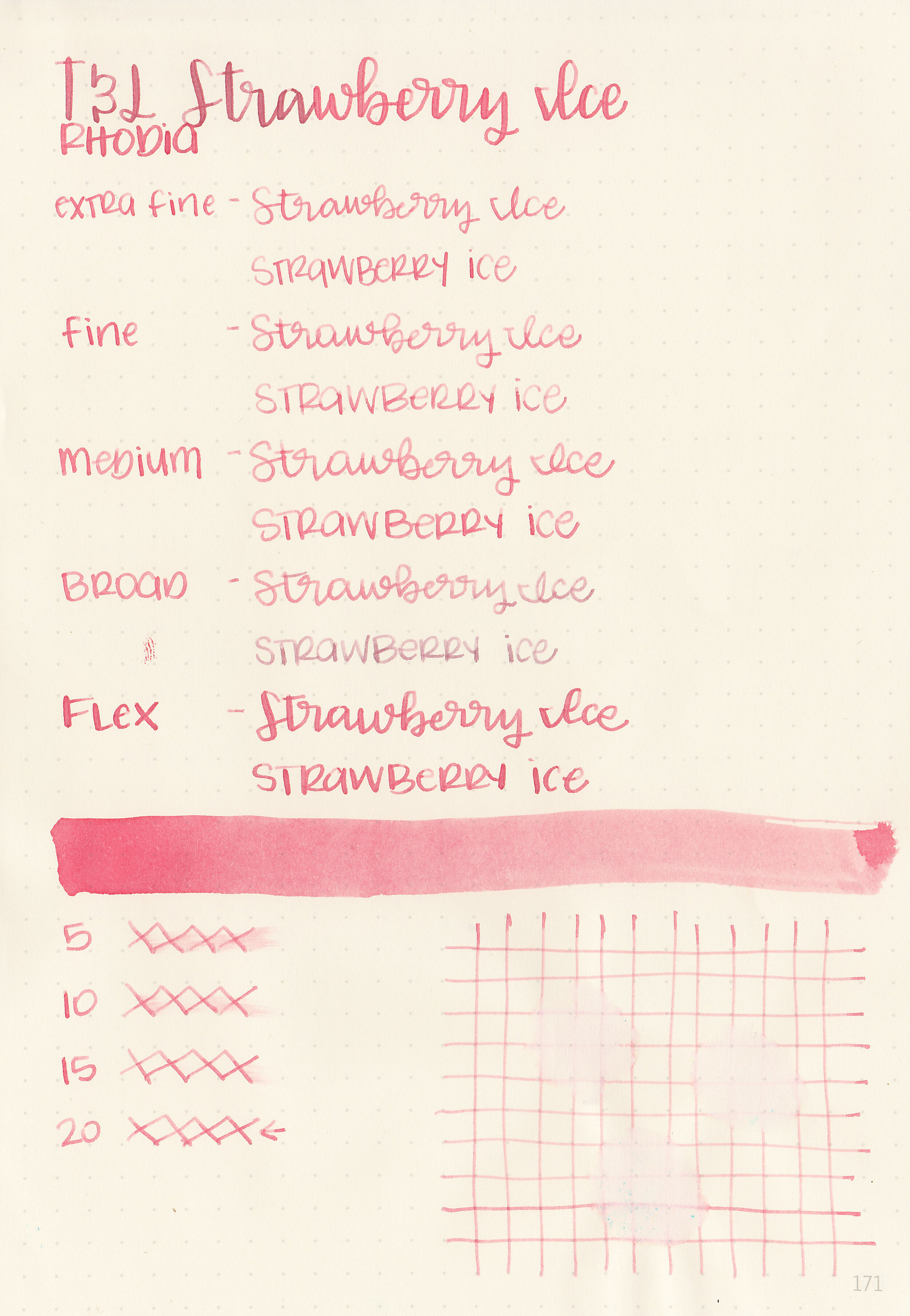
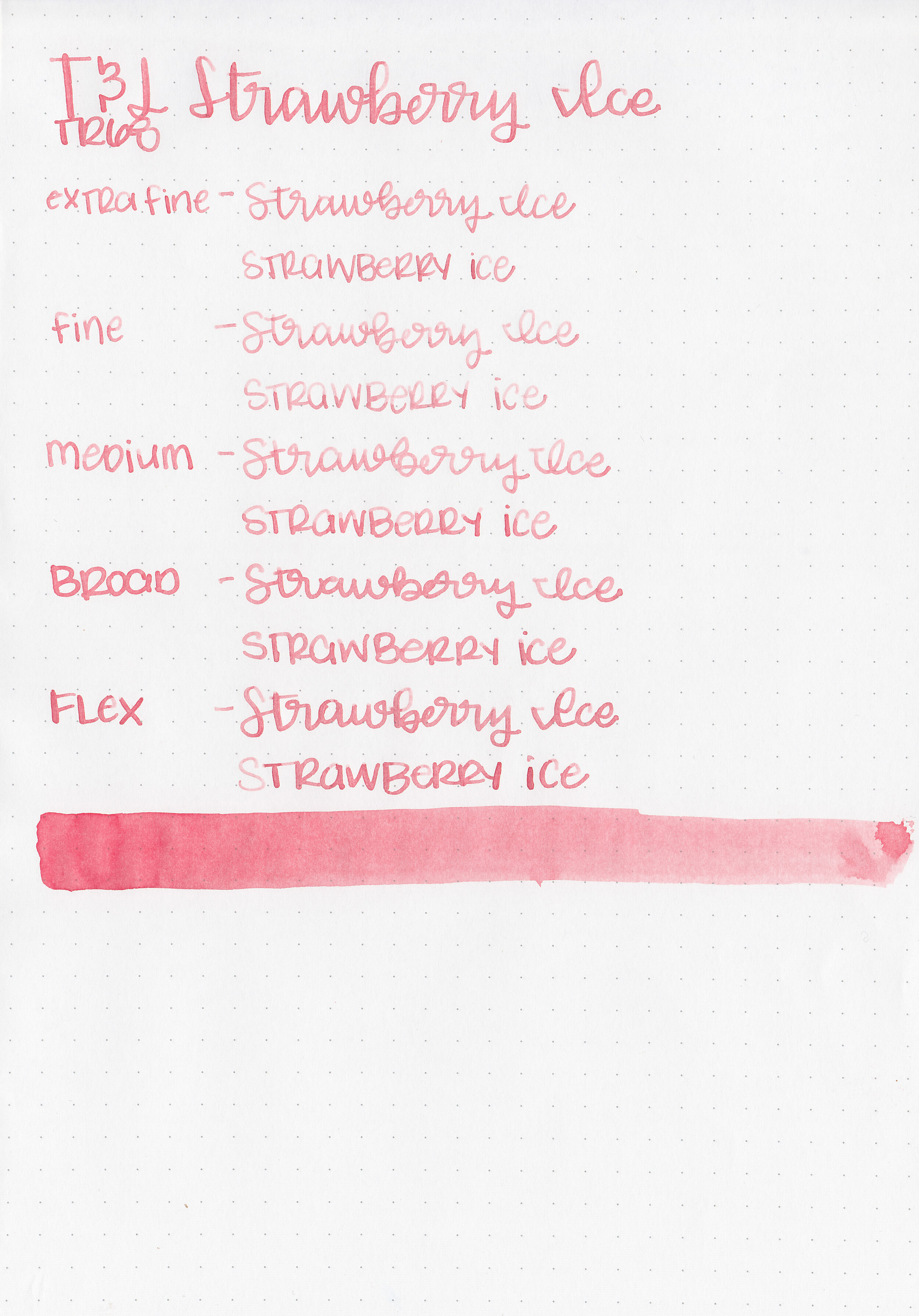
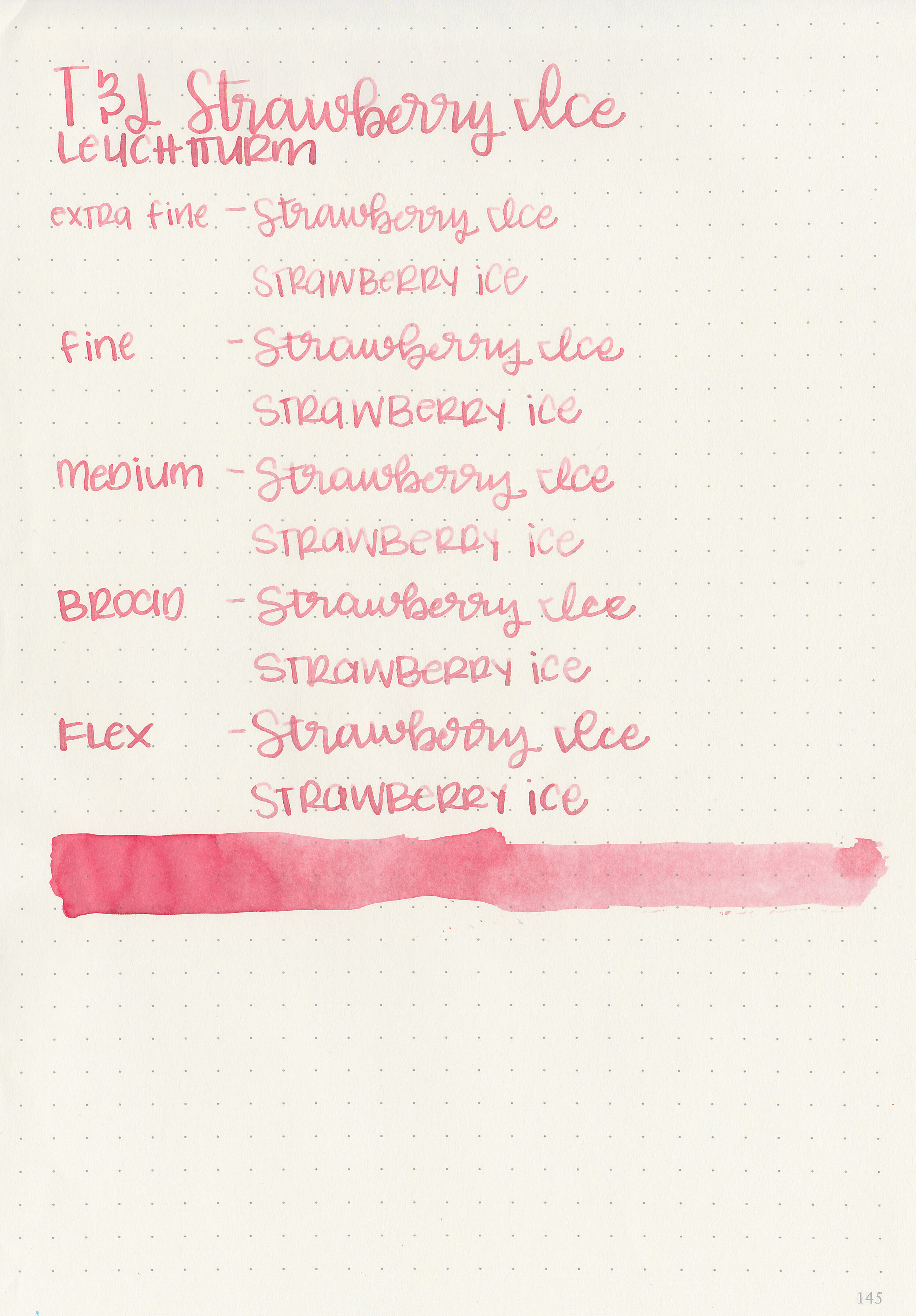
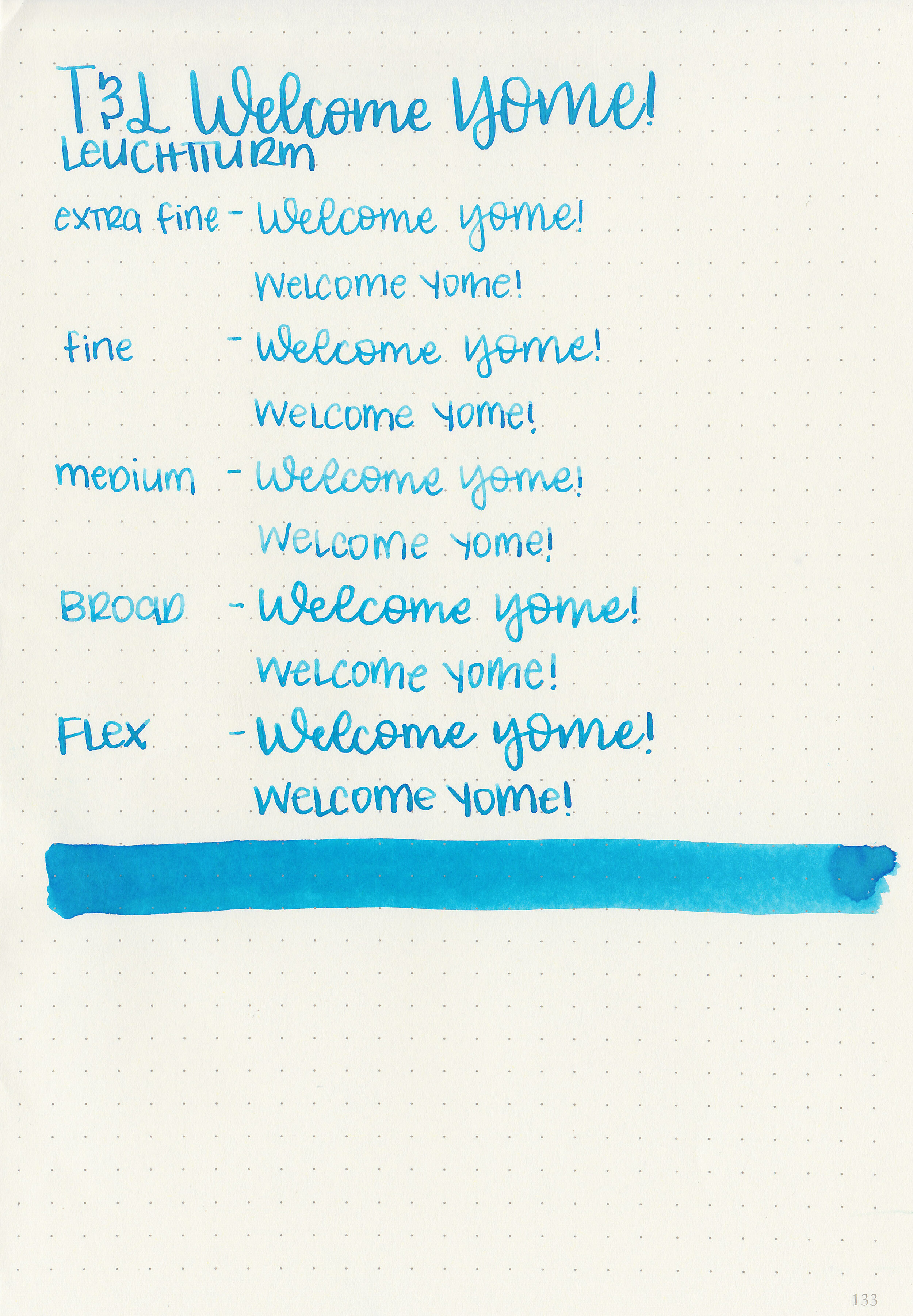
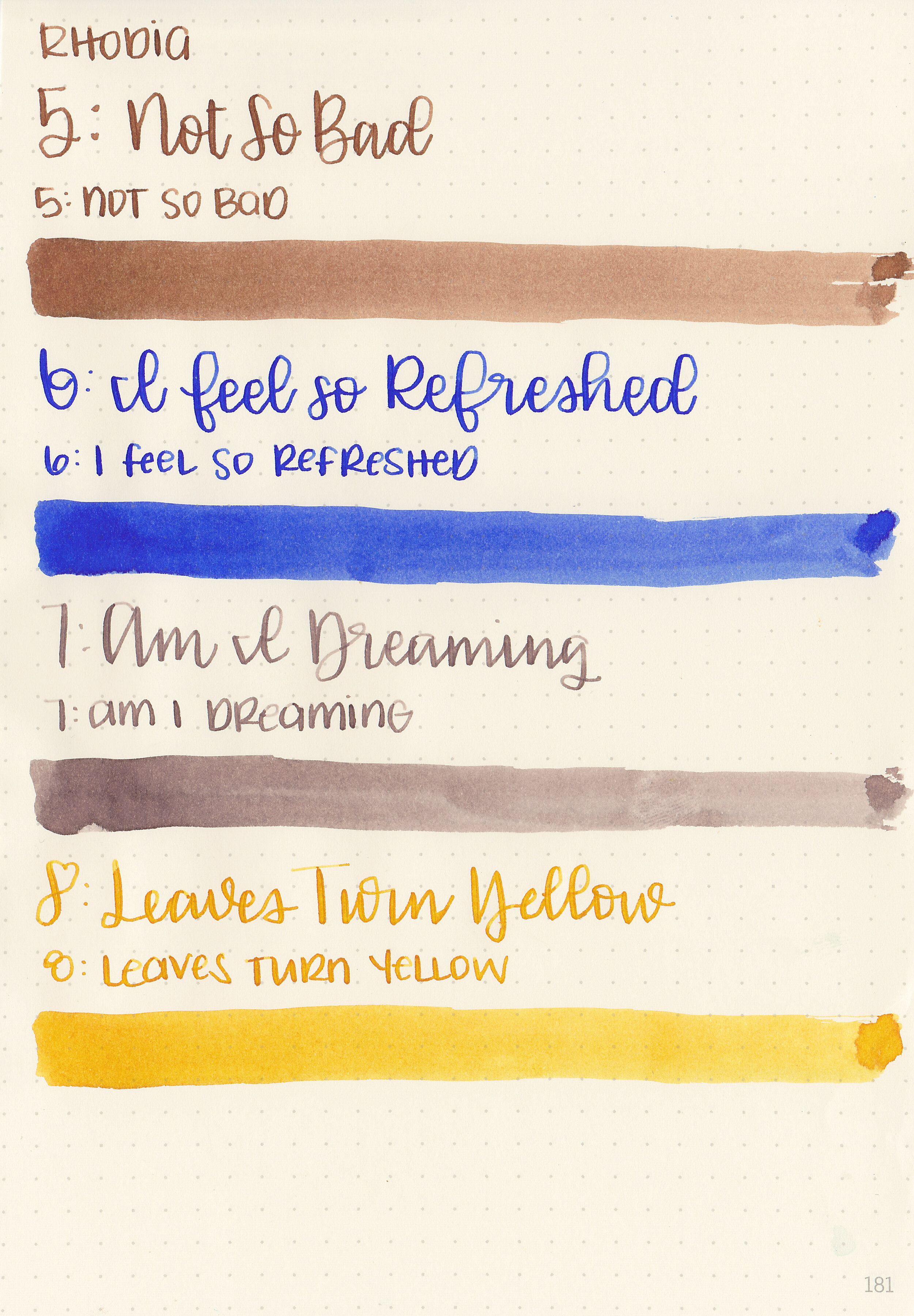
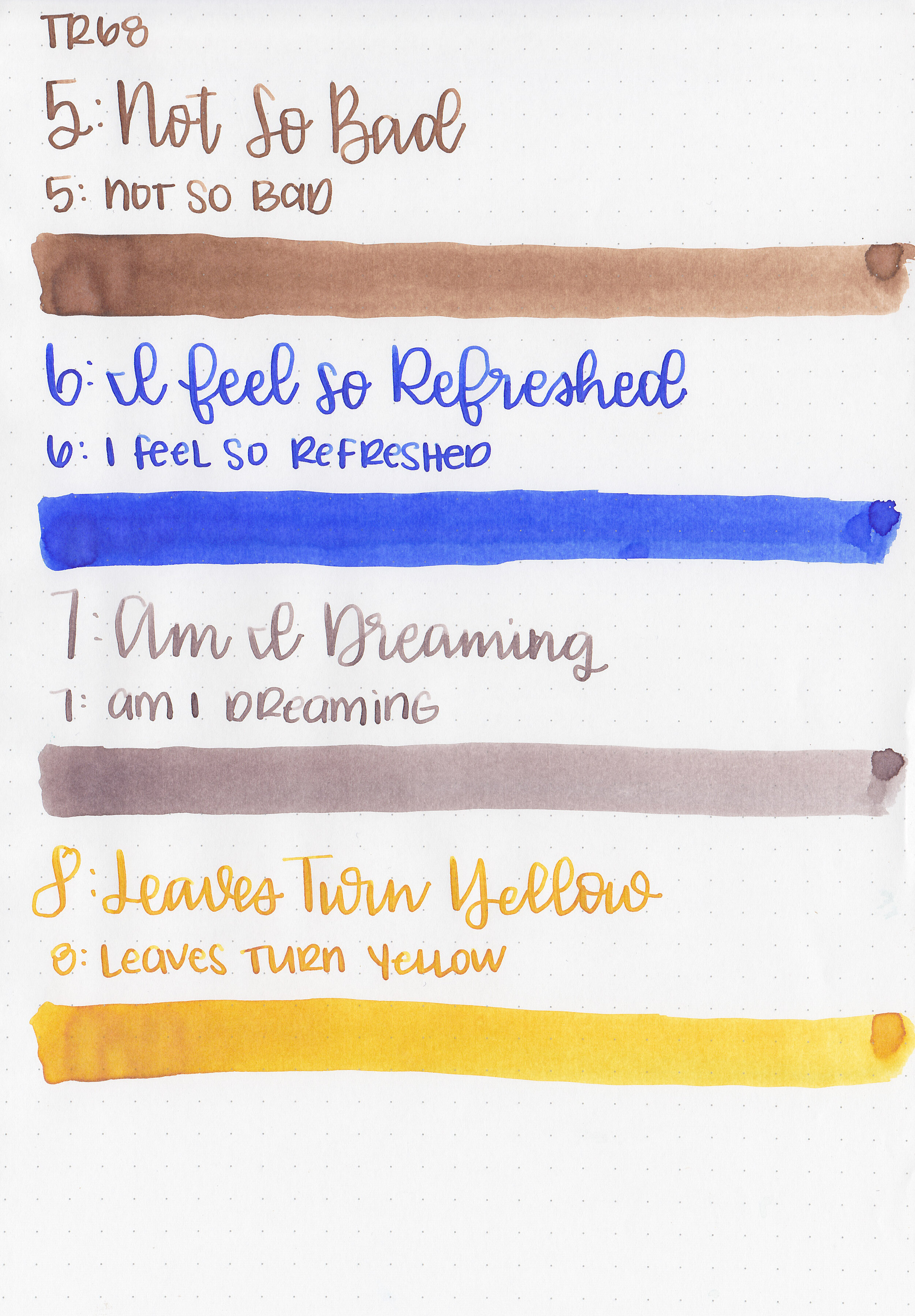
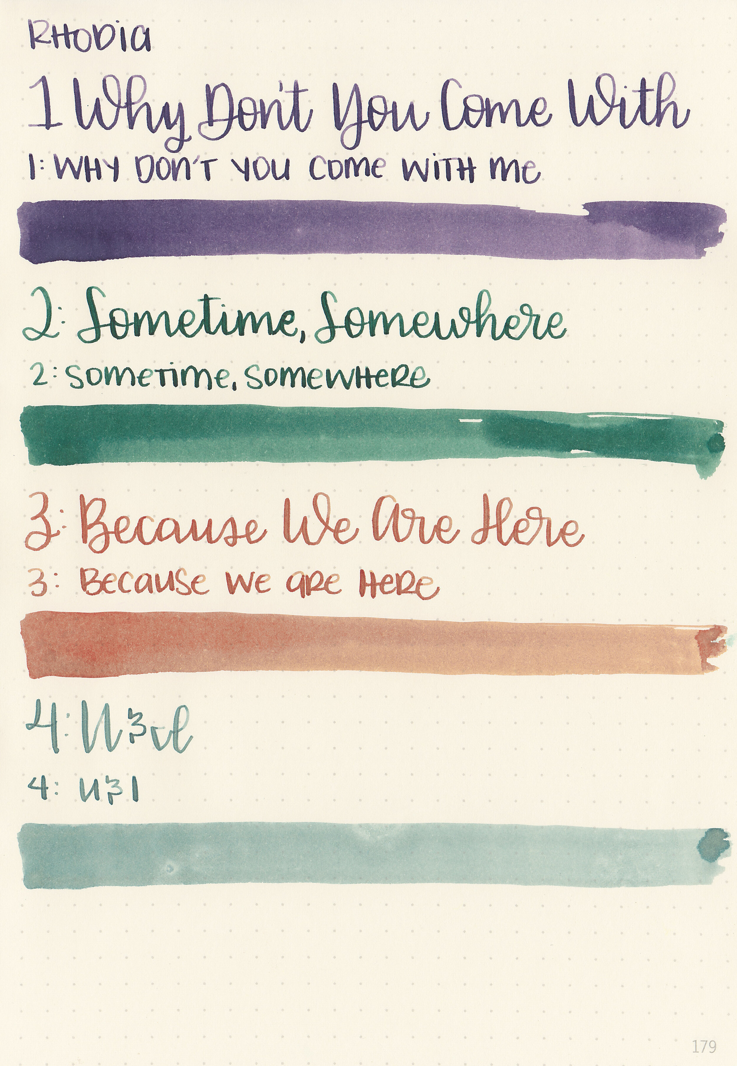
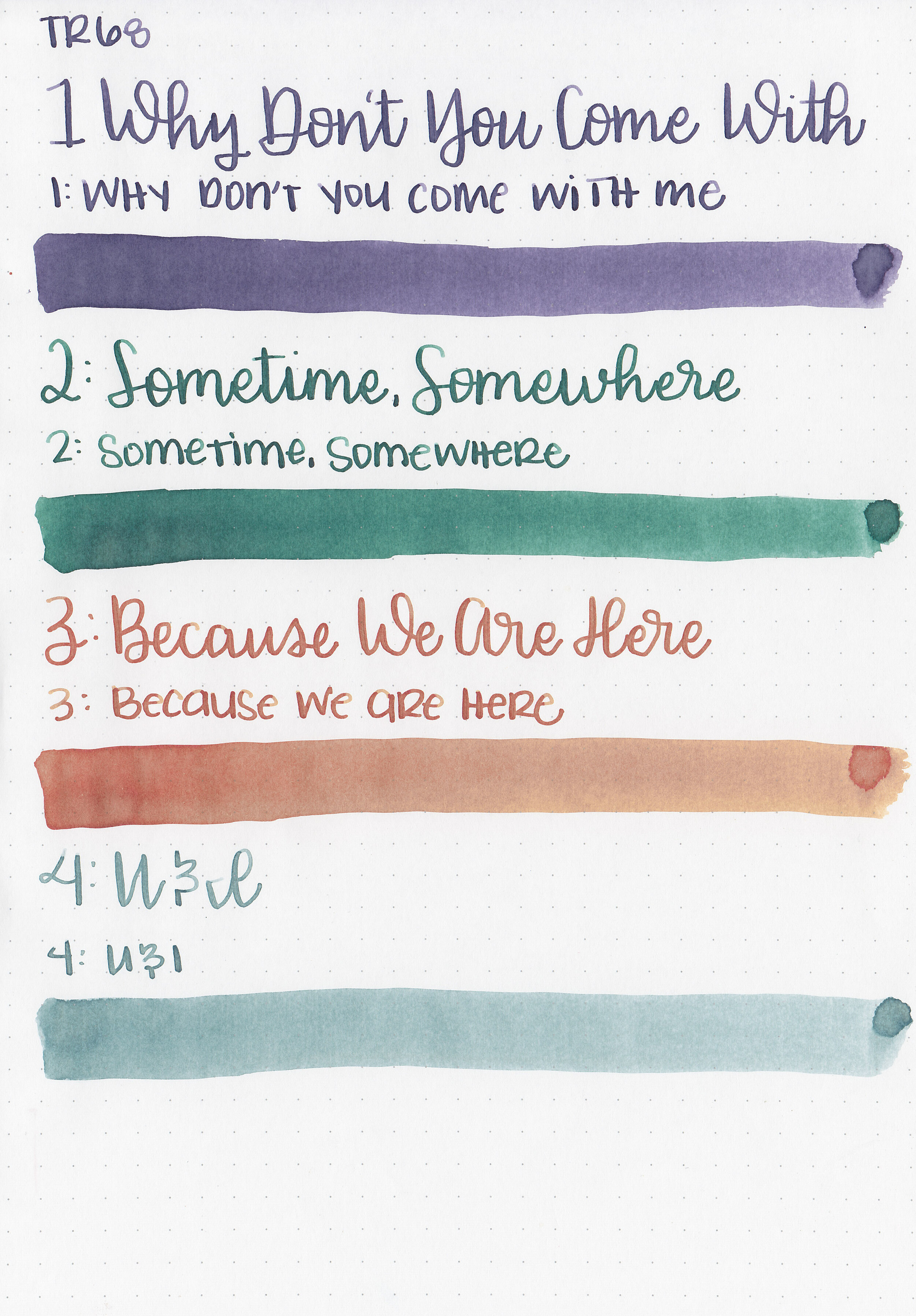
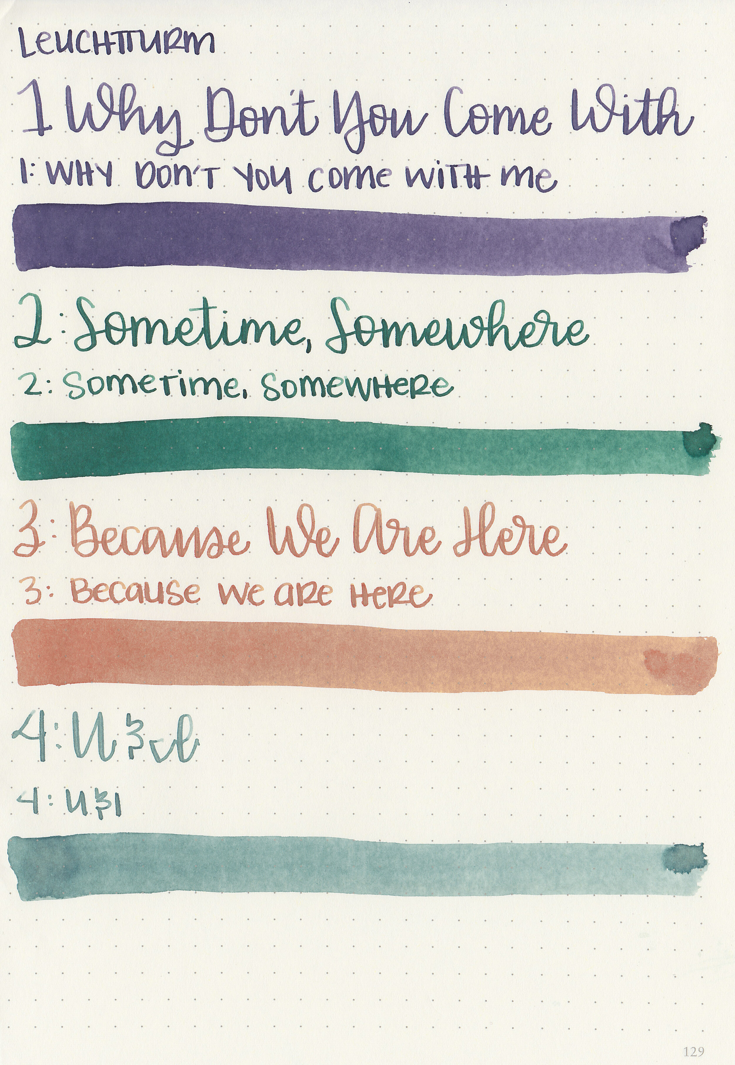
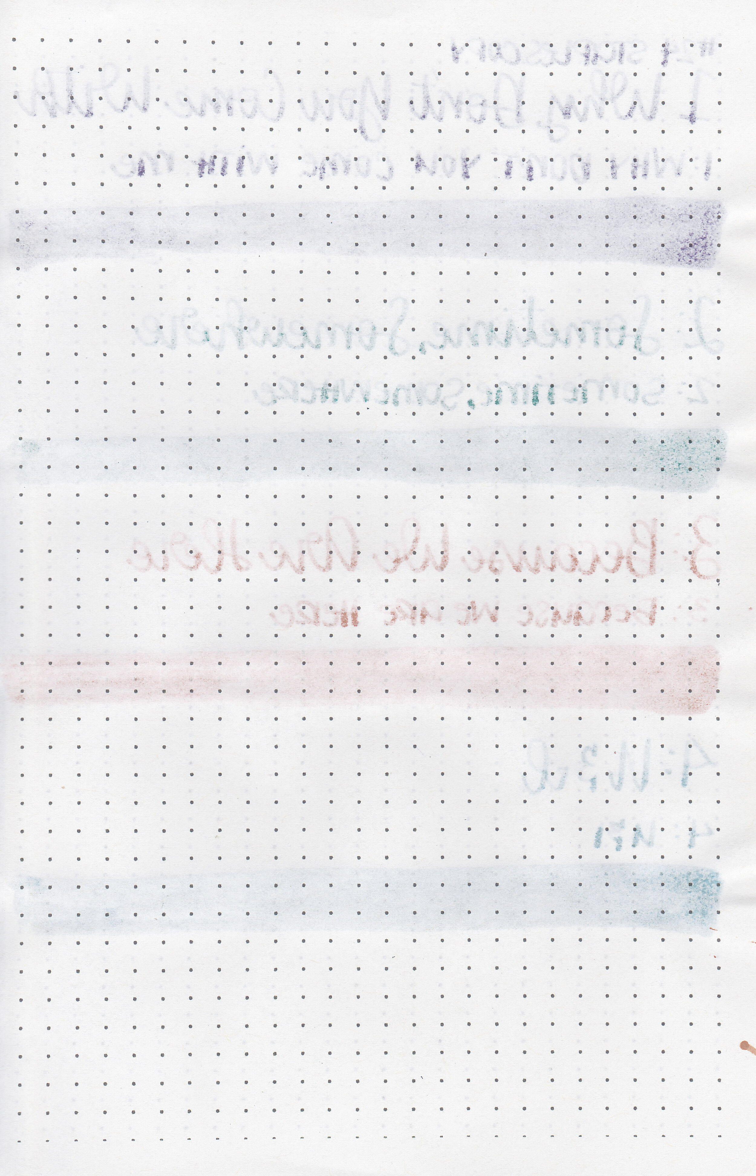
Writing samples:
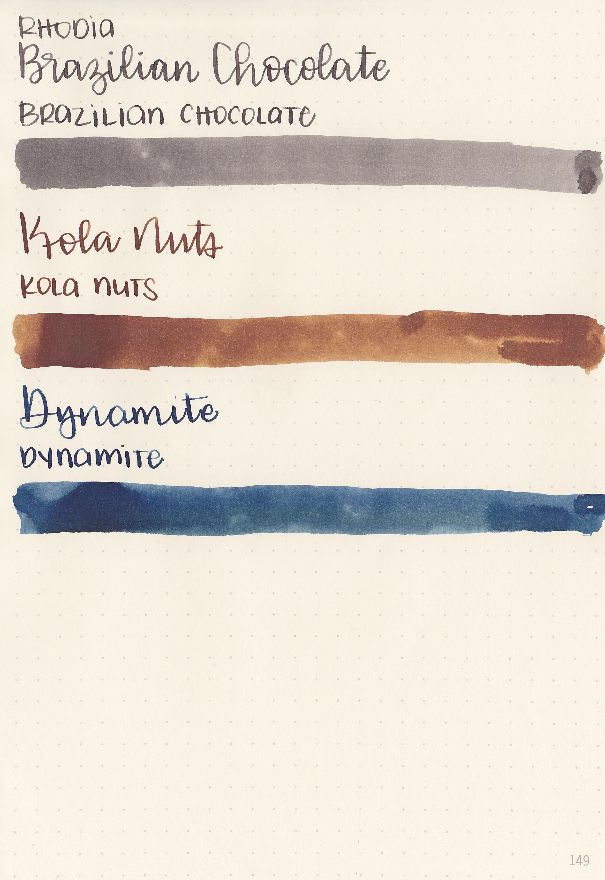
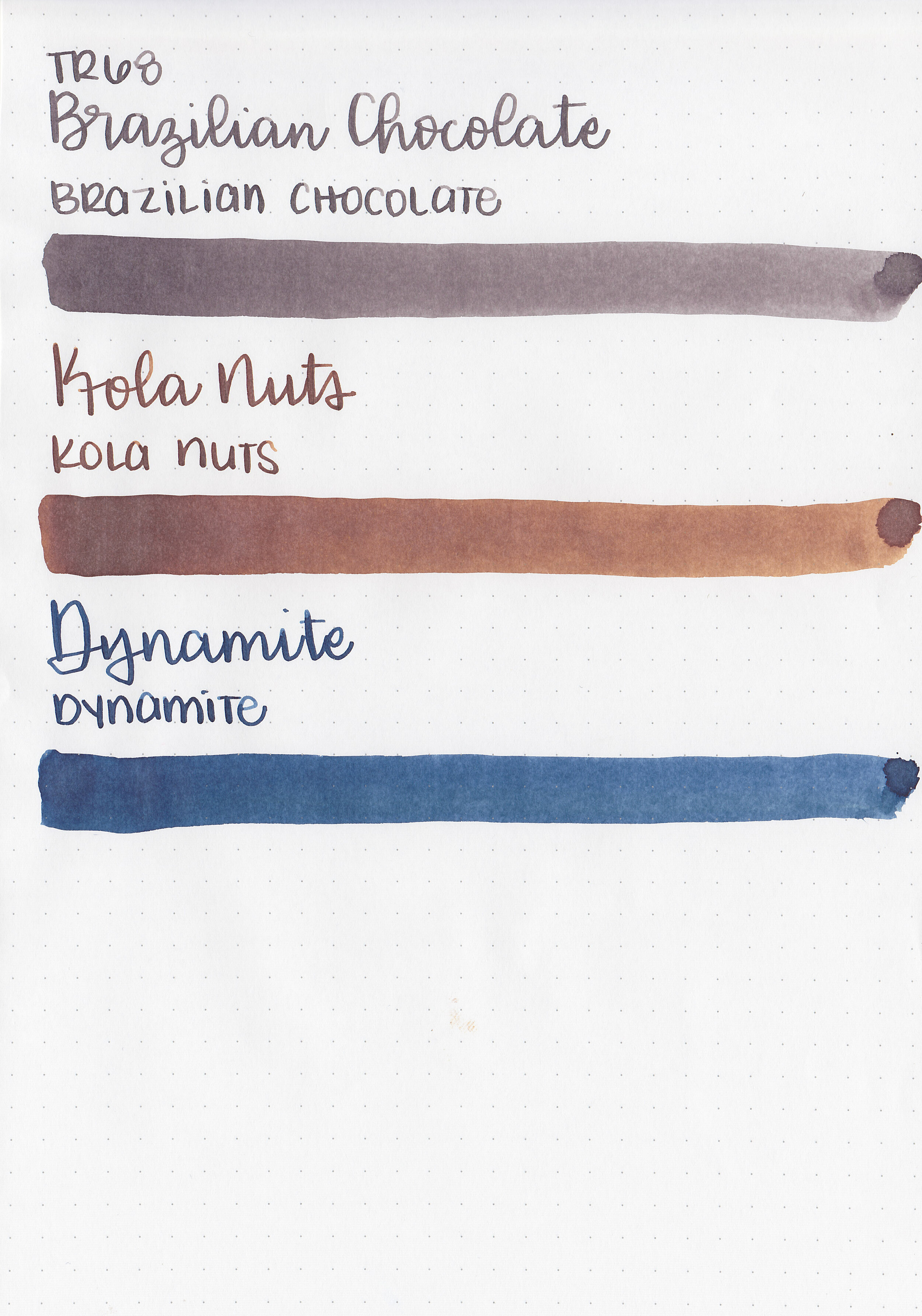
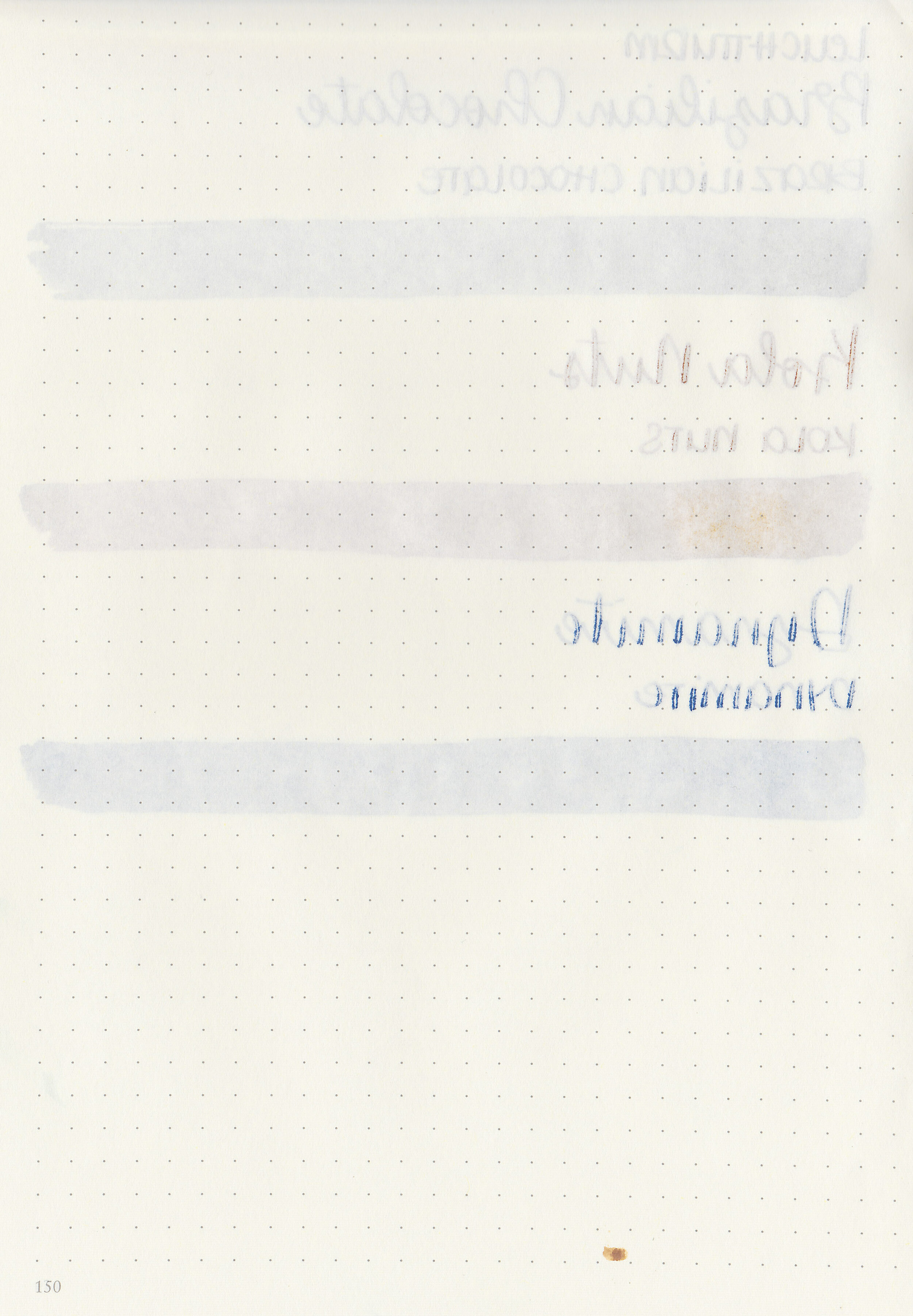
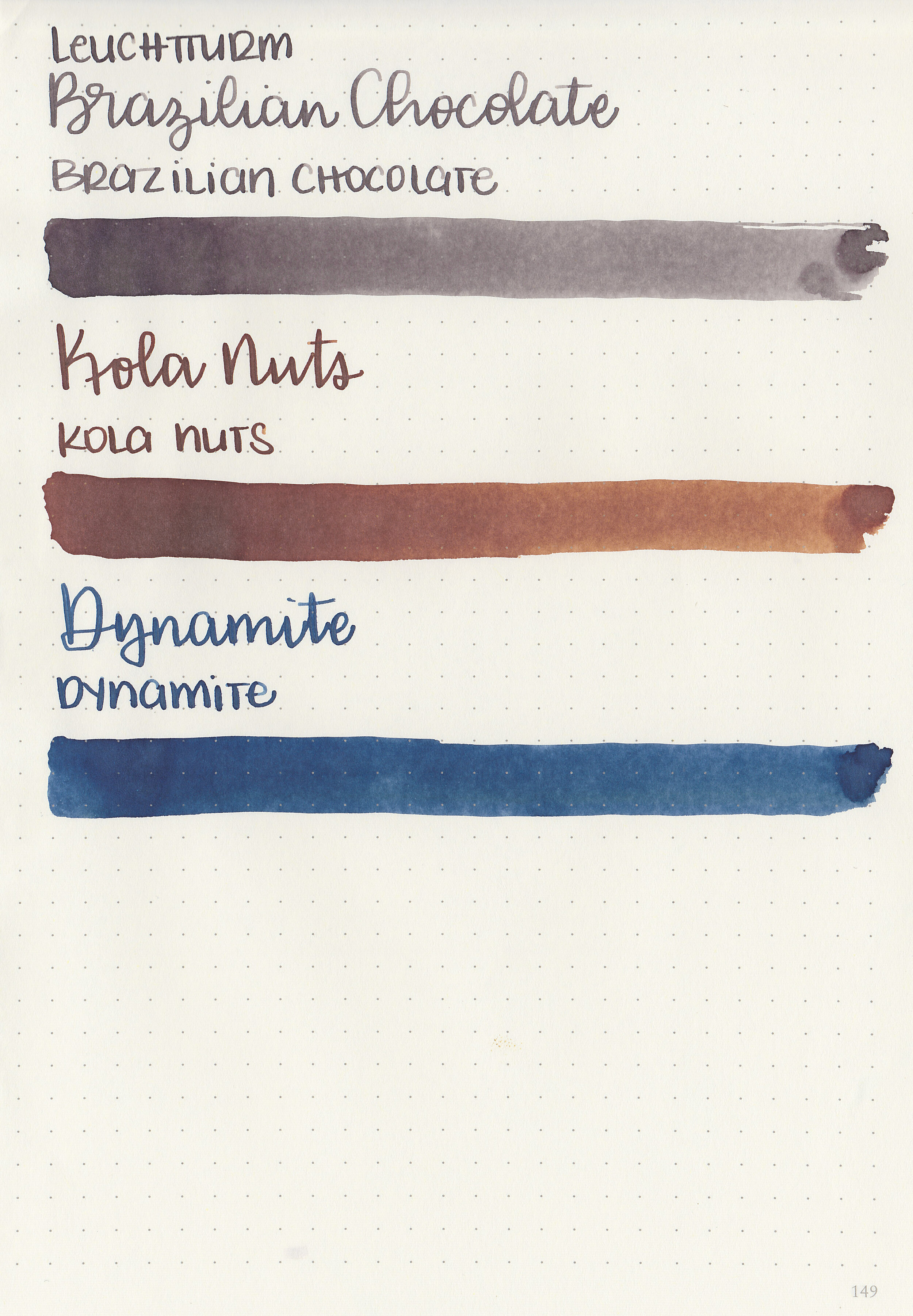
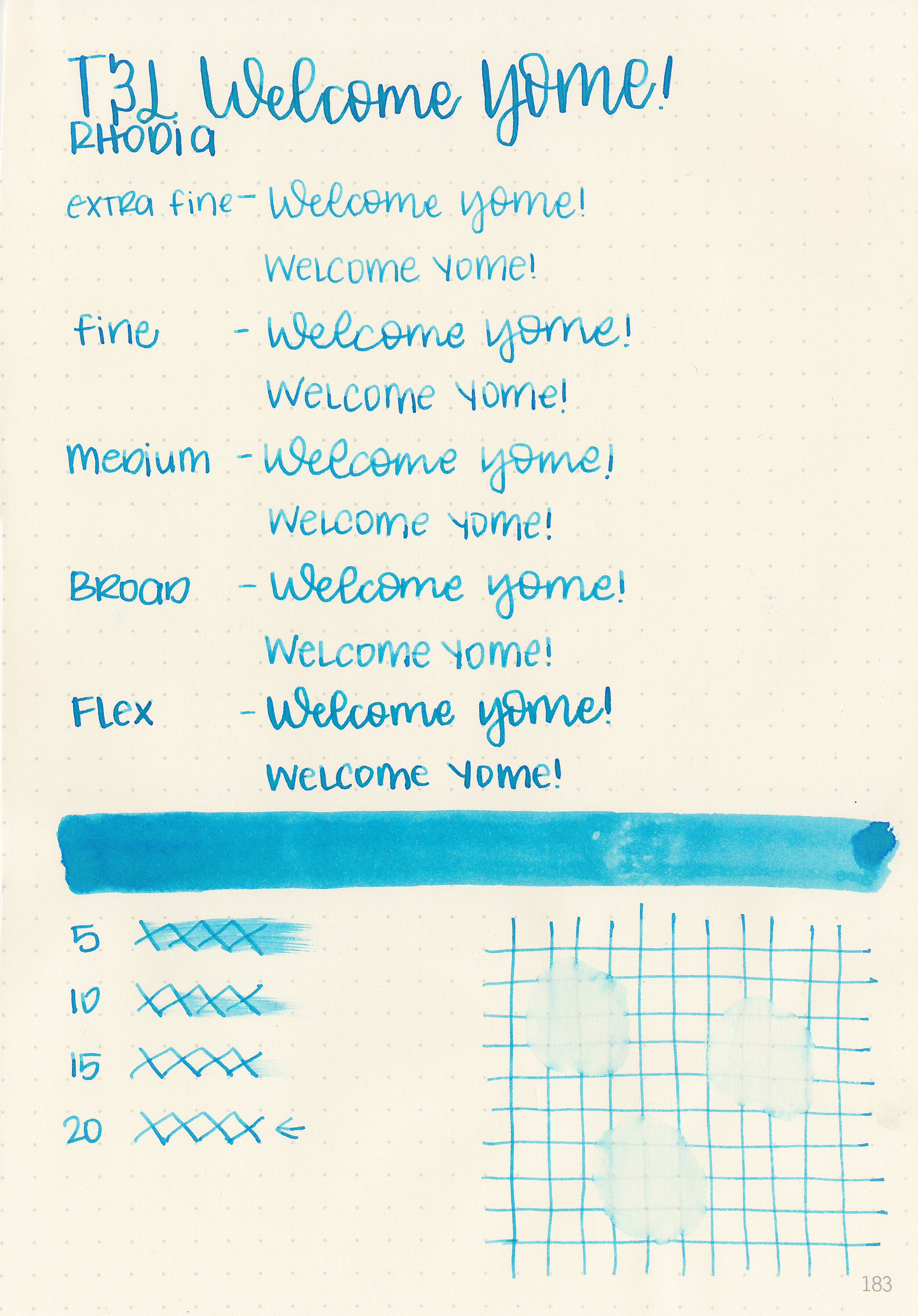
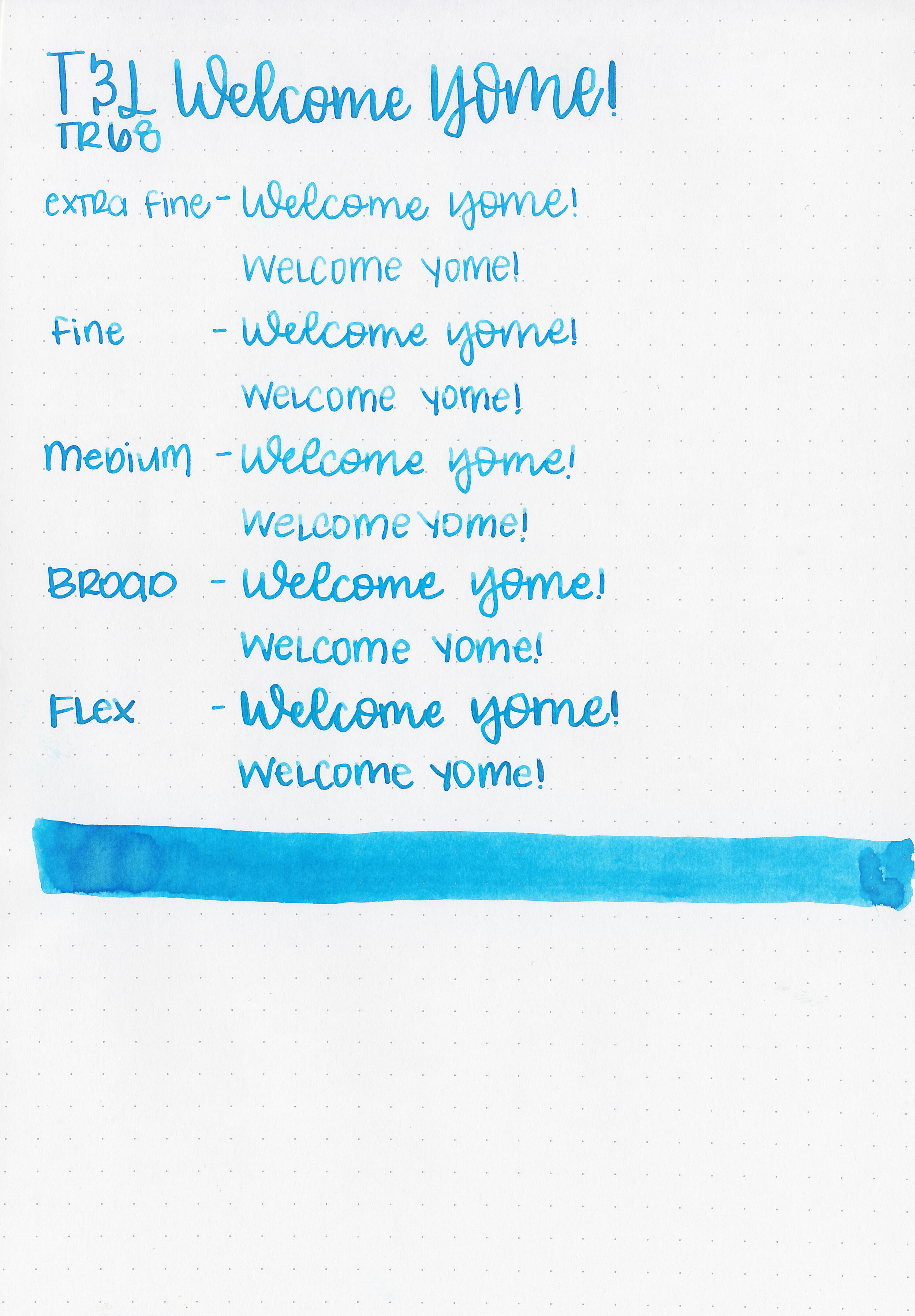
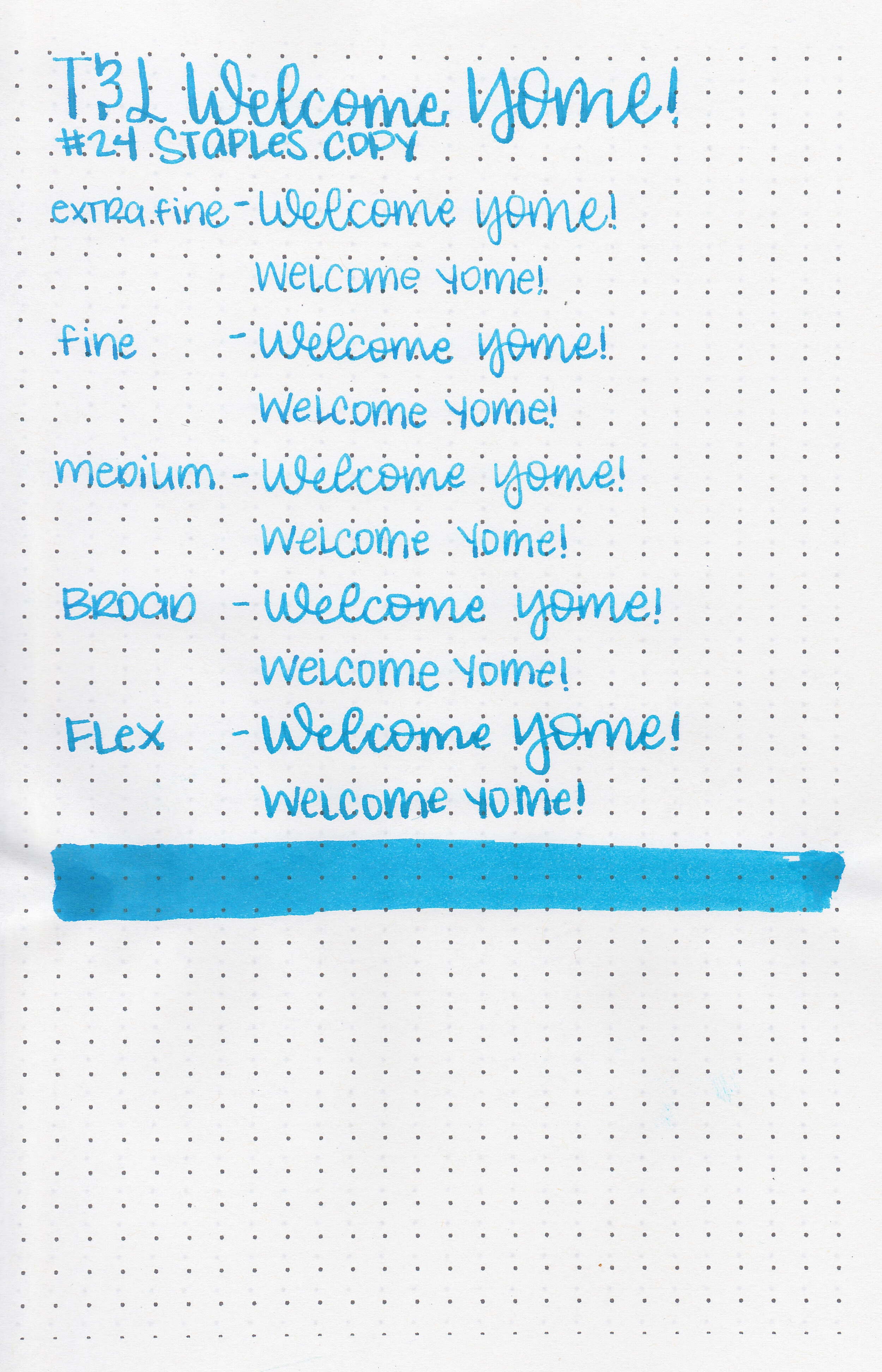
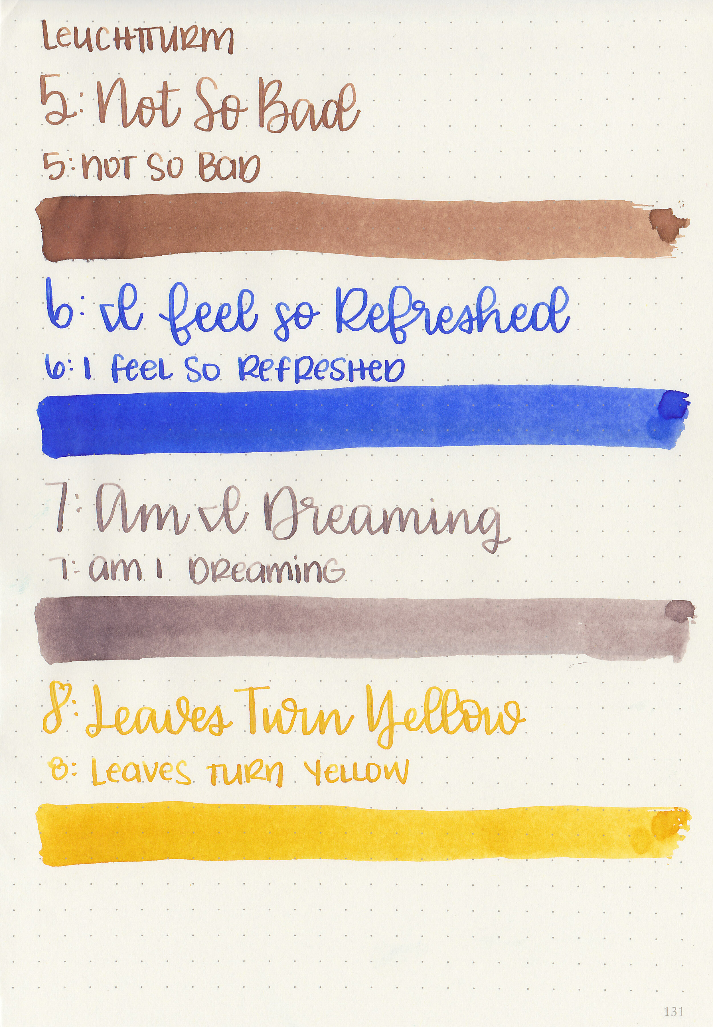
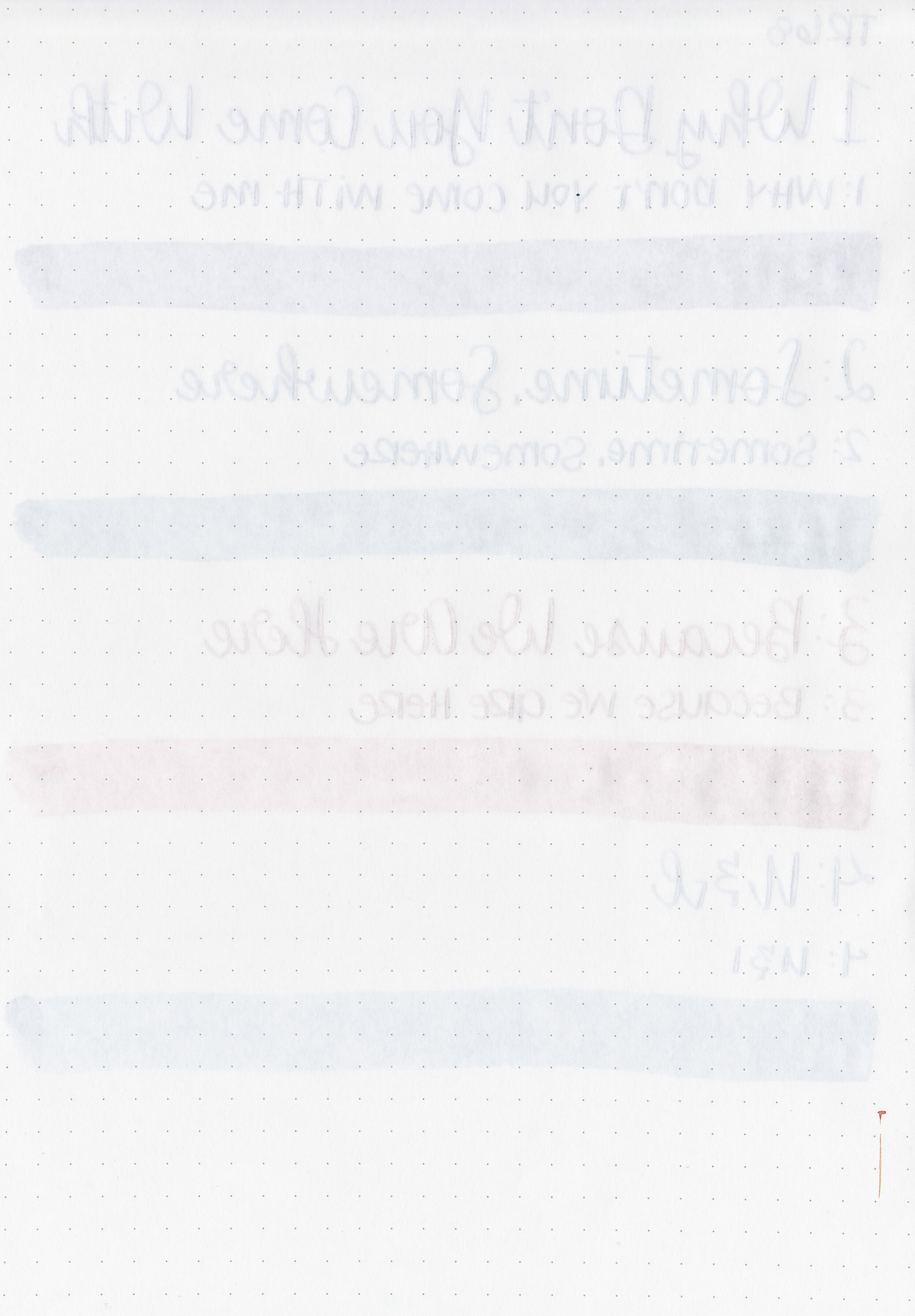
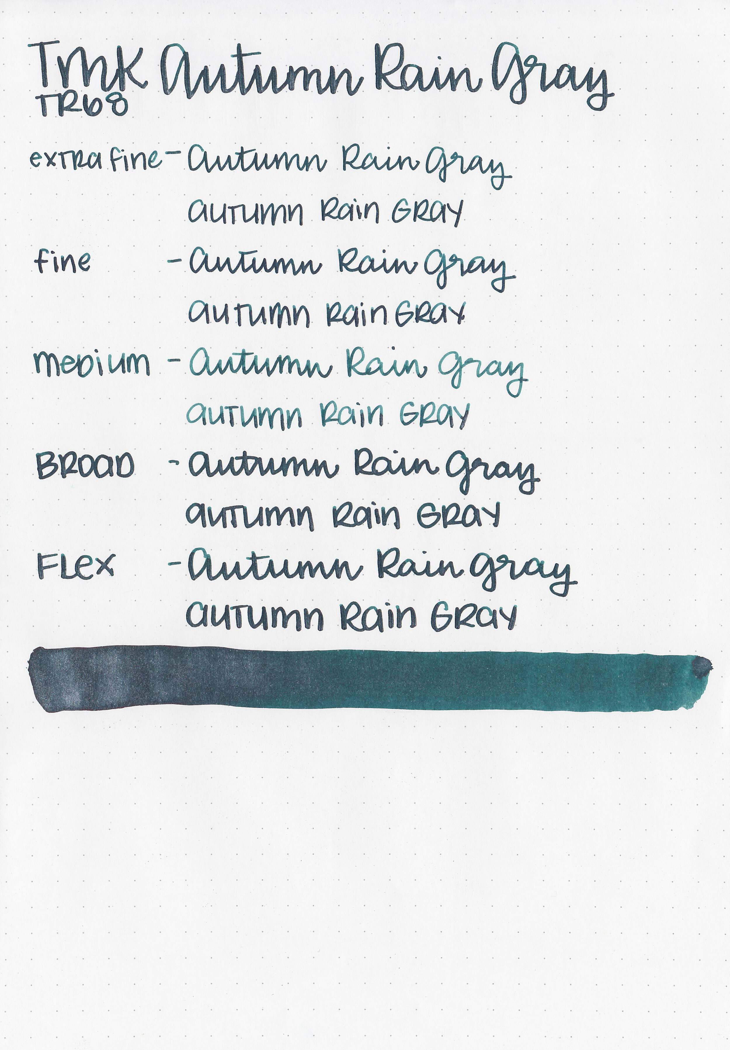
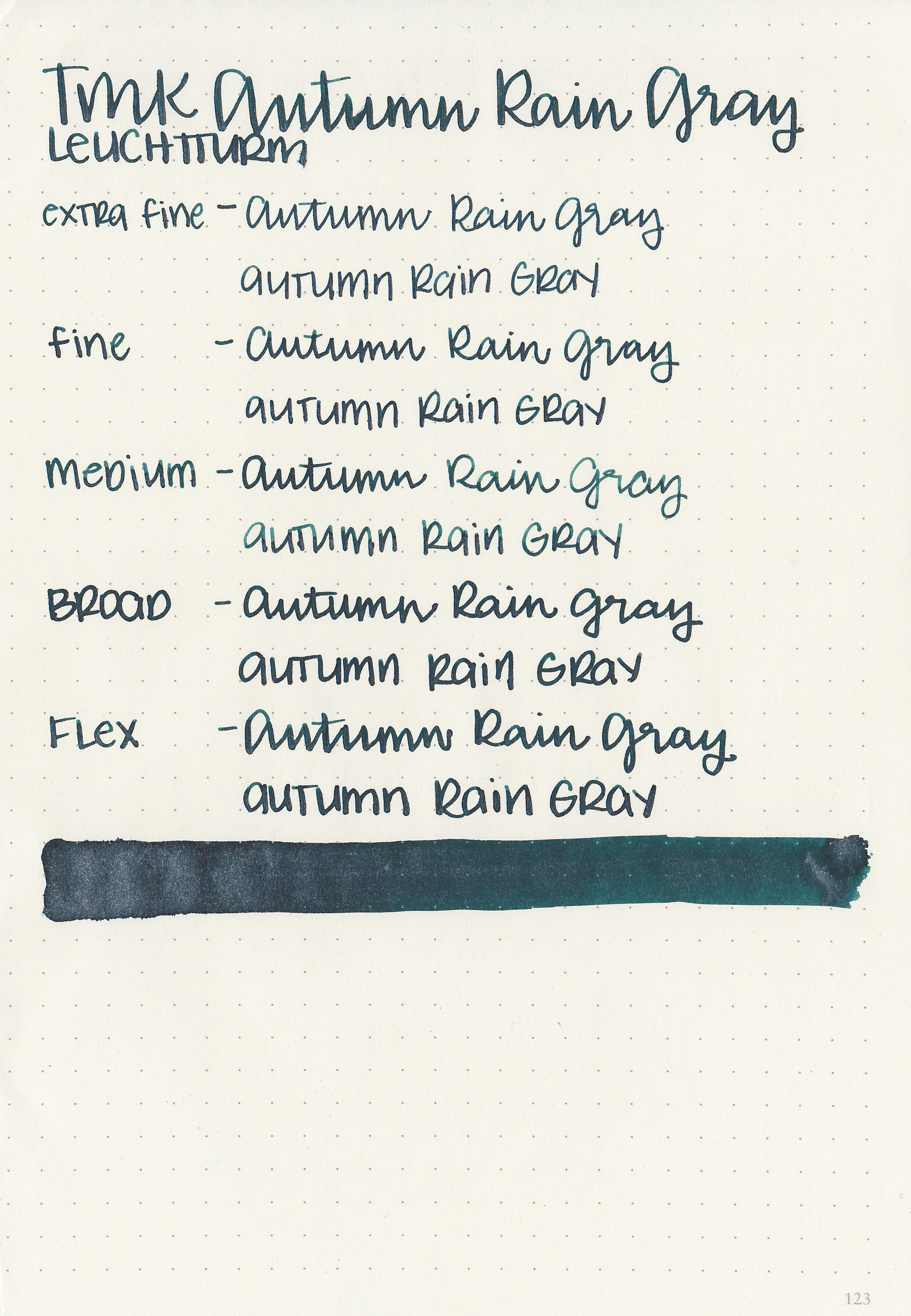
Let's take a look at how the ink behaves on fountain pen friendly papers: Rhodia, Tomoe River, and Leuchtturm.
Water resistance: Low
Feathering: None
Show through: Medium
Bleeding: None
Other properties: very low shading, no sheen, and no shimmer.
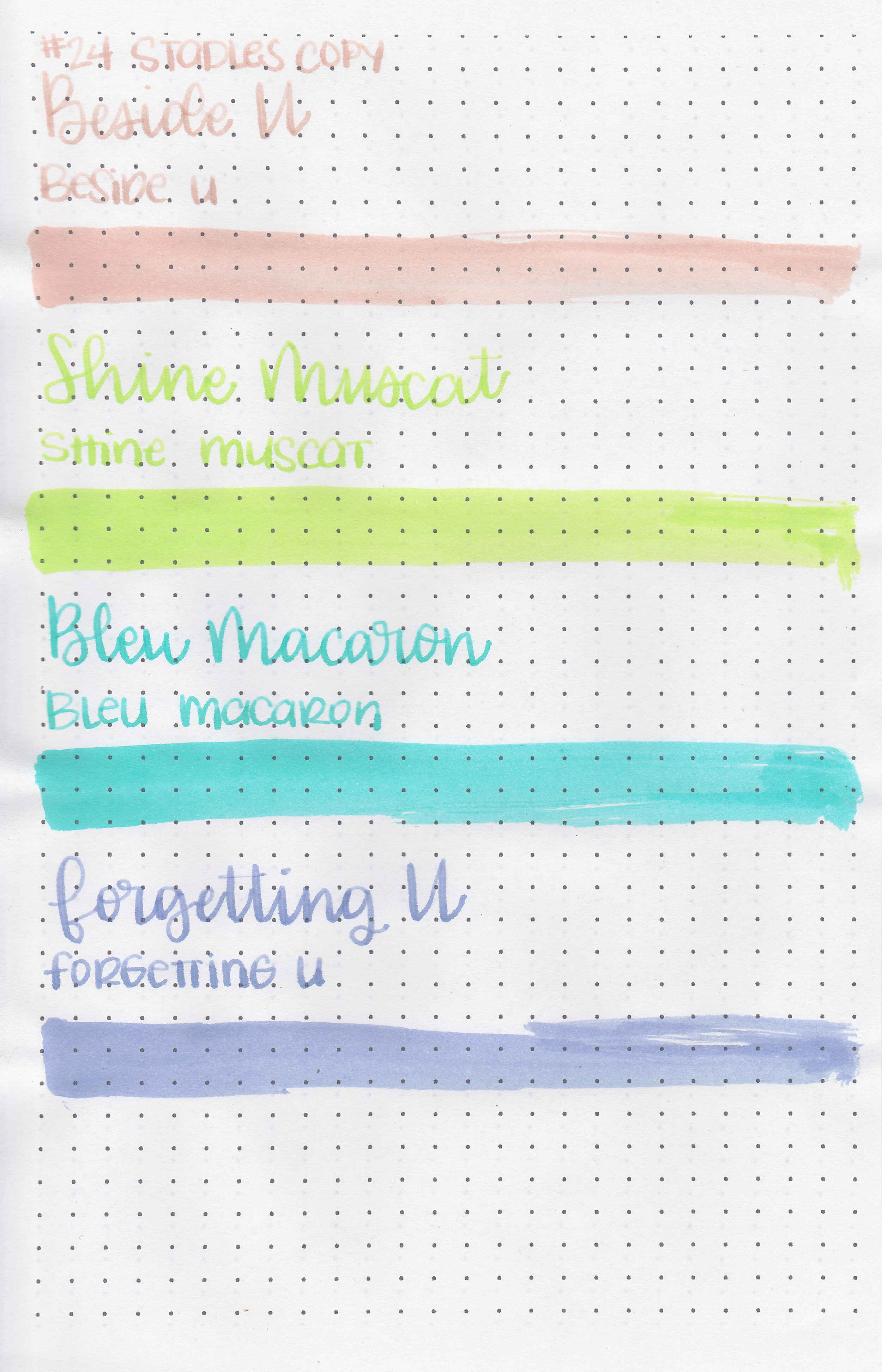
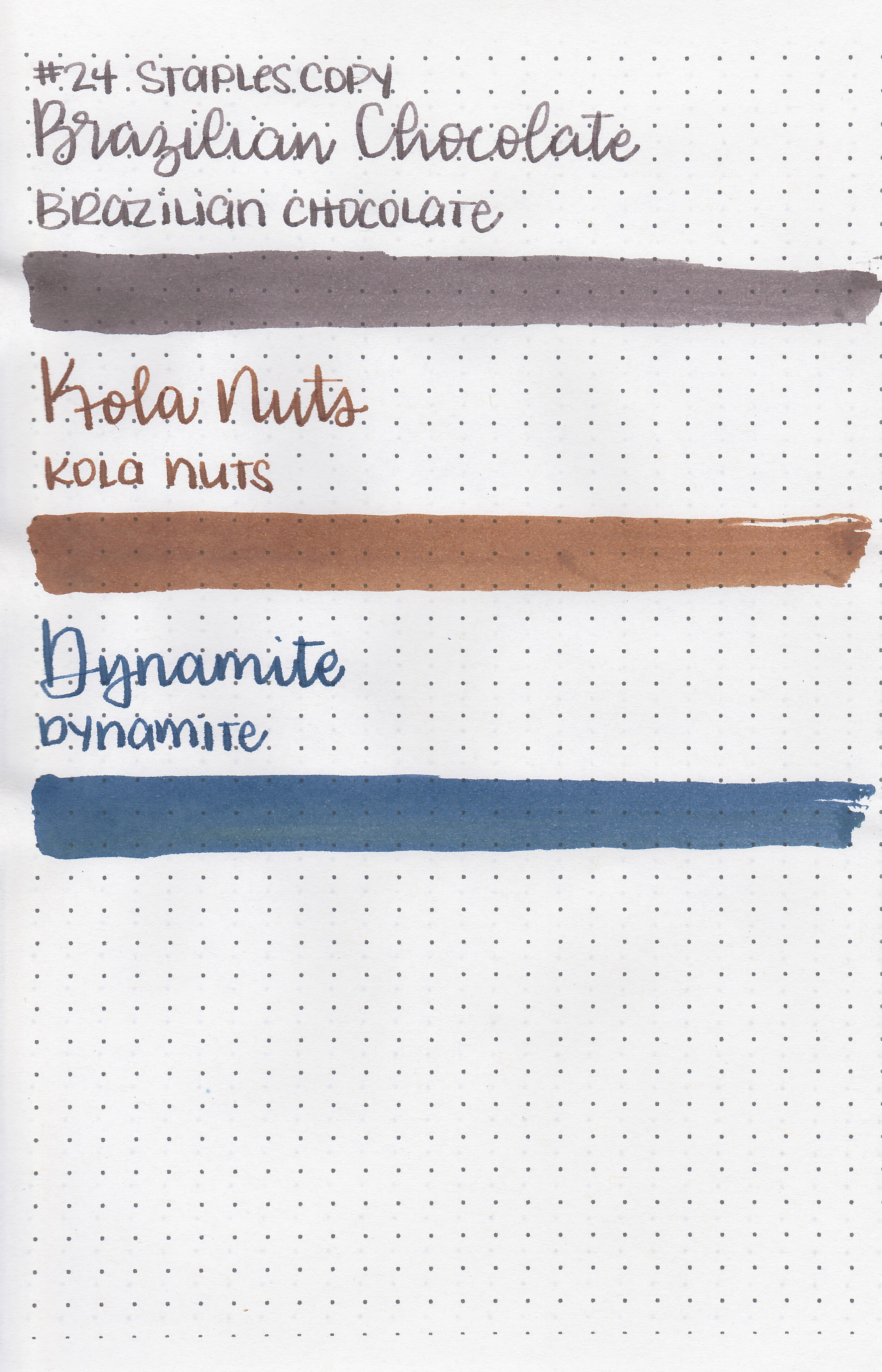
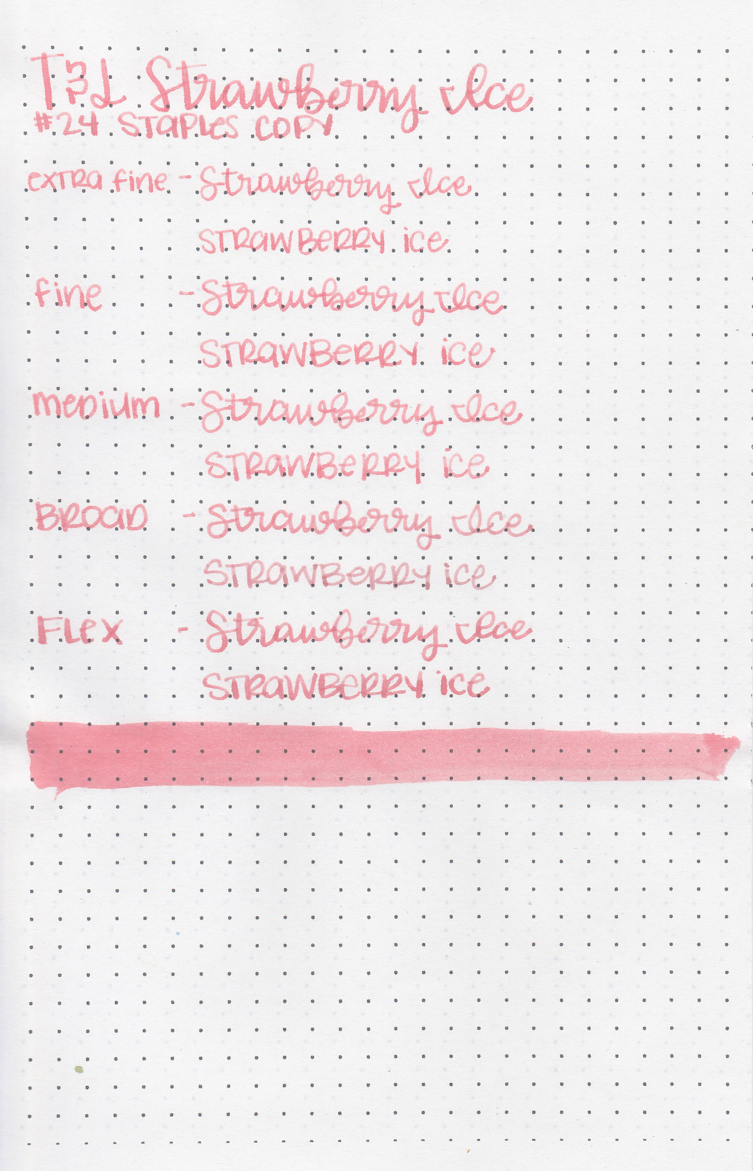
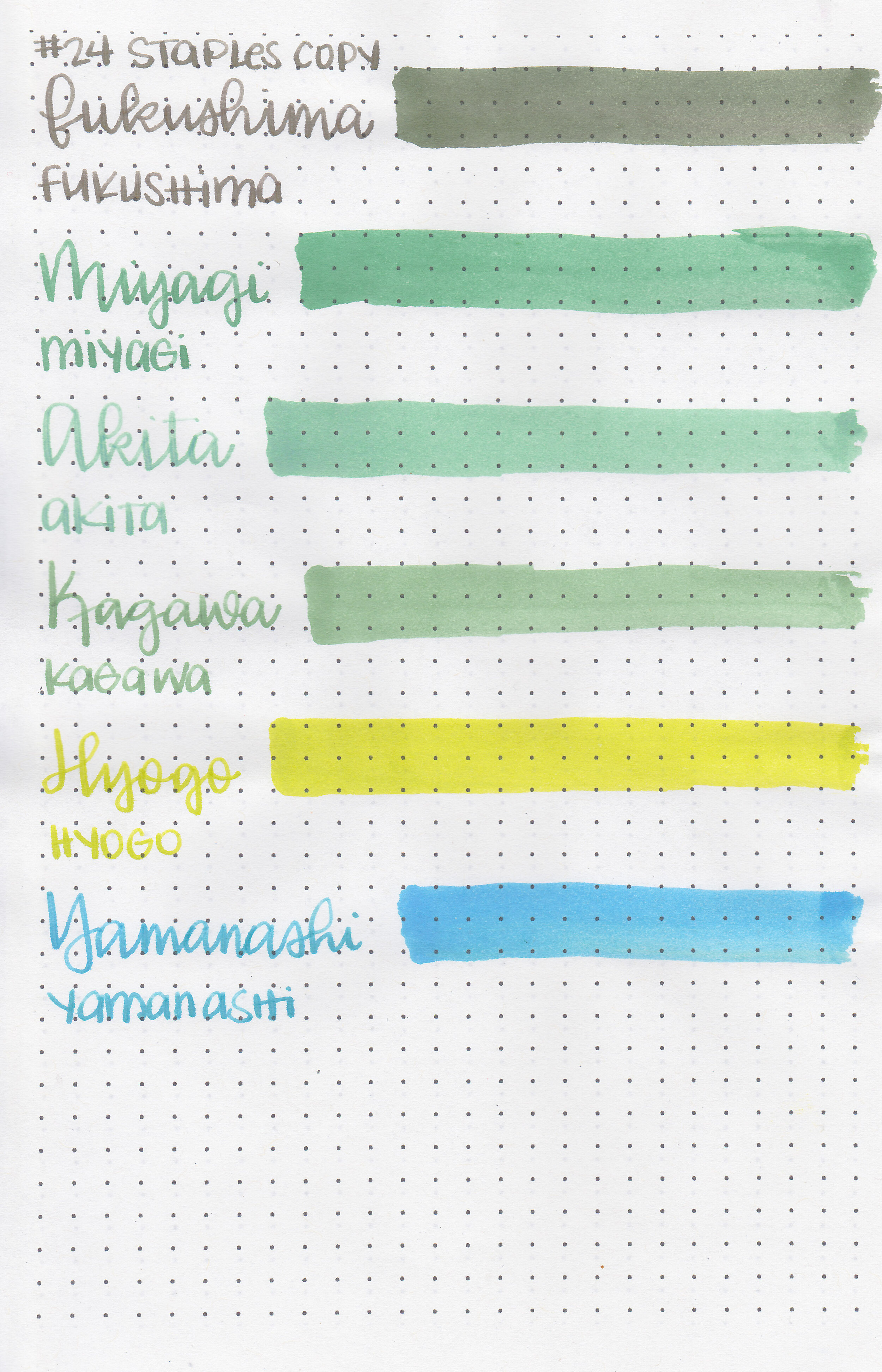
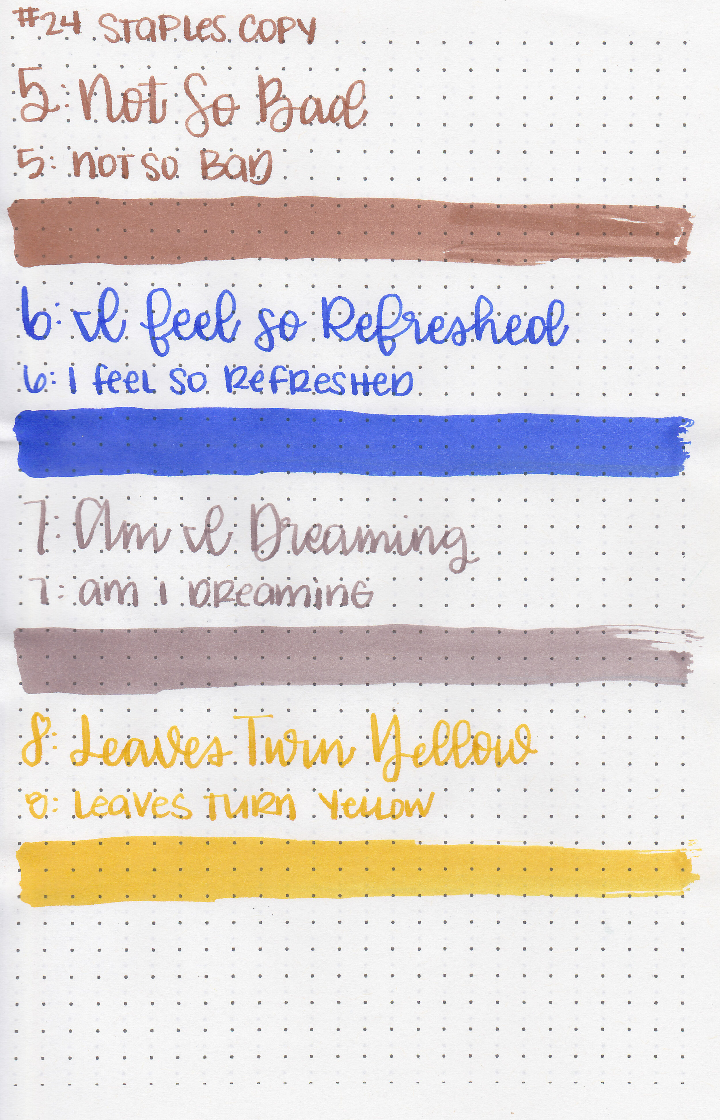
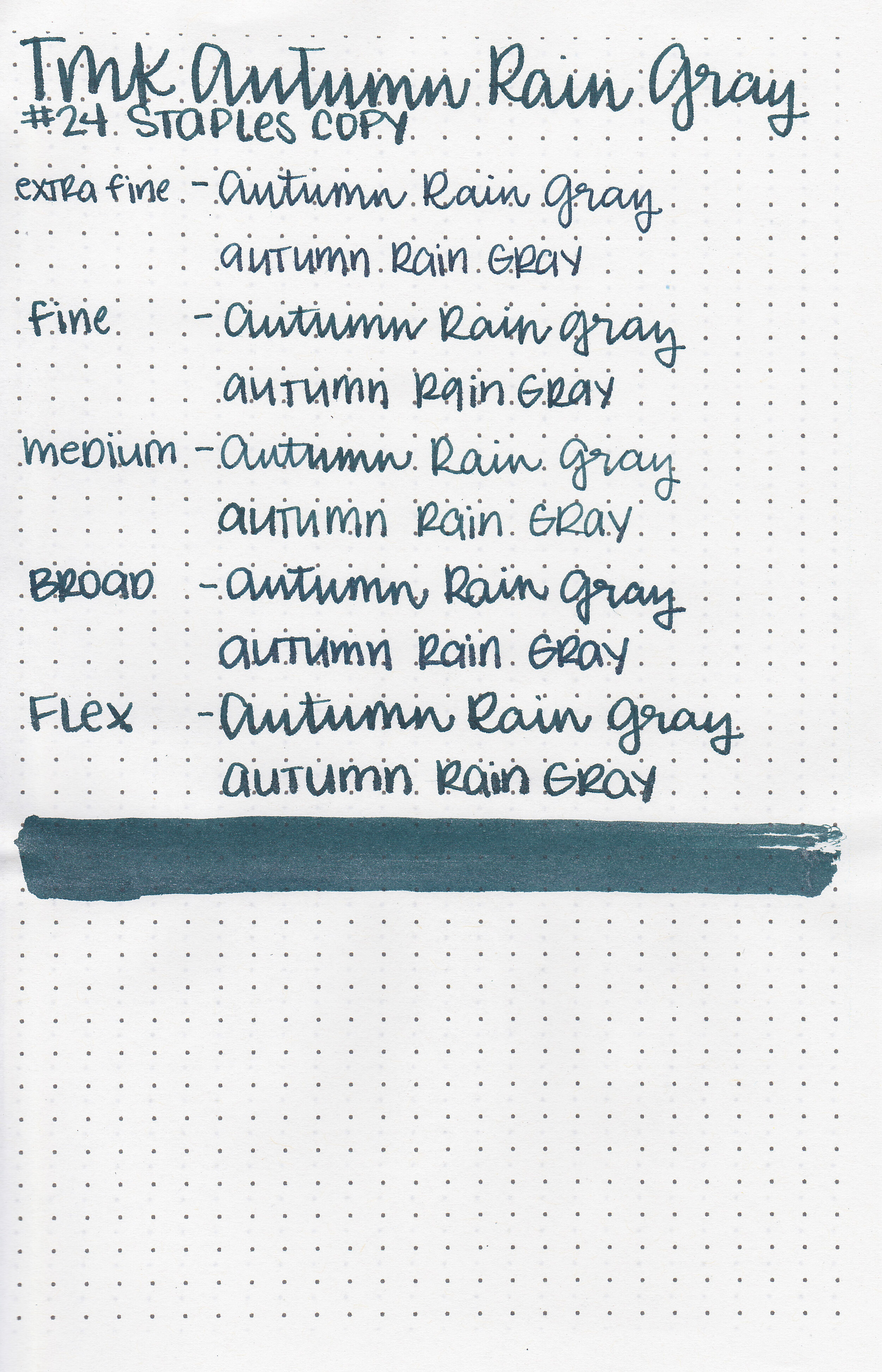
On Staples 24 lb copy paper there was lots of feathering in every nib size as well as a little bleeding.
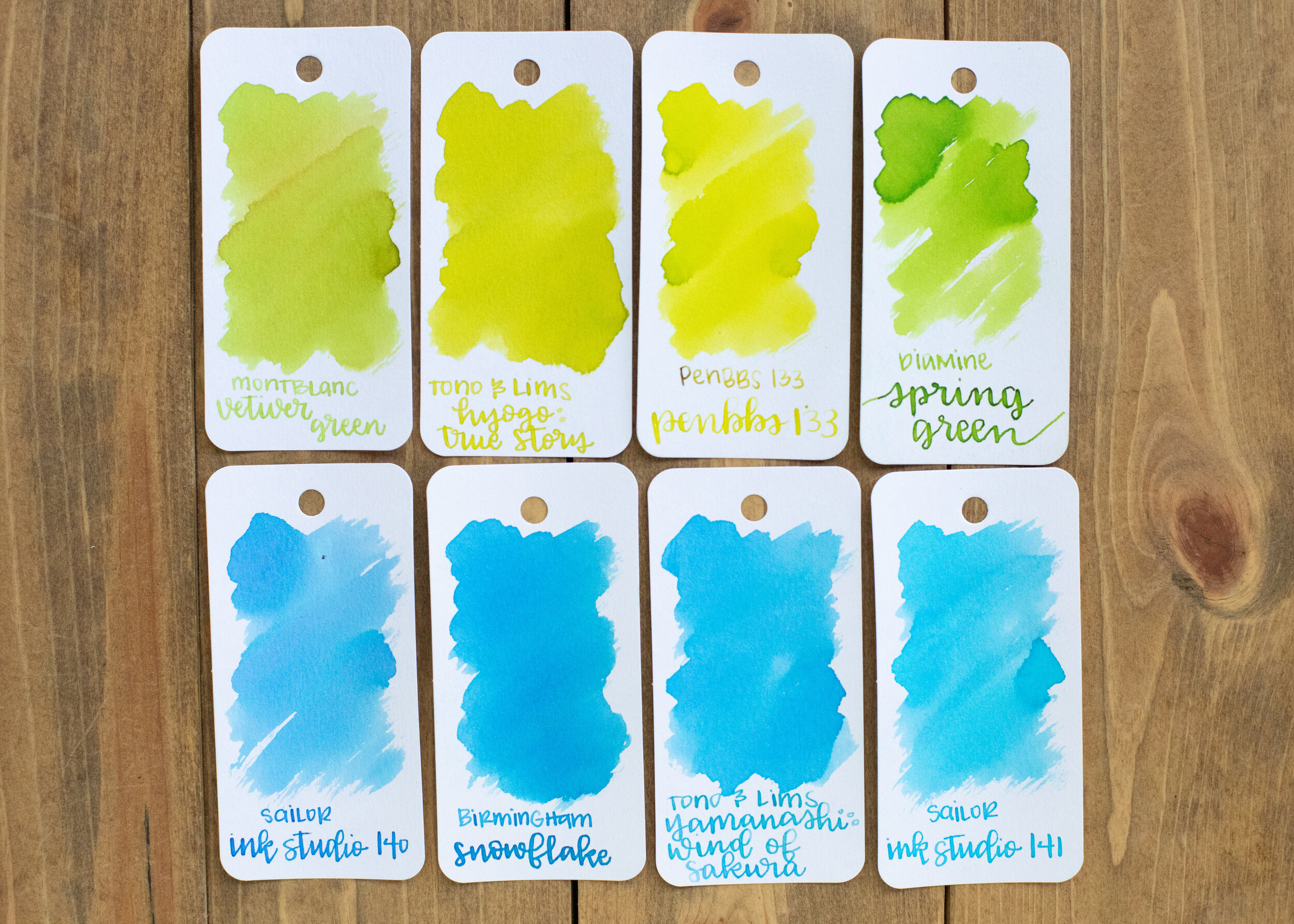
Comparison Swabs:

Forgetting U is less saturated than Robert Oster Grey Seas. Bleu Macaron is lighter than Diamine Soft Mint but darker than Lennon Tool Bar Qiancong. Shine Muscat is lighter than both Diamine Jade Green and Birmingham Parrot. Beside U is lighter and less saturated than Sailor Ink Studio 173.

I used an A5 Yoseka notebook. All of the inks had a slightly dry flow.
Overall, these inks fit in the pastel style that’s really popular right now. Out of these 4 I actually like Beside U the best, which surprised me. It’s more unique than the others, and was easily read in a medium nib.
Disclaimer: These inks were provided by Shigure Inks for the purpose of this review. All photos and opinions are my own. This page does not contain affiliate links, and is not sponsored in any way.