3 Oysters DIY My Color Kit
/
3 Oysters recently sent me their new DIY My Color kit to try out, so I’ve been having fun all week coming up with different ways to use it.

The kit comes in a useful silver tin, packaged well. The kit includes:
10-5ml bottles of ink
2-5ml bottles of ink toner
1 glass pen-mine is green
2-5ml beakers
1-5ml empty glass bottle with eyedropper top
Instruction book
4 coloring postcards

The instructions show how to mix inks, how to create lighter and darker colors, and a sample chart of possible colors. You can see this chart re-created below.
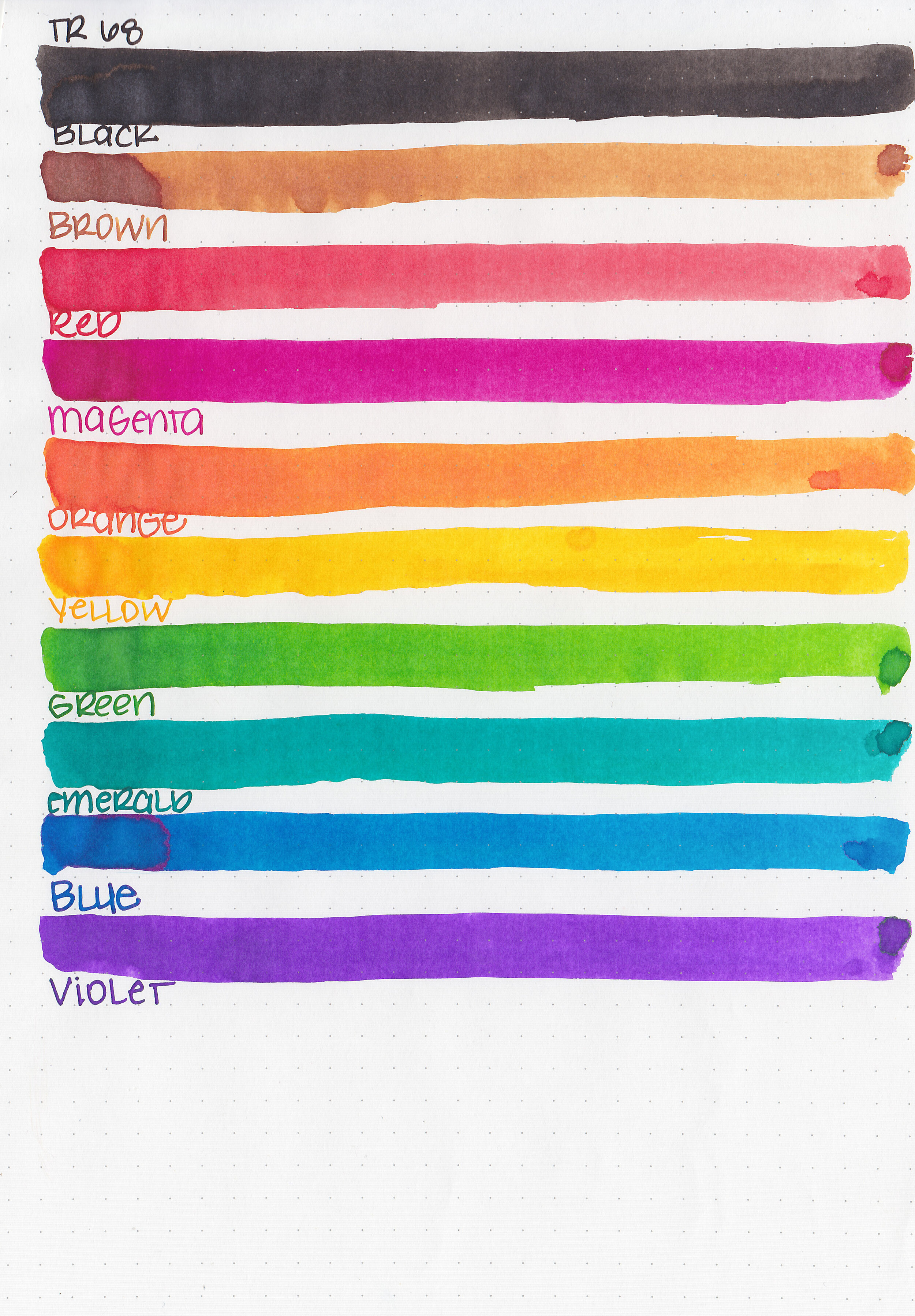
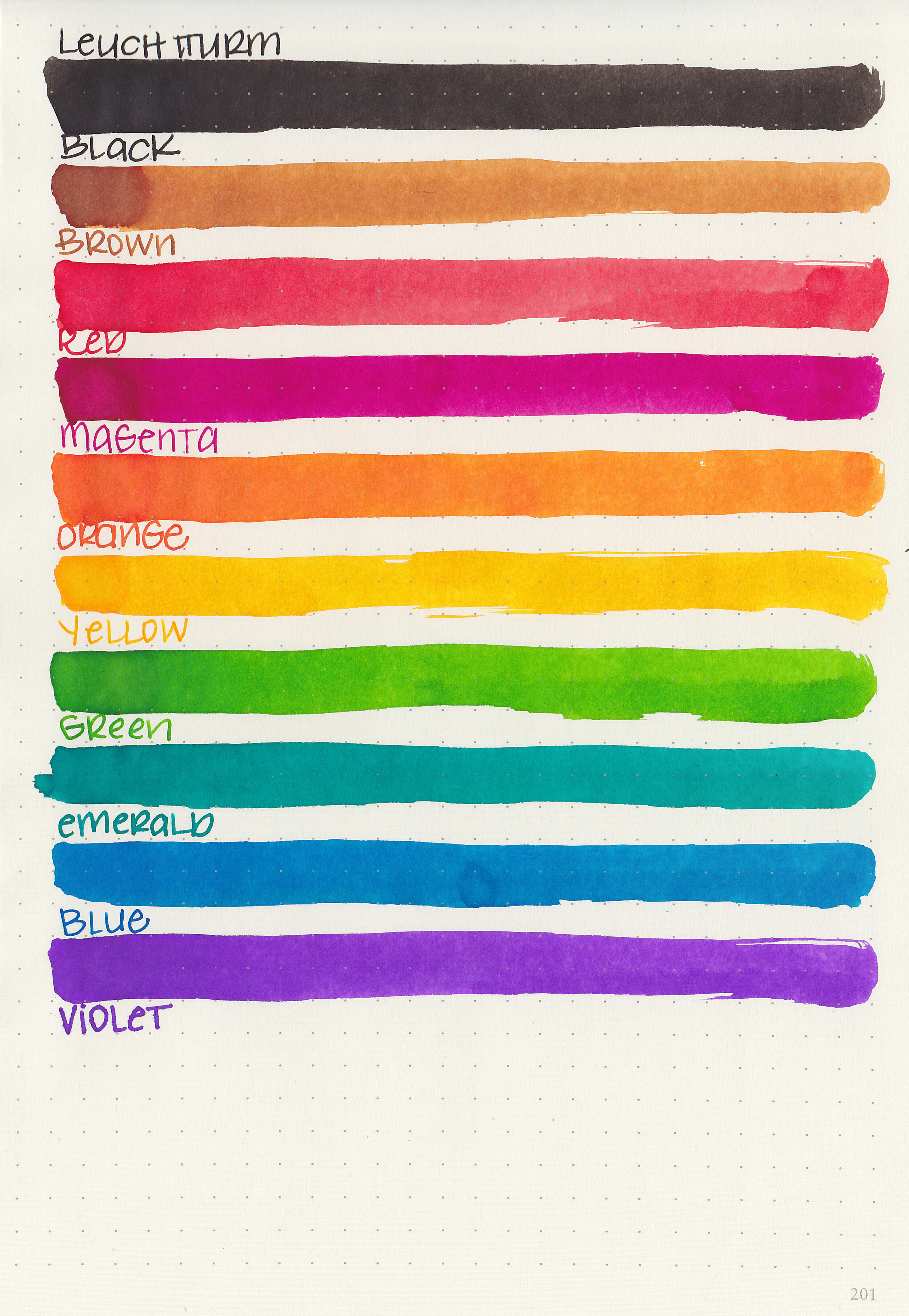
Swabs:
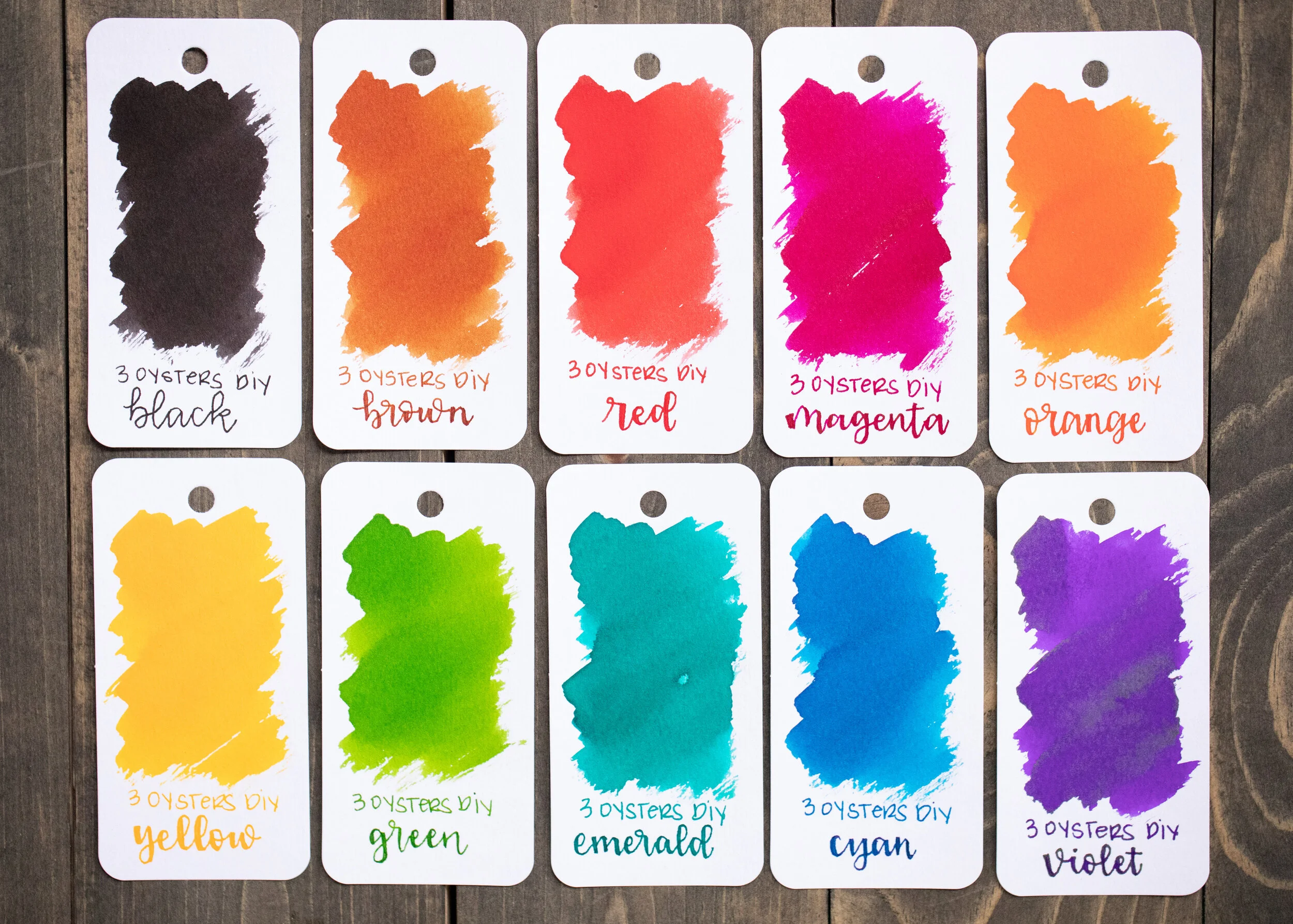
Left to right: Black, Brown, Red, Magenta, Orange, Yellow, Green, Emerald, Cyan and Violet.
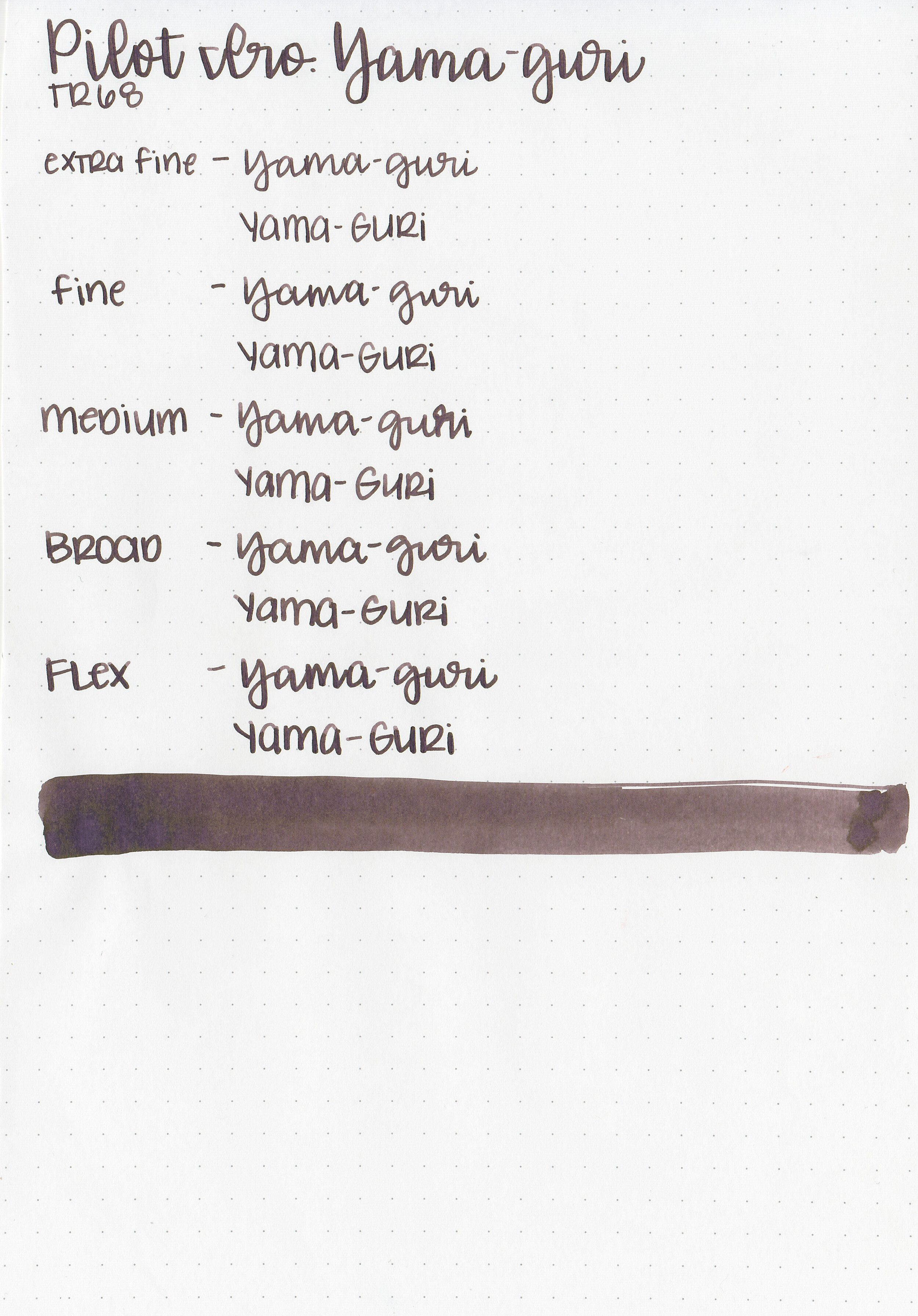
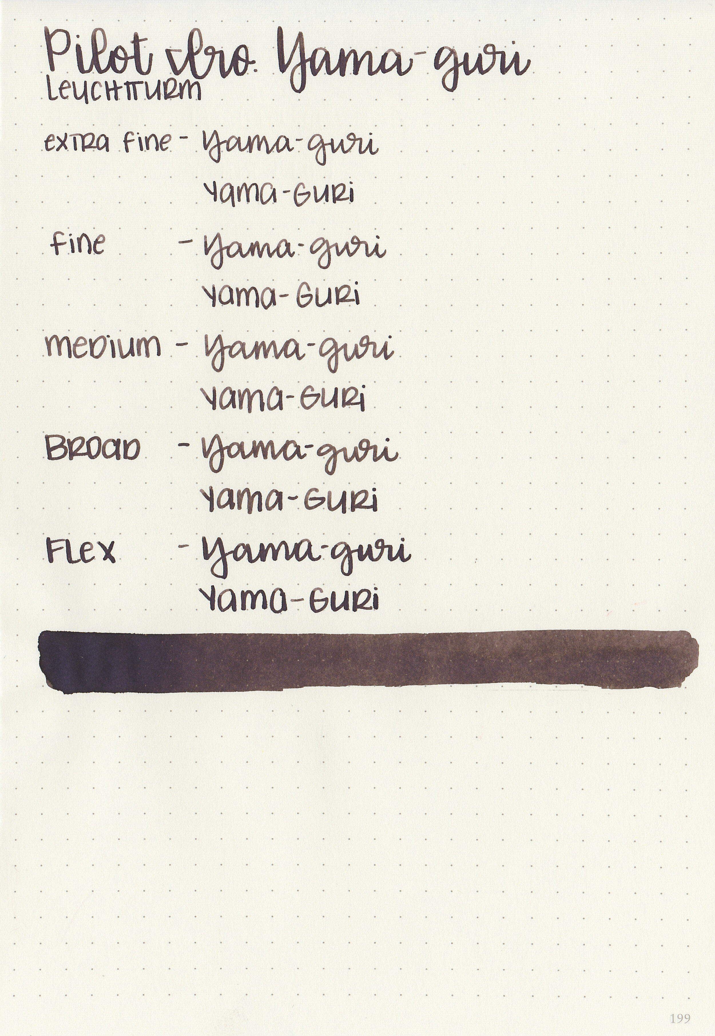
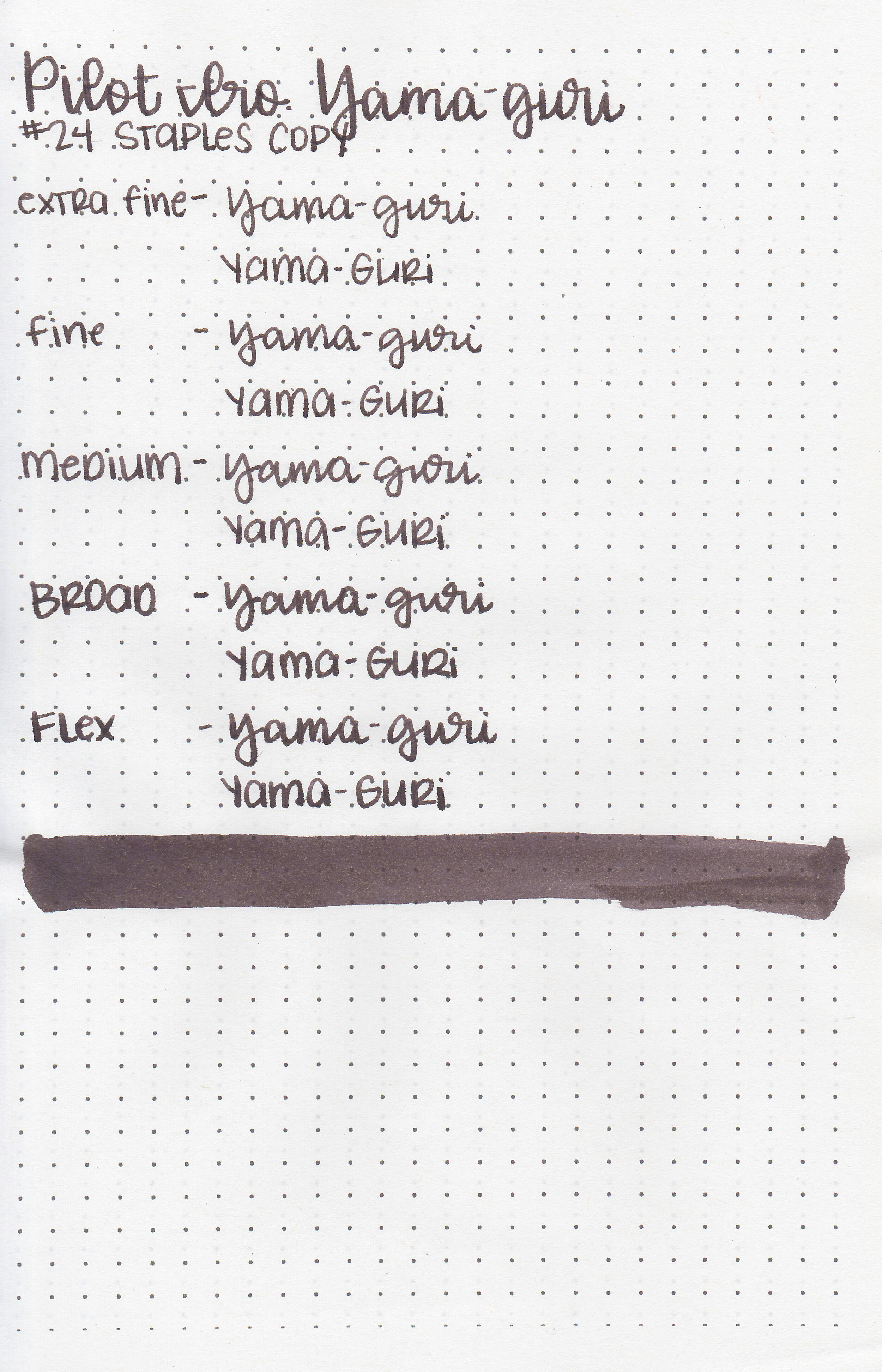
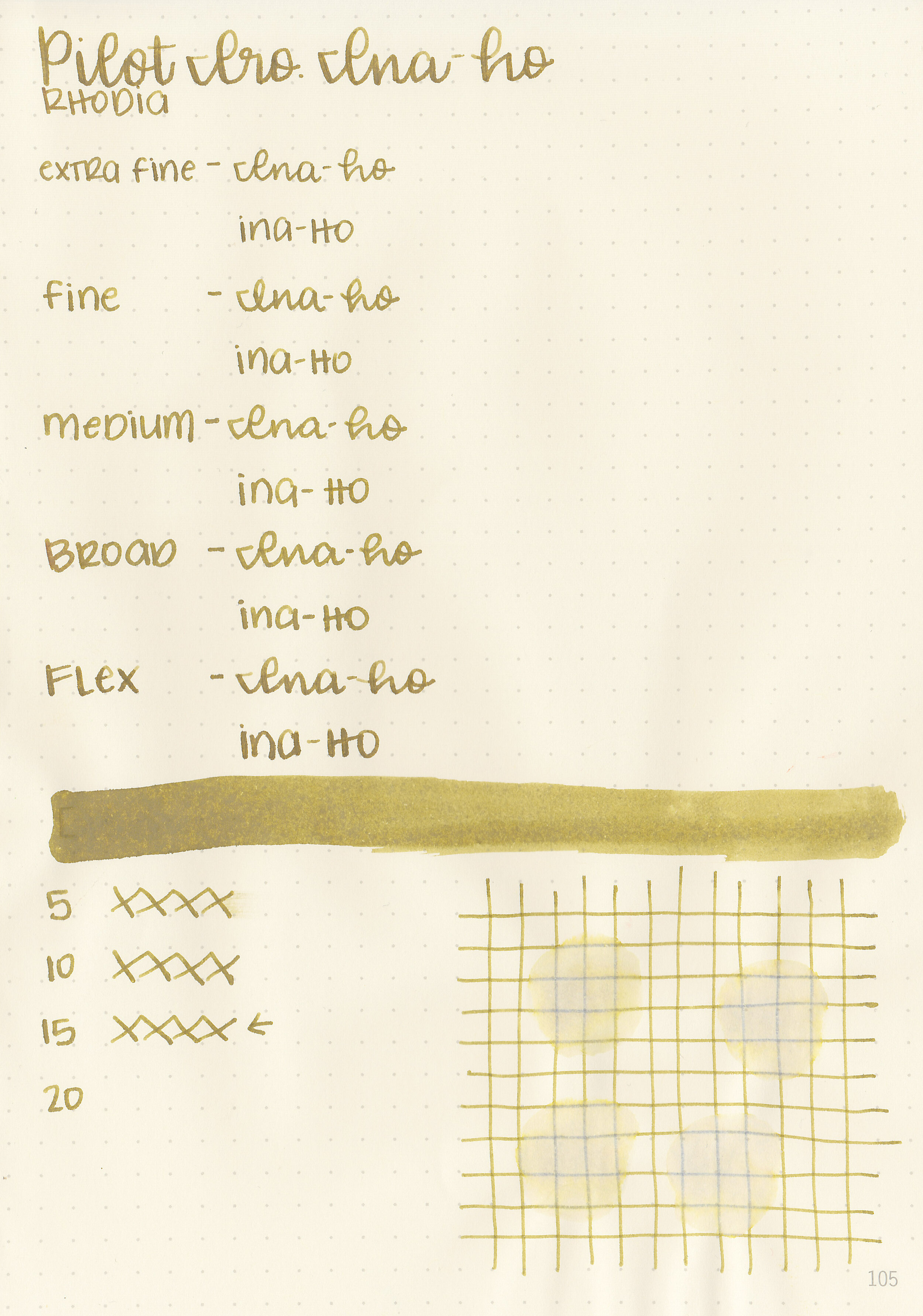
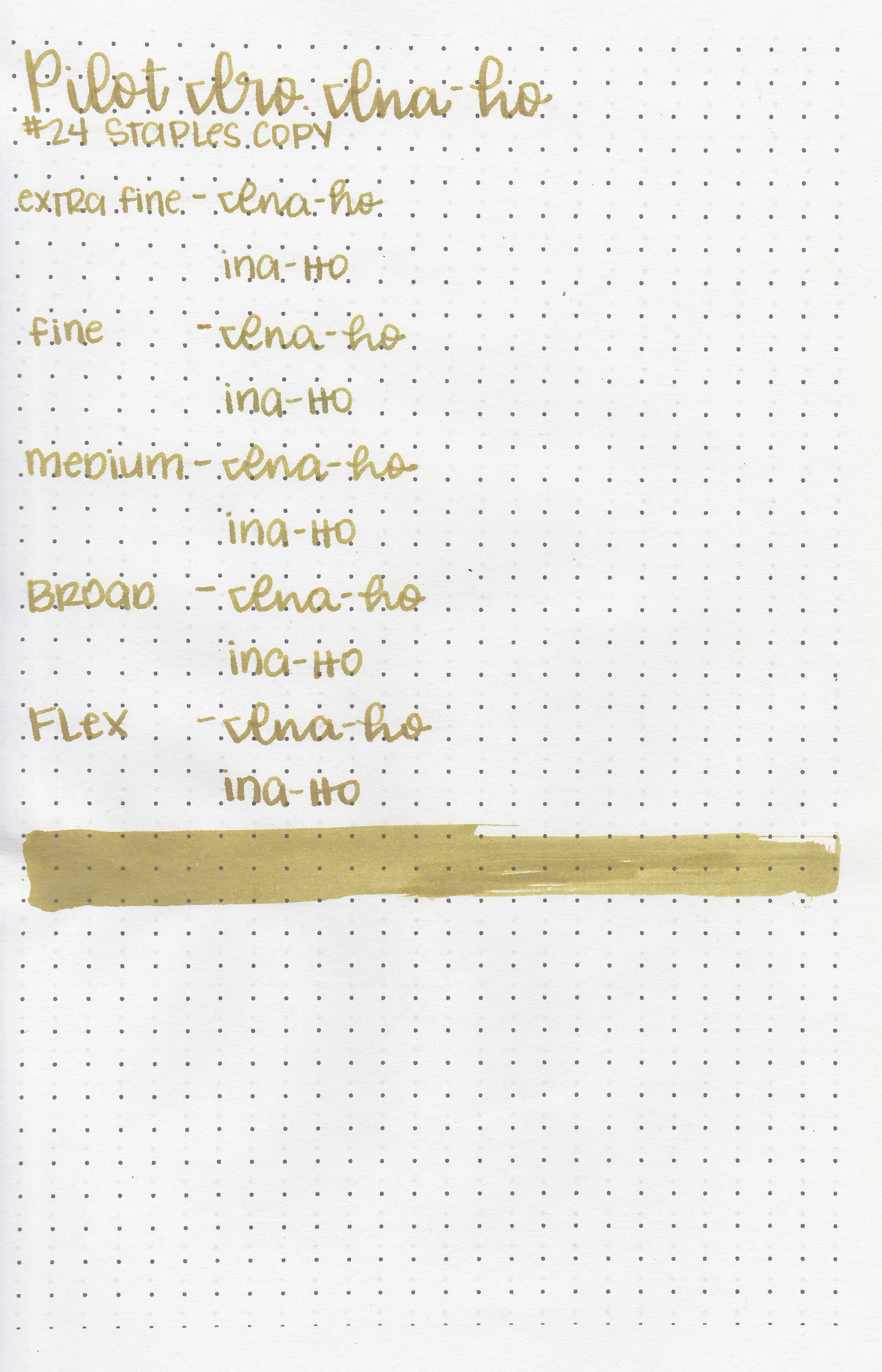
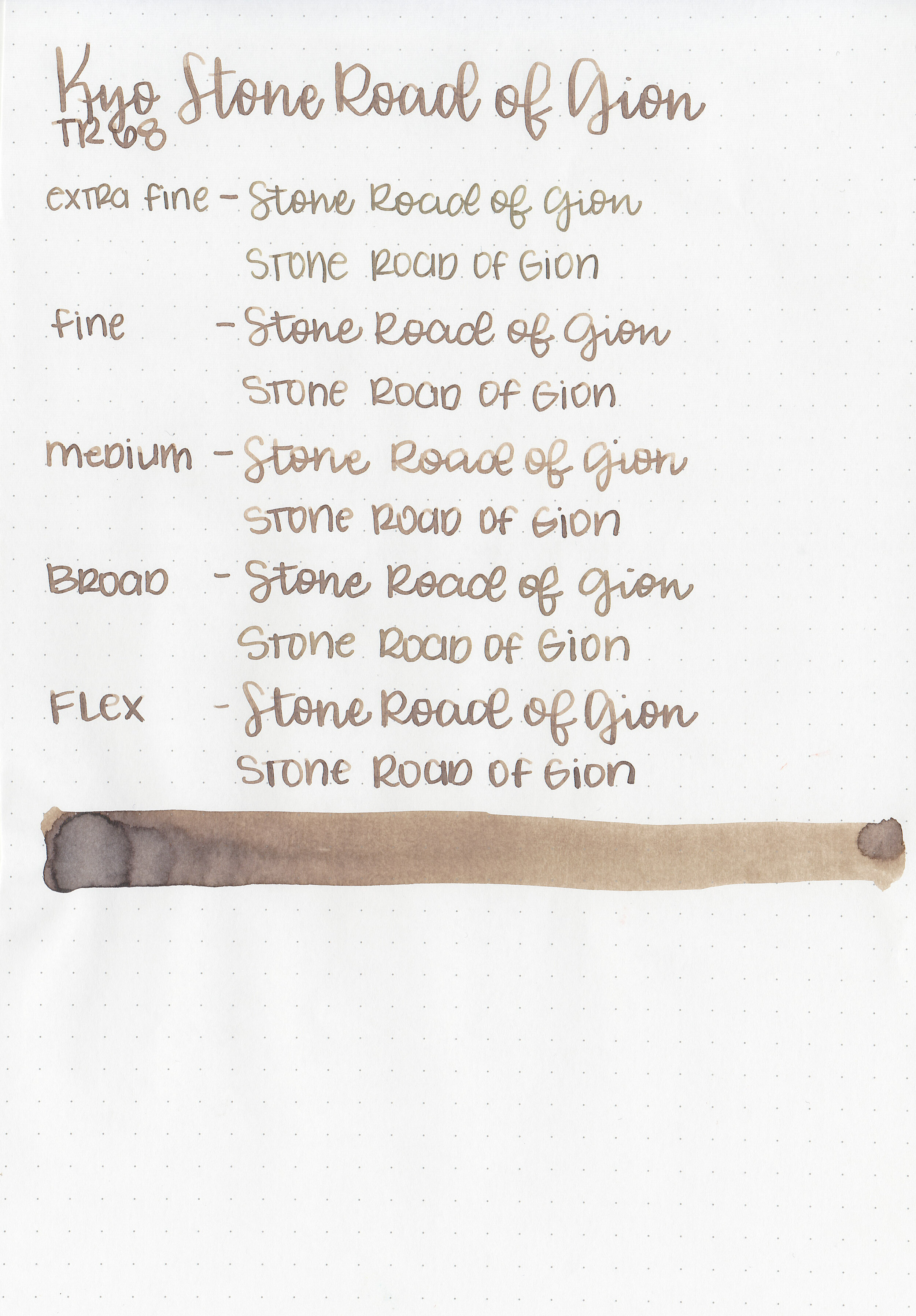
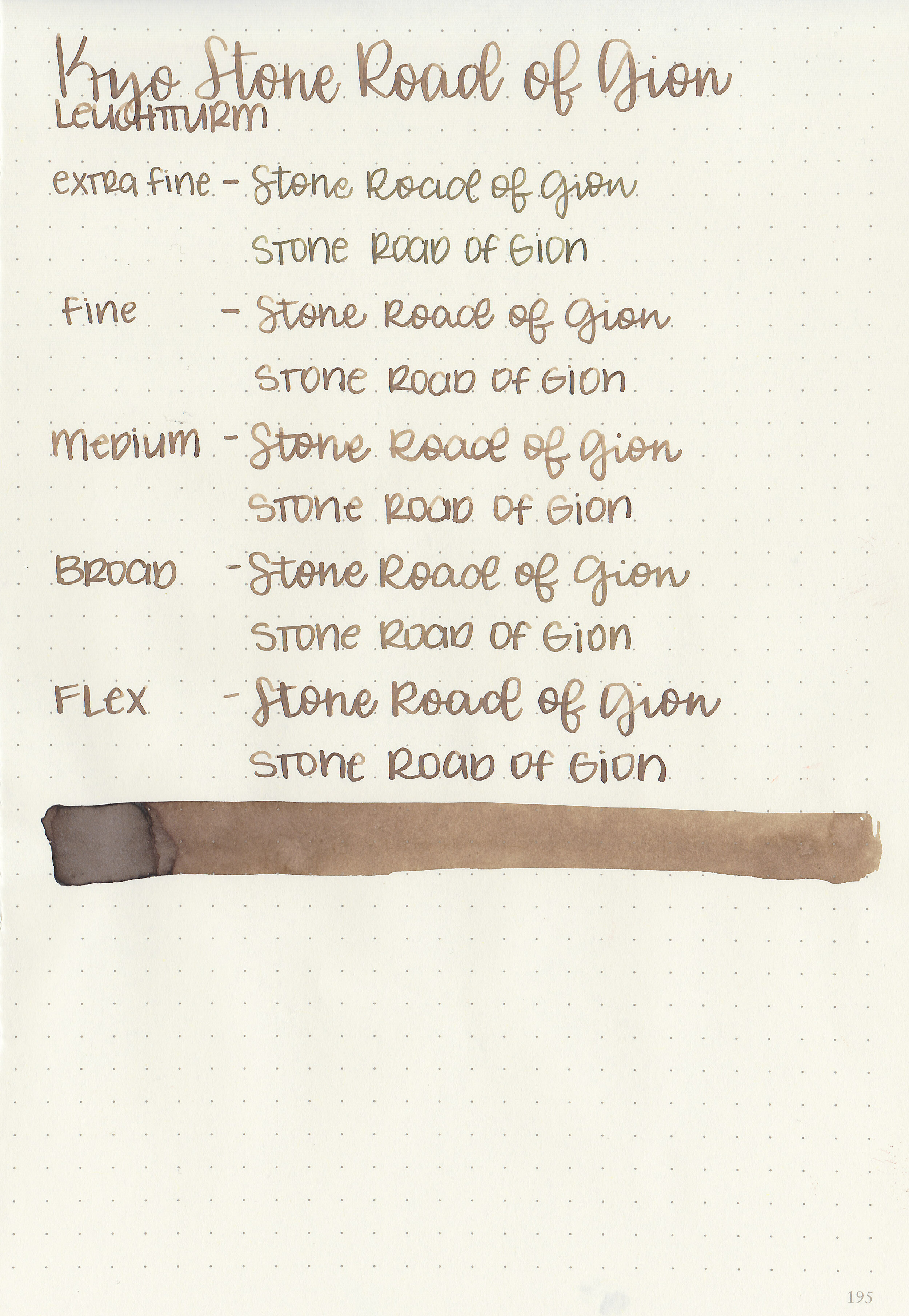
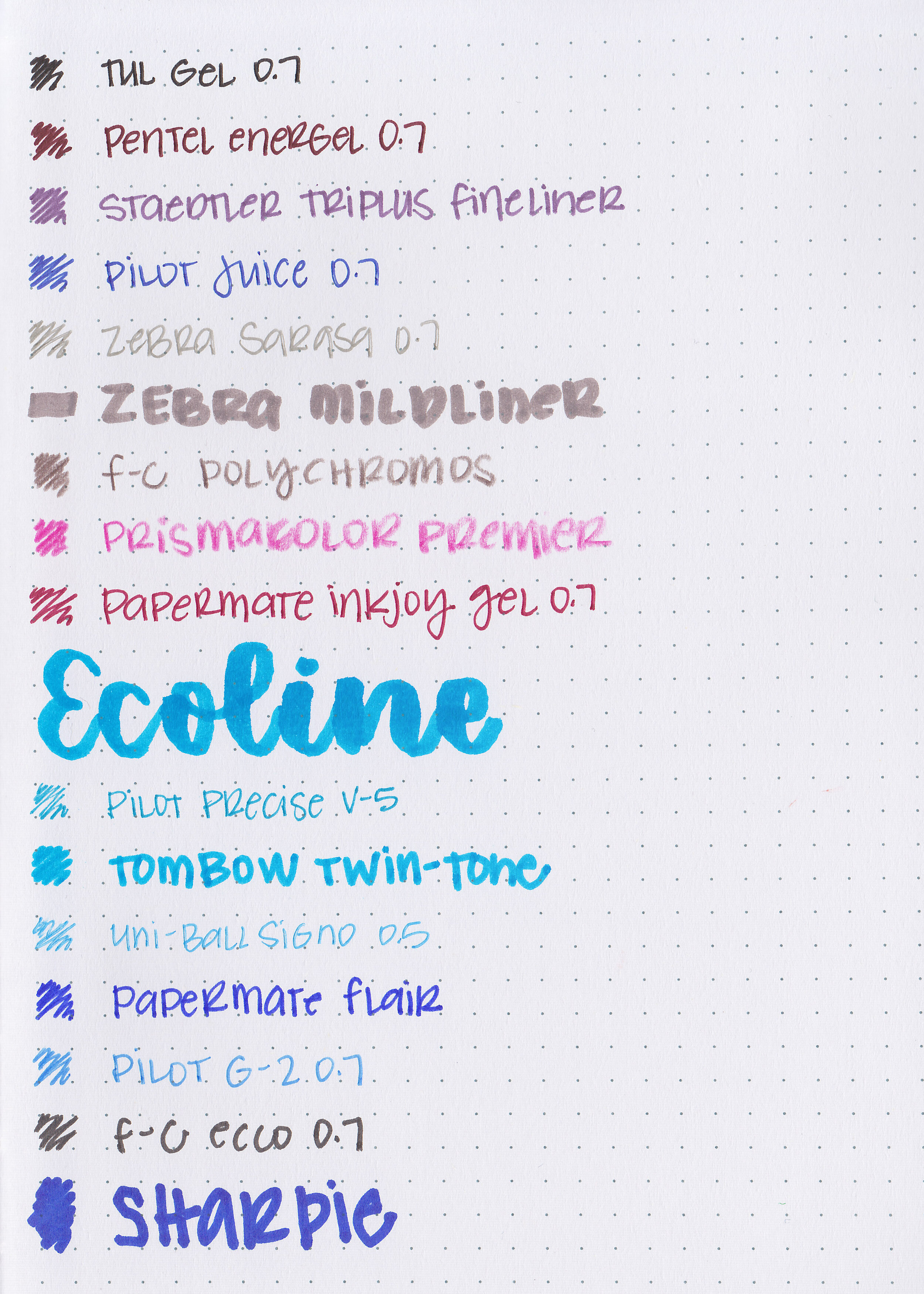
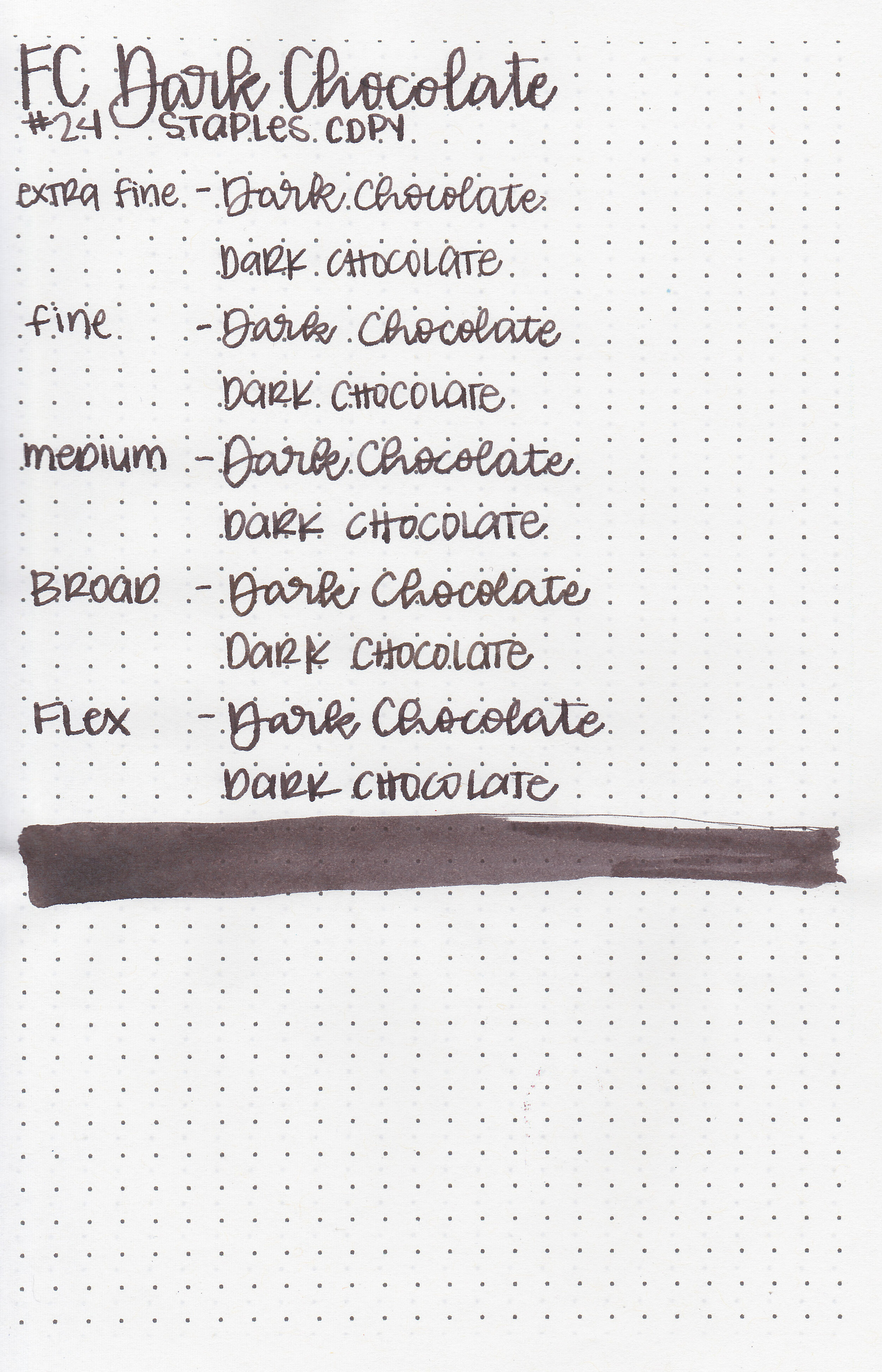
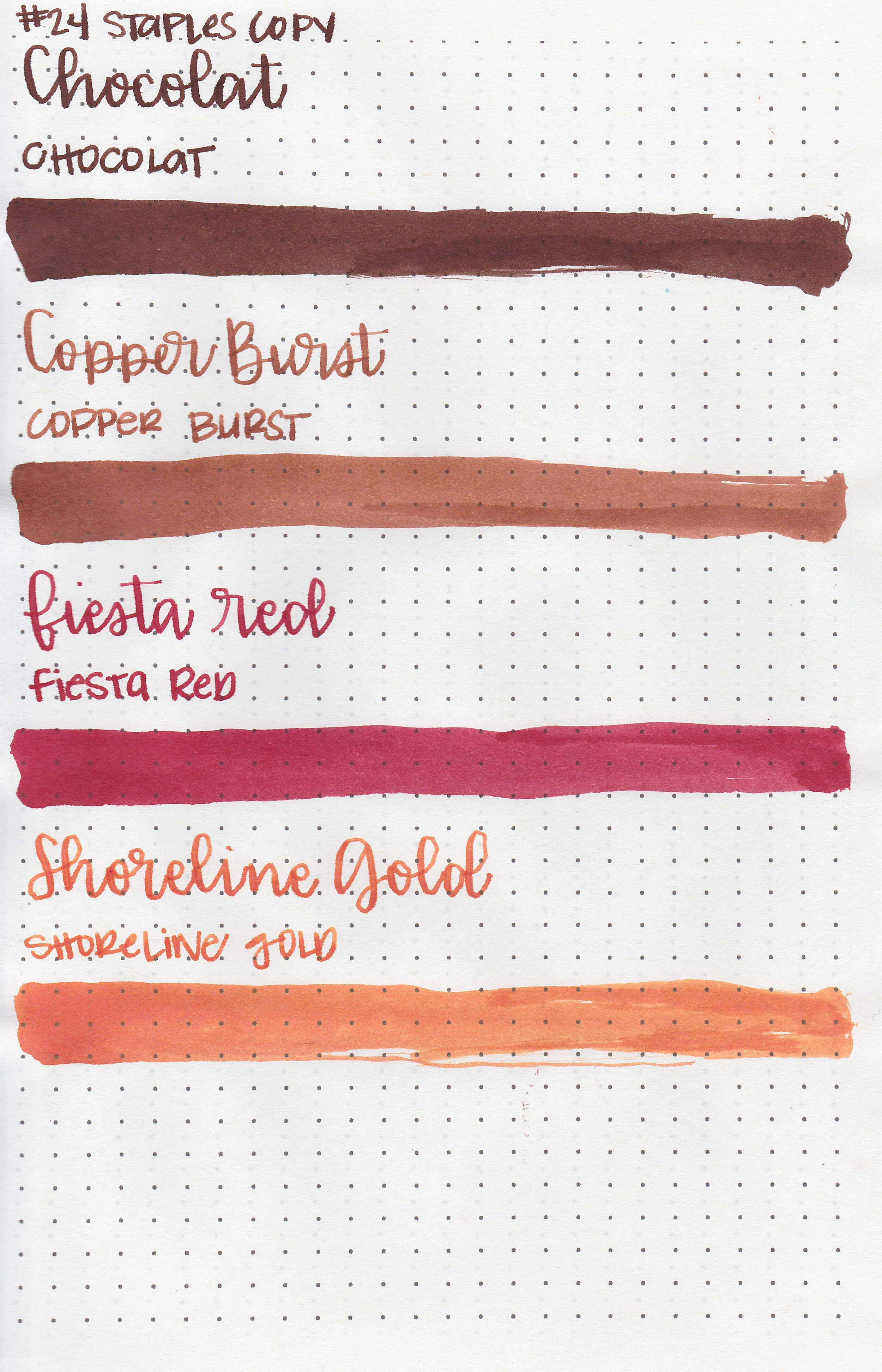
Writing samples:
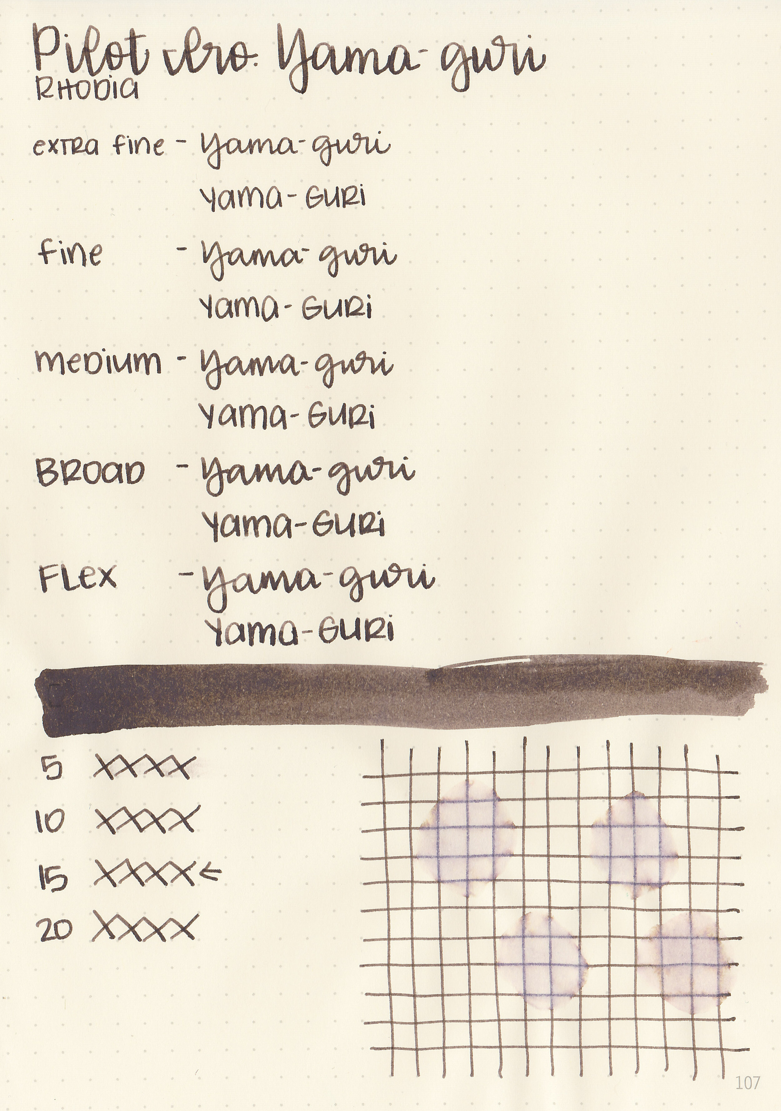
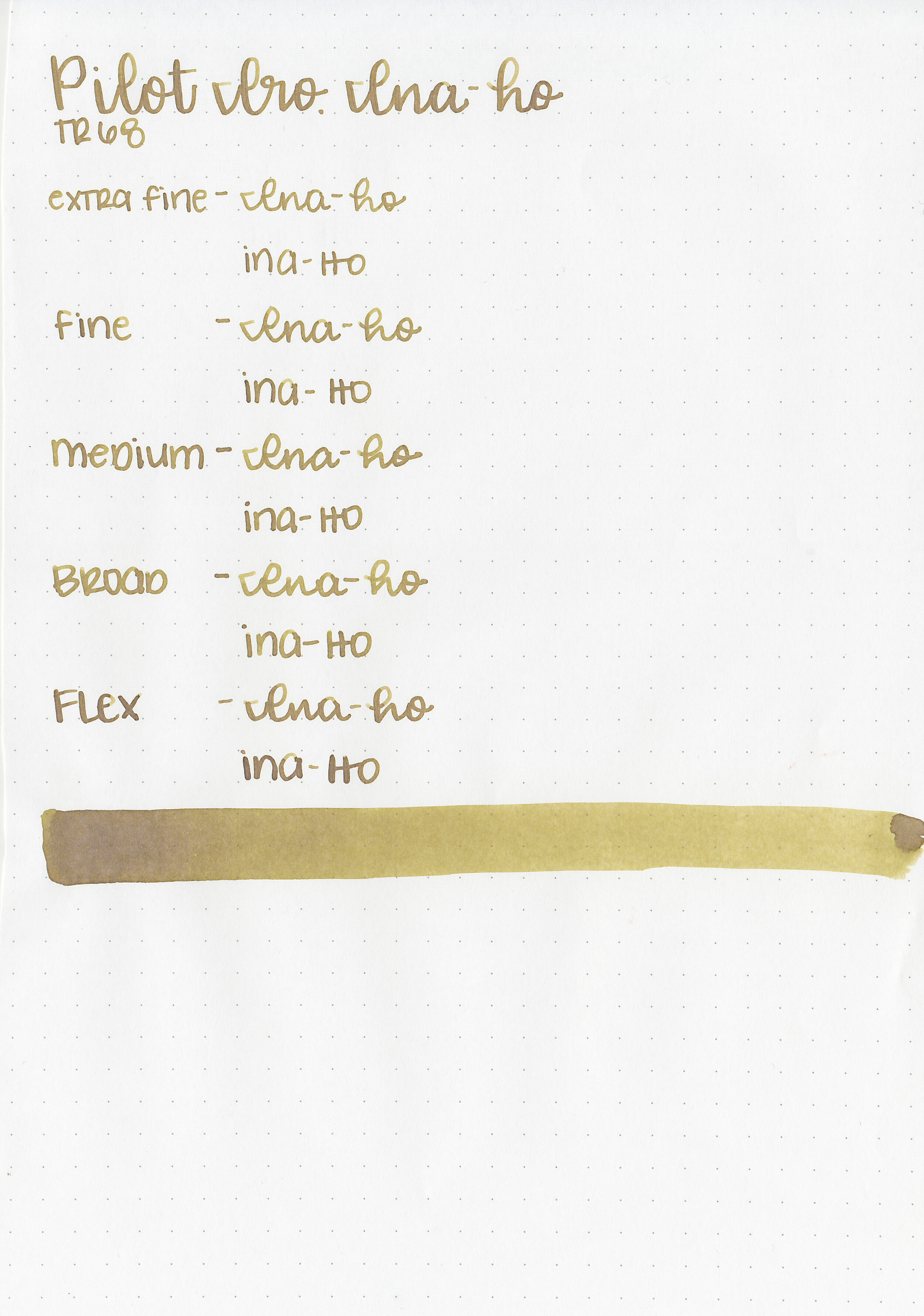
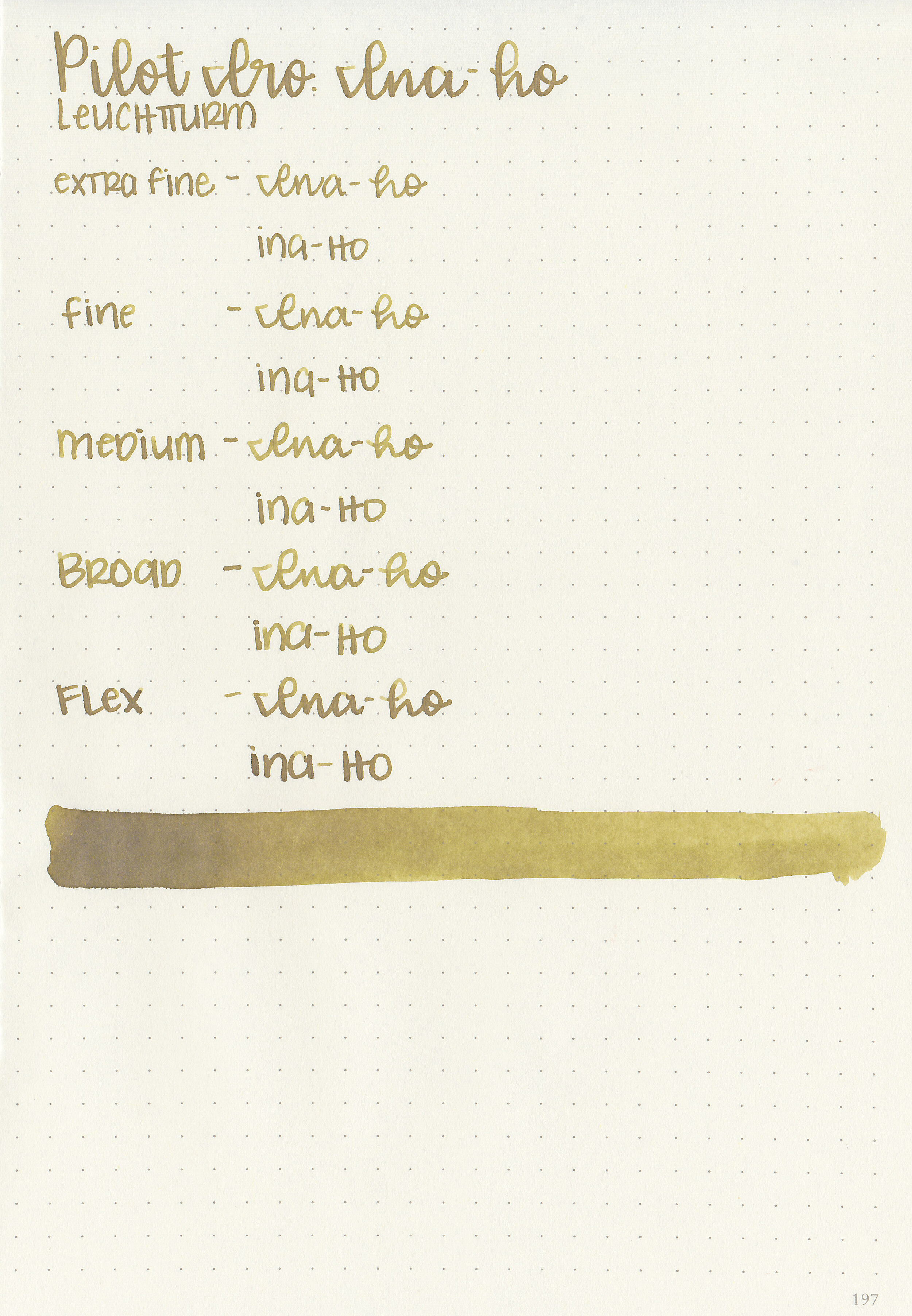
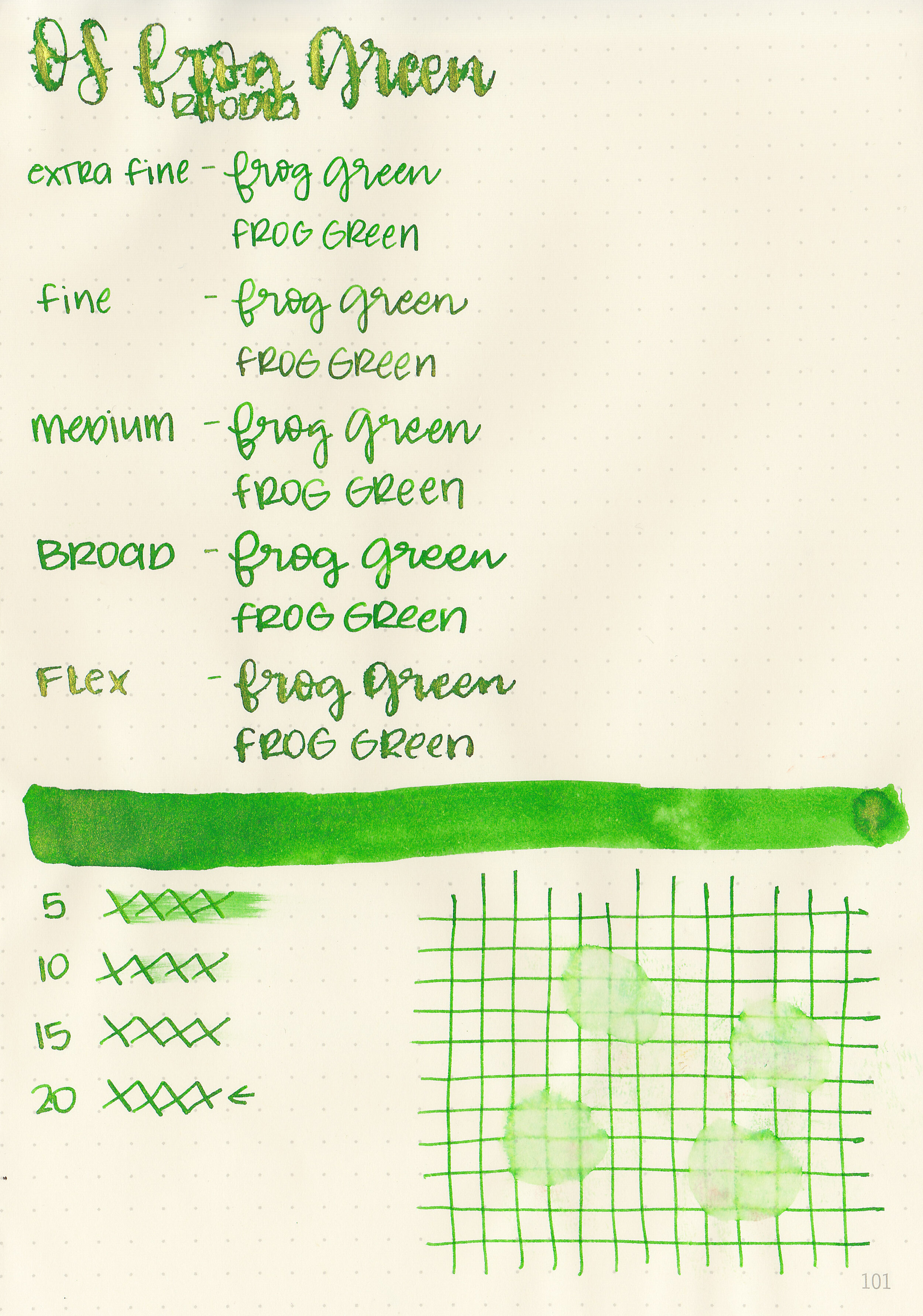
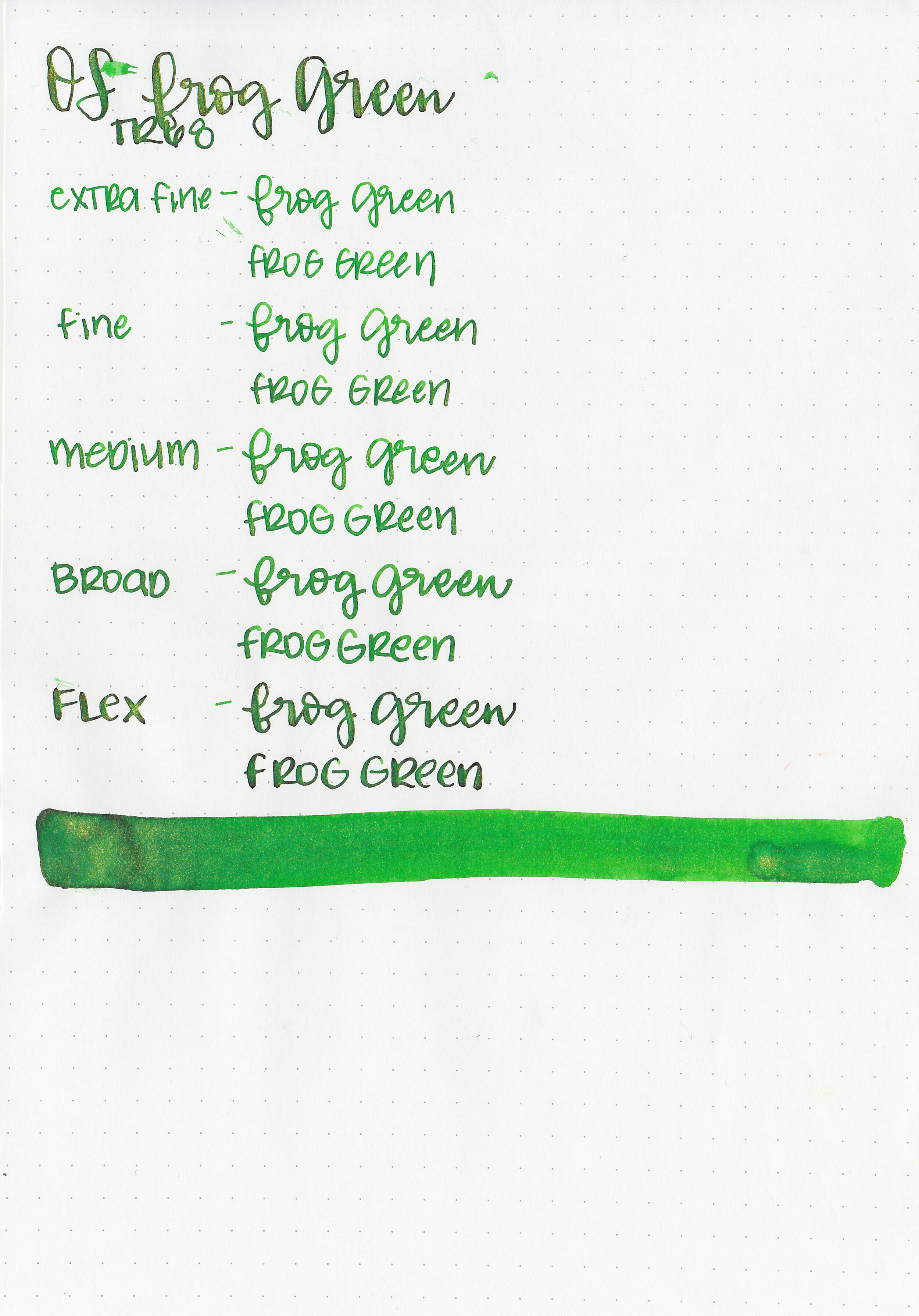
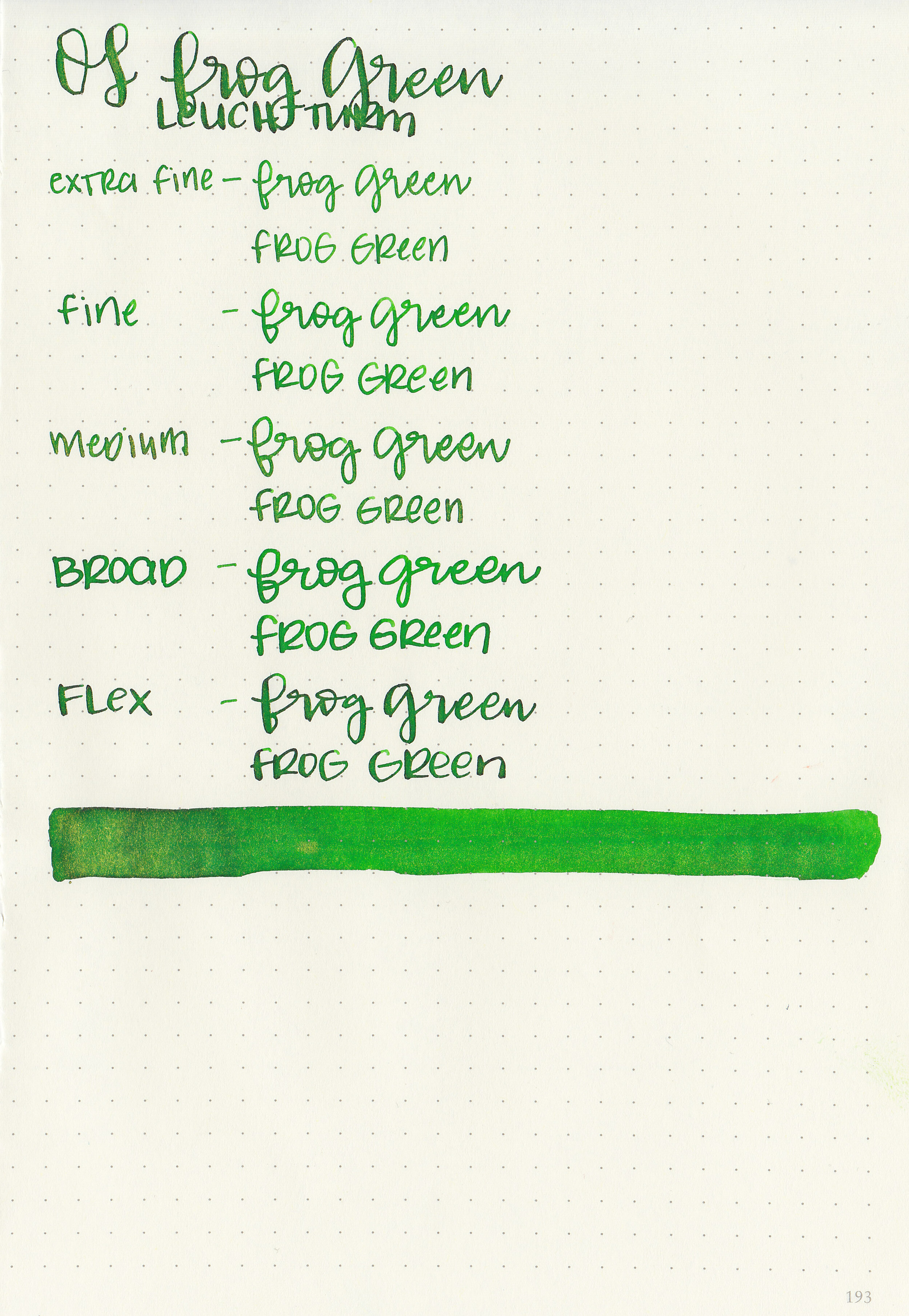
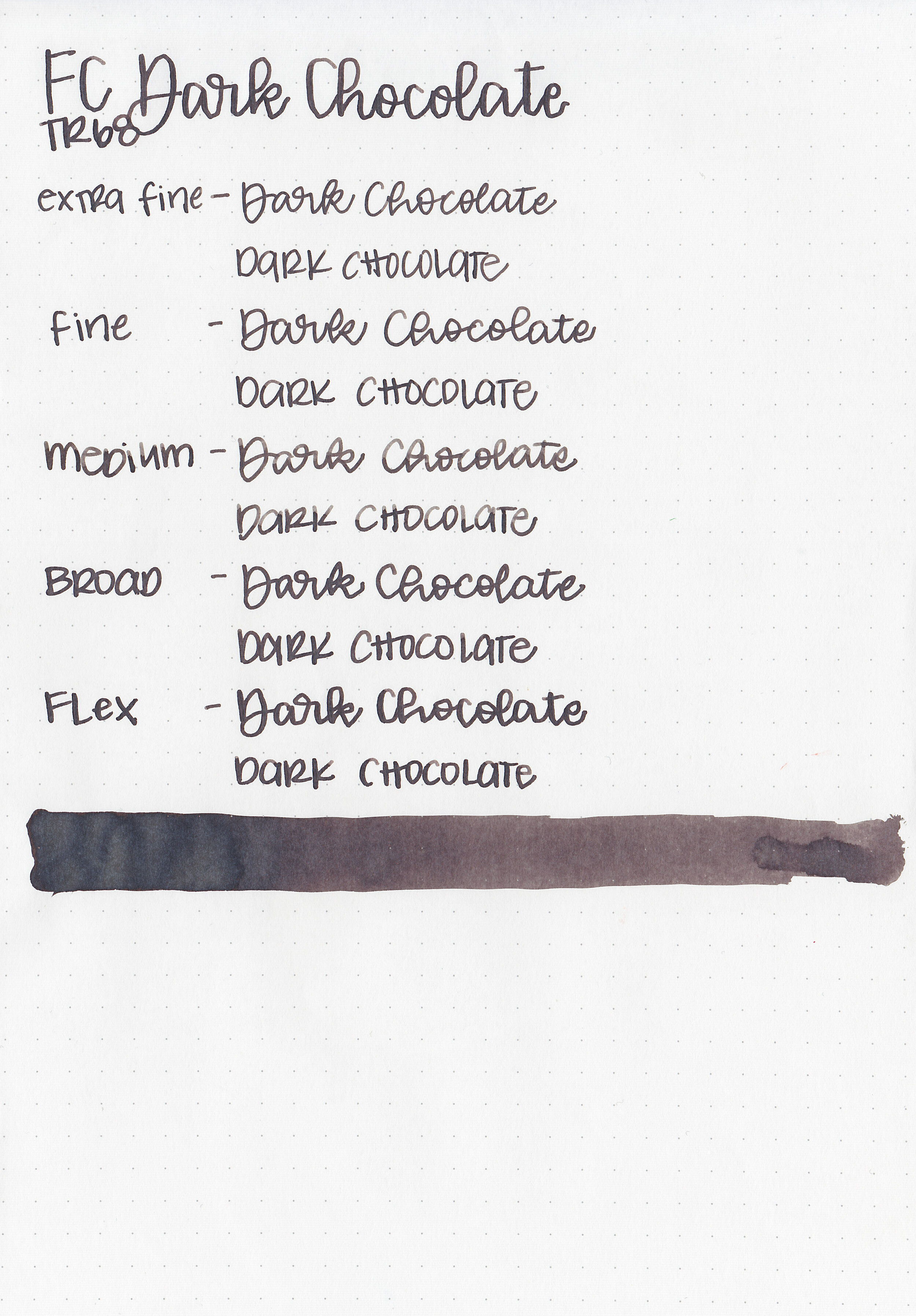
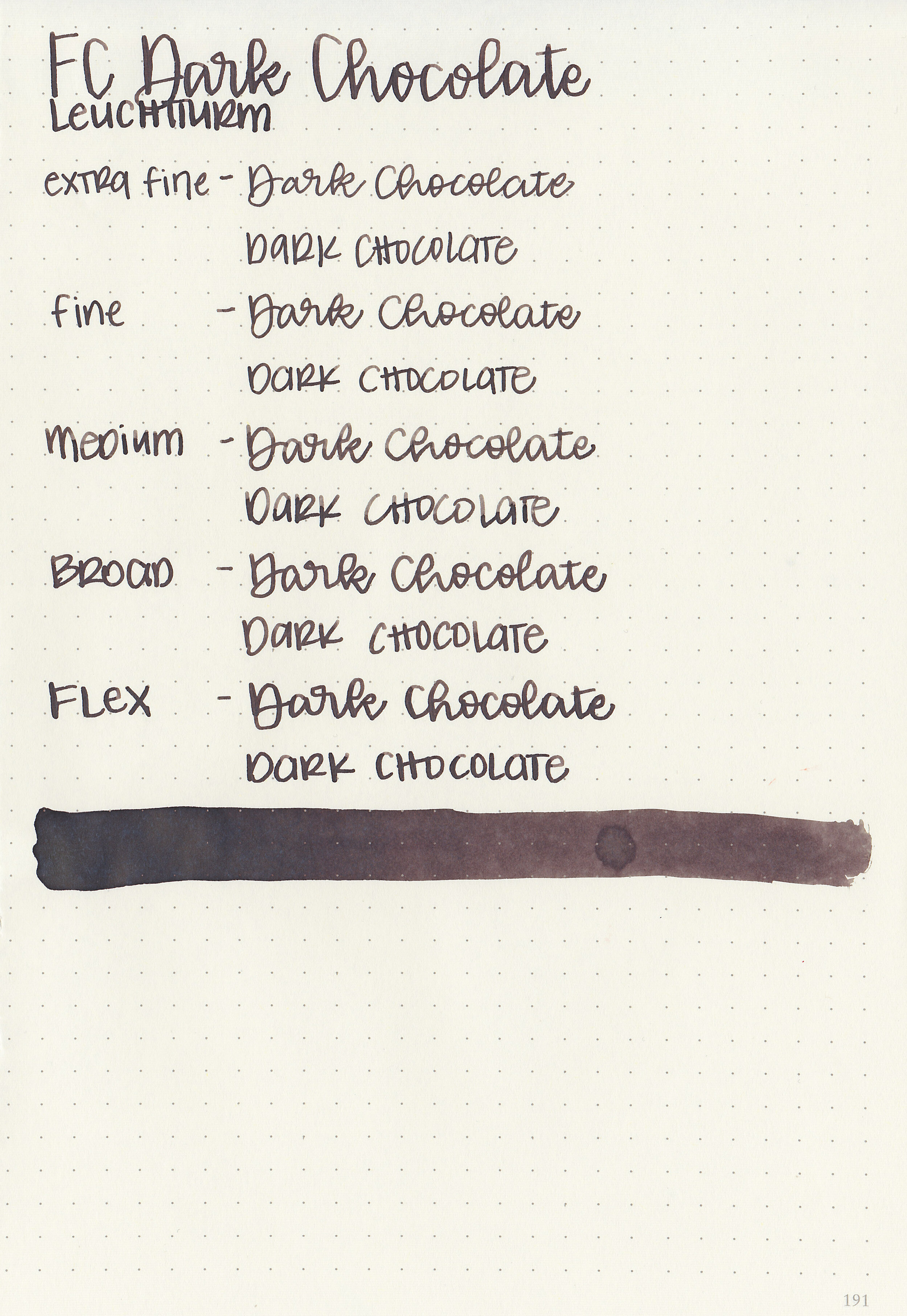
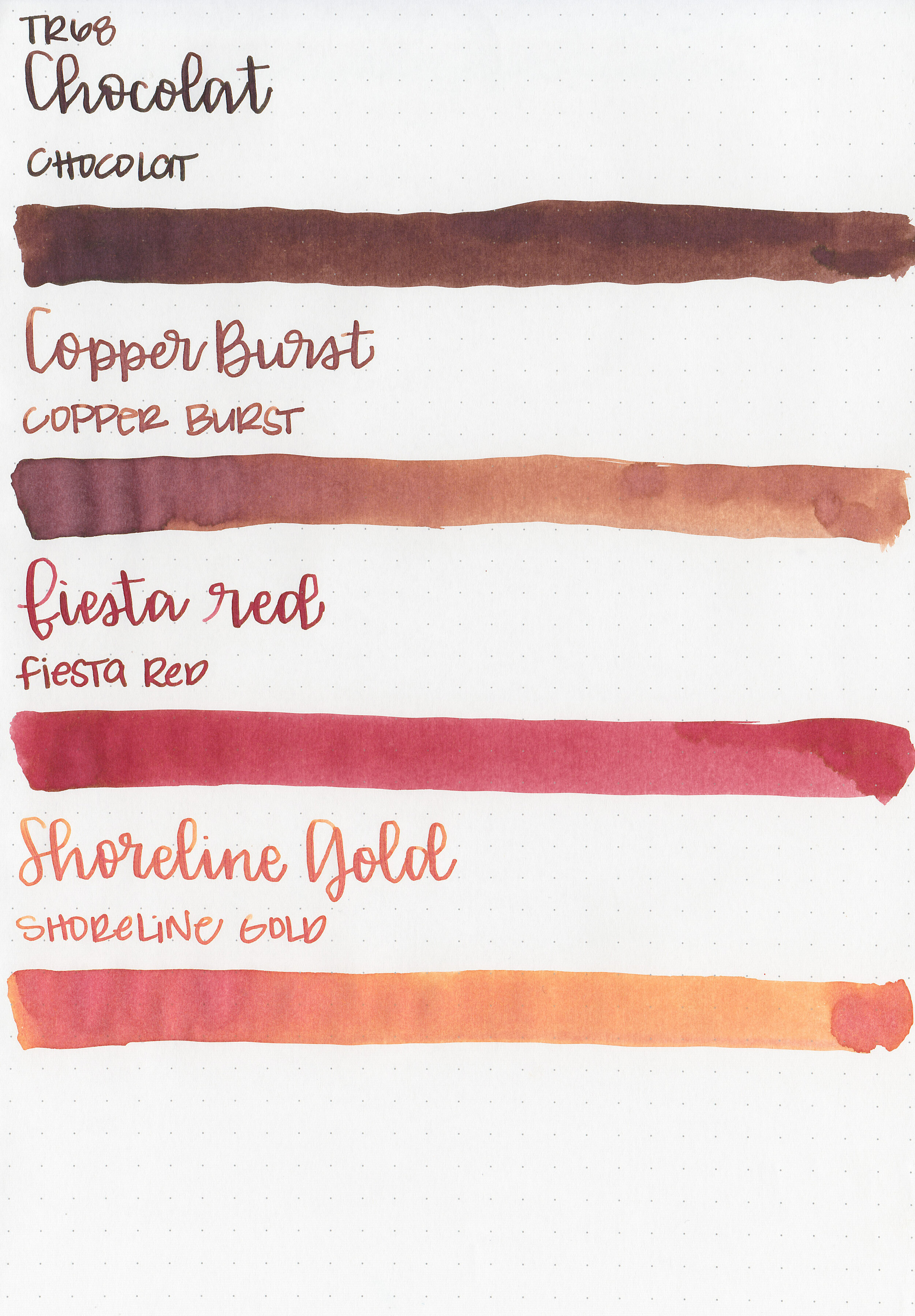
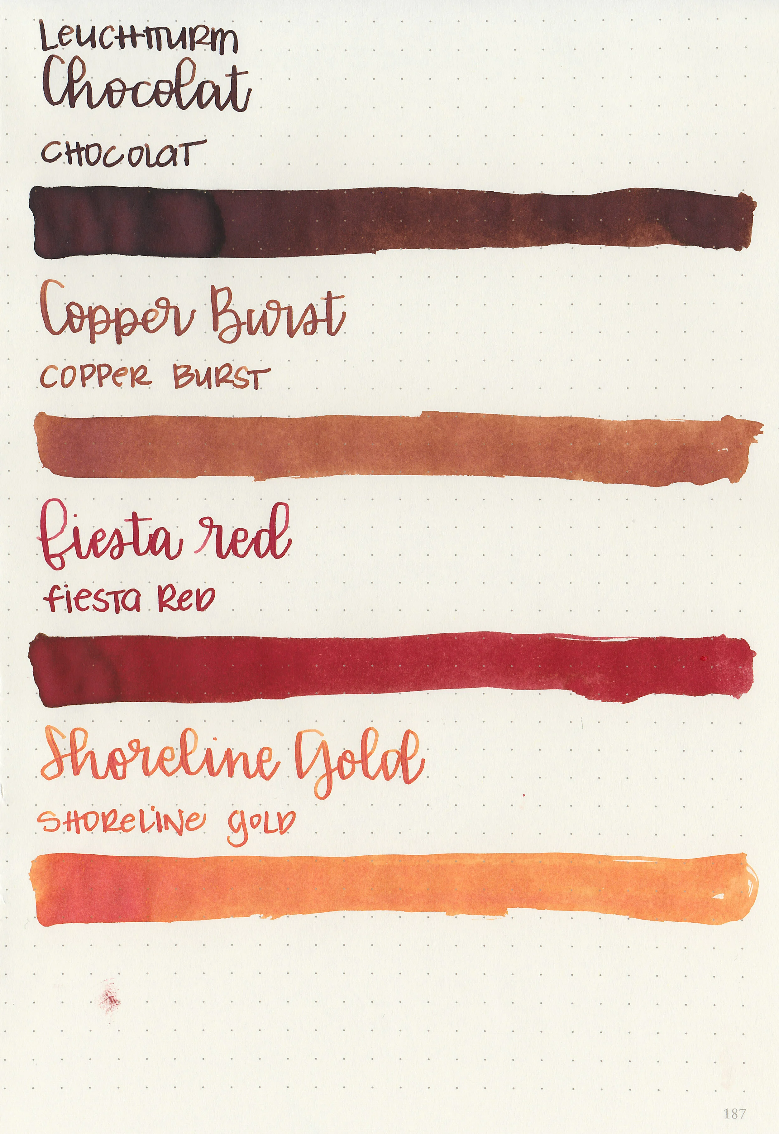
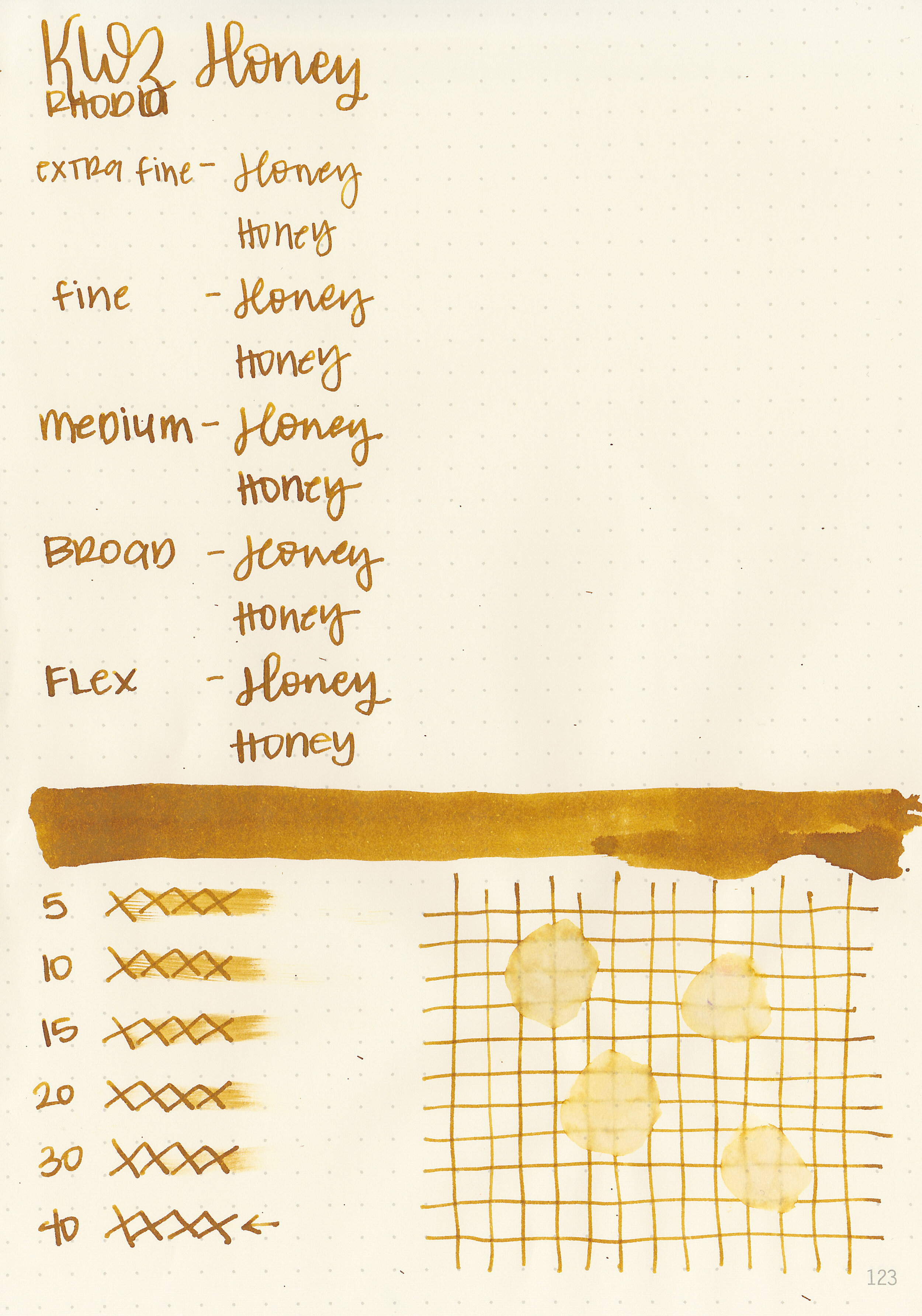
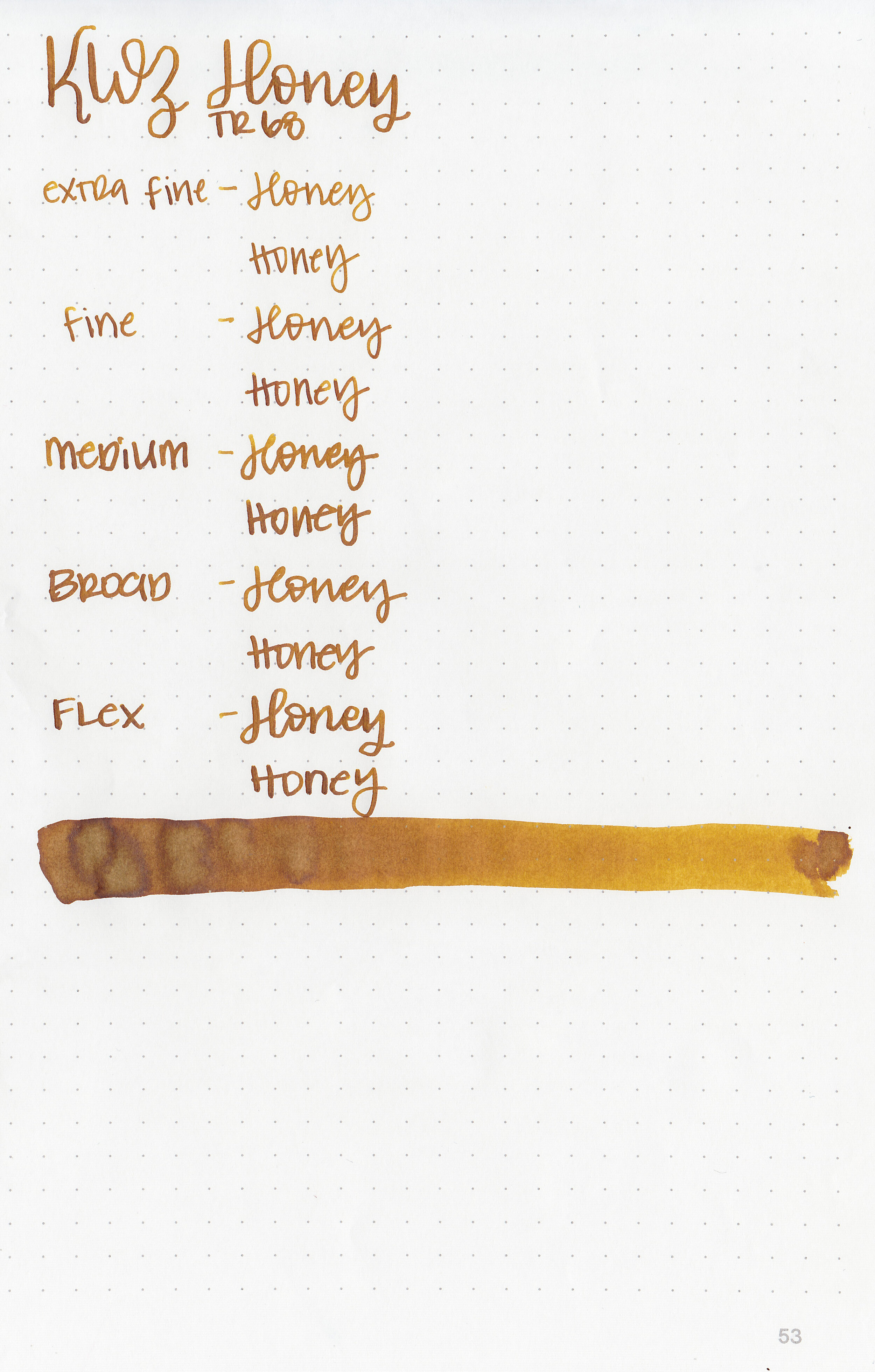
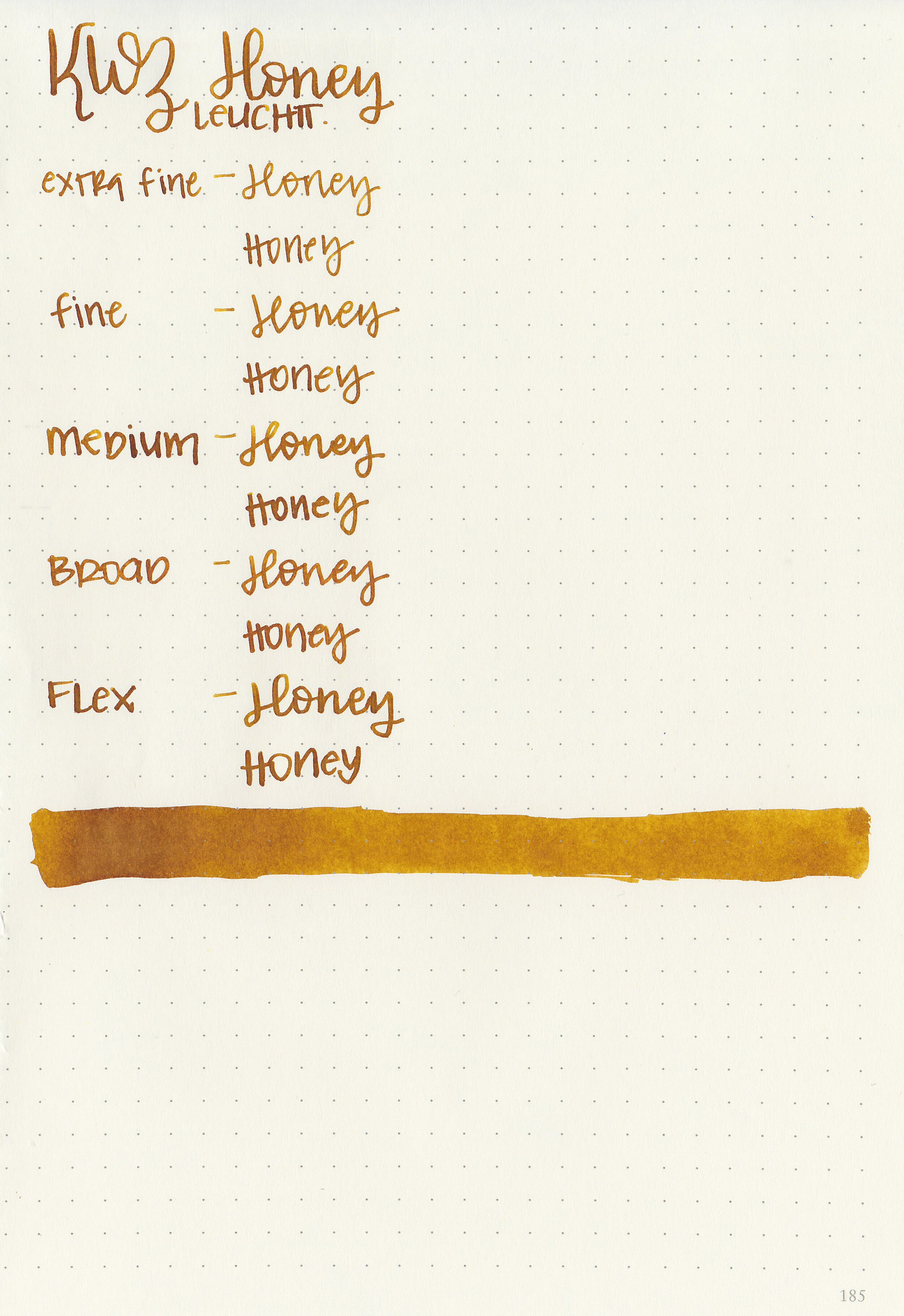
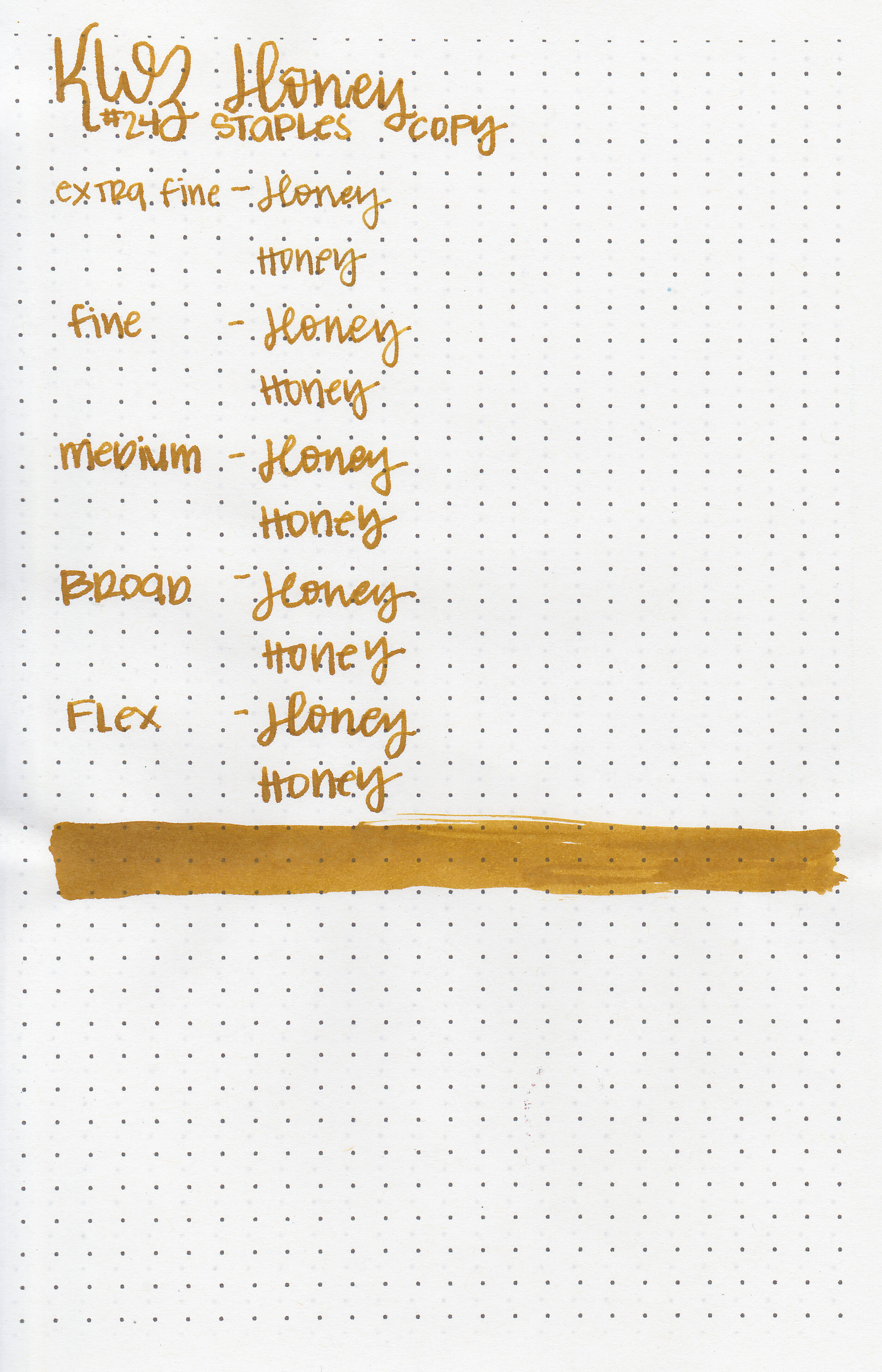
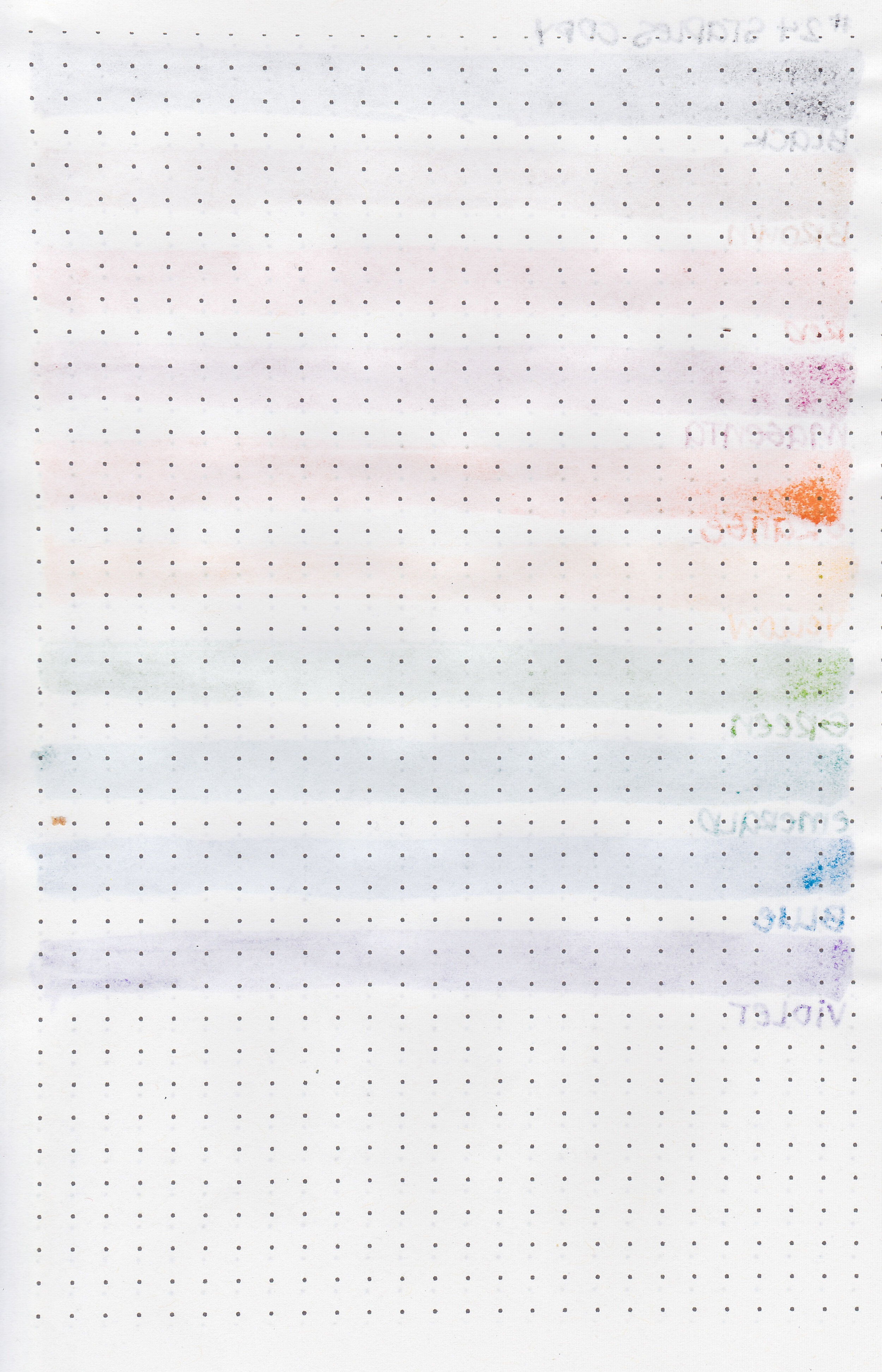
Let's take a look at how the ink behaves on fountain pen friendly papers: Rhodia, Tomoe River, and Leuchtturm.
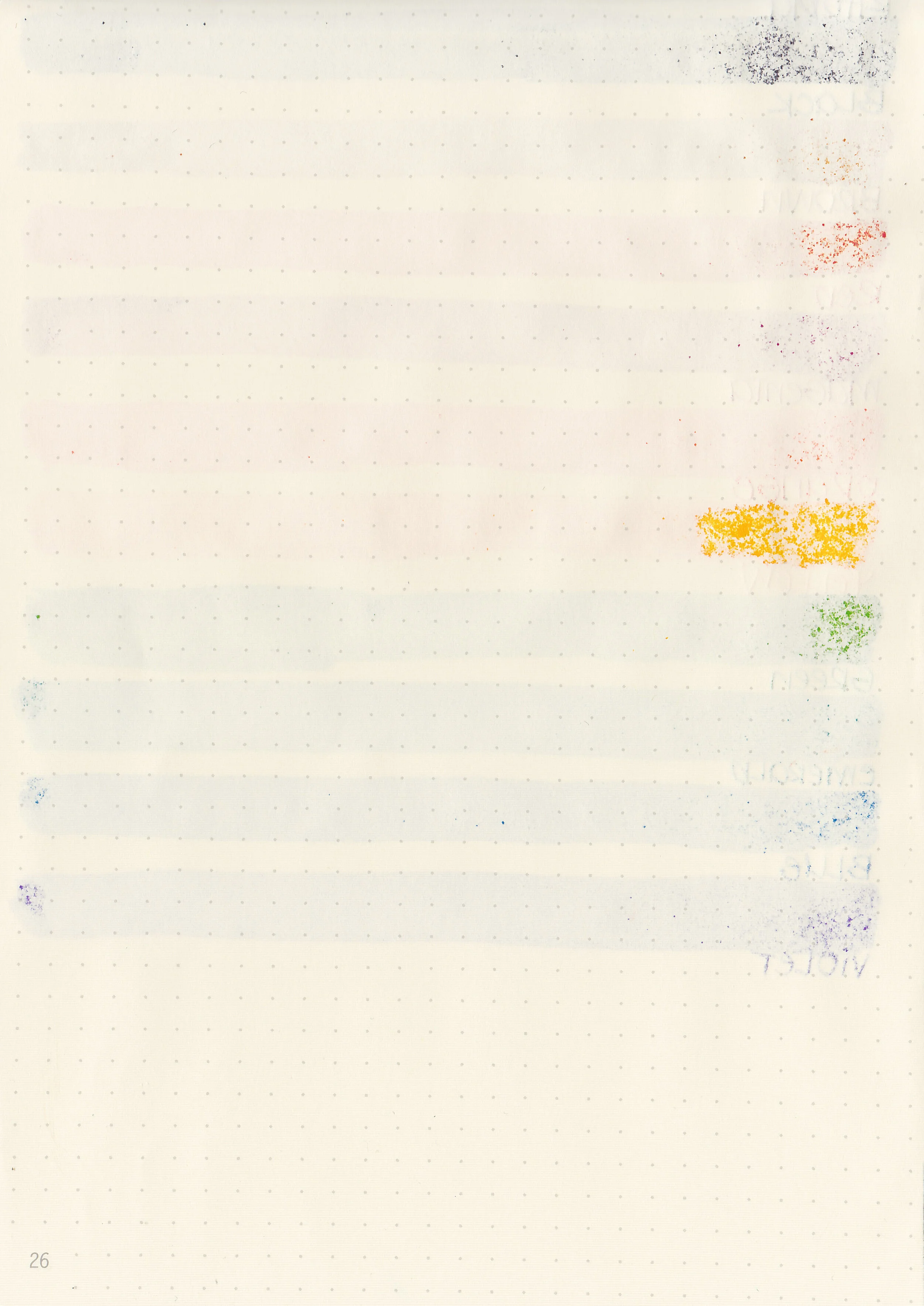
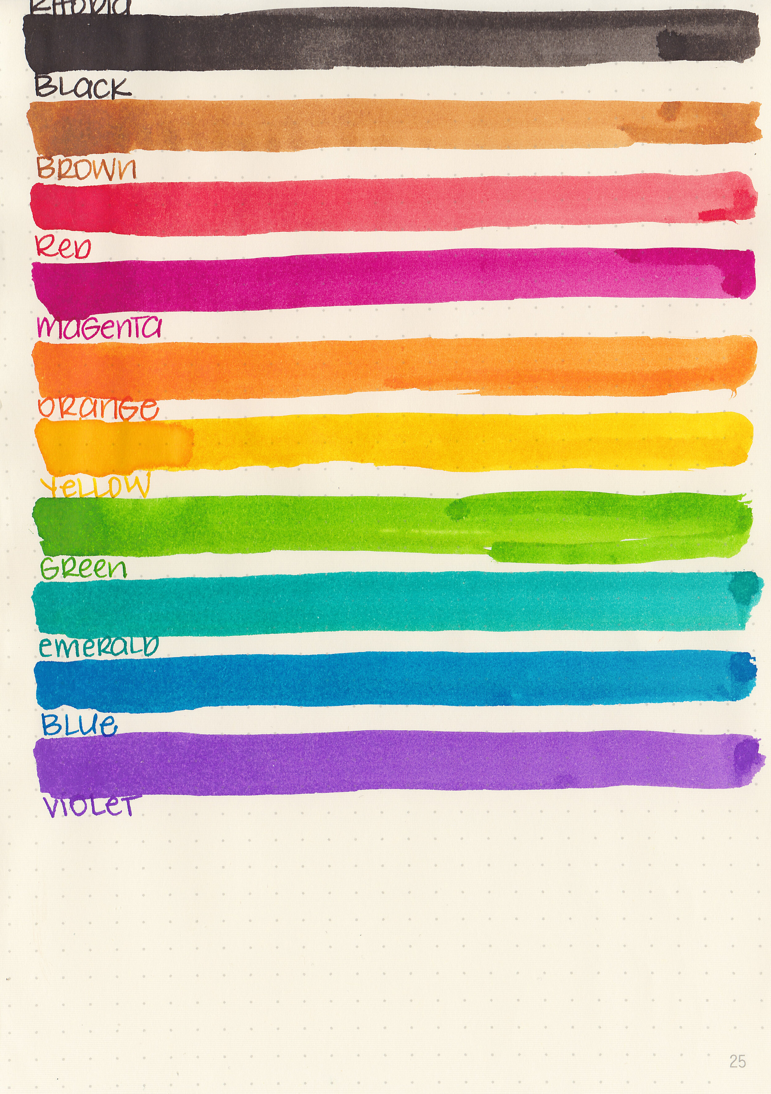
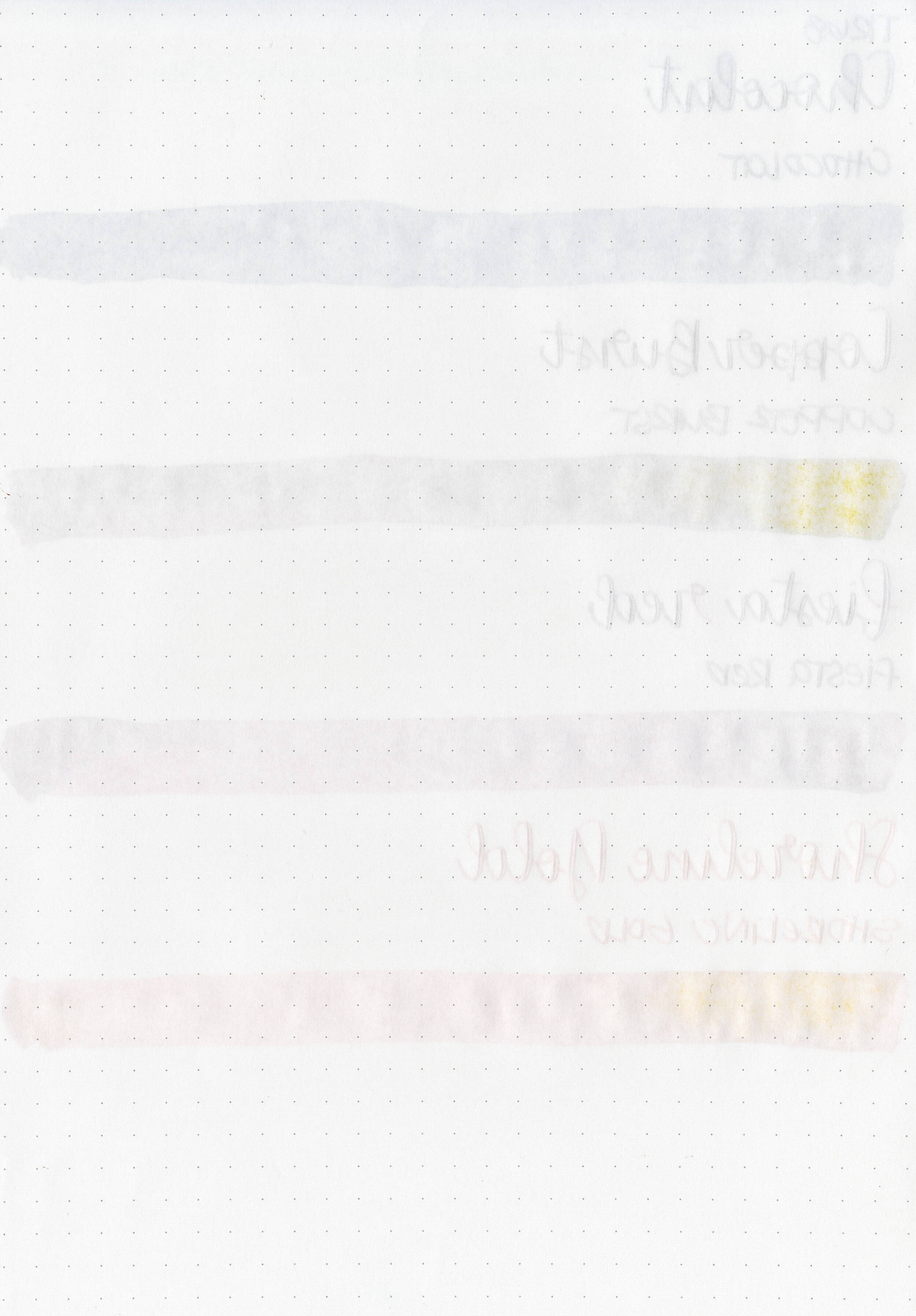
Water resistance: Low
Feathering: None
Show through: Medium
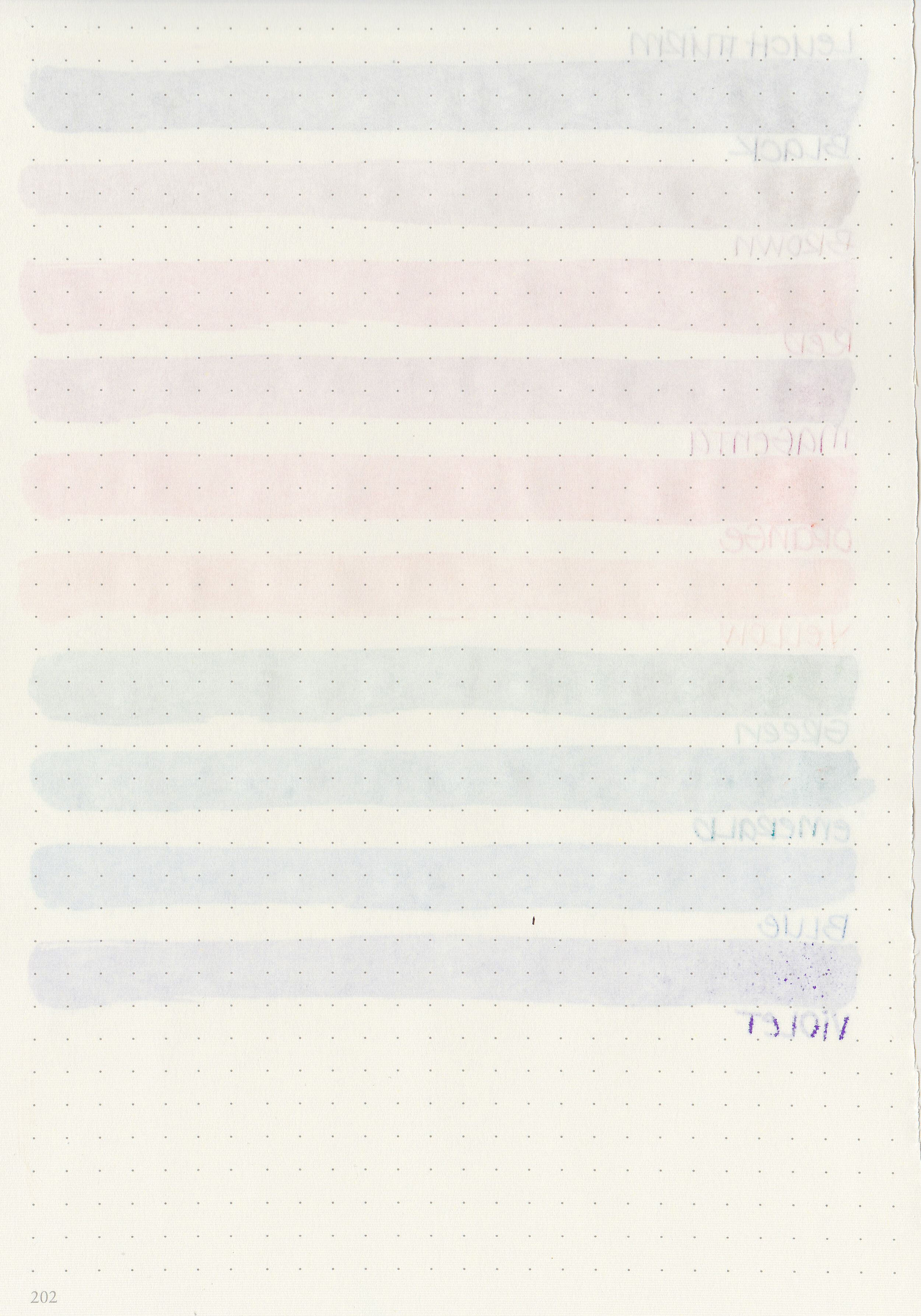
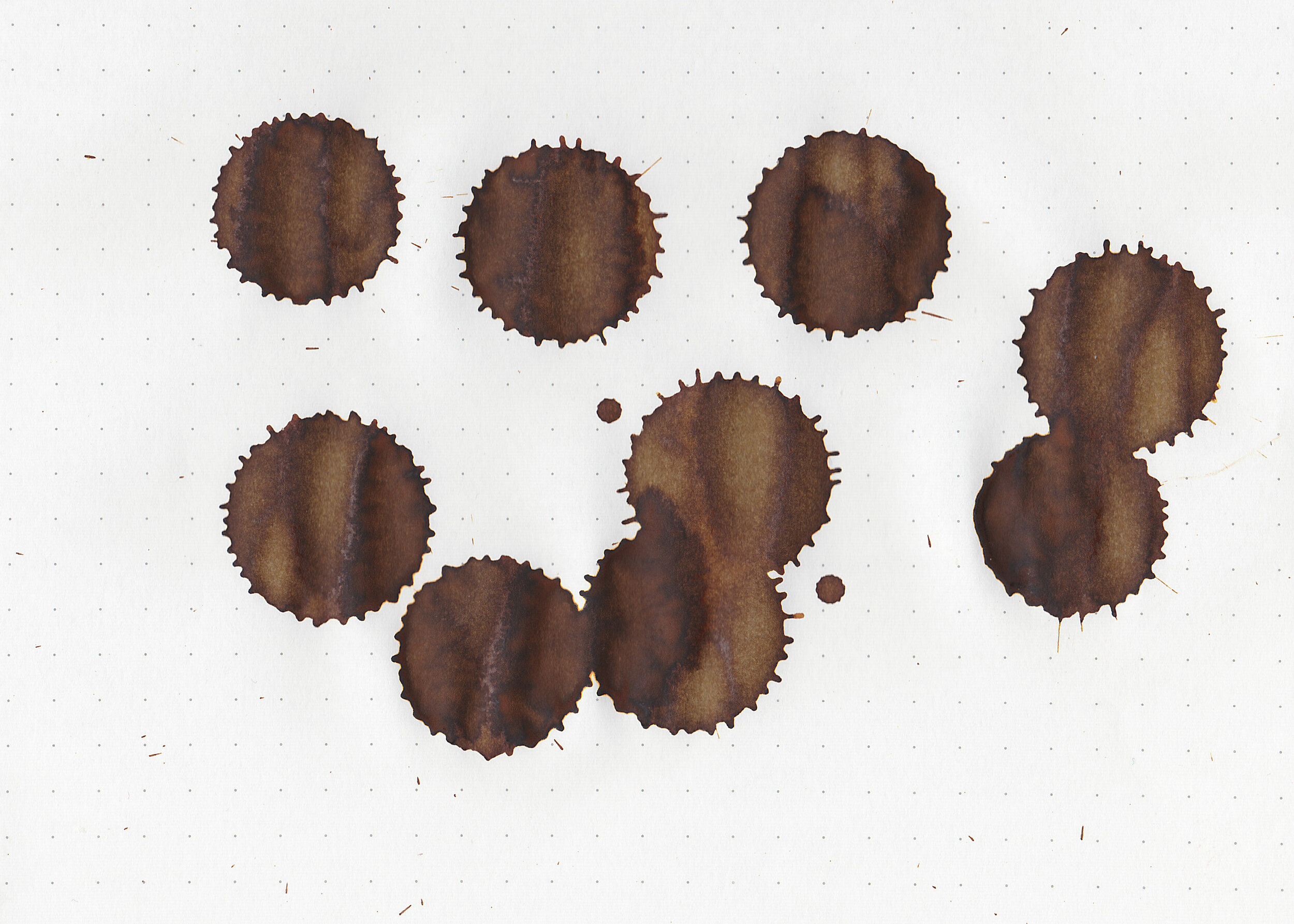
Bleeding: Low-there is just a little bit of bleeding, mainly in the swabs and the Violet color.
Other properties: low shading, tiny to no sheen, and no shimmer. Violet shows some green sheen, Black shows some grey sheen and Cyan shows some pink sheen. I was only able to see the sheen in large swabs on Tomoe River paper, but none in writing.

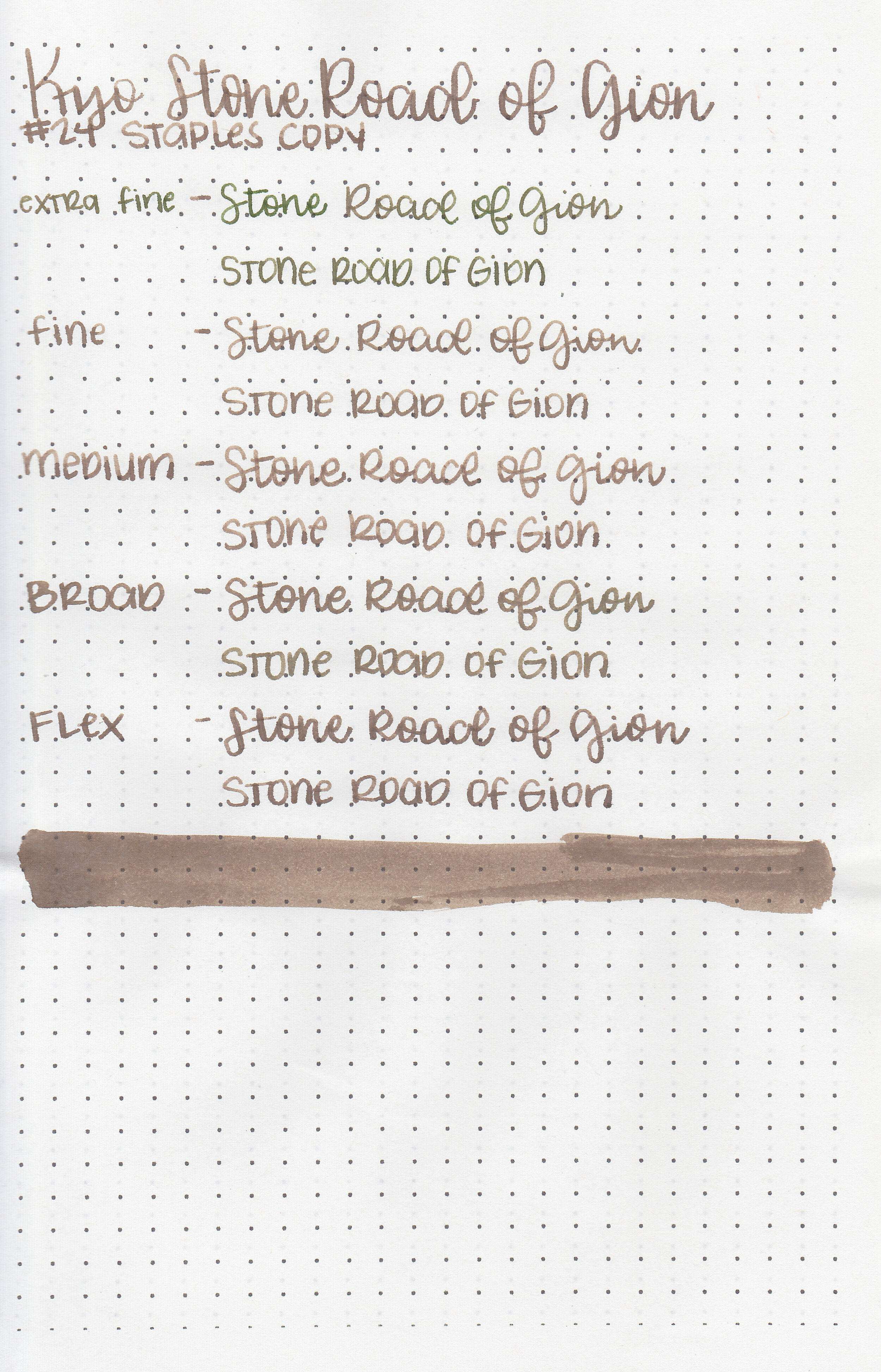
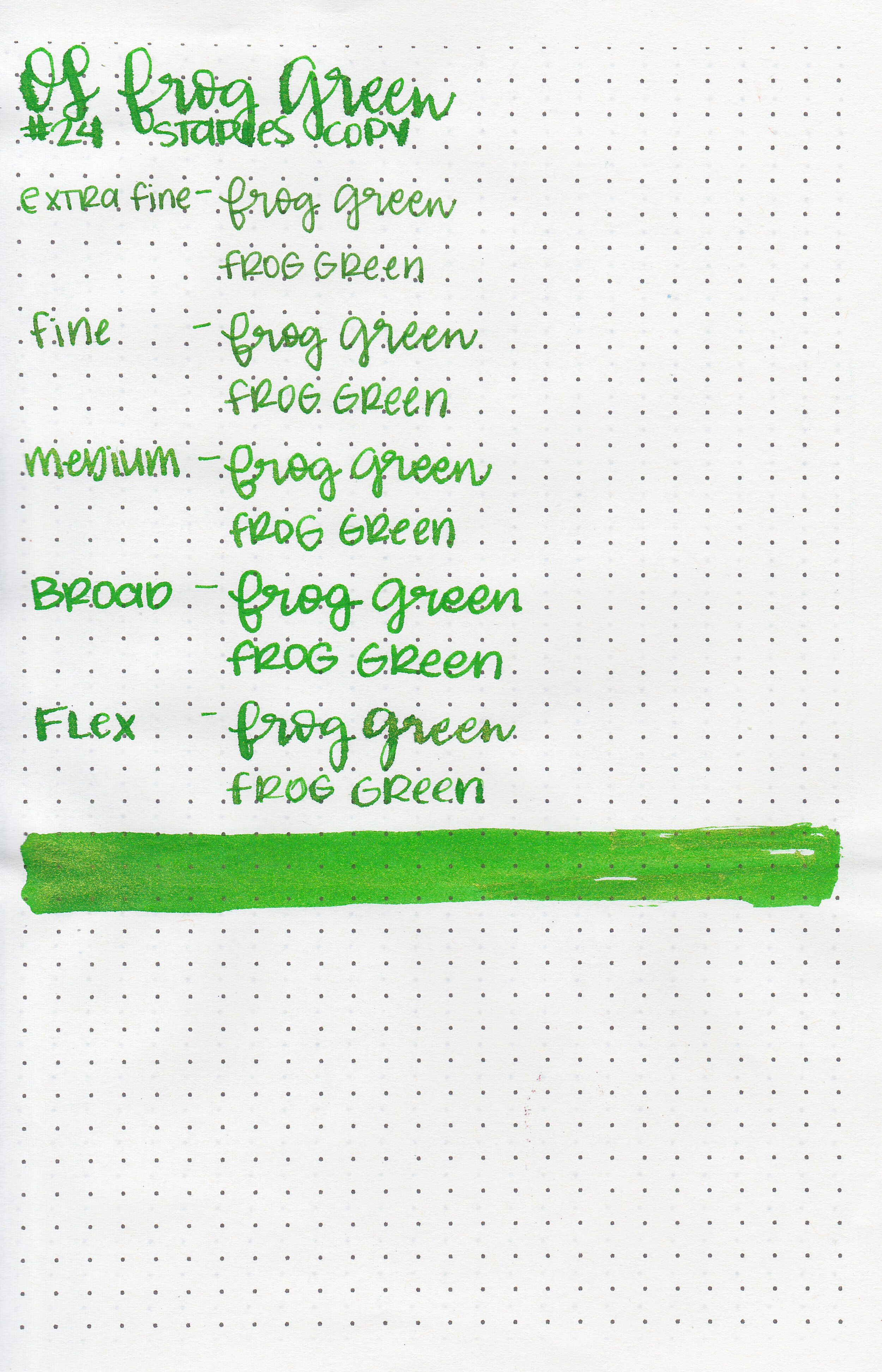
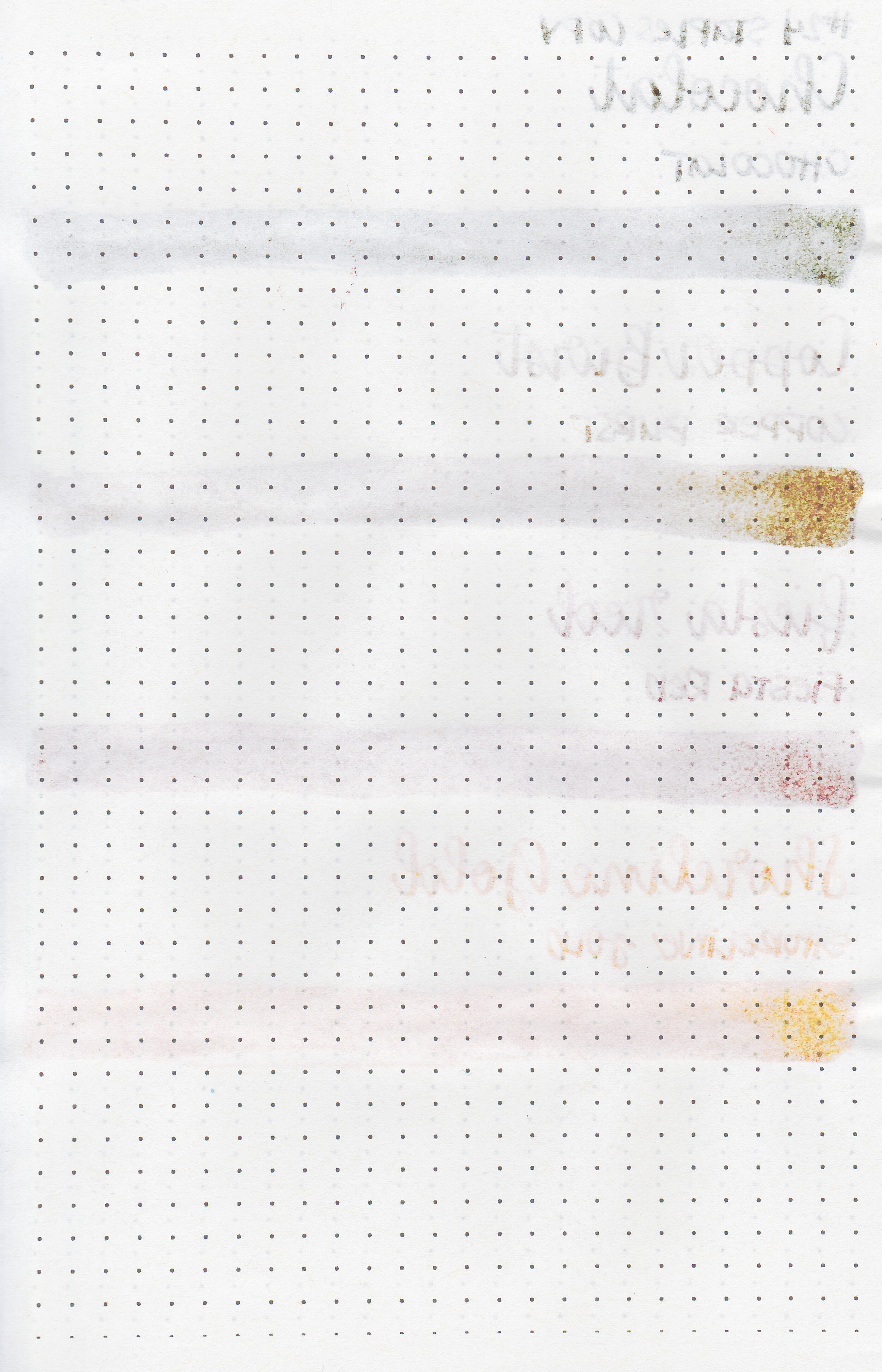
On Staples 24 lb copy paper there was lots of feathering in every nib size as well as bleeding, so I would not recommend these inks for cheap paper.
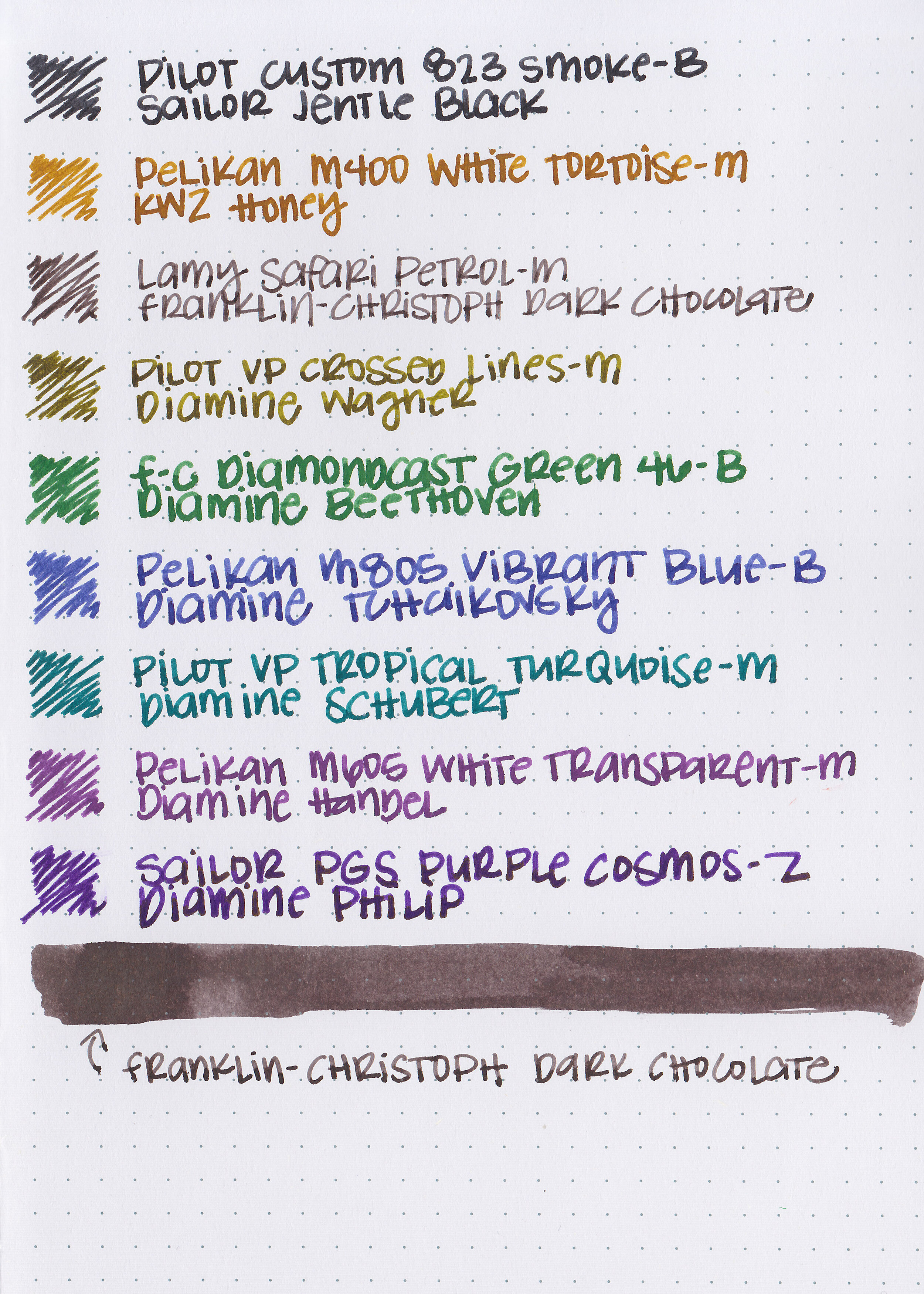
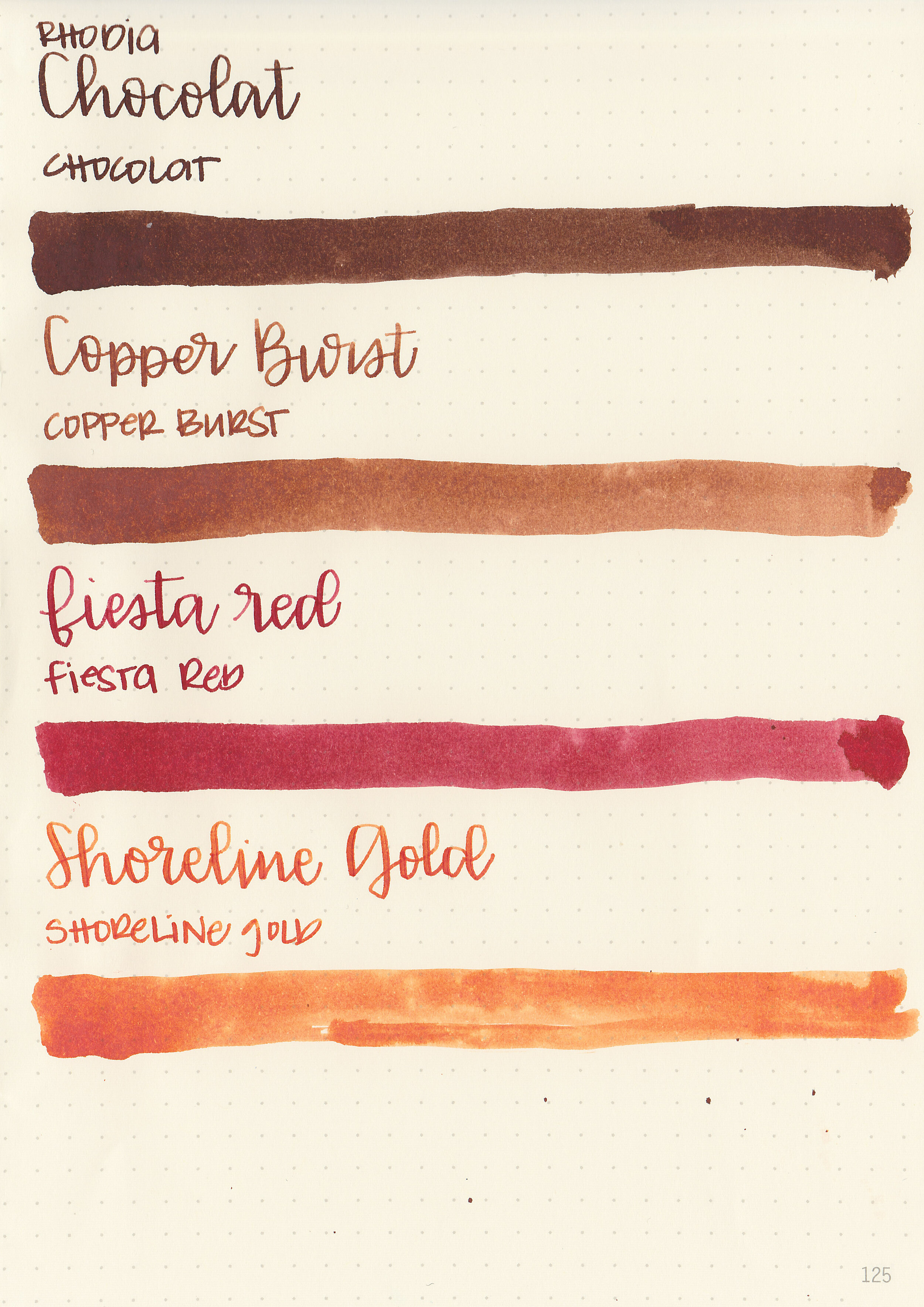
Comparison Swabs:
For these comparisons, I wanted to show some alternatives, as well as coming up with a set of inks you could create yourself from one brand to get a similar mixing kit. Since I have a lot of Diamine inks, and they generally mix safely, I made sure I showed a Diamine alternative for each color.

Black is similar to Sailor Jentle Black, although they are not an exact match-the Sailor ink has a cooler tone, as does Diamine Jet Black.

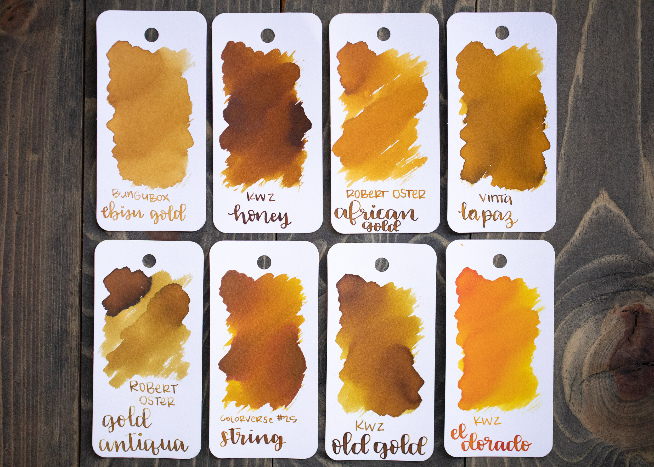
Brown is similar to SBRE Brown, Diamine Ochre is a bit less orange than 3O Brown.

Red is similar to another 3 Oysters ink I have already reviewed-Chili Red, but Diamine Tulip is another alternative.
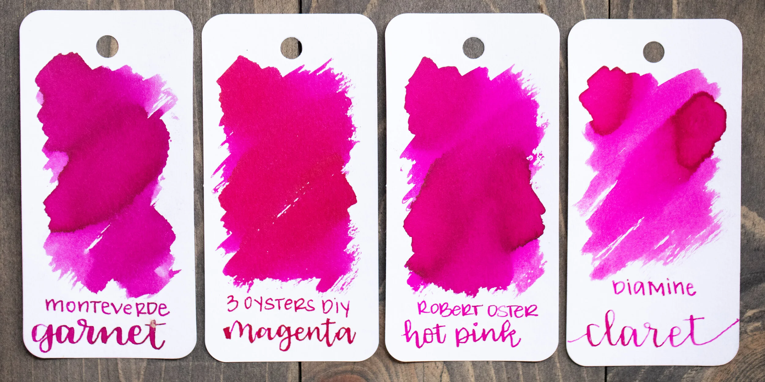
Magenta is similar to Monteverde Garnet, Robert Oster Hot Pink and Diamine Claret.

Orange is similar to Diamine Blaze Orange, Montblanc Lucky Orange and Sailor Jentle Apricot.

Yellow is similar to Diamine Sunshine Yellow, Pilot Iroshizuku Daikokuten and Private Reserve Buttercup.

Green is closest to Colorverse Supernatural, but Diamine Meadow is another close alternative.

Emerald is almost an exact match for 3 Oysters Aqua Green, but is also similar to Colorverse Morning Star and Diamine Steel Blue.

Cyan is almost an exact match for 3 Oysters Blue, but is also similar to Colorverse Supernova, KWZ Hawaii Blue and Diamine Asa Blue.

Violet is similar to Diamine Lavender and warmer than Colorverse Hayabusa and Waterman Tender Purple, but Tender Purple does have a similar green sheen.
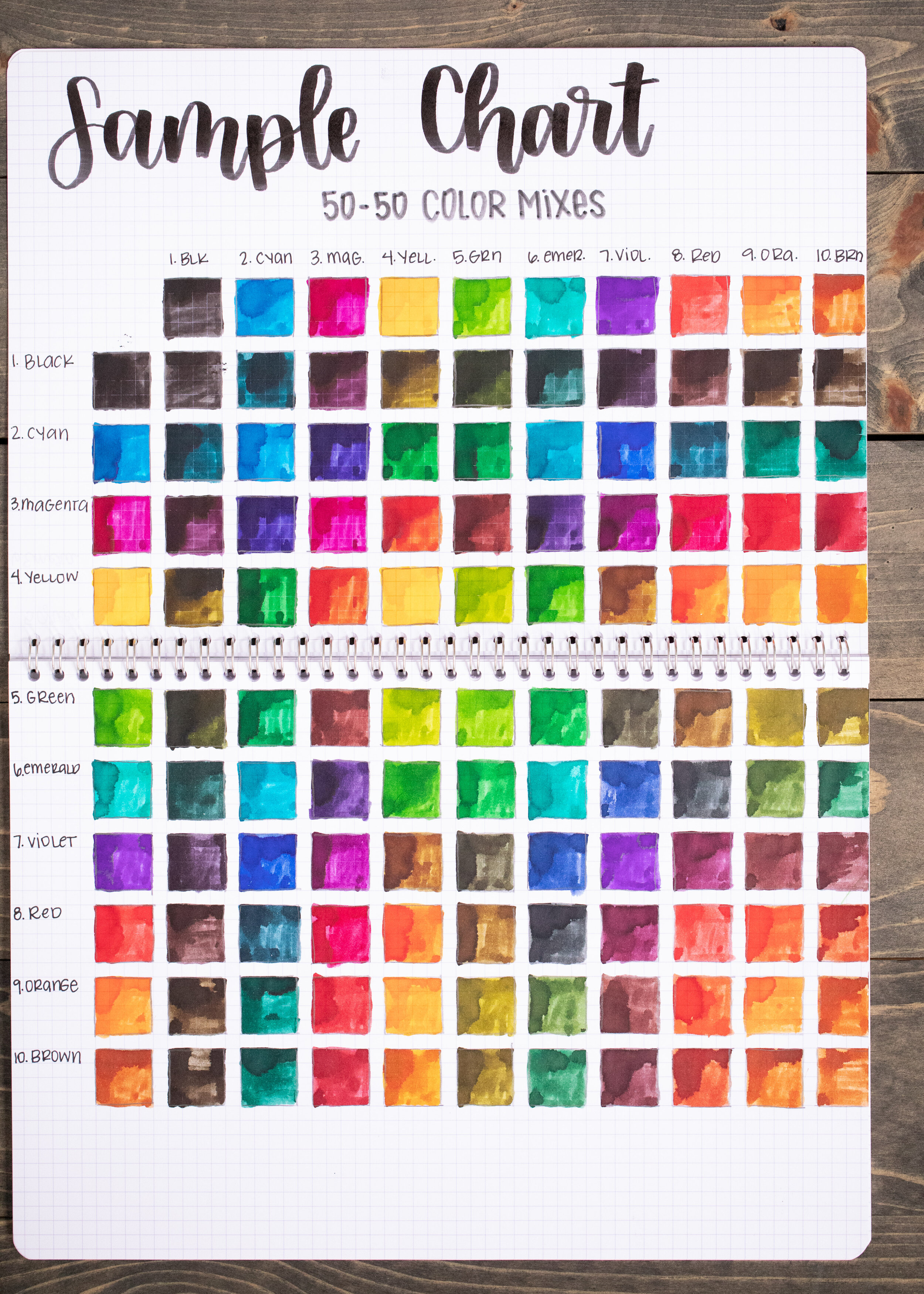
I had a lot of fun re-creating the sample chart from the instructions. I simply mixed 50-50 ratios of each of the colors. So many possibilities from 10 basic inks. I did notice that there wasn’t a lot of difference in the mixes with orange and brown. They are pretty close on their own, so their mixes looked pretty similar.

I love that you can create gradients with this kit. I did notice that it takes twice as many toner drops to create the same change one drop of black can make. For example, 4 drops of toner would create a similar difference to 2 drops of black.

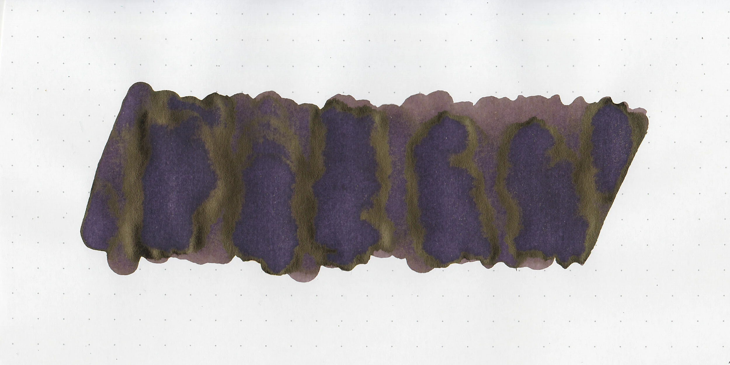
Finally, I made two of my own mixes. What I called Moody Teal is a mix of Emerald, Red and Toner-I picked the name while it was still wet, but it dried to more of a green than teal. It almost reminds me of Robert Oster Sydney Darling Harbour, but darker. Moody Blue is a mix of Red, Cyan and Black. Again, I named it while it was still wet, but it dried to more of a teal. There are so many different colors you could create.
Overall, I really enjoyed this kit, and was impressed by how well thought-out it was. There are so many possibilities. I was sad when I quickly ran out of certain colors (I ran out of Black and Emerald first), so I was excited to find that Cityluxe has the inks for sale individually. UPDATE: I just found out that Vanness Pens (USA) has them in stock and on sale!
Disclaimer: This product was provided by 3 Oysters for the purpose of this review. All photos and opinions are my own. This page does not contain affiliate links, and is not sponsored in any way.