Lennon Tool Bar 2019 Autumn Inks
/
Ink review of the Lennon Tool Bar 2019 Autumn Inks.
Read MoreInk review of the Lennon Tool Bar 2019 Autumn Inks.
Read More
Over the past year I’ve grown to love KWZ inks. I love that they do so many exclusive inks. KWZ V-Dream is a Vitstyle exclusive. Thanks to Vitstyle for sending the ink over for review!

The color:
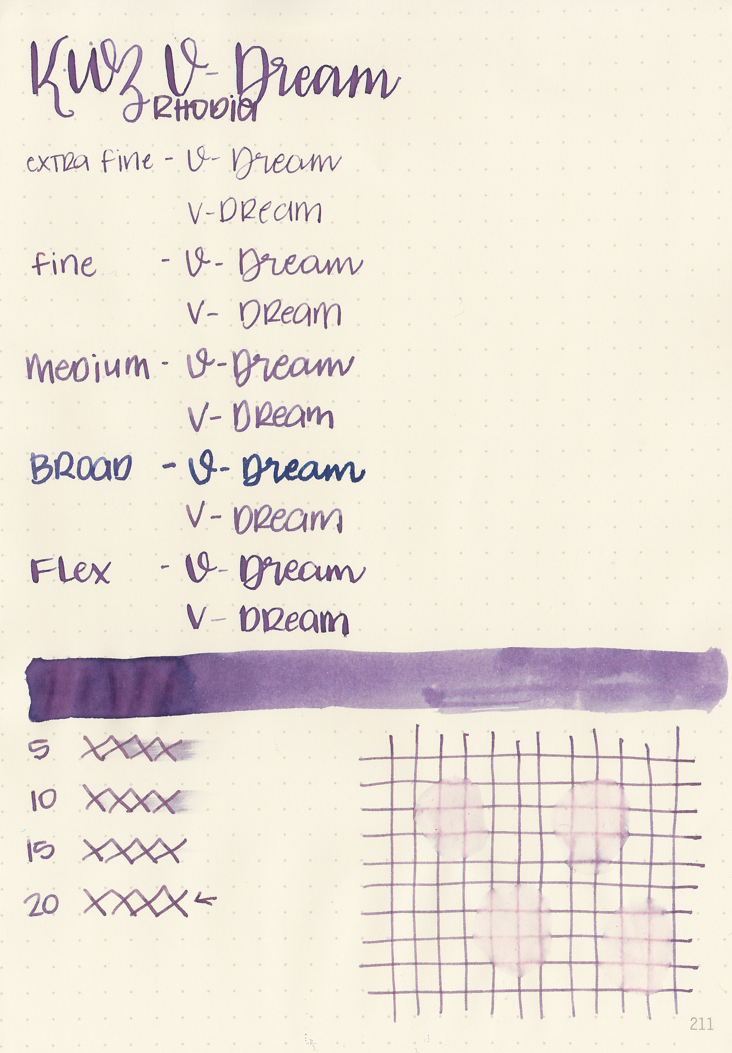
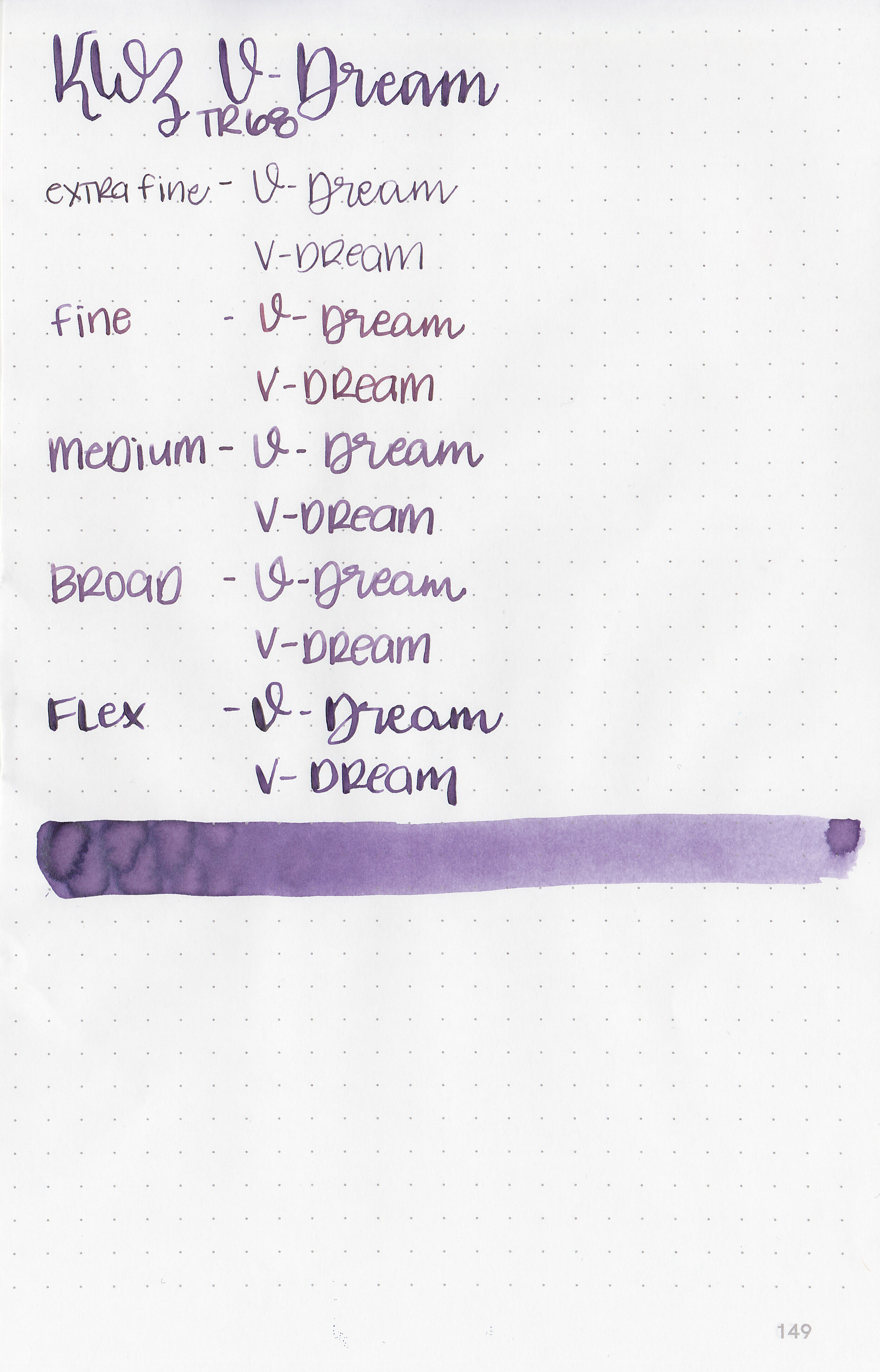
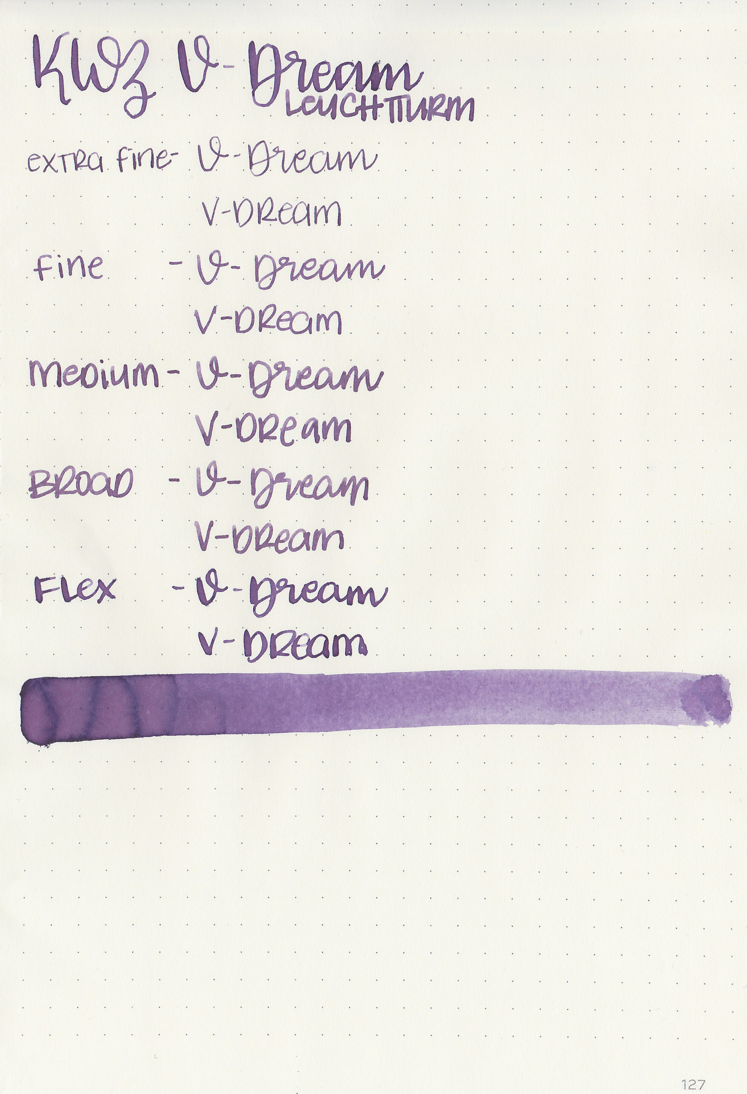
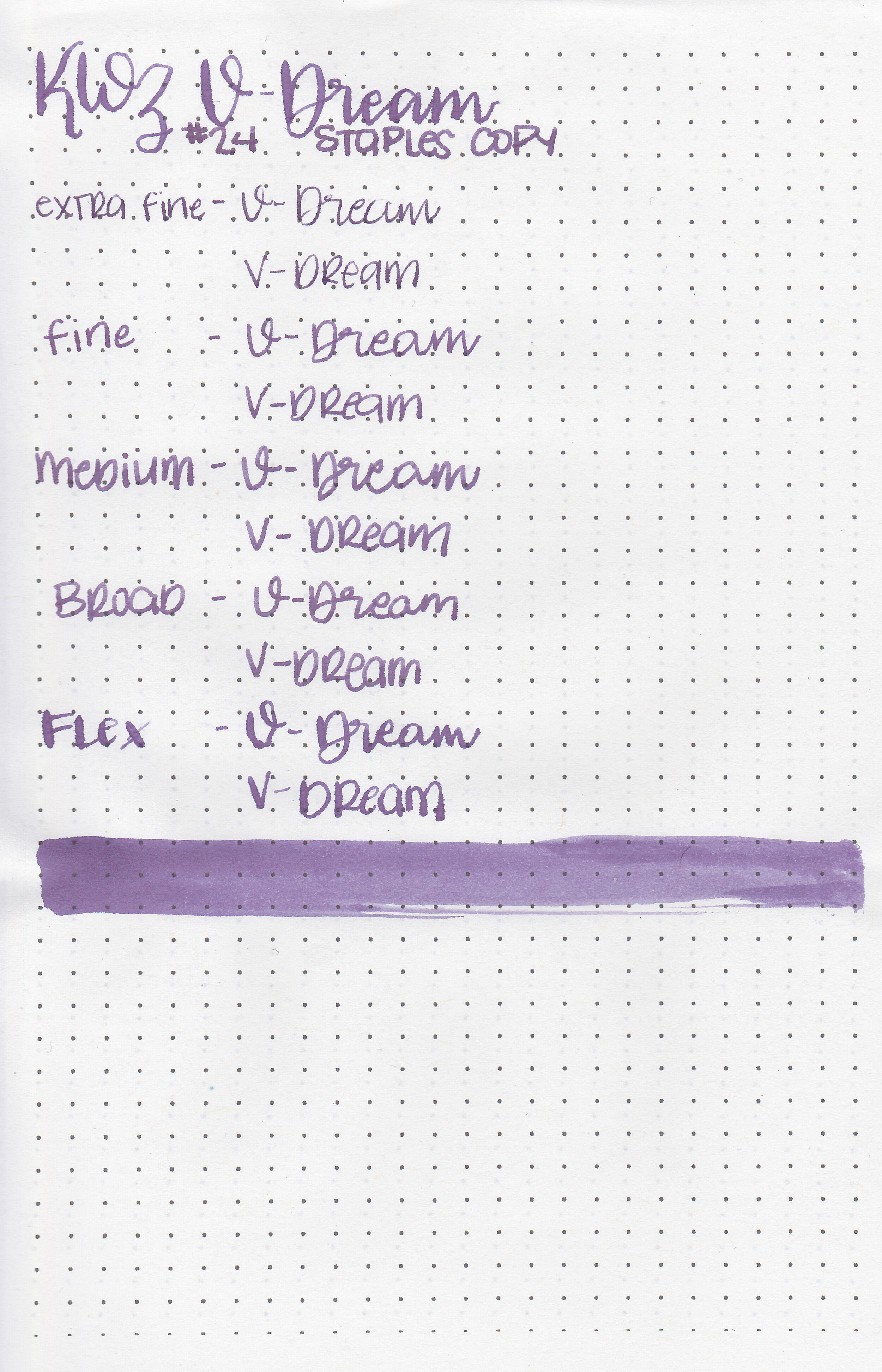
V-Dream is a medium dusky purple. I would almost call it a wisteria purple.

In large swabs on Tomoe River paper the ink looks has some pretty shading but no sheen.

Let's take a look at how the ink behaves on fountain pen friendly papers: Rhodia, Tomoe River, and Leuchtturm.
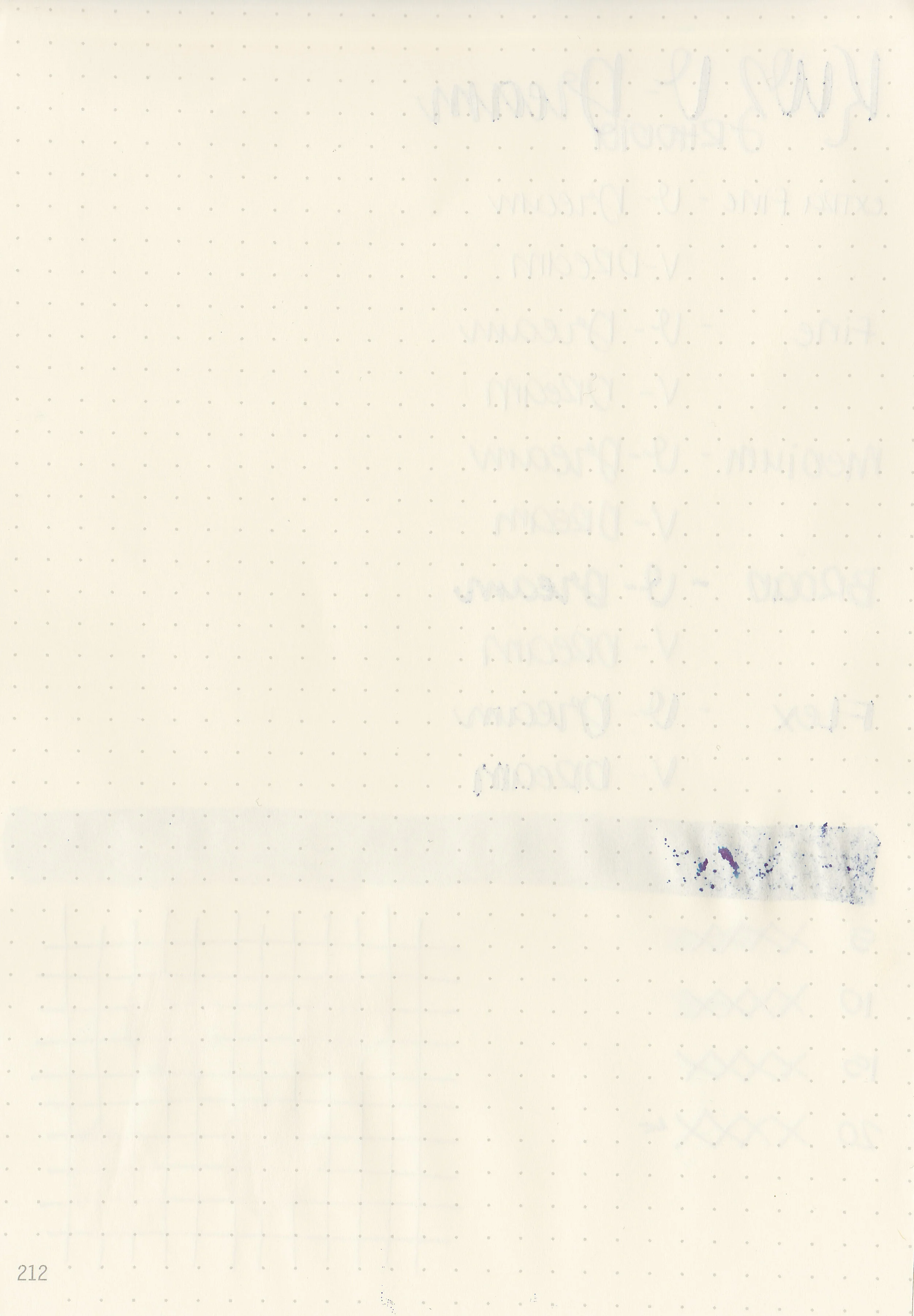
Dry time: 20 seconds
Water resistance: Low
Feathering: None
Show through: Medium
Bleeding: None
Other properties: low shading, no sheen, and no shimmer.
On Staples 24 lb copy paper there was feathering in every nib size and just a little bit of bleeding in the flex nib.

V-Dream is a bit darker than Diamine Amazing Amethyst and a bit lighter than Sailor Ink Studio 452. Click here to see the KWZ inks together, and click here to see the purple inks together.

I used a custom Bonecrusher Studios pen fitted with a Regalia Writing Labs Crossflex nib on a Lochby A5 Lined Refill-Tomoe River 68gsm. The ink had a a wetter than average flow.
Overall, I like this ink. I love the dusky purple color, the wet flow and it’s very well behaved. The color is great for the winter season.
Disclaimer: This product was provided by Vitstyle for the purpose of this review. All photos and opinions are my own. This page does not contain affiliate links, and this post is not sponsored in any way.

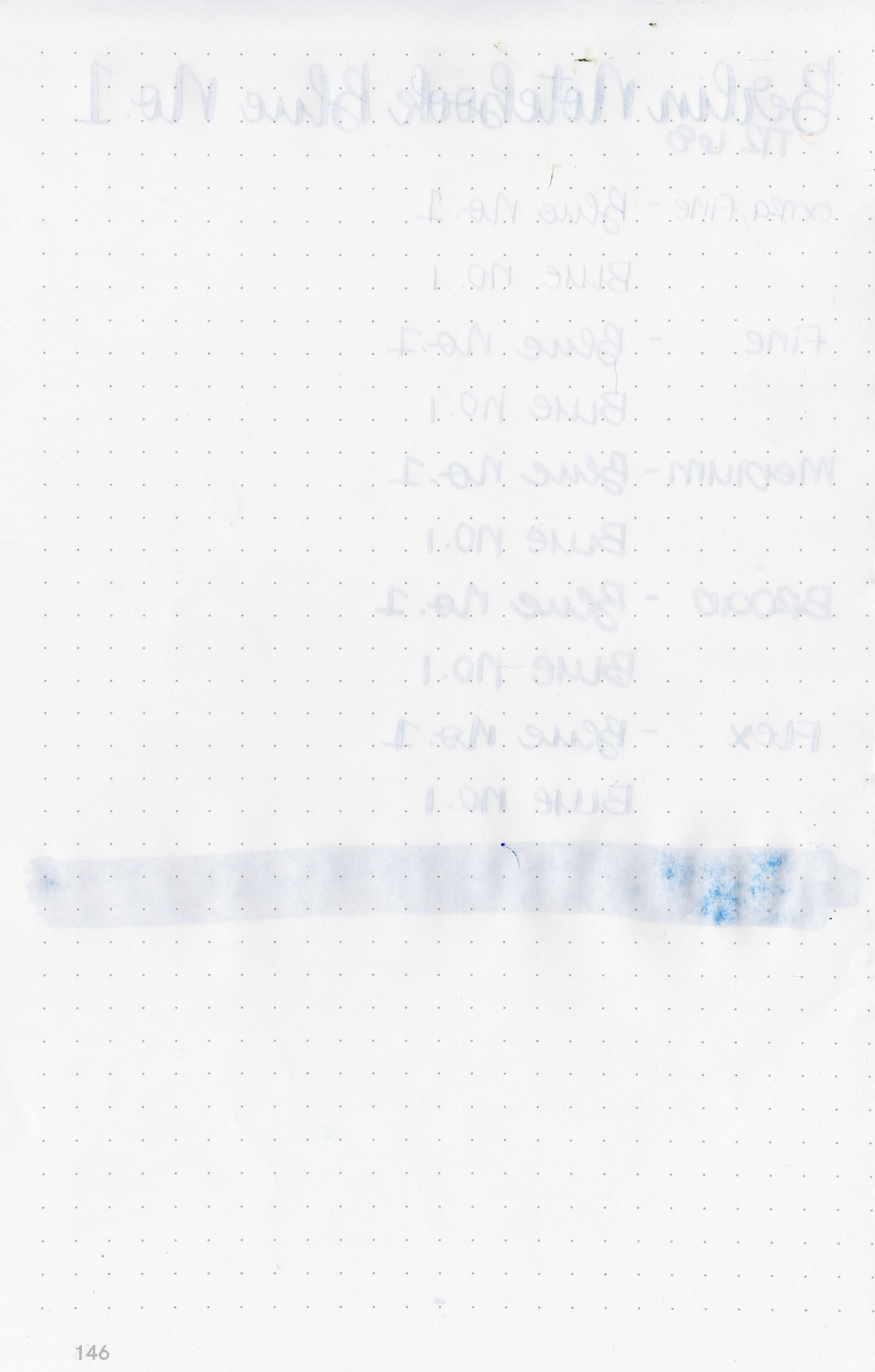
Berlin Notebook Blue No. 1 was designed by painter Viktor Walter. This ink is hand made in Germany and designed to work on recycled and copy papers. This ink is available in both a standard 30ml bottle and a small 5ml travel bottle. Thanks to Berlin Notebook for sending the ink over for review.

The color:
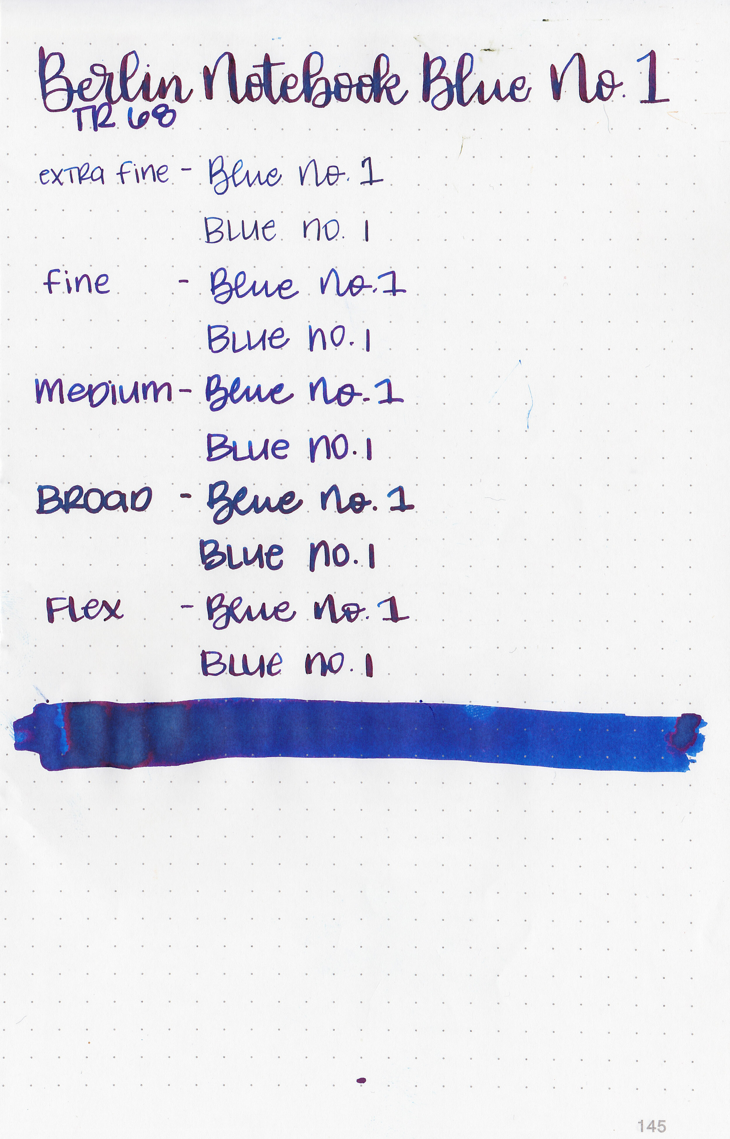
Blue No. 1 is a bright saturated blue with some dark red sheen.

In large swabs on Tomoe River paper the ink shows off its pretty sheen.

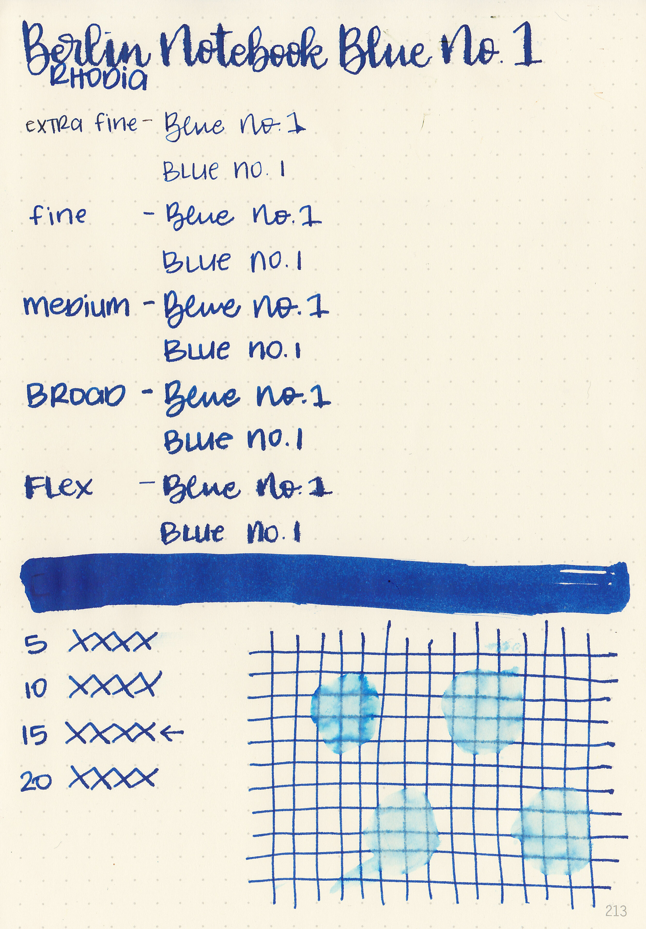
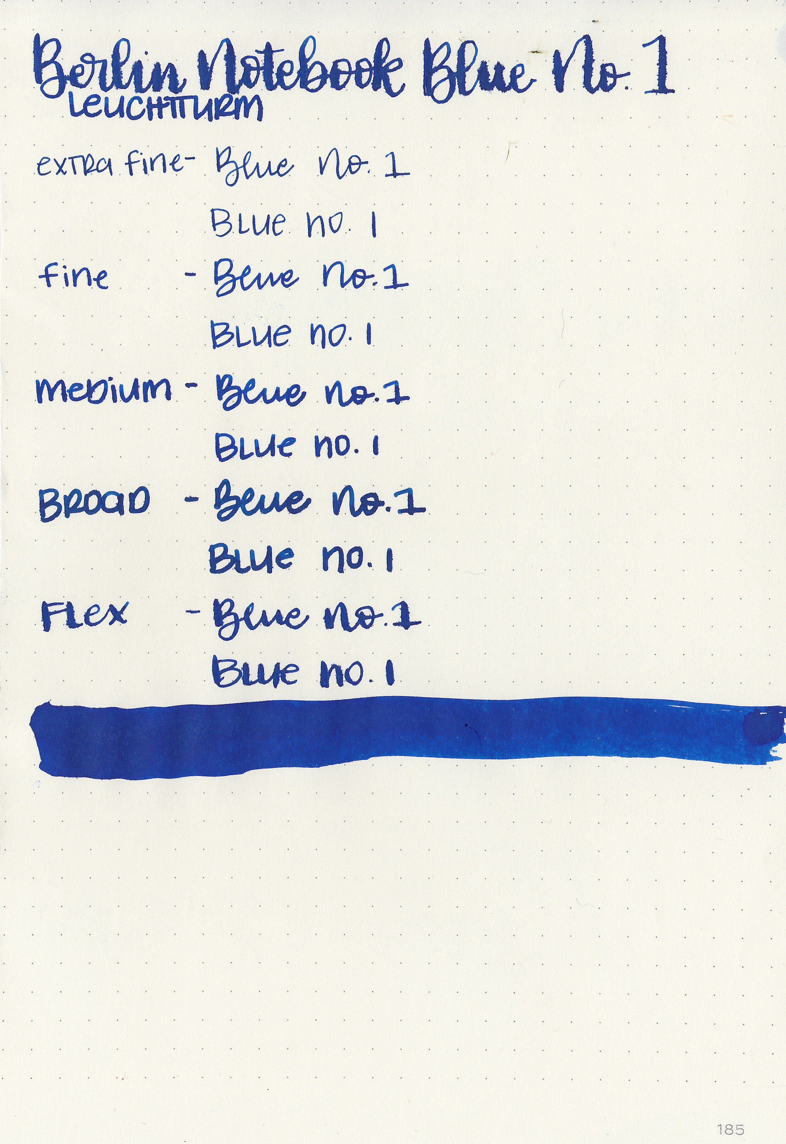
Let's take a look at how the ink behaves on fountain pen friendly papers: Rhodia, Tomoe River, and Leuchtturm.
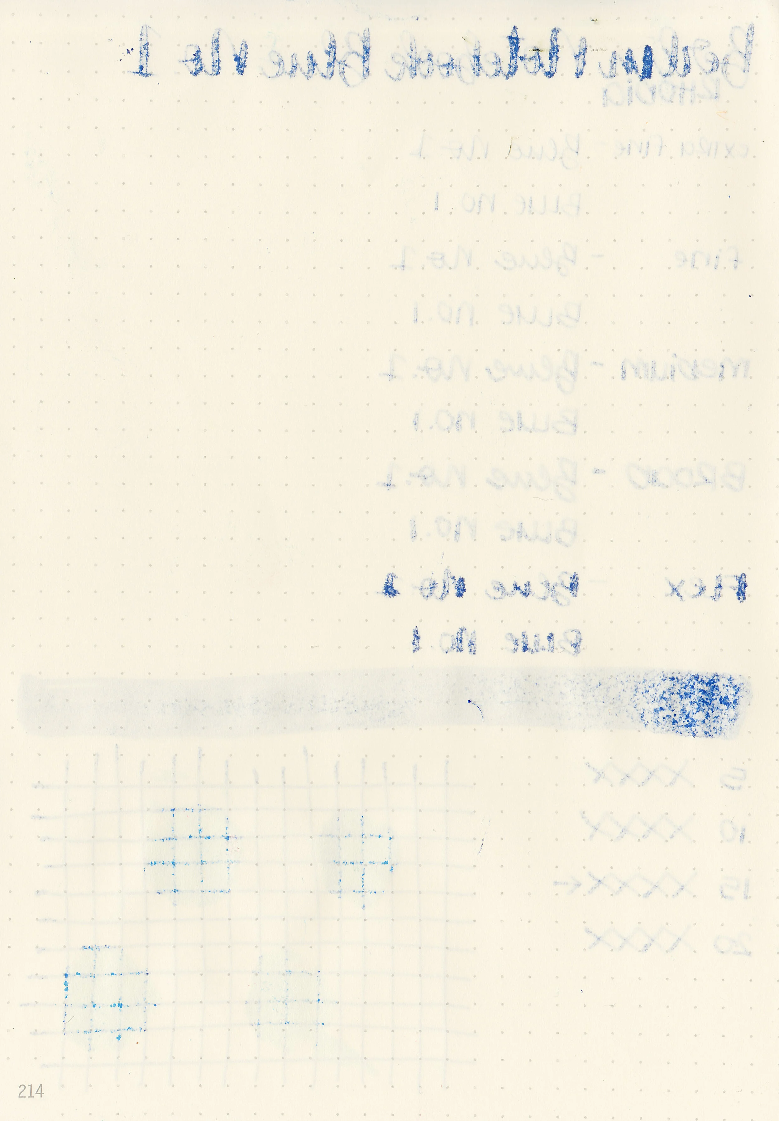
Dry time: 15 seconds
Water resistance: Low
Feathering: Medium-high-there was feathering in every nib size on Rhodia and Leuchtturm.
Show through: Medium
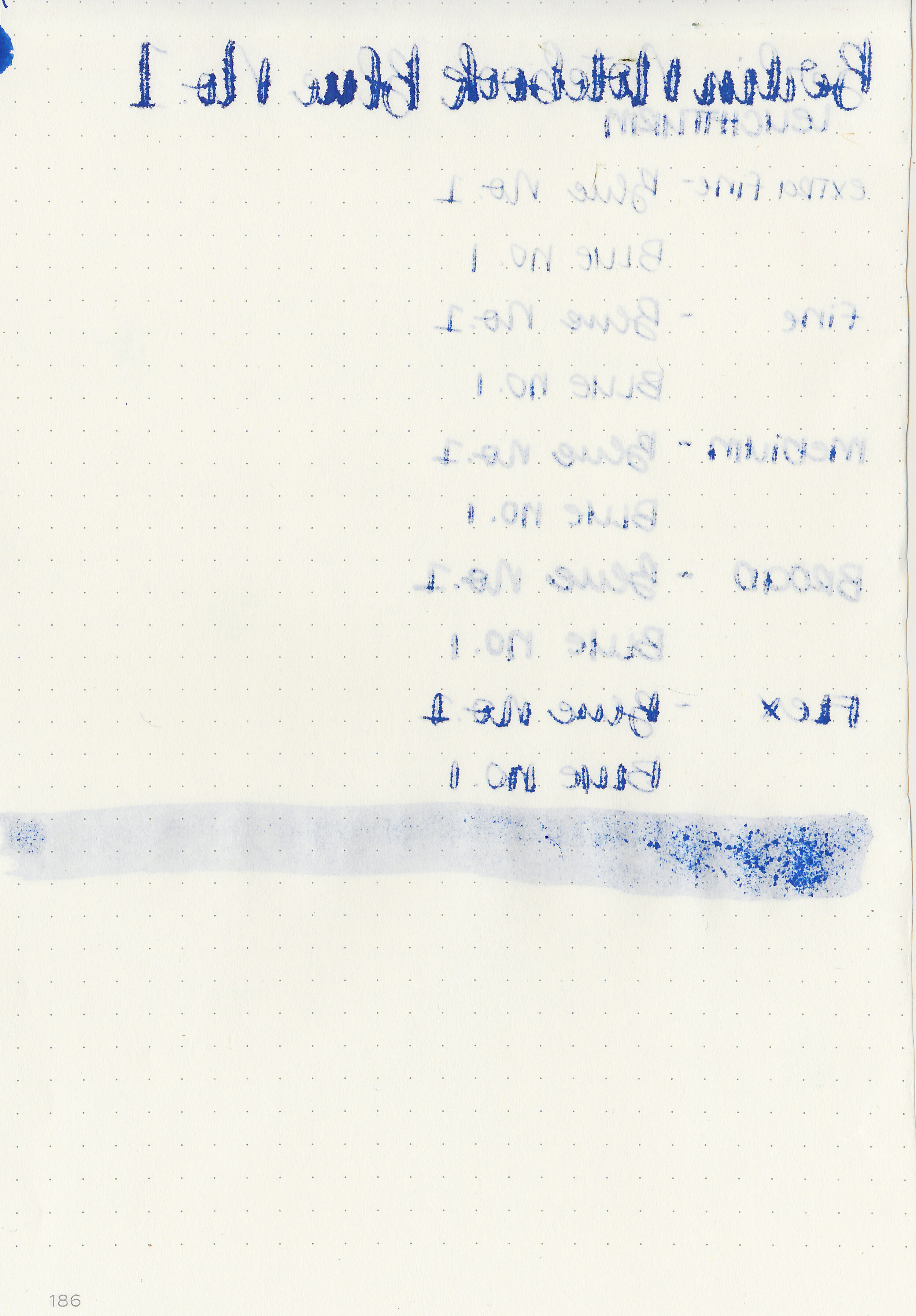
Bleeding: Medium-there was bleeding in every nib size on Leuchtturm and most nib sizes on Rhodia.
Other properties: medium shading, medium sheen, and no shimmer.
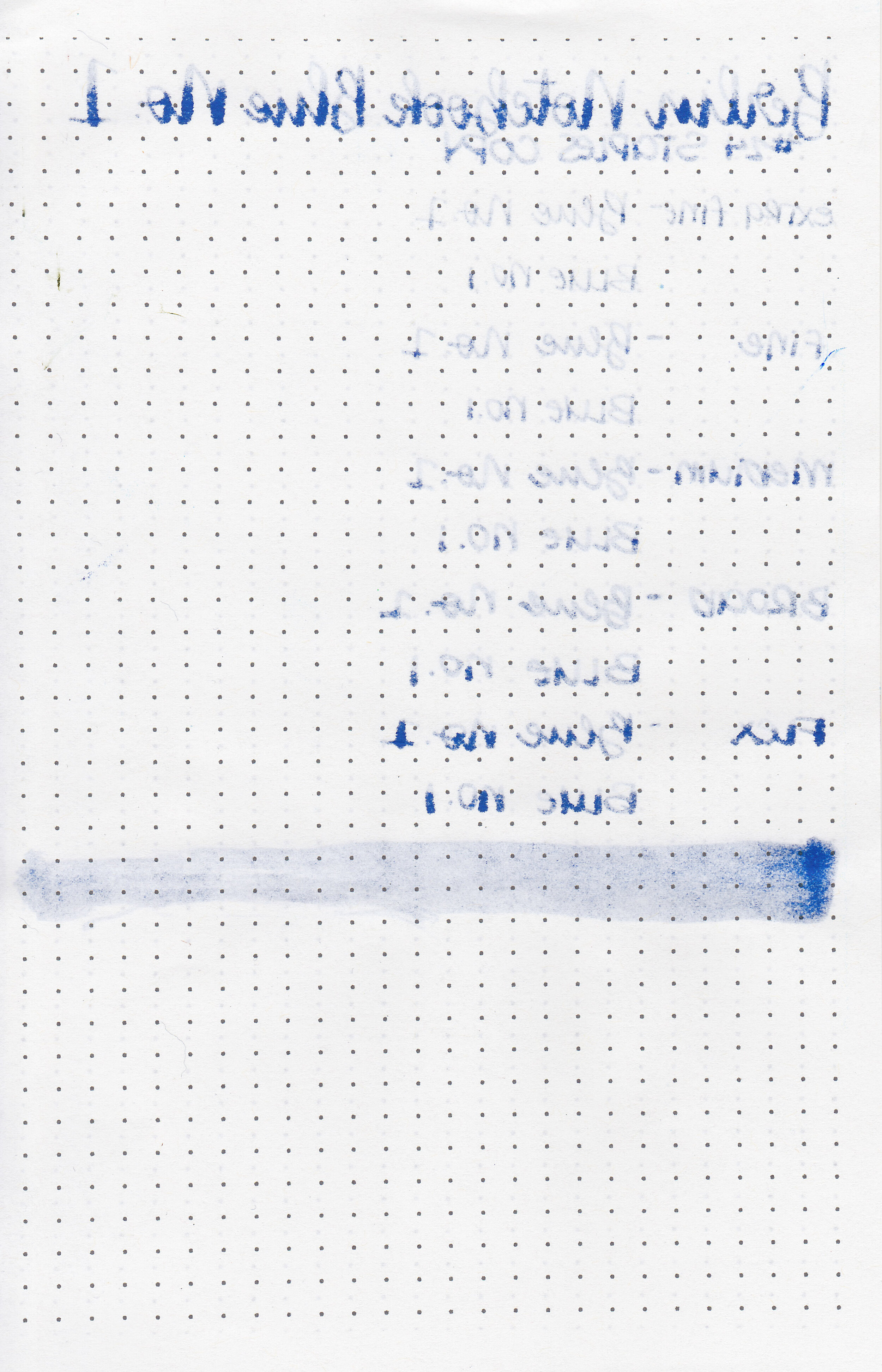
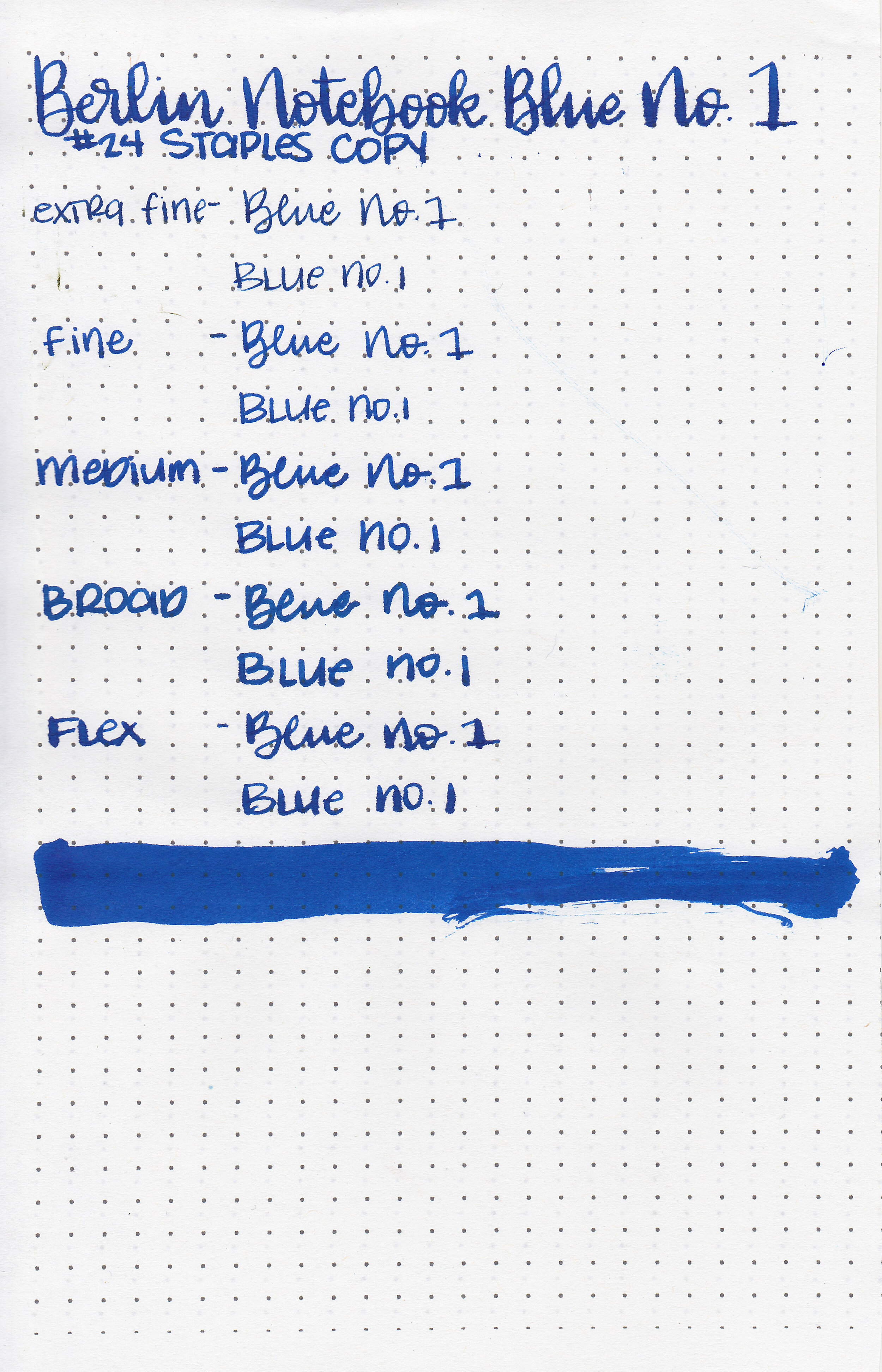
On Staples 24 lb copy paper there was feathering and bleeding in every nib size.

Blue No. 1 is similar to Monteverde Ocean Noir. Click here to see the blue inks together.

I used a broad Pelikan M805 Vibrant Blue on a Lochby A5 Lined Refill-Tomoe River 68gsm. The ink had a wetter than average flow.
Overall, while I love the color of this ink, there’s a bit more feathering and bleeding than I prefer. It dries fast which is great, but is also rather smeary and smudgy. This paper performs the best on Tomoe River paper (as most inks do). Second best on the cheapest copy paper, but there is still a little feathering and bleeding. It feathers and bleeds on Leuchtturm and Rhodia in almost every pen and nib size I tried it in.
Disclaimer: This product was provided by Berlin Notebook for the purpose of this review. All photos and opinions are my own. This page does not contain affiliate links, and this post is not sponsored in any way.

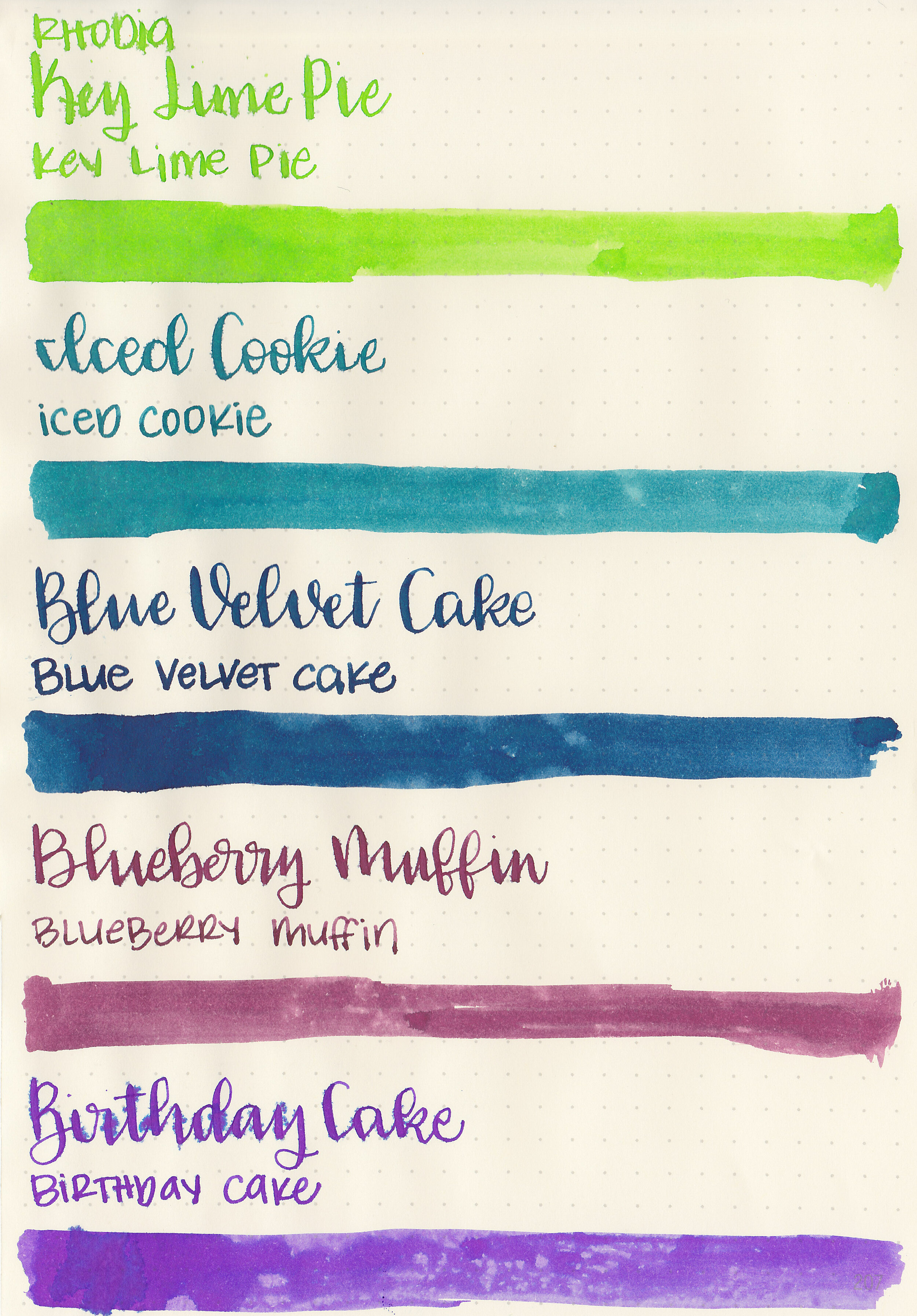
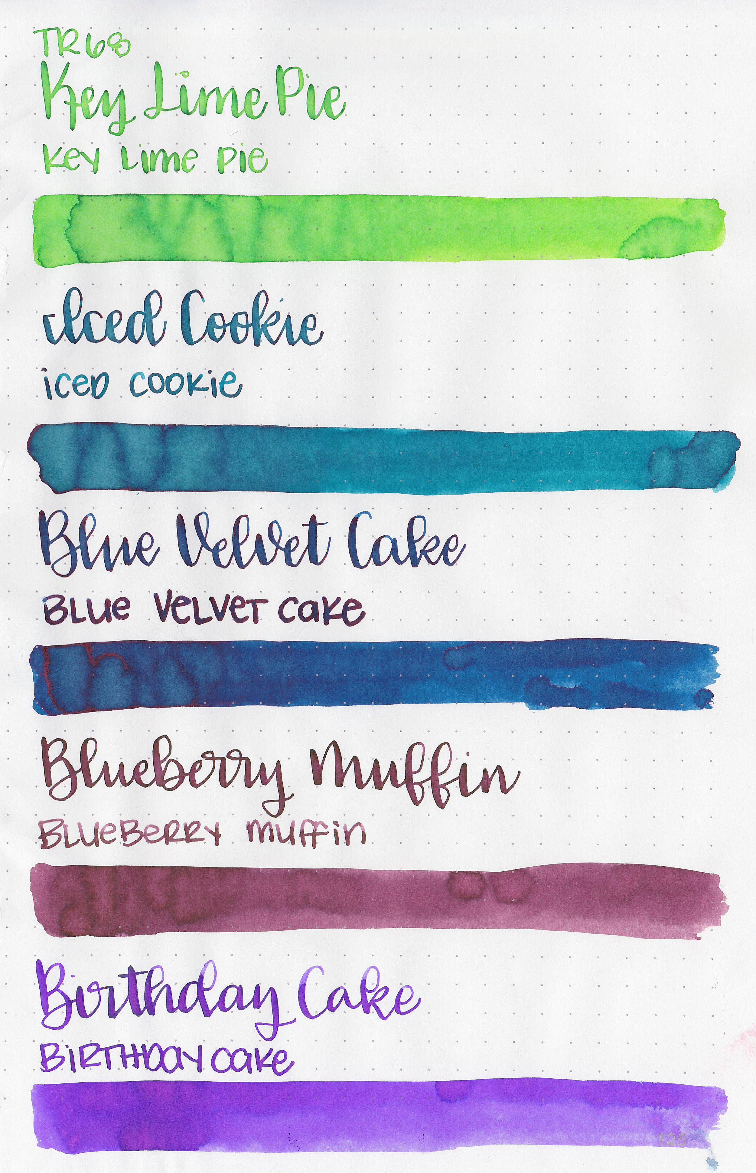
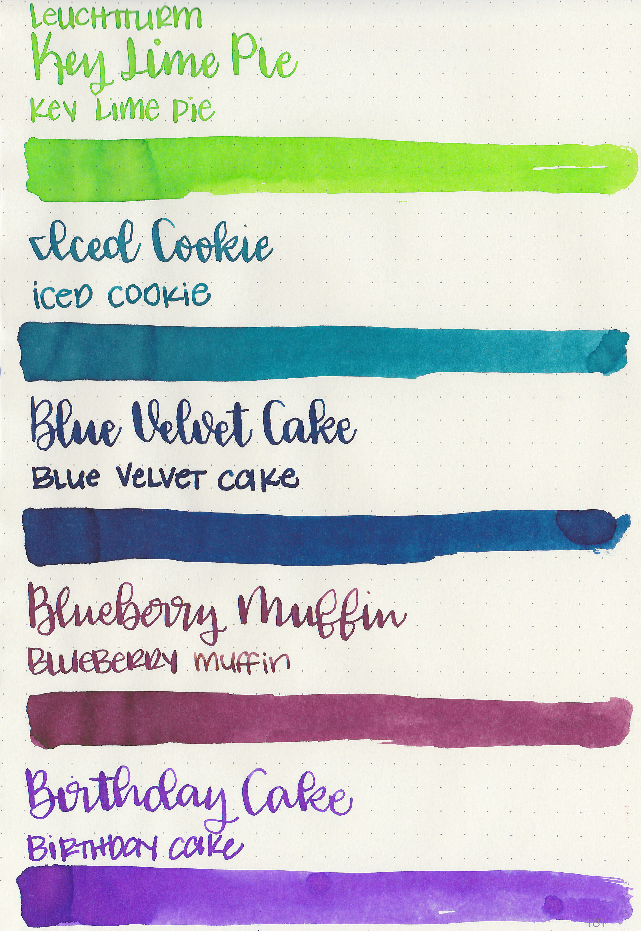
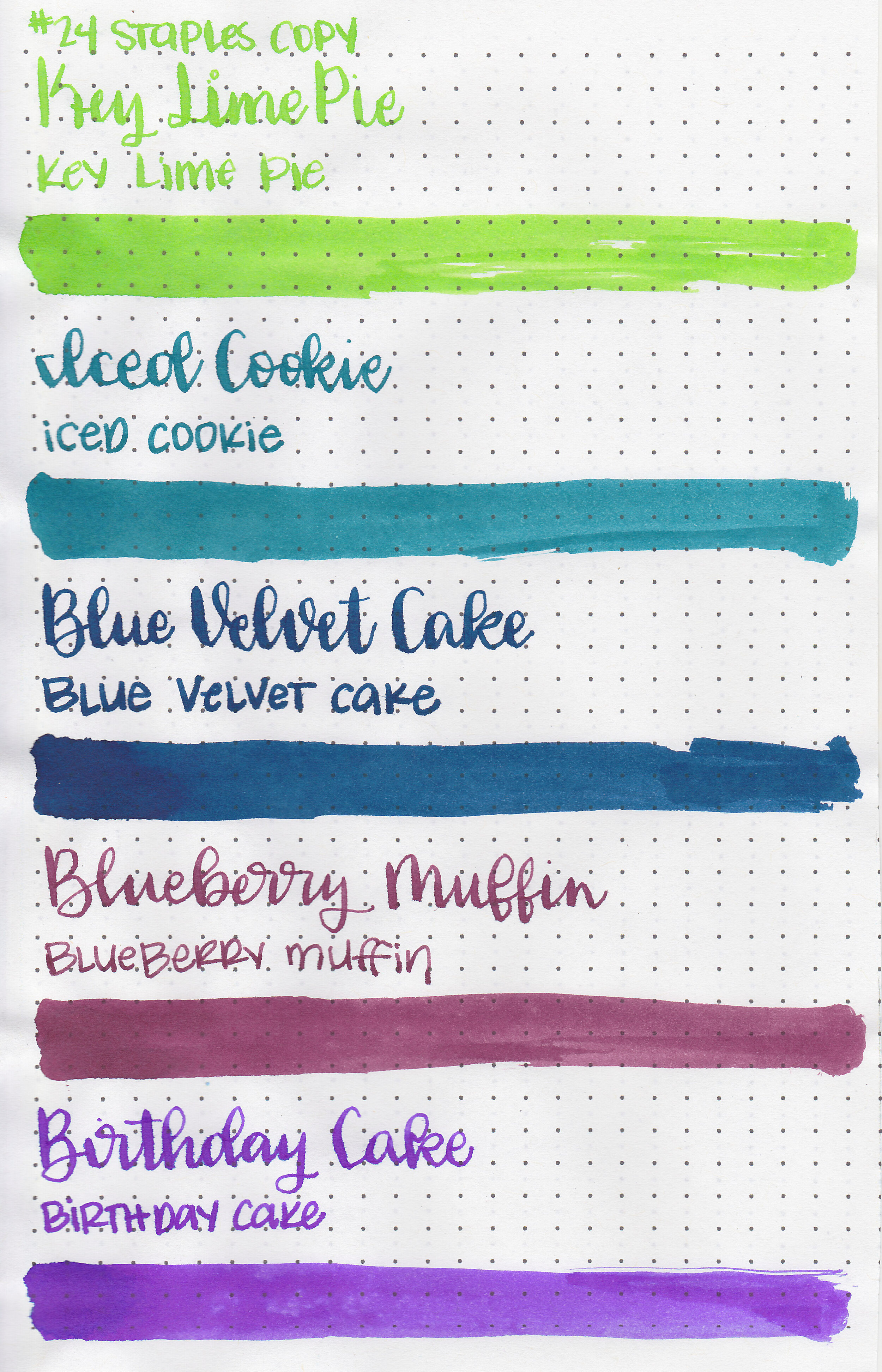
Earlier this week I reviewed the first half of Monteverde’s new Sweet Life collection. You can find the Sweet Life set for sale at most US retailers including Goulet Pens. I decided to break the collection down into two sets for this review, today we are going to cover the second half: Key Lime Pie, Iced Cookie, Blue Velvet Cake, Blueberry Muffin, and Birthday Cake.

Left to right: Key Lime Pie, Iced Cookie, Blue Velvet Cake, Blueberry Muffin and Birthday Cake.
Let's take a look at how the ink behaves on fountain pen friendly papers: Rhodia, Tomoe River, and Leuchtturm.
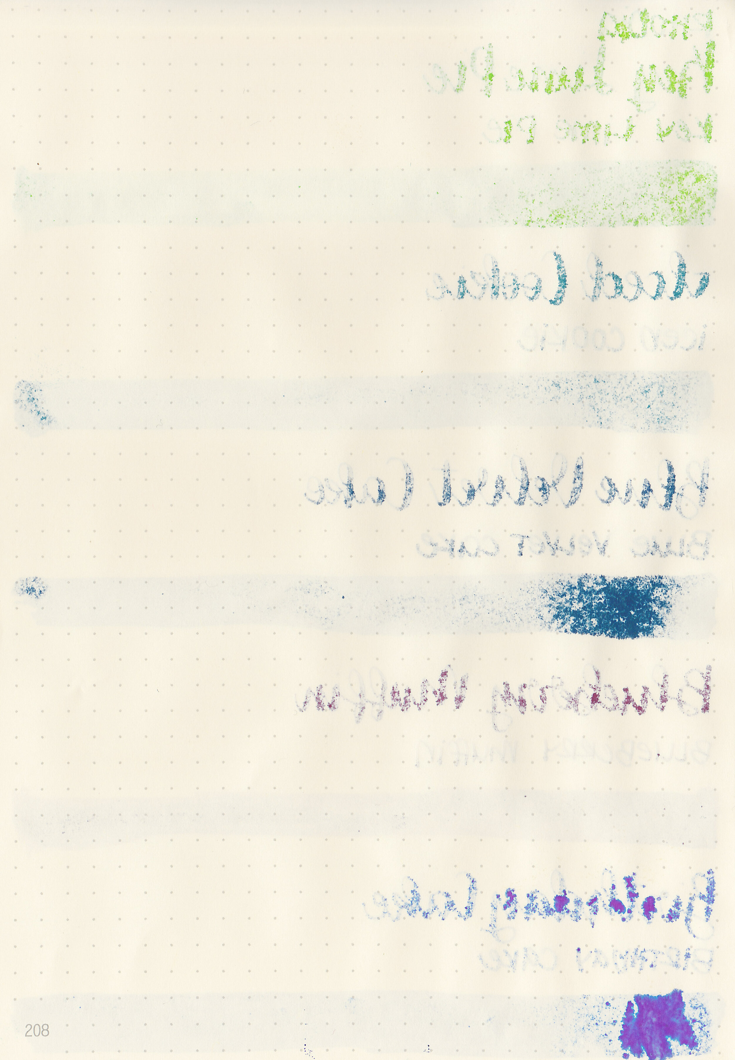
Water resistance: Low
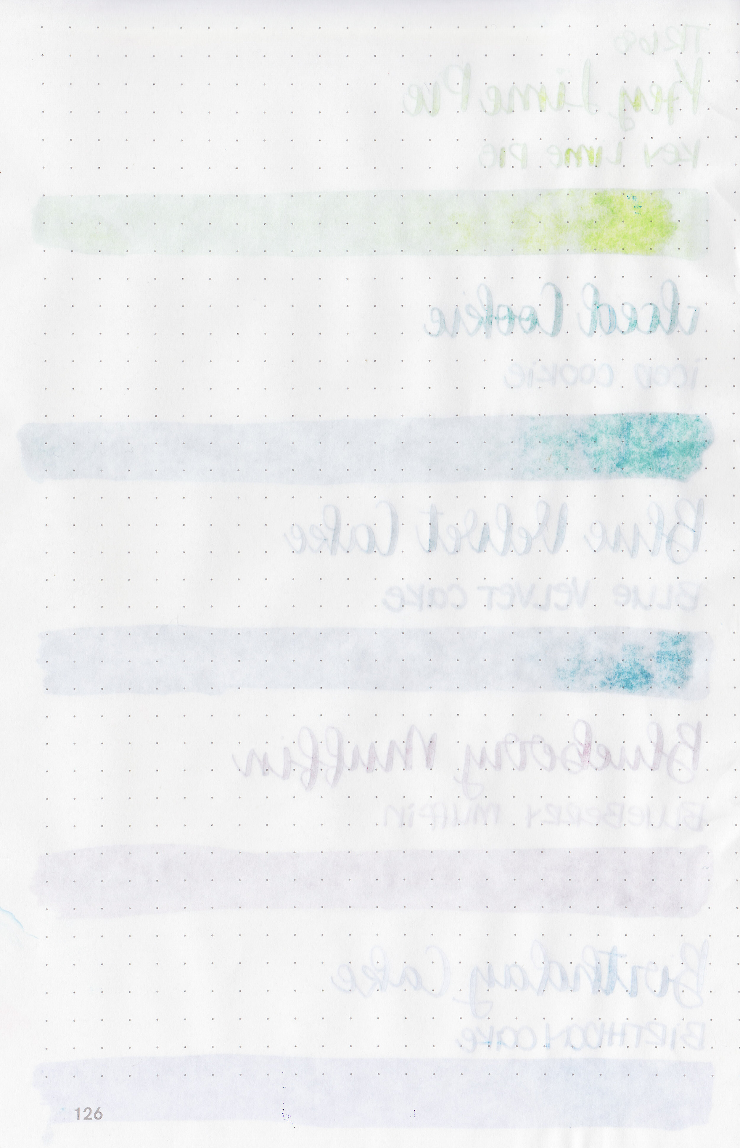
Feathering: Low-there was some feathering in the flex nib on Leuchtturm and Rhodia.
Show through: Medium
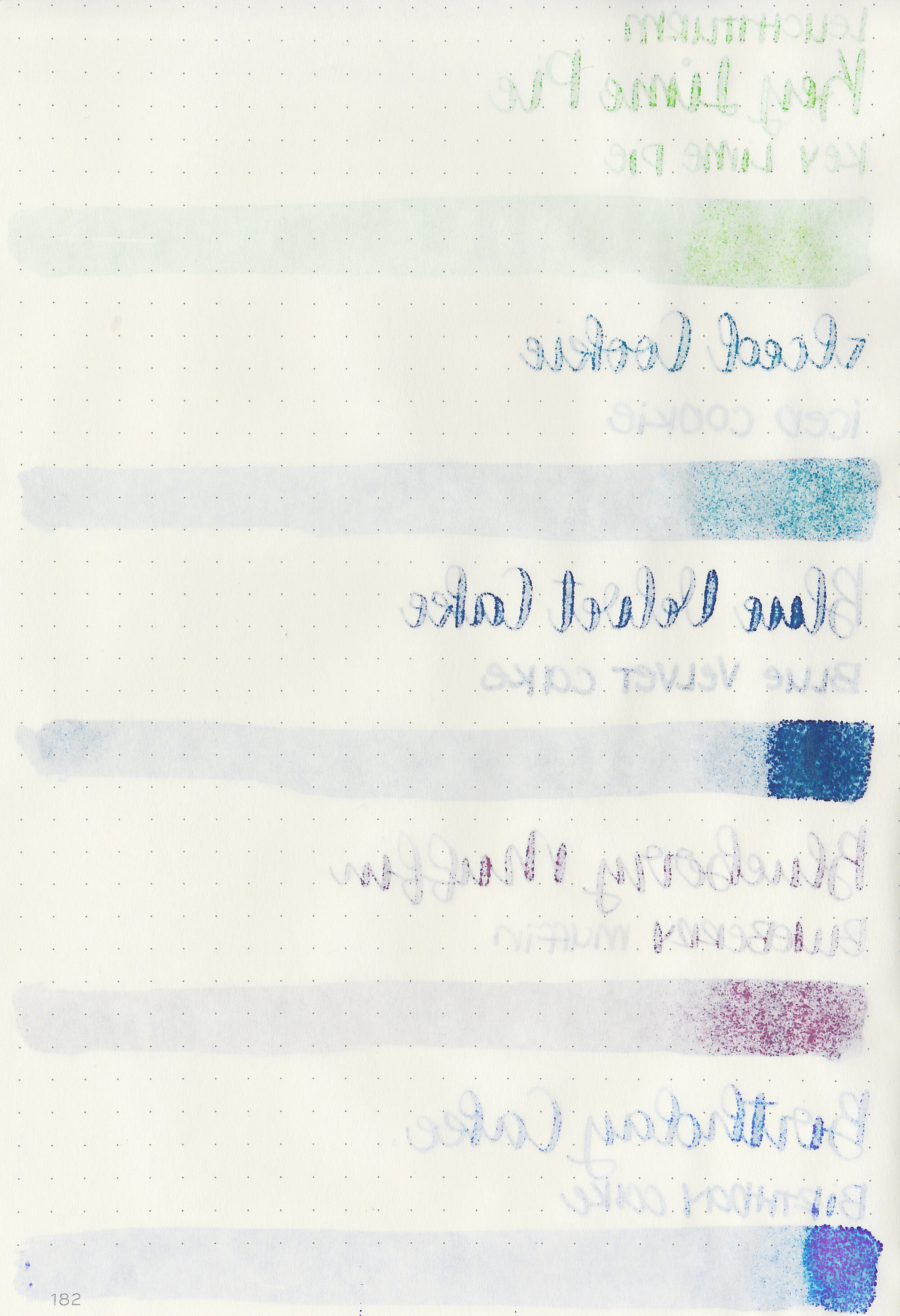
Bleeding: Low-there was some bleeding on Leuchtturm in the flex nib.
Other properties: low to medium shading, no to medium sheen, and no shimmer. Out of the set only Blue Velvet Cake shows any sheen.
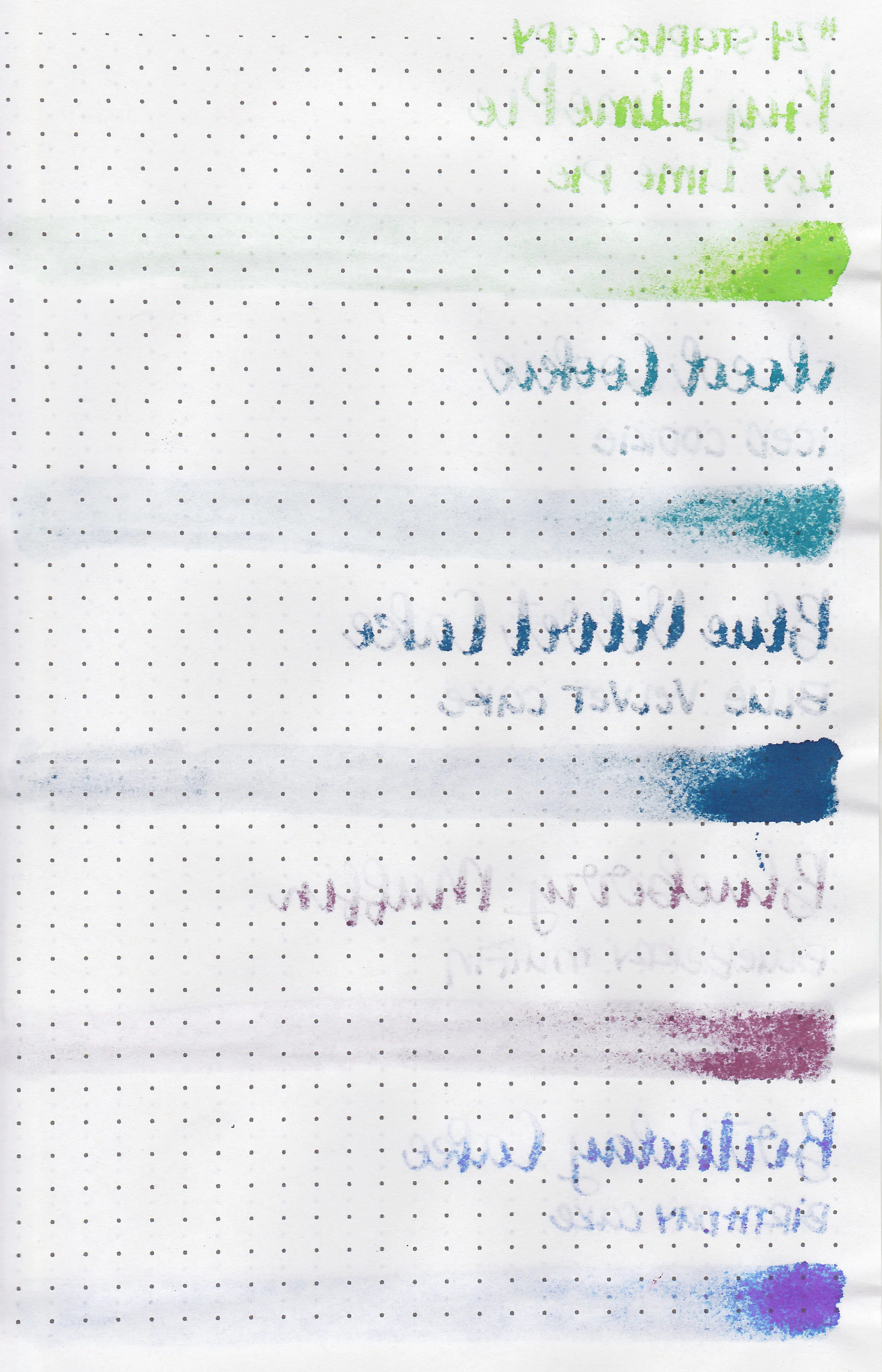
On Staples 24 lb copy paper there was lots of feathering in every nib size as well as a lot of bleeding, so I would not recommend these inks for cheap paper.

Key Lime Pie is warmer than Robert Oster Light Green, but cooler than Diamine Jade Green. Iced Cookie is similar to Lamy Amazonite. Blue Velvet Cake is similar to J Herbin Bleu Des Profondeurs. Blueberry Muffin is a little bit darker than Platinum Lavender Black. Birthday Cake is warmer than Monteverde Charoite but cooler than Monteverde Amethyst. Click here to see the Monteverde Inks together.


I used a Lochby Lined Refill A5 notebook (Tomoe River 68gsm). All of the inks had a wetter than average flow.
Overall, I love all five of these inks. They go well together, are generally well behaved, and have a nice wet flow. I love these colors together, and have been using them daily for the last week. Definitely worth a try!
Disclaimer: I purchased this ink myself. All photos and opinions are my own. This page does not contain affiliate links, and is not sponsored in any way.

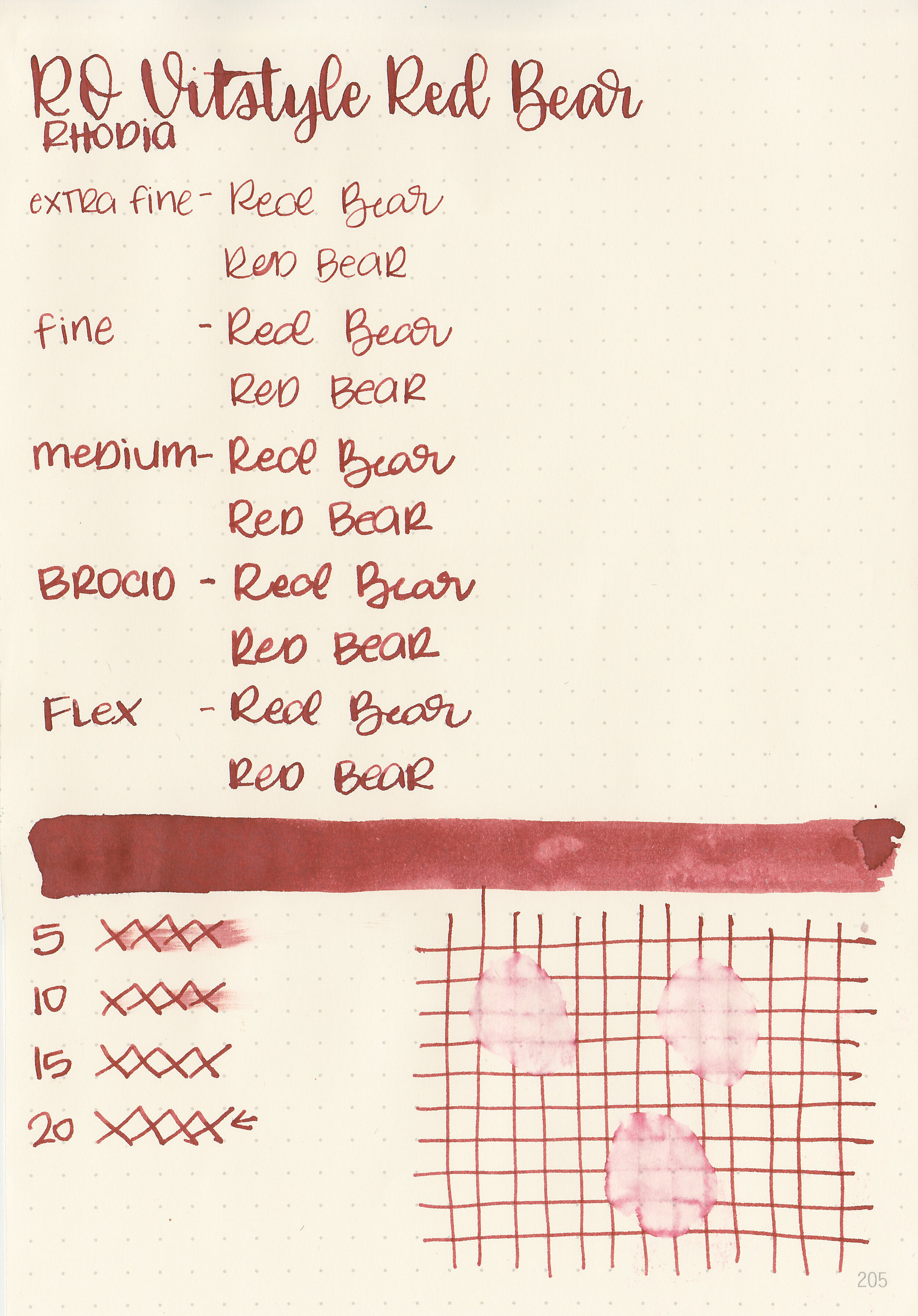
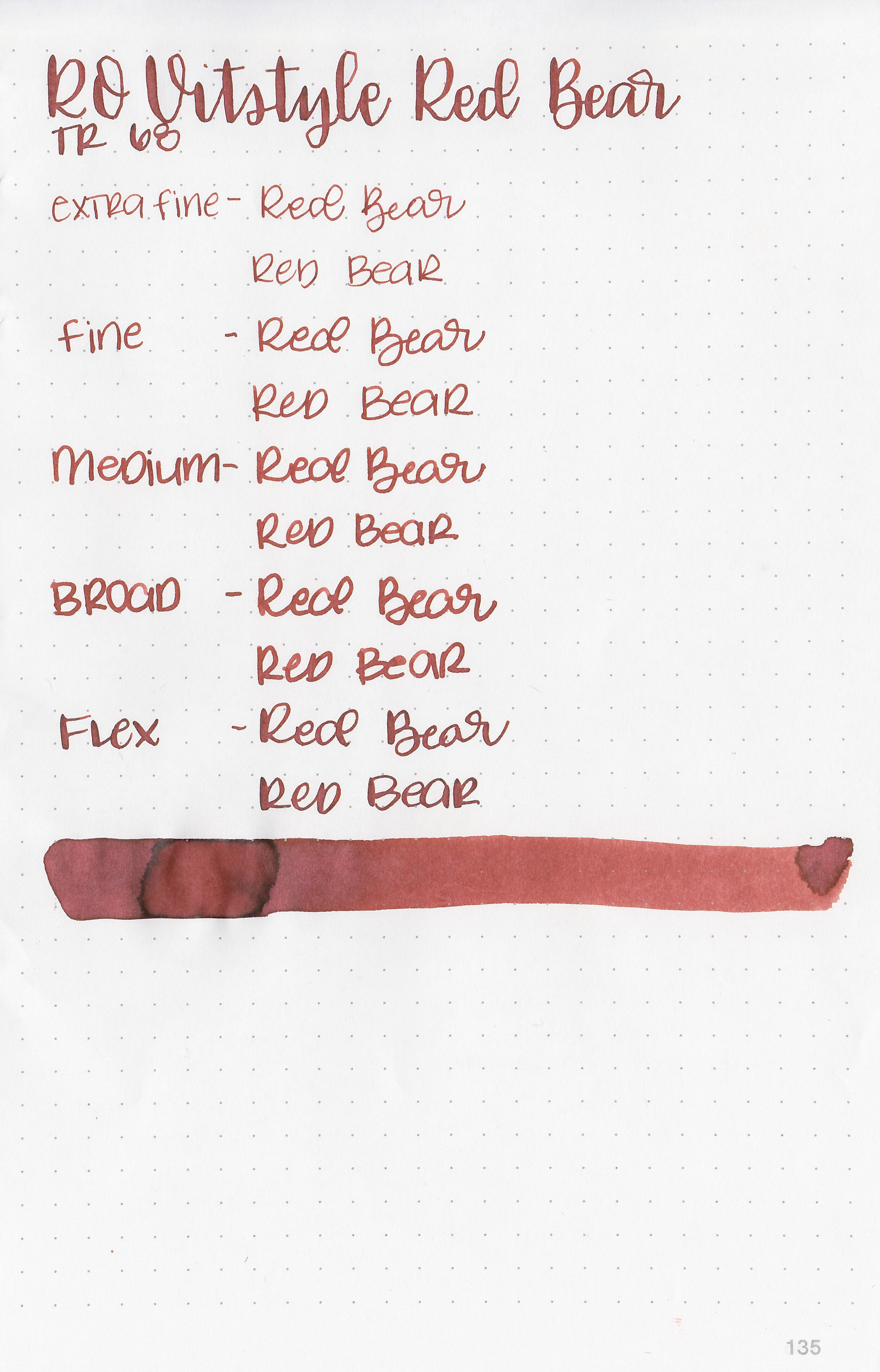
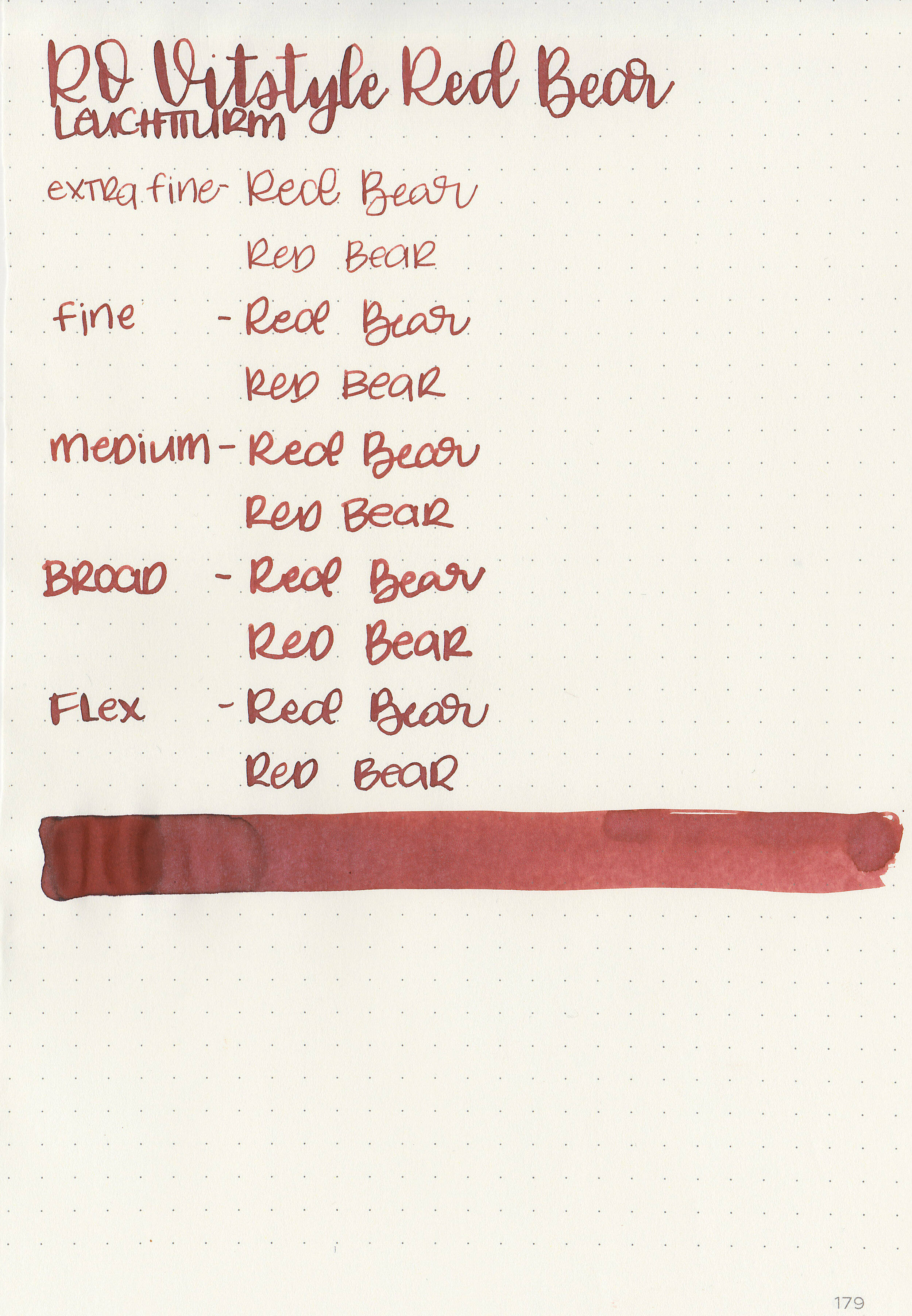
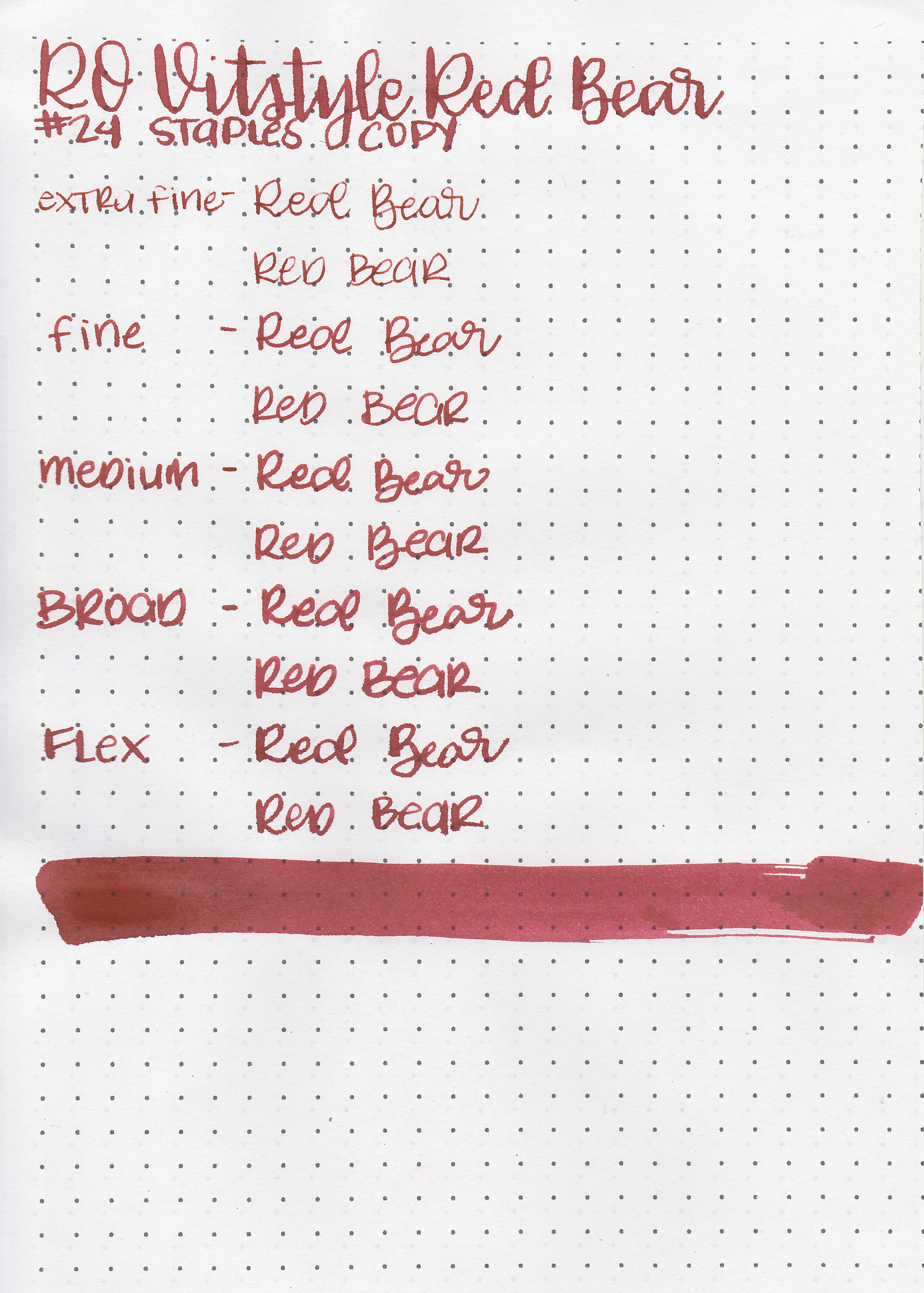
Vitstyle is a pen store in Hong Kong. Recently they sent me two of their store exclusive inks to try, Robert Oster Vitstyle Red Bear and KWZ V-Dream. Today we are going to take a look at Red Bear. Thanks to Vitstyle for sending the ink over for review!

The color:
Red Bear is a dark, slightly unsaturated red. This would be a great color for the fall and winter.

In large swabs on Tomoe River paper the ink looks much less saturated, almost red-brown.

Let's take a look at how the ink behaves on fountain pen friendly papers: Rhodia, Tomoe River, and Leuchtturm.
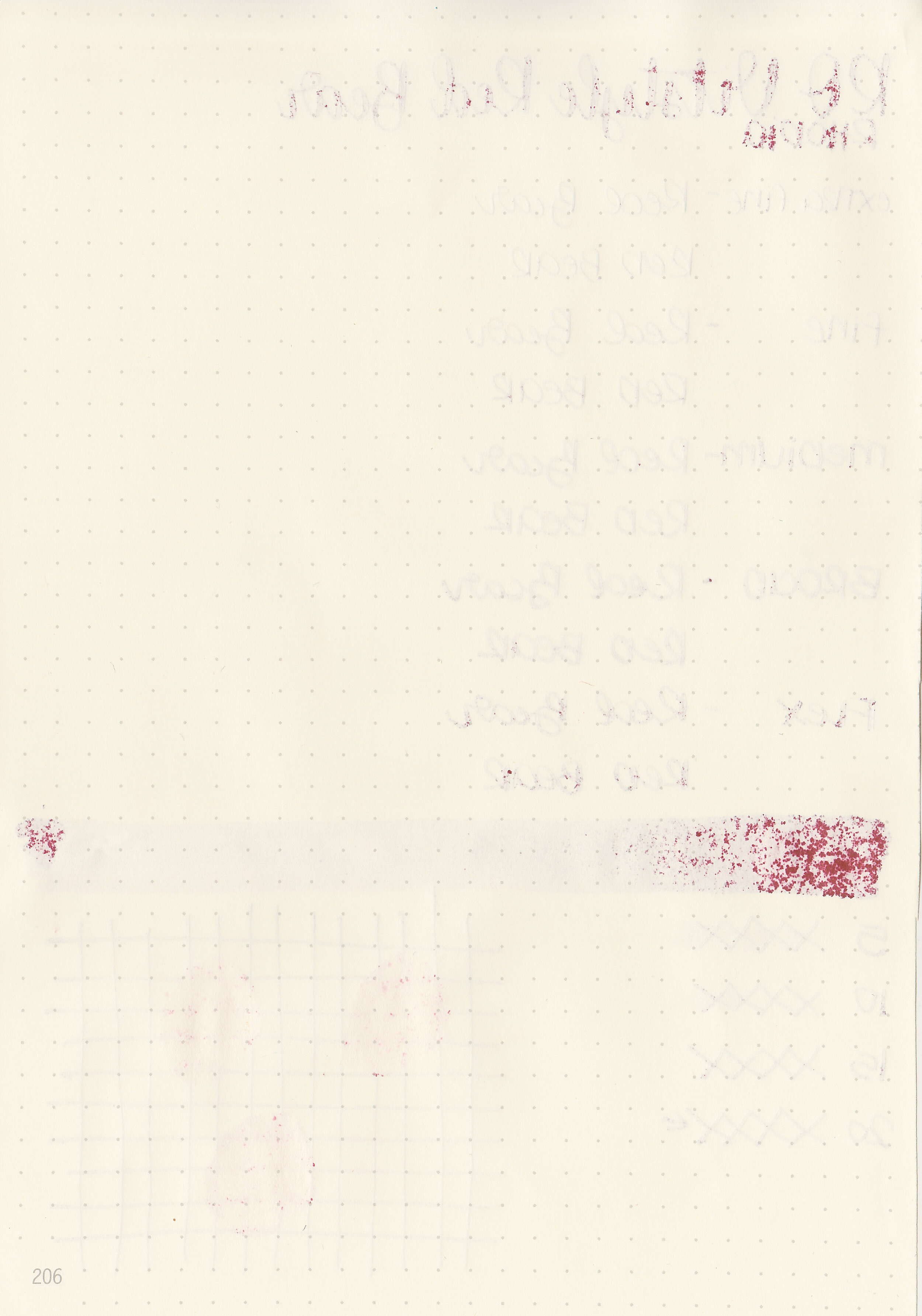
Dry time: 20 seconds
Water resistance: Low
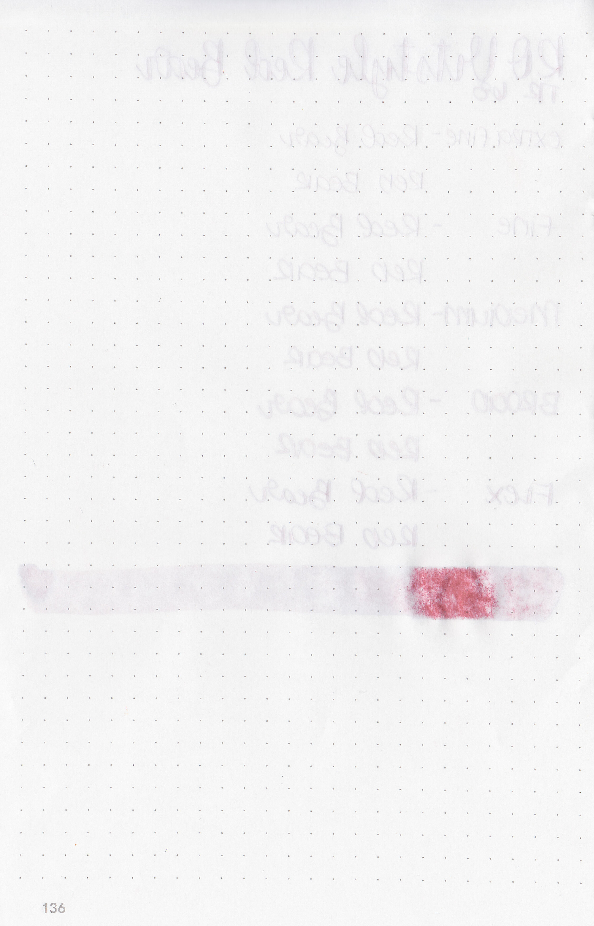
Feathering: Low-there was some feathering on Rhodia
Show through: Medium
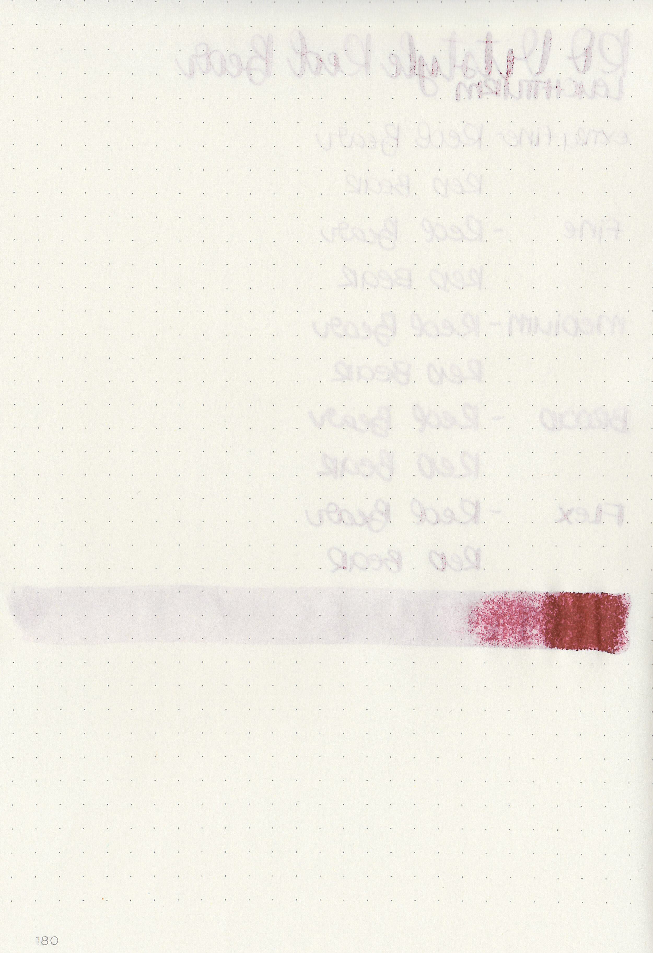
Bleeding: Low-there was a little bit of bleeding on Rhodia.
Other properties: low shading, no sheen, and no shimmer.
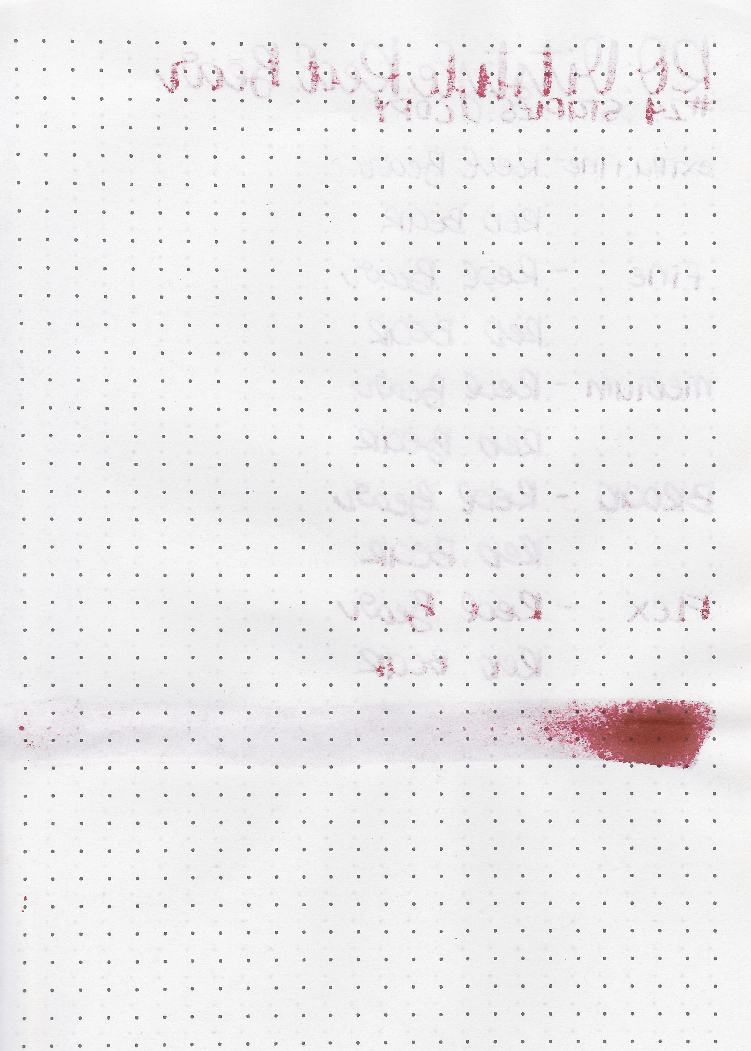
On Staples 24 lb copy paper there was feathering in every nib size, and some bleeding in the flex and broad nibs.
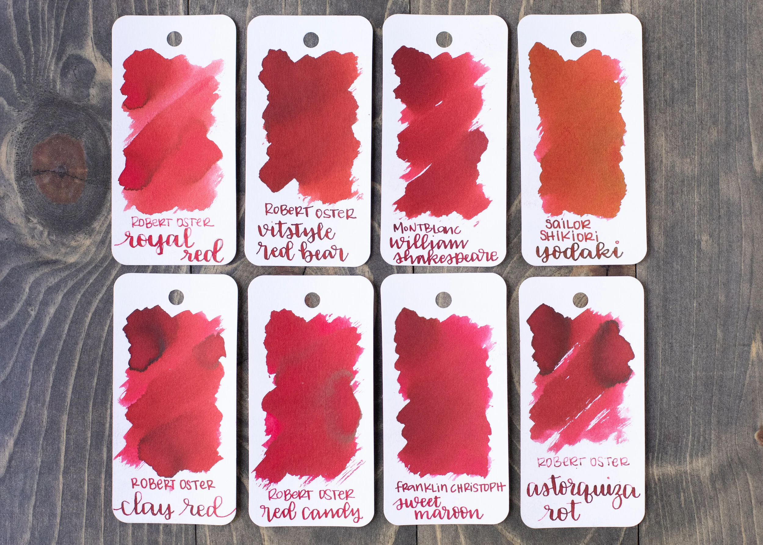
Red Bear is a little darker than Robert Oster Clay Red and a bit warmer than Franklin-Christoph Sweet Maroon. Click here to see the Robert Oster inks together, and click here to see the red inks together.

I used a medium Pilot Custom 74 Merlot on a Lochby A5 Lined Refill-Tomoe River 68gsm. The ink had an average flow.
Overall, I really enjoyed this ink. It’s well behaved, pretty, different enough from the other Robert Oster reds to keep it interesting, and perfect for the fall and winter seasons.
Disclaimer: This product was provided by Vitstyle for the purpose of this review. All photos and opinions are my own. This page does not contain affiliate links, and this post is not sponsored in any way.

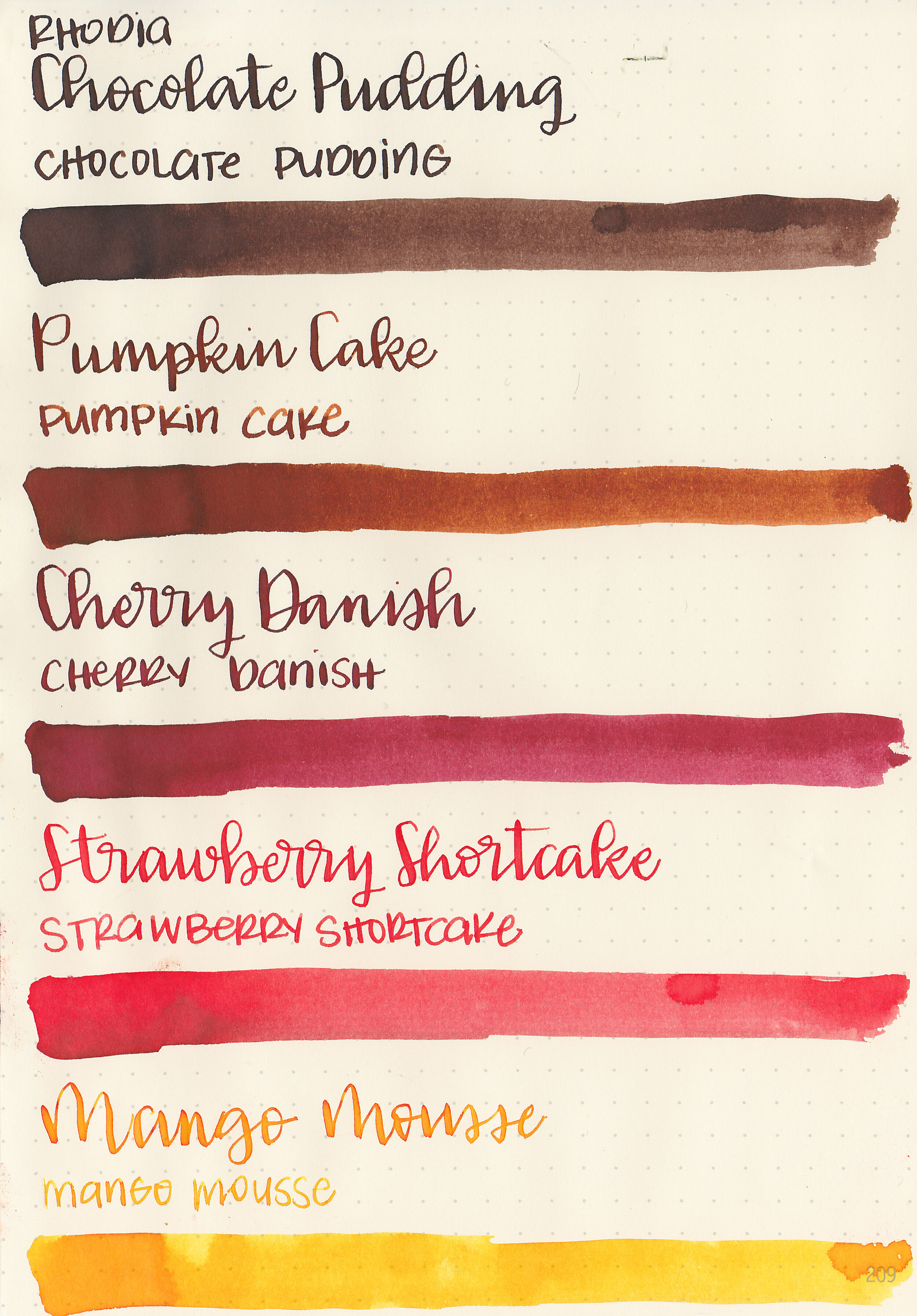
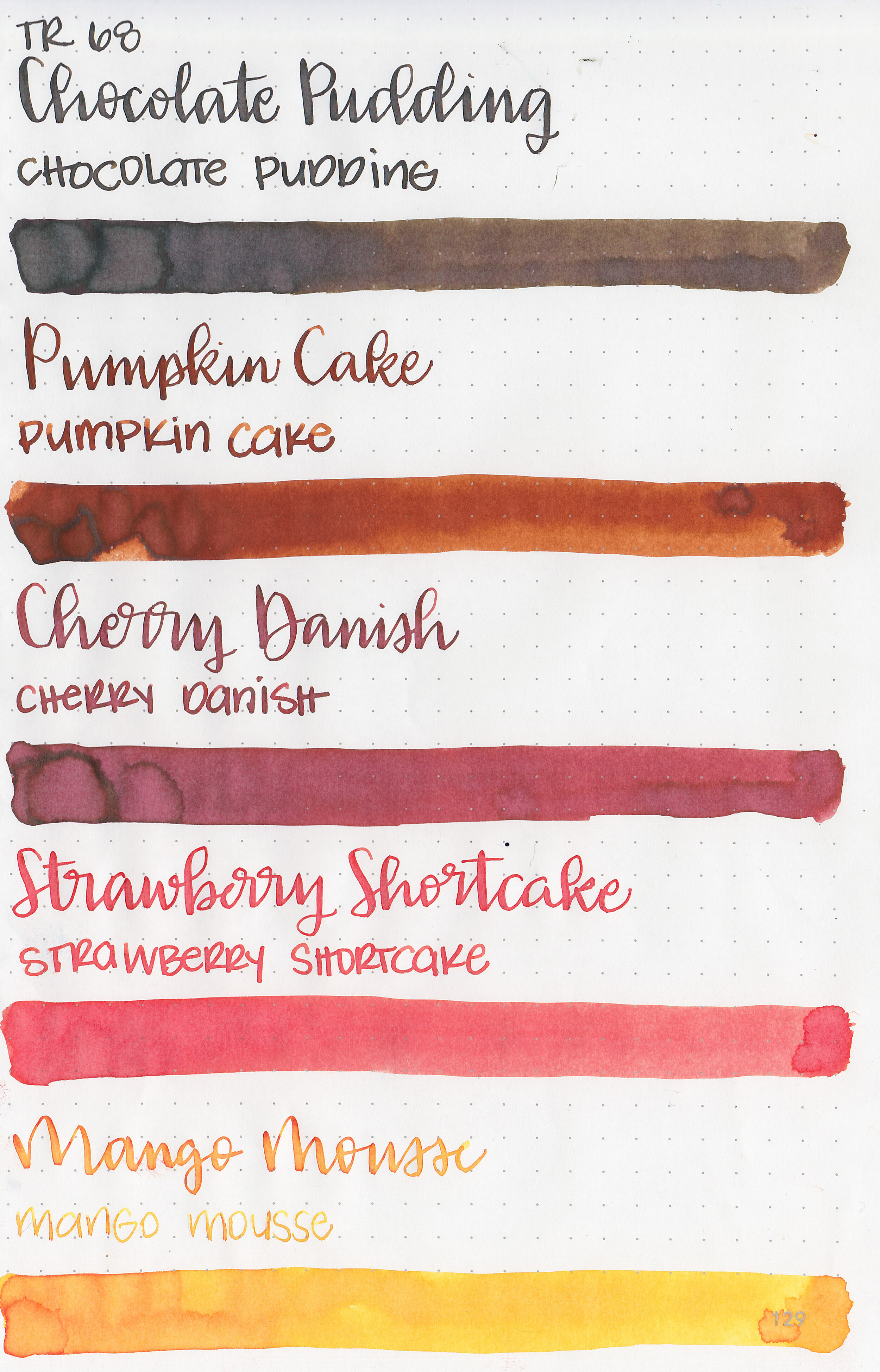
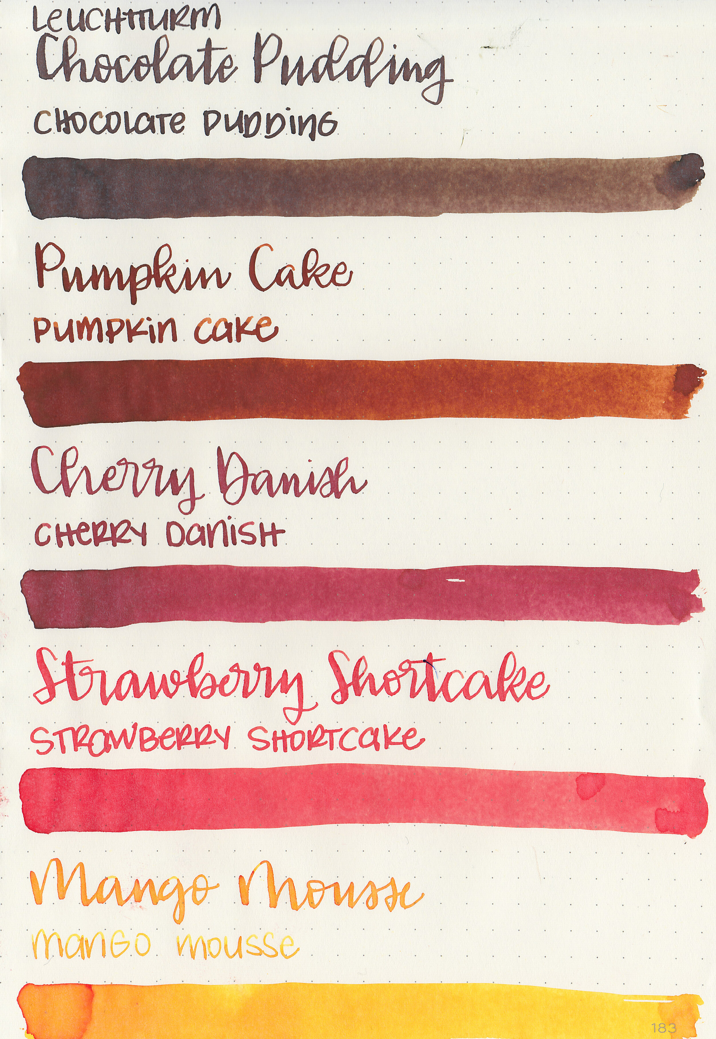
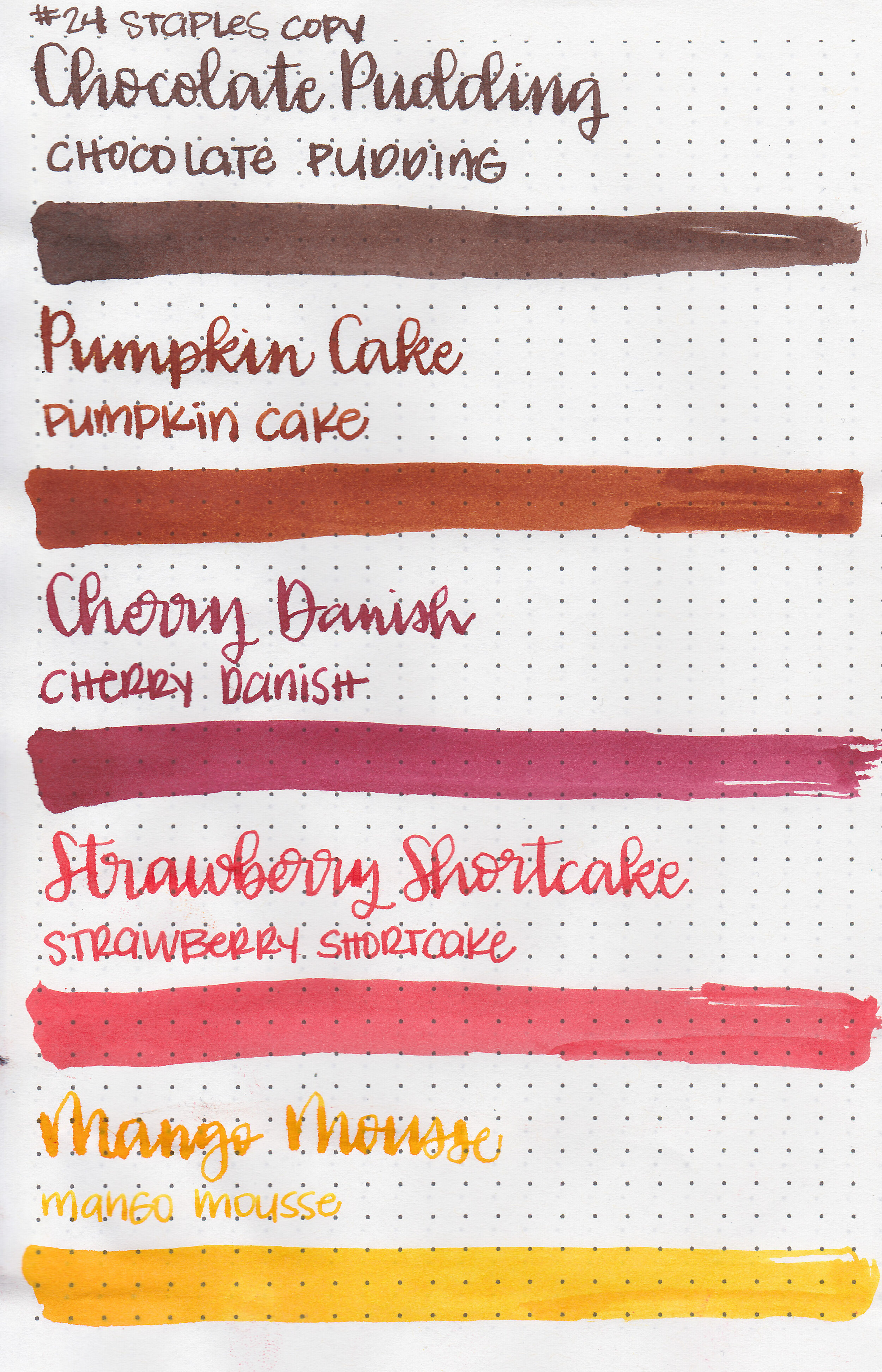
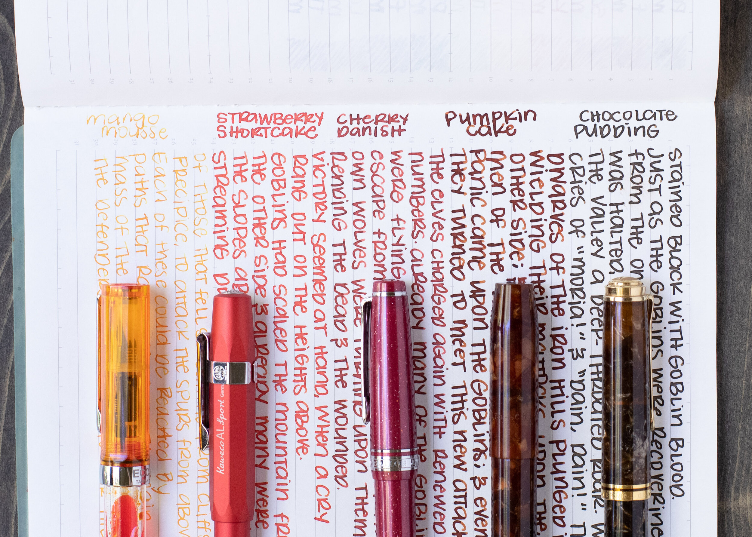
Monteverde is one of my favorite ink brands. Every time they release a new collection I get excited and can’t wait to try them out. When I attended the San Francisco Pen Show in August, YAFA (Monteverde’s US distributor) had the new Sweet Life collection for a really great show price and I immediately picked one up. You can find the Sweet Life set for sale at most US retailers including Goulet Pens. I decided to break the collection down into two sets for this review, today we are going to cover Chocolate Pudding, Pumpkin Cake, Cherry Danish, Strawberry Shortcake and Mango Mousse.

Left to right: Chocolate Pudding, Pumpkin Cake, Cherry Danish, Strawberry Shortcake and Mango Mousse.
Let's take a look at how the ink behaves on fountain pen friendly papers: Rhodia, Tomoe River, and Leuchtturm.
Water resistance: Low
Feathering: None
Show through: Medium
Bleeding: Low-there was some bleeding on Leuchtturm in the flex nib.
Other properties: low to medium shading, no sheen, and no shimmer. Out of the set, Pumpkin Cake and Cherry Danish have the most shading.
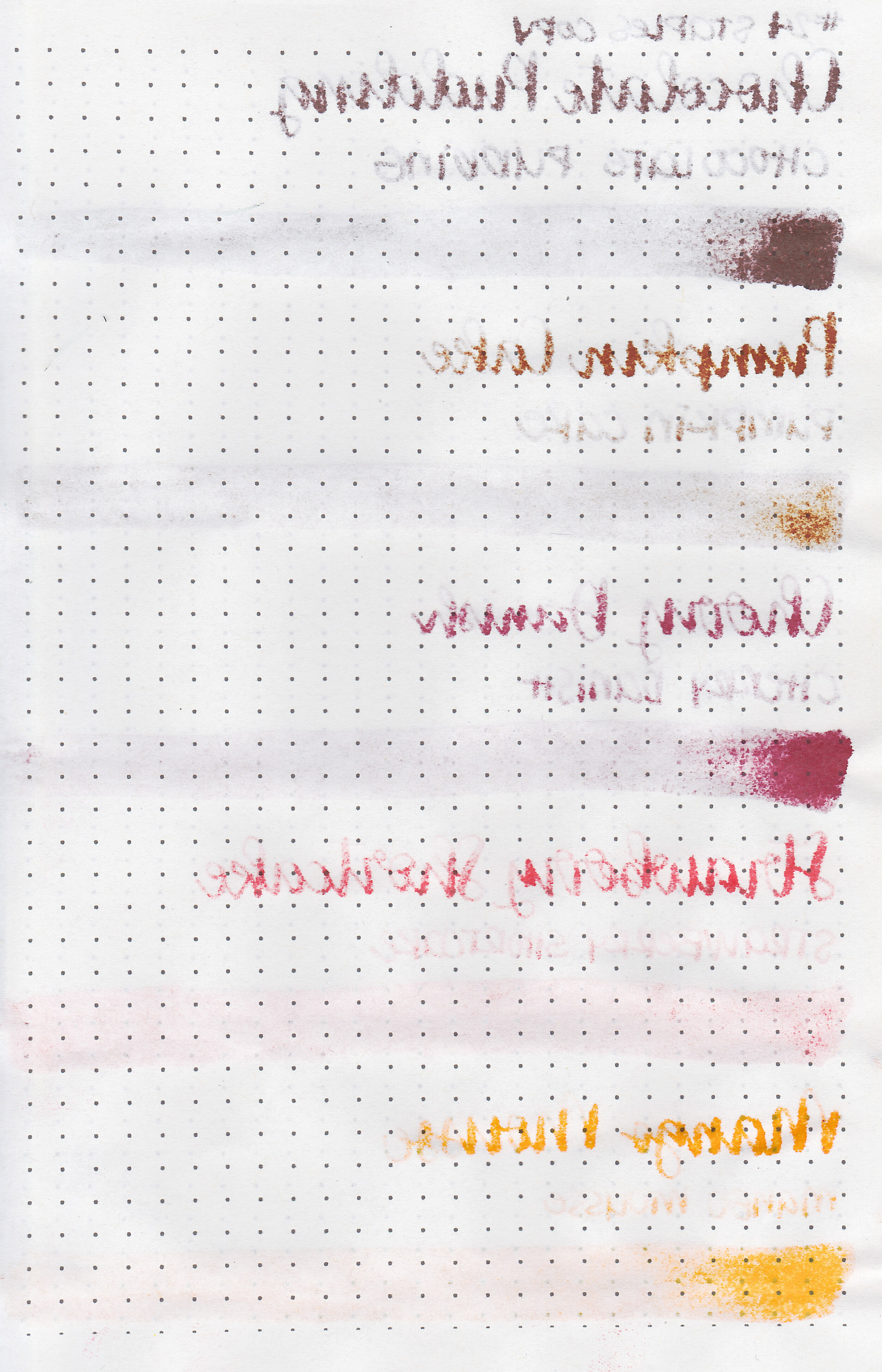
On Staples 24 lb copy paper there was lots of feathering in every nib size as well as a lot of bleeding, so I would not recommend these inks for cheap paper.

Chocolate Pudding is a bit darker than Kobe Nada Brown. Pumpkin Cake is a bit warmer than Stipula Sepia. Cherry Danish is similar to J Herbin Rouge Grenat. Strawberry Shortcake reminds me of Sailor Jentle Irori. Mango Mousse is just a bit lighter than Robert Oster Peach. Click here to see the Monteverde Inks together.
I used a Lochby Lined Refill A5 notebook (Tomoe River 68gsm). All of the inks had a wetter than average flow.
Overall, I really enjoyed all of these inks. Monteverde Inks all have a lovely wet flow and are generally very well behaved. I think Pumpkin Cake is my favorite from these 5 right now-mostly just because it’s a great color for fall and has some pretty shading. I’m so glad I purchased the whole collection because I’ve been using them often.
Disclaimer: I purchased this ink myself. All photos and opinions are my own. This page does not contain affiliate links, and is not sponsored in any way.
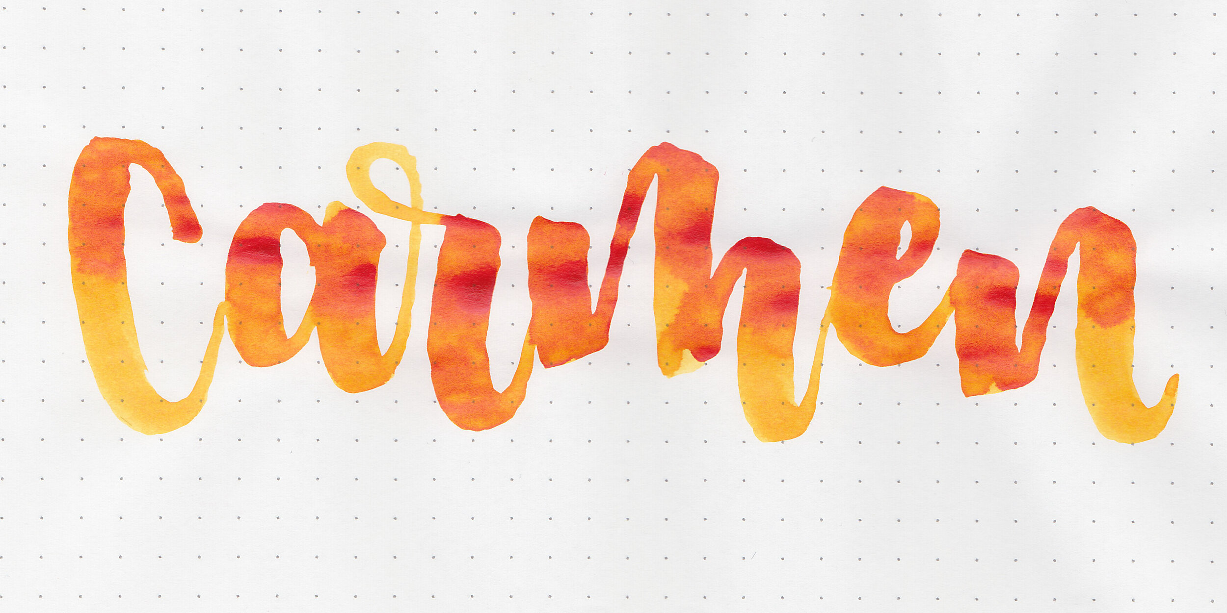
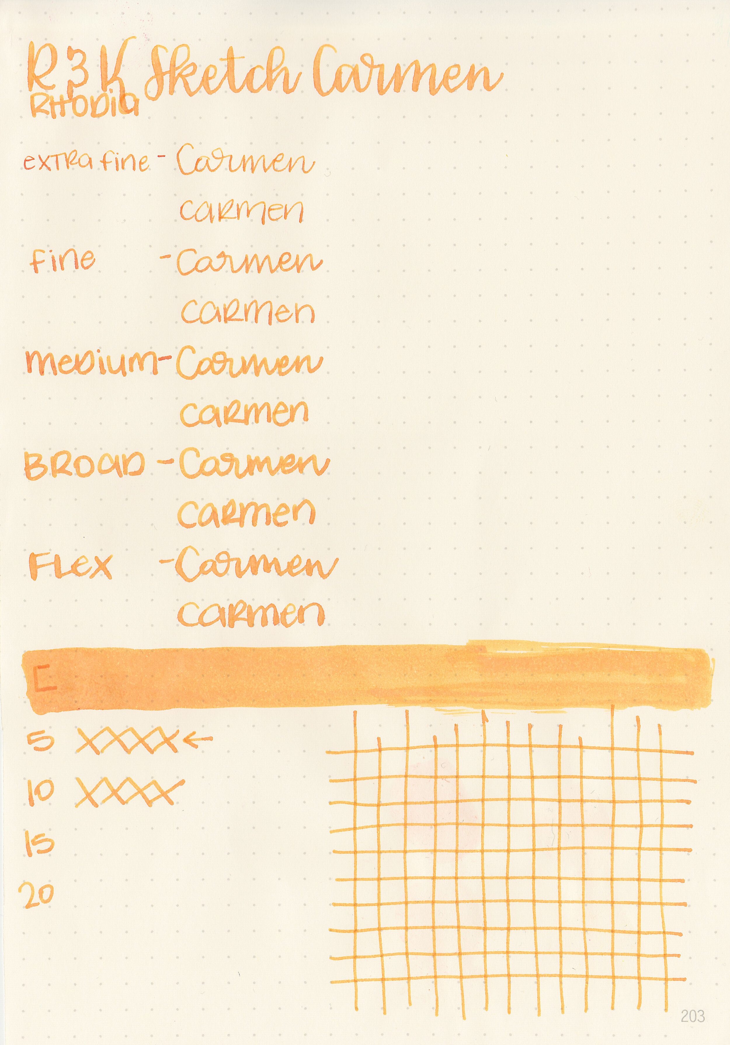
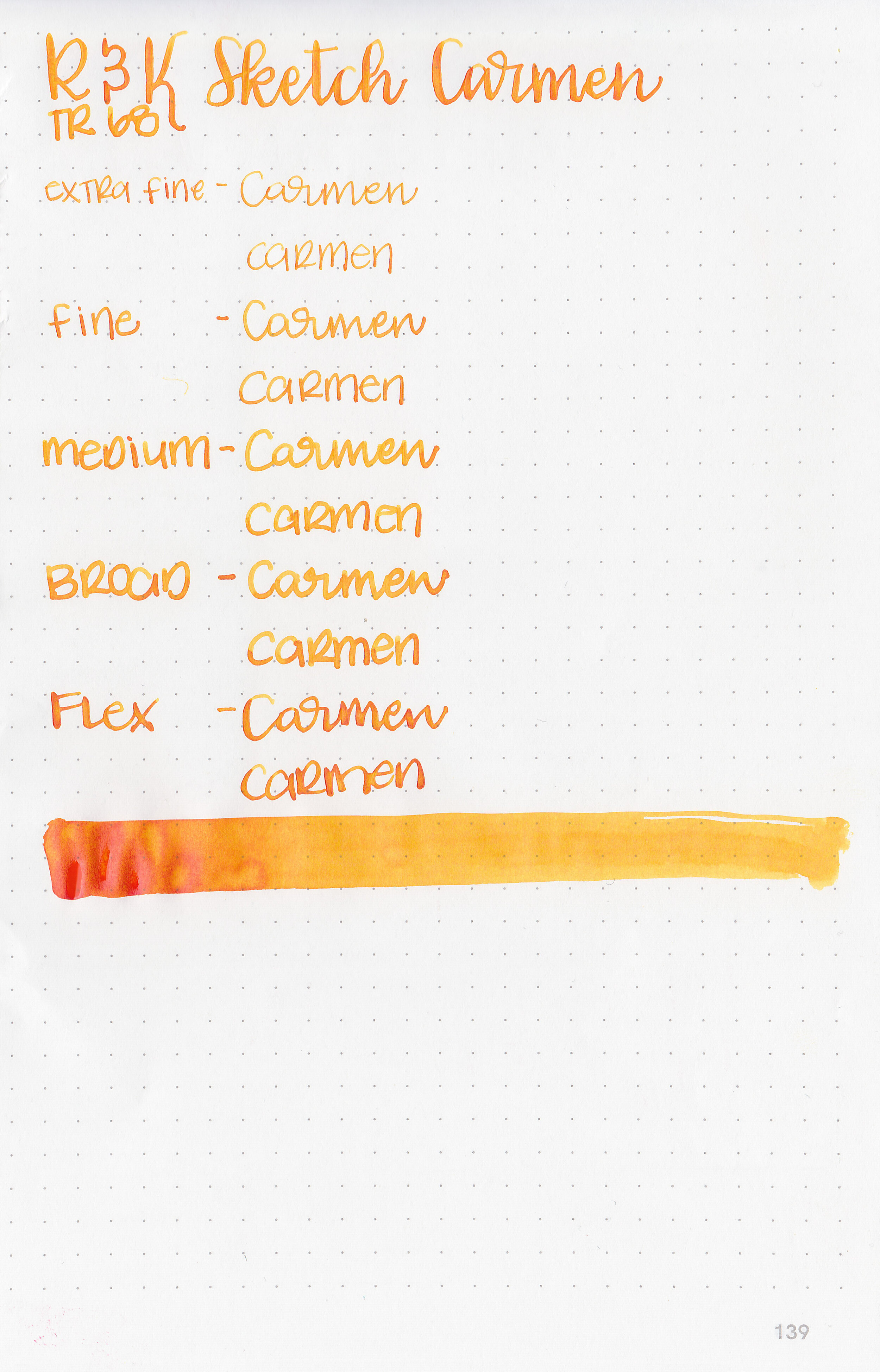
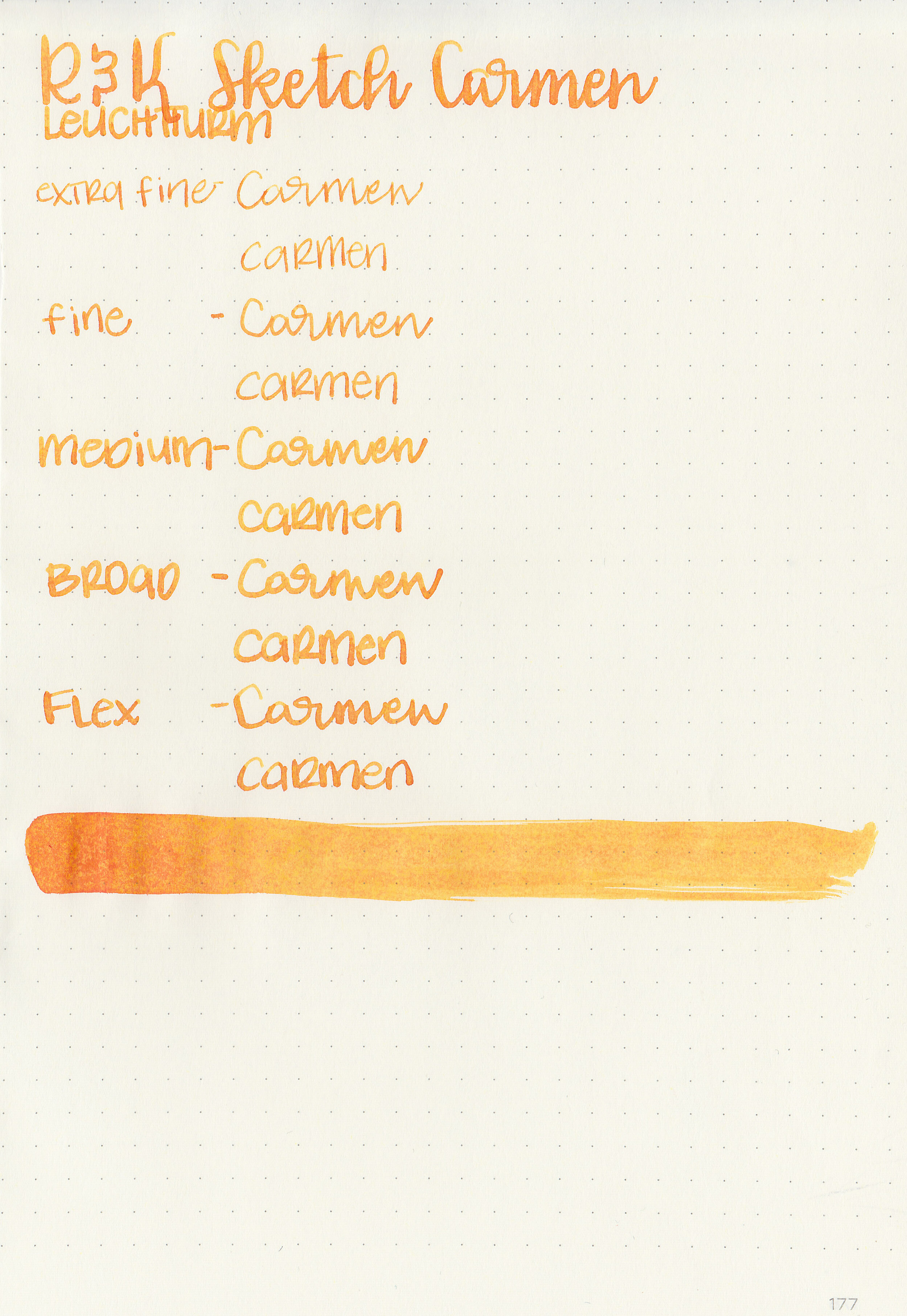
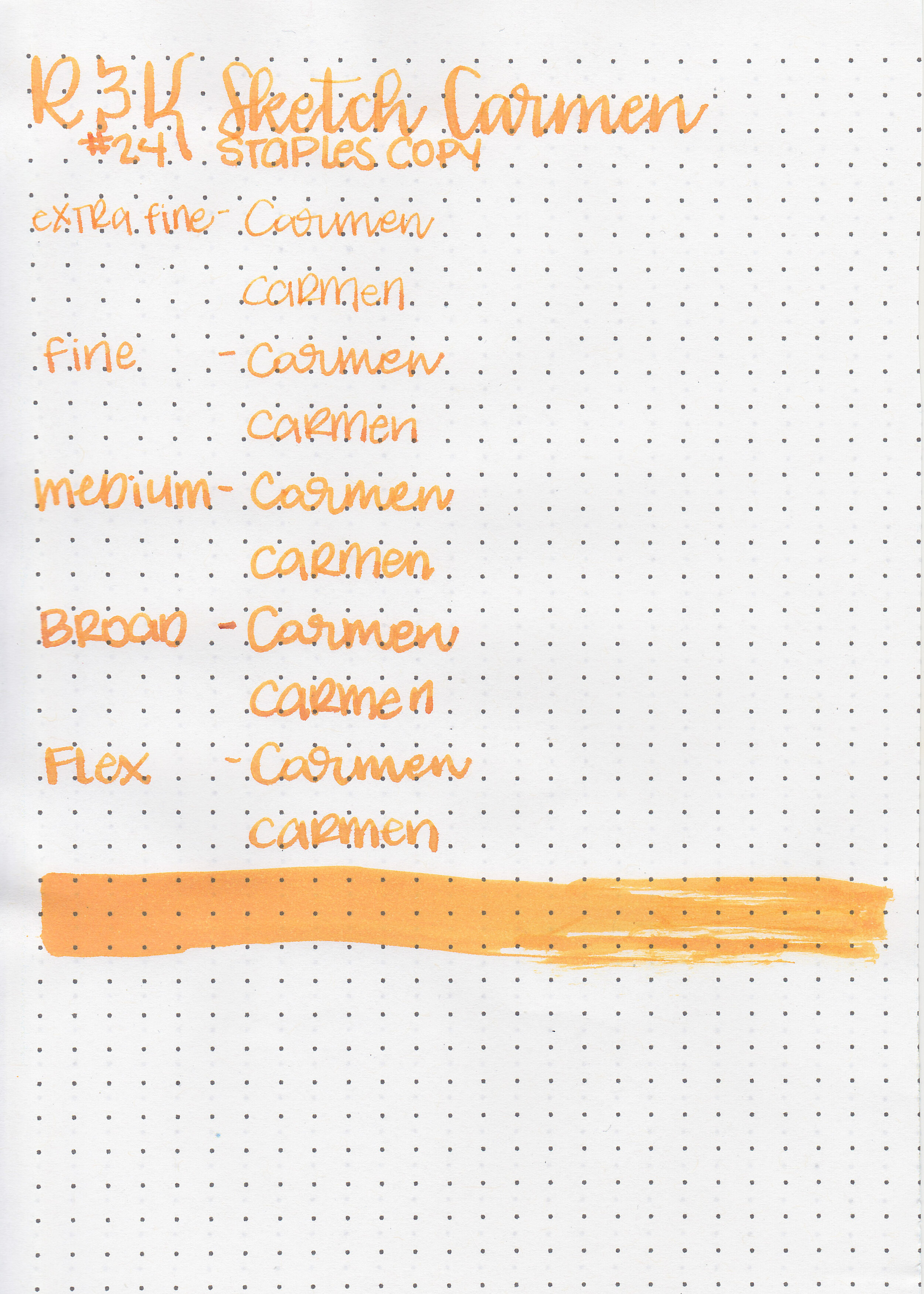
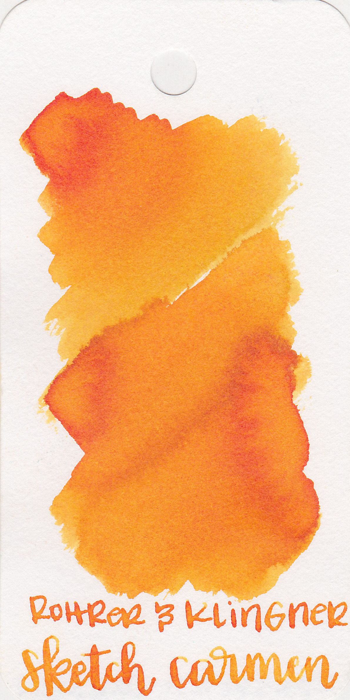
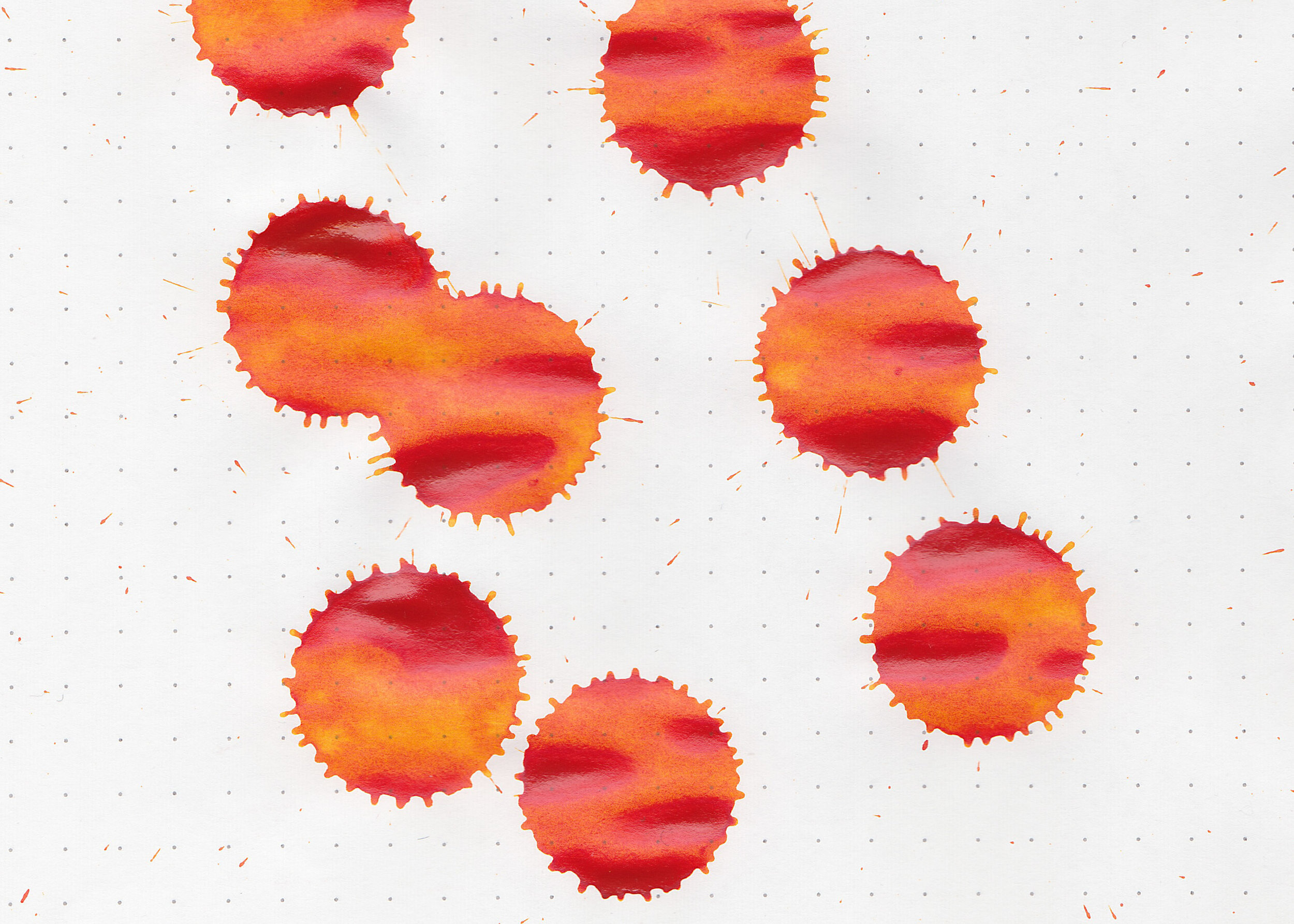
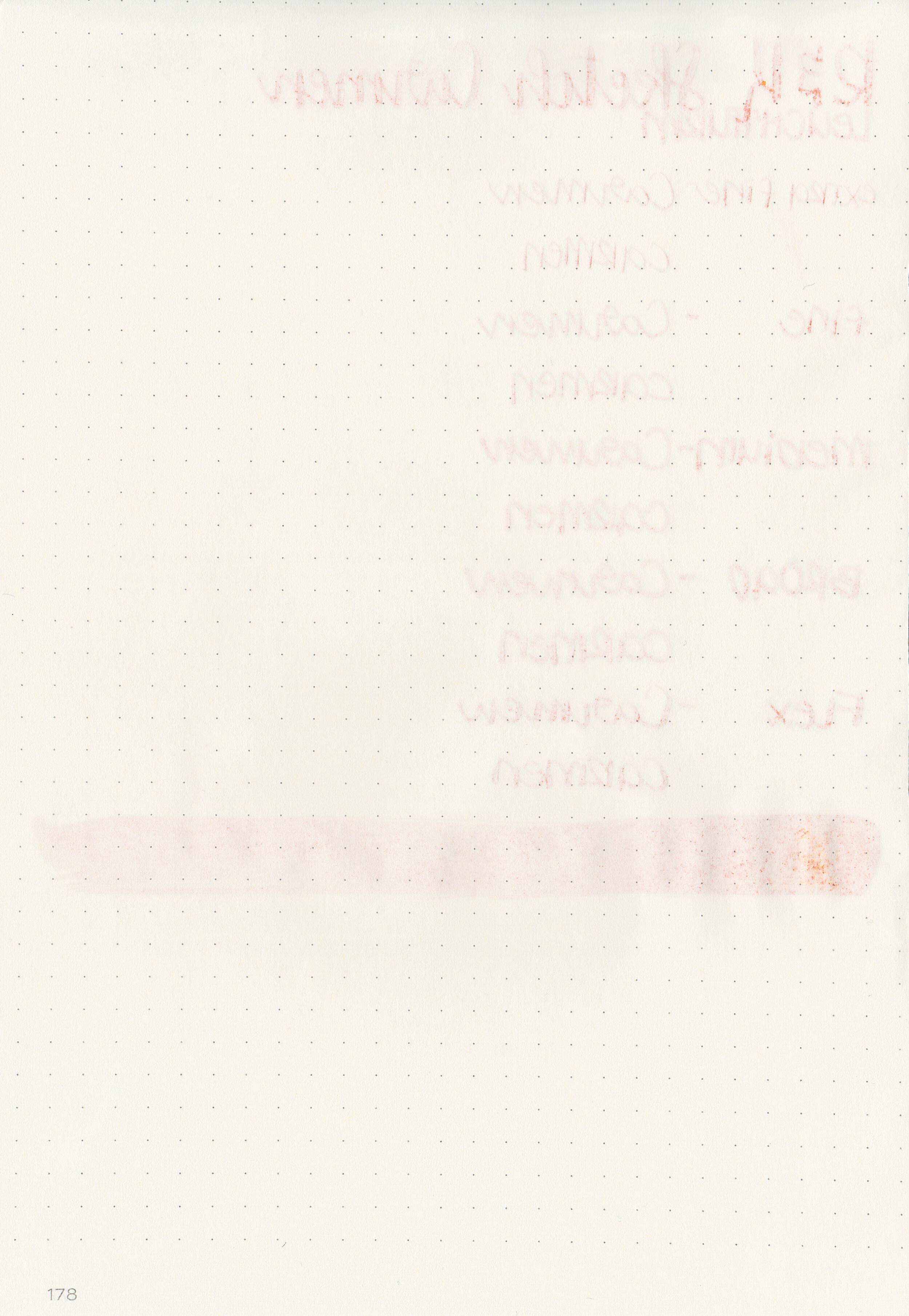
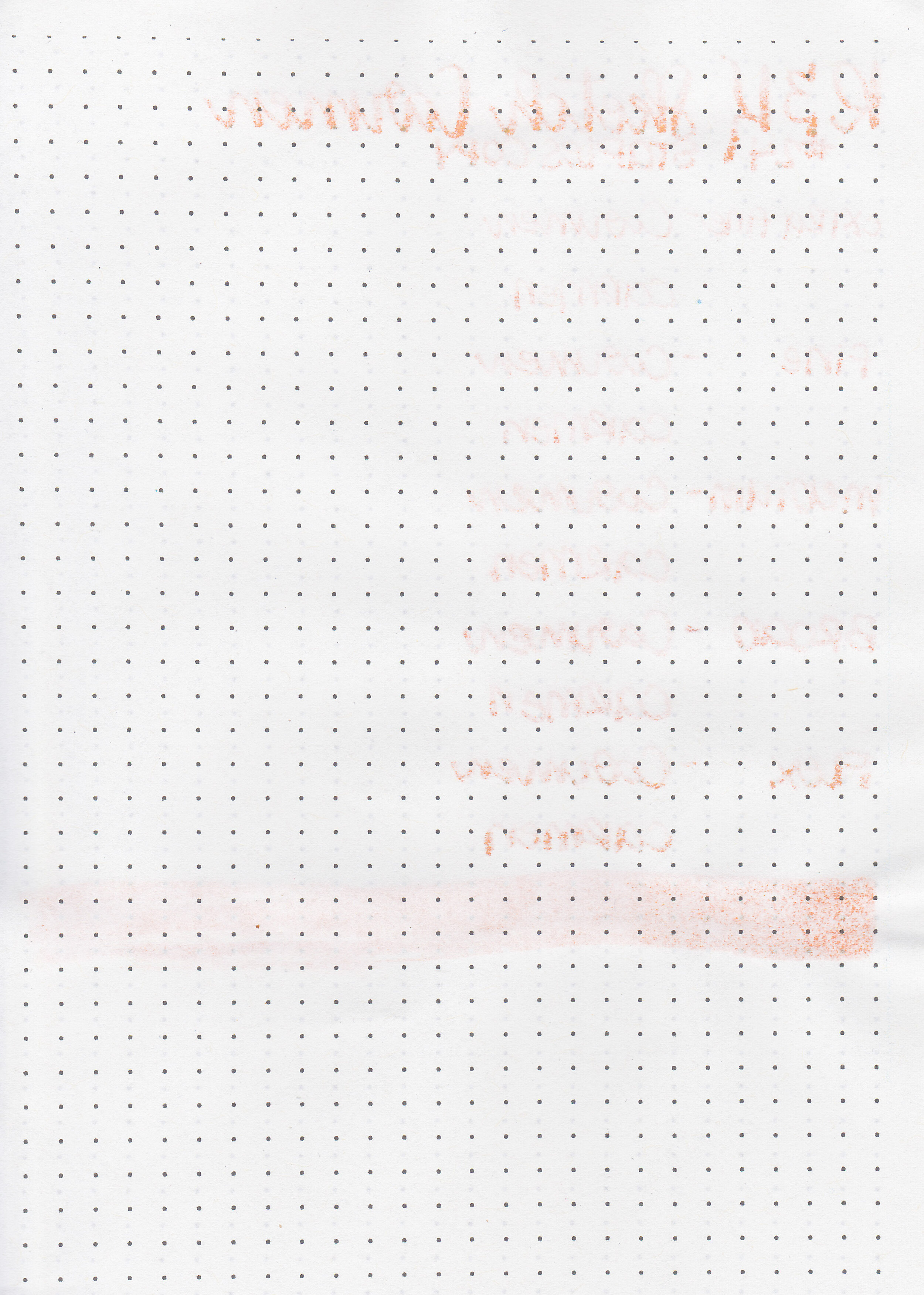
Rohrer and Klingner SketchINK Carmen is designed for sketching and drawing, but also works well for standard writing. This ink has a large color range-from pale yellow-orange to bright red. I purchased my sample of ink from Vanness Pens.
The color:
Carmen is a medium yellow-orange. At the palest it’s almost a yellow and at the darkest it reaches a bright red.
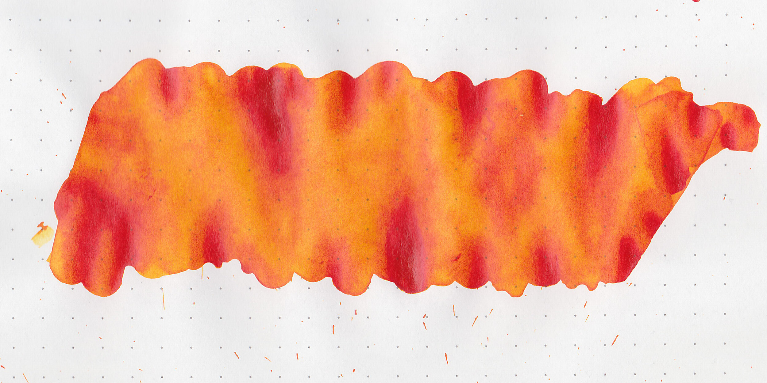
In large swabs on Tomoe River paper the ink shows off some of the darker red tones.
Let's take a look at how the ink behaves on fountain pen friendly papers: Rhodia, Tomoe River, and Leuchtturm.
Dry time: 5 seconds
Water resistance: High
Feathering: Low-there was some feathering on Rhodia
Show through: Medium
Bleeding: Low-there was some bleeding on Rhodia.
Other properties: medium shading, no sheen, and no shimmer.
On Staples 24 lb copy paper there was feathering in every nib size, and some bleeding in the flex and broad nibs.
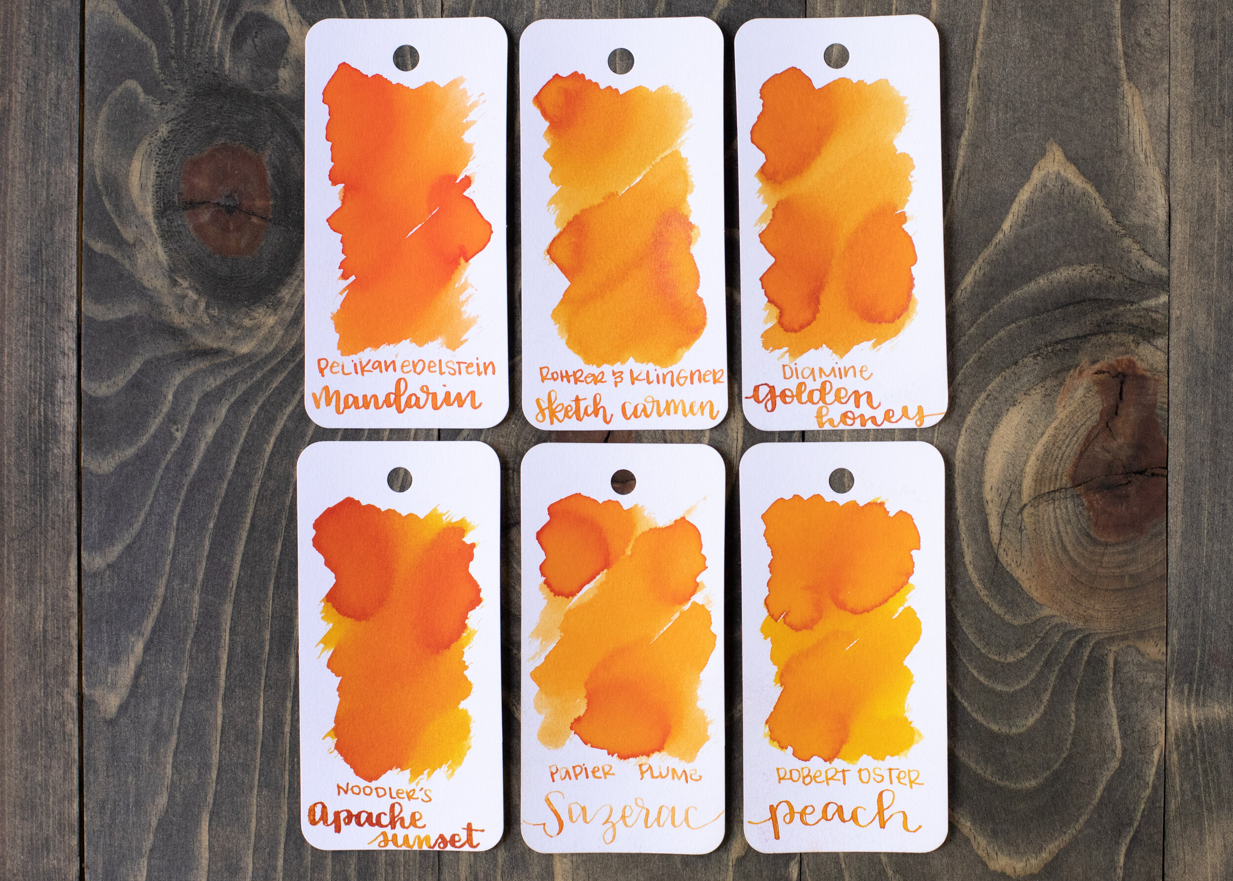
Carmen is similar to Papier Plume Sazerac, maybe just a little bit more vibrant. Click here to see the Rohrer and Klingner inks together, and click here to see the orange inks together.

I used a medium Pelikan M600 Vibrant Orange on a Lochby A5 Lined Refill-Tomoe River 68gsm. The ink had an average flow.
Overall, I really like this ink. It dries super fast, is very water resistant, has a wide range of shading colors and is pretty affordable too. There are some downsides to this ink though-it looks chalky and washed out on Rhodia, and feathers and bleeds a bit on Rhodia as well. This doesn’t bother me since I don’t usually use Rhodia personally, and it performs well on the other papers. Since the ink is pigmented instead of dye-based it is important to shake the ink before filling, and have good pen hygiene. I would absolutely use this ink again.
Disclaimer: I purchased this ink myself, and all photos and opinions are my own. This page does not contain affiliate links, and this post is not sponsored in any way.

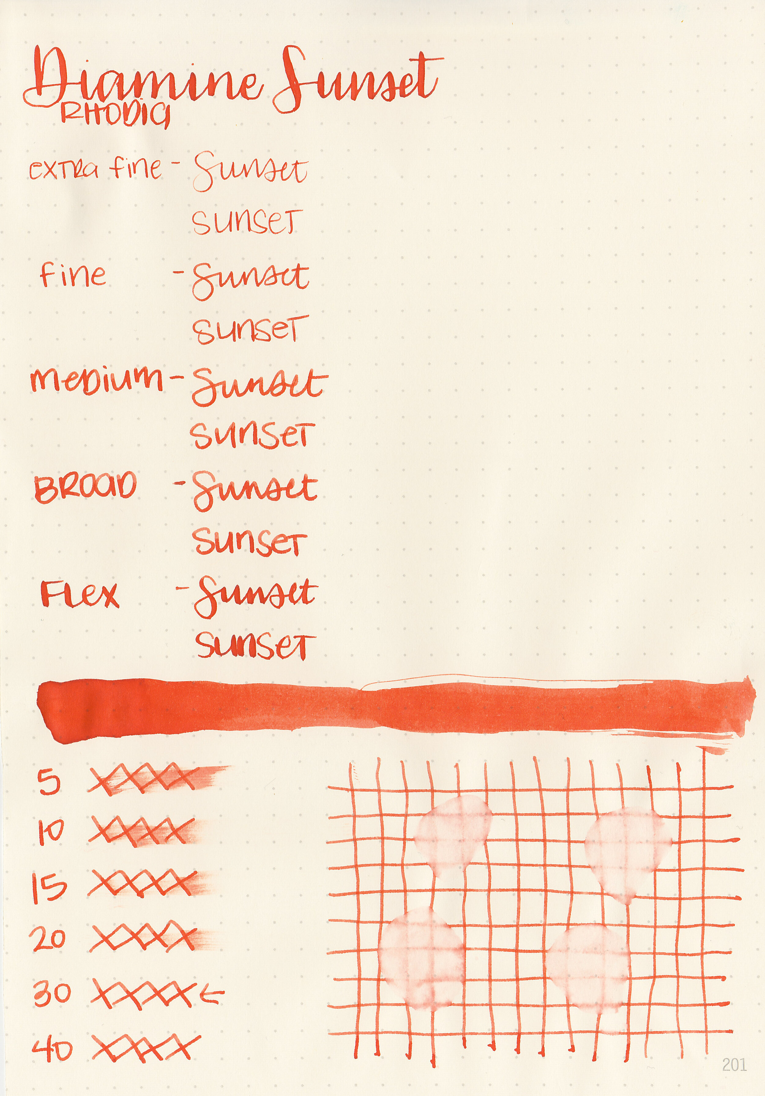
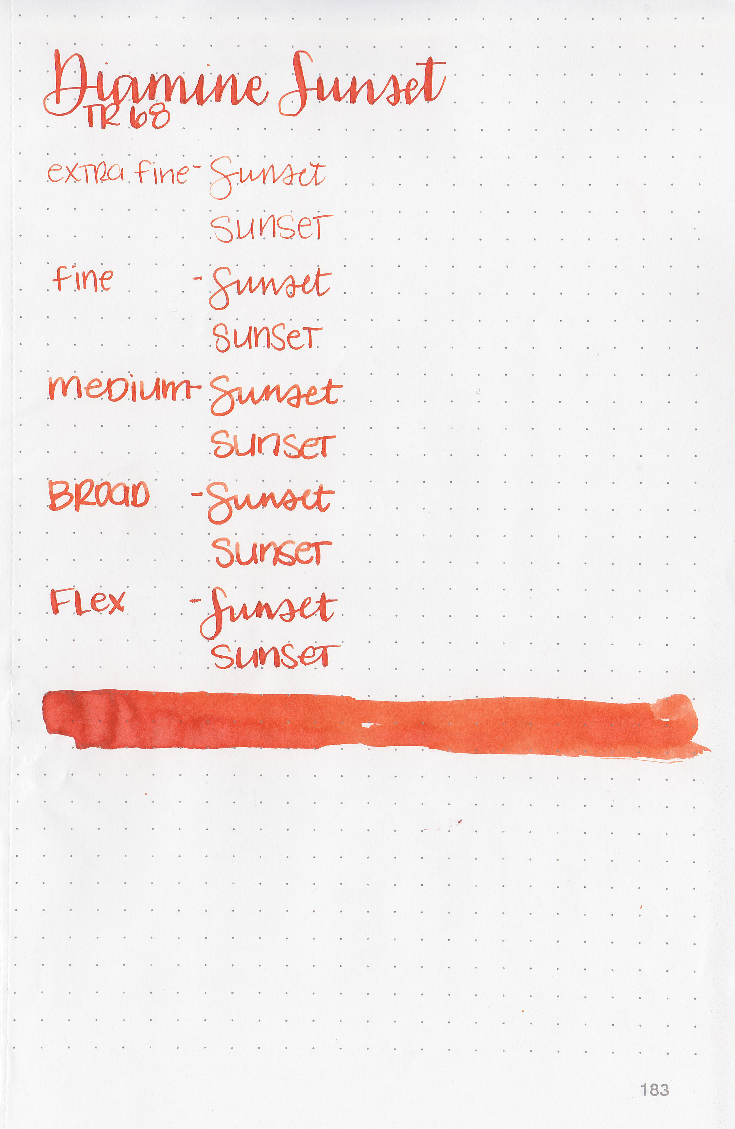
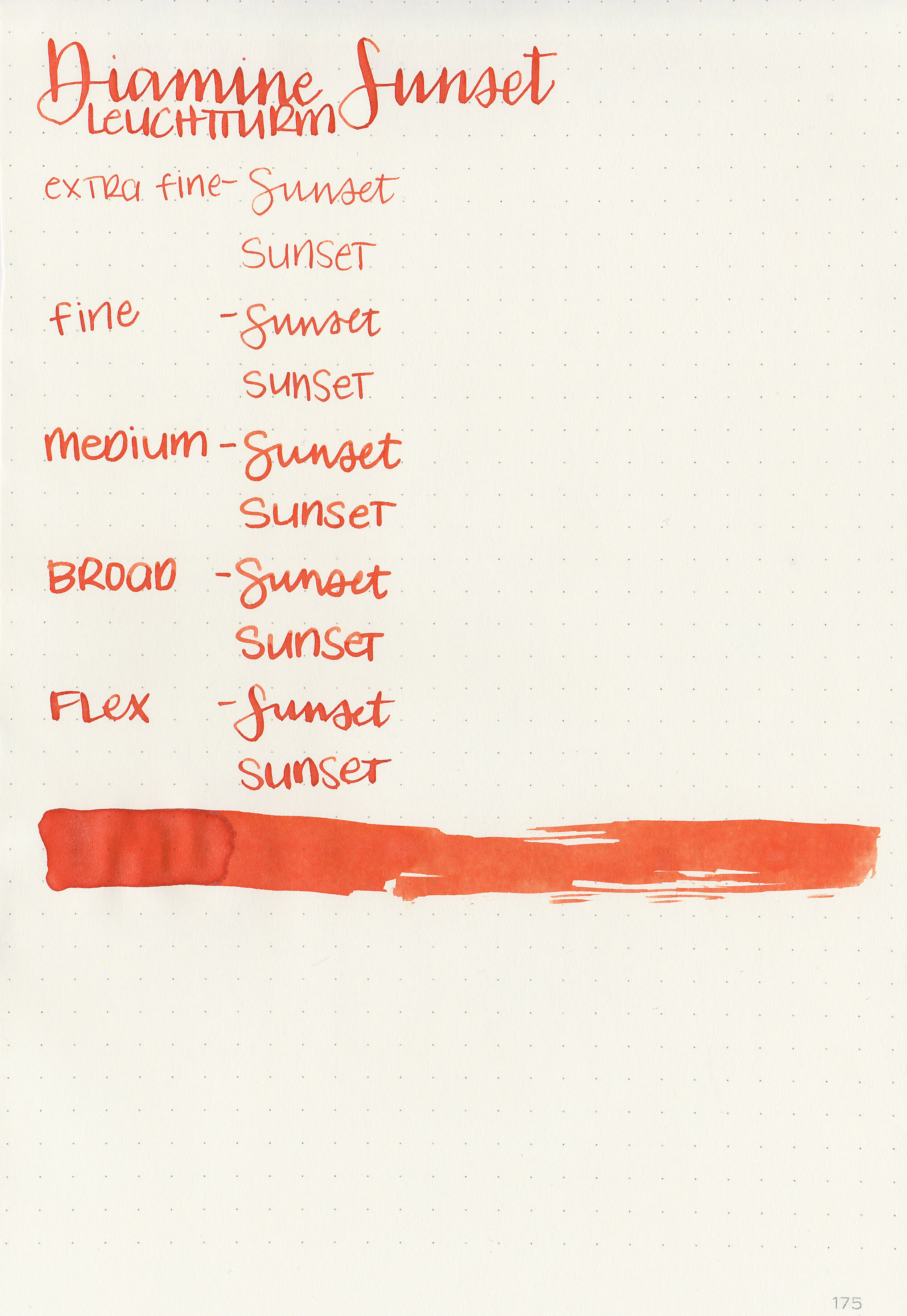
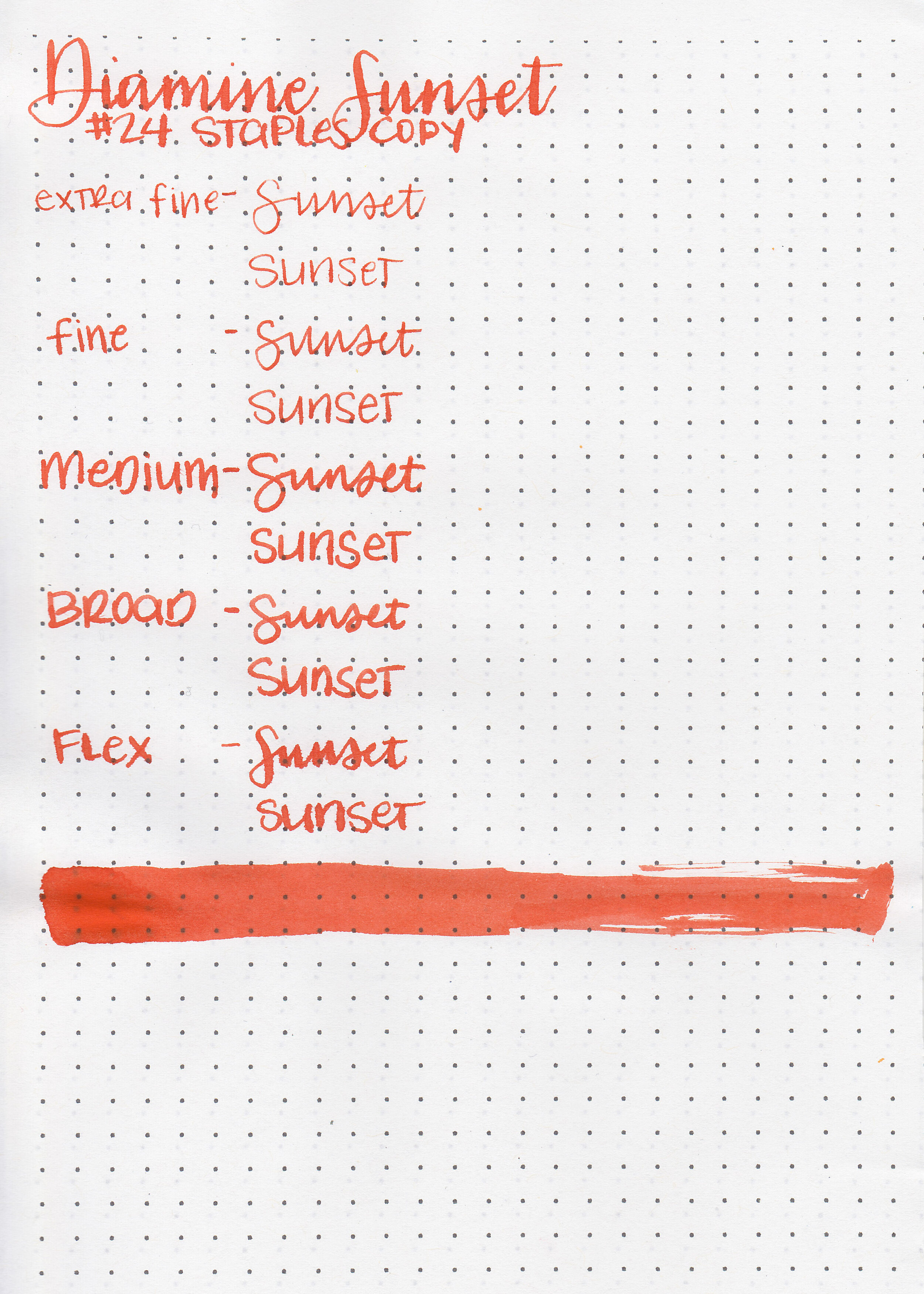
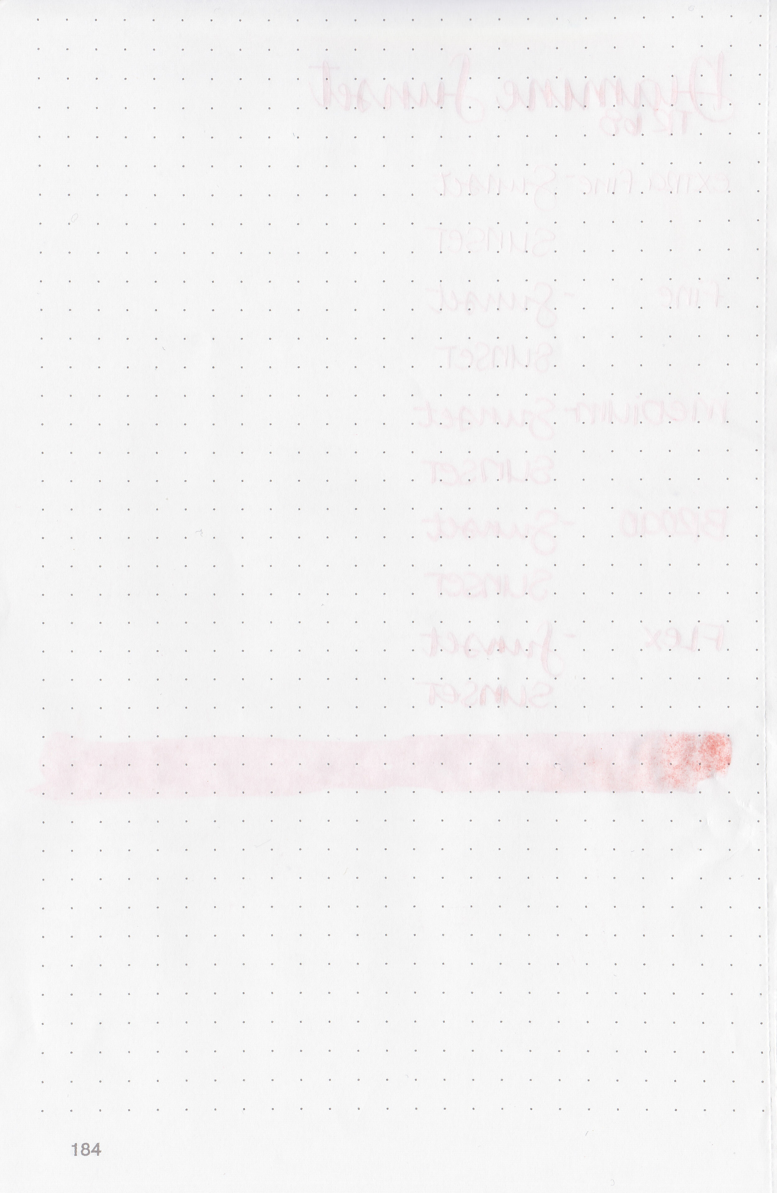
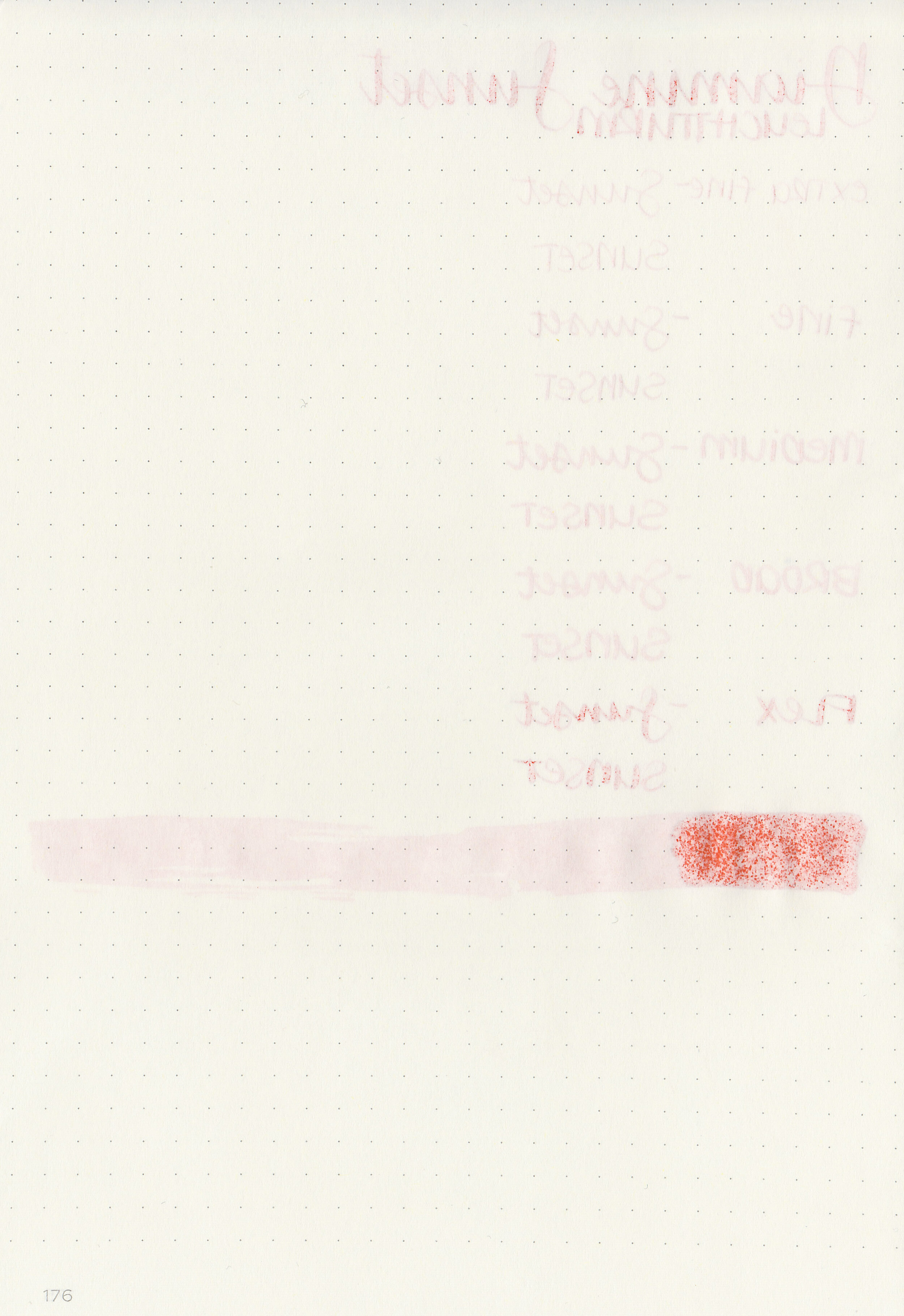
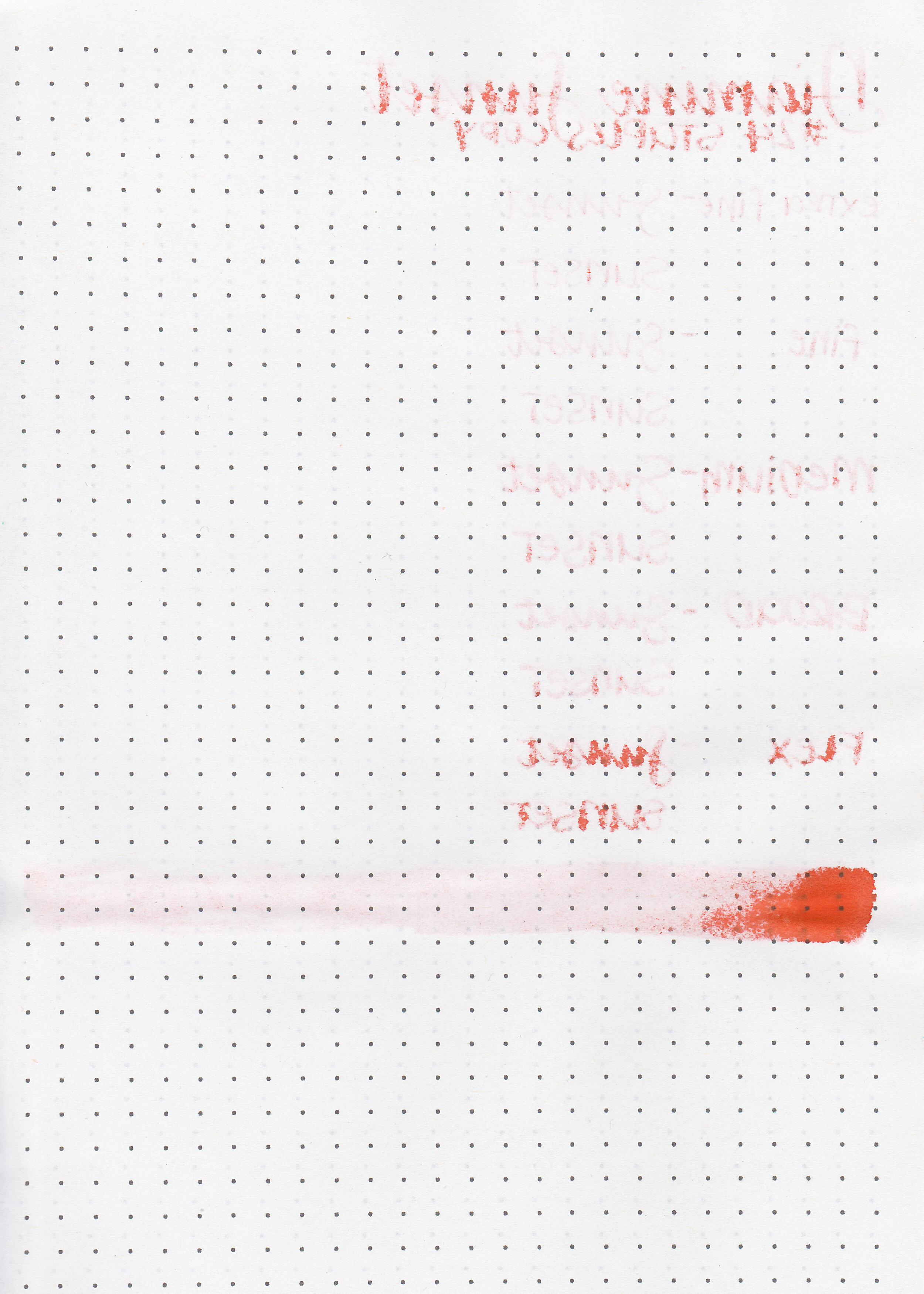
Shortly after I discovered fountain pens I found Cult Pens. There should have been ominous music in the background because when I realized how great their prices are on Diamine ink I quickly fell down a Diamine rabbit hole. Each 30ml ink bottle is currently about $2.52 (the exchange rate changes almost daily). So Diamine Sunset has been sitting in my drawer for a few years now, waiting for an empty pen. Since it’s orange ink week it’s time to give it a try. No, this post is not sponsored by Cult Pens, I just love to buy Diamine inks from them.

The color:
Sunset is a vibrant red-orange. It’s almost a vermillion orange.

In large swabs on Tomoe River paper the ink has some shading but no sheen.

Let's take a look at how the ink behaves on fountain pen friendly papers: Rhodia, Tomoe River, and Leuchtturm.
Dry time: 30 seconds
Water resistance: Low
Feathering: None
Show through: Medium
Bleeding: None
Other properties: medium shading, no sheen, and no shimmer.
On Staples 24 lb copy paper there was feathering in every nib size, and some bleeding in the flex and broad nibs.

Sunset is similar to Papier Plume House of the Rising Sun, but has just a little bit more red in it. It’s a little bit less saturated than Monteverde Motivation, but darker than Robert Oster Orange Zest. Click here to see the Diamine inks together, and click here to see the orange inks together.

I used a double broad Kaweco Sport Orange on a Lochby A5 Lined Refill-Tomoe River 68gsm. The ink had an average flow.
Overall, I really enjoyed this ink. It’s well behaved and super affordable-a win for me.
Disclaimer: I purchased this ink myself, and all photos and opinions are my own. This page does not contain affiliate links, and this post is not sponsored in any way.

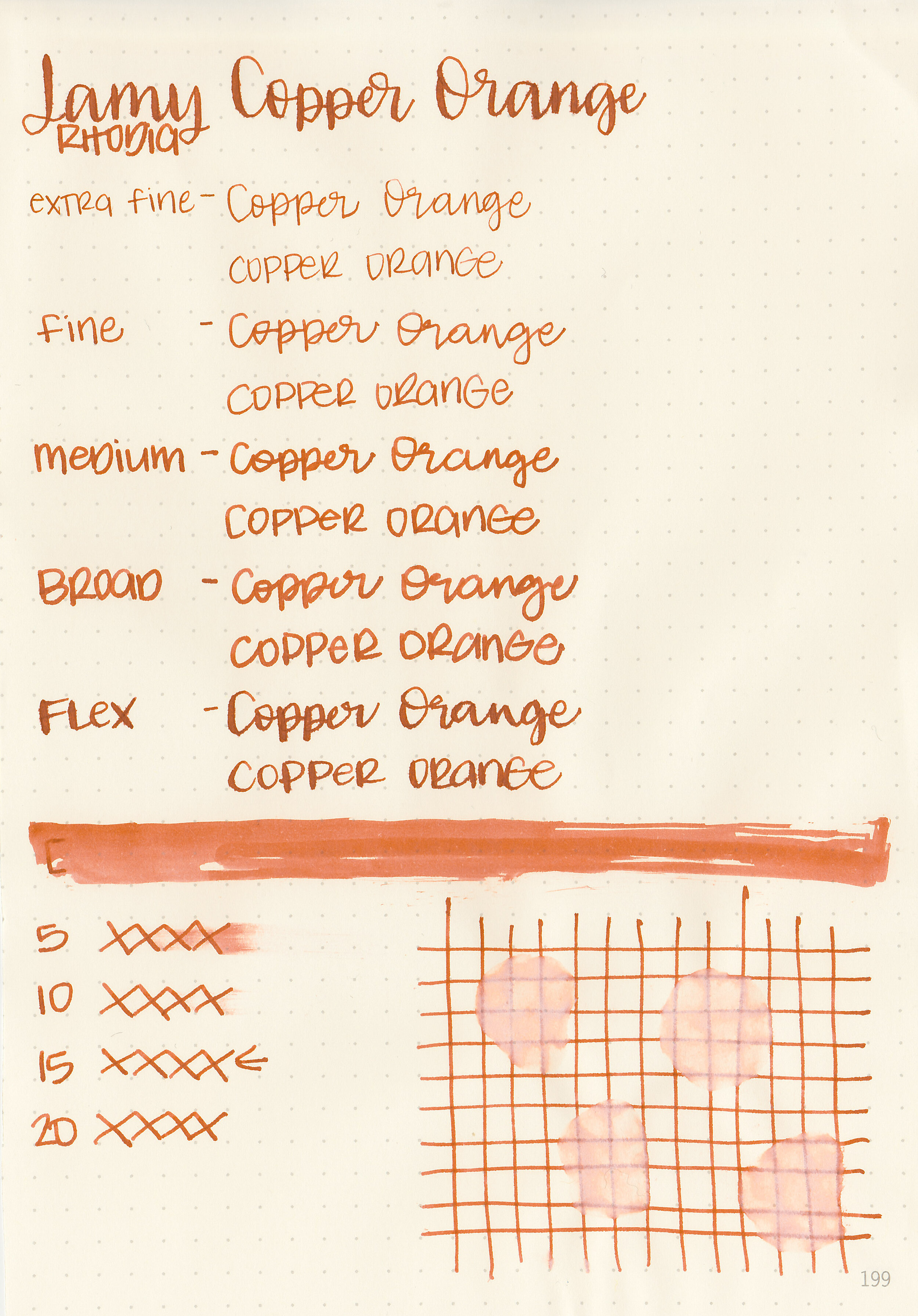
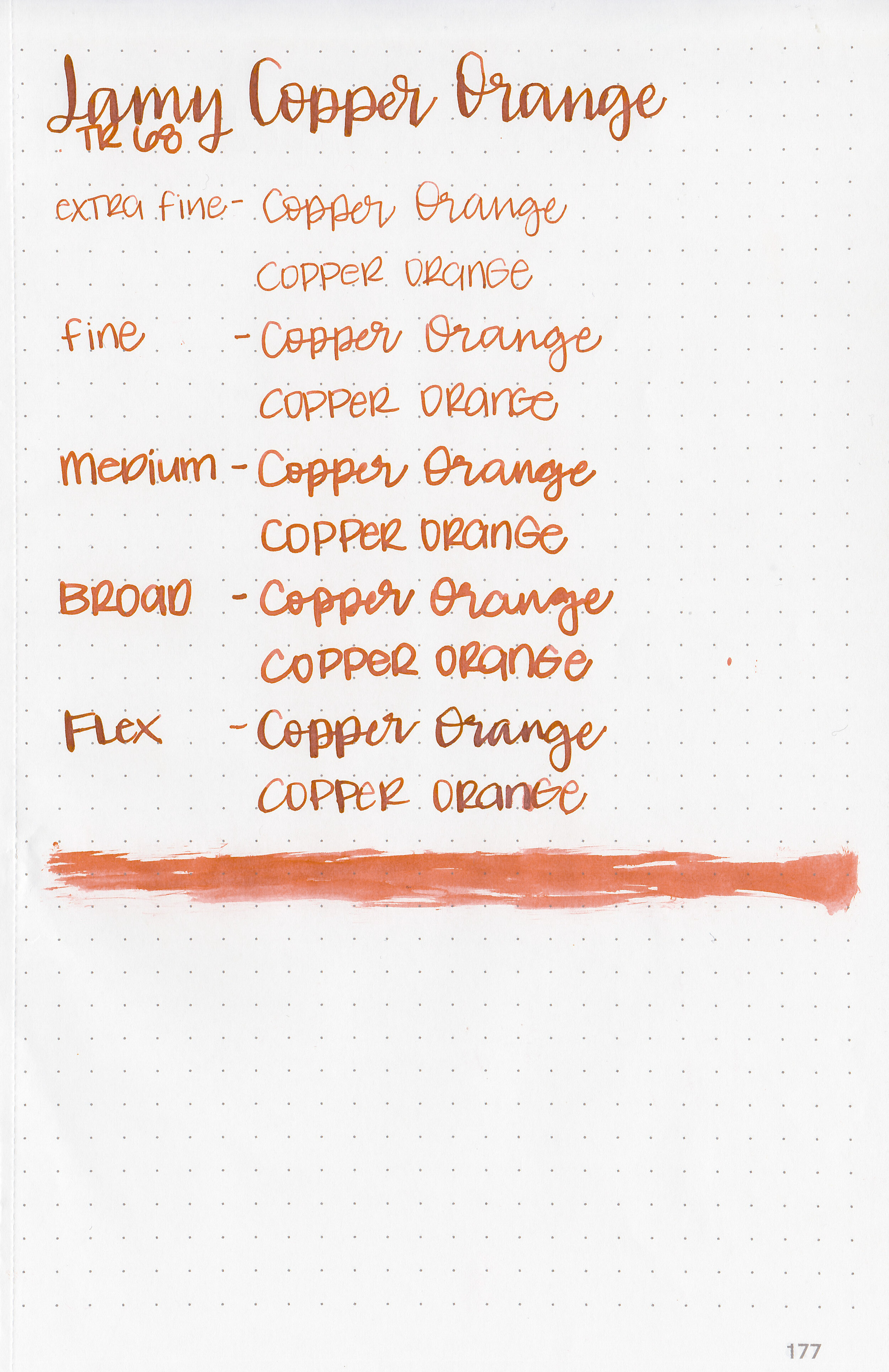
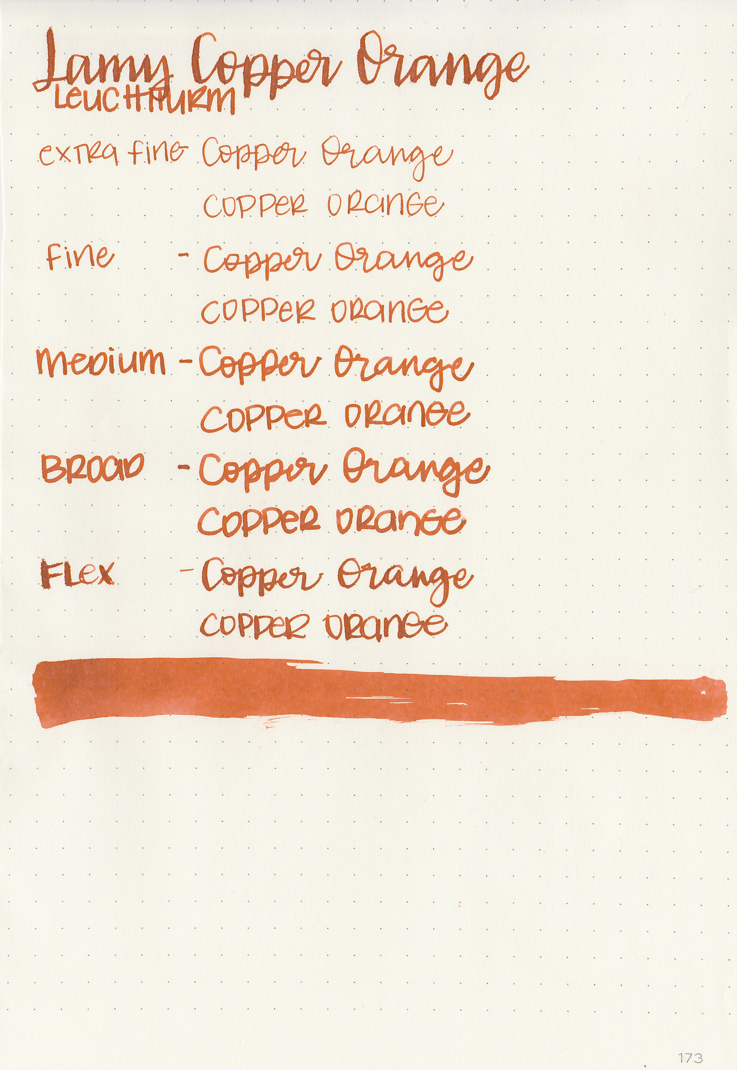
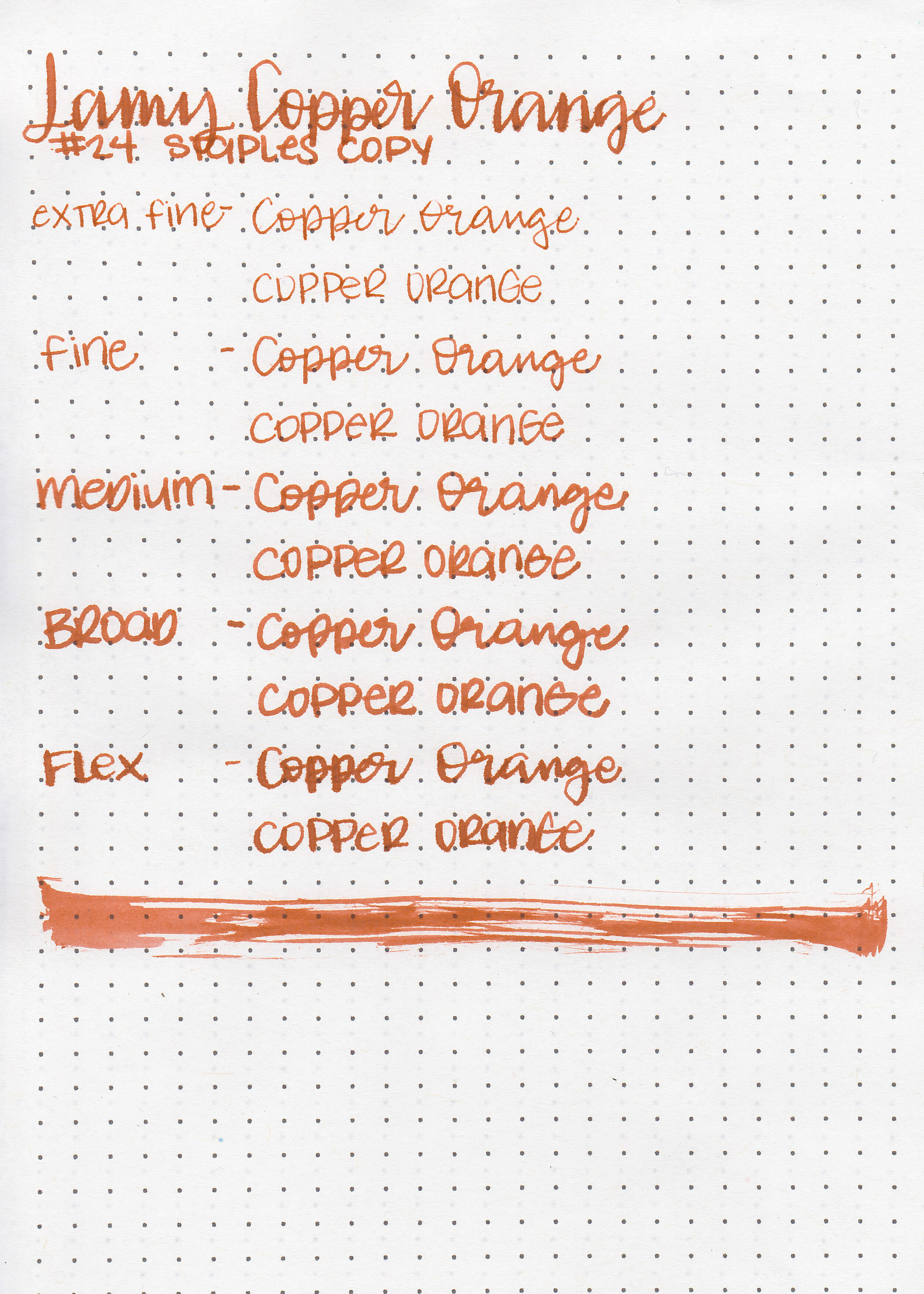
We are still swimming in orange inks this week. One orange ink I’ve had in my drawer forever but never played with is Lamy Copper Orange. Copper Orange was a limited edition ink in 2015. I discovered fountain pens in late 2015, so I didn’t buy a bottle when it was available. Fortunately a friend from my local pen club has a bottle and offered me a sample. My main goal in reviewing past limited edition inks is to show currently available inks that are similar, so if you missed out you can find an alternative.
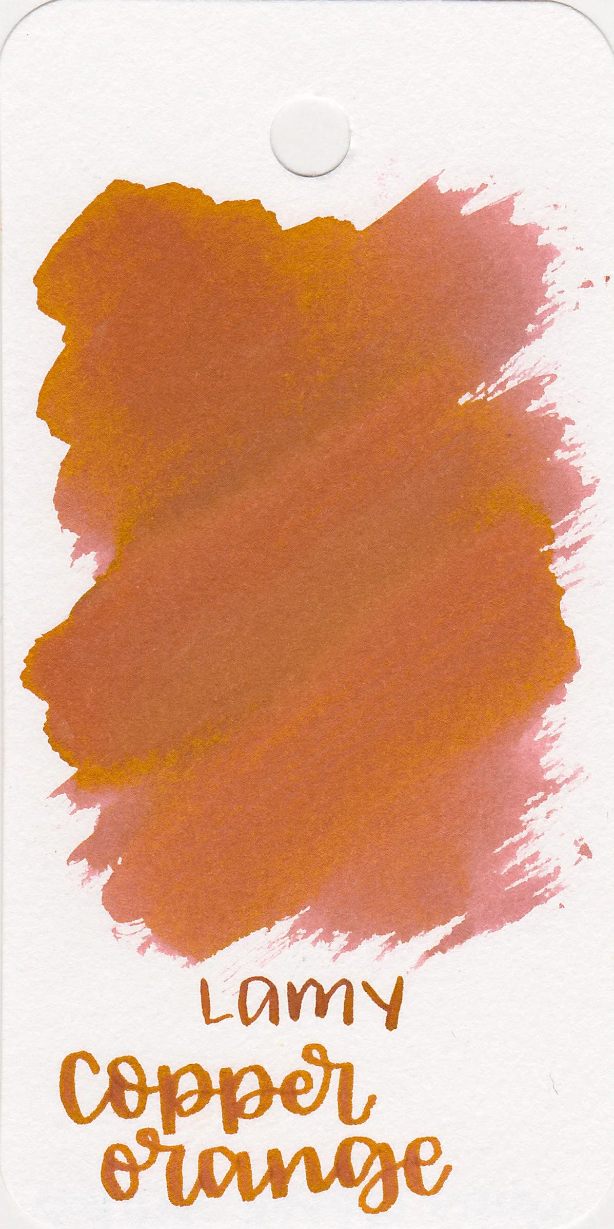
The color:
Copper Orange is a medium slightly unsaturated orange. I had a heck of a time trying to color match these images.

In large swabs on Tomoe River paper the ink almost turns brown where pooled.

Let's take a look at how the ink behaves on fountain pen friendly papers: Rhodia, Tomoe River, and Leuchtturm.
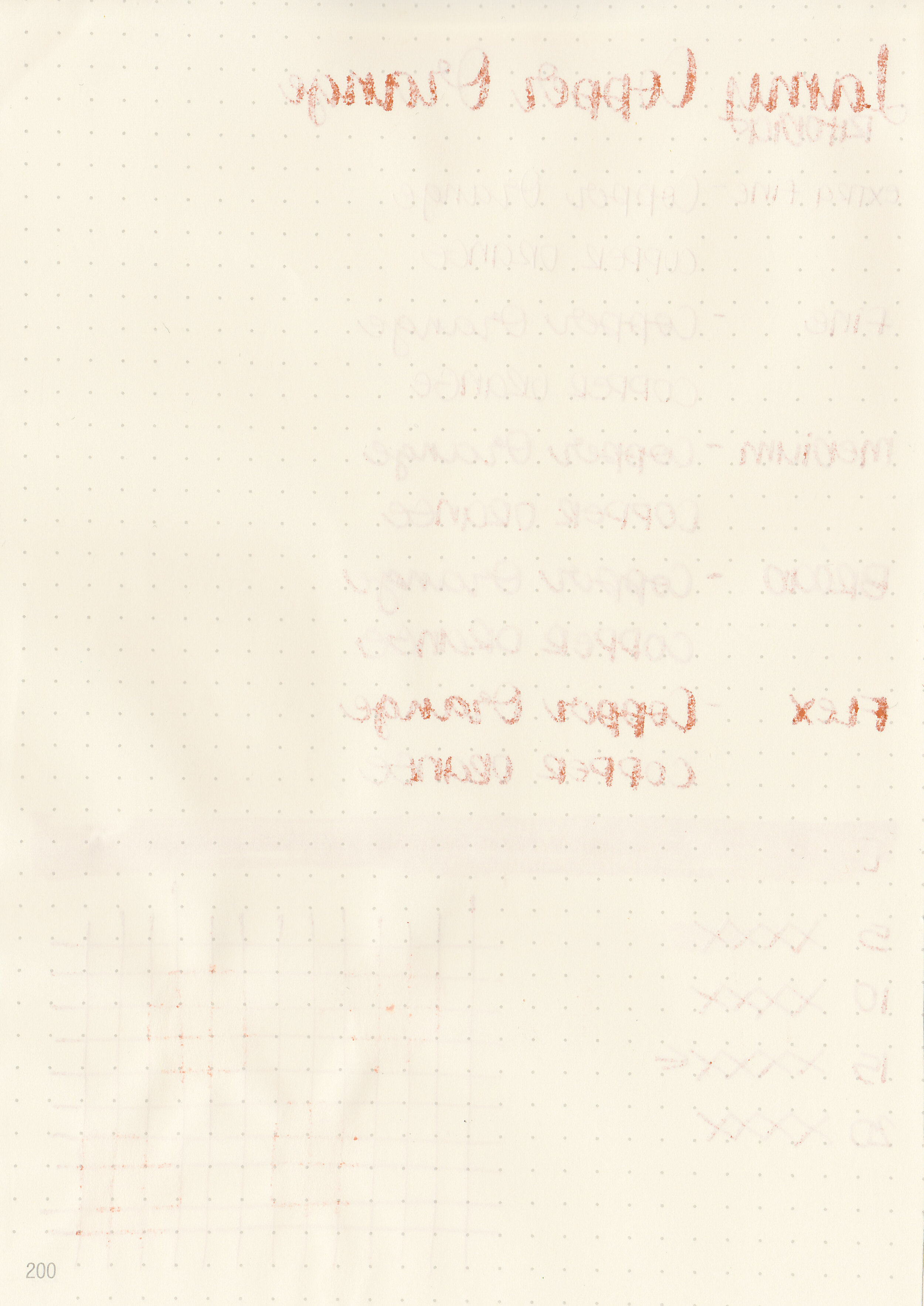
Dry time: 15 seconds
Water resistance: Low
Feathering: Low-there was just a tiny bit of feathering in the flex nib.
Show through: Medium
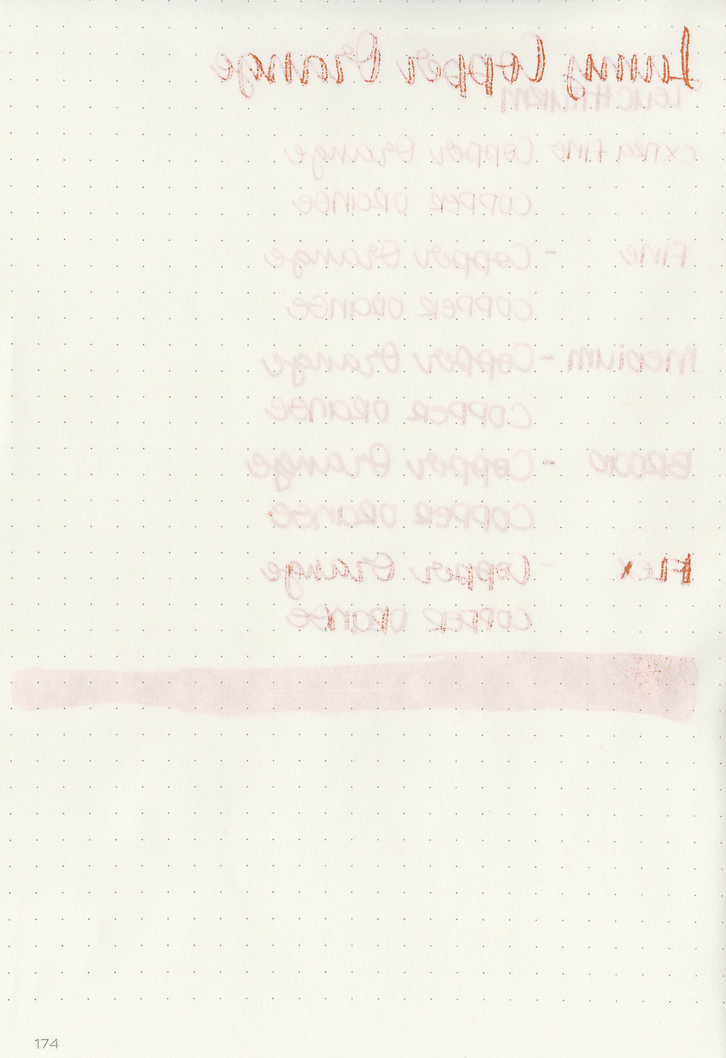
Bleeding: Low-there was some bleeding in the flex nib.
Other properties: low shading, no sheen, and no shimmer.
On Staples 24 lb copy paper there was feathering in every nib size, and some bleeding in the flex and broad nibs.

Copper Orange is just a little bit less saturated than Robert Oster Orange Rumble, and a shade or two lighter than Krishna Jungle Volcano. It’s a shade darker than Lamy Bronze and has a little bit more red in it. Click here to see the Lamy inks together, and click here to see the orange inks together.

I used a medium Lamy Al-star Bronze on a Lochby A5 Lined Refill-Tomoe River 68gsm. The ink had an average flow.
Overall, Robert Oster Orange Rumble is a good alternative. If you would like something one or two shades darker with some sheen (but similar color) give Krishna Jungle Volcano a try.
Disclaimer: A sample of this ink was provided by a pen friend. All photos and opinions are my own. This page does contain affiliate links, but this post is not sponsored in any way.
Hi, I’m Kelli, and I’m the brain behind Mountain of Ink. I’m a homeschooling mama of three littles, full-time student, aspiring photographer, amateur chef, and lover of all things stationery. I think any day that doesn’t involve learning and playing with ink is a day wasted. On my site you will find fountain pen, ink, and paper reviews, along with stationery bits and bobs along the way. You can find me @mountainofink on Instagram, Facebook, Twitter, and Pinterest.
Powered by Squarespace.